
Top 5 Visual Mistakes in Fintech Pitch Decks

Pitching a fintech product is always a balancing act. The ideas are complex, the timelines are tight, and the story usually spans several layers of data, logic, and risk. In that kind of pace, visuals become more than decoration: they either help the reader follow your thinking, or make them work harder than they should.
Over the past year, we’ve worked with dozens of fintech teams — from pre-seed to Series B — and we keep seeing the same visual patterns. These aren’t “mistakes” in the traditional sense. They’re natural side effects of building fast and working under pressure. Below are five situations that often make a pitch harder to absorb, along with simple adjustments that help strengthen any deck.
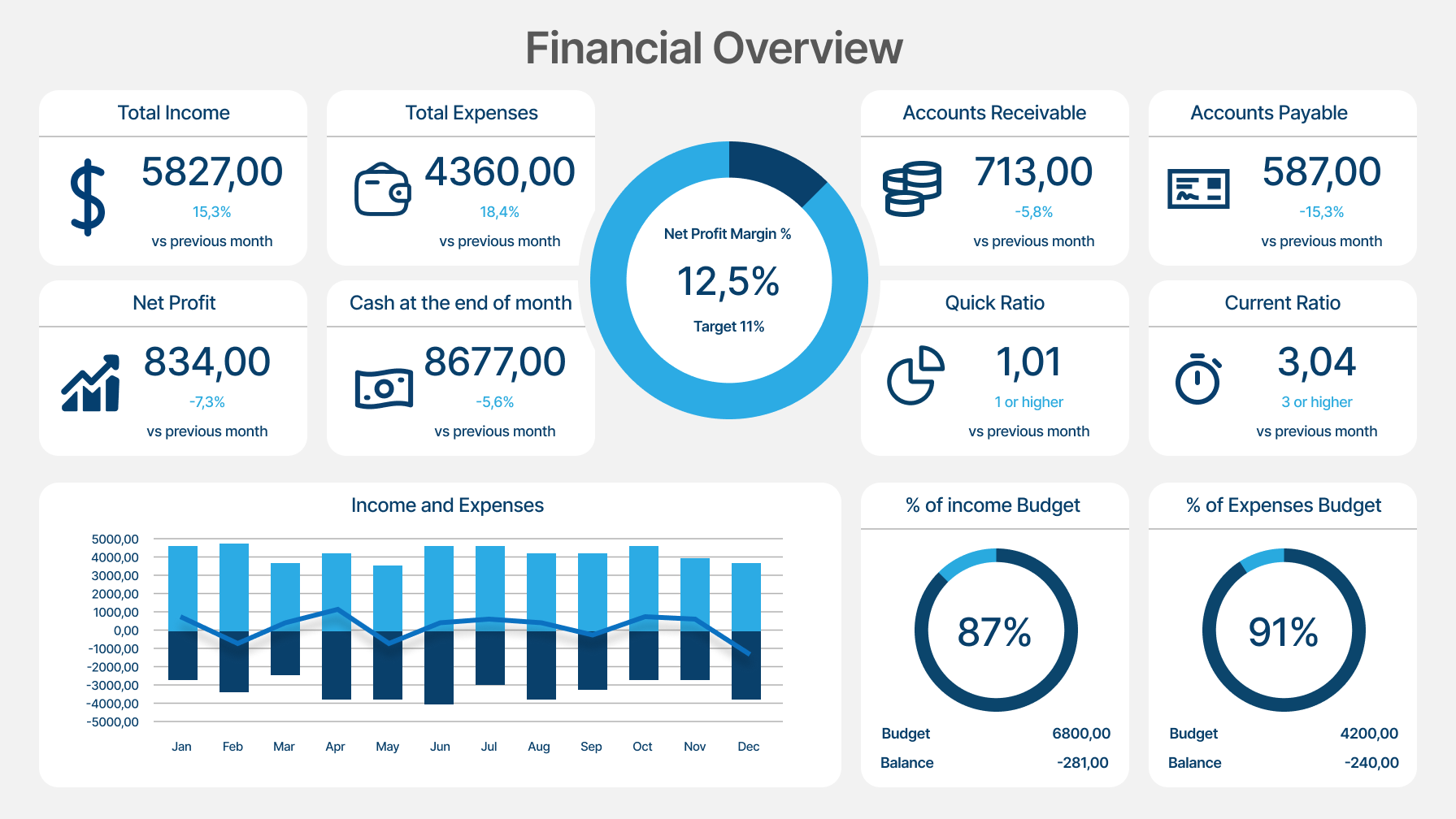
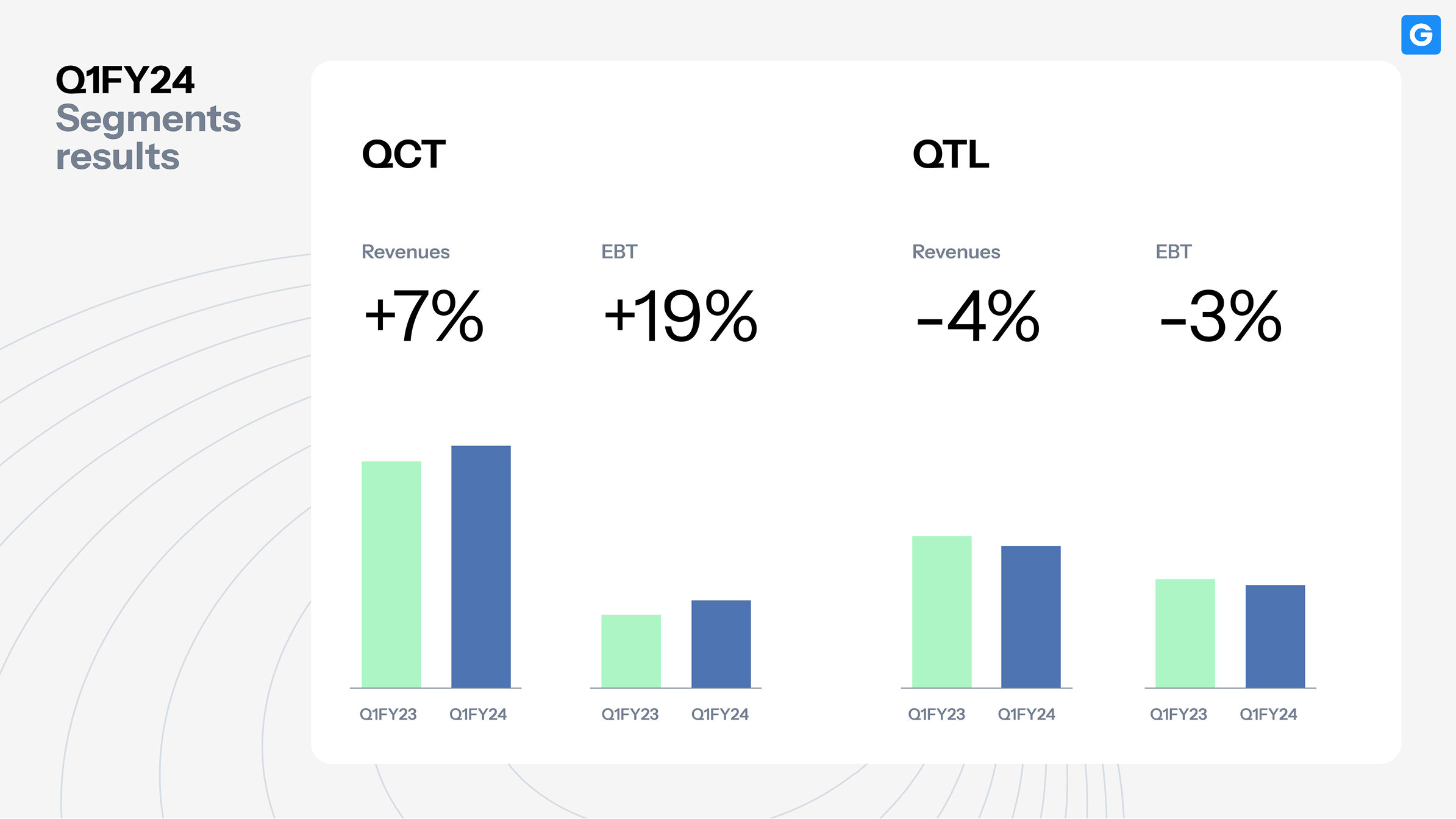
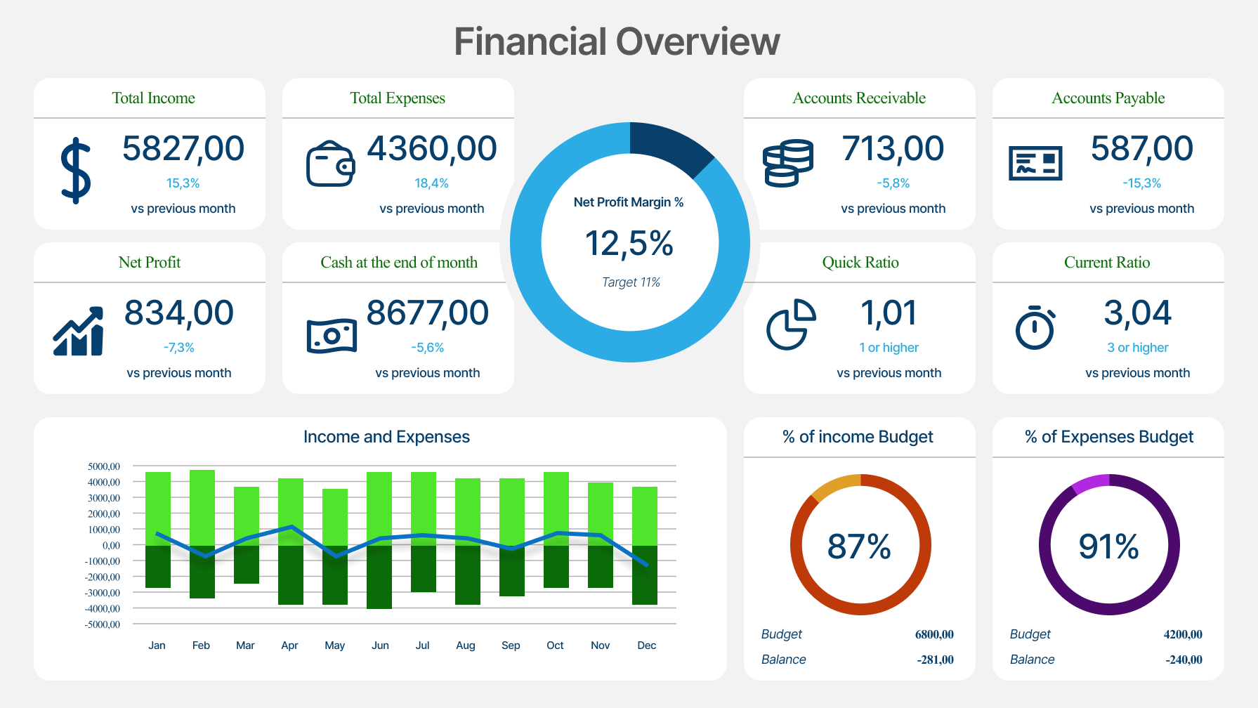
1. Using financial data as decoration
What often makes the slide harder to read
When there are many metrics to show, it’s easy for the key numbers to end up small or tucked into the margins. In the rush of preparing for a raise, this happens almost by default: data piles up faster than the time you have to structure it.
What helps
Pick one or two financial drivers per slide and make them visually dominant. Use clear labels, consistent formatting, and split dense information across multiple slides if needed. Often, clarity comes from giving each number a bit of space.
Why it works
Investors instantly see what matters. Clear financials build trust and show that you understand the mechanics behind your model.
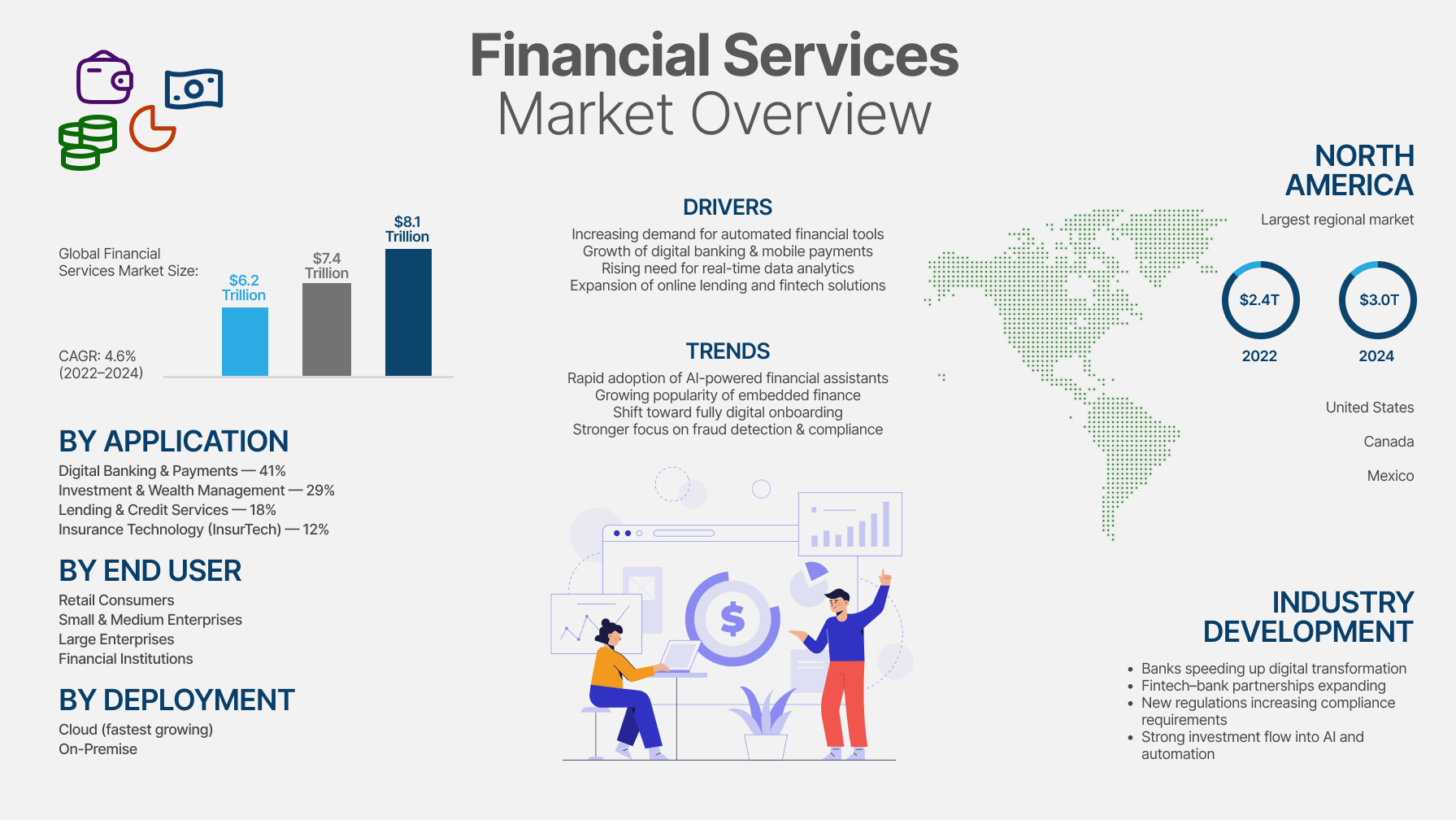
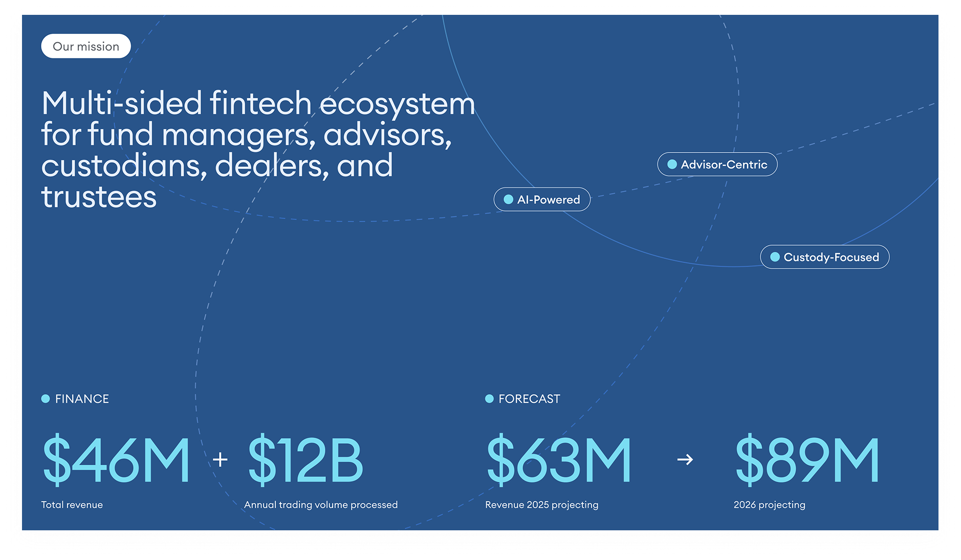
2. Overcomplicating the market slide
What often makes the slide heavier than it needs to be
It’s tempting to place a TAM/SAM/SOM diagram, a Venn shape, or a screenshot from a research report directly into the deck — especially when time is limited. But these graphics rarely communicate market logic at a glance.
What helps
Create a simple, clean version of the market framing: a TAM–SAM–SOM you’ve redrawn, a two-axis matrix, or a segmented bar. The goal is to help the reader immediately understand the scale of the opportunity and your place within it.

Why it works
Good market visuals reduce cognitive load. They help investors see the opportunity without decoding a complex chart.
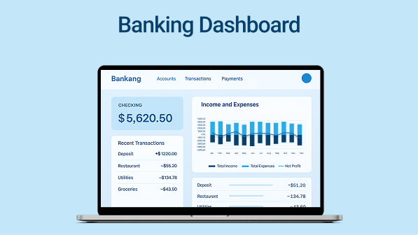
3. Treating product visuals like app store screenshots
What often gets lost
Even strong UI can feel flat if presented as a full-screen screenshot with no explanation. Without context, it’s hard to understand what’s happening or why it matters.
What helps
Zoom in on meaningful interactions. Add callouts, short labels, or a single sentence describing the action, the user flow, or the result. Think of the slide less as a screenshot and more as a guided demo moment.

Why it works
It shows value in action. Instead of just seeing “what it looks like,” investors understand how the product works in real scenarios.
4. Using too many colors or fonts
What often makes the deck feel inconsistent
When a deck is assembled piece by piece, it’s common for different fonts, color accents, or UI elements to slip in. Even with strong content, this creates visual noise.
What helps
Keep the visual system minimal: one or two typefaces, two or three colors, and a clear hierarchy for headings and body text. It’s not about aesthetics — it’s about giving the reader stable visual anchors.
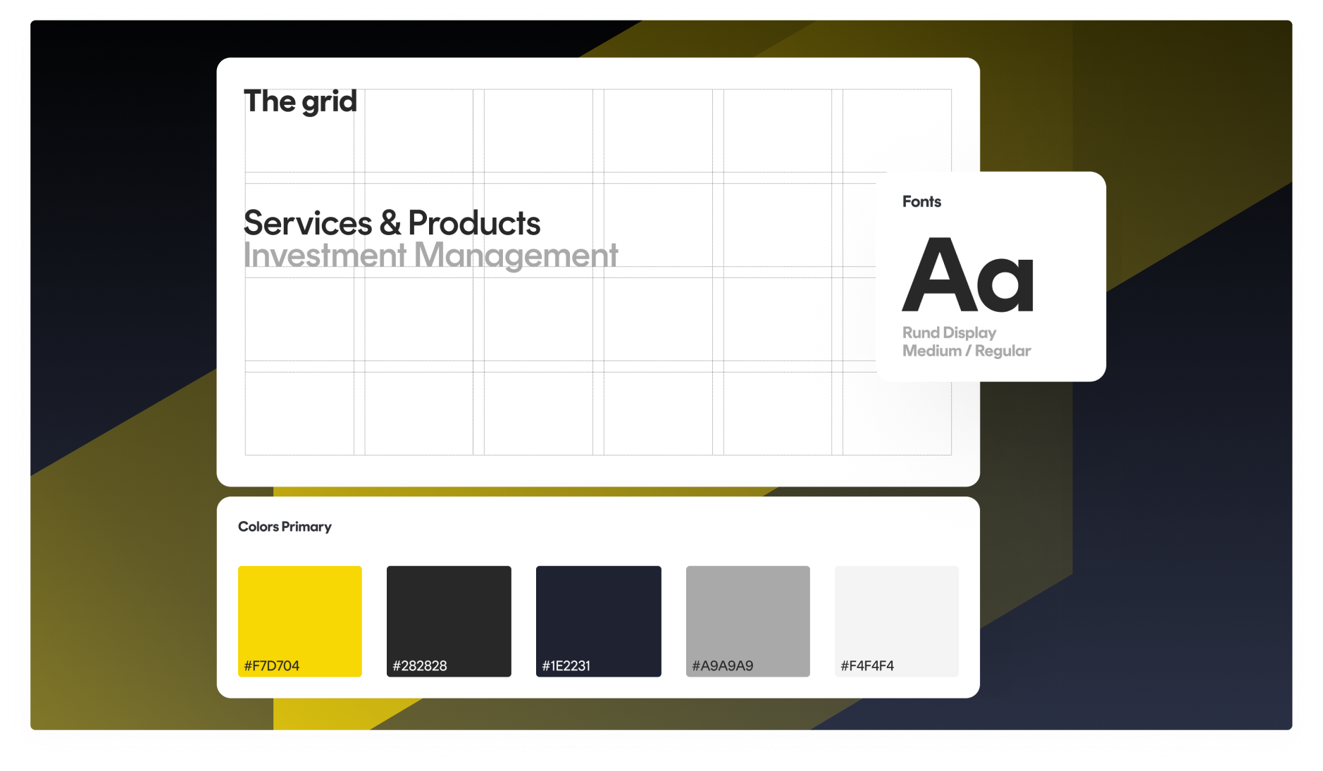
Why it works
Consistency strengthens credibility. It signals a mature approach and helps the content stand on its own.
5. Treating every slide like a one-pager
What often makes the message feel heavy
When a team has a strong product, there’s a natural urge to fit every important detail into a single slide. The result is usually overcrowding — not because the content is wrong, but because there’s too much of it at once.
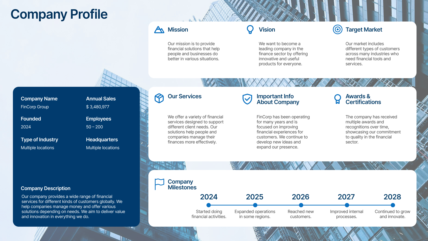
What helps
Let each slide do one job. One idea, one visual, one takeaway. Everything else can move to the next page. This creates a natural rhythm that guides the investor through the story.
Why it works
A clear pace makes the narrative easier to absorb. The deck feels like a conversation rather than a dense document.
Want us to take a look?
If you want a quick, practical review, book 30 minutes with our team.
We’ll look at your deck from an investor’s perspective and highlight small visual adjustments that can make your story clearer and more persuasive — without rebuilding the whole thing.
Keep reading
This post is part of our series on presentation excellence. You may also enjoy:
→ Information Design in PPT: When Data Deserves Better Than A Spreadsheet


- This is some text inside of a div block.lay out the facts clearly and compellingly. Use data to establish the ground reality, but remember that facts alone are like the individual strands of a tapestry—necessary but not complete.lay out the facts clearly and compellingly. Use data to establish the ground reality, but remember that facts alone are like the individual strands of a tapestry—necessary but not complete.
- This is some text inside of a div block.lay out the facts clearly and compellingly. Use data to establish the ground reality, but remember that facts alone are like the individual strands of a tapestry—necessary but not complete.

