
Data Visualization PPT: Transform Complex Data into Action
Creating effective presentations requires more than just displaying numbers on slides. For financial and tech professionals, mastering data visualization ppt techniques transforms overwhelming datasets into clear narratives that drive strategic decisions. When stakeholders can immediately understand complex information through well-designed charts and graphs, presentations move from forgettable to actionable. This comprehensive guide explores proven methods for creating compelling visual data stories in PowerPoint that resonate with executive audiences and technical teams alike.
Understanding the Strategic Value of Data Visualization in PowerPoint
Financial institutions and technology companies face a unique challenge: presenting intricate data to audiences with varying technical expertise. A data visualization ppt serves as the bridge between raw numbers and meaningful insights that influence investment decisions, product strategies, and organizational direction.
The business impact of effective data visualization includes:
- Accelerated decision-making processes through immediate pattern recognition
- Enhanced stakeholder alignment on complex technical concepts
- Increased presentation memorability and message retention
- Reduced meeting time spent clarifying confusing charts
Research demonstrates that visual information processing occurs 60,000 times faster than text-based information. When you create a professional PowerPoint with intentional data visualization, you leverage this cognitive advantage to communicate more effectively with boards, investors, and clients.
Core Principles for Financial and Tech Data Presentation
The foundation of exceptional data visualization ppt design rests on understanding your audience's information needs and cognitive limitations. Financial analysts require precision and detail, while executives prioritize high-level trends and actionable insights.
Consider these fundamental principles when designing your data slides:
- Purpose clarity: Every chart should answer a specific question or support a particular argument
- Data integrity: Maintain accurate scales and avoid manipulative visual techniques
- Cognitive load management: Present one key insight per slide to prevent overwhelming viewers
- Visual hierarchy: Guide attention to the most critical information first

When applying these principles to a company presentation, the difference becomes immediately apparent. Rather than overwhelming audiences with comprehensive data tables, strategic visualization reveals patterns and outliers that warrant discussion and action.
Selecting the Right Chart Types for Your Message
Chart selection represents one of the most critical decisions in data visualization ppt creation. The wrong chart type obscures your message, while the optimal choice illuminates insights instantly. According to Microsoft's data visualization guidelines, matching chart types to data relationships significantly improves comprehension and reduces interpretation errors.
| Data Relationship | Recommended Chart Type | Best Use Case |
|---|---|---|
| Comparison across categories | Bar chart, column chart | Quarterly revenue by product line |
| Trend over time | Line chart, area chart | Stock performance, user growth |
| Part-to-whole | Pie chart, donut chart | Market share breakdown |
| Correlation | Scatter plot, bubble chart | Risk vs. return analysis |
| Distribution | Histogram, box plot | Customer segment analysis |
| Hierarchical | Treemap, sunburst | Organizational spending breakdown |
Advanced Visualization Techniques for Complex Datasets
Financial technology presentations often require displaying multiple dimensions of data simultaneously. Advanced chart types enable sophisticated storytelling without sacrificing clarity.
Combination charts merge different visualization types to reveal complex relationships. For example, overlaying a line chart showing conversion rates on top of column charts displaying monthly revenue helps stakeholders understand the quality-quantity balance in sales performance.
Waterfall charts excel at displaying sequential changes that explain variance from starting to ending values. Tech companies use these to illustrate how different factors contributed to year-over-year ARR growth, while financial institutions apply them to break down investment portfolio returns.
Heat maps transform large datasets into immediately scannable visualizations by using color intensity to represent value magnitude. These prove invaluable when presenting correlation matrices, regional performance data, or time-based pattern analysis.
The DaSy Center's presentation toolkit emphasizes that chart complexity should match audience sophistication. Executive presentations benefit from simplified visualizations that highlight key takeaways, while technical teams may appreciate detailed charts that reveal nuanced patterns.
Design Best Practices for Maximum Impact
Visual design principles directly influence how effectively your data visualization ppt communicates critical information. Color, typography, spacing, and consistency form the foundation of professional presentation aesthetics that enhance rather than distract from your data story.
Strategic Color Application
Color serves three primary functions in data visualization: categorization, emphasis, and emotional resonance. Financial presentations traditionally employ blues and greens to convey stability and growth, while technology companies often incorporate vibrant accent colors that reflect innovation and energy.
Color selection guidelines:
- Limit your palette to 3-5 colors plus neutral tones for backgrounds and text
- Use high-contrast combinations to ensure accessibility for color-blind viewers
- Reserve bright, saturated colors for highlighting critical data points
- Apply consistent color coding throughout your entire presentation deck
According to Purdue University's data visualization best practices, color choices should always serve a functional purpose rather than purely decorative intent. When every color carries meaning, your audience processes information more efficiently.
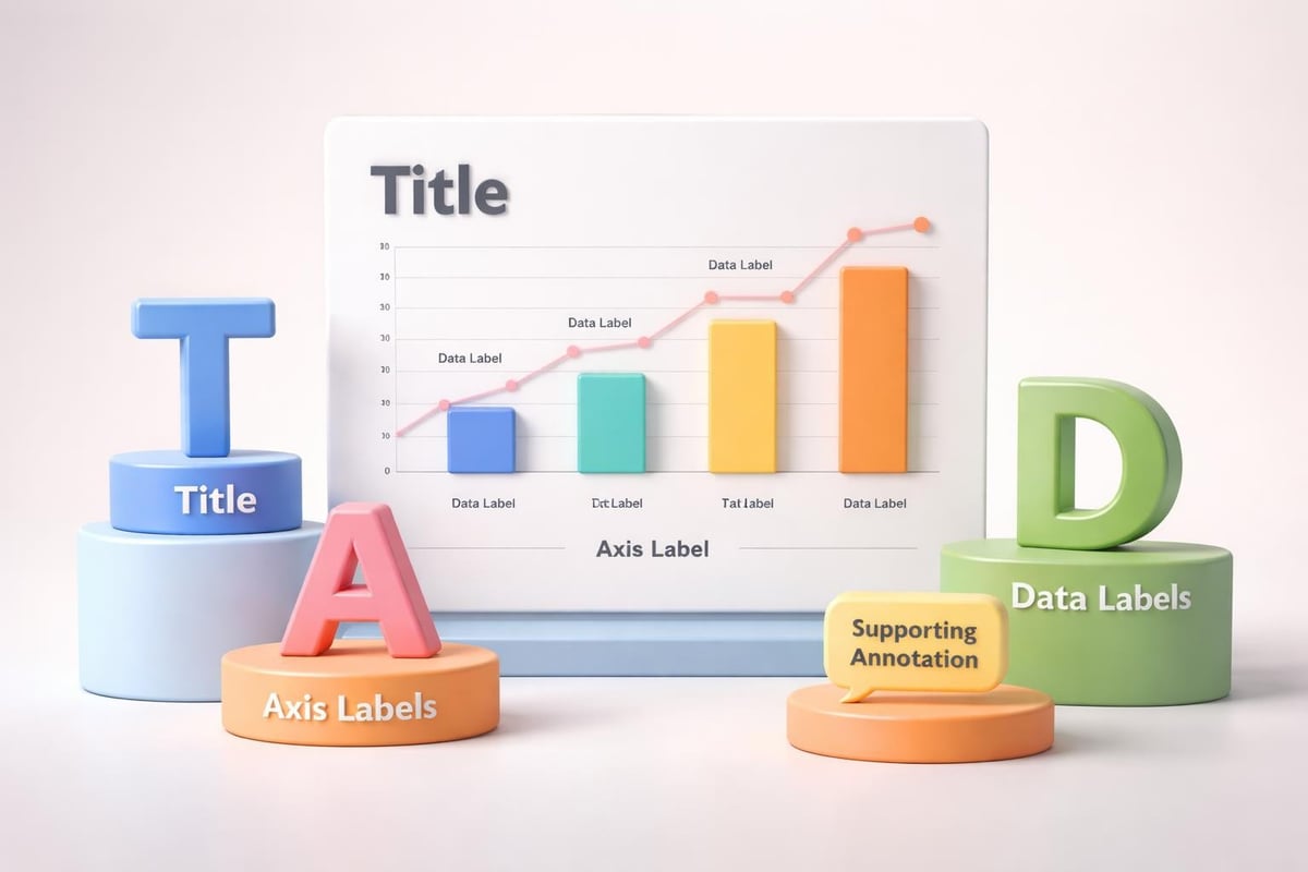
Typography and Readability Considerations
Text elements within charts demand special attention in data visualization ppt design. Axis labels, data labels, legends, and annotations must remain legible across different display sizes and viewing distances.
Font size hierarchy establishes visual importance:
- Chart titles: 18-24 points
- Axis labels and legends: 12-14 points
- Data labels: 10-12 points
- Footnotes and sources: 8-10 points
Sans-serif typefaces like Calibri, Arial, or Helvetica provide superior readability on screens compared to serif alternatives. Consistency in font family throughout your presentation reinforces professionalism and reduces cognitive friction.
Transforming Raw Data into Compelling Narratives
Numbers alone rarely inspire action. The transformation of data into narrative represents where exceptional data visualization ppt design transcends basic reporting to deliver persuasive business communication. Superside's PowerPoint data visualization strategies emphasize that every chart should advance your overall presentation story rather than exist as isolated information displays.
Building Data-Driven Story Arcs
Effective presentation structure follows a narrative framework that creates tension, provides evidence, and resolves with clear next steps. Your data visualizations should sequence logically to build this arc:
- Establish context: Show baseline metrics or historical trends that frame current performance
- Introduce tension: Highlight gaps, opportunities, or challenges revealed by the data
- Present evidence: Display analytical insights that explain causation or correlation
- Propose resolution: Visualize projected outcomes from recommended actions
When creating a fintech pitch deck, this structure might progress from market size data through competitive landscape analysis to customer acquisition metrics that demonstrate traction, ultimately culminating in financial projections that justify the investment ask.
Annotation and Emphasis Techniques
Strategic annotations transform static charts into guided explorations that direct attention to critical insights. Rather than expecting audiences to discover patterns independently, professional data visualization ppt design explicitly highlights what matters most.
| Annotation Type | Purpose | Implementation Example |
|---|---|---|
| Callout boxes | Explain outliers or anomalies | "Q3 spike attributed to product launch" |
| Reference lines | Show targets or benchmarks | Horizontal line indicating industry average |
| Color highlighting | Emphasize specific data points | Red bars for underperforming segments |
| Trend arrows | Indicate direction of change | Upward arrow showing YoY growth trajectory |
These techniques prove particularly valuable when presenting to time-constrained executives who need immediate comprehension. As outlined in best practices for clinical trial presentations, clear labeling and visual hierarchy prevent misinterpretation of complex datasets.
Technical Execution in PowerPoint
PowerPoint offers robust charting capabilities that many professionals underutilize. Moving beyond default chart templates enables creation of custom data visualization ppt designs that align precisely with your brand standards and communication objectives.
Advanced Chart Customization
Data series formatting allows granular control over how individual elements appear within your charts. Right-clicking any chart element opens formatting options for colors, borders, shadows, and data labels. Financial professionals frequently customize error bars to show confidence intervals, while tech companies often adjust gap width in column charts to create modern, spacious aesthetics.
Custom axis scaling prevents misleading visualizations and ensures appropriate focus. Breaking Y-axis should be avoided unless clearly indicated, as this technique can exaggerate differences between values. Logarithmic scales benefit presentations comparing growth rates across vastly different magnitudes.
Template creation streamlines production of consistent data visualization ppt decks across your organization. Save formatted charts as templates that colleagues can populate with updated data while maintaining approved design standards. This approach proves invaluable for recurring reports like quarterly business reviews or monthly performance dashboards.
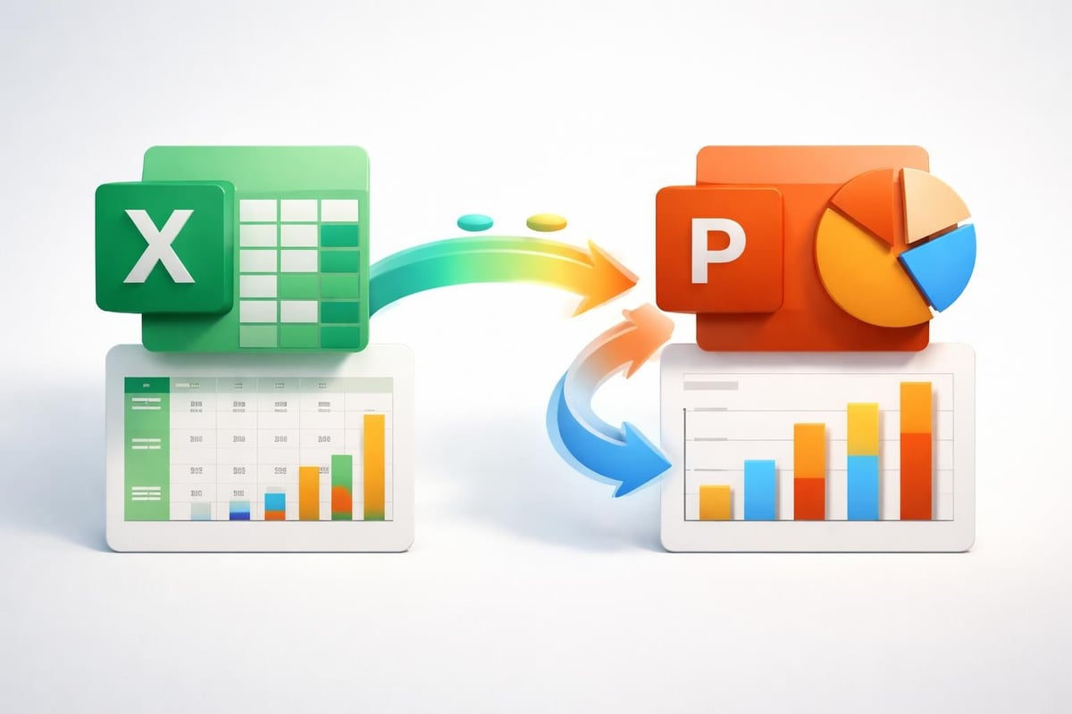
Integration with Data Sources
Static charts quickly become outdated in fast-moving business environments. PowerPoint's data linking capabilities maintain accuracy while reducing manual update requirements.
- Excel integration: Link charts directly to Excel workbooks so data refreshes automatically when source files update
- Copy-paste special: Use "Paste Link" options to maintain connections between PowerPoint charts and external data sources
- Data editing shortcuts: Access the underlying spreadsheet by selecting a chart and clicking "Edit Data" to make quick adjustments
For organizations managing numerous presentations, these connection methods ensure consistency while dramatically reducing preparation time for routine updates. However, remember to maintain organized file structures so linked references don't break when files are moved or shared.
Common Mistakes and How to Avoid Them
Even experienced professionals fall into predictable traps when creating data visualization ppt materials. Recognizing these pitfalls enables proactive design choices that elevate presentation quality.
Visual Clutter and Information Overload
The temptation to include comprehensive data often results in incomprehensible slides packed with tiny text and overlapping elements. Each slide should communicate one primary insight supported by minimal necessary context.
Simplification strategies include:
- Breaking complex charts across multiple slides with progressive disclosure
- Removing gridlines, borders, and decorative elements that don't serve functional purposes
- Aggregating granular categories into meaningful groups
- Using appendix slides for detailed backup data rather than cluttering main presentation flow
According to Johns Hopkins University's data visualization course, reducing chart complexity improves comprehension speed by up to 40% compared to cluttered alternatives.
Inappropriate Chart Selection
3D charts introduce perspective distortion that makes accurate value comparison difficult. While visually striking, these chart types sacrifice precision for aesthetics. Stick with 2D alternatives for data integrity.
Pie charts with numerous segments become illegible and defeat the purpose of at-a-glance comprehension. Limit pie charts to 5-6 categories maximum, or consider bar charts as clearer alternatives for comparison tasks.
Dual-axis charts without clear labeling confuse audiences about which data series corresponds to which scale. When using dual axes, ensure contrasting colors clearly distinguish the series and both axes are prominently labeled.
Accessibility Oversights
Color-blind audiences comprise approximately 8% of men and 0.5% of women globally. Data visualization ppt designs relying solely on color to differentiate categories exclude these viewers from full comprehension.
Accessibility improvements:
- Use patterns, textures, or shapes alongside color coding
- Ensure minimum 4.5:1 contrast ratios between text and backgrounds
- Provide alternative text descriptions for screen readers
- Test visualizations in grayscale to verify information remains distinguishable
Professional presentation design incorporates these considerations from the start rather than retrofitting accessibility after initial creation. Resources like SlideGenius's data presentation guide provide additional techniques for inclusive design practices.
Industry-Specific Applications and Examples
Different sectors prioritize distinct data types and visualization approaches. Tailoring your data visualization ppt style to industry expectations enhances credibility and resonance with target audiences.
Financial Services Presentations
Financial institutions emphasize precision, regulatory compliance, and risk transparency. Charts commonly feature:
- Performance attribution waterfalls breaking down investment returns by contributing factors
- Risk-return scatter plots positioning portfolio holdings or fund options
- Time-series comparisons showing historical performance against benchmarks
- Scenario analysis tables displaying projected outcomes under different market conditions
A cybersecurity pitch deck for a fintech startup might incorporate security metric dashboards showing threat detection rates, response times, and compliance coverage percentages visualized through combination gauges and trend lines.
Technology Sector Presentations
Tech companies showcase growth metrics, user engagement data, and product performance indicators. Visualization priorities include:
- Funnel charts demonstrating conversion rates through customer journeys
- Cohort analysis heatmaps revealing user retention patterns over time
- Network graphs illustrating system architectures or user relationship patterns
- Growth curves comparing actual performance against projected trajectories
Product roadmap presentations benefit from timeline visualizations that show feature releases, development milestones, and market opportunity windows aligned with strategic initiatives.
Creating Template Libraries for Consistency
Organizations producing frequent presentations gain efficiency through standardized data visualization ppt templates that reflect brand identity while accommodating various data types. Template libraries typically include:
| Template Category | Included Components | Customization Options |
|---|---|---|
| Financial metrics | Revenue charts, margin analysis, cash flow | Color schemes, logo placement |
| Customer analytics | Funnel charts, segmentation, satisfaction | Font families, icon styles |
| Operational KPIs | Dashboard layouts, progress indicators | Chart types, layout grids |
| Competitive analysis | Positioning matrices, comparison tables | Annotation styles, emphasis techniques |
These resources ensure brand consistency while empowering team members to create professional visualizations without design expertise. Similar to how attractive PowerPoint templates accelerate deck creation, standardized data visualization components streamline analytical presentation development.
Emerging Trends and Future Considerations
The landscape of data visualization ppt design continues evolving as presentation technology advances and audience expectations shift. Staying current with these developments maintains competitive advantage in business communication.
Interactive and Animated Data Visualizations
Static charts increasingly give way to dynamic presentations that reveal information progressively. PowerPoint's animation capabilities enable:
- Build animations that display data series sequentially, directing attention through complex information
- Morph transitions that smoothly transform one chart type into another, showing data from multiple perspectives
- Trigger-based reveals allowing presenters to expose additional detail on demand rather than overwhelming viewers upfront
While animation enhances engagement, restraint remains critical. Every motion should serve a clear communication purpose rather than simply adding visual interest. Excessive animation distracts from content and appears unprofessional.
Data Storytelling and Narrative Visualization
Moving beyond individual charts toward cohesive visual narratives represents the frontier of presentation excellence. This approach sequences visualizations to build arguments methodically, with each chart answering questions raised by its predecessor.
Narrative visualization frameworks include:
- Problem-solution structures: Show current state data highlighting challenges, then visualize proposed solutions and projected outcomes
- Comparison frameworks: Present multiple options through parallel visualizations that enable side-by-side evaluation
- Temporal progressions: Display how situations evolved over time and project future trajectories based on different scenarios
These sophisticated approaches require upfront planning but deliver significantly higher persuasive impact than collections of disconnected charts. Professional agencies specializing in visual storytelling employ these techniques to transform dense datasets into compelling business cases.
Mobile and Remote Presentation Considerations
With increasing remote work and mobile device usage, data visualization ppt designs must remain effective across screen sizes and viewing contexts. Considerations include:
- Larger minimum font sizes accounting for smaller displays
- Simplified charts that remain legible without zooming
- Higher contrast ratios for varied lighting conditions
- Self-explanatory visualizations that work without presenter narration
Testing presentations on tablets and smartphones during development ensures critical information remains accessible regardless of how stakeholders consume your content.
Mastering data visualization ppt techniques enables financial and tech professionals to transform complex information into actionable insights that drive strategic decisions. By selecting appropriate chart types, applying design best practices, and crafting coherent data narratives, you create presentations that resonate with diverse stakeholders and accelerate organizational progress. When you need expert assistance transforming your data into compelling visual stories, Prznt Perfect specializes in creating impactful presentations that combine analytical rigor with stunning design to help financial and technology businesses communicate with clarity and confidence.


- This is some text inside of a div block.lay out the facts clearly and compellingly. Use data to establish the ground reality, but remember that facts alone are like the individual strands of a tapestry—necessary but not complete.lay out the facts clearly and compellingly. Use data to establish the ground reality, but remember that facts alone are like the individual strands of a tapestry—necessary but not complete.
- This is some text inside of a div block.lay out the facts clearly and compellingly. Use data to establish the ground reality, but remember that facts alone are like the individual strands of a tapestry—necessary but not complete.

