
From Overload to Clarity: How to Simplify Information in Your Presentations

We’ve all seen those slides packed edge to edge with charts, bullet points, and tiny text.
You scroll through, trying to find the point and just get lost.
It’s not about bad design. It’s about too much information and not enough structure.
At PrzntPerfect, we help teams rethink how they organize content—so every slide supports a story, not a headache.
Below is the exact framework we use to simplify and structure complex decks. You can apply it to your own presentations to make them clearer, sharper, and more engaging.
1. Start with what your audience cares about
Most presentations begin with who you are. But people tune in when they hear something that relates to them.
In our cybersecurity pitch deck, we led with a real pain point companies face today, before jumping into the solution. It instantly created context.
But there’s no one-for-all solution: sometimes you start with your vision of the future, other times — with setting up state of the arts. The key is viewing your content through your audience’s eyes.
2. Use clear visual structure
Your audience shouldn’t have to work to understand your slides. A few small things make a big difference:
- Stick to one core idea per slide
- Use space to guide the eye
- Highlight the main takeaway, visually and verbally
We applied this in our auto-tech case study, where we turned heavy product info into a clean, digestible story.
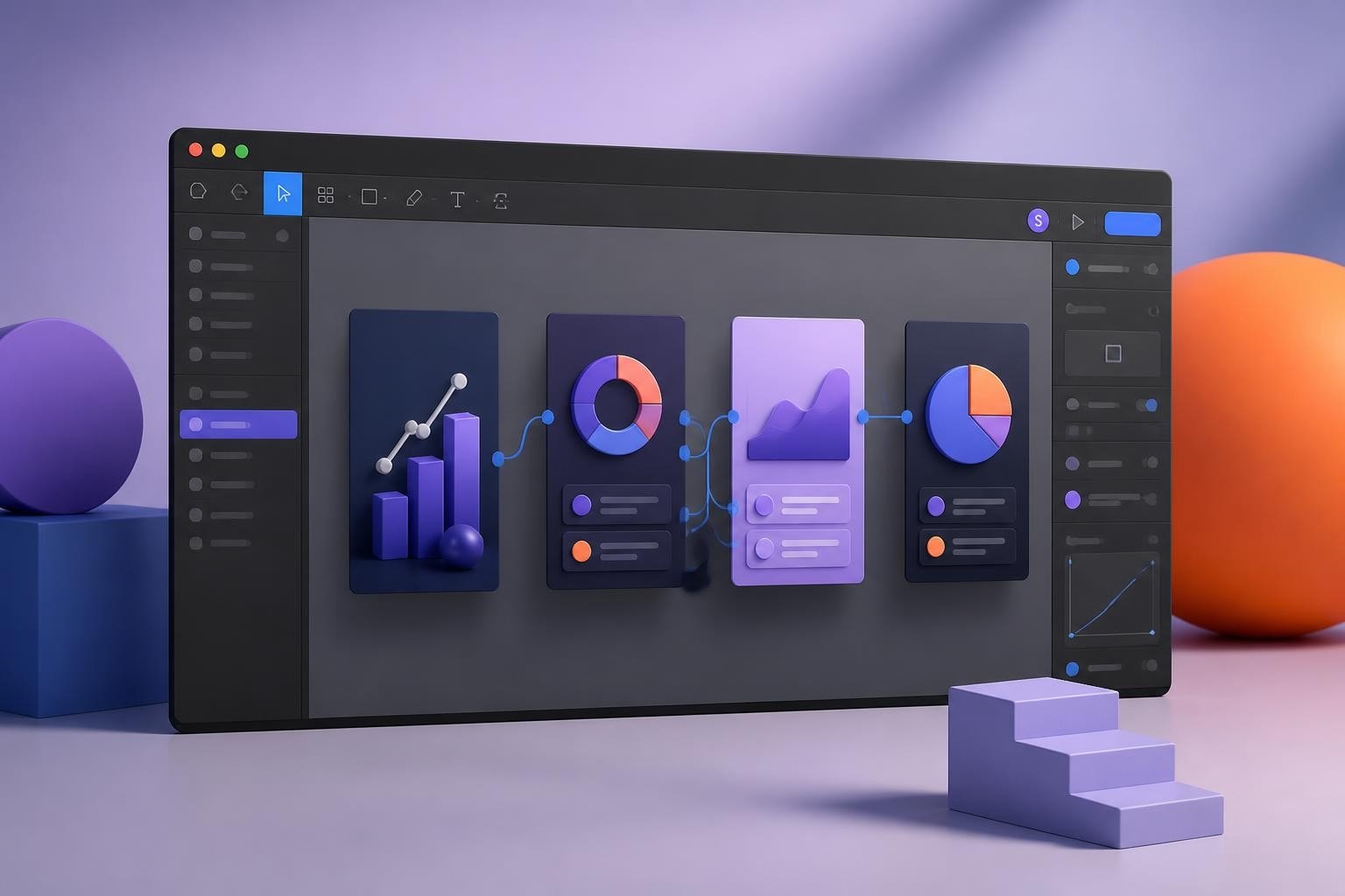
3. Make data easier to read
You can’t impress people with data they don’t understand.
In our semiconductor pitch deck, we simplified the graphs, spotlighted just one insight per slide, and made it super easy to follow.
Focus on the message behind the numbers, not just the numbers themselves.
4. Build a clear flow
Think of your presentation like a story with a beginning, middle, and end.
Instead of jumping straight into features or results, show the shift your product or idea is responding to.
In our fintech pitch, we used a simple question to guide the whole narrative: What would a seamless customer experience actually look like?
5. Keep the design consistent
Simple rule: make your deck look like it all came from the same brain.
- Two fonts, max
- One clean color palette
- Repeat layouts to keep things aligned
Design should support your message, not compete with it.
Want to see how this works in real decks?
Check out our case studies to see how we help teams simplify and elevate their presentations.
Or book a free 30-minute consultation with us. We’ll help you cut through the noise and make your message stick.
This post is part of our ongoing series on presentation excellence.
If you found this helpful, you might also like:
→ The Power of Short, Engaging Presentations: Less is More
→ Common Presentation Design Mistakes That Can Ruin Your Pitch


- This is some text inside of a div block.lay out the facts clearly and compellingly. Use data to establish the ground reality, but remember that facts alone are like the individual strands of a tapestry—necessary but not complete.lay out the facts clearly and compellingly. Use data to establish the ground reality, but remember that facts alone are like the individual strands of a tapestry—necessary but not complete.
- This is some text inside of a div block.lay out the facts clearly and compellingly. Use data to establish the ground reality, but remember that facts alone are like the individual strands of a tapestry—necessary but not complete.

