
Semiconductor Pitch Deck: Design Do’s And Don’ts

Pitching a semiconductor startup isn’t like pitching most startups. Your tech is deep. Your timelines are long. Your market is complex. And your product might not even have a UI.
That’s why your deck matters. In a space where even the basics require context, a clean and strategic pitch deck isn’t optional — it’s the only way to hold attention and tell a coherent story.
We’ve designed decks for early-stage chipmakers and Series A deeptech platforms. Here’s what we’ve learned about how to keep investors engaged and how to avoid the most common visual pitfalls.
1. Don’t throw all the numbers at once
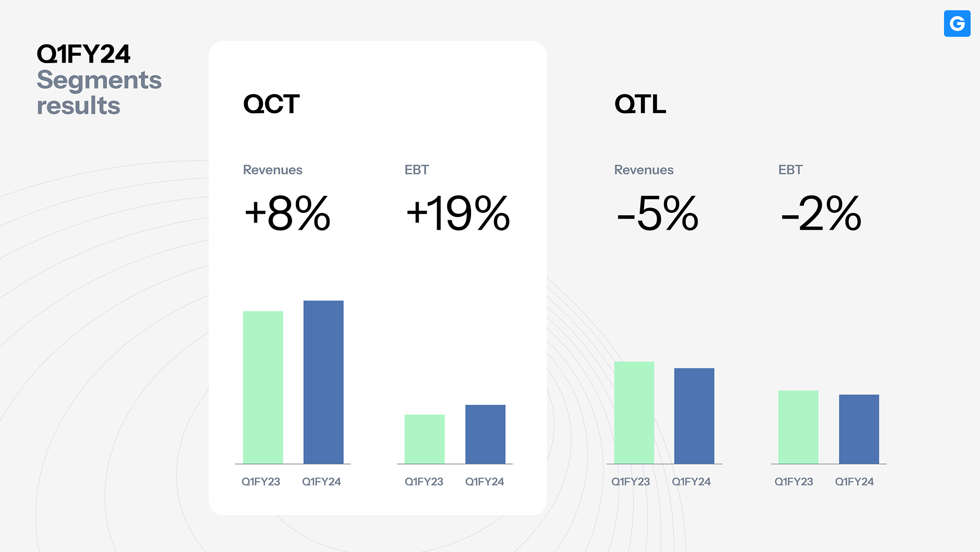
Dense slides often hide great insights. When charts lack labels or KPIs blend together, even solid data feels abstract. Good design doesn’t mean simplifying — it means organizing.
Keep all your key figures, but build hierarchy: headline metric, supporting numbers, and context. That simple rhythm turns a crowded layout into a clear narrative. In this example, a semiconductor startup visualized revenue milestones with structure and focus, keeping investors on track from data to meaning.
Here’s an example from our pitch deck for a semiconductor startup entering the North American market:
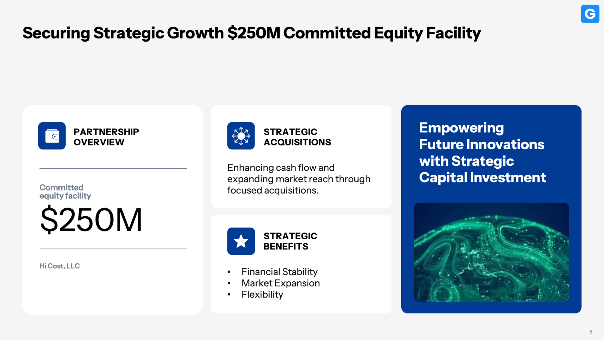
This slide was designed to focus investor attention on projected revenue milestones — without overloading the screen with noise.
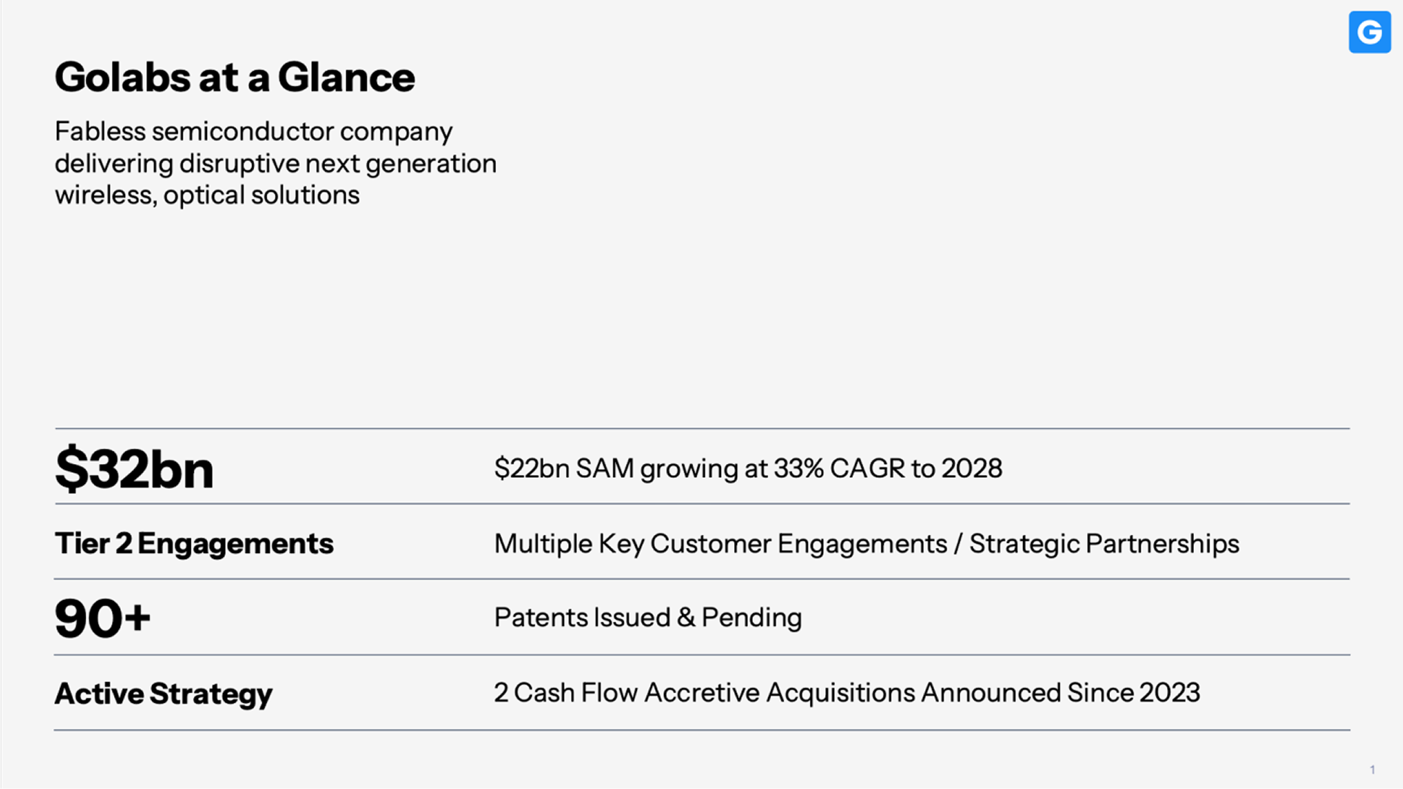
2. Don’t use your product slide as a placeholder
It’s tempting to drop in a chip diagram, an internal tool UI, or a product photo with no context. But for most investors, that visual means nothing without framing.
Instead, think of the product slide as a miniature demo. What’s the mechanism? What’s the outcome? What’s the value? Use annotations or labels to guide the reader.
In this case study, we helped a startup visualize how their product fits into the system — not just what it looks like. That context made the difference.
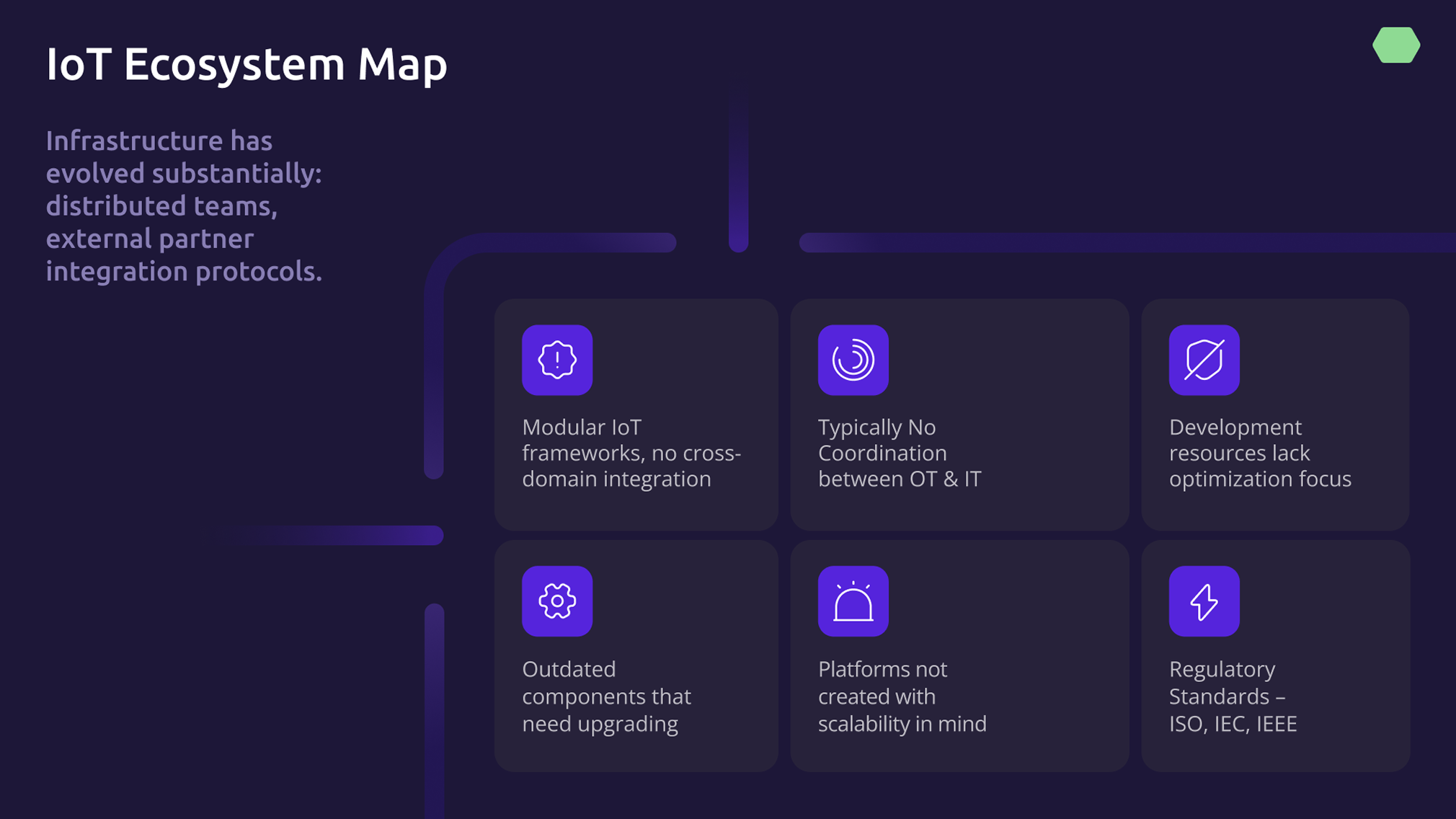
3. Don’t oversimplify the market
In high-tech sectors like semiconductors, market slides are often either too vague or too inflated — showing a single giant TAM number without context or credibility. But investors don’t just want to see that a market is large. They want to understand how your company fits into it.
Use this slide to map your strategic position within the market, not just its outer boundaries.
Show where the growth is happening, what part of the market you’re actually targeting (SAM/SOM), and how your current traction or partnerships validate that position. When done well, this builds both credibility and confidence.
4. Don’t use style to compensate for structure
Too many fonts, inconsistent slide styles, visual metaphors that don’t land — these all get in the way. A clean deck isn’t about being pretty. It’s about being credible.
Instead, keep the visual system tight. Two fonts max. A few brand colors. Consistent hierarchy.

One of our favorite decks to date kept the design minimal and focused on layout rhythm: whitespace, pacing, and clarity. The client said investors kept complimenting how “readable” the deck was — and that’s exactly the point.
5. Design Your Appendix With Intention
When your deck grows beyond 15–17 slides, it’s time to move some of that content to the appendix — not delete it. The appendix is a resource hub for investors who want to go deeper.
Slides that work well there include:
- Technical documentation — architecture diagrams, performance benchmarks, or process visuals that support your claims but slow down the main story.
- Additional financials — extended revenue forecasts, unit economics, or cost breakdowns that help answer follow-up questions.
- Supporting data — research citations, case comparisons, or validation metrics that add depth for due diligence.
Keep it structured: group slides by topic, label them clearly, and link to them intentionally during the live pitch. A well-designed appendix reinforces your credibility — it shows you’ve done the work, and you’re ready for any deep-dive question.
In our semiconductor decks, we often add appendix pages with architecture diagrams or cost breakdowns — but only after we’ve earned attention on the main narrative. See the full case here →
Ready to upgrade your deck?
If you’re working on a pitch deck for a technical or deeptech audience, we can help. We’ve built decks that helped close funding rounds in hardware, AI, and semiconductors.
Book a free 30-min strategy session. We’ll review your existing deck and show you how to make it sharper, cleaner, and more persuasive.
Keep reading
→ Why Quick Turnarounds Still Deserve Great Thinking
→ Information Design in PPT: When Data Deserves Better Than A Spreadsheet
→ Why Edge Intelligence Demands a New Kind of PresentationStrategy


- This is some text inside of a div block.lay out the facts clearly and compellingly. Use data to establish the ground reality, but remember that facts alone are like the individual strands of a tapestry—necessary but not complete.lay out the facts clearly and compellingly. Use data to establish the ground reality, but remember that facts alone are like the individual strands of a tapestry—necessary but not complete.
- This is some text inside of a div block.lay out the facts clearly and compellingly. Use data to establish the ground reality, but remember that facts alone are like the individual strands of a tapestry—necessary but not complete.

