
Comprehensive Infographics Design / PhD Program Data Visualization
How do you explain a doctoral program that spans AI, biodiversity, governance, and equity without flattening it?
That was the challenge behind DREAM-AI, a research training initiative focused on planetary health. The program had depth, structure, and vision. But from the outside, it was hard to follow. The information was scattered across documents, tracks, and committees. What the team understood intuitively, others couldn’t easily access.
It needed a way to show its logic clearly and coherently.
A four-part visual architecture
We created a set of four infographics, each focused on a different layer of the program. Together they formed a visual system that made complexity easier to enter.
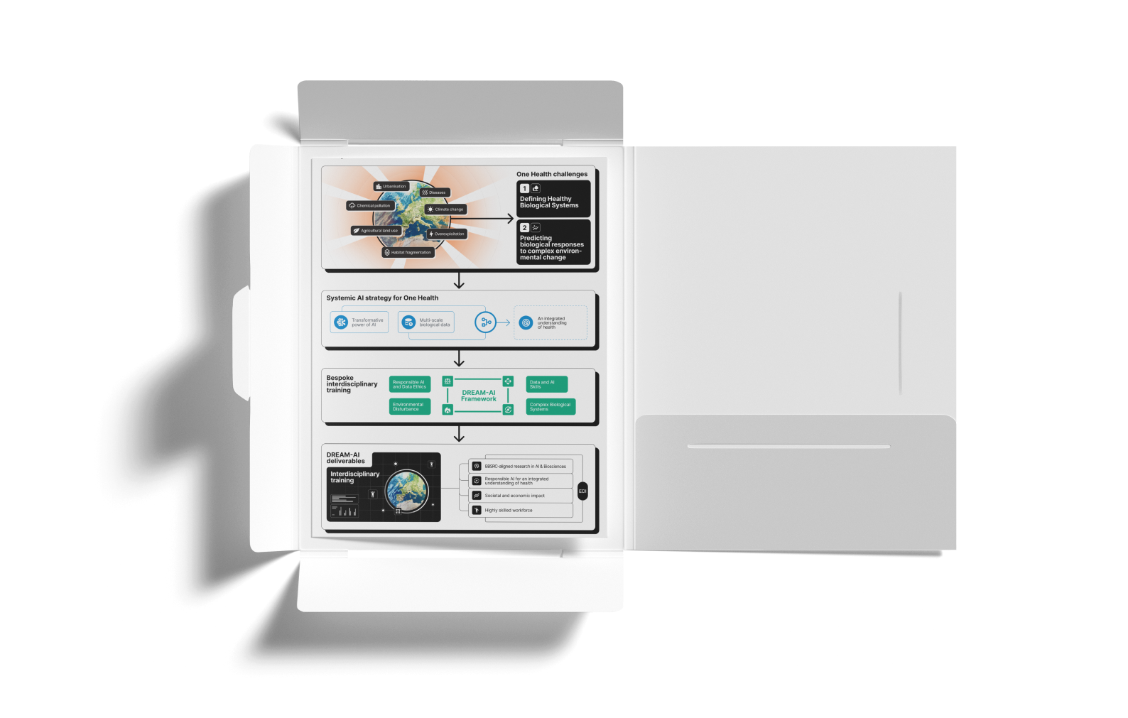
1. The Big Idea: Connecting AI with Biodiversity
A conceptual overview of the One Health challenges the program addresses, and how AI supports systems-level understanding.
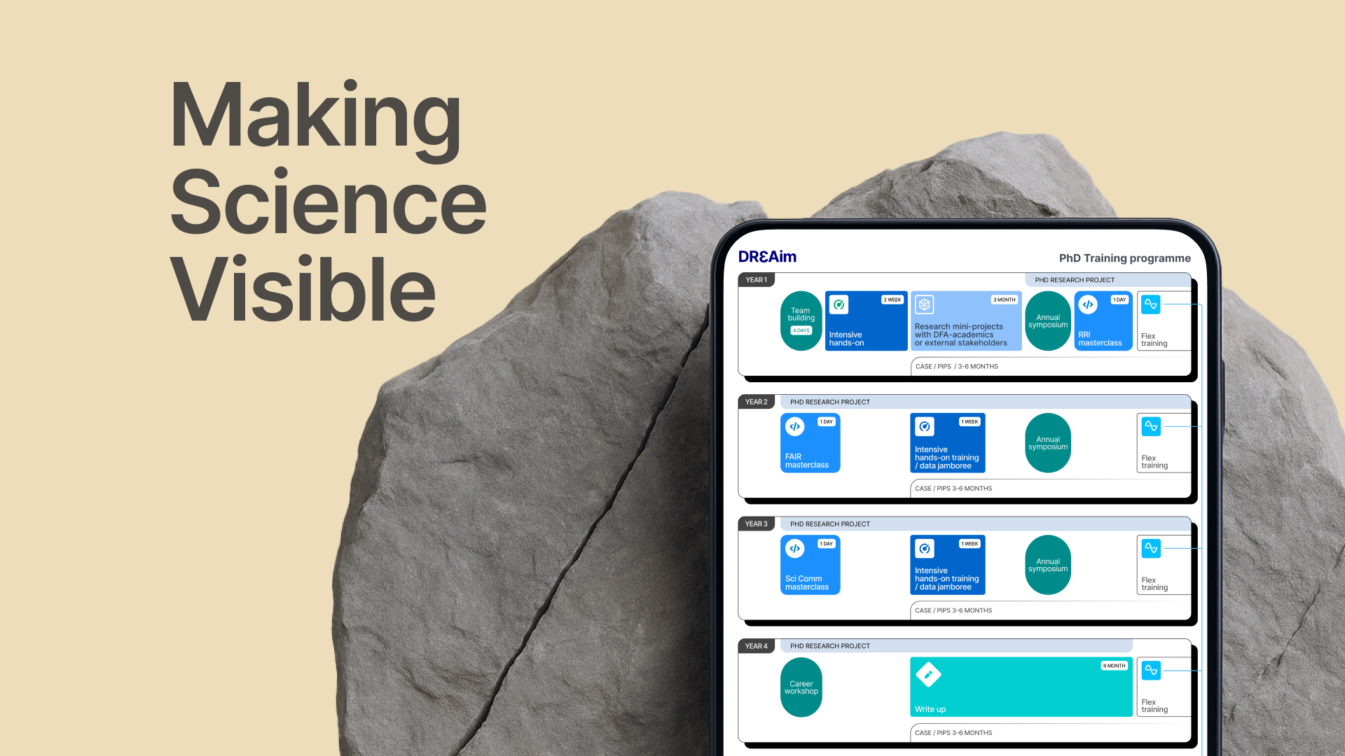
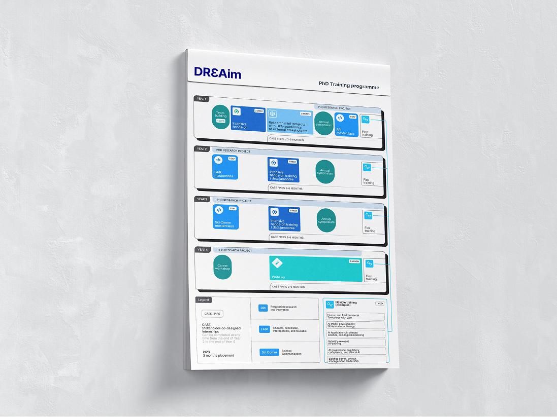
2. The Journey: Four Years at a Glance
A visual guide to the full doctoral track, including research phases, training modules, collaborations, and symposia.
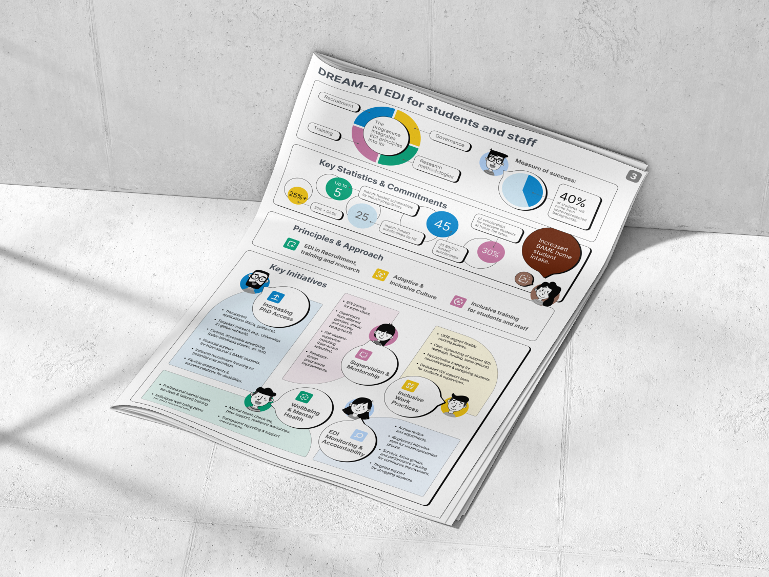
3. The Commitment: Diversity in Action
A breakdown of how equity and inclusion are embedded throughout the program, from recruitment to governance and outcomes.
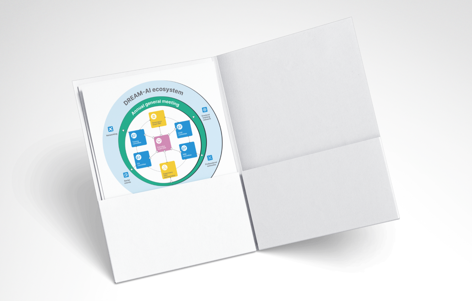
4. The Ecosystem: Beyond Hierarchy
A map of how operational structures interact across academic, strategic, and student-focused areas.
Each infographic works on its own, but they are designed to be stronger as a set.
You can explore the full system here:
👉 Visual System Design for DREAM-AI →
Designing for clarity without losing meaning
The original materials were written for internal or funding use. They held valuable detail but lacked structure for outside readers. Together with the team, we reshaped the core story for future students, collaborators, and partners.
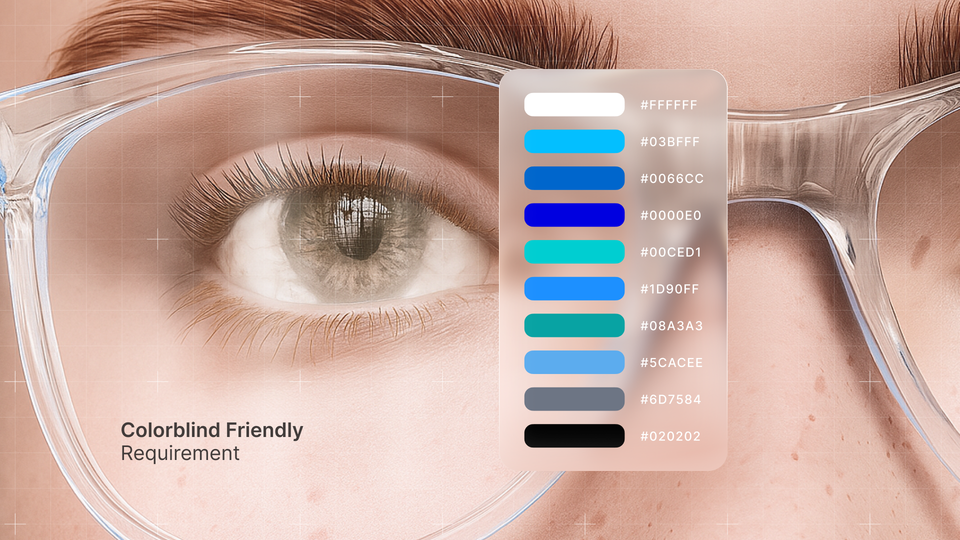
We also made accessibility a baseline, not an afterthought.
That included:
- Color palettes tested for colorblind-friendliness using ColorBrewer
- Labels that work with screen readers
- A layout that stays clear in both print and digital formats
- Visual entry points for people new to the topic
As our lead designer put it, the hardest part was choosing what not to show. When working with scientists, everything feels essential. But design needs focus.
From grant task to shared reference
The visuals were originally developed to support a grant milestone. But once completed, they started living a much broader life. The team now uses them in presentations, onboarding, internal communication, and partner outreach.
They became more than a one-off.
They became a shared language.
See the full case
The full project includes all four visuals, design rationale, and a closer look at the process. If you’re working on something complex and hard to explain, this might be a helpful reference.
👉 Explore the full case on Behance →


- This is some text inside of a div block.lay out the facts clearly and compellingly. Use data to establish the ground reality, but remember that facts alone are like the individual strands of a tapestry—necessary but not complete.lay out the facts clearly and compellingly. Use data to establish the ground reality, but remember that facts alone are like the individual strands of a tapestry—necessary but not complete.
- This is some text inside of a div block.lay out the facts clearly and compellingly. Use data to establish the ground reality, but remember that facts alone are like the individual strands of a tapestry—necessary but not complete.

