
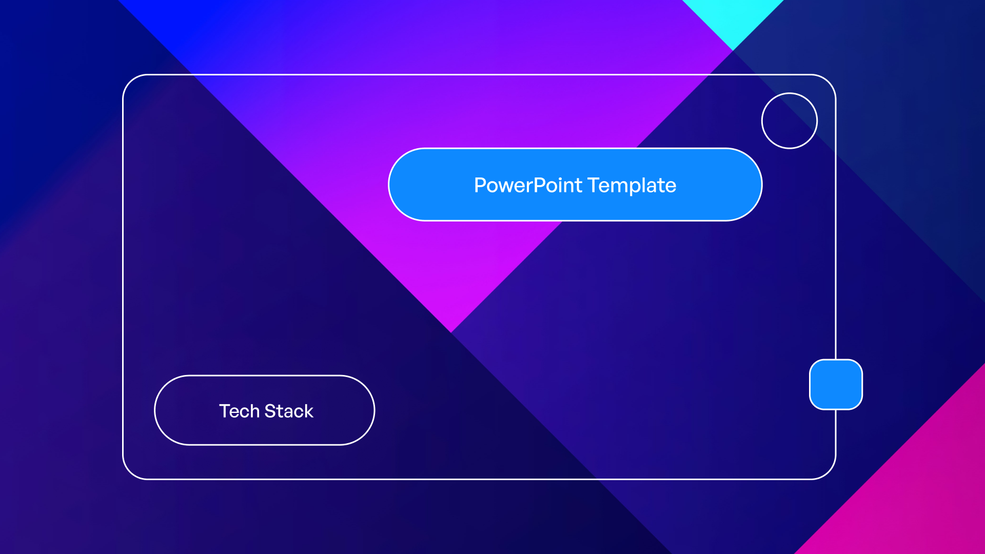
Branding Presentation Template: Complete Guide (2026)
A strong brand identity requires consistent visual communication across every touchpoint, and nowhere is this more critical than in your presentations. A branding presentation template serves as the foundation for delivering your company's story, values, and market position with clarity and impact. For financial and tech businesses competing in crowded markets, having a professionally designed template ensures every slide reinforces brand recognition while maintaining the flexibility to address diverse audiences and objectives. This comprehensive guide explores how to develop, implement, and optimize templates that transform standard presentations into powerful brand experiences.
Understanding the Strategic Value of Brand Templates
The branding presentation template represents far more than a collection of pre-designed slides. It functions as a visual framework that encodes your brand's personality, messaging hierarchy, and aesthetic standards into a reusable system. When executed properly, these templates eliminate the guesswork from presentation creation while ensuring every deck maintains professional consistency.
Financial services firms and technology companies face unique challenges in presentation design. They must balance technical complexity with visual accessibility, maintain credibility through polished aesthetics, and differentiate themselves in industries where competitors often look remarkably similar. A well-crafted template addresses these challenges by establishing guardrails that prevent design inconsistencies while providing enough flexibility for customization.
Core Components That Define Effective Templates
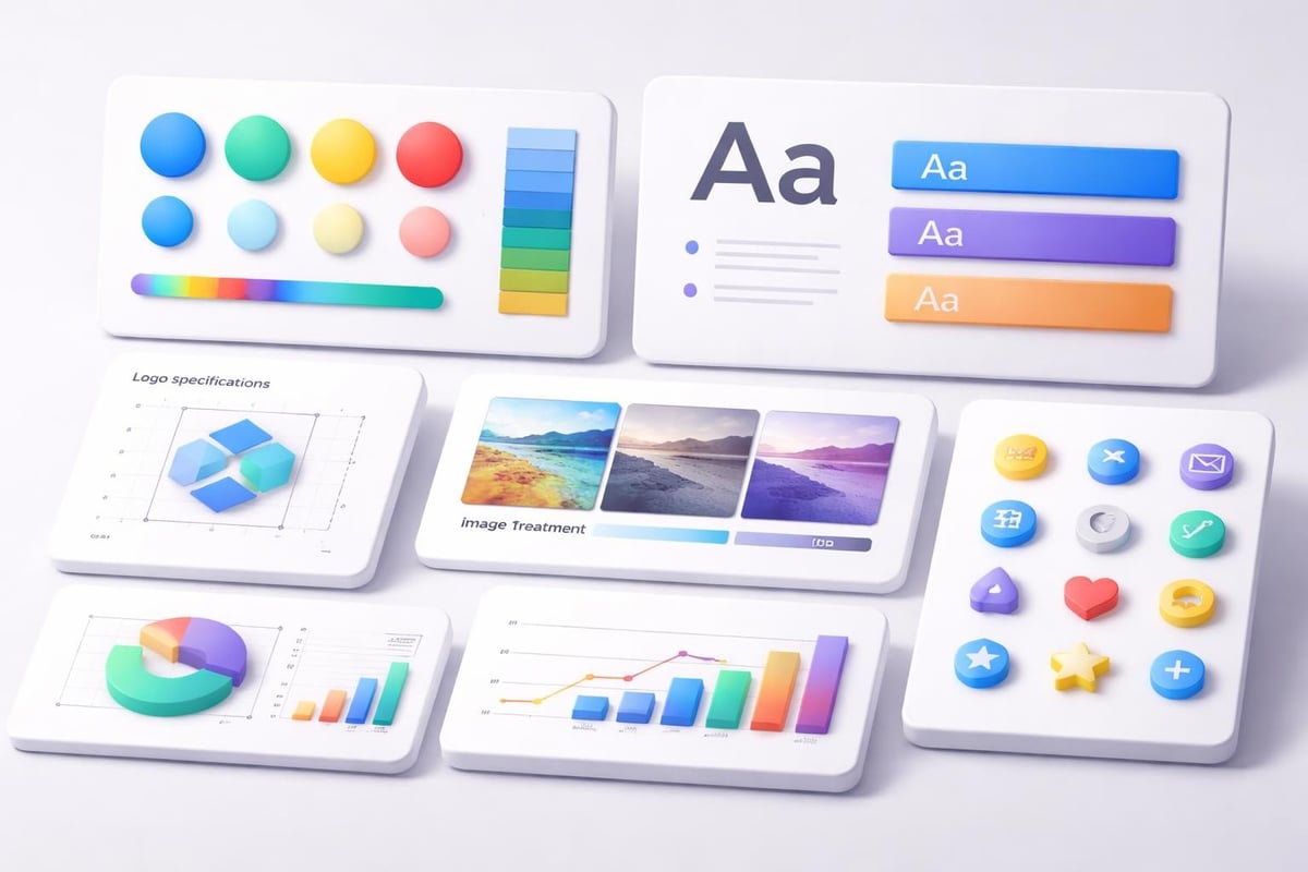
Every successful branding presentation template includes several fundamental elements that work together to create cohesive visual communication:
- Brand color palette with primary, secondary, and accent colors properly defined
- Typography system featuring headline fonts, body text, and special use cases
- Logo placement guidelines including clear space requirements and sizing standards
- Image treatment protocols specifying filters, overlays, and compositional approaches
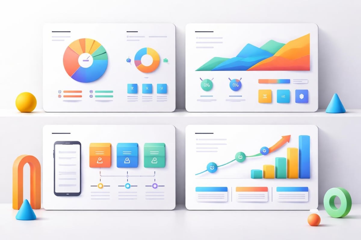
- Data visualization standards for charts, graphs, and information graphics
- Icon library representing common concepts in your brand's visual language
These components must align with your broader brand guidelines while adapting to the specific demands of presentation formats. Creating on-brand PowerPoint templates requires understanding both design principles and technical implementation within presentation software.
Building Your Template Architecture
The structural foundation of your branding presentation template determines its long-term usability and effectiveness. Rather than creating isolated slide designs, think about developing a comprehensive system that addresses every common presentation scenario your organization encounters.
Start by auditing your current presentation needs. Financial firms typically require sections for market analysis, performance metrics, investment strategies, and regulatory disclosures. Tech companies need slides for product demonstrations, technical architectures, user engagement data, and roadmap visualization. Your template architecture should anticipate these requirements with purpose-built layouts.
Master Slide Design Methodology
Creating master slides requires balancing aesthetic appeal with functional flexibility. Each master should solve a specific communication challenge while remaining visually consistent with the overall system.
| Slide Type | Primary Function | Design Priorities |
|---|---|---|
| Title Slide | Opening impact and branding | Large logo placement, compelling imagery, clear hierarchy |
| Section Divider | Content organization | Bold typography, minimal elements, strong color use |
| Content Layout | Information delivery | Readable text blocks, strategic white space, visual balance |
| Data Visualization | Metrics presentation | Chart emphasis, supporting context, source attribution |
| Full Image | Emotional resonance | High-quality photography, subtle branding, message overlay |
| Closing Slide | Call-to-action | Contact information, next steps, memorable final message |
The professional presentation development process emphasizes testing each master slide with real content before finalizing designs. This reveals practical issues that might not be apparent when working with placeholder text and images.
Implementing Brand Consistency Across Presentations
Consistency represents the primary value proposition of any branding presentation template. However, achieving genuine consistency requires more than distributing a file and hoping for compliance. Organizations must establish clear governance around template usage while providing adequate training and support.
Documentation plays a crucial role in successful implementation. Create a companion guide that explains the reasoning behind design decisions, demonstrates proper usage of each slide type, and addresses common customization scenarios. This guide transforms your template from a static file into an educational resource that elevates your team's design capabilities.
Guidelines for Template Customization
While templates provide structure, they must accommodate the unique requirements of specific presentations. Establish clear rules for when and how customization is appropriate:
- Color variations are acceptable for highlighting specific information within defined palette
- Typography adjustments should maintain hierarchical relationships and never introduce new fonts
- Logo modifications are generally prohibited except for localized market versions
- Image selection must align with brand photography standards and quality thresholds
- Data visualization can be customized but must follow established chart styling protocols
Minimal PowerPoint templates demonstrate how restraint in design options can actually increase creative flexibility by providing a stronger foundation for content customization.
Many organizations benefit from establishing tiered permission systems. Junior team members work exclusively within template constraints, while senior designers have authorization to make considered adjustments when presentations demand unique solutions. This approach maintains brand consistency while preventing creative stagnation.

Advanced Design Techniques for Financial and Tech Sectors
Financial services and technology companies have specialized presentation needs that generic templates often fail to address. These industries deal with complex information architectures, sophisticated data relationships, and audiences with high expectations for professional polish.
For financial presentations, data integrity and credibility are paramount. Your branding presentation template should include pre-styled chart templates that make financial information immediately scannable. Consider developing specialized layouts for common financial scenarios: quarterly earnings, portfolio performance, market comparisons, and investment theses. Each layout should guide the presenter toward clear, honest data representation while maintaining visual interest.
Technology presentations face different challenges. Technical concepts often require progressive revelation, where complexity unfolds across multiple slides. Your template should include layouts that support step-by-step explanations, before-and-after comparisons, and system architecture diagrams. Studios like Kollektif® excel at creating brand systems for technology companies that balance technical precision with aesthetic sophistication.
Integrating Motion and Interaction
Static slides represent just one dimension of modern presentations. Consider how your branding presentation template extends into animated and interactive formats:
- Transition standards that reinforce brand personality through motion timing and effects
- Animation protocols for revealing bullet points, charts, and complex diagrams
- Interactive elements for self-guided presentations and digital proposals
- Video integration guidelines for testimonials, product demos, and brand films
The trend toward dynamic presentation design reflects audience expectations for engaging visual experiences. Your template should provide clear guidance on when and how to incorporate these advanced techniques without overwhelming core content.
Template Development Workflow and Tools
Creating a comprehensive branding presentation template requires structured workflow and appropriate tools. Most organizations benefit from developing their primary template in PowerPoint due to its ubiquity in business settings, then creating parallel versions for Google Slides and Keynote to accommodate different preferences.
Begin with wireframes that establish information hierarchy and spatial relationships without visual design distractions. These wireframes should be reviewed by both designers and end users to ensure layouts serve practical communication needs. Only after validating the structural approach should you apply brand aesthetics.
Development phases typically follow this sequence:
- Discovery and requirements gathering - Interview stakeholders about presentation needs and pain points
- Competitive analysis - Review how competitors structure their brand presentations
- Wireframe development - Create gray-box layouts focusing on content hierarchy
- Visual design application - Apply brand colors, typography, and imagery
- Master slide configuration - Build technical infrastructure in presentation software
- Content testing - Populate templates with real content to identify issues
- Refinement and iteration - Adjust based on testing feedback
- Documentation creation - Develop usage guides and training materials
- Distribution and training - Roll out templates with proper education
- Ongoing optimization - Gather feedback and release periodic updates
Digital product studios like CollectDev apply systematic design and development methodologies that ensure templates function as robust, scalable systems rather than one-off design exercises.
Optimizing Templates for Different Use Cases
A single branding presentation template rarely serves all organizational needs effectively. Consider developing a template family that addresses distinct presentation scenarios while maintaining visual continuity across variations.
Internal presentations require different optimization than external decks. Internal templates can use denser layouts, more technical language, and abbreviated explanations since audiences share context. These templates prioritize information efficiency over persuasive storytelling.
Sales presentations demand the opposite approach. These templates should emphasize benefits over features, use compelling imagery to create emotional connections, and guide prospects through carefully structured narratives. The fintech pitch deck examples demonstrate how specialized templates support high-stakes sales scenarios.
Conference presentations face unique constraints around visibility, timing, and audience attention. These templates should feature larger text, higher contrast ratios, minimal detail per slide, and stronger visual anchors that remain legible from distance.
| Presentation Type | Optimal Slide Count | Text Density | Image Emphasis | Data Complexity |
|---|---|---|---|---|
| Investor Pitch | 15-20 slides | Low | High | Medium |
| Sales Deck | 20-30 slides | Medium | High | Low |
| Conference Talk | 30-40 slides | Low | Very High | Low |
| Board Report | 25-35 slides | High | Medium | High |
| Product Demo | 15-25 slides | Medium | Medium | Medium |
The brand presentation template resources available from established platforms provide starting points, but customization is essential for truly effective results.
Maintaining and Evolving Your Template System
Branding presentation templates are not static artifacts. They require ongoing maintenance, periodic updates, and strategic evolution to remain effective as your brand and business mature.
Establish a regular review cycle, typically annually or semi-annually, where you evaluate template performance against current needs. Gather quantitative and qualitative feedback from users at all levels. Track metrics like adoption rates, time-to-create for standard presentations, and audience engagement scores when possible.
Version control becomes critical as templates evolve. Implement clear naming conventions and distribution protocols so teams always access current versions. Consider using a centralized template library with access controls rather than allowing templates to proliferate across individual computers and shared drives.
Responding to Brand Evolution
Major brand refreshes require corresponding template updates, but these should be strategic transitions rather than abrupt replacements. When visual identities evolve, develop migration strategies that allow existing presentations to coexist with new designs during transition periods.
Create clear documentation explaining changes between template versions. This helps users understand not just what changed, but why, building design literacy across your organization. The attractive PowerPoint templates that resonate with audiences balance timeless design principles with contemporary aesthetic trends.
Some organizations maintain legacy template versions for specific contexts, such as presentations that will be regularly updated over extended periods. This prevents visual inconsistency within long-running presentation series while still allowing new projects to leverage updated designs.
Measuring Template Effectiveness and ROI
Quantifying the value of a branding presentation template helps justify design investment and guides improvement priorities. While some benefits resist precise measurement, several meaningful metrics can demonstrate impact.
Time savings represent the most tangible benefit. Track how long presentations take to create before and after template implementation. Organizations typically report 40-60% reductions in presentation development time once teams become proficient with well-designed templates.
Brand consistency scores can be assessed through periodic audits of presentation deliverables. Review random samples of presentations created during specific periods and score them against brand guideline adherence. Improvements in consistency scores indicate template effectiveness.
Presentation outcomes provide indirect performance indicators. Track conversion rates on sales presentations, funding success rates for pitch decks, and audience engagement metrics for conference talks. While numerous factors influence these outcomes, consistent improvements following template implementation suggest positive impact.
The research on presentation design strategies indicates that systematic approaches to presentation development yield measurably better results than ad-hoc design methods.
Integration with Broader Brand Systems
Your branding presentation template should function as one component within a comprehensive brand system, not an isolated asset. Consider how presentations relate to other branded materials and ensure visual continuity across touchpoints.
Marketing collateral, digital properties, proposal documents, and presentation decks should share common visual DNA. This doesn't mean everything looks identical, but rather that clear family resemblances exist. Color palettes, typography choices, imagery styles, and graphic treatments should translate logically across media.
Documentation standards help maintain this integration. Develop a central brand style guide that defines core principles, then create medium-specific addendums that explain how principles adapt to particular contexts. Your presentation template documentation should reference the broader style guide while detailing presentation-specific applications.
Advanced organizations implement design systems that function as single sources of truth for brand elements. These systems include component libraries, pattern collections, and usage guidelines that span all communication channels. Tools like Figma enable systematic approaches where brand elements can be updated centrally and propagate to all dependent materials.
Common Pitfalls and How to Avoid Them
Even well-intentioned template projects can fail if common mistakes aren't anticipated and prevented. Understanding these pitfalls helps organizations navigate template development more successfully.
Over-design ranks among the most frequent mistakes. Templates that prioritize aesthetic complexity over functional clarity frustrate users and often get abandoned. Every design element should serve a clear purpose in supporting communication objectives. Decorative elements that don't enhance message clarity should be eliminated.
Insufficient flexibility creates the opposite problem. Templates that are too rigid can't accommodate the natural diversity of content that organizations need to present. Build flexibility into your system through well-considered variations rather than trying to force all content into identical layouts.
Inadequate training undermines even excellent templates. Users need structured education about template philosophy, proper usage techniques, and customization boundaries. One-time training sessions are rarely sufficient; develop ongoing support resources and make expert help accessible when users encounter challenges.
Technical limitations sometimes compromise template functionality. Test thoroughly across different software versions, operating systems, and display contexts. What works perfectly on a designer's high-resolution monitor may fail on a conference projector or client's outdated software version.
Neglecting maintenance allows templates to become outdated and ineffective. Assign clear ownership for template stewardship, establish update protocols, and resource ongoing improvements. Templates require the same attention as any critical business system.
Working with Professional Design Partners
Many organizations benefit from partnering with specialized agencies for template development rather than attempting purely internal creation. Professional presentation designers bring expertise in visual communication, technical implementation, and strategic thinking that may not exist in-house.
When evaluating potential design partners, prioritize those with specific experience in your industry. Financial services and technology presentations have unique requirements that generalist designers may not fully understand. Review portfolios for relevant work examples, such as cybersecurity pitch decks or technology company presentations, that demonstrate appropriate expertise.
The collaborative process should begin with discovery where designers learn your brand, understand your audiences, and identify your presentation challenges. This foundation ensures resulting templates address real needs rather than applying generic solutions. Expect iterative refinement cycles where initial concepts are tested, feedback is incorporated, and designs evolve toward optimal solutions.
Budget considerations should account for both initial development and ongoing support. Template creation is an investment, but one that typically delivers strong returns through time savings, improved consistency, and enhanced communication effectiveness. Discuss maintenance arrangements upfront so templates remain current and useful over extended periods.
Developing an effective branding presentation template requires balancing aesthetic excellence with practical functionality, creating systems that elevate brand consistency while supporting diverse communication needs. Whether you're building templates internally or partnering with specialists, the principles outlined here provide a roadmap for creating presentation systems that truly serve your organization. Prznt Perfect specializes in developing customized presentation templates for financial and tech businesses, transforming complex brand guidelines into practical, user-friendly systems that empower teams to create compelling presentations with confidence.


- This is some text inside of a div block.lay out the facts clearly and compellingly. Use data to establish the ground reality, but remember that facts alone are like the individual strands of a tapestry—necessary but not complete.lay out the facts clearly and compellingly. Use data to establish the ground reality, but remember that facts alone are like the individual strands of a tapestry—necessary but not complete.
- This is some text inside of a div block.lay out the facts clearly and compellingly. Use data to establish the ground reality, but remember that facts alone are like the individual strands of a tapestry—necessary but not complete.

