Visual Data Presentation: Transform Complex Data

The ability to transform complex data into clear, actionable insights has become a critical business skill in 2026. Financial institutions and tech companies generate massive volumes of information daily, yet raw data alone rarely drives decision-making. Effective visual data presentation bridges the gap between numbers and narratives, converting spreadsheets into strategic stories that resonate with investors, stakeholders, and customers. For businesses competing in fast-paced markets, the difference between winning and losing often comes down to how well they communicate their value proposition through data visualization.

The Strategic Value of Visual Data Presentation

Visual data presentation serves as the foundation for modern business communication. When financial metrics or technical performance indicators appear as endless rows in a spreadsheet, audiences struggle to identify trends, patterns, or actionable insights. Converting this information into visual formats immediately enhances comprehension and retention.

Research demonstrates that people process visuals 60,000 times faster than text. This neurological advantage makes visual data presentation essential for time-constrained executives and investors who need to grasp key concepts quickly. In pitch meetings or board presentations, decision-makers allocate limited attention to each presenter, making every second count.

The transformation from raw data to compelling visuals requires more than technical skill. It demands strategic thinking about what story the data tells and which insights matter most to specific audiences. A fintech presentation design approach differs significantly from traditional corporate reporting because fintech audiences prioritize scalability metrics, user acquisition costs, and regulatory compliance indicators.

Data storytelling workflow

Core Principles for Financial and Tech Audiences

Financial and technology sectors demand precision in data representation. Misleading visualizations can damage credibility and undermine strategic initiatives. Maintaining visual integrity in data visualizations requires commitment to accuracy, consistency, and transparency throughout the design process.

Several fundamental principles guide effective visual data presentation:

  • Accuracy: Every data point must reflect actual values without distortion or manipulation
  • Clarity: Visual elements should simplify complexity rather than add decorative confusion
  • Context: Comparative benchmarks and historical trends provide meaningful reference points
  • Relevance: Selected metrics must align with strategic objectives and audience priorities
  • Consistency: Visual treatments across multiple slides create professional cohesion

Chart Types and When to Use Them

Selecting appropriate chart types represents a critical decision point in visual data presentation. Each visualization format communicates different relationship types and serves distinct analytical purposes. Understanding these distinctions separates amateur presentations from professional deliverables.

Chart Type Best Use Case Key Advantage Common Mistake
Bar Chart Comparing categories Clear visual comparison Too many categories
Line Graph Showing trends over time Reveals patterns Irregular time intervals
Pie Chart Proportions of a whole Instant percentage grasp More than 5 segments
Scatter Plot Correlation between variables Shows relationships Unlabeled axes
Heat Map Multi-dimensional data High information density Poor color selection

Bar charts excel at category comparison, making them ideal for revenue breakdowns by product line, customer acquisition costs across marketing channels, or performance metrics between departments. The horizontal or vertical orientation provides instant visual hierarchy that audiences process intuitively.

Line graphs dominate time-series analysis in financial presentations. Month-over-month revenue growth, user engagement trends, or market share evolution all benefit from line graph treatment. The slope of the line immediately communicates trajectory, making this format invaluable for growth-focused narratives.

Scatter plots reveal correlations that other formats obscure. In tech presentations, plotting feature usage against customer lifetime value might reveal unexpected patterns. Similarly, financial analysts use scatter plots to identify relationships between variables like marketing spend and customer acquisition.

Advanced Visualization Techniques

Beyond basic chart types, sophisticated visual data presentation leverages advanced techniques for complex datasets. Combination charts merge multiple data types, such as overlaying a line graph showing profit margin percentage onto bar charts displaying quarterly revenue. This dual-axis approach communicates both volume and efficiency simultaneously.

Waterfall charts effectively demonstrate how initial values transform through sequential changes. Tech companies use waterfall visualizations to show how user cohorts progress through conversion funnels, while financial institutions display how starting balances change through various transaction categories.

Dashboard design represents the pinnacle of visual data presentation complexity. Multiple visualizations coexist in a single view, requiring careful attention to data visualization best practices to avoid cognitive overload. Effective dashboards balance comprehensiveness with clarity, providing drill-down capabilities without overwhelming initial impressions.

Design Elements That Enhance Comprehension

Typography choices significantly impact visual data presentation effectiveness. Font selection, size hierarchy, and text placement guide viewer attention through complex information. Sans-serif fonts like Helvetica or Calibri maintain readability at small sizes, crucial when labeling data points or axis values.

Color strategy extends far beyond aesthetic preference. In financial presentations, red universally signals negative values or losses, while green indicates positive performance or gains. However, approximately 8% of men and 0.5% of women have color vision deficiency, making redundant encoding essential. Combining color with patterns, shapes, or labels ensures accessibility across all viewer capabilities.

The data visualization principles from Carnegie Mellon University emphasize purposeful design decisions that prioritize audience needs over designer preferences. Every element should serve a communicative function rather than existing solely for decoration.

Visual hierarchy in data presentation

White Space and Visual Balance

Novice presenters often cram excessive information onto individual slides, undermining visual data presentation effectiveness. Strategic white space around charts and graphics allows breathing room that enhances focus. This principle proves especially important in professional PowerPoint design where slide real estate feels limited.

The rule of thirds provides a compositional framework borrowed from photography and fine art. Positioning key visual elements along imaginary lines dividing the slide into thirds creates natural balance and visual interest. Charts placed dead center often feel static and unremarkable, while off-center positioning with supporting text creates dynamic tension that maintains attention.

Alignment consistency across presentation decks reinforces professionalism. When charts align to the same grid system throughout a pitch deck, audiences subconsciously recognize structure and intentionality. Conversely, random positioning signals carelessness that audiences may project onto business operations.

Data Transformation Workflows

Converting raw data into presentation-ready visuals follows systematic workflows that ensure accuracy and efficiency. Financial and tech companies typically extract data from multiple sources including CRM systems, financial software, analytics platforms, and operational databases.

The extraction phase requires validation protocols to confirm data integrity before visualization begins. Mismatched date ranges, incomplete datasets, or calculation errors compound exponentially when transformed into visual formats. A single incorrect data point can undermine an entire presentation's credibility.

  1. Data Collection: Aggregate information from relevant sources with documented time periods
  2. Cleaning and Validation: Remove duplicates, correct errors, standardize formats
  3. Analysis and Insight Extraction: Identify patterns, trends, and anomalies worth highlighting
  4. Visual Format Selection: Choose chart types that best communicate specific insights
  5. Design and Refinement: Apply branding, optimize for readability, test comprehension
  6. Quality Review: Verify accuracy, check accessibility, confirm message alignment

Many organizations establish templates for recurring visual data presentation needs. Monthly board reports, quarterly investor updates, and annual performance reviews benefit from standardized formats that allow period-over-period comparison while reducing production time.

Tools and Technology Integration

Modern visual data presentation leverages specialized software beyond basic spreadsheet charting capabilities. Tools like Tableau, Power BI, and Looker offer sophisticated visualization engines with real-time data connectivity. These platforms excel at exploratory analysis but often require translation into presentation formats for stakeholder communication.

The challenge lies in maintaining brand consistency when moving between analytical tools and presentation software. Effective slide deck organization demands intentional structure that guides audiences through logical progression while maintaining visual coherence. Exported charts from analytical tools often require redesign to match corporate identity standards and presentation aesthetics.

Strategic consultancies like Rise Reign Rule emphasize systematic approaches to business operations, a philosophy that applies equally to visual data presentation workflows. Establishing repeatable processes ensures consistent quality while reducing the founder bottlenecks that plague scaling organizations.

Industry-Specific Applications

Financial services organizations face unique visual data presentation challenges. Regulatory requirements mandate specific disclosures, risk metrics require careful contextualization, and investment performance demands transparent representation. Charts showing portfolio allocation must clearly distinguish between asset classes while maintaining visual simplicity.

Fintech companies operate at the intersection of finance and technology, requiring visual approaches that communicate both traditional financial metrics and tech-specific performance indicators. A fintech pitch deck might visualize customer acquisition costs alongside average transaction values, daily active users alongside revenue per user, and regulatory compliance milestones alongside product roadmap timelines.

Industry-specific data visualization

Technology companies prioritize growth metrics, user engagement analytics, and technical performance indicators. Visual data presentation for tech audiences often incorporates funnel visualizations showing conversion rates, cohort analyses revealing retention patterns, and A/B test results demonstrating feature effectiveness. These visualizations must communicate statistical significance while remaining accessible to non-technical stakeholders.

Sector-Specific Metrics and Benchmarks

Each industry vertical maintains distinct performance indicators that drive decision-making. SaaS companies obsess over Monthly Recurring Revenue (MRR), churn rates, and Customer Lifetime Value (CLV). Visual data presentation for SaaS businesses must communicate these metrics with appropriate context, such as industry benchmarks or historical performance.

Cybersecurity firms require visualizations that communicate threat landscapes, incident response times, and vulnerability remediation rates. A cybersecurity pitch deck might visualize attack vector frequency, detection accuracy rates, or compliance framework alignment through specialized chart types that resonate with security-conscious audiences.

Banking institutions leverage visual data presentation to communicate credit risk distributions, loan portfolio composition, and regulatory capital ratios. These visualizations must satisfy both internal stakeholders and external regulators, requiring dual-purpose designs that serve multiple audience needs simultaneously.

Accessibility and Inclusive Design

Visual data presentation in 2026 must accommodate diverse audience capabilities. Combining text and visuals for effective data communication enhances understanding for all viewers while ensuring accessibility for those with visual impairments or cognitive differences.

Screen reader compatibility requires thoughtful implementation. Alt text for charts should describe key insights rather than merely listing data points. For example, "Revenue increased 47% year-over-year, driven primarily by enterprise customer growth" communicates more value than "Bar chart showing quarterly revenue from Q1 2025 through Q4 2025."

Color blindness considerations extend beyond simple red-green avoidance. Utilizing patterns, shapes, and labels alongside color coding ensures information remains accessible regardless of color perception. Testing visualizations through color blindness simulators identifies potential issues before presentations reach audiences.

  • Maintain minimum 4.5:1 contrast ratios between text and backgrounds
  • Provide text alternatives for all visual information
  • Avoid relying solely on color to convey meaning
  • Use clear, descriptive labels for all data points
  • Test readability across different display sizes and projector systems

Narrative Integration and Storytelling

Data alone rarely persuades. Effective visual data presentation weaves numbers into compelling narratives that resonate emotionally while satisfying analytical rigor. The hero's journey framework adapts surprisingly well to business presentations, with challenges representing market problems, solutions depicting product capabilities, and metrics demonstrating successful outcomes.

Sequencing visualizations creates dramatic tension that maintains audience engagement. Opening with current state challenges, building tension through market analysis, and resolving with solution efficacy creates narrative arc within data-driven presentations. This approach transforms potentially dry financial reviews into engaging stories.

Annotation strategies enhance narrative integration by highlighting specific data points worth discussing. Callout boxes, arrows, and text labels direct attention to anomalies, breakthroughs, or inflection points that deserve verbal elaboration. Presenting data effectively requires balancing visual simplicity with sufficient detail to support strategic conversations.

Balancing Data Density and Clarity

The temptation to include every available metric undermines visual data presentation effectiveness. Presenters often fear omitting information that might answer potential questions, leading to cluttered slides that overwhelm rather than inform. Strategic editing separates essential insights from supplementary details.

Appendix slides accommodate comprehensive data needs without compromising main narrative flow. Core presentation decks focus on critical metrics and strategic insights, while detailed breakdowns reside in backup slides accessible during Q&A sessions. This structure maintains momentum while ensuring thorough preparation.

Progressive disclosure techniques reveal information in stages, preventing cognitive overload. An initial slide might show top-line revenue growth, followed by subsequent slides breaking down contribution by product line, customer segment, and geographic region. This layered approach builds understanding incrementally rather than demanding instantaneous comprehension of complex multidimensional data.

Quality Assurance and Testing

Visual data presentation mistakes can prove costly. Calculation errors, incorrect labels, or misleading scales undermine presenter credibility and potentially impact strategic decisions. Systematic quality assurance processes catch errors before presentations reach critical audiences.

Peer review represents the first quality gate. Colleagues unfamiliar with underlying data can identify confusing visualizations or unclear labels that creators overlook through familiarity. Fresh perspectives reveal assumptions that seemed obvious during creation but require explicit communication for broader audiences.

Quality Check Purpose Common Issues Identified
Data Accuracy Verify calculations Formula errors, outdated sources
Visual Clarity Test comprehension Unclear labels, poor contrast
Brand Alignment Ensure consistency Off-brand colors, mismatched fonts
Accessibility Confirm inclusivity Color-only encoding, missing alt text
Narrative Flow Validate logic Disconnected slides, unclear progression

Usability testing with representative audience members reveals comprehension gaps. Observing viewers interact with visualizations identifies which elements draw attention, which require explanation, and which create confusion. These insights inform revisions that enhance effectiveness.

Version control becomes critical when multiple stakeholders contribute to presentation development. Cloud-based collaboration platforms track changes, maintain revision history, and prevent the "final_final_v3_ACTUAL_FINAL" filename proliferation that plagues team projects. Clear ownership and approval workflows ensure quality standards while enabling collaborative input.

Professional presentation design agencies like those specializing in pitch deck design maintain rigorous quality assurance protocols that combine aesthetic excellence with analytical precision. This dual expertise ensures visual data presentation that satisfies both creative and quantitative standards.

Emerging Trends and Future Directions

Artificial intelligence increasingly influences visual data presentation workflows. Natural language processing enables conversational queries that generate appropriate visualizations automatically. Users might ask "Show me quarterly revenue by product line" and receive optimized chart recommendations based on data characteristics and presentation context.

Interactive visualizations transition from exploratory tools to presentation formats. Embedded dashboards within pitch decks allow real-time filtering and drill-down capabilities during investor meetings. This interactivity demonstrates data fluency while accommodating diverse stakeholder interests within single presentations.

Animation and motion design enhance understanding of complex processes or temporal changes. Animated transitions showing market share evolution or step-by-step product development timelines communicate dynamics that static visualizations obscure. However, animation requires restraint, as excessive movement distracts rather than clarifies.

For organizations seeking development talent to build custom visualization tools or interactive presentation platforms, platforms like FreelanceDEV connect businesses with skilled developers specializing in web applications, software development, and UX/UI design.

Augmented reality applications begin appearing in high-stakes presentations, allowing three-dimensional data exploration within physical spaces. While still emerging, AR visualization promises to revolutionize how technical and financial data appears in boardrooms and investor presentations.


Mastering visual data presentation transforms how organizations communicate value, demonstrate performance, and persuade stakeholders. By combining analytical rigor with design excellence, businesses create compelling narratives that drive strategic decisions and competitive advantage. Prznt Perfect specializes in transforming complex financial and technical data into visually stunning presentations that resonate with investors, executives, and customers. Whether you need a pitch deck that secures funding or keynote visuals that establish thought leadership, our team delivers presentation design that converts data into decisions.

We offer free 30-min consultation on the presentation design audit
and hiring the right visual 
comms professional, let’s talk!
Shedule a call
Shedule a call
"I understand" goes a step further into the cognitive dance of persuasion. It's where the audience begins to see the connections between the facts, to grasp the nuances of the problem and the elegance of the solution.
  • This is some text inside of a div block.
    lay out the facts clearly and compellingly. Use data to establish the ground reality, but remember that facts alone are like the individual strands of a tapestry—necessary but not complete.
    lay out the facts clearly and compellingly. Use data to establish the ground reality, but remember that facts alone are like the individual strands of a tapestry—necessary but not complete.
  • This is some text inside of a div block.
    lay out the facts clearly and compellingly. Use data to establish the ground reality, but remember that facts alone are like the individual strands of a tapestry—necessary but not complete.

We offer free 30-min consultation on the presentation design audit

and hiring the right visual 
comms professional, let’s talk!

Shedule a call

"I understand" goes a step further into the cognitive dance of persuasion. It's where the audience begins to see the connections between the facts, to grasp the nuances of the problem and the elegance of the solution.

  • - 1 -
    Consistency at Scale:

    Biotech Market Trends 2024: Tailoring Your Pitch Deck to Current Industry Dynamics.

  • - 2 -
    Efficiency and Speed:

    The traditional process of manually updating presentations is not only slow but also prone to bottlenecks, especially when dealing with large volumes of slides. Automation dramatically accelerates this process, enabling designers to apply changes across hundreds of slides in the time it would take to manually update a single one. This efficiency is a game-changer for agencies working under tight deadlines or managing multiple projects simultaneously.

  • - 3 -
    Enhanced Creativity:

    With the burden of manual updates lifted, designers can allocate more time and energy to the creative aspects of presentation design. This freedom allows for deeper exploration of innovative design concepts, experimentation with new visual storytelling techniques, and the development of more engaging and interactive presentations. Automation doesn't stifle creativity; it amplifies it, enabling designers to push the boundaries of what's possible in corporate presentation design.

  • - 4 -
    Error Reduction:

    Manual updates are inherently prone to inconsistencies and mistakes, from misaligned logos to incorrect font sizes. These errors can detract from the professionalism of a presentation and, by extension, the corporate image. Automation minimizes these risks by ensuring that updates are applied uniformly and accurately across all slides, enhancing the overall quality and integrity of the presentation.

  • - 5 -
    Cost-Effectiveness:

    The time savings afforded by automation directly translate to cost savings for both the design agency and its clients. By reducing the hours spent on manual updates, agencies can optimize their workflows and resources, allowing them to take on more projects without compromising on quality. This efficiency can also make high-quality presentation design services more affordable and accessible to a broader range of businesses.

Visual Data Presentation: Transform Complex Data
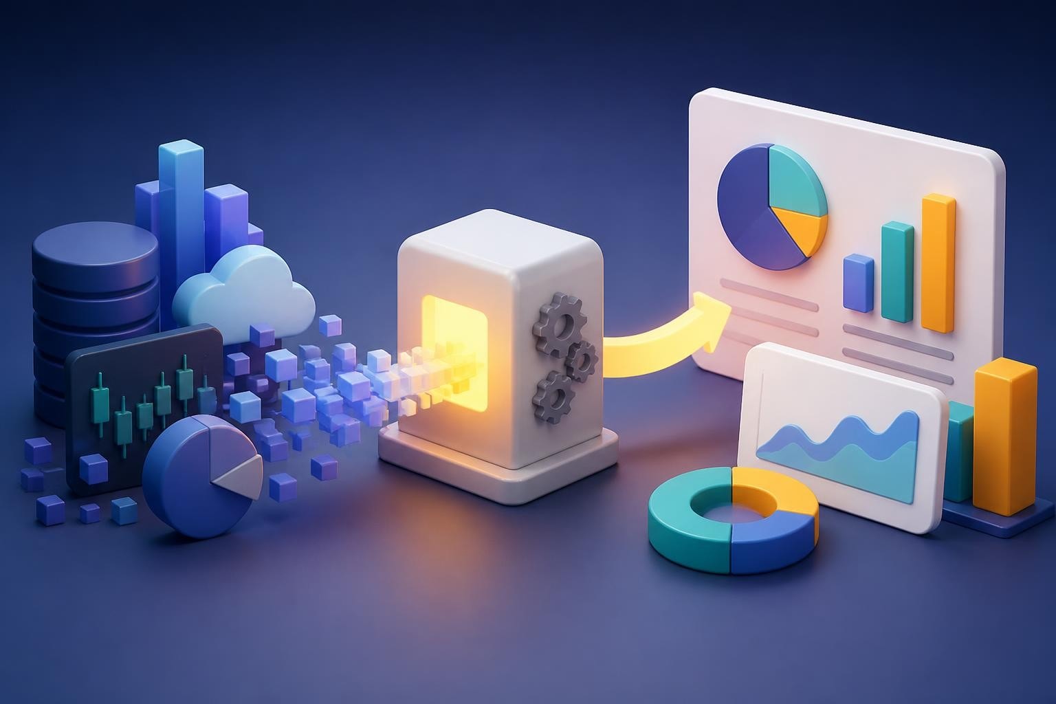
Master visual data presentation techniques to transform complex information into clear, compelling narratives for financial and tech audiences.

The ability to transform complex data into clear, actionable insights has become a critical business skill in 2026. Financial institutions and tech companies generate massive volumes of information daily, yet raw data alone rarely drives decision-making. Effective visual data presentation bridges the gap between numbers and narratives, converting spreadsheets into strategic stories that resonate with investors, stakeholders, and customers. For businesses competing in fast-paced markets, the difference between winning and losing often comes down to how well they communicate their value proposition through data visualization.

The Strategic Value of Visual Data Presentation

Visual data presentation serves as the foundation for modern business communication. When financial metrics or technical performance indicators appear as endless rows in a spreadsheet, audiences struggle to identify trends, patterns, or actionable insights. Converting this information into visual formats immediately enhances comprehension and retention.

Research demonstrates that people process visuals 60,000 times faster than text. This neurological advantage makes visual data presentation essential for time-constrained executives and investors who need to grasp key concepts quickly. In pitch meetings or board presentations, decision-makers allocate limited attention to each presenter, making every second count.

The transformation from raw data to compelling visuals requires more than technical skill. It demands strategic thinking about what story the data tells and which insights matter most to specific audiences. A fintech presentation design approach differs significantly from traditional corporate reporting because fintech audiences prioritize scalability metrics, user acquisition costs, and regulatory compliance indicators.

Data storytelling workflow

Core Principles for Financial and Tech Audiences

Financial and technology sectors demand precision in data representation. Misleading visualizations can damage credibility and undermine strategic initiatives. Maintaining visual integrity in data visualizations requires commitment to accuracy, consistency, and transparency throughout the design process.

Several fundamental principles guide effective visual data presentation:

  • Accuracy: Every data point must reflect actual values without distortion or manipulation
  • Clarity: Visual elements should simplify complexity rather than add decorative confusion
  • Context: Comparative benchmarks and historical trends provide meaningful reference points
  • Relevance: Selected metrics must align with strategic objectives and audience priorities
  • Consistency: Visual treatments across multiple slides create professional cohesion

Chart Types and When to Use Them

Selecting appropriate chart types represents a critical decision point in visual data presentation. Each visualization format communicates different relationship types and serves distinct analytical purposes. Understanding these distinctions separates amateur presentations from professional deliverables.

Chart Type Best Use Case Key Advantage Common Mistake
Bar Chart Comparing categories Clear visual comparison Too many categories
Line Graph Showing trends over time Reveals patterns Irregular time intervals
Pie Chart Proportions of a whole Instant percentage grasp More than 5 segments
Scatter Plot Correlation between variables Shows relationships Unlabeled axes
Heat Map Multi-dimensional data High information density Poor color selection

Bar charts excel at category comparison, making them ideal for revenue breakdowns by product line, customer acquisition costs across marketing channels, or performance metrics between departments. The horizontal or vertical orientation provides instant visual hierarchy that audiences process intuitively.

Line graphs dominate time-series analysis in financial presentations. Month-over-month revenue growth, user engagement trends, or market share evolution all benefit from line graph treatment. The slope of the line immediately communicates trajectory, making this format invaluable for growth-focused narratives.

Scatter plots reveal correlations that other formats obscure. In tech presentations, plotting feature usage against customer lifetime value might reveal unexpected patterns. Similarly, financial analysts use scatter plots to identify relationships between variables like marketing spend and customer acquisition.

Advanced Visualization Techniques

Beyond basic chart types, sophisticated visual data presentation leverages advanced techniques for complex datasets. Combination charts merge multiple data types, such as overlaying a line graph showing profit margin percentage onto bar charts displaying quarterly revenue. This dual-axis approach communicates both volume and efficiency simultaneously.

Waterfall charts effectively demonstrate how initial values transform through sequential changes. Tech companies use waterfall visualizations to show how user cohorts progress through conversion funnels, while financial institutions display how starting balances change through various transaction categories.

Dashboard design represents the pinnacle of visual data presentation complexity. Multiple visualizations coexist in a single view, requiring careful attention to data visualization best practices to avoid cognitive overload. Effective dashboards balance comprehensiveness with clarity, providing drill-down capabilities without overwhelming initial impressions.

Design Elements That Enhance Comprehension

Typography choices significantly impact visual data presentation effectiveness. Font selection, size hierarchy, and text placement guide viewer attention through complex information. Sans-serif fonts like Helvetica or Calibri maintain readability at small sizes, crucial when labeling data points or axis values.

Color strategy extends far beyond aesthetic preference. In financial presentations, red universally signals negative values or losses, while green indicates positive performance or gains. However, approximately 8% of men and 0.5% of women have color vision deficiency, making redundant encoding essential. Combining color with patterns, shapes, or labels ensures accessibility across all viewer capabilities.

The data visualization principles from Carnegie Mellon University emphasize purposeful design decisions that prioritize audience needs over designer preferences. Every element should serve a communicative function rather than existing solely for decoration.

Visual hierarchy in data presentation

White Space and Visual Balance

Novice presenters often cram excessive information onto individual slides, undermining visual data presentation effectiveness. Strategic white space around charts and graphics allows breathing room that enhances focus. This principle proves especially important in professional PowerPoint design where slide real estate feels limited.

The rule of thirds provides a compositional framework borrowed from photography and fine art. Positioning key visual elements along imaginary lines dividing the slide into thirds creates natural balance and visual interest. Charts placed dead center often feel static and unremarkable, while off-center positioning with supporting text creates dynamic tension that maintains attention.

Alignment consistency across presentation decks reinforces professionalism. When charts align to the same grid system throughout a pitch deck, audiences subconsciously recognize structure and intentionality. Conversely, random positioning signals carelessness that audiences may project onto business operations.

Data Transformation Workflows

Converting raw data into presentation-ready visuals follows systematic workflows that ensure accuracy and efficiency. Financial and tech companies typically extract data from multiple sources including CRM systems, financial software, analytics platforms, and operational databases.

The extraction phase requires validation protocols to confirm data integrity before visualization begins. Mismatched date ranges, incomplete datasets, or calculation errors compound exponentially when transformed into visual formats. A single incorrect data point can undermine an entire presentation's credibility.

  1. Data Collection: Aggregate information from relevant sources with documented time periods
  2. Cleaning and Validation: Remove duplicates, correct errors, standardize formats
  3. Analysis and Insight Extraction: Identify patterns, trends, and anomalies worth highlighting
  4. Visual Format Selection: Choose chart types that best communicate specific insights
  5. Design and Refinement: Apply branding, optimize for readability, test comprehension
  6. Quality Review: Verify accuracy, check accessibility, confirm message alignment

Many organizations establish templates for recurring visual data presentation needs. Monthly board reports, quarterly investor updates, and annual performance reviews benefit from standardized formats that allow period-over-period comparison while reducing production time.

Tools and Technology Integration

Modern visual data presentation leverages specialized software beyond basic spreadsheet charting capabilities. Tools like Tableau, Power BI, and Looker offer sophisticated visualization engines with real-time data connectivity. These platforms excel at exploratory analysis but often require translation into presentation formats for stakeholder communication.

The challenge lies in maintaining brand consistency when moving between analytical tools and presentation software. Effective slide deck organization demands intentional structure that guides audiences through logical progression while maintaining visual coherence. Exported charts from analytical tools often require redesign to match corporate identity standards and presentation aesthetics.

Strategic consultancies like Rise Reign Rule emphasize systematic approaches to business operations, a philosophy that applies equally to visual data presentation workflows. Establishing repeatable processes ensures consistent quality while reducing the founder bottlenecks that plague scaling organizations.

Industry-Specific Applications

Financial services organizations face unique visual data presentation challenges. Regulatory requirements mandate specific disclosures, risk metrics require careful contextualization, and investment performance demands transparent representation. Charts showing portfolio allocation must clearly distinguish between asset classes while maintaining visual simplicity.

Fintech companies operate at the intersection of finance and technology, requiring visual approaches that communicate both traditional financial metrics and tech-specific performance indicators. A fintech pitch deck might visualize customer acquisition costs alongside average transaction values, daily active users alongside revenue per user, and regulatory compliance milestones alongside product roadmap timelines.
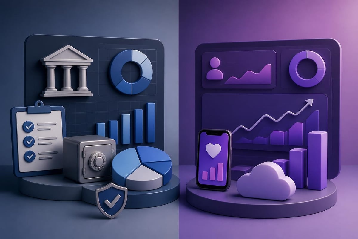
Industry-specific data visualization

Technology companies prioritize growth metrics, user engagement analytics, and technical performance indicators. Visual data presentation for tech audiences often incorporates funnel visualizations showing conversion rates, cohort analyses revealing retention patterns, and A/B test results demonstrating feature effectiveness. These visualizations must communicate statistical significance while remaining accessible to non-technical stakeholders.

Sector-Specific Metrics and Benchmarks

Each industry vertical maintains distinct performance indicators that drive decision-making. SaaS companies obsess over Monthly Recurring Revenue (MRR), churn rates, and Customer Lifetime Value (CLV). Visual data presentation for SaaS businesses must communicate these metrics with appropriate context, such as industry benchmarks or historical performance.

Cybersecurity firms require visualizations that communicate threat landscapes, incident response times, and vulnerability remediation rates. A cybersecurity pitch deck might visualize attack vector frequency, detection accuracy rates, or compliance framework alignment through specialized chart types that resonate with security-conscious audiences.

Banking institutions leverage visual data presentation to communicate credit risk distributions, loan portfolio composition, and regulatory capital ratios. These visualizations must satisfy both internal stakeholders and external regulators, requiring dual-purpose designs that serve multiple audience needs simultaneously.

Accessibility and Inclusive Design

Visual data presentation in 2026 must accommodate diverse audience capabilities. Combining text and visuals for effective data communication enhances understanding for all viewers while ensuring accessibility for those with visual impairments or cognitive differences.

Screen reader compatibility requires thoughtful implementation. Alt text for charts should describe key insights rather than merely listing data points. For example, "Revenue increased 47% year-over-year, driven primarily by enterprise customer growth" communicates more value than "Bar chart showing quarterly revenue from Q1 2025 through Q4 2025."

Color blindness considerations extend beyond simple red-green avoidance. Utilizing patterns, shapes, and labels alongside color coding ensures information remains accessible regardless of color perception. Testing visualizations through color blindness simulators identifies potential issues before presentations reach audiences.

  • Maintain minimum 4.5:1 contrast ratios between text and backgrounds
  • Provide text alternatives for all visual information
  • Avoid relying solely on color to convey meaning
  • Use clear, descriptive labels for all data points
  • Test readability across different display sizes and projector systems

Narrative Integration and Storytelling

Data alone rarely persuades. Effective visual data presentation weaves numbers into compelling narratives that resonate emotionally while satisfying analytical rigor. The hero's journey framework adapts surprisingly well to business presentations, with challenges representing market problems, solutions depicting product capabilities, and metrics demonstrating successful outcomes.

Sequencing visualizations creates dramatic tension that maintains audience engagement. Opening with current state challenges, building tension through market analysis, and resolving with solution efficacy creates narrative arc within data-driven presentations. This approach transforms potentially dry financial reviews into engaging stories.

Annotation strategies enhance narrative integration by highlighting specific data points worth discussing. Callout boxes, arrows, and text labels direct attention to anomalies, breakthroughs, or inflection points that deserve verbal elaboration. Presenting data effectively requires balancing visual simplicity with sufficient detail to support strategic conversations.

Balancing Data Density and Clarity

The temptation to include every available metric undermines visual data presentation effectiveness. Presenters often fear omitting information that might answer potential questions, leading to cluttered slides that overwhelm rather than inform. Strategic editing separates essential insights from supplementary details.

Appendix slides accommodate comprehensive data needs without compromising main narrative flow. Core presentation decks focus on critical metrics and strategic insights, while detailed breakdowns reside in backup slides accessible during Q&A sessions. This structure maintains momentum while ensuring thorough preparation.

Progressive disclosure techniques reveal information in stages, preventing cognitive overload. An initial slide might show top-line revenue growth, followed by subsequent slides breaking down contribution by product line, customer segment, and geographic region. This layered approach builds understanding incrementally rather than demanding instantaneous comprehension of complex multidimensional data.

Quality Assurance and Testing

Visual data presentation mistakes can prove costly. Calculation errors, incorrect labels, or misleading scales undermine presenter credibility and potentially impact strategic decisions. Systematic quality assurance processes catch errors before presentations reach critical audiences.

Peer review represents the first quality gate. Colleagues unfamiliar with underlying data can identify confusing visualizations or unclear labels that creators overlook through familiarity. Fresh perspectives reveal assumptions that seemed obvious during creation but require explicit communication for broader audiences.

Quality Check Purpose Common Issues Identified
Data Accuracy Verify calculations Formula errors, outdated sources
Visual Clarity Test comprehension Unclear labels, poor contrast
Brand Alignment Ensure consistency Off-brand colors, mismatched fonts
Accessibility Confirm inclusivity Color-only encoding, missing alt text
Narrative Flow Validate logic Disconnected slides, unclear progression

Usability testing with representative audience members reveals comprehension gaps. Observing viewers interact with visualizations identifies which elements draw attention, which require explanation, and which create confusion. These insights inform revisions that enhance effectiveness.

Version control becomes critical when multiple stakeholders contribute to presentation development. Cloud-based collaboration platforms track changes, maintain revision history, and prevent the "final_final_v3_ACTUAL_FINAL" filename proliferation that plagues team projects. Clear ownership and approval workflows ensure quality standards while enabling collaborative input.

Professional presentation design agencies like those specializing in pitch deck design maintain rigorous quality assurance protocols that combine aesthetic excellence with analytical precision. This dual expertise ensures visual data presentation that satisfies both creative and quantitative standards.

Emerging Trends and Future Directions

Artificial intelligence increasingly influences visual data presentation workflows. Natural language processing enables conversational queries that generate appropriate visualizations automatically. Users might ask "Show me quarterly revenue by product line" and receive optimized chart recommendations based on data characteristics and presentation context.

Interactive visualizations transition from exploratory tools to presentation formats. Embedded dashboards within pitch decks allow real-time filtering and drill-down capabilities during investor meetings. This interactivity demonstrates data fluency while accommodating diverse stakeholder interests within single presentations.

Animation and motion design enhance understanding of complex processes or temporal changes. Animated transitions showing market share evolution or step-by-step product development timelines communicate dynamics that static visualizations obscure. However, animation requires restraint, as excessive movement distracts rather than clarifies.

For organizations seeking development talent to build custom visualization tools or interactive presentation platforms, platforms like FreelanceDEV connect businesses with skilled developers specializing in web applications, software development, and UX/UI design.

Augmented reality applications begin appearing in high-stakes presentations, allowing three-dimensional data exploration within physical spaces. While still emerging, AR visualization promises to revolutionize how technical and financial data appears in boardrooms and investor presentations.


Mastering visual data presentation transforms how organizations communicate value, demonstrate performance, and persuade stakeholders. By combining analytical rigor with design excellence, businesses create compelling narratives that drive strategic decisions and competitive advantage. Prznt Perfect specializes in transforming complex financial and technical data into visually stunning presentations that resonate with investors, executives, and customers. Whether you need a pitch deck that secures funding or keynote visuals that establish thought leadership, our team delivers presentation design that converts data into decisions.


News & Updates...

Master corporate PowerPoint design with proven strategies for financial and tech presentations. Learn brand consistency, visual hierarchy, and data storytelling techniques.

Discover how to select and customize strategy PowerPoint templates for impactful business presentations. Expert tips for financial and tech firms.