
Chart Presentation Design Guide: Creative Strategies for 2026
Over 90% of business decisions now rely on data visualizations, but a surprising 70% of charts fail to communicate insights clearly. In an era where information overload is the norm and attention spans are shrinking, innovative chart presentation design is more critical than ever.
As we approach 2026, the ability to craft creative, compelling visuals sets leaders apart in finance, tech, and beyond. Mastering these skills can elevate your presentations, drive understanding, and influence high-stakes decisions.
This guide explores actionable chart presentation design strategies for 2026. Discover the latest trends, step-by-step processes, visual storytelling techniques, accessibility essentials, and expert tips to create truly memorable chart presentations.
The Evolution of Chart Presentation Design: Trends for 2026
The landscape of chart presentation design is evolving rapidly as we approach 2026. Organizations are no longer satisfied with static visuals and basic graphs. Instead, they seek engaging, memorable, and accessible experiences for every audience. Staying ahead of the curve means understanding the latest trends and best practices shaping the future of data communication. For a deeper dive into current and emerging presentation trends, explore 7 trends in presentation design 2024.

Shifting Visual Paradigms: From Static to Interactive
The transition from static images to interactive visualizations is redefining chart presentation design. In 2026, business intelligence and fintech sectors increasingly rely on interactive dashboards that enable users to explore data in real time. According to Gartner's 2024 report, 65 percent of enterprises now utilize interactive data tools. These platforms let viewers drill down into specifics, filter metrics, and uncover hidden insights. Interactive elements not only boost engagement but also improve information retention, making chart presentation design more impactful and user-centric.
Minimalism & Data-Ink Ratio
Minimalism stands at the forefront of chart presentation design, inspired by Edward Tufte's principle of maximizing data-ink and minimizing chartjunk. Tech leaders in 2026, such as Apple, embrace clean visuals in their annual reports. By stripping away unnecessary elements, designers ensure each pixel serves a purpose. This approach clarifies the message and prevents distraction. Minimalist chart presentation design supports faster comprehension, especially in data-heavy environments. A focus on simplicity helps audiences grasp key trends without visual clutter or confusion.
AI-Driven Personalization in Chart Design
Artificial intelligence is transforming chart presentation design by tailoring visuals to individual preferences. Modern tools like Tableau Pulse use AI to recommend the most effective chart types for specific data and audiences. Forrester estimates that 42 percent of enterprise presentations now leverage AI-powered design features. Personalized charts adjust not only in form but also in narrative emphasis, highlighting what matters most to each viewer. This evolution in chart presentation design enhances relevance, making complex data more accessible and influential.
Motion Graphics and Micro-Animations
Subtle motion graphics and micro-animations are enhancing clarity in chart presentation design. Animated time-series charts, for example, bring financial forecasts to life, illustrating trends over time. Surveys from Nielsen Norman Group show that 60 percent of users recall animated charts better than static ones. When used thoughtfully, these animations guide attention and explain data transitions without overwhelming the viewer. The key is moderation—motion should support, not overshadow, the underlying message in chart presentation design.
Inclusive & Accessible Chart Design
Accessibility is now a non-negotiable aspect of chart presentation design. Organizations prioritize features like high color contrast, descriptive alt text, and screen reader compatibility to ensure all audiences can interpret their data. Following accessibility guidelines, such as Microsoft's for Power BI, helps broaden the reach and meet regulatory standards. Inclusive chart presentation design not only complies with legal requirements but also demonstrates a commitment to equity, ensuring that information is available to everyone, regardless of ability.
Step-by-Step Process: Designing Effective Charts for 2026
Creating a compelling chart presentation design in 2026 requires a systematic approach. This step-by-step process ensures your data visuals are purposeful, innovative, and accessible. By following these steps, you can transform complex information into clear, engaging stories that resonate with any audience.

Step 1: Define the Purpose and Audience
Every successful chart presentation design starts with a clear purpose. Identify the core message you want to convey and the action you expect from your audience. Are you presenting to investors, internal teams, or external stakeholders?
For example, an investor pitch deck might require high-level trends and projections, while an internal analytics report may focus on granular, operational data. Understanding the audience’s needs and expertise ensures your chart presentation design uses appropriate detail and terminology.
Clarify objectives before you visualize. This step shapes every design choice, from chart type to storytelling depth, and sets the foundation for an effective chart presentation design.
Step 2: Select the Right Chart Type
Choosing the optimal chart type is crucial in chart presentation design. Different data stories call for specific visuals: bar charts for comparisons, line graphs for trends, scatter plots for relationships, heatmaps for correlations, and waterfall charts for financial flows.
Reference tools like Datawrapper’s chart selection matrix to match your data to its best visual form. For innovative approaches, explore Creative PPT design strategies to discover fresh ideas that can elevate your chart presentation design beyond the basics.
Selecting the right chart type enhances clarity, supports your message, and ensures your audience quickly grasps key insights.
Step 3: Gather, Clean, and Structure Data
Reliable data is the backbone of any chart presentation design. Begin by collecting accurate, relevant data from trusted sources. Clean your dataset to remove duplicates, errors, and inconsistencies.
For instance, cleansing quarterly financial data eliminates reporting errors that could mislead stakeholders. Structured data, organized into logical categories and hierarchies, enables precise chart presentation design and supports advanced analytics.
This meticulous approach ensures your visuals are both credible and meaningful, building trust with viewers and stakeholders alike.
Step 4: Sketch the Visual Storyboard
Before diving into digital tools, sketch your chart presentation design as a storyboard. Outline the narrative flow: what comes first, which data points are emphasized, and how the story unfolds visually.
A storyboard for a sales funnel might highlight conversion rates at each stage, mapping out the journey from leads to closed deals. Pre-visualizing your chart presentation design reduces costly revisions and helps maintain narrative coherence throughout your presentation.
This step bridges the gap between raw data and polished visuals, ensuring every chart serves a distinct narrative purpose.
Step 5: Apply Design Principles
Strong chart presentation design relies on proven design principles. Use contrast to highlight outliers, hierarchy to direct attention, alignment for order, and whitespace for visual comfort. Apply color theory thoughtfully—choose palettes that align with your brand and enhance comprehension.
For example, highlighting key trends in blue and outliers in orange can draw immediate focus. Consistent typography supports readability, while balanced layouts prevent visual clutter.
Thoughtful application of these principles ensures your chart presentation design is both visually appealing and easy to interpret.
Step 6: Integrate Interactivity and Animation
Modern audiences expect more from chart presentation design. Incorporate interactive elements—such as hover-to-reveal details, clickable filters, or animated transitions—to boost engagement.
Tools like Tableau and Power BI enable dynamic features that let users explore data at their own pace. Animated time-series charts can illustrate trends over time, making complex changes easy to understand.
Interactive and animated elements not only captivate viewers but also increase the impact of your chart presentation design by making data exploration intuitive and enjoyable.
Step 7: Test for Accessibility and Responsiveness
No chart presentation design is complete without rigorous accessibility and responsiveness testing. Use a checklist: verify color contrast, add descriptive alt text, ensure screen reader compatibility, and optimize for mobile devices.
For executive presentations, meet standards like WCAG 2.2 to guarantee inclusivity. Accessible chart presentation design broadens your reach, accommodates all users, and demonstrates professional responsibility.
Testing ensures your visuals perform flawlessly across platforms and for every audience member, making your message truly universal.
Visual Storytelling: Transforming Data into Narrative
Storytelling has always been a powerful tool for making information memorable. In chart presentation design, weaving a narrative into the visuals turns raw numbers into insights that stick. Research from Stanford shows that stories increase retention by 22 times compared to standalone data. When you embed a story within your data visuals, you bridge the gap between abstract figures and real-world action.
This approach is especially effective in dashboard design for healthcare, finance, and technology. Narrative-driven dashboards help decision-makers quickly identify trends and outliers. By leveraging chart presentation design that incorporates storytelling elements, teams can drive better understanding and more confident decisions.

The Science of Data Storytelling
Humans are hardwired to remember stories more than isolated facts. In chart presentation design, this means that when you anchor your visuals in a narrative, your audience is far more likely to remember the message. According to Stanford, stories can make information 22 times more memorable.
For example, healthcare analytics dashboards that show patient journeys or treatment outcomes through a story-driven lens help clinicians and executives see the impact behind the numbers. This narrative approach transforms data into meaningful insights, making chart presentation design not just informative, but actionable.
Structuring a Compelling Chart Narrative
Effective chart presentation design relies on clear, purposeful narrative frameworks. Two popular structures are Problem–Insight–Action and the Hero’s Journey, adapted for data. Start by defining the central question or challenge, then guide your audience through key insights, and finally, conclude with recommended actions.
For instance, when charting a startup’s growth for investors, map the journey from inception through milestones to projected success. If you want to explore practical techniques, How to deliver your message using infographics provides actionable tips on visual storytelling in chart presentation design.
A well-structured narrative ensures that your visuals provide context, clarity, and a logical flow, keeping your message focused and memorable.
Using Color, Typography, and Visual Hierarchy
Color and typography are crucial in chart presentation design, shaping both comprehension and emotional response. Use color strategically to highlight key data points or trends, and rely on gradients to represent risk levels or intensity. Choose typefaces that maximize readability, especially for dense data displays.
Consider this table mapping color to emotion:
| Color | Typical Data Use | Emotional Cue |
|---|---|---|
| Red | Loss, Risk, Warning | Urgency |
| Green | Gain, Growth, Success | Optimism |
| Blue | Neutral, Context | Trust |
Visual hierarchy guides the eye, ensuring important insights stand out. By applying these design principles, chart presentation design becomes both aesthetically pleasing and highly effective.
Emotional Impact and Persuasion
Emotions play a significant role in decision-making. In chart presentation design, using color, size, and placement can subtly influence how viewers feel about the data. For example, highlighting losses in red during a financial downturn creates a sense of urgency, while using green to showcase positive trends signals growth and opportunity.
Strategic use of emotional triggers enhances retention and drives action. When your charts evoke the right emotions, your message resonates long after the presentation ends, making chart presentation design a persuasive communication tool.
Case Study: High-Stakes Financial Pitch Decks
Consider a unicorn startup preparing a pitch deck to raise $50 million. By leveraging narrative-led chart presentation design, the team transforms complex financial data into a compelling growth story. Each chart follows a clear narrative arc, from early traction to future projections.
The result? Investors engage more deeply, ask informed questions, and gain a clear understanding of the company’s trajectory. This approach to chart presentation design has been proven to increase clarity and drive funding outcomes, setting high-stakes presentations apart in competitive markets.
Accessibility and Inclusivity in Chart Presentation Design
Creating truly effective chart presentation design requires an inclusive approach that ensures everyone can understand and act on the data. Accessibility is no longer optional. It impacts both the reach and the legal compliance of your visual communication.
Designing for Visual Impairments
Visual impairments are more common than many realize. Around 1 in 12 men have some form of color vision deficiency, while millions more live with low vision or blindness. For chart presentation design, this means using high-contrast color palettes and integrating patterns or textures to distinguish data points beyond color alone.
Adding descriptive alt text to every chart ensures that screen readers can convey the message to users with vision loss. For practical guidelines, the Accessible Data Visualization Guidelines provide actionable steps for making charts readable for all users.
Testing with real users, not just automated tools, helps uncover gaps in your chart presentation design. This step is crucial for banking apps, financial dashboards, and any situation where data must be universally understood.
Ensuring Screen Reader Compatibility
Screen readers are essential tools for many users. To support them, every element in a chart presentation design must be properly labeled. Use ARIA labels and clear descriptions for axes, legends, and data points. This enables screen readers to navigate and interpret complex visuals.
Charts should avoid relying solely on visual cues. Instead, present key insights in both visual and text formats. For web dashboards, structured data and semantic HTML tags help screen readers parse information accurately.
Accessibility audits should include a review of screen reader compatibility as a checklist item. By embedding these practices within your chart presentation design workflow, you foster a more inclusive experience for all users.
Colorblind-Friendly and Universal Design
Color is a powerful tool in chart presentation design, but it can exclude users if not handled thoughtfully. Adopting colorblind-safe palettes, such as those provided by ColorBrewer, ensures clarity for the 8% of men globally who are colorblind.
| Palette Type | Suitable For | Example Use |
|---|---|---|
| High-contrast | Low vision | Pie charts |
| Colorblind-safe | Color deficiencies | Financial dashboards |
| Patterns/textures | All audiences | Bar/line charts |
Always test charts by simulating different vision conditions. Universal design benefits everyone, from busy executives glancing at a dashboard to users with specific accessibility needs. Consistency across platforms strengthens your chart presentation design and broadens your audience.
Legal and Ethical Considerations
Legal compliance is now a baseline expectation for chart presentation design. Standards like ADA, WCAG 2.2, and EU accessibility regulations shape how charts are built and shared. Failing to meet these requirements can lead to lawsuits, especially in finance and public sectors.
Beyond avoiding legal risks, ethical chart presentation design demonstrates a commitment to equity and transparency. By proactively addressing accessibility, organizations protect their reputation and foster trust.
Embedding accessibility from the start, rather than as an afterthought, transforms chart presentation design from a compliance task into a strategic advantage that benefits everyone.
Tools, Technologies, and Expert Resources for Cutting-Edge Chart Design
Staying at the forefront of chart presentation design means leveraging the latest tools, embracing automation, and tapping into expert resources. As the landscape evolves rapidly, understanding which technologies to use and where to find guidance can make all the difference in producing visuals that resonate.
Top Chart Design Tools for 2026
Selecting the right platform is foundational for chart presentation design success. In 2026, leading tools like Tableau, Power BI, Flourish, and Datawrapper continue to shape the industry. These platforms offer intuitive interfaces, robust analytics, and AI-powered features.
For instance, Tableau’s 2026 release introduces smart template suggestions and real-time data streaming, while Power BI enhances automated insights and collaborative editing. Flourish is favored for its rich animation and storytelling options, and Datawrapper excels in rapid, web-friendly chart deployment. Notably, according to Gartner, 70 percent of Fortune 500 companies now rely on advanced data visualization tools for mission-critical presentations.
To stay ahead of the curve and learn about the latest innovations, explore Data Visualization Trends for 2026, which highlights breakthroughs such as real-time dashboards and deeper AI integration.
Integrating AI and Automation
AI is reshaping chart presentation design by automating routine tasks and personalizing visuals. Today’s platforms leverage AI to recommend optimal chart types, detect data outliers, and even suggest color palettes based on audience preferences.
For example, Power BI’s automated outlier detection and Tableau’s AI-driven formatting dramatically reduce manual effort and error. These features allow designers to focus on narrative and insight, rather than mechanics. Emerging research, such as LLM-Enabled Visualization Interaction, demonstrates how large language models are enhancing interactive and conversational data analysis, making chart presentation design more intuitive and responsive.
The result is a workflow that is faster, more accurate, and tailored to specific communication goals.
Collaboration and Cloud-Based Design
Modern chart presentation design is rarely a solo effort. Cloud-based platforms like Google Charts, Power BI, and Tableau Online empower teams to work together in real time, regardless of location.
With features such as simultaneous editing, instant feedback, and version control, these tools streamline the creation process. Distributed teams can share dashboards, annotate changes, and ensure consistency across all stages of development. Recent data shows that 60 percent of teams now use cloud-based design platforms for their chart presentation design projects, reflecting a clear trend toward collaborative workflows.
By embracing these solutions, organizations improve efficiency and ensure every stakeholder’s input is captured.
Staying Ahead: Learning and Inspiration
Continuous learning is essential for mastering chart presentation design. Professionals can advance their skills through online courses, webinars, and active participation in design communities.
Resources like LinkedIn Learning’s chart design curriculum offer structured paths for both beginners and experienced users. Subscribing to industry newsletters, such as Chart Design Weekly, provides regular inspiration and showcases emerging trends. Engaging with thought leaders and attending virtual conferences further expands one’s knowledge base.
By staying connected to these resources, you ensure your chart presentation design approach remains fresh and relevant.
Prznt Perfect: Professional Chart Presentation Design Services
For organizations seeking expert guidance, Prznt Perfect delivers end-to-end chart presentation design solutions tailored to high-stakes financial and tech narratives.
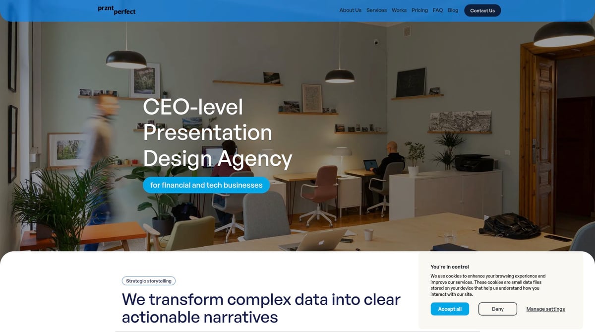
The team specializes in creative consulting, visual storytelling, and marcom design, supporting Fortune 500s and startups alike. With a focus on accessibility and AI-driven design, Prznt Perfect transforms complex data into clear, actionable visuals. Their proven track record includes over $2.3 billion raised through client presentations and consistent five-star ratings for creativity and reliability.
Executives, CMOs, and founders benefit from flexible support and predictable, high-quality outcomes in every chart presentation design engagement.
Future-Proofing Your Chart Presentation Skills: Expert Tips for 2026 and Beyond
Staying ahead in chart presentation design requires an agile mindset and a willingness to embrace change. As the field evolves rapidly, professionals who proactively sharpen their skills can deliver more impactful, memorable presentations.
Continuous Learning and Trend Monitoring
To excel in chart presentation design, continuous learning is crucial. Design trends, technology, and audience expectations shift quickly. Make it a habit to track emerging innovations by subscribing to reputable sources and attending industry webinars.
For example, following Data Visualization Trends 2026 provides early insights into AI-driven tools and real-time storytelling, helping you anticipate changes before they become mainstream. Early adopters of new approaches often gain a distinct competitive edge in their presentations.
Regularly review annual reports from leaders like Gartner or Forrester. These resources spotlight tools, techniques, and best practices that shape the future of chart presentation design.
Gathering and Implementing Feedback
Feedback is a powerful driver of improvement in chart presentation design. Use structured methods such as user testing, analytics, and audience surveys to gather actionable insights. For instance, A/B testing interactive versus static charts in your presentations can reveal which format enhances clarity and engagement.
Make adjustments based on real data, not just intuition. Feedback-driven revisions often lead to a 35% increase in audience comprehension. Building a culture of iteration ensures that each chart presentation design becomes sharper and more effective over time.
Encourage colleagues and stakeholders to share specific suggestions. Their perspectives can uncover blind spots and spark creative solutions you might overlook.
Building a Chart Design System
Consistency is key to scaling chart presentation design across teams and projects. Developing a robust design system—complete with reusable templates, style guides, and component libraries—streamlines workflows and ensures cohesive visuals.
Tech companies often standardize dashboard components to maintain brand alignment and efficiency. Incorporating foundational advice from resources like Simple PowerPoint design principles can help you craft effective templates that prioritize clarity and minimalism.
A well-documented chart design system reduces time spent on repetitive formatting and allows designers to focus on storytelling and data accuracy. It also simplifies onboarding for new team members.
Networking with Industry Leaders and Communities
Connecting with peers accelerates growth in chart presentation design. Join forums, attend conferences, and participate in LinkedIn groups dedicated to data visualization. Sharing experiences and challenges with fellow professionals sparks innovation and builds a strong support network.
Speaking at events like the Data Visualization Society or contributing to online discussions can raise your profile and expose you to fresh ideas. Peer learning often leads to breakthroughs that transform your approach to chart presentation design.
Stay open to mentorship and collaboration opportunities. Industry leaders can offer guidance and feedback that propel your skills to the next level.
Experimentation and Creative Risk-Taking
Innovation thrives when you step outside your comfort zone. Experiment with new chart types, hybrid formats, and unconventional visual elements. For example, blending infographics with traditional graphs can create standout presentations that capture attention.
Encourage a spirit of creative risk-taking within your team. Embracing experimentation is what sets exceptional chart presentation design apart from the ordinary.


- This is some text inside of a div block.lay out the facts clearly and compellingly. Use data to establish the ground reality, but remember that facts alone are like the individual strands of a tapestry—necessary but not complete.lay out the facts clearly and compellingly. Use data to establish the ground reality, but remember that facts alone are like the individual strands of a tapestry—necessary but not complete.
- This is some text inside of a div block.lay out the facts clearly and compellingly. Use data to establish the ground reality, but remember that facts alone are like the individual strands of a tapestry—necessary but not complete.

