
Beautiful Presentation PowerPoint Design Guide

Creating a beautiful presentation powerpoint has become essential for businesses seeking to make meaningful connections with investors, clients, and stakeholders. In an era where attention spans are measured in seconds, the visual impact of your slides can determine whether your message resonates or falls flat. For financial and tech companies navigating complex topics, the challenge extends beyond simply making slides look attractive-it requires transforming intricate data and sophisticated concepts into clear, compelling visual narratives that drive decision-making and inspire action.
The Foundation of Visual Excellence
Every beautiful presentation powerpoint begins with a solid understanding of design fundamentals that transcend temporary trends. These principles form the bedrock upon which all effective visual communication stands, regardless of industry or audience.
Strategic color selection serves as the cornerstone of presentation aesthetics. Financial presentations benefit from sophisticated palettes that convey trust and stability-deep blues, charcoal grays, and strategic accent colors that highlight key metrics without overwhelming viewers. Tech companies often leverage bolder combinations that reflect innovation while maintaining readability across projection systems and screens.
Typography choices carry equal weight in the visual hierarchy. Sans-serif fonts like Helvetica, Montserrat, or Inter provide clean readability for body text, while carefully selected display fonts can add personality to section headers. The American Express guide on PowerPoint design emphasizes maintaining consistency throughout slides, limiting presentations to two or three complementary typefaces maximum.
White Space as a Design Element
Professional designers understand that what you leave out matters as much as what you include. Strategic use of negative space allows your content to breathe, directing viewer attention to critical information without visual clutter.
Consider these benefits of generous white space:
When presenting quarterly earnings or technical specifications, the temptation to fill every pixel with information can be overwhelming. Resist this impulse. A well-designed slide with focused content surrounded by thoughtful spacing communicates confidence and control.

Data Visualization That Communicates
For financial and tech businesses, data forms the foundation of most presentations. Transforming spreadsheets into visual stories requires both technical skill and artistic sensibility to create a beautiful presentation powerpoint.
Visualization TypeBest Use CaseDesign ConsiderationLine ChartsTrends over time, financial performanceLimit to 3-4 lines maximum for clarityBar ChartsComparisons, market share analysisUse consistent color coding throughoutPie ChartsProportional relationships (limited use)Restrict to 5 segments or fewerHeat MapsComplex datasets, user behaviorChoose accessible color gradientsInfographicsProcess flows, customer journeysBalance visual interest with information
Modern audiences expect sophisticated data presentation that goes beyond default chart templates. Custom-designed visualizations aligned with brand guidelines create cohesive narratives. Microsoft's PowerPoint design ideas for 2026 highlight the growing importance of interactive elements and animated data reveals that maintain engagement during lengthy presentations.
When working with professional PowerPoint services, designers apply advanced techniques like data annotation, progressive disclosure, and strategic color highlighting to ensure your numbers tell compelling stories rather than overwhelming viewers.
Selecting the Right Chart for Your Message
Not all data deserves equal treatment. A beautiful presentation powerpoint requires matching visualization methods to communication goals. Revenue growth over five years demands different treatment than customer demographic breakdowns or product feature comparisons.
Before defaulting to familiar chart types, consider what story the data tells. Is it about change, composition, relationship, or distribution? This fundamental question should drive every visualization decision.
Layout Strategies for Professional Impact
Slide layout determines how effectively your audience absorbs information. Cookie-cutter templates broadcast amateur hour, while thoughtful layout approaches for PowerPoint demonstrate strategic thinking and attention to detail.
The rule of thirds applies as powerfully to presentation design as it does to photography. Positioning key elements along imaginary grid lines creates natural visual interest and guides viewer attention. For pitch decks targeting venture capital firms, this principle helps structure slides that balance compelling visuals with essential financial projections.
Grid systems provide the invisible framework supporting beautiful presentation powerpoint designs. A consistent 12-column grid ensures alignment across all slides, creating visual harmony even as content varies dramatically from section to section. This structured approach proves particularly valuable when presenting technical specifications or multi-variable comparisons.
Asymmetric Balance for Dynamic Slides
While symmetry offers safety and stability, asymmetric layouts inject energy and movement into presentations. Tech companies showcasing innovative products or disruptive technologies benefit from layouts that mirror their forward-thinking positioning.
Consider these asymmetric approaches:
The Ethos3 presentation design tips reinforce the importance of purposeful design choices rather than arbitrary decoration. Every layout decision should support your message, not distract from it.
Color Psychology and Brand Alignment
Color selection transcends aesthetic preference-it triggers psychological responses that influence how audiences perceive your message and organization. A beautiful presentation powerpoint leverages color theory to reinforce brand identity while optimizing emotional impact.
Financial institutions traditionally embrace blues and grays that communicate trustworthiness and stability. However, fintech disruptors often incorporate vibrant accent colors suggesting innovation and accessibility. The key lies in strategic application: dominant colors establish mood, while accent colors highlight critical information and calls to action.
Accessibility considerations cannot be overlooked. Approximately 8% of men and 0.5% of women experience some form of color vision deficiency. Presentations relying solely on color to convey information exclude a significant portion of potential audiences. Effective designs incorporate additional cues-icons, patterns, labels-ensuring everyone receives your complete message.
When developing fintech pitch decks, color choices must balance disruption with credibility. Too conservative, and you risk appearing outdated. Too bold, and you may undermine investor confidence in your fiscal responsibility.

Creating Custom Color Palettes
Move beyond PowerPoint's default themes by developing custom palettes aligned with brand guidelines. Start with your primary brand colors, then expand using complementary and analogous relationships on the color wheel.
Palette ComponentPurposeExample ApplicationPrimary Brand ColorMain headings, key metricsFinancial growth percentagesSecondary Brand ColorSubheadings, section breaksChapter dividers, category labelsNeutral BaseBody text, backgroundsParagraph content, slide foundationsAccent Color 1Positive data, success storiesRevenue increases, achievement highlightsAccent Color 2Contrasting informationCompetitive comparisons, alternative scenarios
Professional designers test color combinations across multiple devices and projection systems before finalizing palettes, ensuring consistency whether viewed on mobile devices, laptops, or conference room screens.
Typography That Enhances Readability
Font selection dramatically impacts whether your beautiful presentation powerpoint communicates effectively or creates barriers to comprehension. The DesignCrowd design tips for PowerPoint emphasize simplicity and purpose in typographic choices.
Hierarchy establishes importance. Slide titles should be immediately distinguishable from body text, which differs from captions and annotations. This visual ranking system allows audiences to quickly scan slides and identify key takeaways even during rapid-fire presentations.
Font size matters more than many presenters realize. While 18-point text might appear adequate on your laptop, audience members in the back rows of conference rooms need larger type. Professional standards recommend minimum 24-point for body text and 36-point or larger for headings.
Font Pairing Strategies
Combining typefaces requires understanding their personalities and ensuring they complement rather than compete. Successful pairings typically match a distinctive display font with a neutral, highly readable body font.
Popular combinations for business presentations include:
Consistency across slides reinforces professionalism. Once you establish typographic standards, maintain them throughout the presentation. Unexpected font changes signal amateur design and distract from your message.
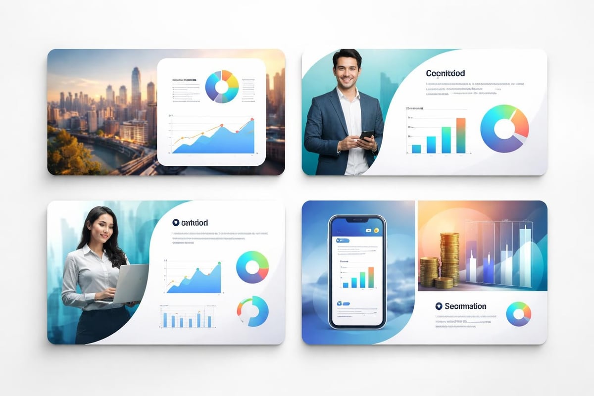
Image Selection and Integration
Photography and graphics transform abstract concepts into tangible realities, making them essential components of any beautiful presentation powerpoint. However, poor image choices undermine credibility faster than almost any other design mistake.
Authentic imagery resonates more powerfully than generic stock photography. When possible, use custom photography featuring your actual products, team members, or office environments. For concepts requiring illustration, invest in professional assets that align with your brand aesthetic rather than settling for overused stock images that audiences have seen countless times.
Image quality cannot be compromised. Pixelated, low-resolution graphics broadcast lack of attention to detail and professionalism. Ensure all images meet minimum resolution requirements: 1920x1080 pixels for full-slide backgrounds, with proportional scaling for smaller applications.
When creating cybersecurity pitch decks, imagery must balance accessibility with technical sophistication. Abstract representations of data security work better than cliché lock-and-key visuals that feel dated and oversimplified.
Strategic Image Placement
Images serve multiple functions within presentations: establishing mood, illustrating concepts, providing visual relief from dense information, and creating memorable moments. Each application requires different treatment.
Full-bleed background images create immersive experiences but demand careful text overlay consideration. Ensure sufficient contrast between background and foreground elements through darkening filters, gradient overlays, or strategic positioning of text in less busy image areas.
Animation and Transition Considerations
Motion adds dimension to static slides, but restraint separates professional presentations from amateur efforts. A beautiful presentation powerpoint uses animation purposefully-to reveal information progressively, demonstrate processes, or emphasize critical points.
Entrance animations should be subtle and quick. Fade and wipe effects work better than flashy spins or bounces that feel gimmicky. For financial data reveals, consider using progressive disclosure that builds complex charts element by element, allowing audiences to absorb information in digestible chunks.
Transition consistency matters. Select one or two transition styles and apply them uniformly throughout the presentation. Random transitions between slides create jarring experiences that interrupt narrative flow and diminish perceived professionalism.
When showcasing new PowerPoint design approaches, remember that cutting-edge aesthetics should enhance rather than overshadow content. Animation serves the message, not the designer's desire to showcase technical capabilities.
Template Development and Maintenance
Consistent templates ensure every presentation your organization produces meets quality standards while streamlining creation processes. Developing comprehensive template libraries pays dividends through time savings and brand consistency.
Master slide design establishes the framework supporting all content slides. This includes header and footer treatments, logo placement, slide number formatting, and standard layouts for common content types: title slides, section dividers, content slides, image-focused slides, and data visualization slides.
Version control prevents template drift over time. As brands evolve and design trends shift, updating master templates ensures all presentations reflect current standards. Organizations should review and refresh templates annually, incorporating lessons learned from recent presentations and emerging design best practices.
The Old Dominion University presentation best practices highlight the importance of consistency in creating professional presentations that audiences trust and remember.
Building a Template Library
Different presentation contexts demand different approaches. Rather than forcing all content into a single template, develop a suite of options addressing common scenarios:
Each template variation maintains core brand elements while optimizing layout and emphasis for specific communication goals.
Advanced Design Techniques for 2026
Presentation design continues evolving as technology advances and audience expectations shift. Staying current with emerging trends while maintaining timeless design principles creates presentations that feel fresh without appearing trendy.
Interactive elements transform passive viewing experiences into engaging explorations. Embedded calculators allowing investors to model different scenarios, clickable navigation enabling non-linear story paths, and integrated video content providing deeper context all elevate presentations beyond traditional slide progressions.
Micro-interactions add polish through subtle animations responding to user actions. Hover states on clickable elements, animated iconography that reinforces concepts, and smooth transitions between presentation sections create cohesive experiences that feel intentionally crafted.
For organizations seeking to understand how to create the best PPT presentations, embracing these advanced techniques while maintaining focus on core communication objectives delivers optimal results.
Incorporating Multimedia Strategically
Video integration within slides provides powerful storytelling opportunities but requires careful execution. Keep clips brief (under 90 seconds), ensure audio quality meets professional standards, and always have fallback plans for technical difficulties.
Audio considerations extend beyond embedded videos. Background music during pre-presentation loops can set appropriate moods, while sound effects highlighting key moments create memorable emphasis. However, use audio sparingly-poorly implemented sound design distracts more than it enhances.
Design Collaboration and Feedback
Creating a beautiful presentation powerpoint rarely happens in isolation. Effective collaboration between subject matter experts, executives, and design professionals ensures presentations communicate accurately while maintaining visual excellence.
Structured feedback processes prevent endless revision cycles. Establish clear review stages: content development, initial design, refinement, and final approval. At each stage, stakeholders provide specific, actionable feedback rather than subjective preferences.
Design rationale documentation helps stakeholders understand choices that might initially seem counterintuitive. When designers explain why certain layouts, colors, or typographic treatments best serve communication objectives, non-designers develop appreciation for professional expertise and question fewer decisions.
Collaboration StagePrimary FocusKey ParticipantsContent StrategyMessage architecture, key pointsExecutives, subject matter expertsDesign DirectionVisual concept, brand alignmentDesign team, marketing leadershipDraft ReviewContent accuracy, visual effectivenessAll stakeholdersRefinementDetail optimization, polishDesign team, content ownersFinal ApprovalQuality assurance, sign-offExecutive leadership
Tools like collaborative presentation platforms, design system libraries, and version control systems streamline this process while maintaining clear accountability.
Testing and Optimization
Even beautifully designed presentations can fail if not tested across actual presentation conditions. Run-throughs in target environments reveal issues invisible on design workstations.
Display compatibility testing ensures slides appear correctly across different projection systems, screen resolutions, and aspect ratios. Colors that look perfect on calibrated monitors may shift dramatically when projected. Fonts render differently across operating systems. What works brilliantly on a 27-inch display might become illegible on a conference room screen viewed from 30 feet away.
Load time considerations matter for presentations incorporating high-resolution images, embedded videos, or complex animations. Test file performance on typical hardware, not just high-end design workstations. Stuttering animations or slow slide transitions undermine professionalism and disrupt presentation flow.
Accessibility testing extends beyond color contrast. Verify that presentations work effectively for audiences with various needs: screen reader compatibility, keyboard navigation for interactive elements, and alternative text for all meaningful images.
Maintaining Design Consistency at Scale
Organizations producing dozens or hundreds of presentations annually face unique challenges maintaining quality and consistency. Systematic approaches prevent quality erosion while empowering diverse creators.
Brand guidelines specific to presentations supplement general brand standards with slide-specific direction. These documents address PowerPoint-specific considerations: animation standards, chart styling conventions, photography usage rules, and template selection criteria.
Training programs elevate internal capabilities, teaching team members presentation design fundamentals even when professional designers handle high-stakes projects. Understanding basic principles helps everyone recognize and avoid common mistakes while appreciating professional expertise.
Quality assurance checkpoints catch issues before presentations reach external audiences. Simple checklists verifying template compliance, proofreading completion, multimedia functionality, and file optimization prevent embarrassing mistakes that damage credibility.
Mastering the elements that comprise a beautiful presentation powerpoint requires balancing artistic sensibility with strategic communication objectives, always keeping your audience's needs at the forefront. Whether you're building internal capabilities or seeking expert partnership, Prznt Perfect specializes in transforming complex financial and technical concepts into visually stunning presentations that drive results, combining creative excellence with deep understanding of what makes business audiences engage, trust, and take action.


- This is some text inside of a div block.lay out the facts clearly and compellingly. Use data to establish the ground reality, but remember that facts alone are like the individual strands of a tapestry—necessary but not complete.lay out the facts clearly and compellingly. Use data to establish the ground reality, but remember that facts alone are like the individual strands of a tapestry—necessary but not complete.
- This is some text inside of a div block.lay out the facts clearly and compellingly. Use data to establish the ground reality, but remember that facts alone are like the individual strands of a tapestry—necessary but not complete.

