


Challenge
This growing quantum cybersecurity company came to us at a pivotal stage of its journey. As it prepared for its next fundraising round, its existing brand identity no longer reflected the maturity of the business, the sophistication of its technology, or the ambitions of the team.
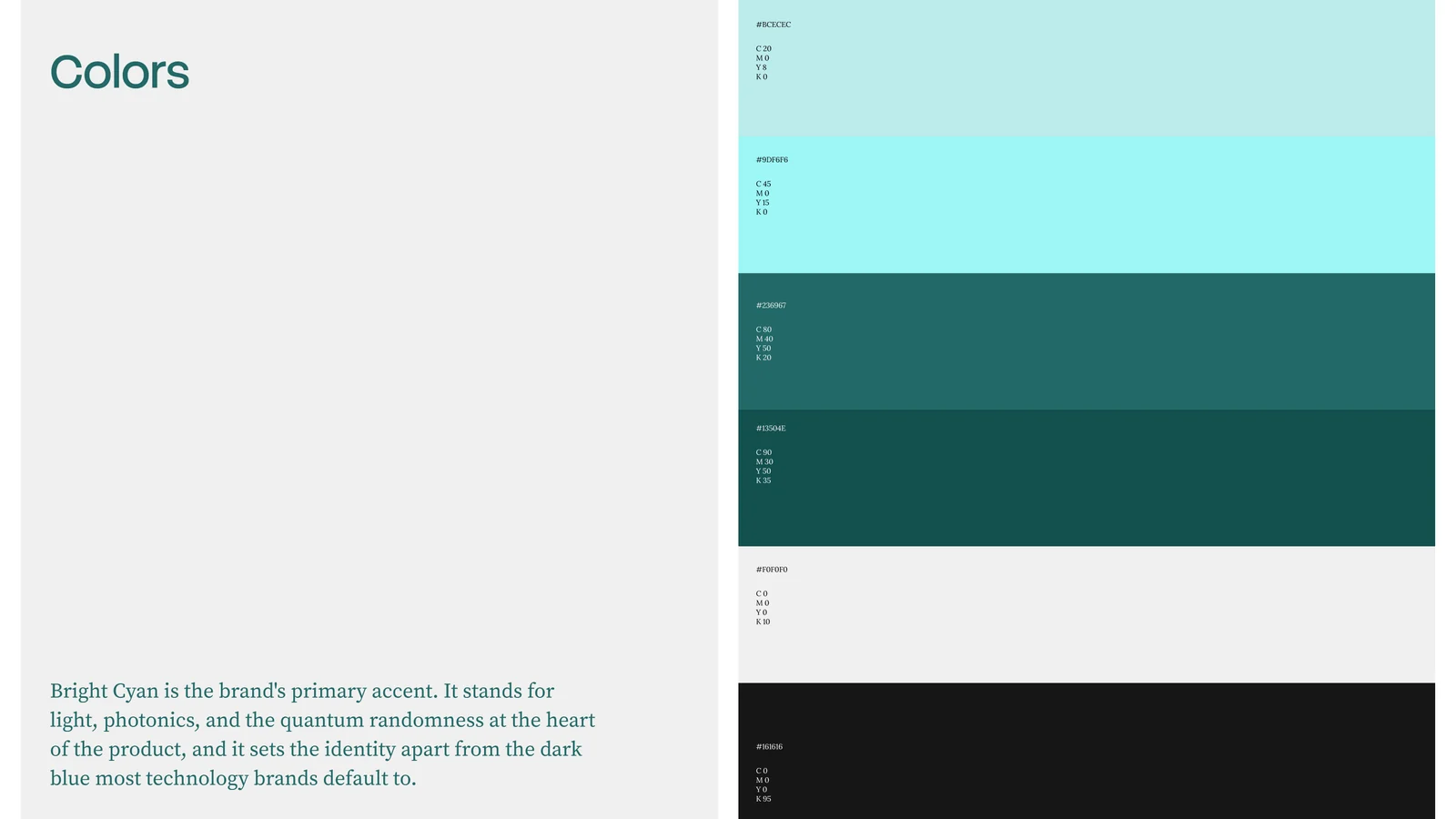
Strategy
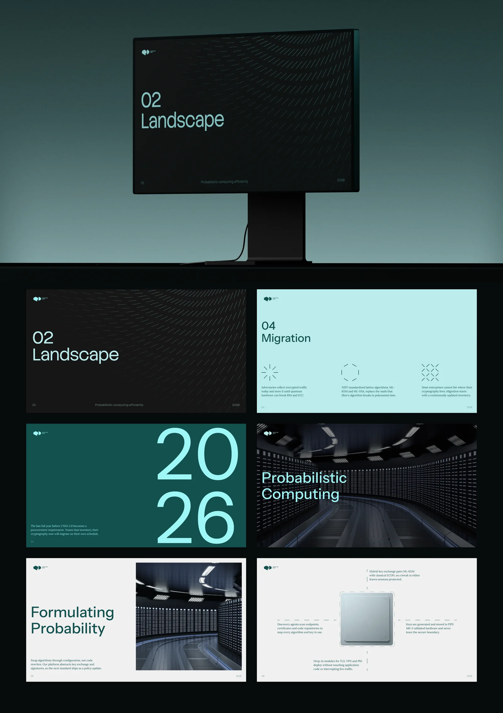
Our goal was to build a new brand foundation that would position the company as an established player in the cybersecurity and semiconductor ecosystem, inspire confidence among investors and enterprise customers, and remain scalable through the company's next several years of growth. Beyond the visual identity itself, the project established a coherent brand system that could be applied consistently across every touchpoint, from the website and social channels to presentations, marketing collateral, and industry events.
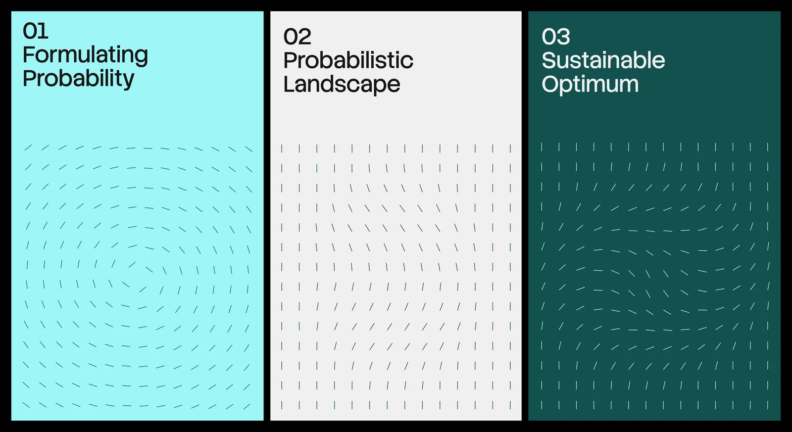
From tone of voice to visual language
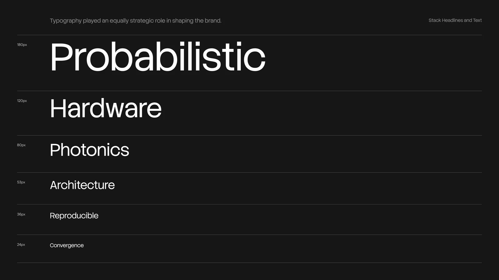
Building a long-lasting brand in B2B deep tech starts with defining a visual language that reflects the company's personality as well as its technology. Through a series of strategy workshops, we established the core attributes that would guide every design decision: credible, category-defining, high-performance, modern, and quietly confident.
A new compute category, that is already real now.
The challenge then became translating these abstract qualities into a visual system that would feel distinctive without relying on generic "quantum" aesthetics.
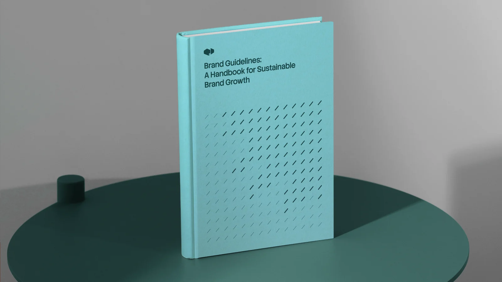
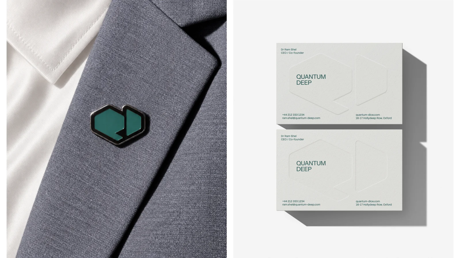
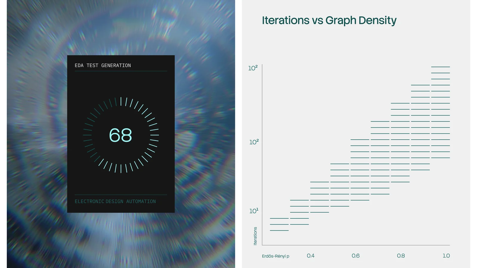
Visual language
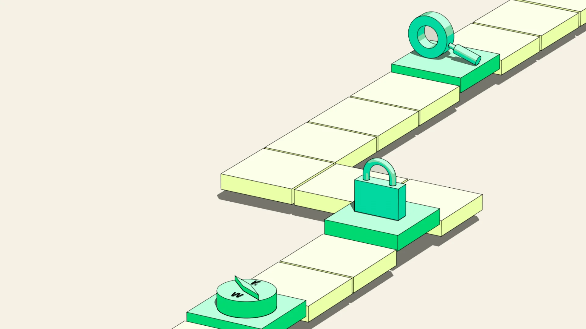
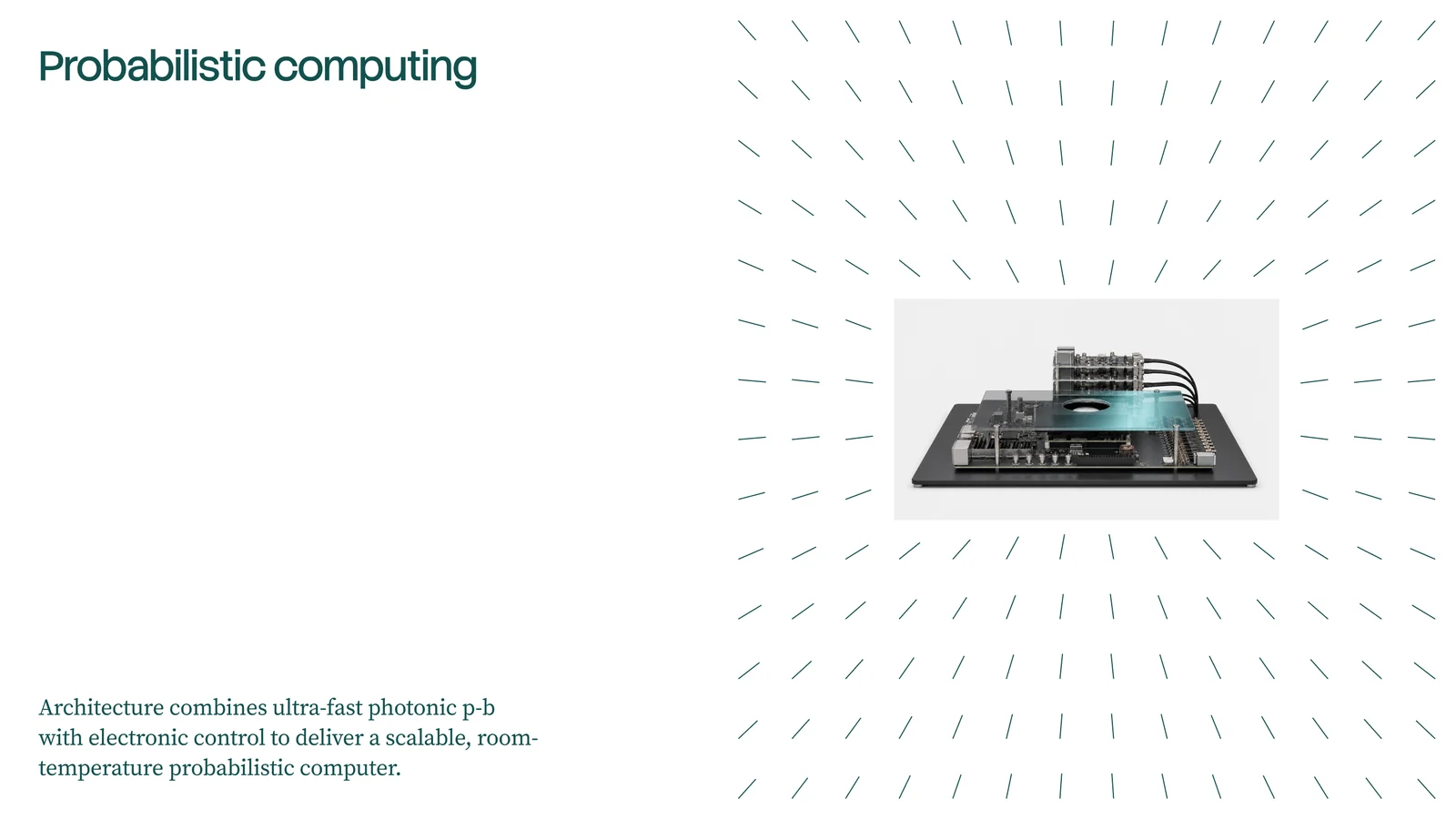
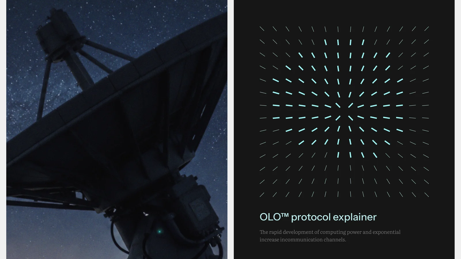
Rather than illustrating quantum mechanics literally, we developed a visual metaphor inspired by probability, photonics, and structured uncertainty. The resulting graphic language balances precision with unpredictability, creating a system that is both scientifically grounded and instantly recognizable across digital, print, and event applications. This flexible visual foundation extends naturally into patterns, iconography, branded environments, motion, and marketing collateral, ensuring consistency across every brand touchpoint.