

Context
Most AI agents can look things up, but few can learn from what they have done. Our client builds the memory layer that closes that gap: agents keep a record of what happened, tell established facts apart from their own conclusions, and revise those conclusions as new evidence comes in. It is serious infrastructure, sold to technology leaders who have little time and a long list of vendors.
We built the brand identity and launch kit around one idea, memory that builds up: a design system, a technical deck, a whitepaper and an AI-powered icon generator. Each piece had to hold up for the engineer checking the details and for the executive who reads only the headlines.
Challenge
Agent memory was still a new and noisy category. Buyers often grouped our client’s platform with simpler technologies for storing and retrieving AI data, reducing conversations to feature comparisons and pricing. Meanwhile, sales, product and leadership were each telling a slightly different story about the company.
When we joined the project, we had little to work with: a handful of plain-text documents describing the product and a wiki-style website with just the foundations of a brand identity (a logo and a few core colors).
The client needed a scalable brand framework and visual system that could communicate complex technical concepts, bring consistency to the story across teams, and still hold an executive reader’s attention.
Discovery and reframing
We audited existing assets against the competitive set, and one pattern kept recurring: teams that added memory early moved from pilot to production faster. The buyers' real problem sat at strategy level, and the platform could answer it.
That reframed the category question. We moved the client out of the tooling conversation and into the strategy conversation, positioning memory as the layer that decides whether AI investment compounds over time. A leadership alignment workshop agreed the frame before any design work began.
Brand platform and architecture
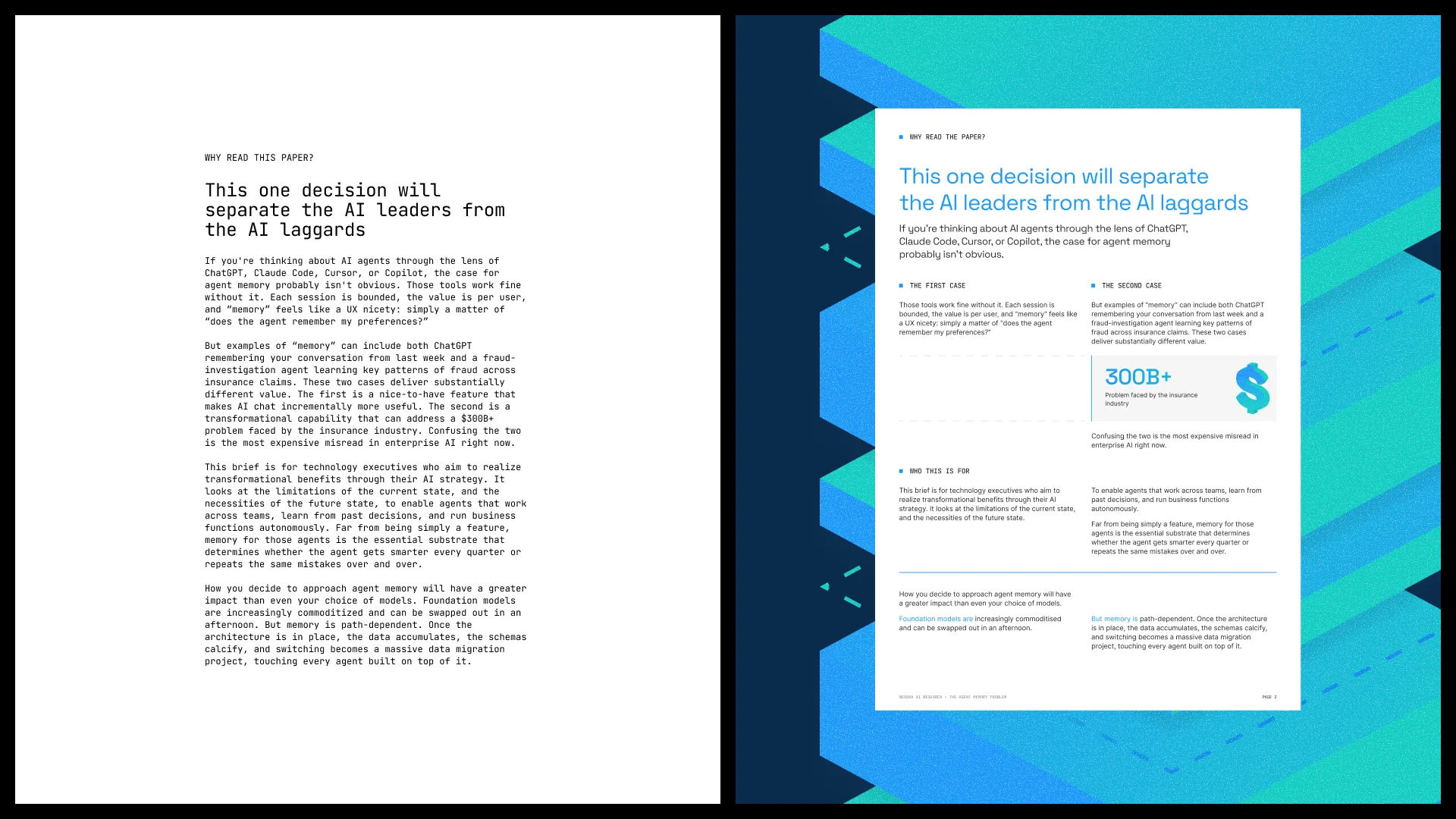
We built the narrative on Andy Raskin's structure: name the shift, show the stakes, describe the promised land. The shift is from isolated AI tools to coordinated agents. The stakes come from the whitepaper: "This one decision will separate the AI leaders from the AI laggards." The promised land is AI that learns across the whole organization.
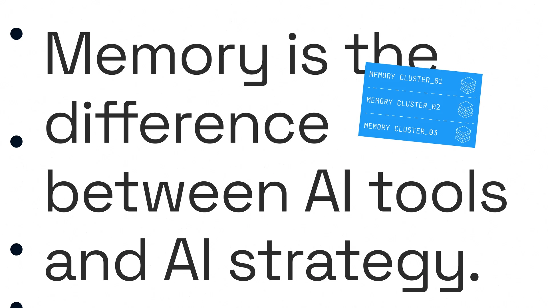
One sentence carries the story: "Memory is the difference between AI tools and AI strategy." Product capabilities come in after it, as the means to reach that future. Every asset now opens from the same line, from the deck's first slide to the whitepaper's introduction.
Around that line, we wrote the platform on one page: purpose, positioning, three pillars and the reasons to believe behind each. A message house set one umbrella message, with pillars for continuity, control and cost. Each pillar is backed by proof that sales engineering can defend in a technical review.
Verbal and visual identity
We set three voice principles: precise, calm and accountable. Tone sliders place the brand toward serious, measured and matter-of-fact, and a we-are/we-are-not table shows where each slider stops.
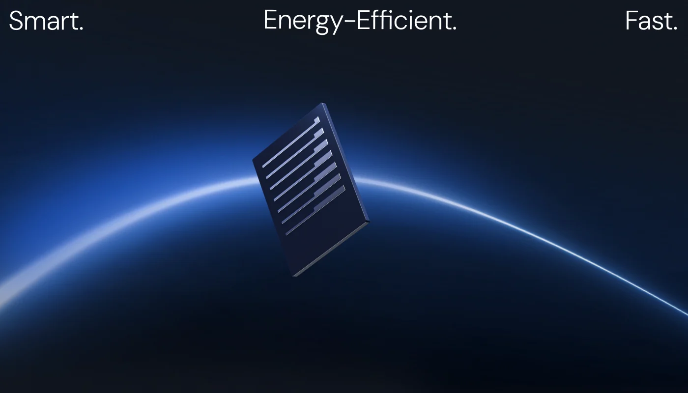
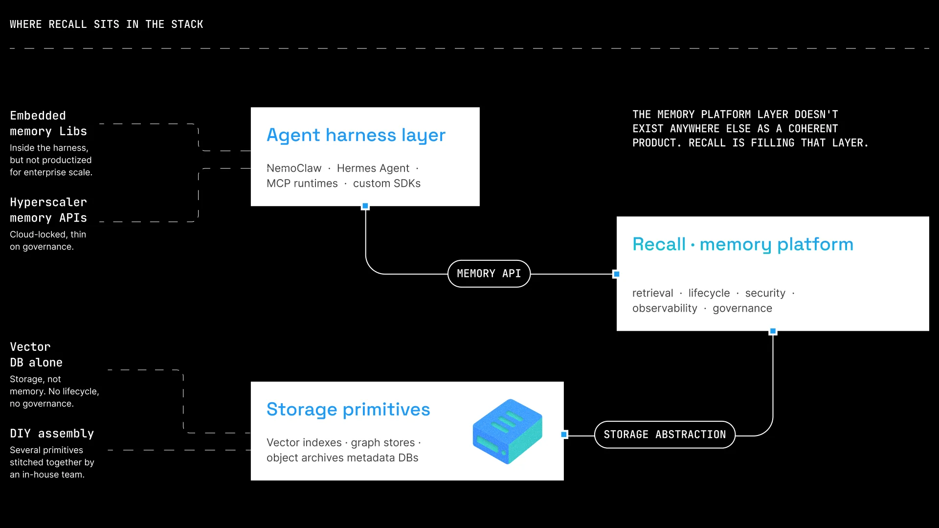
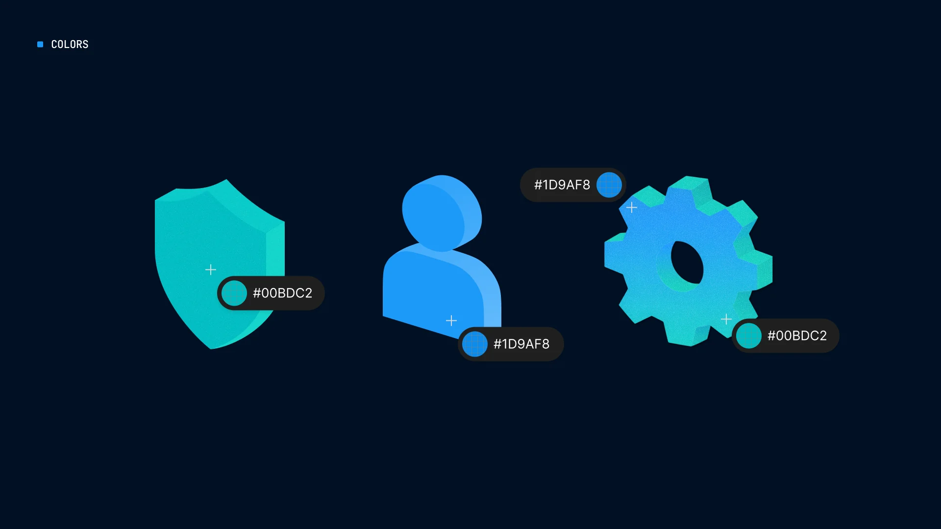
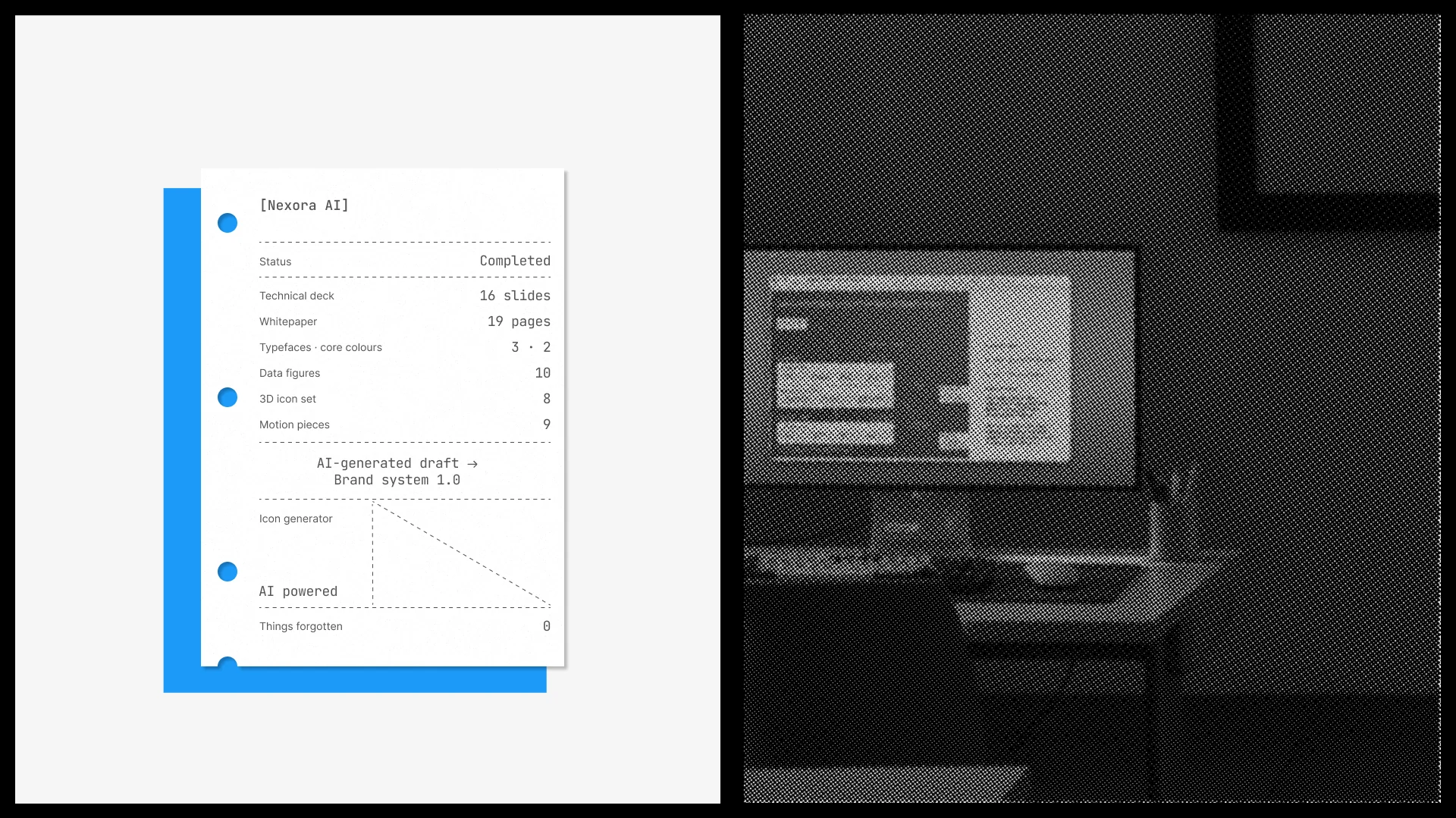
The visual idea comes from the product's mechanism. Stacked 3D layers show memory building up over time and show where the platform sits in the enterprise stack. The same motif shapes the logo construction, the 8 3D icons and the 9 motion pieces, so one metaphor explains the product at every size, in the same calm register as the words.
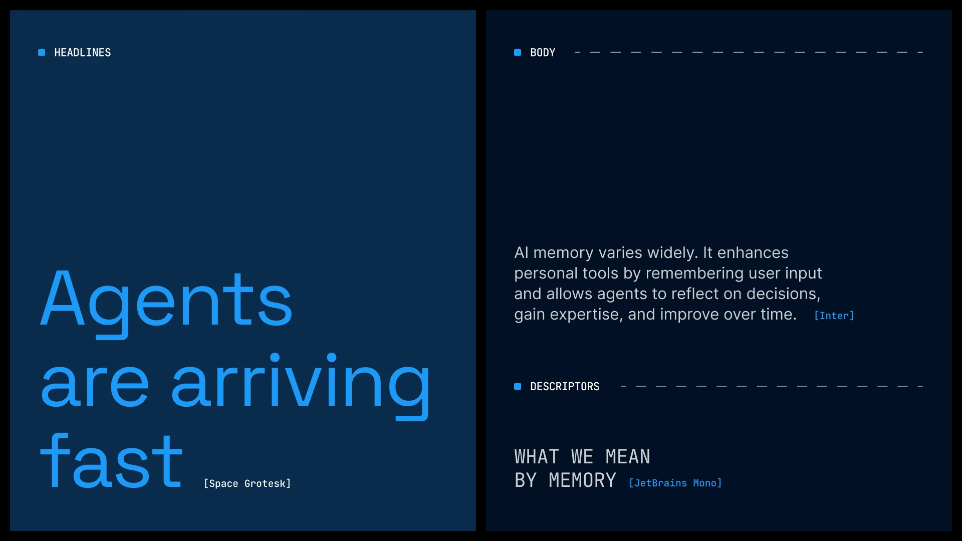
Two core colors carry the system: electric blue #1D9AF8 and teal #00BDC2. Each typeface has one job: Space Grotesk for headlines, Inter for reading text, JetBrains Mono for code and technical labels. An AI-powered icon generator lets the in-house team extend the icon library on-brand, without a new design brief.
Data storytelling
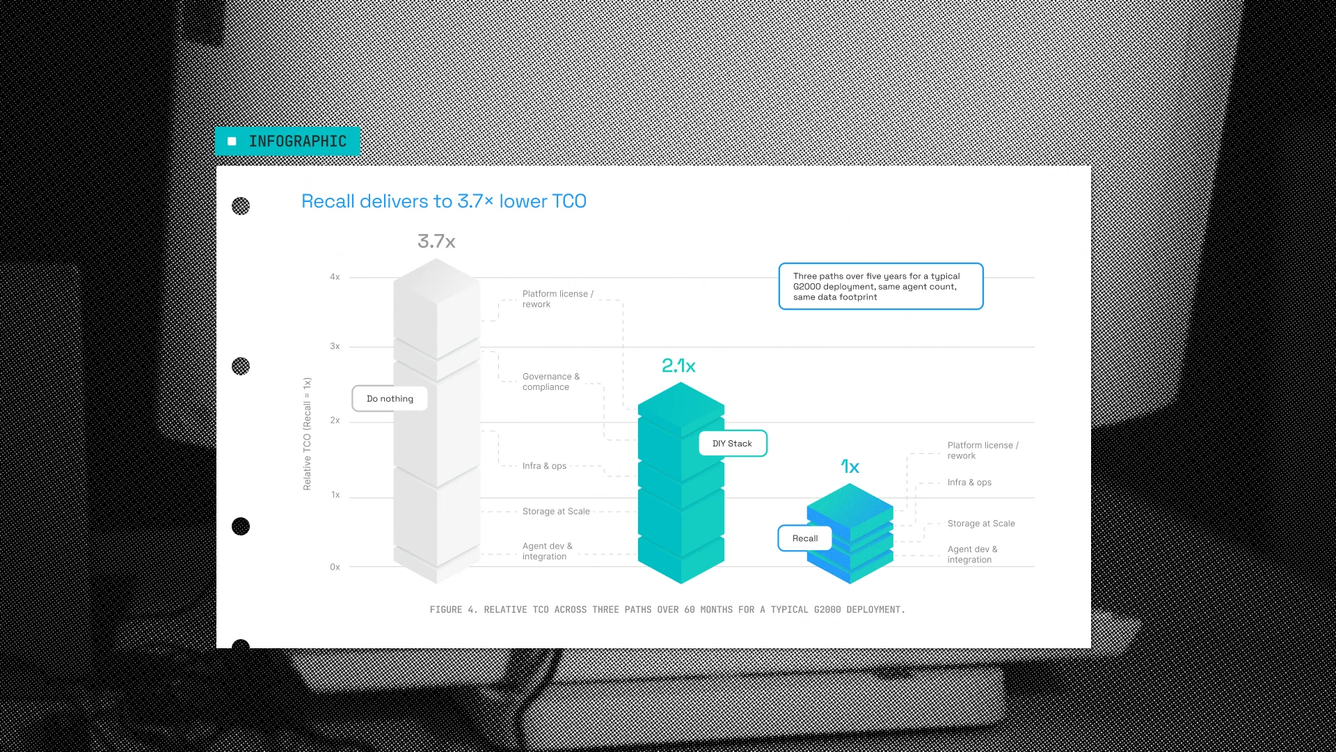
We applied Cole Nussbaumer Knaflic's rule of one message per chart. Each of the 10 data figures has an action title that states its finding, and anything that did not support the finding was removed. Read the titles in order and the argument holds on its own.
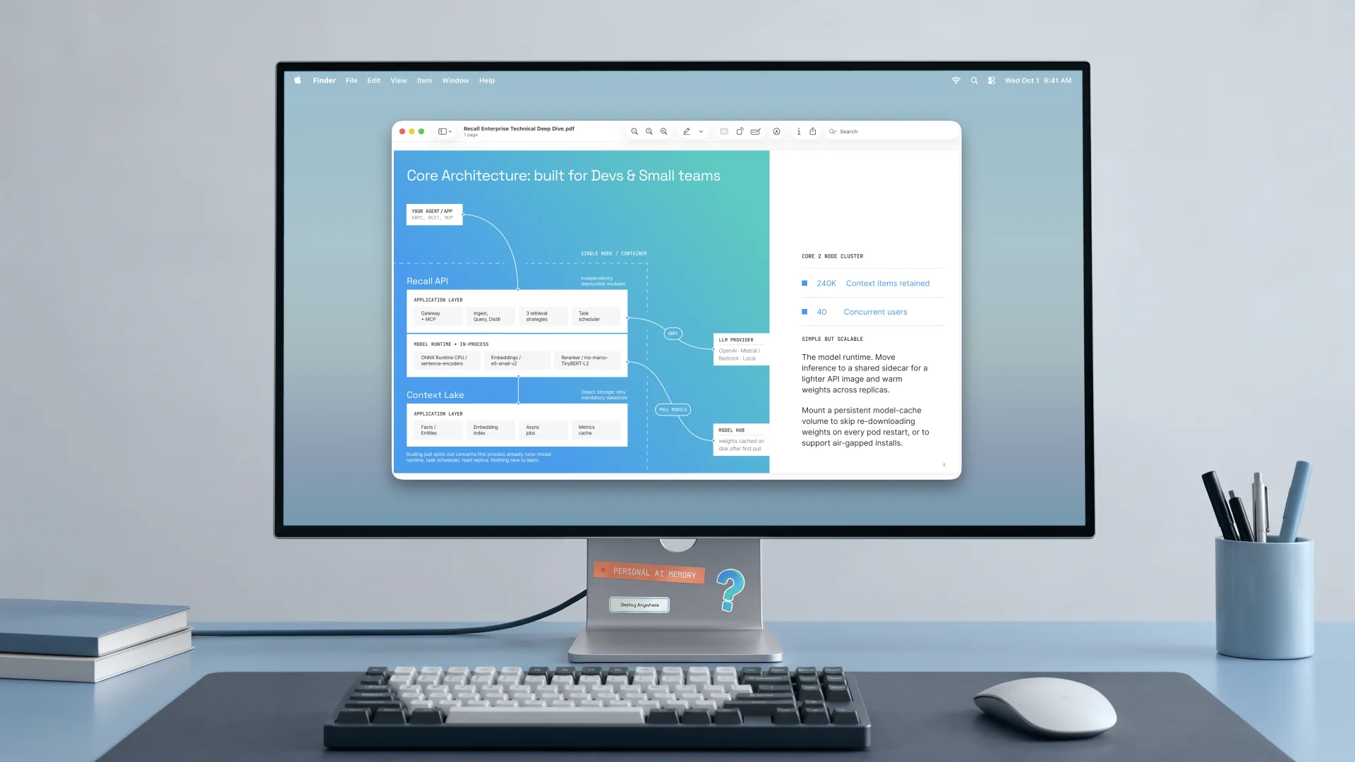
The headline figure is the client's own model: 3.7× lower total cost of ownership over five years for a Global 2000 deployment. We placed it after the stakes and before the action plan, so it answers a question the reader already holds. The "where the platform sits in the stack" diagram gives the CTO the same proof in architectural form.
Deck and whitepaper
The 16-slide technical deck was storylined answer-first, using Barbara Minto's Pyramid Principle with an SCQA opening. Before any design work, we agreed a ghost deck with the founders: titles only, one claim per slide. Design started once the logic held, which kept review rounds short.
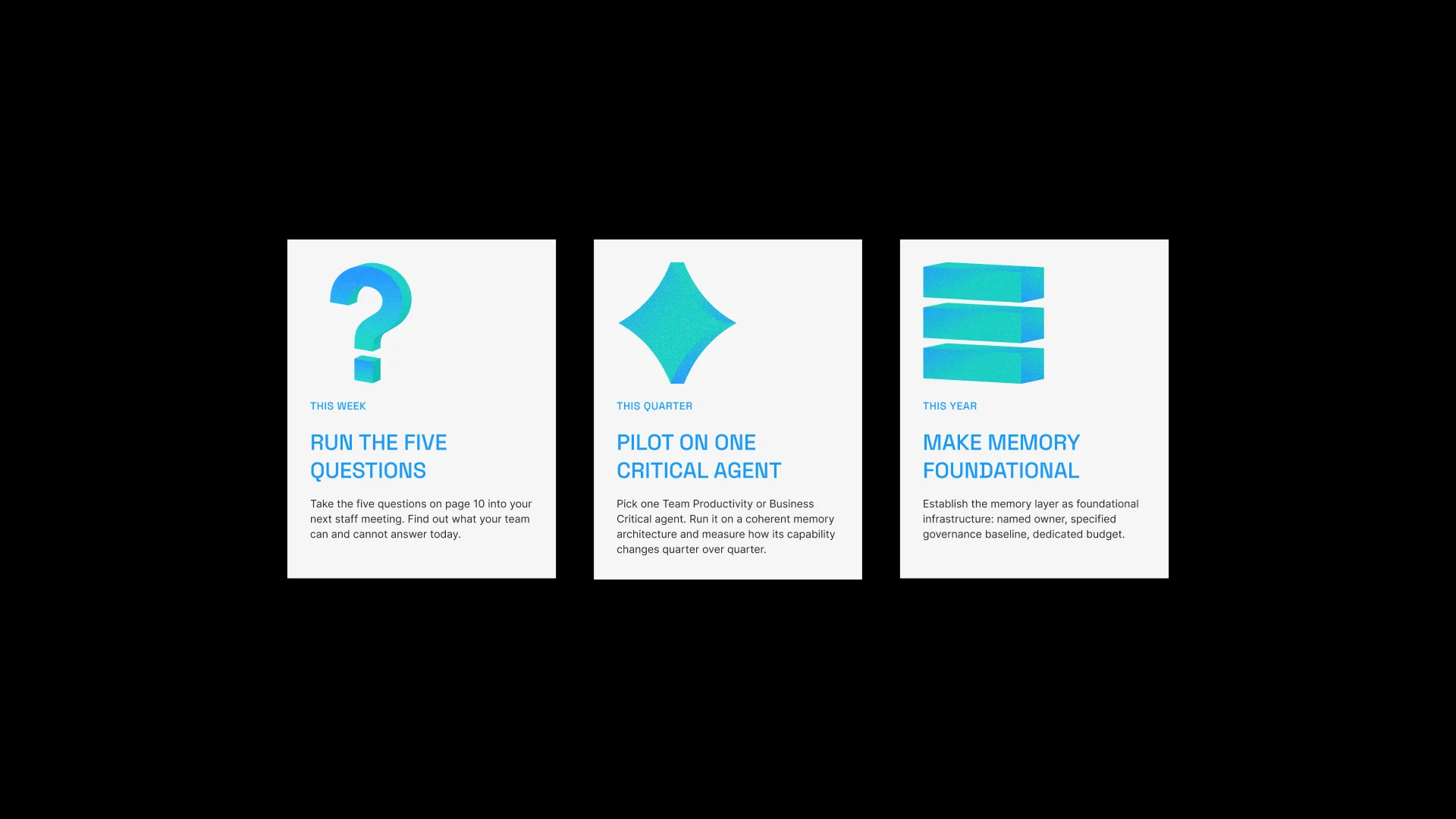
The 19-page whitepaper follows the same spine and ends on an action plan in three horizons: this week, this quarter, this year. That ending turns a thought-leadership document into a decision tool. The executive sponsor finishes reading with a concrete next step to take inside their own organization.
AI got the first draft moving and now powers the icon generator. The argument, the editing and the final call on every page stayed with people, and that is what keeps the voice distinct from the AI-made content the client's buyers already scroll past.
Outcome
The client moved from an AI-generated draft to Brand system 1.0, with one story that leadership, sales and product now tell in the same words. The company now competes in the AI strategy conversation, where budgets and executive sponsors sit. Its narrative is ready for enterprise sales cycles and investor conversations.
The system is built for reuse. Voice rules, the naming logic and the icon generator let the team produce on-brand material and add products without agency support. The evidence sits in a 16-slide deck, a 19-page whitepaper, 10 data figures, 8 3D icons and 9 motion pieces. New assets start from an agreed position, which speeds decisions.
Client and product names are anonymized.