
Top PowerPoint Presentations: Design Insights for 2026

The difference between ordinary slides and top PowerPoint presentations often determines whether your message resonates with investors, clients, or stakeholders. In 2026, the bar for presentation excellence has risen significantly, particularly in the financial and technology sectors where complex data must transform into compelling narratives. Understanding what elevates a presentation from adequate to exceptional requires examining design principles, storytelling techniques, and the strategic use of visual elements that characterize the best work in this field.
Essential Elements That Define Excellence
When analyzing top PowerPoint presentations across financial services and technology companies, several foundational elements consistently appear. These presentations don't just share information; they create experiences that guide audiences through complex concepts with clarity and impact.
Visual hierarchy stands as the cornerstone of effective slide design. The best presentations use size, color, and positioning to direct attention exactly where it needs to go. Headers command attention, supporting text provides context, and data visualizations deliver insights without overwhelming viewers.
Consistent branding throughout the deck reinforces credibility and professionalism. This goes beyond simply placing logos on slides:
- Color schemes that align with brand guidelines while remaining visually appealing
- Typography choices that balance readability with personality
- Design elements that create cohesive visual language
- Spacing and alignment that demonstrate attention to detail
The most successful presentations also master data storytelling, a skill particularly crucial for financial and tech pitch decks where numbers must convince rather than confuse.
The Power of Strategic Simplicity
Top PowerPoint presentations embrace minimalism not as a trendy aesthetic but as a strategic communication tool. Each slide serves a specific purpose, and every element earns its place through contribution to the overall message.
Microsoft's research on effective presentation creation emphasizes that simplicity enhances retention and comprehension. For financial presentations, this means distilling quarterly reports into key performance indicators. For technology companies, it means explaining complex architectures through clear diagrams rather than dense text blocks.
Consider how leading firms structure their slides:
| Element | Traditional Approach | Top-Tier Approach |
|---|---|---|
| Text per slide | 100+ words | 20-30 words maximum |
| Data presentation | Raw spreadsheet data | Interpreted, visualized insights |
| Image usage | Stock photos as decoration | Custom graphics supporting narrative |
| Slide count | 60+ slides for 30 minutes | 1-2 slides per minute of presentation |
This disciplined approach to content curation separates memorable presentations from forgettable ones.
Design Trends Shaping 2026 Presentations
The landscape of presentation design continues evolving, with 2026 bringing refined approaches that balance innovation with functionality. Understanding these trends helps creators develop professional PowerPoint presentations that feel contemporary without sacrificing clarity.
Dynamic data visualization has moved beyond static charts. Top PowerPoint presentations now incorporate animated graphs that reveal insights progressively, allowing presenters to control the narrative flow. Rather than showing complete bar charts or line graphs immediately, the best decks build these visuals step by step, highlighting specific data points as the story unfolds.
Asymmetrical layouts challenge traditional centered designs, creating visual interest while maintaining readability. This approach works particularly well for technology companies showcasing innovative products or services. The latest PowerPoint design ideas for 2026 demonstrate how breaking grid patterns strategically can enhance engagement without sacrificing professionalism.
Color Psychology and Brand Alignment
Color selection in top PowerPoint presentations extends far beyond aesthetic preference. Financial institutions often employ blues and greens to convey trust and growth, while technology startups might leverage purples and oranges to signal innovation and energy.
The most sophisticated presentations use color to:
- Create visual pathways that guide eyes across slides
- Establish emotional resonance appropriate to the message
- Differentiate data categories in complex visualizations
- Maintain accessibility for color-blind viewers
Digital product studios like CollectDev understand this principle when designing both software interfaces and presentation materials, ensuring visual consistency across all brand touchpoints.
Storytelling Architecture for Business Impact
The structure of top PowerPoint presentations follows proven narrative frameworks that maintain audience engagement from opening slide to final call-to-action. These aren't random collections of slides but carefully architected journeys.
The Problem-Solution-Impact Framework
Most successful business presentations, particularly pitch decks, follow this three-act structure:
- Establish the problem with data and real-world examples
- Present your solution with clarity and confidence
- Demonstrate impact through projections, case studies, or testimonials
This framework appears consistently in best PowerPoint presentation examples across industries, adapted to specific audiences and objectives.
For financial services firms, the problem might center on market inefficiencies or unmet customer needs. Technology companies often highlight gaps in existing solutions or emerging opportunities. Regardless of sector, top PowerPoint presentations make the problem tangible before introducing solutions.

Transition and Flow Techniques
Seamless transitions between concepts separate polished presentations from disjointed ones. The best decks use several techniques:
- Visual anchors that carry from one slide to the next
- Consistent iconography that reinforces themes
- Progressive disclosure that builds complexity gradually
- Callback slides that reference earlier points to strengthen arguments
These techniques create cohesion, helping audiences follow complex arguments without getting lost.
Typography and Readability Standards
Font selection dramatically impacts how audiences perceive and process information. Top PowerPoint presentations adhere to strict typography principles that prioritize clarity while supporting brand identity.
Sans-serif fonts dominate modern business presentations for good reason. Fonts like Helvetica, Arial, Calibri, and newer options like Aptos provide excellent screen readability. Financial presentations often pair a bold sans-serif for headers with a lighter weight for body text, creating clear hierarchy without introducing multiple font families.
Size matters more than most creators realize. The minimum font size for body text should be 24 points, with headers starting at 36 points or larger. This ensures readability even in large conference rooms or virtual meetings where participants might view slides on various devices.
According to Microsoft's formatting guidelines, presentation slides should prioritize scanability over comprehensive detail, using bullet points sparingly and avoiding walls of text that diminish impact.
| Typography Element | Standard Practice | Excellence Standard |
|---|---|---|
| Font families per deck | 3-4 different fonts | 1-2 maximum |
| Minimum body text size | 18 points | 24 points |
| Header hierarchy levels | 4-5 levels | 2-3 levels |
| Text animation | Multiple effects | Subtle or none |
Technical Execution and File Management
Beyond design aesthetics, top PowerPoint presentations demonstrate technical excellence in file structure, compatibility, and delivery. These operational considerations often determine whether beautiful designs function properly in high-stakes situations.
File size optimization ensures presentations load quickly and share easily. Large image files, embedded videos, and complex animations can bloat presentations to hundreds of megabytes. Professional designers compress images appropriately, link to videos rather than embedding them when possible, and test presentations on multiple devices before delivery.
Master slide utilization creates consistency and enables rapid updates. Rather than formatting each slide individually, top-tier presentations leverage PowerPoint's master slide functionality to control global design elements. This approach saves time and ensures perfect consistency across hundreds of slides.
When examining PowerPoint design services, the ability to create scalable, maintainable templates distinguishes professional agencies from amateur designers.
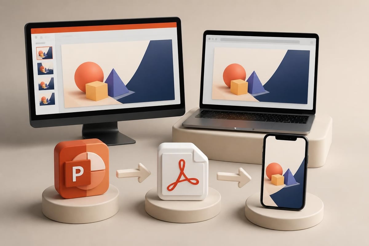
Cross-Platform Considerations
In 2026, presentations rarely live exclusively in PowerPoint. Top presentations consider how content appears across multiple platforms:
- PDF exports for sharing and printing
- Web versions for remote viewing
- Mobile optimization for tablet review
- Video recordings for asynchronous consumption
Smart designers test their work across these formats, ensuring consistent quality regardless of delivery method. The rise of alternative presentation software means creators must also consider how their decks might appear if opened in Google Slides or other platforms.
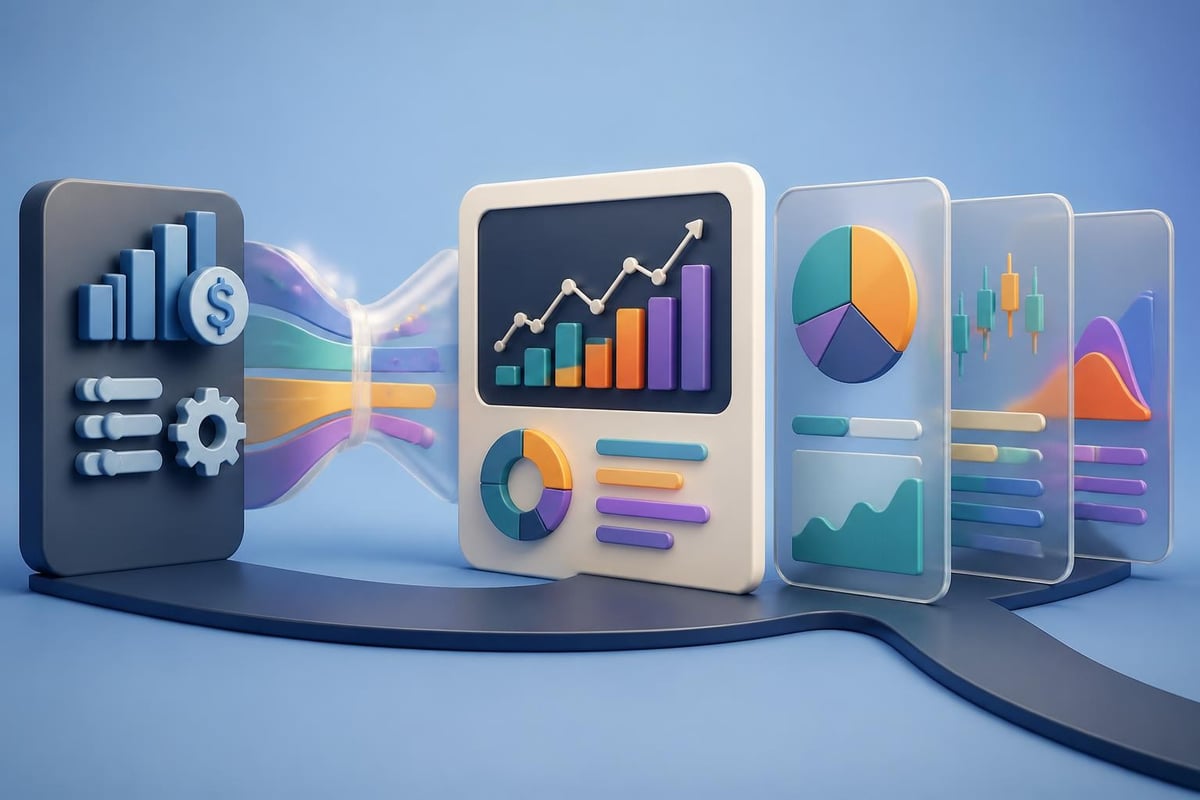
Data Visualization Best Practices
Financial and technology presentations live or die by their ability to make data compelling. Top PowerPoint presentations transform raw numbers into visual insights that drive decision-making.
Chart selection matters immensely. Line graphs excel at showing trends over time, bar charts compare discrete categories, and scatter plots reveal correlations. The best presentations choose chart types that align with the story they're telling rather than defaulting to whatever Excel generates.
Contextual annotation elevates good data visualization to great. Simply showing a revenue growth chart doesn't create impact. Adding annotations that highlight specific quarters, call out notable events, or compare against benchmarks transforms data into narrative.
For companies creating digital products, understanding how to visualize user metrics, conversion funnels, and growth trajectories becomes essential for investor presentations and board meetings.
Avoiding Common Data Mistakes
Even sophisticated presenters fall into visualization traps:
- 3D charts that distort perception and reduce clarity
- Too many data series on a single chart creating confusion
- Inappropriate scales that exaggerate or minimize trends
- Missing context like comparison points or industry benchmarks
The University of New South Wales design tips emphasize clarity and honesty in data presentation, principles that characterize all top PowerPoint presentations.
Industry-Specific Excellence Examples
Different sectors demonstrate excellence in unique ways, though fundamental principles remain consistent. Understanding these nuances helps creators tailor presentations for maximum impact within their industries.
Financial Services Presentations
Top PowerPoint presentations in banking and investment showcase several distinguishing characteristics. They balance regulatory requirements with compelling storytelling, present complex financial models clearly, and maintain conservative aesthetics that reinforce stability and trust.
Compliance considerations influence every design decision. Financial presentations often require disclaimers, regulatory language, and specific disclosures. The best designers integrate these requirements seamlessly rather than tacking them onto slides as afterthoughts.
Scenario modeling appears frequently, showing how different variables affect outcomes. These presentations use color coding and animation to make multiple scenarios understandable without overwhelming audiences.
Technology Sector Presentations
Technology companies push presentation boundaries with innovative designs that reflect their innovative products. However, top PowerPoint presentations in tech still prioritize clarity over cleverness.
Product demonstrations integrate smoothly into narrative flow rather than feeling like tangents. Whether showcasing software interfaces, hardware capabilities, or platform architectures, the best tech presentations make complex functionality feel intuitive and accessible.
Technical architecture slides present particular challenges. Top presentations layer information progressively, starting with high-level overviews before drilling into technical details as needed. This approach respects diverse audience expertise levels without boring sophisticated viewers or losing less technical stakeholders.
Template Selection and Customization
While custom design produces the most distinctive presentations, thoughtfully selected and customized templates can serve as excellent foundations. The key lies in significant modification rather than accepting default designs.
Starting points matter. Generic templates downloaded from free sites rarely align with brand standards or contemporary design principles. Professional templates designed for specific industries provide better foundations, particularly when creators invest time customizing them.
Resources like minimal PowerPoint templates offer clean starting points that require significant customization before becoming truly distinctive. Top PowerPoint presentations built from templates show no obvious signs of their template origins.
Customization Strategies
Transforming templates into original work requires strategic modifications:
- Replace all color schemes with brand-appropriate palettes
- Substitute stock imagery with custom photography or illustrations
- Modify layouts to break from template patterns
- Add unique design elements that reflect brand personality
- Restructure content flow to match specific narrative needs
This level of customization demands design expertise, which explains why many organizations partner with specialists rather than attempting template modification internally.
Presentation Delivery Integration
Design excellence means nothing if delivery falters. Top PowerPoint presentations consider the presentation context from inception, ensuring slides support rather than complicate the speaker's job.
Speaker notes provide value without duplicating slide content. The best presentations include detailed notes that offer talking points, timing guidance, and strategic reminders while keeping slides themselves uncluttered.
Presentation mode optimization ensures smooth delivery. This includes testing animations, confirming video playback, verifying font rendering, and checking how slides appear on projectors or screens. Professional presenters rehearse with their actual equipment whenever possible.
Backup planning distinguishes prepared professionals from amateurs. Top presenters carry presentations in multiple formats, anticipate technical failures, and prepare abbreviated versions for time-constrained situations.
Measurement and Iteration
The best presentation creators treat each deck as an opportunity for learning and improvement. They gather feedback, analyze outcomes, and refine their approaches based on results.
Audience feedback provides invaluable insights. Post-presentation surveys, stakeholder interviews, and outcome analysis reveal what worked and what fell flat. This information guides future design decisions.
A/B testing approaches work even for presentations. When delivering similar presentations to different audiences, varying specific elements and tracking responses helps identify optimal approaches. Does the data-heavy opening engage better than the storytelling start? Do animated charts generate more questions than static ones?
Portfolio analysis of successful presentations reveals patterns. Reviewing top PowerPoint presentations that achieved their objectives, whether securing funding, closing sales, or driving strategic decisions, highlights common elements worth replicating.
Creating presentations that truly stand out requires combining strategic thinking, design expertise, and deep understanding of audience needs. The top PowerPoint presentations of 2026 demonstrate that excellence emerges from disciplined execution of fundamental principles rather than flashy effects or trendy templates. Whether you're preparing a critical pitch deck, quarterly board presentation, or industry conference keynote, Prznt Perfect specializes in transforming complex financial and technical concepts into visually compelling narratives that drive results and resonate with sophisticated audiences.

- This is some text inside of a div block.lay out the facts clearly and compellingly. Use data to establish the ground reality, but remember that facts alone are like the individual strands of a tapestry—necessary but not complete.lay out the facts clearly and compellingly. Use data to establish the ground reality, but remember that facts alone are like the individual strands of a tapestry—necessary but not complete.
- This is some text inside of a div block.lay out the facts clearly and compellingly. Use data to establish the ground reality, but remember that facts alone are like the individual strands of a tapestry—necessary but not complete.

