
Project Plan PPT: Create Professional Presentations

Creating an effective project plan ppt requires more than simply filling slides with task lists and deadlines. For financial and tech businesses, a well-designed presentation transforms complex project methodologies into clear, actionable visual narratives that engage stakeholders, align teams, and drive successful execution. Whether you're presenting to executives, investors, or cross-functional teams, your project plan presentation serves as both a roadmap and a communication tool that can make or break buy-in for critical initiatives. Understanding how to balance comprehensive information with visual clarity is essential for modern business professionals.
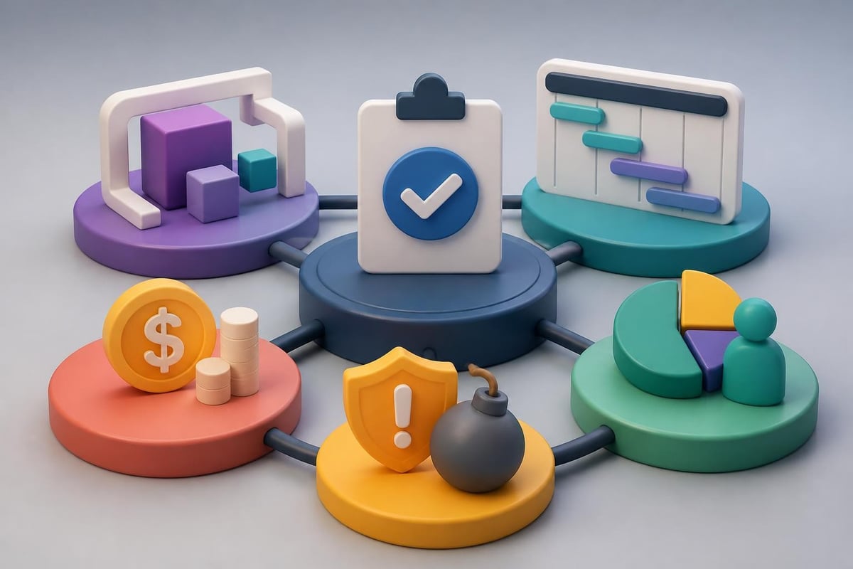
Strategic Elements of an Effective Project Plan PPT
Successful project plan presentations begin with a clear understanding of your audience and objectives. Financial institutions and technology companies demand precision, while also appreciating presentations that communicate efficiently without overwhelming detail.
Defining Core Components
Every comprehensive project plan ppt should include several fundamental elements that establish credibility and clarity. The project scope statement defines boundaries, deliverables, and exclusions. Timeline visualizations show when activities occur and how they interconnect. Resource allocation demonstrates who does what and when they're needed. Risk assessment identifies potential obstacles and mitigation strategies. Budget breakdowns provide financial transparency and accountability.
When structuring these components, consider the information hierarchy. Executives typically need high-level summaries, while project teams require granular details. Creating a modular presentation allows you to adapt content depth based on your audience without rebuilding the entire deck.
Visual Hierarchy and Information Architecture
Design principles for project plan presentations:
- Use consistent color coding to differentiate project phases, teams, or priority levels
- Implement white space strategically to prevent cognitive overload
- Align text and visual elements to create professional polish
- Limit each slide to one primary message or data point
- Choose typography that balances readability with brand alignment
The architecture of your presentation should follow a logical progression. Start with the project overview and strategic context, then move into detailed planning components, and conclude with next steps and stakeholder commitments. This narrative flow helps audiences process information sequentially rather than jumping between disconnected concepts.
Designing Timeline and Gantt Chart Visualizations
Timeline slides represent the backbone of most project plan presentations. These visualizations communicate progress, dependencies, and critical milestones more effectively than text-based schedules. Project planning templates provide structured starting points, though customization ensures alignment with your specific methodology and brand standards.
Creating Effective Gantt Charts
Gantt charts excel at showing task relationships, duration, and resource loading across project phases. However, poorly designed Gantt visualizations can confuse rather than clarify.
| Gantt Chart Element | Best Practice | Common Mistake |
|---|---|---|
| Task Bars | Use distinct colors for different phases or teams | Making all bars the same color |
| Dependencies | Show with clear arrows or connectors | Omitting relationships entirely |
| Milestones | Mark with distinctive icons or diamonds | Burying them among regular tasks |
| Timeline Scale | Match to project duration (days, weeks, quarters) | Using inappropriate granularity |
| Resource Names | Include responsible parties visibly | Leaving assignments ambiguous |
Professional PowerPoint design services understand how to transform standard Gantt templates into branded, audience-appropriate visualizations that enhance rather than detract from your message. The difference between generic templates and custom-designed charts often determines whether stakeholders immediately grasp project scope or struggle to extract meaning.
Timeline Alternatives for Executive Presentations
When presenting to senior leadership, simplified timeline formats often communicate more effectively than detailed Gantt charts. Roadmap visualizations show major milestones across quarters or years without overwhelming detail. Phase-based timelines group activities into strategic stages rather than individual tasks. Swim lane diagrams separate parallel workstreams while maintaining chronological flow.
Choosing the right timeline format:
- Detailed Gantt charts - Project managers and team members who execute work
- High-level roadmaps - Executive stakeholders who approve budgets and strategy
- Milestone timelines - Cross-functional partners who need coordination points
- Swim lane diagrams - Organizations with multiple concurrent initiatives
Templates from resources like Lucen Software offer Gantt-style layouts that can accelerate development, though adapting them to your brand identity and specific project parameters remains essential for professional impact.
Resource Allocation and Budget Presentation Strategies
Financial transparency builds stakeholder confidence, particularly when requesting significant resources or navigating budget constraints. Your project plan ppt must communicate not just what resources you need, but why those investments deliver strategic value.
Visualizing Resource Distribution
Resource allocation slides answer critical questions: Who works on this project? What skills do they bring? When are they available? How much capacity do they have?
Matrix layouts work particularly well for showing team members against project phases or deliverables. Stack bar charts illustrate resource loading across time periods, highlighting potential bottlenecks. Organizational hierarchy diagrams establish reporting relationships and decision-making authority. Skill maps demonstrate capability alignment with project requirements.
For technology companies managing multiple projects simultaneously, resource conflicts often determine feasibility more than technical considerations. Showing resource availability honestly prevents over-commitment and sets realistic expectations.
Budget Breakdown Techniques
Financial stakeholders appreciate budget presentations that balance transparency with digestibility. Avoid simply listing expense categories. Instead, connect financial investments to project outcomes and business value.
Effective budget visualization approaches:
- Waterfall charts showing cumulative costs building across phases
- Pie charts for major expense category proportions
- Comparison tables contrasting planned versus allocated budgets
- Burn-down charts for tracking actual spend against projections
- ROI timelines demonstrating when investments generate returns
When creating financial slides for your project plan ppt, remember that different stakeholders care about different metrics. CFOs focus on cash flow timing and budget variance. Program sponsors emphasize ROI and strategic alignment. Project teams need operational budgets broken into actionable categories.
Risk Management and Contingency Planning
Projects rarely proceed exactly as planned. Acknowledging risks proactively demonstrates maturity and builds confidence that you've thought through potential obstacles. Your presentation should dedicate appropriate attention to risk assessment without creating undue alarm.
Risk Assessment Frameworks
Effective project planning guides emphasize systematic risk identification and prioritization. Structure your risk slides to show both likelihood and impact, helping stakeholders understand which threats require immediate attention versus ongoing monitoring.
| Risk Category | Example Risks | Mitigation Strategies |
|---|---|---|
| Technical | Integration failures, performance issues | Proof of concepts, architectural reviews |
| Resource | Key personnel turnover, skill gaps | Cross-training, vendor partnerships |
| Schedule | Scope creep, dependency delays | Buffer time, phased delivery |
| Budget | Cost overruns, unforeseen expenses | Contingency reserves, value engineering |
| External | Regulatory changes, market shifts | Environmental scanning, flexible design |
Matrix visualizations placing risks on likelihood-versus-impact axes help audiences quickly grasp your risk landscape. Color coding (red for high priority, yellow for moderate, green for low) provides instant visual recognition.

Contingency and Response Planning
Identifying risks means nothing without corresponding response strategies. For each significant threat, your project plan ppt should outline mitigation approaches, contingency plans, and trigger points for escalation.
Contingency planning demonstrates leadership preparedness. Rather than hoping problems won't occur, you've anticipated challenges and developed responses. This proactive stance particularly resonates with financial services clients who manage risk professionally and expect the same discipline from project leaders.
Stakeholder Communication and Governance Structures
Projects succeed or fail based largely on stakeholder alignment and communication effectiveness. Your presentation must clearly establish who needs what information, when they receive updates, and how decisions get made.
Communication Matrix Development
A stakeholder communication plan answers several questions simultaneously. Who are the key stakeholders? What information do they need? How frequently should they receive updates? Through which channels does communication occur? Who owns responsibility for each communication?
Stakeholder categories and communication needs:
- Executive sponsors - Monthly strategic updates, immediate escalation of major issues
- Project steering committee - Bi-weekly progress reviews, decision requests, risk updates
- Project team members - Daily standup meetings, real-time collaboration tools
- Cross-functional partners - Milestone notifications, dependency coordination
- End users - Training schedules, change management communications
Table formats work well for communication matrices, showing stakeholders in rows and communication types in columns. This structured approach ensures comprehensive planning while preventing information gaps or overwhelming stakeholders with irrelevant updates.
Decision Rights and Escalation Paths
Governance structures establish decision-making authority and escalation protocols. Your project plan ppt should clarify who approves scope changes, budget adjustments, timeline extensions, and resource reallocations. Ambiguity in decision rights creates delays, frustration, and political maneuvering that derails projects.
RACI matrices (Responsible, Accountable, Consulted, Informed) provide clear frameworks for decision allocation. For each major project activity or decision type, identify who executes work, who maintains ultimate accountability, who provides input, and who simply receives notifications.
Template Selection and Customization Strategies
While building project plan presentations from scratch offers maximum flexibility, starting with professionally designed templates accelerates development and ensures visual consistency. The key lies in selecting appropriate templates and customizing them to reflect your brand and specific project requirements.
Evaluating Template Quality
Not all project plan templates deliver equal value. Smartsheet's collection includes options for Agile projects and high-level plans, though evaluating templates requires critical assessment of several factors.
Template evaluation criteria:
- Visual design quality and modern aesthetic appeal
- Structural flexibility allowing content adaptation
- Brand customization capability for colors, fonts, and logos
- Slide variety addressing different project planning needs
- File compatibility with your presentation software version
- Licensing terms permitting commercial use
Professional presentation designers understand that templates provide starting frameworks, not finished products. The customization process transforms generic templates into polished, branded presentations that reflect organizational standards and project-specific requirements.
Brand Alignment and Visual Identity
Generic templates immediately signal lack of attention to detail. Audiences notice when presentations use default colors, standard fonts, and template watermarks. Customizing templates to match your brand identity demonstrates professionalism and reinforces organizational credibility.
Brand alignment extends beyond simply changing color schemes. Typography choices, icon styles, imagery selection, data visualization approaches, and layout preferences all contribute to cohesive visual identity. Companies investing in professional presentation development understand that brand consistency across all communications builds recognition and trust.
For financial services firms and technology companies, visual credibility particularly matters. Stakeholders associate presentation polish with operational excellence. Conversely, amateur-looking slides raise questions about project management capability regardless of content quality.
Data Visualization Best Practices for Project Metrics
Project plan presentations inevitably include quantitative information: budgets, timelines, resource hours, risk probabilities, and performance metrics. How you visualize this data dramatically impacts stakeholder comprehension and engagement.
Choosing Appropriate Chart Types
Different data types demand different visualization approaches. Trends over time suit line charts. Part-to-whole relationships work best as pie or donut charts. Comparisons between categories call for bar charts. Correlations between variables benefit from scatter plots. Hierarchical relationships need tree maps or organizational charts.
| Data Type | Recommended Visualization | Poor Choice |
|---|---|---|
| Timeline progression | Gantt chart, roadmap | Pie chart |
| Budget breakdown | Stacked bar, waterfall | Line graph |
| Resource allocation | Heat map, matrix | Scatter plot |
| Risk assessment | 2x2 matrix, bubble chart | Table only |
| Performance trends | Line chart, area chart | Pie chart |
Beyond selecting appropriate chart types, design execution matters enormously. Remove chartjunk: unnecessary grid lines, redundant labels, decorative elements, and excessive colors. Emphasize data over decoration. Use color purposefully to highlight key findings rather than simply making charts colorful.
Simplifying Complex Information
Technology and financial projects often involve intricate data relationships and multidimensional analyses. The temptation to show every detail can overwhelm audiences and obscure primary messages. Effective presenters distill complexity into digestible insights.
Simplification techniques:
- Break complex analyses across multiple slides rather than cramming everything into one
- Use progressive disclosure, showing summary first then offering detail on backup slides
- Highlight the "so what" by annotating charts with key takeaways
- Eliminate precision that doesn't drive decisions (round numbers appropriately)
- Compare data to benchmarks or targets to provide context
When working with particularly complex datasets, consider whether your project plan ppt is the appropriate medium or whether supplementary documents better serve detailed analysis. Presentations excel at high-level communication and storytelling, while detailed appendices or data books support in-depth technical review.

Agile and Waterfall Methodology Adaptations
Project management methodologies significantly influence how you structure and present project plans. Waterfall projects follow sequential phases with clearly defined milestones. Agile initiatives embrace iterative development with evolving requirements. Your project plan ppt should reflect your chosen methodology while remaining accessible to stakeholders unfamiliar with specific frameworks.
Waterfall Project Presentations
Traditional waterfall projects benefit from linear timeline presentations showing distinct phases: requirements, design, development, testing, deployment, and maintenance. Each phase has clear entry and exit criteria, deliverables, and approval gates.
Waterfall presentations typically include detailed work breakdown structures, comprehensive resource loading charts, and phase-based budget allocations. The emphasis falls on thorough upfront planning and controlled change management processes. Stakeholders receive confidence through comprehensive documentation and structured governance.
Agile Project Communication
Agile projects present different communication challenges. Rather than fixed scopes and timelines, Agile emphasizes adaptive planning, evolutionary development, and continuous improvement. Your presentation must communicate this flexibility while still providing stakeholders sufficient visibility into progress and outcomes.
Agile project plan ppt components:
- Product roadmap showing major themes and epics across releases
- Sprint velocity and burndown charts demonstrating team capacity
- Feature prioritization backlogs with value versus effort analysis
- Release planning timelines with incremental delivery milestones
- Retrospective insights and continuous improvement initiatives
Hybrid approaches combining Waterfall and Agile elements require careful communication. Some stakeholders prefer predictability, while others value flexibility. Framing methodology choices around business benefits rather than technical jargon helps diverse audiences understand your approach.
Presentation Delivery and Stakeholder Engagement
Even brilliantly designed project plan presentations fail without effective delivery. Your presentation skills, audience engagement techniques, and facilitation capabilities determine whether stakeholders leave aligned and committed or confused and skeptical.
Tailoring Content to Audience Needs
Different stakeholder groups need different information depths and emphases. Executives want strategic context, key decisions, and risk implications. Technical teams need architectural details, integration points, and implementation specifics. Finance stakeholders focus on budget accuracy, cash flow timing, and ROI projections.
Rather than creating separate presentations for each audience, build modular content that allows selective emphasis. Use section dividers to clearly mark transitions between strategic and detailed content. Leverage appendix slides containing supporting detail you can reference if questions arise without cluttering the primary narrative.
Understanding your audience extends beyond role-based assumptions. Consider their familiarity with your project domain, their communication preferences, their decision-making styles, and their likely concerns or objections. Anticipating questions and preparing thoughtful responses demonstrates preparation and builds confidence.
Interactive Elements and Engagement Strategies
Project plan presentations shouldn't be one-way information dumps. Engagement techniques transform passive audiences into active participants who invest in project success.
Engagement approaches:
- Pause for questions after each major section rather than only at the end
- Solicit input on risk identification, mitigation strategies, or decision criteria
- Use polls or votes when multiple options exist and stakeholder preference matters
- Share success stories from similar projects to build confidence
- Acknowledge concerns directly rather than dismissing or minimizing them
For virtual presentations, engagement becomes even more critical as digital fatigue and multitasking temptations increase. Incorporate chat interactions, breakout discussions, or collaborative whiteboarding to maintain attention and participation.
Advanced Design Techniques for Professional Impact
Basic project plan templates serve functional purposes, but advanced design techniques elevate presentations from adequate to exceptional. These approaches require additional effort but deliver substantial returns through enhanced comprehension, retention, and persuasive impact.
Custom Iconography and Visual Metaphors
Standard clipart and generic icons feel outdated and unprofessional. Custom iconography aligned with your brand and project themes creates visual distinction while improving information processing. Icons work particularly well for representing abstract concepts: security as shields, growth as upward arrows, collaboration as interconnected nodes.
Visual metaphors help audiences grasp complex ideas through familiar analogies. Presenting transformation initiatives as journeys with waypoints and destinations resonates more effectively than abstract change management frameworks. Depicting system architectures as building blueprints leverages spatial reasoning that most people understand intuitively.
Animation and Transition Strategy
When used purposefully, animation guides attention and reveals information progressively. Building complex diagrams element-by-element prevents overwhelming audiences with fully populated slides. Transitioning between related slides with subtle movements maintains visual continuity.
However, animation requires restraint. Excessive effects distract rather than enhance. Every animation should serve a communication purpose: revealing information sequentially, showing relationships between elements, or guiding attention to specific details. Gratuitous swooping, spinning, or bouncing undermines professional credibility.
Accessibility and Inclusive Design
Professional presentations accommodate diverse audience needs through inclusive design practices. Sufficient color contrast ensures readability for vision-impaired stakeholders. Alternative text on images supports screen readers. Clear verbal descriptions complement visual elements for remote participants who may experience connectivity issues.
Font size matters significantly for presentation readability. Minimum 24-point type for body text and 36-point for headings ensures legibility even in large conference rooms. Avoid ornate script fonts or ultra-thin weights that become illegible from distance or on low-resolution displays.
Maintaining and Updating Project Plans
Project plan presentations aren't static documents created once and forgotten. As projects evolve, your presentation must reflect current reality. Establishing update protocols and version control prevents confusion about which information remains valid.
Version Control and Change Documentation
Every updated version should include a revision date and version number. Consider maintaining a change log slide documenting major updates, particularly for long-running projects with multiple stakeholder reviews. This transparency helps audiences track evolution and understand how planning has adapted to new information.
File naming conventions prevent confusion about which version represents the current plan. Include project name, document type, version number, and date in consistent formats: "ProductLaunch_ProjectPlan_v3.2_2026-06-02.pptx"
Template Libraries and Reusable Components
Organizations running multiple projects benefit from standardized template libraries containing approved slide layouts, color schemes, icon sets, and boilerplate content. This standardization accelerates development while ensuring brand consistency across all project communications.
Reusable components like standard risk matrices, governance structures, or communication plans reduce redundant work. Rather than rebuilding common elements for each project, teams adapt proven frameworks to specific circumstances. This efficiency allows more time for customization that genuinely adds value rather than recreating standard components.
Integration with Project Management Tools
Modern project management increasingly relies on specialized software platforms for planning, tracking, and collaboration. Your project plan ppt should complement rather than duplicate these systems, presenting synthesized insights while detailed data lives in operational tools.
Linking Presentations to Source Systems
Rather than manually updating presentation data that quickly becomes stale, consider approaches that connect slides to authoritative data sources. Some presentation platforms support dynamic links refreshing automatically from project management systems, spreadsheets, or databases.
When dynamic linking isn't feasible, establish clear protocols for data updates. Identify which slides contain time-sensitive information requiring refresh before stakeholder presentations. Assign responsibility for validating data accuracy and executing updates on defined schedules.
Balancing Detail with Accessibility
Project management tools like Microsoft Project, Asana, Jira, or Monday.com contain granular task details valuable for execution but overwhelming in presentation formats. Your project plan ppt should extract strategic insights and high-level summaries while directing audiences to source systems for operational details.
This separation serves multiple purposes. Presentations remain focused and digestible. Operational tools maintain single sources of truth preventing version conflicts. Stakeholders receive appropriate information depth for their roles without navigating complex software interfaces.
Resources like TeamGantt's planning guide offer comprehensive approaches to project planning that span both presentation development and operational tool configuration, ensuring alignment between communication artifacts and execution systems.
Mastering project plan ppt development requires balancing comprehensive information with visual clarity, adapting content to diverse stakeholder needs, and maintaining presentations as living documents throughout project lifecycles. For financial services and technology companies where project success often hinges on stakeholder alignment and resource commitment, professional presentation design becomes a strategic capability rather than administrative overhead. When your next critical initiative needs a presentation that commands attention and drives action, Prznt Perfect transforms complex project plans into compelling visual narratives that resonate with executives, investors, and cross-functional teams alike.


- This is some text inside of a div block.lay out the facts clearly and compellingly. Use data to establish the ground reality, but remember that facts alone are like the individual strands of a tapestry—necessary but not complete.lay out the facts clearly and compellingly. Use data to establish the ground reality, but remember that facts alone are like the individual strands of a tapestry—necessary but not complete.
- This is some text inside of a div block.lay out the facts clearly and compellingly. Use data to establish the ground reality, but remember that facts alone are like the individual strands of a tapestry—necessary but not complete.

