
Professional PPT: Transform Your Presentations in 2026

Creating a professional ppt has become essential for businesses seeking to communicate complex ideas, secure funding, or drive strategic decisions. In the competitive landscape of 2026, where attention spans are shorter and stakeholder expectations are higher than ever, the quality of your presentation directly impacts your credibility and success. Financial services firms and technology companies face unique challenges when presenting intricate data, innovative solutions, and market opportunities. Understanding how to craft presentations that combine visual excellence with strategic messaging separates industry leaders from those who struggle to capture their audience's attention.
Understanding What Makes a Professional PPT Stand Out
A professional ppt goes far beyond simply adding bullet points to slides and calling it finished. The distinction lies in how effectively you communicate your message through strategic design choices, thoughtful content organization, and audience-focused storytelling.
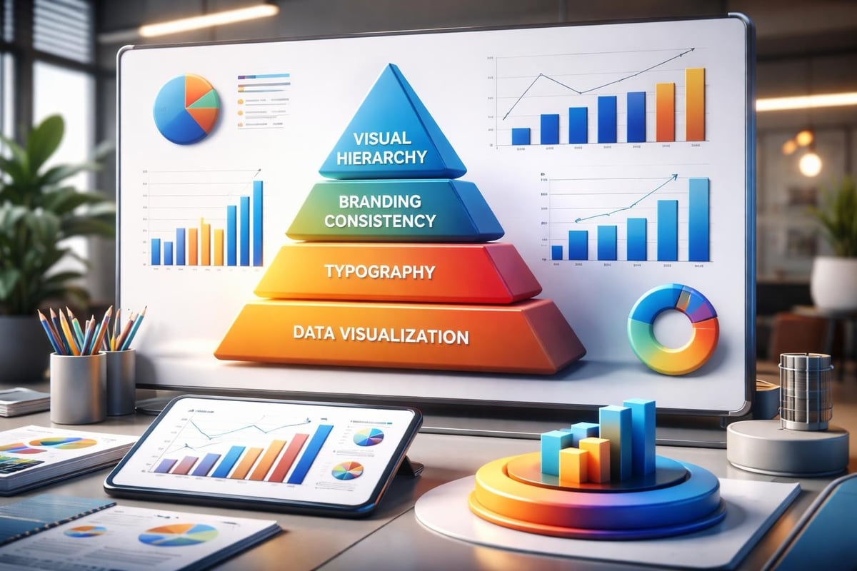
Visual hierarchy establishes the foundation of professional presentation design. Your slides must guide the viewer's eye naturally from the most important information to supporting details. This means using size, color, and positioning strategically rather than arbitrarily.
Core Elements of Professional Design
The building blocks of exceptional presentations include several non-negotiable components:
- Consistent branding throughout every slide, reinforcing company identity
- High-quality visual assets that enhance rather than distract from your message
- Strategic white space allowing content to breathe and improving comprehension
- Professional typography with appropriate font pairings and hierarchy
- Data visualization that transforms numbers into compelling narratives
Financial and tech companies particularly benefit from mastering these elements because their presentations often contain dense information that must remain accessible to diverse audiences. Good presentation design requires balancing aesthetic appeal with functional clarity.
| Design Element | Purpose | Common Mistakes |
|---|---|---|
| Color Scheme | Brand consistency and visual harmony | Using too many competing colors |
| Typography | Readability and hierarchy | Mixing more than three font families |
| Images | Emotional connection and context | Using low-resolution stock photos |
| Data Charts | Simplify complex information | Overwhelming slides with raw data |
| White Space | Focus and clarity | Cramming too much content per slide |
According to expert PowerPoint designers, utilizing slide masters ensures consistency across your entire deck while dramatically reducing production time.
Strategic Content Development for Business Presentations
Content strategy separates memorable presentations from forgettable ones. Your professional ppt should tell a cohesive story that builds momentum toward a clear objective, whether that's securing investment, explaining a product, or driving organizational change.
Structuring Your Narrative Arc
Begin by identifying your core message and desired outcome. Every slide should advance this central narrative rather than existing as isolated information.
Opening sections must immediately establish relevance and credibility. Financial presentations might open with market size and opportunity, while tech presentations often lead with the problem being solved. Presentation cover design sets the tone for everything that follows.
Middle sections develop your argument through evidence, examples, and explanation. This is where data visualization becomes crucial. Transform spreadsheets into intuitive charts that reveal patterns and insights at a glance.
Closing sections reinforce key takeaways and specify next steps. Professional presentations end with clarity about what happens after the final slide.
The U.S. Chamber of Commerce emphasizes the importance of templates that maintain visual consistency while allowing creative flexibility within your established framework.
Technical Excellence in PowerPoint Execution
Mastering PowerPoint's technical capabilities elevates your professional ppt from adequate to exceptional. Many presenters only scratch the surface of what's possible within the platform.
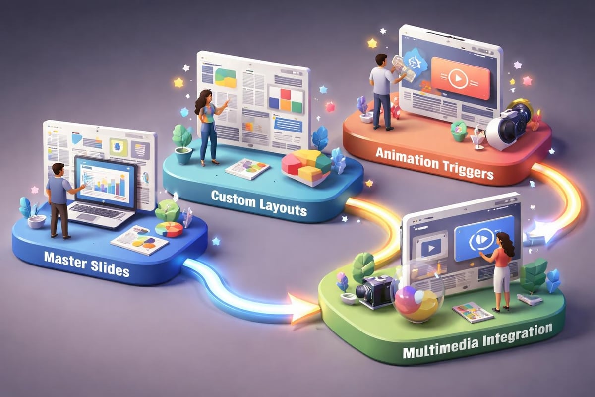
Advanced Features That Matter
- Master Slides control formatting across your entire presentation
- Custom Layouts provide flexibility while maintaining consistency
- Animation Triggers create interactive experiences
- Embedded Fonts ensure your presentation looks identical on any device
- Section Zoom enables non-linear navigation during Q&A
These technical elements become particularly valuable during live presentations where you need to adapt to audience questions or time constraints. Professional PowerPoint tips highlight how advanced features create more engaging and flexible presentations.
Multimedia integration adds another dimension to your professional ppt. Video clips, audio narration, and interactive elements can make complex concepts more accessible. However, always ensure these elements serve your message rather than overshadowing it.
File Management Best Practices
Technical excellence extends to how you manage presentation files. Compress images to reduce file size without sacrificing quality. Embed rather than link media files to avoid broken references. Create backup copies before making significant changes.
For collaborative environments, establish naming conventions and version control processes. A professional ppt reflects organizational sophistication in both content and workflow management.
Design Principles for Financial and Tech Audiences
Different industries require tailored approaches to presentation design. Financial services audiences expect precision, credibility, and clarity. Technology audiences value innovation, simplicity, and forward-thinking design.
Financial Presentation Design Standards
Financial presentations demand data integrity above all else. Charts must accurately represent information without distortion. Tables should present numbers clearly with appropriate formatting for currency, percentages, and large values.
Color psychology matters in financial contexts. Blues and grays convey trustworthiness and stability. Strategic accent colors highlight key metrics without appearing frivolous. PPT layout design for financial decks prioritizes information density balanced with readability.
Regulatory compliance often influences design choices in financial presentations. Ensure all required disclaimers appear clearly without cluttering slides. Build sections for detailed disclosures that support your main narrative without interrupting flow.
Technology Presentation Innovation
Tech presentations can push creative boundaries while maintaining professionalism. Modern, minimalist design with bold typography reflects innovation. Dynamic animations demonstrate product functionality or illustrate technical processes.
However, avoid letting creativity compromise clarity. Your professional ppt should make complex technology accessible to non-technical stakeholders. Visual metaphors bridge understanding gaps between engineers and executives.
| Industry Focus | Design Priority | Content Emphasis | Visual Style |
|---|---|---|---|
| Financial Services | Data accuracy | Metrics and projections | Conservative, trustworthy |
| Fintech | Innovation meets credibility | Disruption narrative | Modern with data focus |
| Enterprise Tech | Scalability proof | ROI and implementation | Clean, professional |
| Startup Tech | Vision and potential | Problem-solution fit | Bold, aspirational |
Elevating Presentations Through Professional Services
Creating truly exceptional presentations requires significant time, expertise, and attention to detail. Many businesses discover that outsourcing to specialists delivers better results than internal efforts.
Professional design agencies bring specialized skills in visual storytelling, brand development, and technical execution. They understand how to transform complex information into compelling narratives that resonate with target audiences.
Consider engaging professionals when stakes are high. Investor pitches, board presentations, and major client proposals deserve the investment in professional quality. The ROI often manifests in secured funding, approved budgets, or won contracts that far exceed design costs.
When to Invest in Professional Help
- High-stakes presentations where outcomes significantly impact business success
- Complex data visualization requiring specialized design expertise
- Brand-defining moments establishing market position or company identity
- Time-constrained situations where internal resources cannot deliver required quality
- Ongoing presentation needs benefiting from established templates and processes
The comprehensive guide to professional PPT services outlines how agencies transform initial concepts into polished deliverables through collaborative processes.

Optimizing Your Presentation Workflow
Efficiency in creating professional ppt materials comes from established processes and reusable assets. Build a library of branded templates, approved imagery, and formatted data visualizations that accelerate future projects.
Building Reusable Assets
Start by creating comprehensive brand guidelines specific to presentations. Document approved color palettes, font specifications, logo usage, and image styles. This foundation ensures consistency across all materials regardless of who creates them.
Develop slide templates for common scenarios:
- Title slides for different presentation types
- Data visualization layouts for various chart types
- Comparison slides for feature matrices or competitive analysis
- Team introduction slides with consistent formatting
- Section dividers that maintain visual flow
Content libraries provide another efficiency boost. Maintain updated versions of company descriptions, product explanations, case studies, and frequently used statistics. This reduces redundant work and ensures accuracy across presentations.
Review and update these assets quarterly to reflect evolving brand standards, new products, and current market positioning. Outdated templates undermine the professional impression you're working to create.
Quality Assurance Checklist
Before finalizing any professional ppt, conduct systematic reviews:
- Content accuracy including all data, claims, and contact information
- Visual consistency across fonts, colors, spacing, and alignment
- Technical functionality testing animations, transitions, and embedded media
- Accessibility compliance ensuring readability and inclusive design
- File optimization confirming appropriate size and compatibility
This structured approach catches errors before they reach audiences and maintains your reputation for excellence. Professional presentation elements include these quality standards as fundamental requirements rather than optional enhancements.
Data Visualization Mastery for Business Impact
Numbers tell stories, but only when presented effectively. Your professional ppt must transform raw data into insights that drive decisions and inspire action.
Choosing the Right Chart Types
Different data relationships require specific visualization approaches:
- Trends over time work best with line charts showing trajectory
- Part-to-whole relationships benefit from pie charts or stacked bars
- Comparisons between categories call for bar or column charts
- Correlations between variables become clear through scatter plots
- Geographic patterns require maps with data overlays
Avoid defaulting to the same chart type for all data. Match visualization method to the insight you want to emphasize.
Simplification enhances comprehension. Remove gridlines, reduce decimal places, and eliminate chart junk that doesn't contribute to understanding. Every element should serve the communication goal.
Use annotation strategically to guide interpretation. Highlight key data points, add context for unusual values, and call out specific trends that support your narrative. Your audience shouldn't need to search for meaning within complex visualizations.
Financial Metrics That Resonate
Financial presentations succeed when they connect numbers to business outcomes. Present revenue growth alongside market share gains. Show cost reductions in context of efficiency improvements. Link investment requests directly to projected returns.
Comparative context makes metrics meaningful. Year-over-year growth matters more when positioned against industry benchmarks. Absolute numbers gain significance when compared to relevant baselines or targets.
Dashboard-style slides consolidate multiple related metrics into unified views. These work particularly well for performance reviews, quarterly updates, and portfolio summaries where stakeholders need comprehensive snapshots.
Audience Engagement Through Design Psychology
Understanding how audiences process visual information informs better design decisions in your professional ppt. Cognitive psychology reveals patterns in attention, memory, and persuasion that translate directly to presentation effectiveness.
Visual Processing Principles
The picture superiority effect explains why images are remembered better than words alone. Combine verbal and visual information to maximize retention and impact. However, ensure images directly support your message rather than serving purely decorative purposes.
Color psychology influences emotional responses and associations. Warm colors create urgency and excitement, while cool colors convey calm and professionalism. Cultural contexts affect color interpretation, so consider your audience's background when making palette decisions.
Gestalt principles govern how viewers organize visual information:
- Proximity groups related elements together
- Similarity suggests connection through shared characteristics
- Continuity creates flow through aligned elements
- Closure allows audiences to complete implied patterns
Apply these principles deliberately in your layouts to guide attention and facilitate understanding.
Reducing Cognitive Load
Professional presentations respect audience cognitive capacity. Each slide should convey one main idea supported by complementary details. Overwhelming slides with excessive information guarantees reduced comprehension and retention.
Progressive disclosure reveals information incrementally through builds and animations. This technique maintains focus on current points while previewing what's coming. Use it strategically rather than animating everything, which becomes distracting.
Contrast in size, color, and weight directs attention to priority information. Your most important message should stand out immediately through visual emphasis rather than requiring audiences to search for meaning.
Maintaining Brand Consistency Across Presentations
Your professional ppt serves as a brand ambassador, representing organizational values and identity with every slide. Consistency across all presentations reinforces brand recognition and credibility.
Building Comprehensive Brand Standards
Detailed guidelines ensure anyone creating presentations maintains brand integrity. Document specific requirements for:
- Logo placement, sizing, and clear space
- Primary and secondary color palettes with exact values
- Typography hierarchy including font families and sizes
- Image style guidelines with approved examples
- Iconography standards for consistency across visual elements
Brand voice extends beyond visual elements to messaging and tone. Presentations should reflect whether your organization communicates formally or conversationally, technically or accessibly, conservatively or innovatively.
Create example slides demonstrating correct implementation of brand standards across different scenarios. These references reduce ambiguity and provide clear models for team members to follow.
Adapting for Different Contexts
Brand consistency doesn't mean rigid uniformity. Your professional ppt should adapt appropriately to different audiences and occasions while maintaining core brand identity.
Internal presentations might use relaxed formatting compared to investor pitches. Conference presentations may emphasize visual impact while sales decks prioritize information density. All variations should remain recognizably part of your brand family.
Template libraries supporting different use cases provide flexibility within consistent frameworks. Develop separate templates for pitch decks, sales presentations, training materials, and conference talks, each optimized for its specific purpose while sharing fundamental brand elements.
Leveraging Professional Tools and Resources
Beyond PowerPoint itself, numerous tools and resources enhance your ability to create professional ppt materials efficiently and effectively.
Design Asset Resources
Stock photography libraries provide professional imagery when custom photography isn't feasible. Prioritize platforms offering business-focused content with diverse representation and authentic scenarios rather than obviously staged stock photos.
Icon libraries maintain visual consistency across presentations. Choose comprehensive icon sets with unified styles rather than mixing icons from different sources, which creates visual discord.
Template marketplaces offer starting points, though customization remains essential. Pre-built templates rarely align perfectly with specific brand requirements but can inspire layout ideas and structural approaches.
Collaboration and Review Tools
Cloud-based presentation platforms enable real-time collaboration among team members. Multiple contributors can work simultaneously while version control tracks changes and maintains editing history.
Review workflows structured through project management tools ensure presentations receive appropriate stakeholder input before finalization. Assign specific reviewers for content accuracy, brand compliance, and design quality.
Screen recording tools help presenters practice delivery and identify areas for improvement. Reviewing yourself on video reveals verbal tics, pacing issues, and opportunities to strengthen your presentation skills alongside your slide design.
Mastering the art and science of professional ppt creation requires dedication to both design excellence and strategic communication. The investment in quality presentations pays dividends through more effective stakeholder engagement, stronger brand perception, and better business outcomes. When your presentation needs demand expertise beyond internal capabilities, Prznt Perfect specializes in transforming complex financial and technology narratives into visually compelling stories that resonate with your target audiences. From pitch decks that secure funding to executive presentations that drive decisions, professional presentation design ensures your message receives the attention and impact it deserves.

- This is some text inside of a div block.lay out the facts clearly and compellingly. Use data to establish the ground reality, but remember that facts alone are like the individual strands of a tapestry—necessary but not complete.lay out the facts clearly and compellingly. Use data to establish the ground reality, but remember that facts alone are like the individual strands of a tapestry—necessary but not complete.
- This is some text inside of a div block.lay out the facts clearly and compellingly. Use data to establish the ground reality, but remember that facts alone are like the individual strands of a tapestry—necessary but not complete.

