
Infographic PPT Template: Complete 2026 Design Guide
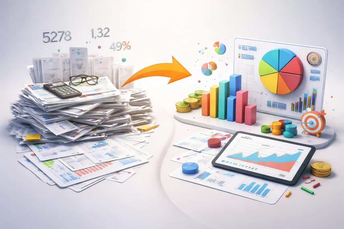
Infographics have become essential tools for modern business communication, particularly in financial and technology sectors where complex data must be transformed into digestible visual narratives. An infographic ppt template provides the foundation for creating compelling presentations that combine data visualization with storytelling. These templates offer pre-designed layouts, color schemes, and graphic elements that accelerate the design process while maintaining professional standards. For financial professionals and tech executives presenting quarterly reports, market analysis, or product roadmaps, mastering infographic templates can dramatically improve audience engagement and message retention.
Understanding Infographic PPT Templates
An infographic ppt template serves as a structured framework for presenting information visually within PowerPoint. Unlike traditional slide decks that rely heavily on bullet points and text, these templates emphasize visual hierarchy, data visualization, and graphic elements that guide the viewer's eye through complex information.
The core advantage of using templates lies in their ability to standardize design elements while allowing customization for specific content needs. Professional templates include pre-configured color palettes, font hierarchies, and spacing guidelines that ensure visual consistency across multiple slides. This consistency becomes particularly important when presenting financial data or technical specifications where clarity and professionalism directly impact credibility.
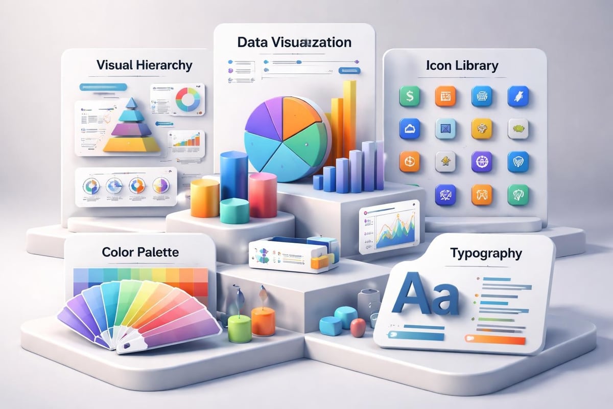
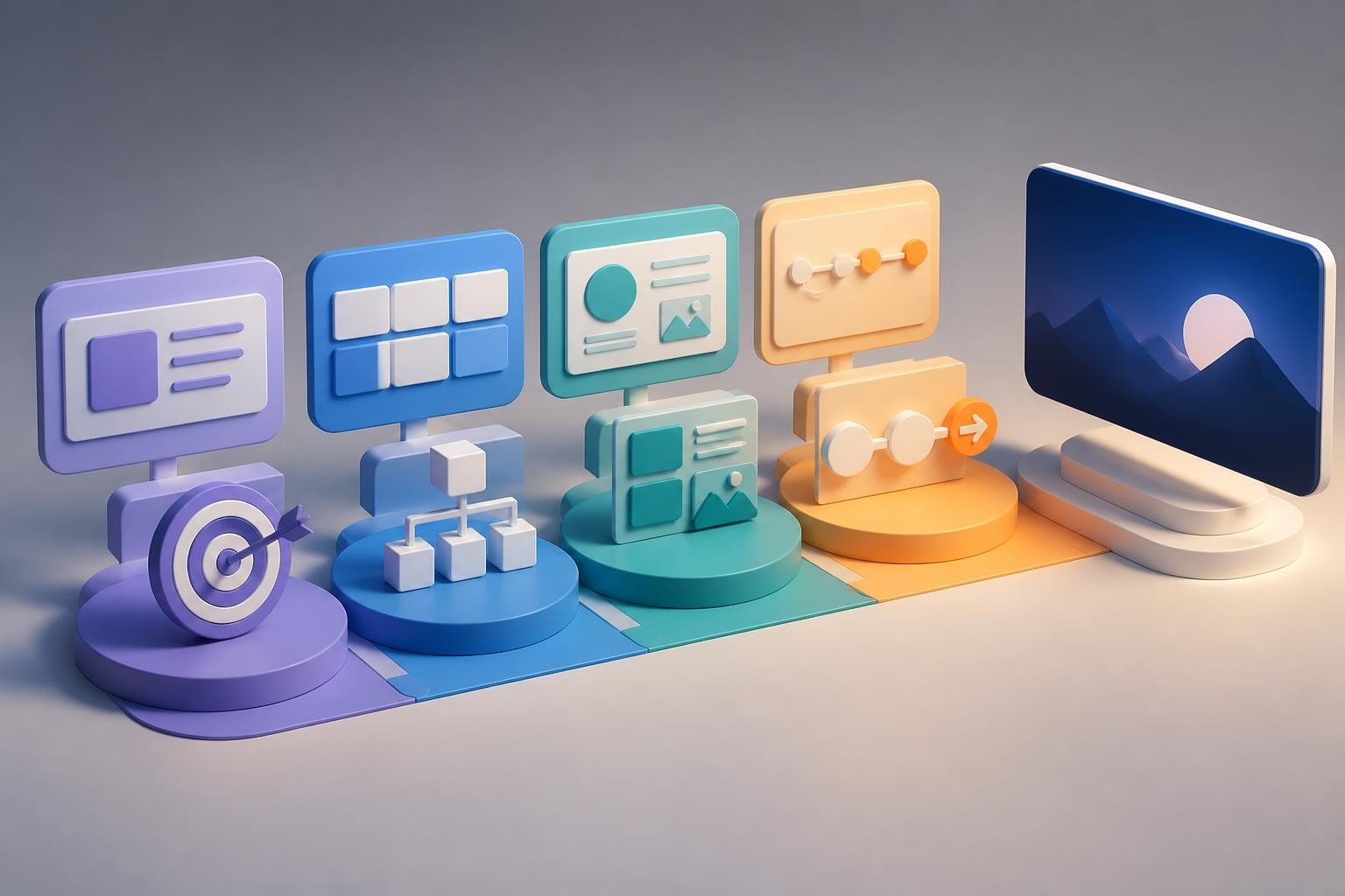
Key Components of Effective Templates
Modern infographic templates incorporate several critical design elements that work together to create impactful presentations:
- Data visualization frameworks including chart placeholders, timeline layouts, and comparison matrices
- Icon libraries featuring industry-specific symbols for finance, technology, and business concepts
- Modular grid systems that maintain alignment and spacing consistency
- Color-coding systems for categorizing information and creating visual connections
- Typography hierarchies with designated styles for headlines, subheads, and body text
When evaluating templates, consider how these components align with your presentation objectives. Financial presentations often require precise data visualization capabilities, while tech pitches may prioritize process flows and product feature comparisons. The right infographic ppt template adapts to your content rather than forcing your content into rigid constraints.
Selecting Templates for Financial Presentations
Financial professionals face unique challenges when presenting data-heavy content. Quarterly reports, investment proposals, and market analyses require templates that balance aesthetic appeal with numerical precision. The most effective templates for financial content feature clean layouts that prioritize readability and data accuracy.
Consider templates with dedicated sections for key performance indicators, financial metrics dashboards, and comparative analysis frameworks. These specialized layouts help audiences quickly identify critical numbers and trends without visual clutter. Good presentation design principles emphasize white space and strategic use of color to highlight important data points.
Essential Features for Finance-Focused Templates
| Feature | Purpose | Application |
|---|---|---|
| Chart placeholders | Display financial trends | Revenue growth, market share |
| Data tables | Present precise numbers | Balance sheets, metrics |
| Timeline layouts | Show historical progress | Company milestones, projections |
| Comparison grids | Contrast options | Investment scenarios, competitors |
| Icon sets | Represent concepts | Risk factors, opportunities |
Microsoft offers extensive infographic templates that include finance-specific options. These templates provide starting points that can be customized to match corporate branding while maintaining the structural integrity needed for financial reporting.
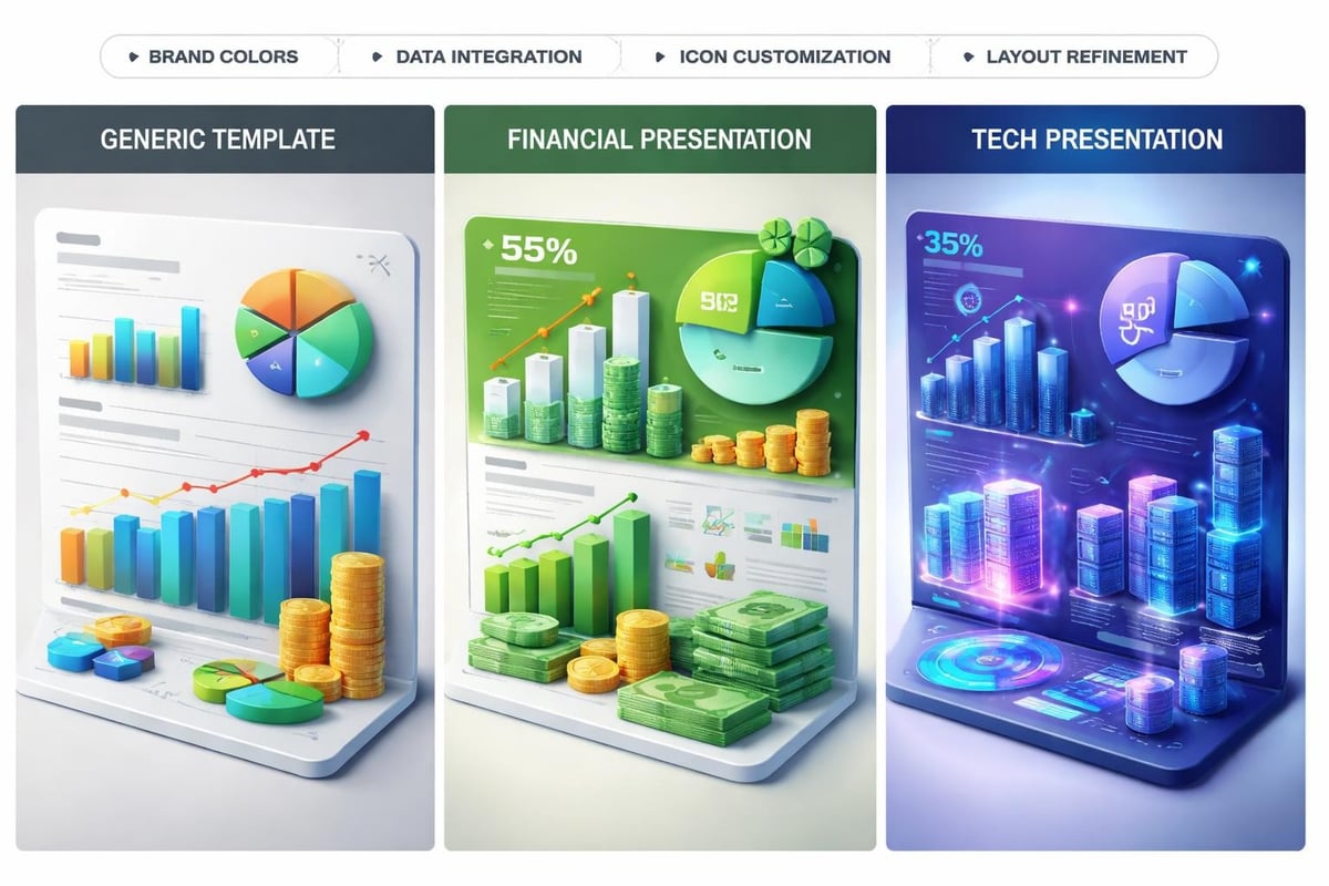
Customizing Templates for Technology Companies
Technology companies require infographic templates that communicate innovation, complex processes, and product capabilities. Unlike financial presentations that emphasize stability and precision, tech presentations often need to convey forward momentum and transformative potential.
The most effective tech-focused templates incorporate modern design aesthetics with functional elements that explain technical concepts. Process diagrams, product roadmaps, and feature comparison charts become central components. When working with technology content, prioritize templates that offer flexibility in representing both high-level strategy and technical details.
Template Customization Best Practices
Start with presentation cover design that establishes your brand identity immediately. The opening slide sets expectations for the entire presentation, so customize template colors, fonts, and graphic elements to align with your company's visual identity.
Replace placeholder content systematically:
- Identify your core message and select template slides that support your narrative arc
- Customize color schemes to match brand guidelines while maintaining visual hierarchy
- Replace generic icons with industry-specific graphics that resonate with your audience
- Adjust data visualizations to accurately represent your specific metrics and comparisons
- Refine typography to ensure readability across different presentation environments
Understanding how to create infographics in PowerPoint provides technical skills for template modification. This knowledge enables you to move beyond simple content replacement and truly adapt templates to your specific communication needs.
Design Principles for Professional Infographics
Professional infographic ppt template usage requires understanding fundamental design principles that separate mediocre presentations from exceptional ones. These principles apply whether you're creating pitch decks for investors or internal communications for stakeholders.
Visual hierarchy guides viewers through information in a logical sequence. Use size, color, and positioning to emphasize primary messages while supporting details remain accessible but subordinate. In financial contexts, this might mean featuring year-over-year growth percentages prominently while keeping supporting calculations available in smaller text.
Color psychology influences how audiences perceive information. Blue conveys trust and stability (ideal for financial institutions), while orange and purple suggest innovation (suitable for tech startups). Limit your palette to three or four main colors plus neutral tones to maintain visual coherence.
Typography and Readability Standards
Font selection dramatically impacts professional perception and information retention. Sans-serif fonts like Helvetica, Arial, or Calibri work well for modern business presentations, offering clean readability across screen sizes. Establish a clear hierarchy:
- Headlines: 32-44 points, bold weight
- Subheadings: 24-28 points, medium weight
- Body text: 18-20 points, regular weight
- Annotations: 14-16 points, light weight
Never use more than two font families in a single presentation. Consistency builds professional credibility and reduces cognitive load for your audience.
Advanced Customization Techniques
Beyond basic content replacement, advanced customization transforms generic templates into branded communication tools. These techniques require deeper PowerPoint knowledge but yield significantly more impactful results.
Master slide editing allows you to modify template foundations rather than individual slides. Access master slides through the View menu to adjust universal elements like headers, footers, and recurring graphic elements. Changes made at the master level propagate throughout your presentation, ensuring consistency.
Custom color themes replace template defaults with your exact brand colors. Create custom RGB or HEX color sets that can be saved and reused across multiple presentations. This approach maintains brand consistency while leveraging template structures.
Working with Data Visualization Elements
Financial and tech presentations rely heavily on charts and graphs. Most templates include placeholder visualizations, but customizing these elements requires attention to detail:
- Link charts to live data sources for automatic updates
- Simplify chart elements by removing unnecessary gridlines and labels
- Use consistent color coding across all visualizations
- Add clear data labels for precise number communication
- Include source citations for external data
Microsoft's infographic creation tools provide built-in functionality for sophisticated data visualization. Explore SmartArt graphics and chart formatting options to elevate template-based designs.
Template Sources and Selection Criteria
Identifying quality templates requires evaluating multiple factors beyond visual appeal. Professional templates should offer editable elements, scalable graphics, and proper file organization that facilitates efficient customization.
Evaluating Template Quality
| Criterion | What to Check | Why It Matters |
|---|---|---|
| Editability | All elements unlocked | Enables full customization |
| File structure | Organized layers | Simplifies modifications |
| Resolution | Vector graphics | Maintains quality at any size |
| Compatibility | PowerPoint version | Ensures feature availability |
| Documentation | Usage instructions | Accelerates implementation |
Premium templates typically offer better quality than free alternatives, providing more sophisticated design elements and professional support. However, Microsoft's free template library includes surprisingly robust options suitable for many business applications.
When selecting templates for client presentations or investor pitches, prioritize designs that allow extensive customization. Generic templates work for internal communications, but high-stakes presentations benefit from unique designs that reflect your brand identity. Consider how PPT layout design fundamentals apply to template selection.
Optimizing Templates for Different Presentation Contexts
An infographic ppt template that works perfectly for a boardroom presentation may fail completely in a virtual meeting environment. Context-aware template selection and modification ensures your message reaches audiences effectively regardless of delivery format.
Screen vs. Print Optimization
Digital presentations allow for more complex animations and interactive elements, while printed materials require higher resolution and static clarity. When preparing templates for both contexts:
- Set slide dimensions to 16:9 for screens, custom sizes for print
- Increase font sizes by 20-25% for projected presentations
- Remove animations and transitions for printed handouts
- Verify color accuracy in CMYK mode for physical printing
- Export high-resolution PDFs for distribution
Virtual presentations introduce additional considerations. Test templates with typical video conferencing tools to ensure graphics remain clear when compressed for bandwidth efficiency. Simplify busy slides that may appear cluttered when participants view on smaller screens.
Industry-Specific Template Applications
Different industries require specialized approaches to infographic template usage. Financial services presentations demand different visual languages than software-as-a-service pitches, even when using similar template structures.
Financial services presentations benefit from templates emphasizing stability, precision, and regulatory compliance. Conservative color palettes (blues, grays, greens) combined with detailed data tables and transparent calculation methodologies build trust. Include sections for risk disclosures and compliance statements that integrate seamlessly with compelling visuals.
Technology startups require templates that balance innovation with credibility. Modern, bold designs communicate forward-thinking approaches while structured information architecture demonstrates business acumen. Feature product roadmaps, competitive positioning matrices, and market opportunity visualizations prominently.
Template Adaptation Strategies
- Audit existing brand materials to identify visual elements requiring integration
- Map presentation objectives to template sections and layouts
- Customize color schemes to match industry expectations and brand identity
- Select appropriate chart types for your specific data and message
- Test with representative audience members before final presentations
Professional presentation slides design incorporates these industry-specific considerations while maintaining visual appeal and information clarity.
Common Template Mistakes and Solutions
Even experienced presenters make critical errors when working with infographic templates. Understanding these pitfalls helps you avoid compromising presentation effectiveness.
Overcrowding slides represents the most common mistake. Templates provide designated spaces for content, but filling every available area creates visual chaos. Maintain generous white space around key elements. If a slide feels cramped, distribute content across multiple slides rather than compressing information.
Inconsistent customization occurs when some slides receive thorough branding while others retain template defaults. This inconsistency undermines professional credibility. Establish a systematic approach to template modification, ensuring every slide receives equivalent attention.
Solutions for Common Issues
- Problem: Generic stock photos that don't relate to content
- Solution: Replace with custom photography or industry-specific imagery
- Problem: Mismatched fonts between template and brand guidelines
- Solution: Update master slides with approved corporate fonts
- Problem: Color schemes that clash with existing brand materials
- Solution: Create custom color themes using exact brand hex codes
- Problem: Data visualizations that confuse rather than clarify
- Solution: Simplify charts, add clear labels, use consistent formatting
Resources like Ellen Finkelstein's PowerPoint guidance provide detailed solutions for technical challenges encountered during template customization.
Maintaining Templates for Ongoing Use
Organizations that regularly create presentations benefit from developing template libraries rather than starting from scratch each time. This approach ensures brand consistency while reducing production time significantly.
Create a master template repository with variations for different use cases:
- Investor presentations: Heavy data visualization, financial metrics focus
- Sales decks: Product features, competitive comparisons, case studies
- Internal communications: Operational metrics, team updates, strategic planning
- Conference presentations: Thought leadership, industry insights, research findings
Document customization guidelines for each template variation, including approved color schemes, font usage, and content placement rules. This documentation enables team members to maintain consistency even when multiple people create presentations.
Version Control and Updates
Implement systematic version control for template files. As brand guidelines evolve or new design trends emerge, update master templates and distribute revised versions to all users. Include version numbers and update dates in template file names for easy identification.
Regular template audits ensure ongoing relevance. Quarterly reviews should assess:
- Alignment with current brand guidelines
- Incorporation of new data visualization techniques
- Compatibility with latest PowerPoint versions
- User feedback and modification requests
- Industry design trend alignment
Accessibility Considerations in Template Design
Professional infographic ppt template usage includes ensuring accessibility for all audience members. Inclusive design practices expand your message reach while demonstrating corporate responsibility.
Color contrast must meet WCAG 2.1 AA standards minimum. Use contrast checking tools to verify text remains readable against background colors. Avoid relying solely on color to convey information; supplement with patterns, labels, or icons.
Alt text for images and graphics ensures screen reader compatibility. When customizing templates, add descriptive alt text to all visual elements. This practice benefits visually impaired audience members and improves searchability.
Implementing Accessibility Features
Font size minimums prevent readability issues. Never use text smaller than 18 points for body copy or 24 points for headings, even if template defaults suggest smaller sizes. Consider that presentation environments often involve projectors or screens viewed from distance.
Provide text alternatives for complex infographics. While visual elements communicate efficiently to most audiences, supplementary text descriptions ensure all participants access the same information. Include these in speaker notes or handout materials.
Measuring Template Effectiveness
Effective presentation design ultimately drives specific business outcomes. Track metrics that indicate whether your infographic ppt template choices contribute to presentation success.
Audience engagement metrics include question volume during presentations, follow-up meeting requests, and social media sharing of presentation content. Higher engagement often correlates with effective visual communication.
Conversion rates measure presentation effectiveness in sales or fundraising contexts. Track how many pitch deck presentations convert to closed deals or funded rounds. A/B test different template approaches with similar content to identify optimal designs.
Feedback Collection Methods
Implement systematic feedback collection after major presentations:
- Post-presentation surveys assessing clarity and visual appeal
- Stakeholder interviews exploring which slides proved most effective
- Analytics tracking for shared digital presentations
- Sales team debriefs identifying presentation strengths and weaknesses
Use this feedback to refine template selection and customization approaches continuously. What works for one audience segment may require adjustment for others.
Integration with Broader Presentation Strategy
Templates represent just one component of comprehensive presentation strategy. The most effective organizations integrate template usage with content development, delivery training, and follow-up processes.
Align template selection with message architecture developed during presentation planning phases. Visual design should support narrative structure rather than competing with it. When templates and content strategy work together, presentations achieve maximum impact.
Consider how templates support your broader communication ecosystem. Presentation slides often become the foundation for other materials including handouts, social media content, and video productions. Select templates that facilitate repurposing across multiple channels while maintaining brand consistency.
Professional agencies like those specializing in fintech presentations understand how template selection integrates with industry-specific communication requirements. Their expertise demonstrates the strategic value of thoughtful template usage beyond simple visual appeal.
Mastering infographic ppt template selection and customization empowers financial and technology professionals to communicate complex information with clarity and impact. The principles outlined here provide frameworks for transforming generic templates into powerful communication tools aligned with your specific business objectives. When your presentation demands exceed template capabilities or time constraints limit customization efforts, Prznt Perfect delivers professionally designed presentations that combine visual storytelling expertise with deep understanding of financial and tech sector communication requirements.


- This is some text inside of a div block.lay out the facts clearly and compellingly. Use data to establish the ground reality, but remember that facts alone are like the individual strands of a tapestry—necessary but not complete.lay out the facts clearly and compellingly. Use data to establish the ground reality, but remember that facts alone are like the individual strands of a tapestry—necessary but not complete.
- This is some text inside of a div block.lay out the facts clearly and compellingly. Use data to establish the ground reality, but remember that facts alone are like the individual strands of a tapestry—necessary but not complete.

