
9 Essential PPT Layout Design Tips for Stunning Slides 2026

In 2026’s digital-first business landscape, the power of a truly impactful presentation can set you apart from the competition. Whether you are closing deals, inspiring teams, or educating your audience, PowerPoint remains an essential tool for clear communication, persuasive pitching, and compelling storytelling.
Yet, even the best content can fall flat without the right ppt layout design. Mastering this skill is crucial for creating slides that not only look stunning but also engage and persuade every viewer.
In this guide, you will discover 9 essential ppt layout design tips tailored for professionals, educators, and business leaders. Ready to elevate your slides and leave a lasting impression? Let’s dive in and transform the way you present.
The Fundamentals of Effective PPT Layout Design
Mastering the fundamentals of ppt layout design is the cornerstone of creating slides that capture attention and deliver results. Each principle below builds a foundation for clarity, engagement, and professionalism. Let’s break down the essentials every presenter should know.

Understanding Visual Hierarchy
Visual hierarchy is the way elements are arranged to guide the viewer’s eye to the most important information first. In ppt layout design, hierarchy helps your audience instantly grasp what matters most. A slide with a clear headline, bolded key data, and supporting visuals draws attention naturally.
Contrast this with a slide where all text is the same size and color. The message gets lost, and viewers struggle to know where to look. Font size, color, and placement are your tools for building structure. According to a Northumbria University study, 94% of first impressions are design-related, underscoring the impact of visual hierarchy in ppt layout design.
Balancing Simplicity and Detail
Effective ppt layout design strikes a balance between simplicity and detail. Overloading slides with text or graphics increases cognitive load and reduces retention. Cognitive load theory shows that as clutter rises, attention drops.
TED Talks often use slides with minimal words and bold visuals. This approach helps the audience focus and remember key points. In fact, slides containing fewer than 40 words are 30% more likely to be recalled. For ppt layout design, minimize text and highlight only the essentials to boost impact.
Choosing the Right Slide Structure
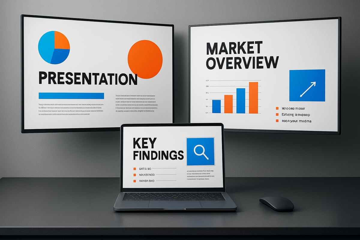
Selecting the ideal slide structure is crucial in ppt layout design. Common structures include title-content, split, comparison, and visual-only layouts. Each serves a different purpose. For instance, comparison slides work well for contrasting ideas, while visual-only layouts are powerful for storytelling.
Match the structure to your message and audience. Avoid relying solely on default templates, as they often lack customization. Custom layouts can increase engagement by up to 25%. Experiment with different formats to ensure your ppt layout design supports your communication goals.
Consistency in Design Elements
Consistency is key for building trust and projecting professionalism in ppt layout design. Uniform fonts, colors, and icons create a cohesive look. Branding guidelines often dictate these elements, helping align your slides with your organization’s identity.
Leverage tools like master slides for consistency to ensure every slide follows the same design rules. Apple’s keynote presentations are a great example of how uniformity reinforces brand recognition. Remember, consistent ppt layout design makes your message more credible.
The Power of White Space
White space, or negative space, is the area between elements on a slide. In ppt layout design, white space makes content more readable and less overwhelming. For example, compare a crowded slide with one that has generous spacing around text and images. The latter allows viewers to process information faster and with less effort.
White space is not empty—it is a powerful design tool that enhances comprehension and visual appeal. Prioritize white space to elevate your ppt layout design.
9 Essential PPT Layout Design Tips for Stunning Slides 2026
Creating slides that captivate, inform, and persuade is both an art and a science. The following nine tips will elevate your ppt layout design, ensuring your presentations stand out in 2026’s fast-paced digital landscape.
1. [Start with a Strong Visual Anchor]
Every effective ppt layout design begins with a compelling visual anchor. This could be a striking image, a bold icon, or an attention-grabbing headline. Visual anchors draw the audience’s eyes to the most important part of your slide, setting the tone for the rest of your message.
For best results, position your anchor in the top-left or center of the slide. Studies show slides with a clear focal point improve recall by up to 20 percent. Consider how a powerful photograph or a concise, well-designed headline can instantly clarify your message.
Compare these two slides: one features a generic title, while the other opens with a vivid photo and a strong statement. The latter immediately engages viewers and provides context. In ppt layout design, starting with a visual anchor is essential for creating memorable, persuasive slides.
2. [Embrace Modern Minimalism]
Modern minimalism is the hallmark of professional ppt layout design in 2026. Minimalist slides use only essential elements, focusing on clarity and impact rather than clutter. This approach leads to faster audience comprehension, a cleaner aesthetic, and reduced distractions.
Tech and finance leaders often use minimalist decks to communicate complex ideas with elegance. Slides with generous white space, limited color palettes, and concise statements are proven to be more effective.
A practical strategy is to use fewer than 40 words per slide and let visuals do the heavy lifting. If you want to dig deeper into the benefits of simplicity, Why you need less content explains how minimalist ppt layout design can make your message more memorable.
Remember, minimalism isn’t about making slides empty. It’s about making every element count.
3. [Prioritize Readability with Smart Typography]
Typography is at the heart of ppt layout design. Choose fonts that are easy to read, whether your audience is viewing slides on a projector, a laptop, or a mobile device. Sans-serif fonts like Arial, Calibri, or Roboto tend to be most legible.
Pair fonts carefully: use one for headlines and another for body text, ensuring clear hierarchy. Maintain optimal font sizes—at least 24pt for body text and 36pt for titles—to guarantee readability from any distance.
Google Slides recommends specific font settings that balance clarity and aesthetics. Well-chosen typography reduces audience fatigue by 15 percent and keeps attention focused. In ppt layout design, smart font choices make your message accessible to everyone.
4. [Leverage Grids and Alignment Tools]
A well-structured ppt layout design relies on grids and alignment tools. Grids create visual balance, making slides appear organized and professional. PowerPoint’s built-in alignment features help you distribute elements evenly and avoid messy, inconsistent layouts.
To see the difference, compare a slide with scattered text and images to one aligned on a grid. The grid-based slide looks cleaner and is easier to follow. Use guides, snap-to-grid, and alignment options to streamline your workflow.
Consistent alignment also speeds up design and ensures that each slide feels connected to the rest. When you invest in grid-based ppt layout design, your presentations look polished and credible.
5. [Use Color Strategically for Emphasis]
Color is a powerful tool in ppt layout design, guiding attention and highlighting key messages. Strategic use of color can direct eyes to calls to action or vital data points. In business presentations, contrast is key—combining bold accent colors with neutral backgrounds ensures clarity.
Color psychology plays a crucial role. For example, blue conveys trust, while red signals urgency. When presenting financial data, use color to differentiate trends or emphasize results.
Slides employing thoughtful color schemes see a 9 percent increase in comprehension. For ppt layout design, select a simple palette and use accent colors sparingly to maximize impact.
6. [Incorporate Data Visualization Wisely]
Data visualizations transform complex information into easily digestible visuals. In ppt layout design, use charts, graphs, and infographics to tell your data’s story. Prioritize clarity over decoration—avoid “chartjunk” like unnecessary 3D effects or distracting backgrounds.
Convert dense tables into simple bar charts or pie graphs. For example, a cluttered spreadsheet can become a single, powerful visual that communicates trends instantly.
Remember that visualized data is processed 60,000 times faster than text. Effective data visualization in ppt layout design lets your audience grasp insights at a glance.
7. [Integrate Engaging Visual Storytelling]
Storytelling is the engine of impactful ppt layout design. Combine images, icons, and logical flow to guide your audience through a narrative. Each slide should build on the last, creating a sense of progression and purpose.
For instance, a pitch deck that raised funding often uses a sequence of visuals to illustrate a problem, solution, and results. Story-driven slides are proven to increase retention and emotional connection.
In ppt layout design, think of each slide as a chapter in your story. Use visual cues and consistent themes to keep your audience engaged from start to finish.
8. [Optimize for All Devices and Environments]
Today’s presentations happen everywhere: boardrooms, webinars, and mobile screens. Optimizing ppt layout design for every environment ensures your message lands, no matter the setting.
Design responsive layouts that adapt to different screen sizes. Test your slides for readability on laptops, projectors, and smartphones. For webinars, increase font size and simplify visuals to accommodate limited screen space.
Adapt slides for both remote and in-person audiences. Well-optimized ppt layout design guarantees your presentations are accessible and effective in any context.
9. [Test, Refine, and Iterate Your Layouts]
No ppt layout design is perfect on the first try. Review your slides carefully, seeking feedback from colleagues or your intended audience. Use PowerPoint’s preview tools to catch alignment issues or readability problems.
Iterative improvement is key. For example, a sales deck may go through several rounds of edits based on audience feedback, resulting in a more persuasive and polished final product.
In ppt layout design, continuous testing and refinement ensure your slides always deliver maximum impact.
Advanced Techniques for Next-Level PPT Layouts
Elevating your ppt layout design demands more than basic skills. Advanced techniques help transform ordinary slides into memorable experiences. Let us explore four powerful strategies to take your presentations to the next level.

Harnessing Animation and Transitions
Animation and transitions can inject life into your ppt layout design. The key is to use them with purpose, not as a distraction. Subtle fades, smooth entrances, and strategic emphasis help guide attention to critical points.
Avoid overused effects like spinning or bouncing. Data shows that 62% of viewers consider excessive animation distracting. Instead, rely on gentle transitions to maintain flow and focus.
Best practices include:
- Animating one element at a time
- Matching animation pace to your speaking rhythm
- Previewing slides to check for smoothness
Thoughtful animation supports your message without overwhelming the audience.
Customizing Templates for Brand Impact
Your ppt layout design should reflect your brand’s identity. Moving beyond default templates is essential for standing out in any professional setting. Custom master slides allow you to integrate logos, signature colors, and preferred fonts seamlessly.
A well-designed template not only boosts consistency but also builds trust and authority. For a step-by-step guide, explore how to create an impressive template that is both effective and user-friendly.
Consider:
- Aligning every slide to branding standards
- Saving custom layouts for future use
- Updating templates as your brand evolves
Custom templates are a foundation for impactful presentations.
Interactive Elements for Audience Engagement
Interactive features can make your ppt layout design more engaging. By adding clickable elements, polls, or navigation links, you invite your audience to participate directly in your presentation.
These enhancements are especially valuable in webinars and live events. For example, an interactive agenda allows viewers to jump to relevant sections, while live polls can gauge audience sentiment in real time.
Engagement tips:
- Use action buttons for navigation
- Embed polls or quizzes for feedback
- Add Q and A slides for participation
Interactive slides can boost participation rates by 18%, keeping your audience active and attentive.
Accessibility Best Practices
Accessible ppt layout design ensures your message reaches everyone, including people with visual impairments. Use high-contrast colors, large readable fonts, and descriptive alt text for images.
PowerPoint offers built-in accessibility checkers to help you spot issues. Designing with accessibility in mind can expand your presentation’s reach by up to 15%.
Key accessibility tips:
- Choose color schemes friendly for colorblind users
- Write clear, concise alt text for all visuals
- Test slides on different devices and screen readers
Prioritizing accessibility demonstrates professionalism and respect for all viewers.
Common PPT Layout Mistakes and How to Avoid Them
Even the most seasoned professionals can fall into common pitfalls when working on ppt layout design. Overlooking these mistakes can diminish your message and weaken your credibility. By recognizing and addressing these errors, you can ensure your slides always support your communication goals. Let us explore the most frequent issues and practical ways to avoid them, so your ppt layout design remains sharp, effective, and memorable.

Overcrowding Slides with Content
Packing slides with too much information is a frequent ppt layout design error. Overloading your audience with text or visuals can quickly lead to cognitive overload, making it difficult for them to retain key points.
Consider the difference between a cluttered slide and a clean, focused layout. The former can cause your message to get lost, while the latter allows your audience to process information efficiently. To avoid this, limit each slide to one main idea and use concise bullet points or images.
For more strategies on avoiding overcrowded slides, check out Presentation design mistakes to avoid. Remember, a clear ppt layout design keeps your audience engaged and helps them remember your message.
Inconsistent Design Language
Inconsistent use of fonts, colors, or icon styles can signal a lack of professionalism in your ppt layout design. When design elements vary from slide to slide, your presentation can feel disjointed and distract from the main message.
A uniform design language builds trust and reinforces your brand identity. Follow branding guidelines and stick to a defined palette and font set. Use the master slide feature in PowerPoint to apply consistent styles throughout.
Avoid mixing multiple typefaces or color schemes. A reliable ppt layout design should maintain visual harmony, ensuring your audience focuses on your content, not design discrepancies.
Neglecting Data Visualization Principles
Another common ppt layout design mistake is misusing data visuals. Overcomplicated charts, misleading graphics, or unreadable text can undermine your credibility and confuse your audience.
Stick to clear, simple visuals that accurately represent your data. Avoid unnecessary decorations or “chartjunk” that distracts from your point. For more in-depth advice on effective slide visuals, refer to Effective PowerPoint Slide Design.
Revise your visuals to highlight trends or comparisons, and make sure every chart or graph is easy to interpret. Sound ppt layout design practices ensure your data supports, rather than complicates, your story.
Ignoring Audience and Context
Failing to tailor your slides to your audience or presentation setting is a critical ppt layout design oversight. Technical jargon or detailed diagrams may alienate non-experts, while overly simplistic slides might insult a knowledgeable crowd.
Before finalizing your slides, consider who will be viewing them and where. Adjust your language, visuals, and depth of information accordingly. For instance, a client pitch may require more visuals and less technical detail than an internal project review.
A thoughtful ppt layout design always puts the audience and context first, ensuring your message resonates and achieves its intended impact.
The Future of PPT Layout Design: Trends & Innovations for 2026
The future of ppt layout design is rapidly evolving, driven by technological advancements and shifts in business communication. As we approach 2026, keeping pace with the latest trends ensures your presentations remain impactful and relevant. Let us explore the most significant innovations shaping ppt layout design in the coming years.
AI-Powered Design Assistance
Artificial intelligence is transforming ppt layout design by offering smart, automated suggestions for layouts, color schemes, and content arrangement. Tools like PowerPoint Designer and Copilot are streamlining the creation process, allowing users to focus more on storytelling than formatting. For example, AI can instantly adjust slide elements for maximum readability and visual impact.
According to PowerPoint Design Trends 2025, AI-generated graphics and layouts are becoming standard in modern presentations. These features help ensure every slide looks polished, even for those with limited design experience. As AI continues to evolve, expect ppt layout design to become even more intuitive and efficient.
Immersive and Interactive Slide Experiences
Immersive technologies are redefining ppt layout design by integrating AR, VR, and interactive elements into slides. Presenters can now engage audiences with dynamic content, clickable elements, and real-time data visualizations. At leading tech conferences in 2025 and 2026, interactive slides have become a highlight, drawing in viewers and boosting engagement.
This trend is also evident at events like the Presentation Design Conference 2025, where experts showcase the latest in interactive slide design. Incorporating immersive features into ppt layout design increases audience participation and leaves a lasting impression.
Hyper-Personalization and Dynamic Content
Personalization is a key focus in ppt layout design for 2026. Presenters can now customize slides in real time, tailoring content to specific audiences. Dynamic data integration allows for live updates, ensuring information remains current and relevant throughout the presentation.
For instance, investor decks can now display individualized financial data depending on the audience. This level of customization in ppt layout design not only enhances engagement but also strengthens the connection between presenter and viewer. The ability to adapt content on the fly is becoming a standard expectation.
Sustainability and Eco-Friendly Design
Sustainability is influencing ppt layout design, with more organizations adopting digital-first, minimalist approaches. Eco-friendly layouts prioritize clarity and reduce unnecessary graphics or colors, making slides easier to read and less resource-intensive to print.
A growing number of companies now opt for digital decks over printed materials, with 70% preferring electronic versions in 2026. By embracing sustainable ppt layout design, businesses minimize their environmental impact while delivering clear, concise messages to their audiences. Expect eco-friendly practices to remain a top priority moving forward.
Globalization and Multilingual Layouts
As business becomes increasingly global, ppt layout design must account for diverse audiences and languages. Flexible layouts that accommodate text expansion and localization are essential for international presentations. Design elements such as font choices, iconography, and color usage should support multiple languages for maximum clarity.
Globalization demands that ppt layout design is adaptable and inclusive, allowing presenters to communicate effectively across different cultures. By considering multilingual needs, you can ensure your slides resonate with audiences worldwide and maintain professionalism in any setting.


- This is some text inside of a div block.lay out the facts clearly and compellingly. Use data to establish the ground reality, but remember that facts alone are like the individual strands of a tapestry—necessary but not complete.lay out the facts clearly and compellingly. Use data to establish the ground reality, but remember that facts alone are like the individual strands of a tapestry—necessary but not complete.
- This is some text inside of a div block.lay out the facts clearly and compellingly. Use data to establish the ground reality, but remember that facts alone are like the individual strands of a tapestry—necessary but not complete.

