How to Make a Slide Presentation That Captivates

Creating compelling presentations has become an essential skill in today's business environment, particularly for financial and tech companies where complex information must be communicated clearly and persuasively. Whether you're pitching to investors, presenting quarterly results, or sharing strategic insights with stakeholders, knowing how to make a slide presentation effectively can determine whether your message resonates or falls flat. The difference between a mediocre deck and one that drives action lies in understanding both the technical aspects of slide creation and the strategic principles that guide effective visual communication.

Understanding the Strategic Foundation

Before opening any presentation software, successful professionals establish a clear foundation for their work. The strategic phase determines everything that follows and significantly impacts the final outcome.

Define your core objective. Every presentation should have a single, focused purpose that guides all design and content decisions. For financial presentations, this might be securing investment or demonstrating ROI. Tech companies often focus on explaining complex solutions or demonstrating product capabilities.

When you make a slide presentation without this clarity, the result typically appears scattered and fails to move audiences toward a specific action. Start by writing a one-sentence objective that articulates exactly what you want your audience to think, feel, or do after viewing your presentation.

Audience Analysis Drives Design Choices

Understanding your audience shapes every element of your presentation strategy:

  • Technical expertise level determines terminology and explanation depth
  • Decision-making authority influences the type of data and evidence required
  • Time constraints affect presentation length and information density
  • Cultural context impacts design aesthetics and communication style
  • Prior knowledge guides how much background information to include

According to Harvard Catalyst's guidelines on effective slides, understanding your audience allows you to craft presentations that deliver strong headlines backed by visual evidence, making complex information accessible without oversimplifying.

Presentation planning workflow

Choosing the Right Platform and Tools

The software you select to make a slide presentation influences your workflow, collaboration capabilities, and final output quality. Different platforms serve different needs and organizational contexts.

Platform Best For Key Strengths Limitations
PowerPoint Enterprise presentations Robust features, universal compatibility Steeper learning curve
Google Slides Team collaboration Real-time editing, cloud-based Fewer advanced design options
Keynote Visual polish Superior design templates Mac/iOS ecosystem only
Canva Quick turnaround User-friendly interface Less customization depth

Microsoft's four-step guide to creating presentations demonstrates how PowerPoint streamlines the process through theme selection, slide addition, and transition application. For teams requiring extensive collaboration, Google Slides offers intuitive interfaces with cost-effective cloud functionality.

Professional agencies like Prznt Perfect often utilize multiple platforms depending on client needs and delivery requirements. Understanding these tools' capabilities helps you select the right solution for each project's specific demands.

Template Selection and Customization

Templates provide foundational structure, but customization separates professional presentations from generic ones. When selecting templates, prioritize those offering:

  • Consistent grid systems for alignment
  • Complementary color palettes aligned with brand guidelines
  • Hierarchical typography that guides visual attention
  • Flexible layouts accommodating various content types

Organizations in sectors like cybersecurity and fintech benefit from exploring specialized resources. For instance, pitch deck design agencies offer industry-specific templates that address unique communication challenges in technical fields.

Structuring Content for Maximum Impact

Content structure determines whether audiences can follow your narrative and retain key information. The framework you establish when you make a slide presentation directly impacts comprehension and engagement.

The Narrative Arc Approach

Opening (10-15% of slides): Establish context and hook audience interest. Financial presentations might open with market opportunity, while tech decks often begin with the problem being solved.

Development (70-75% of slides): Build your argument systematically. This section includes data, evidence, case studies, and detailed explanations that support your core message.

Resolution (10-15% of slides): Conclude with clear calls to action, next steps, or decision frameworks that guide audience response.

This narrative structure keeps audiences engaged by creating anticipation and delivering satisfying resolution. Platforms like Swisspreneur emphasize storytelling as a critical skill for entrepreneurs presenting to investors, where narrative clarity can determine funding outcomes.

Information Hierarchy and Cognitive Load

Northern Illinois University's guide to effective presentations emphasizes minimizing text and maximizing visual effectiveness to reduce cognitive load.

Apply these principles:

  1. One main idea per slide prevents information overload
  2. Progressive disclosure introduces complex concepts in digestible stages
  3. Visual anchors use images, icons, or diagrams to reinforce verbal messages
  4. Whitespace provides visual breathing room and highlights priority elements

When working with complex financial data or technical specifications, breaking information across multiple slides with clear transitions maintains comprehension better than cramming everything onto single, dense slides.

Content organization strategies

Design Principles That Drive Engagement

Visual design transforms information into experiences. When you make a slide presentation with professional design standards, you enhance credibility and ensure your message receives the attention it deserves.

Typography and Readability

Typography choices communicate professionalism before audiences process actual content:

  • Headline fonts should be bold, clear, and sized at 32-44 points minimum
  • Body text requires 18-24 points for readability in presentation contexts
  • Font pairings limit presentations to two complementary typefaces maximum
  • Line spacing at 1.2-1.5 prevents text from appearing cramped

Old Dominion University's presentation guidelines stress consistent layout and readable fonts as foundations for professional slides. Sans-serif fonts like Helvetica, Arial, or Calibri offer superior readability in presentation contexts compared to serif alternatives.

Color Theory in Business Presentations

Strategic color application reinforces brand identity while guiding visual attention:

Primary brand colors establish identity and should appear consistently in headers, key callouts, and accent elements. Financial institutions often gravitate toward blues and greens signaling trust and growth, while tech companies frequently employ more dynamic palettes.

Contrast ratios must meet accessibility standards, with text maintaining at least 4.5:1 contrast against backgrounds. Harvard's slide checklist emphasizes inclusive design ensuring all audience members can engage with content regardless of visual abilities.

Color psychology influences emotional response. Understanding how colors affect perception helps you make a slide presentation that resonates emotionally while communicating rationally.

Visual Data Representation

Transforming raw data into visual insights remains a critical skill for financial and tech presentations:

Data Type Best Visualization When to Use
Trends over time Line charts Showing growth, decline, or patterns
Comparisons Bar charts Highlighting differences between categories
Proportions Pie charts Demonstrating parts of a whole (limit to 5 segments)
Relationships Scatter plots Revealing correlations between variables
Hierarchies Tree diagrams Displaying organizational or system structures

For complex datasets common in financial reporting or technical documentation, consider how professional PowerPoint services approach data visualization, balancing comprehensiveness with clarity.

Advanced Techniques for Professional Results

Moving beyond basic slide creation, advanced techniques elevate presentations from competent to exceptional. These methods distinguish presentations that merely inform from those that persuade and inspire action.

Animation and Transition Strategy

Purposeful animation directs attention and reveals information strategically. When you make a slide presentation, animations should serve specific communication goals rather than decorative purposes.

Effective applications include:

  • Revealing bullet points sequentially to control information flow
  • Highlighting specific data points within complex charts
  • Demonstrating processes or sequences through stepped animations
  • Creating visual continuity between related slides

Transition consistency maintains professional polish. Select one primary transition style and apply it throughout, reserving variations only for major section breaks or emphasis.

Overanimation undermines credibility. Financial and tech audiences particularly value substance over flash, making restraint a virtue in professional contexts.

Master Slide Customization

Master slides ensure design consistency across entire presentations:

  1. Define layout templates for title slides, content slides, section dividers, and data visualization slides
  2. Establish style guides specifying fonts, colors, spacing, and element positioning
  3. Create reusable components like headers, footers, and logo placement
  4. Build theme variations for different presentation types while maintaining brand consistency

Organizations managing multiple presentation types benefit from documented style systems. Resources like slides deck organization guidelines provide frameworks ensuring every presentation aligns with organizational standards.

Integrating Multimedia Elements

Strategic multimedia integration enhances engagement when used appropriately:

Video content works effectively for product demonstrations, customer testimonials, or executive messages. Keep clips brief (30-90 seconds) and ensure they play reliably across presentation contexts.

Audio elements should be used sparingly and always with visual cues indicating their presence. Auto-playing audio typically disrupts presentation flow.

Interactive elements like embedded dashboards or clickable prototypes work well in self-paced contexts but can introduce technical risks in live presentations.

For sectors requiring robust security measures, such as organizations working with Tien Security, ensure multimedia elements don't compromise data protection or introduce vulnerabilities when sharing presentations.

Design implementation workflow

Leveraging AI and Automation

Artificial intelligence has transformed how professionals make a slide presentation, offering efficiency gains while maintaining quality standards. Understanding these tools' capabilities and limitations helps you leverage them effectively.

AI-Powered Design Assistance

Modern AI tools can revolutionize presentation creation by generating polished slides from basic outlines or content inputs. These platforms analyze content and apply design principles automatically, significantly reducing production time.

Research published on AI-powered outline tools demonstrates how systems like OutlineSpark generate structured presentations from simple outlines, streamlining workflows for busy professionals.

Benefits include:

  • Rapid prototype development for iterative refinement
  • Consistent design application across large decks
  • Template suggestions based on content type
  • Automated layout optimization for readability

Limitations to consider:

  • Generic outputs requiring customization for brand alignment
  • Potential loss of nuanced messaging in automated processes
  • Limited understanding of industry-specific visual conventions
  • Dependency on quality input for quality output

Organizations like Noomii Leadership Coaching working with Fortune 500 companies and government agencies often require presentation precision that blends AI efficiency with human expertise to ensure messaging aligns perfectly with organizational standards.

Collaboration and Version Control

Cloud-based presentation platforms enable seamless collaboration, particularly valuable for teams distributed across locations:

  • Real-time editing allows multiple contributors to work simultaneously
  • Comment threads facilitate feedback without altering original content
  • Version history provides rollback capabilities and change tracking
  • Permission controls protect sensitive information while enabling appropriate access

For teams managing sensitive financial data or proprietary technology information, establishing clear collaboration protocols prevents version conflicts and maintains content security.

Quality Assurance and Delivery Preparation

Even expertly designed presentations fail without proper quality assurance and delivery preparation. Final checks ensure your presentation performs as intended when it matters most.

Comprehensive Review Checklist

Before finalizing any presentation:

  • Proofread thoroughly for spelling, grammar, and factual accuracy
  • Test all animations to confirm they execute as intended
  • Verify data accuracy by cross-referencing sources and calculations
  • Check brand compliance ensuring logos, colors, and fonts align with guidelines
  • Confirm accessibility including alt text for images and readable contrast ratios
  • Test file compatibility across different devices and software versions

Professional review processes catch errors that undermine credibility. Even minor mistakes in financial figures or technical specifications can damage trust and derail objectives.

Technical Preparation

File formats matter. Save presentations in multiple formats (native, PDF, and video) to ensure accessibility regardless of viewing context. PDF versions prevent font substitution issues, while video exports work when live presentation software isn't available.

Equipment testing eliminates technical surprises. Test presentations on actual presentation hardware, verify display resolution compatibility, and confirm audio levels function properly.

Backup strategies protect against technology failures. Cloud storage, USB drives, and email copies provide redundancy ensuring presentations remain accessible even when primary systems fail.

Organizations managing high-stakes presentations for clients benefit from systems ensuring reliability. Examining sample PowerPoint design work demonstrates how professionals prepare deliverables meeting stringent quality standards.

Specialized Applications and Industry Considerations

Different industries and use cases require tailored approaches when you make a slide presentation. Understanding these variations ensures your presentations resonate with specific audiences and contexts.

Investor Pitch Decks

Investor presentations demand particular attention to storytelling, data visualization, and persuasive structure:

Financial projections must balance optimism with credibility, presenting growth trajectories supported by market data and operational plans. Charts showing revenue forecasts, customer acquisition costs, and unit economics require special care in design and accuracy.

Competitive positioning slides need clear differentiation without appearing dismissive of competition. Matrix diagrams and comparison tables work effectively when designed with appropriate nuance.

For entrepreneurs navigating these challenges, resources like Swisspreneur provide community support and masterclasses on crafting compelling investor narratives that secure funding.

Technical Product Demonstrations

Technology companies face unique challenges presenting complex products:

  • Architecture diagrams must simplify without oversimplifying
  • Feature comparisons require clarity about technical advantages
  • Integration scenarios demonstrate value in customer contexts
  • Security frameworks communicate protection without overwhelming non-technical stakeholders

Cybersecurity firms particularly benefit from presentation expertise translating technical complexity into accessible narratives. Examples like cybersecurity pitch decks demonstrate effective approaches balancing technical depth with executive-level clarity.

Educational and Training Presentations

Learning-focused presentations prioritize comprehension and retention:

  1. Chunking information into digestible segments prevents cognitive overload
  2. Interactive elements like discussion prompts encourage active engagement
  3. Reinforcement techniques including summaries and key takeaways support retention
  4. Assessment opportunities help learners gauge understanding

E-commerce professionals building businesses on platforms like Shopify can find community support through Talk Shop, where merchants, developers, and experts share knowledge through collaborative learning that often involves presentation skills.

Continuous Improvement and Iteration

Presentation excellence emerges through continuous refinement. The most effective professionals treat each presentation as an opportunity to learn and improve their craft.

Gathering and Implementing Feedback

Audience feedback provides invaluable insights:

  • Post-presentation surveys capture immediate reactions
  • One-on-one discussions reveal nuanced perspectives
  • Analytics from digital presentations show engagement patterns
  • A/B testing different approaches identifies what resonates

Iterative refinement applies learnings systematically. Maintain a swipe file of effective techniques, track what works across different contexts, and gradually build a personal presentation methodology informed by real-world results.

Staying Current with Design Trends

Design trends evolve, requiring ongoing learning to maintain contemporary aesthetics. However, trends should enhance rather than override fundamental principles of clarity and effectiveness.

Balance innovation with timelessness. While incorporating current visual styles keeps presentations fresh, avoiding extreme trend-chasing prevents rapid obsolescence. Classic design principles centered on hierarchy, contrast, and whitespace remain relevant regardless of stylistic shifts.

Professional development through industry resources, design communities, and expert analysis helps you make a slide presentation that feels both current and enduring.


Mastering how to make a slide presentation requires understanding strategic planning, design principles, technical execution, and continuous improvement. For financial and tech businesses where presentations directly impact bottom-line outcomes, investing in presentation excellence delivers measurable returns through clearer communication and more persuasive messaging. When you need presentations that transform complex data into compelling narratives that drive action, Prznt Perfect brings specialized expertise in visual storytelling, brand management, and creative consulting to ensure your presentations achieve their objectives with professional polish and strategic impact.

We offer free 30-min consultation on the presentation design audit
and hiring the right visual 
comms professional, let’s talk!
Shedule a call
Shedule a call
"I understand" goes a step further into the cognitive dance of persuasion. It's where the audience begins to see the connections between the facts, to grasp the nuances of the problem and the elegance of the solution.
  • This is some text inside of a div block.
    lay out the facts clearly and compellingly. Use data to establish the ground reality, but remember that facts alone are like the individual strands of a tapestry—necessary but not complete.
    lay out the facts clearly and compellingly. Use data to establish the ground reality, but remember that facts alone are like the individual strands of a tapestry—necessary but not complete.
  • This is some text inside of a div block.
    lay out the facts clearly and compellingly. Use data to establish the ground reality, but remember that facts alone are like the individual strands of a tapestry—necessary but not complete.

We offer free 30-min consultation on the presentation design audit

and hiring the right visual 
comms professional, let’s talk!

Shedule a call

"I understand" goes a step further into the cognitive dance of persuasion. It's where the audience begins to see the connections between the facts, to grasp the nuances of the problem and the elegance of the solution.

  • - 1 -
    Consistency at Scale:

    Biotech Market Trends 2024: Tailoring Your Pitch Deck to Current Industry Dynamics.

  • - 2 -
    Efficiency and Speed:

    The traditional process of manually updating presentations is not only slow but also prone to bottlenecks, especially when dealing with large volumes of slides. Automation dramatically accelerates this process, enabling designers to apply changes across hundreds of slides in the time it would take to manually update a single one. This efficiency is a game-changer for agencies working under tight deadlines or managing multiple projects simultaneously.

  • - 3 -
    Enhanced Creativity:

    With the burden of manual updates lifted, designers can allocate more time and energy to the creative aspects of presentation design. This freedom allows for deeper exploration of innovative design concepts, experimentation with new visual storytelling techniques, and the development of more engaging and interactive presentations. Automation doesn't stifle creativity; it amplifies it, enabling designers to push the boundaries of what's possible in corporate presentation design.

  • - 4 -
    Error Reduction:

    Manual updates are inherently prone to inconsistencies and mistakes, from misaligned logos to incorrect font sizes. These errors can detract from the professionalism of a presentation and, by extension, the corporate image. Automation minimizes these risks by ensuring that updates are applied uniformly and accurately across all slides, enhancing the overall quality and integrity of the presentation.

  • - 5 -
    Cost-Effectiveness:

    The time savings afforded by automation directly translate to cost savings for both the design agency and its clients. By reducing the hours spent on manual updates, agencies can optimize their workflows and resources, allowing them to take on more projects without compromising on quality. This efficiency can also make high-quality presentation design services more affordable and accessible to a broader range of businesses.

How to Make a Slide Presentation That Captivates

Learn how to make a slide presentation that engages audiences and drives results. Expert tips on design, storytelling, and visual impact.

Creating compelling presentations has become an essential skill in today's business environment, particularly for financial and tech companies where complex information must be communicated clearly and persuasively. Whether you're pitching to investors, presenting quarterly results, or sharing strategic insights with stakeholders, knowing how to make a slide presentation effectively can determine whether your message resonates or falls flat. The difference between a mediocre deck and one that drives action lies in understanding both the technical aspects of slide creation and the strategic principles that guide effective visual communication.

Understanding the Strategic Foundation

Before opening any presentation software, successful professionals establish a clear foundation for their work. The strategic phase determines everything that follows and significantly impacts the final outcome.

Define your core objective. Every presentation should have a single, focused purpose that guides all design and content decisions. For financial presentations, this might be securing investment or demonstrating ROI. Tech companies often focus on explaining complex solutions or demonstrating product capabilities.

When you make a slide presentation without this clarity, the result typically appears scattered and fails to move audiences toward a specific action. Start by writing a one-sentence objective that articulates exactly what you want your audience to think, feel, or do after viewing your presentation.

Audience Analysis Drives Design Choices

Understanding your audience shapes every element of your presentation strategy:

  • Technical expertise level determines terminology and explanation depth
  • Decision-making authority influences the type of data and evidence required
  • Time constraints affect presentation length and information density
  • Cultural context impacts design aesthetics and communication style
  • Prior knowledge guides how much background information to include

According to Harvard Catalyst's guidelines on effective slides, understanding your audience allows you to craft presentations that deliver strong headlines backed by visual evidence, making complex information accessible without oversimplifying.

Presentation planning workflow

Choosing the Right Platform and Tools

The software you select to make a slide presentation influences your workflow, collaboration capabilities, and final output quality. Different platforms serve different needs and organizational contexts.

Platform Best For Key Strengths Limitations
PowerPoint Enterprise presentations Robust features, universal compatibility Steeper learning curve
Google Slides Team collaboration Real-time editing, cloud-based Fewer advanced design options
Keynote Visual polish Superior design templates Mac/iOS ecosystem only
Canva Quick turnaround User-friendly interface Less customization depth

Microsoft's four-step guide to creating presentations demonstrates how PowerPoint streamlines the process through theme selection, slide addition, and transition application. For teams requiring extensive collaboration, Google Slides offers intuitive interfaces with cost-effective cloud functionality.

Professional agencies like Prznt Perfect often utilize multiple platforms depending on client needs and delivery requirements. Understanding these tools' capabilities helps you select the right solution for each project's specific demands.

Template Selection and Customization

Templates provide foundational structure, but customization separates professional presentations from generic ones. When selecting templates, prioritize those offering:

  • Consistent grid systems for alignment
  • Complementary color palettes aligned with brand guidelines
  • Hierarchical typography that guides visual attention
  • Flexible layouts accommodating various content types

Organizations in sectors like cybersecurity and fintech benefit from exploring specialized resources. For instance, pitch deck design agencies offer industry-specific templates that address unique communication challenges in technical fields.

Structuring Content for Maximum Impact

Content structure determines whether audiences can follow your narrative and retain key information. The framework you establish when you make a slide presentation directly impacts comprehension and engagement.

The Narrative Arc Approach

Opening (10-15% of slides): Establish context and hook audience interest. Financial presentations might open with market opportunity, while tech decks often begin with the problem being solved.

Development (70-75% of slides): Build your argument systematically. This section includes data, evidence, case studies, and detailed explanations that support your core message.

Resolution (10-15% of slides): Conclude with clear calls to action, next steps, or decision frameworks that guide audience response.

This narrative structure keeps audiences engaged by creating anticipation and delivering satisfying resolution. Platforms like Swisspreneur emphasize storytelling as a critical skill for entrepreneurs presenting to investors, where narrative clarity can determine funding outcomes.

Information Hierarchy and Cognitive Load

Northern Illinois University's guide to effective presentations emphasizes minimizing text and maximizing visual effectiveness to reduce cognitive load.

Apply these principles:

  1. One main idea per slide prevents information overload
  2. Progressive disclosure introduces complex concepts in digestible stages
  3. Visual anchors use images, icons, or diagrams to reinforce verbal messages
  4. Whitespace provides visual breathing room and highlights priority elements

When working with complex financial data or technical specifications, breaking information across multiple slides with clear transitions maintains comprehension better than cramming everything onto single, dense slides.

Content organization strategies

Design Principles That Drive Engagement

Visual design transforms information into experiences. When you make a slide presentation with professional design standards, you enhance credibility and ensure your message receives the attention it deserves.

Typography and Readability

Typography choices communicate professionalism before audiences process actual content:

  • Headline fonts should be bold, clear, and sized at 32-44 points minimum
  • Body text requires 18-24 points for readability in presentation contexts
  • Font pairings limit presentations to two complementary typefaces maximum
  • Line spacing at 1.2-1.5 prevents text from appearing cramped

Old Dominion University's presentation guidelines stress consistent layout and readable fonts as foundations for professional slides. Sans-serif fonts like Helvetica, Arial, or Calibri offer superior readability in presentation contexts compared to serif alternatives.

Color Theory in Business Presentations

Strategic color application reinforces brand identity while guiding visual attention:

Primary brand colors establish identity and should appear consistently in headers, key callouts, and accent elements. Financial institutions often gravitate toward blues and greens signaling trust and growth, while tech companies frequently employ more dynamic palettes.

Contrast ratios must meet accessibility standards, with text maintaining at least 4.5:1 contrast against backgrounds. Harvard's slide checklist emphasizes inclusive design ensuring all audience members can engage with content regardless of visual abilities.

Color psychology influences emotional response. Understanding how colors affect perception helps you make a slide presentation that resonates emotionally while communicating rationally.

Visual Data Representation

Transforming raw data into visual insights remains a critical skill for financial and tech presentations:

Data Type Best Visualization When to Use
Trends over time Line charts Showing growth, decline, or patterns
Comparisons Bar charts Highlighting differences between categories
Proportions Pie charts Demonstrating parts of a whole (limit to 5 segments)
Relationships Scatter plots Revealing correlations between variables
Hierarchies Tree diagrams Displaying organizational or system structures

For complex datasets common in financial reporting or technical documentation, consider how professional PowerPoint services approach data visualization, balancing comprehensiveness with clarity.

Advanced Techniques for Professional Results

Moving beyond basic slide creation, advanced techniques elevate presentations from competent to exceptional. These methods distinguish presentations that merely inform from those that persuade and inspire action.

Animation and Transition Strategy

Purposeful animation directs attention and reveals information strategically. When you make a slide presentation, animations should serve specific communication goals rather than decorative purposes.

Effective applications include:

  • Revealing bullet points sequentially to control information flow
  • Highlighting specific data points within complex charts
  • Demonstrating processes or sequences through stepped animations
  • Creating visual continuity between related slides

Transition consistency maintains professional polish. Select one primary transition style and apply it throughout, reserving variations only for major section breaks or emphasis.

Overanimation undermines credibility. Financial and tech audiences particularly value substance over flash, making restraint a virtue in professional contexts.

Master Slide Customization

Master slides ensure design consistency across entire presentations:

  1. Define layout templates for title slides, content slides, section dividers, and data visualization slides
  2. Establish style guides specifying fonts, colors, spacing, and element positioning
  3. Create reusable components like headers, footers, and logo placement
  4. Build theme variations for different presentation types while maintaining brand consistency

Organizations managing multiple presentation types benefit from documented style systems. Resources like slides deck organization guidelines provide frameworks ensuring every presentation aligns with organizational standards.

Integrating Multimedia Elements

Strategic multimedia integration enhances engagement when used appropriately:

Video content works effectively for product demonstrations, customer testimonials, or executive messages. Keep clips brief (30-90 seconds) and ensure they play reliably across presentation contexts.

Audio elements should be used sparingly and always with visual cues indicating their presence. Auto-playing audio typically disrupts presentation flow.

Interactive elements like embedded dashboards or clickable prototypes work well in self-paced contexts but can introduce technical risks in live presentations.

For sectors requiring robust security measures, such as organizations working with Tien Security, ensure multimedia elements don't compromise data protection or introduce vulnerabilities when sharing presentations.
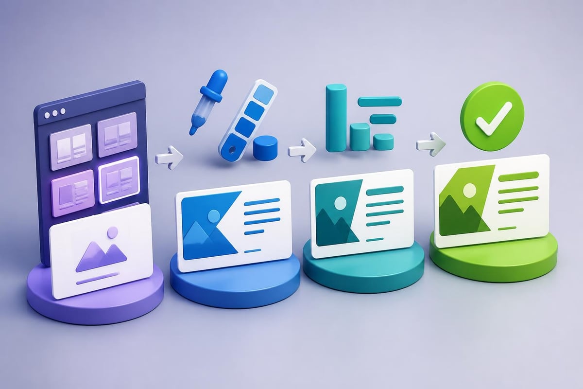
Design implementation workflow

Leveraging AI and Automation

Artificial intelligence has transformed how professionals make a slide presentation, offering efficiency gains while maintaining quality standards. Understanding these tools' capabilities and limitations helps you leverage them effectively.

AI-Powered Design Assistance

Modern AI tools can revolutionize presentation creation by generating polished slides from basic outlines or content inputs. These platforms analyze content and apply design principles automatically, significantly reducing production time.

Research published on AI-powered outline tools demonstrates how systems like OutlineSpark generate structured presentations from simple outlines, streamlining workflows for busy professionals.

Benefits include:

  • Rapid prototype development for iterative refinement
  • Consistent design application across large decks
  • Template suggestions based on content type
  • Automated layout optimization for readability

Limitations to consider:

  • Generic outputs requiring customization for brand alignment
  • Potential loss of nuanced messaging in automated processes
  • Limited understanding of industry-specific visual conventions
  • Dependency on quality input for quality output

Organizations like Noomii Leadership Coaching working with Fortune 500 companies and government agencies often require presentation precision that blends AI efficiency with human expertise to ensure messaging aligns perfectly with organizational standards.

Collaboration and Version Control

Cloud-based presentation platforms enable seamless collaboration, particularly valuable for teams distributed across locations:

  • Real-time editing allows multiple contributors to work simultaneously
  • Comment threads facilitate feedback without altering original content
  • Version history provides rollback capabilities and change tracking
  • Permission controls protect sensitive information while enabling appropriate access

For teams managing sensitive financial data or proprietary technology information, establishing clear collaboration protocols prevents version conflicts and maintains content security.

Quality Assurance and Delivery Preparation

Even expertly designed presentations fail without proper quality assurance and delivery preparation. Final checks ensure your presentation performs as intended when it matters most.

Comprehensive Review Checklist

Before finalizing any presentation:

  • Proofread thoroughly for spelling, grammar, and factual accuracy
  • Test all animations to confirm they execute as intended
  • Verify data accuracy by cross-referencing sources and calculations
  • Check brand compliance ensuring logos, colors, and fonts align with guidelines
  • Confirm accessibility including alt text for images and readable contrast ratios
  • Test file compatibility across different devices and software versions

Professional review processes catch errors that undermine credibility. Even minor mistakes in financial figures or technical specifications can damage trust and derail objectives.

Technical Preparation

File formats matter. Save presentations in multiple formats (native, PDF, and video) to ensure accessibility regardless of viewing context. PDF versions prevent font substitution issues, while video exports work when live presentation software isn't available.

Equipment testing eliminates technical surprises. Test presentations on actual presentation hardware, verify display resolution compatibility, and confirm audio levels function properly.

Backup strategies protect against technology failures. Cloud storage, USB drives, and email copies provide redundancy ensuring presentations remain accessible even when primary systems fail.

Organizations managing high-stakes presentations for clients benefit from systems ensuring reliability. Examining sample PowerPoint design work demonstrates how professionals prepare deliverables meeting stringent quality standards.

Specialized Applications and Industry Considerations

Different industries and use cases require tailored approaches when you make a slide presentation. Understanding these variations ensures your presentations resonate with specific audiences and contexts.

Investor Pitch Decks

Investor presentations demand particular attention to storytelling, data visualization, and persuasive structure:

Financial projections must balance optimism with credibility, presenting growth trajectories supported by market data and operational plans. Charts showing revenue forecasts, customer acquisition costs, and unit economics require special care in design and accuracy.

Competitive positioning slides need clear differentiation without appearing dismissive of competition. Matrix diagrams and comparison tables work effectively when designed with appropriate nuance.

For entrepreneurs navigating these challenges, resources like Swisspreneur provide community support and masterclasses on crafting compelling investor narratives that secure funding.

Technical Product Demonstrations

Technology companies face unique challenges presenting complex products:

  • Architecture diagrams must simplify without oversimplifying
  • Feature comparisons require clarity about technical advantages
  • Integration scenarios demonstrate value in customer contexts
  • Security frameworks communicate protection without overwhelming non-technical stakeholders

Cybersecurity firms particularly benefit from presentation expertise translating technical complexity into accessible narratives. Examples like cybersecurity pitch decks demonstrate effective approaches balancing technical depth with executive-level clarity.

Educational and Training Presentations

Learning-focused presentations prioritize comprehension and retention:

  1. Chunking information into digestible segments prevents cognitive overload
  2. Interactive elements like discussion prompts encourage active engagement
  3. Reinforcement techniques including summaries and key takeaways support retention
  4. Assessment opportunities help learners gauge understanding

E-commerce professionals building businesses on platforms like Shopify can find community support through Talk Shop, where merchants, developers, and experts share knowledge through collaborative learning that often involves presentation skills.

Continuous Improvement and Iteration

Presentation excellence emerges through continuous refinement. The most effective professionals treat each presentation as an opportunity to learn and improve their craft.

Gathering and Implementing Feedback

Audience feedback provides invaluable insights:

  • Post-presentation surveys capture immediate reactions
  • One-on-one discussions reveal nuanced perspectives
  • Analytics from digital presentations show engagement patterns
  • A/B testing different approaches identifies what resonates

Iterative refinement applies learnings systematically. Maintain a swipe file of effective techniques, track what works across different contexts, and gradually build a personal presentation methodology informed by real-world results.

Staying Current with Design Trends

Design trends evolve, requiring ongoing learning to maintain contemporary aesthetics. However, trends should enhance rather than override fundamental principles of clarity and effectiveness.

Balance innovation with timelessness. While incorporating current visual styles keeps presentations fresh, avoiding extreme trend-chasing prevents rapid obsolescence. Classic design principles centered on hierarchy, contrast, and whitespace remain relevant regardless of stylistic shifts.

Professional development through industry resources, design communities, and expert analysis helps you make a slide presentation that feels both current and enduring.


Mastering how to make a slide presentation requires understanding strategic planning, design principles, technical execution, and continuous improvement. For financial and tech businesses where presentations directly impact bottom-line outcomes, investing in presentation excellence delivers measurable returns through clearer communication and more persuasive messaging. When you need presentations that transform complex data into compelling narratives that drive action, Prznt Perfect brings specialized expertise in visual storytelling, brand management, and creative consulting to ensure your presentations achieve their objectives with professional polish and strategic impact.


News & Updates...

Master pitch slide decks with proven design strategies. Learn essential layouts, visual principles, and storytelling techniques that captivate investors.

Master professional business PowerPoint template design with expert tips on branding, layout, and visual hierarchy for financial and tech presentations.