
Data Visualization Presentation: Best Practices Guide
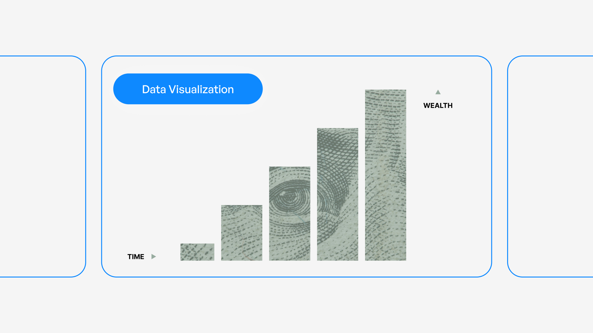
Transforming raw data into compelling visual narratives has become a critical skill for modern businesses, particularly in the financial and technology sectors where complex information must be communicated clearly to diverse audiences. A well-crafted data visualization presentation doesn't simply display numbers; it tells a story that drives decision-making, builds investor confidence, and creates meaningful business outcomes. Whether you're presenting quarterly earnings, product metrics, or market analysis, the ability to translate data into visually engaging and easily digestible formats can mean the difference between securing stakeholder buy-in and losing their attention in the first three slides.
Understanding the Strategic Role of Data Visualization
Data visualization serves as the bridge between raw information and actionable insights. In today's business environment, executives and investors are inundated with information, making it essential to present data in formats that facilitate rapid comprehension and informed decision-making.
Why Visual Communication Outperforms Raw Data
The human brain processes visual information 60,000 times faster than text, which explains why a data visualization presentation consistently outperforms traditional text-heavy reports. When financial performance metrics or technical specifications are transformed into charts, graphs, and infographics, audiences can identify patterns, trends, and anomalies within seconds rather than minutes.
Key advantages of visual data presentation include:
- Immediate pattern recognition across large datasets
- Enhanced retention rates compared to numerical tables
- Simplified communication of complex relationships
- Accelerated decision-making processes
- Universal understanding across language barriers
Research from Purdue University's data visualization guidelines demonstrates that properly designed visualizations increase comprehension by up to 400% compared to text alone.
Aligning Visualizations with Business Objectives
Every data visualization presentation should start with a clear understanding of its purpose. Are you seeking investment approval, demonstrating product-market fit, or reporting on operational performance? The objective determines which data points deserve emphasis and which visualization types will most effectively support your narrative.
For financial presentations, stakeholders typically prioritize:
- Revenue growth trajectories showing sustainable business models
- Cost efficiency metrics demonstrating operational excellence
- Market penetration rates validating strategic positioning
- Comparative performance against competitors and benchmarks
Tech companies often focus on different metrics when creating a professional PowerPoint that includes data:
- User acquisition and retention curves
- Feature adoption rates
- System performance benchmarks
- Development velocity indicators
Selecting the Right Visualization Types
Chart selection represents one of the most critical decisions in creating an effective data visualization presentation. The wrong chart type can obscure insights, confuse audiences, or misrepresent the underlying data relationships.
Matching Charts to Data Relationships
| Data Relationship | Recommended Chart Types | Best Use Cases |
|---|---|---|
| Time-based trends | Line charts, area charts | Revenue growth, user engagement over quarters |
| Part-to-whole comparisons | Pie charts, stacked bars | Market share, budget allocation |
| Item comparisons | Bar charts, column charts | Product performance, regional sales |
| Distribution analysis | Histograms, box plots | Customer demographics, transaction values |
| Correlation | Scatter plots, bubble charts | Investment performance, risk-return profiles |
According to Chapman University's visualization best practices, simplicity should guide chart selection. A common mistake in financial and tech presentations involves using overly complex visualizations when straightforward options would communicate more effectively.
Advanced Visualization Techniques for Complex Data
When presenting multidimensional data common in financial modeling or technical architecture, consider these sophisticated approaches:
Heat maps excel at showing patterns across two dimensions, such as customer activity by day of week and hour of day, or geographic sales performance across product categories.
Waterfall charts effectively demonstrate how individual components contribute to a final value, making them ideal for explaining revenue buildup or cost structures in fintech pitch decks.
Sankey diagrams visualize flow and allocation, perfect for showing customer journey paths, budget distributions, or data pipeline architectures.
The key principle is matching complexity to necessity. If a simpler chart conveys the same insight, always choose simplicity.
Design Principles for Maximum Impact
Visual design can either amplify or undermine your data's message. Professional data visualization presentation design requires attention to multiple elements that work together to create clarity and emphasis.
Color Strategy and Psychological Impact
Color choices in data visualization carry both functional and psychological weight. In financial contexts, traditional associations matter: green typically signals growth or positive performance, while red indicates decline or risk. However, these conventions should be applied thoughtfully rather than automatically.
Effective color strategies include:
- Limiting palettes to 3-5 primary colors to avoid visual chaos
- Using color intentionally to highlight key data points
- Ensuring sufficient contrast for accessibility
- Maintaining consistency across all slides in the presentation
- Considering colorblind-safe palettes for inclusive design
Carnegie Mellon's data visualization guidelines emphasize that accessibility should never be an afterthought. Approximately 8% of men and 0.5% of women have some form of color vision deficiency, making color-only encoding problematic.

Typography and Readability Considerations
Text elements in your data visualization presentation deserve as much attention as the charts themselves. Clear, hierarchical typography ensures that labels, legends, and annotations support rather than distract from the visual elements.
Best practices for typography in data presentations:
- Use sans-serif fonts for improved screen readability (Arial, Helvetica, Calibri)
- Maintain minimum 18-point font sizes for body text in presentation contexts
- Create clear visual hierarchy through size and weight variations
- Limit font families to two maximum across the entire presentation
- Ensure adequate spacing between text elements and visual components
The best PPT presentations balance visual impact with information density, recognizing that cluttered slides reduce comprehension regardless of data quality.
White Space as a Design Element
Professional designers understand that empty space isn't wasted space. Strategic use of white space in a data visualization presentation helps guide attention, reduces cognitive load, and creates visual breathing room that improves comprehension.
When reviewing your slides, ensure that:
- Charts have adequate margins separating them from text and slide edges
- Data points aren't crowded together, making individual values difficult to distinguish
- Legend placement doesn't interfere with the visualization itself
- Supporting text has clear separation from visual elements
Storytelling Through Data Visualization
Numbers alone rarely persuade. The most effective data visualization presentation weaves quantitative evidence into a compelling narrative that resonates emotionally while satisfying intellectual scrutiny.
Structuring Your Data Narrative
Every persuasive presentation follows a story arc, and data-driven decks are no exception. Consider this proven structure:
Setup: Establish context by showing the current state or historical baseline. For a tech startup, this might display market size and growth trajectory.
Conflict: Introduce the problem or opportunity through contrasting data. Show the gap between current performance and potential, or demonstrate an unmet market need through usage statistics.
Resolution: Present your solution with supporting data that demonstrates viability. Include projections, test results, or pilot program outcomes that validate your approach.
Call to Action: Close with specific asks supported by compelling metrics. Whether seeking investment, approval, or partnership, tie your request directly to the data story you've built.
This narrative framework transforms a collection of charts into a coherent argument. GoodData's visualization practices emphasize understanding your audience's priorities when structuring your data story.
Balancing Detail with Accessibility
Financial and technical audiences often demand depth, but overwhelming viewers with excessive detail undermines communication effectiveness. A skilled data visualization presentation provides layers of information that allow different audience members to engage at appropriate levels.
Consider implementing:
- Summary slides with high-level insights for executive audiences
- Detailed backup slides containing granular data for technical questions
- Progressive disclosure that reveals complexity gradually across multiple slides
- Interactive elements (in digital presentations) allowing viewers to explore specifics
| Audience Type | Preferred Detail Level | Recommended Visualization Focus |
|---|---|---|
| C-Suite Executives | High-level trends, bottom-line impact | Summary charts, performance dashboards |
| Board Members | Strategic implications, risk factors | Comparative analyses, scenario models |
| Technical Teams | Granular metrics, methodology | Detailed breakdowns, statistical depth |
| Investors | Growth potential, market position | Traction metrics, competitive landscape |
Avoiding Common Data Visualization Mistakes
Even experienced presenters fall into predictable traps when creating data-driven slides. Recognizing and avoiding these pitfalls elevates your data visualization presentation from adequate to exceptional.
Misleading Visual Representations
Ethical data visualization requires honest representation of underlying information. UC San Diego's best practices guide warns against several common distortions:
Truncated axes can exaggerate differences by not starting at zero, making modest variations appear dramatic. While sometimes appropriate for specific data types, this technique should be used transparently with clear labeling.
Inappropriate chart types distort relationships. Pie charts with too many slices become unreadable, while 3D effects add visual interest but reduce accuracy by distorting proportions.
Cherry-picked timeframes can misrepresent trends by selecting periods that support desired conclusions rather than showing full context.
Overcomplication and Chart Junk
Edward Tufte coined the term "chart junk" to describe visual elements that don't convey information. In a data visualization presentation, every element should serve a purpose or be eliminated.
Common forms of unnecessary complexity include:
- Excessive gridlines that create visual noise
- Decorative backgrounds that reduce contrast
- 3D effects that distort data perception
- Redundant labels repeating obvious information
- Ornamental clip art unrelated to data points
Chartio's visualization practices recommend the "data-ink ratio" principle: maximize the proportion of ink (or pixels) dedicated to representing actual data versus decoration.
Technical Execution and Platform Considerations
The tools and platforms you choose for creating your data visualization presentation significantly impact both the design process and final output quality. In 2026, presentation professionals have access to sophisticated software that balances ease of use with advanced capabilities.
Software Selection for Different Needs
Traditional presentation platforms like PowerPoint and Keynote remain industry standards, offering familiar interfaces and widespread compatibility. These tools have evolved considerably, now including:
- Built-in chart tools with extensive customization
- Integration with Excel and other data sources
- Template systems for maintaining consistency
- Collaboration features for team workflows
Specialized data visualization tools such as Tableau, Power BI, and Flourish provide advanced capabilities for interactive dashboards and complex visualizations that can be embedded into presentation files.
Design-first platforms like Figma are increasingly used for presentations, offering pixel-perfect control and collaborative design features that appeal to teams prioritizing visual excellence.
The right choice depends on your specific requirements:
- Audience format: Will presentations be delivered live, shared as PDFs, or viewed on screens?
- Interactivity needs: Do viewers need to manipulate data or explore different scenarios?
- Team collaboration: How many people need to contribute to creation and editing?
- Brand consistency: What level of design customization does your brand require?
Ensuring Cross-Platform Compatibility
A data visualization presentation created on one system must render correctly across different devices and platforms. Font substitution, color profile differences, and chart rendering variations can undermine professional appearance.
Best practices for compatibility:
- Embed custom fonts or use system-standard alternatives
- Export critical slides as high-resolution images for backup
- Test presentations on target display systems before important meetings
- Create PDF versions for distribution while maintaining editable source files
- Use web-safe color profiles that render consistently across devices
When working with cybersecurity pitch decks or other sensitive materials, consider security implications of different platforms and file formats.
Data Accuracy and Ethical Considerations
Professional credibility depends on absolute accuracy in data representation. A single error in a data visualization presentation can undermine trust and damage business relationships, particularly in financial contexts where stakeholders make decisions based on presented information.
Verification and Quality Control Processes
Implement systematic checks before finalizing any data-driven presentation:
- Source validation: Confirm all data originates from authoritative, current sources
- Calculation verification: Double-check formulas, aggregations, and derived metrics
- Peer review: Have colleagues examine visualizations for clarity and accuracy
- Consistency checks: Ensure numbers align across different slides and visualizations
- Update currency: Verify data reflects the most recent available information
According to ThoughtSpot's best practices, establishing a review protocol reduces errors while improving overall presentation quality.
Transparent Representation of Uncertainty
Financial projections and technical estimates inherently contain uncertainty. Professional data visualization presentation design acknowledges this through appropriate visual techniques:
Confidence intervals show the range of likely outcomes rather than single-point estimates, giving stakeholders realistic expectations.
Scenario modeling presents multiple potential futures based on different assumptions, helping audiences understand variability and risk.
Clear attribution identifies data sources, collection methodologies, and any limitations that might affect interpretation.
Assumption documentation explains the basis for projections and calculations, particularly important in forward-looking financial statements.
Adapting Visualizations for Different Delivery Formats
The same data often needs presentation in multiple contexts: live pitches, printed reports, web dashboards, and video conferences. Each format requires specific adaptations to maintain effectiveness.
Live Presentation Optimization
When delivering a data visualization presentation in person or via video conference:
- Increase font sizes beyond what seems necessary; text readable on your laptop may be illegible on projection screens
- Use animation sparingly to reveal data progressively, controlling audience attention and pacing
- Build in redundancy by verbalizing key insights rather than assuming audiences will extract them from visuals alone
- Prepare for questions with backup slides containing additional detail and alternative views
Print and Distribution Formats
Data visualizations intended for printed materials or PDF distribution require different considerations:
- Higher resolution images to maintain quality when printed
- Self-explanatory charts that communicate without verbal explanation
- Comprehensive labels and legends since presenter narration won't be available
- Conservative color choices that reproduce well in grayscale if needed
The ADP Health data presentation guide offers valuable insights into adapting visualizations for advocacy and communication across multiple channels.
Measuring Presentation Effectiveness
Creating a data visualization presentation represents significant investment of time and resources. Professional teams measure effectiveness to continuously improve their approach and demonstrate value.
Quantitative Success Metrics
Depending on presentation objectives, relevant metrics might include:
| Objective | Measurable Outcomes | Assessment Methods |
|---|---|---|
| Investor fundraising | Capital raised, investor meetings secured | Conversion tracking, follow-up rates |
| Board approval | Decisions approved, budget allocated | Vote outcomes, allocation amounts |
| Sales enablement | Deal velocity, win rates | CRM data analysis |
| Stakeholder alignment | Agreement scores, action item completion | Survey responses, task tracking |
Qualitative Feedback Collection
Numbers don't capture everything. Gathering qualitative feedback provides insights into audience comprehension, emotional response, and areas for improvement:
- Post-presentation surveys with specific questions about clarity and persuasiveness
- Focus groups to explore reactions to specific visualizations or narrative elements
- A/B testing different approaches with similar audiences to identify what resonates
- Stakeholder interviews to understand decision-making processes and information needs
Vizzu's visualization examples demonstrate how iterative refinement based on feedback transforms adequate visualizations into exceptional ones.
Building a Data Visualization Template Library
Efficiency and consistency improve when organizations develop reusable templates for common data visualization presentation needs. Rather than starting from scratch for each deck, professional teams create frameworks that can be adapted quickly while maintaining quality standards.
Essential Template Categories
A comprehensive template library for financial and tech businesses should include:
Financial performance dashboards showing revenue, expenses, profitability, and key performance indicators with consistent formatting and calculation methodologies.
Product metrics templates for user acquisition, engagement, retention, and feature adoption that enable rapid reporting across different products or time periods.
Competitive analysis frameworks that standardize how market positioning, feature comparisons, and performance benchmarking are visualized.
Technical architecture diagrams with established visual language for system components, data flows, and integration points.
When building templates, remember that flexibility matters as much as structure. Templates should provide consistent frameworks while allowing customization for specific contexts.
Mastering data visualization presentation techniques transforms how businesses communicate insights, secure resources, and drive strategic decisions. By combining thoughtful chart selection, ethical data representation, compelling storytelling, and professional design execution, organizations create presentations that inform, persuade, and inspire action. If you're looking to elevate your data-driven presentations with visually stunning designs that turn complex information into clear narratives, Prznt Perfect specializes in creating impactful presentations for financial and tech businesses that resonate with stakeholders and deliver measurable results.


- This is some text inside of a div block.lay out the facts clearly and compellingly. Use data to establish the ground reality, but remember that facts alone are like the individual strands of a tapestry—necessary but not complete.lay out the facts clearly and compellingly. Use data to establish the ground reality, but remember that facts alone are like the individual strands of a tapestry—necessary but not complete.
- This is some text inside of a div block.lay out the facts clearly and compellingly. Use data to establish the ground reality, but remember that facts alone are like the individual strands of a tapestry—necessary but not complete.

