


Corporate Presentation Design: A Strategic Guide
Learn how corporate presentation design blends visual storytelling, data visualization, and brand consistency to win investors and boards.

In the high-stakes world of financial services and technology, the quality of your visual communications directly impacts business outcomes. Corporate presentation design has evolved from simple slide creation into a strategic discipline that combines visual storytelling, data visualization, and brand management. Whether you're pitching to investors, presenting quarterly results to the board, or delivering a keynote at an industry conference, your presentation design communicates competence, credibility, and strategic thinking before you speak a single word.
The Strategic Foundation of Corporate Presentation Design
Professional corporate presentation design begins with understanding your audience and objectives. Financial executives expect different visual approaches than technology innovators, yet both demand clarity, precision, and visual sophistication. The most effective presentations balance information density with aesthetic appeal, a principle explored in detail in balancing slide aesthetics with information density.
Defining Your Communication Goals
Every corporate presentation serves a specific purpose:
- Investor presentations require financial clarity and growth narratives
- Board decks demand executive-level summaries with drill-down capability
- Sales presentations focus on value propositions and competitive differentiation
- Internal strategy communications align teams around vision and execution
- Conference keynotes establish thought leadership and brand authority
Before opening your design software, identify your primary objective. Are you securing funding? Reporting performance? Gaining approval for a strategic initiative? Your design choices should support this goal at every level.

Visual Hierarchy and Information Architecture
Corporate audiences process information quickly. Your presentation design must guide attention deliberately through visual hierarchy. This means establishing clear patterns that help viewers understand what matters most on each slide.
Typography plays a foundational role. Use no more than two typefaces throughout your deck, typically a sans-serif for headings and body text. Size differentiation creates hierarchy: primary headlines at 32-40 points, subheadings at 24-28 points, and body text never smaller than 18 points. Remember that boardroom screens and video conferences reduce legibility compared to your laptop display.
Grid Systems and Alignment
Professional corporate presentation design relies on consistent grid systems. Establish margins (typically 0.5-1 inch on all sides) and align all elements to invisible guidelines. This creates visual cohesion across slides and projects competence.
| Design Element | Best Practice | Common Mistake |
|---|---|---|
| Margins | 0.5-1 inch consistent | Varying per slide |
| Text alignment | Left-aligned for readability | Centered paragraphs |
| Element spacing | Consistent 20-30px gaps | Random positioning |
| Image treatment | Consistent borders/shadows | Mixed styles |
Color usage should reinforce hierarchy rather than decorate. Your primary brand color draws attention to key points, while neutral grays handle supporting information. Research on decluttering visual communications demonstrates that reducing visual complexity improves comprehension and retention.
Data Visualization Excellence
Financial and technology presentations depend heavily on data visualization. The difference between mediocre and exceptional corporate presentation design often lies in how effectively complex information becomes clear, actionable insight.
Charts should communicate one primary message. If a viewer can't grasp your point in five seconds, your visualization needs refinement. Remove gridlines, reduce decimal places, eliminate legends when direct labeling works better, and ensure sufficient color contrast for accessibility.
Choosing the Right Chart Type
Different data relationships require specific visualization approaches:
- Trends over time - Line charts with clear axis labels and annotated inflection points
- Part-to-whole relationships - Pie charts (limited to 5 segments maximum) or stacked bars
- Comparisons - Horizontal or vertical bar charts with consistent scaling
- Correlations - Scatter plots with trend lines and clear quadrant labels
- Geographic patterns - Heat maps or proportional symbol maps
For financial presentations specifically, consider the best chart types for financial data, which addresses revenue waterfalls, variance analysis, and performance dashboards.
The Harvard T.H. Chan School of Public Health offers a practical slide design checklist that emphasizes accessibility in chart design, including color contrast ratios and alternative text for screen readers. These considerations aren't just compliance requirements; they ensure your message reaches every stakeholder.
Brand Consistency Across Presentations
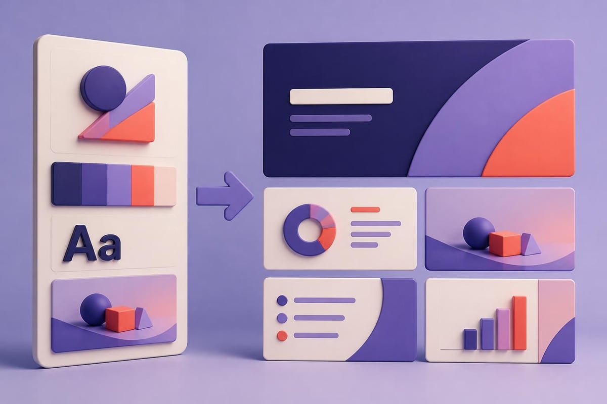
Corporate presentation design must reinforce brand identity without overshadowing content. Your presentation templates should reflect your brand guidelines while maintaining flexibility for different content types and presenters.
Building Scalable Template Systems
Effective corporate template systems include:
- Master slide layouts for common content patterns (title slide, section divider, content slide, data slide, quote slide)
- Color palette documentation with specific RGB/HEX values for digital and print
- Typography specifications including font weights, sizes, and use cases
- Image treatment guidelines for photography, icons, and illustrations
- Logo placement rules that maintain visibility without dominating
Many organizations face the challenge of deciding whether to rebrand before or after major milestones, which significantly impacts presentation design strategies. If your brand identity is evolving, your presentation templates must accommodate transition periods.
Narrative Structure and Storytelling
Even the most visually sophisticated slides fail without compelling narrative structure. Corporate presentation design must support clear storytelling that guides audiences through complex information toward specific conclusions or decisions.
The classic presentation narrative follows a three-act structure: establish context and problem, present analysis and options, conclude with recommendations and next steps. Within this framework, Harvard Business Review's guidance on making a good presentation great emphasizes purposeful slide sequencing and audience-focused messaging.
The Pyramid Principle in Corporate Decks
For executive audiences particularly, the pyramid principle structures information effectively:
- Lead with your conclusion - Executives want the answer first
- Support with key arguments - Provide 3-5 main supporting points
- Back with detailed evidence - Include data, case studies, or analysis in appendices
This approach respects time-constrained decision-makers while providing depth for those who need it. Your corporate presentation design should visually distinguish between main deck content and supporting appendices through layout changes or section dividers.
Production Quality and Technical Excellence
Professional corporate presentation design demands attention to technical details that separate amateur work from agency-quality deliverables. File management, asset quality, and format compatibility all impact final results.
Image resolution matters significantly. Use only high-resolution images (minimum 150 DPI at display size, preferably 300 DPI). Stretched or pixelated photos undermine credibility instantly. When incorporating infographics, follow best practices for PowerPoint infographics to maintain quality across different display environments.
Software Capabilities and Limitations
While PowerPoint dominates corporate environments, understanding its capabilities prevents design compromises. Modern PowerPoint includes:
- Advanced animation tools for data reveals and transitions
- Morph transitions for seamless slide-to-slide movement
- Designer suggestions powered by AI (though manual refinement typically improves results)
- Collaboration features for team-based development
- Accessibility checkers that identify contrast and alt-text issues
Microsoft provides comprehensive guidance on creating accessible documents, including PowerPoint-specific features. These tools help ensure your corporate presentations meet accessibility standards while improving overall clarity.
For organizations considering professional presentation design services, understanding what separates DIY efforts from agency work helps set appropriate expectations and budgets.
Specialized Corporate Presentation Types
Different corporate scenarios require adapted design approaches. Understanding these variations helps you allocate resources and set design standards appropriately.
Investor and Pitch Presentations
Financial presentations for investors demand specific design considerations. Your pitch deck design must balance storytelling with data substantiation. Investors evaluate hundreds of decks; visual differentiation combined with information clarity creates competitive advantage.
Key slides typically include:
- Problem statement with market sizing
- Solution overview with product visualization
- Business model and unit economics
- Traction metrics and growth trajectory
- Competitive landscape positioning
- Team credentials and advisory board
- Financial projections and funding ask
| Investor Type | Design Priority | Common Pitfall |
|---|---|---|
| Venture Capital | Growth narrative, team | Over-designed, under-substantiated |
| Private Equity | Financial detail, operations | Generic templates, poor data viz |
| Strategic Corporate | Integration thesis, synergies | Mismatched brand sophistication |
| Angel Investors | Problem-solution fit, founder story | Too complex, jargon-heavy |
For technology companies particularly, corporate presentation design must communicate innovation without sacrificing clarity. Technical architecture slides need simplification for non-technical stakeholders while maintaining enough detail to demonstrate feasibility.

Workflow Optimization and Team Collaboration
Effective corporate presentation design requires efficient workflows, especially when multiple stakeholders contribute content. Establishing clear processes prevents last-minute scrambles and maintains quality standards.
Version control becomes critical in collaborative environments. Implement naming conventions that include date stamps and version numbers (e.g., "Q4-Board-Deck_2026-10-05_v3.pptx"). Cloud-based collaboration through Microsoft 365 or Google Workspace enables simultaneous editing while tracking changes.
Content Development Timelines
Professional agencies typically structure presentation development in phases:
- Discovery and strategy (20% of timeline) - Audience analysis, objective setting, content audit
- Content development (30% of timeline) - Copywriting, data preparation, narrative structuring
- Design execution (35% of timeline) - Visual design, chart creation, template application
- Review and refinement (15% of timeline) - Stakeholder feedback, revisions, quality control
Stanford's institutional guide on giving great presentations emphasizes the relationship between preparation time and presentation effectiveness. Rushing design compromises both aesthetics and clarity.
For organizations facing urgent deadlines, services offering 24-hour presentation turnaround can provide professional results under time pressure, though advance planning always yields superior outcomes.
Measuring Presentation Effectiveness
Corporate presentation design should be evaluated against measurable outcomes, not just aesthetic preferences. Different presentation types require different success metrics.
Quantitative and Qualitative Metrics
For sales presentations, track:
- Conversion rates from presentation to next-step meetings
- Time from presentation to deal closure
- Win rates compared to competitors
- Stakeholder engagement during delivery (questions, discussion time)
For investor presentations, measure:
- Meeting-to-term-sheet conversion
- Follow-up meeting requests
- Specific slide discussion time (which content resonates)
- Investor questions (indicating clarity gaps or interest areas)
For internal strategic communications:
- Post-presentation surveys on clarity and alignment
- Action item completion rates
- Cross-functional collaboration improvements
- Strategic initiative adoption metrics
The Nielsen Norman Group's research on investor relations and corporate communications includes usability considerations that apply to presentation design, particularly around template systems and content reusability.
Integration with Broader Marketing Communications
Corporate presentation design doesn't exist in isolation. Your presentations should align with broader marketing communications, creating consistent brand experiences across touchpoints. This integration becomes particularly important for organizations managing multiple communication channels simultaneously.
Consider how your presentation templates complement website design, sales collateral, social media assets, and trade show materials. Companies working with digital marketing specialists can ensure visual consistency across presentation design and digital campaigns, strengthening brand recognition and message reinforcement.
For eCommerce and technology companies particularly, presentations often support product launches, partnership announcements, or community engagement initiatives. Organizations building communities around their platforms, similar to how Talk Shop serves the Shopify ecosystem, can leverage presentation design to educate users, showcase success stories, and drive platform adoption.
Advanced Design Techniques for Impact
Elevating corporate presentation design beyond competent to exceptional requires mastering advanced techniques that create memorability and engagement.
Animation and Transition Strategy
Purposeful animation directs attention and reveals information progressively. Effective uses include:
- Data reveals that build charts point-by-point, allowing narration of each insight
- Comparison slides that show before-after or option A vs. option B sequentially
- Process flows that animate step-by-step through workflows or timelines
- Emphasis effects that briefly highlight key numbers or conclusions
Avoid decorative animations that distract. Every motion should serve a communication purpose. Research from ACM SIGCHI on presentation structure and automatic analysis explores how presentation format affects comprehension, with implications for animation and transition design.
Custom Illustration and Icon Systems
Stock photography and generic icons create sameness. Custom illustrations and icon systems differentiate your corporate presentation design while reinforcing brand identity. This investment pays dividends when:
- Explaining proprietary processes or methodologies
- Visualizing abstract concepts specific to your industry
- Creating consistent visual metaphors across multiple presentations
- Building templates that flex across departments and use cases
For organizations considering whether to invest in custom design assets, examining award-winning presentation examples demonstrates how visual originality impacts audience perception and recall.
Accessibility and Inclusive Design
Accessible corporate presentation design isn't optional in 2026. Legal requirements, ethical obligations, and practical benefits all demand presentations that serve diverse audiences.
Implementing WCAG Guidelines in Presentations
Web Content Accessibility Guidelines (WCAG) principles apply to presentation design:
- Color contrast ratios of at least 4.5:1 for normal text, 3:1 for large text
- Alternative text for all images, charts, and diagrams (screen readers should convey full meaning)
- Reading order that follows logical information flow
- Keyboard navigation compatibility for users who cannot use mice
- Captions and transcripts for any embedded video or audio
These considerations improve comprehension for all users, not just those with disabilities. High-contrast slides are more legible in bright conference rooms. Clear reading order helps non-native speakers follow along. Alternative text forces designers to articulate what each visual element communicates.
Industry-Specific Considerations
Financial services and technology sectors have distinct corporate presentation design requirements that reflect regulatory environments, audience sophistication, and communication norms.
Financial Services Presentations
Banks, investment firms, and fintech companies navigate complex regulatory disclosure requirements. Your corporate presentation design must accommodate:
- Required disclaimers without overwhelming slides
- Precise data presentation where accuracy is legally critical
- Performance comparisons that follow industry standards (GIPS for investment performance)
- Risk disclosures integrated naturally rather than relegated to fine print
Financial presentations also serve sophisticated audiences who scrutinize methodology and assumptions. Your design should enable, not obscure, this level of examination.
Technology and SaaS Presentations
Tech companies face different challenges. Product demonstrations, technical architecture, and innovation narratives require design approaches that:
- Simplify complex systems through progressive disclosure
- Visualize abstract concepts (cloud infrastructure, API integrations, data flows)
- Demonstrate user interfaces and product experiences
- Communicate technical differentiation to non-technical decision-makers
For biotech and specialized technology sectors, explore resources on biotech presentation design that address scientific communication challenges within corporate presentation contexts.
The ROI of Professional Corporate Presentation Design
Organizations frequently underestimate presentation design's business impact. A well-designed corporate presentation generates measurable returns through:
Higher close rates. Sales teams using professionally designed presentations report 15-30% higher conversion rates compared to template-based decks. The investment in design pays for itself within a few closed deals.
Faster decision cycles. Clear, well-organized presentations reduce stakeholder questions and accelerate approval processes. Board members spend less time requesting clarification and more time making strategic decisions.
Enhanced brand perception. Your presentation quality signals organizational sophistication. Investors, clients, and partners form impressions of your company's competence based partly on visual communications quality.
Improved internal alignment. When strategy presentations communicate clearly, teams execute more effectively. Reduced misalignment saves significant costs in wasted effort and rework.
For organizations evaluating presentation agency pricing, consider these returns against investment costs. Professional corporate presentation design isn't an expense; it's a strategic asset that compounds value over time.
Mastering corporate presentation design requires balancing aesthetic sophistication with communication clarity, brand consistency with content flexibility, and creative impact with professional credibility. The strategies outlined here provide a framework for elevating your visual communications from functional to strategic. When your presentation challenges demand specialized expertise in visual storytelling, data visualization, or brand-aligned design, Prznt Perfect transforms complex business narratives into compelling visual communications that drive results for financial and technology organizations.
