
Business Presentation PPT: Professional Design Guide

Creating an effective business presentation ppt requires more than simply populating slides with bullet points and generic templates. Financial and tech companies face unique challenges when communicating complex data, innovative solutions, and strategic visions to stakeholders, investors, and clients. The quality of your presentation deck can determine whether you secure funding, close a deal, or simply lose your audience's attention in the first three slides. Understanding the principles of professional presentation design transforms your communication from forgettable to unforgettable, ensuring your message resonates with precision and impact.
Understanding the Core Elements of Business Presentation PPT Design
Every successful business presentation ppt begins with a clear understanding of its fundamental components. These elements work together to create a cohesive narrative that guides your audience from problem identification through to your proposed solution.
Structure and flow form the backbone of any compelling presentation. Your deck should follow a logical progression that builds momentum and maintains engagement throughout. Most effective business presentations follow a proven structure:
- Opening with a strong hook that captures attention immediately
- Establishing the problem or opportunity with concrete evidence
- Presenting your solution with clarity and confidence
- Supporting your claims with data and proof points
- Concluding with clear next steps and calls to action
Visual hierarchy ensures that audiences process information in the intended order. This means strategically using size, color, contrast, and positioning to direct attention to the most critical elements on each slide.

The typography choices you make significantly impact readability and professionalism. Sans-serif fonts like Helvetica, Arial, or Calibri typically work best for business contexts, offering clean lines that remain legible even on large screens or when projected. Font sizes should never drop below 24 points for body text, with headings ranging from 36 to 44 points.
Data Visualization Principles That Drive Understanding
Financial and tech businesses deal with complex datasets that require thoughtful translation into visual formats. Effective data visualization in business presentations transforms numbers into narratives that stakeholders can quickly grasp and remember.
Charts and graphs must serve a specific purpose rather than simply displaying data because it exists. Each visualization should answer a question or prove a point that advances your overall narrative. Consider these guidelines:
| Visualization Type | Best Used For | Avoid When |
|---|---|---|
| Bar charts | Comparing values across categories | Showing trends over time |
| Line graphs | Displaying trends and changes | Comparing unrelated categories |
| Pie charts | Showing parts of a whole (limit to 5 segments) | Precise comparisons are needed |
| Scatter plots | Revealing correlations and patterns | Audience lacks technical background |
Color psychology plays a crucial role in how your audience interprets information. Blue conveys trust and stability, making it ideal for financial presentations. Green suggests growth and positive outcomes. Red demands attention but should be reserved for highlighting critical issues or urgent matters.
Creating Compelling Visual Narratives for Tech and Financial Sectors
The most impactful business presentation ppt transforms abstract concepts into tangible stories that resonate with decision-makers. This approach proves especially valuable when explaining technical innovations or complex financial instruments to non-specialist audiences.
Visual metaphors bridge the gap between complex ideas and audience understanding. Rather than explaining blockchain technology through technical jargon, you might visualize it as an unbreakable chain of verified transactions. Similarly, representing cybersecurity as layered shields helps audiences grasp defense-in-depth strategies without needing technical expertise.
Your opening slide sets expectations for everything that follows. It should immediately communicate what the presentation covers and why it matters to the specific audience in the room. Generic title slides waste valuable real estate and fail to capture attention. Instead, consider opening with a provocative statistic, a challenging question, or a bold statement that compels engagement.
Slide Design Best Practices for Professional Impact
Individual slide design determines whether your audience focuses on your message or becomes distracted by visual clutter. Professional PowerPoint design requires disciplined restraint and strategic choice-making at every level.
The one-idea-per-slide principle prevents cognitive overload. Each slide should advance a single concept, supported by minimal text and relevant visuals. This approach forces you to distill complex information into its essential components, making your presentation more digestible and memorable.
White space is a design element, not wasted space. Generous margins and breathing room around text and images create visual comfort and direct attention to what matters. Overcrowded slides signal amateur design and make audiences work harder to extract meaning.
Consistency in design elements builds professional credibility:
- Use the same font families throughout (maximum of two typefaces)
- Maintain consistent spacing and alignment across all slides
- Apply a unified color palette of three to five complementary colors
- Position recurring elements (logos, page numbers) in identical locations
Image quality cannot be compromised in professional contexts. Pixelated, stretched, or low-resolution images immediately diminish perceived credibility. Invest in high-quality photography, custom illustrations, or professional icon sets that align with your brand standards.

Adapting Your Business Presentation PPT for Different Audiences
Understanding your audience drives every design decision in effective presentation creation. A pitch deck for venture capitalists requires different emphasis, pacing, and visual treatment than a quarterly review for internal stakeholders or a product demonstration for potential clients.
Investor presentations demand concise communication of market opportunity, competitive advantage, and financial projections. These audiences review dozens of decks weekly and appreciate presentations that respect their time while delivering comprehensive information. Creating effective business presentations for investors means focusing on metrics that matter: addressable market size, customer acquisition costs, lifetime value, and clear paths to profitability.
Executive audiences prefer high-level strategic insights over operational details. They need to understand implications and outcomes rather than processes and methodologies. This means front-loading conclusions, using executive summaries, and providing supporting detail in appendix slides that can be referenced during Q&A sessions.
Technical audiences engage differently, appreciating precision, methodology, and evidence-based claims. When presenting to engineers, developers, or technical decision-makers, including architecture diagrams, code snippets (when appropriate), and detailed specifications demonstrates depth of understanding and builds credibility.
Presentation Delivery Modes and Format Optimization
Modern business presentation ppt must work across multiple delivery contexts. The same deck might be presented live, sent as a PDF for asynchronous review, or displayed on video conference platforms.
Stand-alone decks require more comprehensive text and explanation since no presenter will guide viewers through the content. These presentations substitute speaker notes with actual slide content while maintaining visual appeal and readability. Every slide must be self-explanatory without verbal accompaniment.
Live presentations allow for minimal text since you provide context verbally. These decks emphasize powerful visuals, key statistics, and talking point reminders rather than complete sentences. Business presentation best practices distinguish between content designed for presentation versus content designed for distribution.
Video conference presentations require special consideration for screen sharing limitations:
- Increase font sizes by 10-20% compared to in-room presentations
- Use higher contrast ratios to compensate for compression
- Avoid intricate details that may not render clearly
- Build in longer pauses for questions due to audio delays
Advanced Techniques for Financial Services Presentations
Financial sector presentations carry unique requirements for data accuracy, regulatory compliance, and professional gravitas. Your business presentation ppt must balance comprehensive information disclosure with engaging storytelling that holds attention through complex subjects.
Scenario modeling visualizations help audiences understand potential outcomes under different conditions. Rather than presenting single forecasts, show optimistic, realistic, and conservative scenarios with clear assumptions underlying each projection. This approach demonstrates thorough analysis while managing expectations appropriately.
Regulatory disclosures and legal requirements often mandate specific content inclusion. Rather than appending these elements awkwardly, integrate compliance information thoughtfully through footnotes, appendix sections, and design treatments that maintain visual flow while meeting legal obligations.
Risk visualization requires particular attention in financial contexts. Heat maps, probability distributions, and sensitivity analyses translate abstract risk concepts into comprehensible formats that support informed decision-making. Color-coding risk levels (green for low, yellow for moderate, red for high) provides immediate visual assessment.
Technology Sector Presentation Strategies
Tech company presentations must communicate innovation while remaining accessible to non-technical stakeholders. This balance proves especially challenging when explaining emerging technologies, complex software architectures, or novel business models.
Product demonstrations within presentation contexts require careful planning. Screen recordings, interactive prototypes, and step-by-step walkthroughs show rather than tell, creating tangible understanding of user experiences and technical capabilities. These elements should integrate seamlessly into the overall narrative rather than interrupting flow.
Competitive positioning slides clarify your differentiation in crowded markets. Feature comparison matrices, positioning maps, and capability assessments help audiences quickly grasp your unique value proposition relative to alternatives. Understanding presentation design trends ensures your competitive slides reflect current best practices.
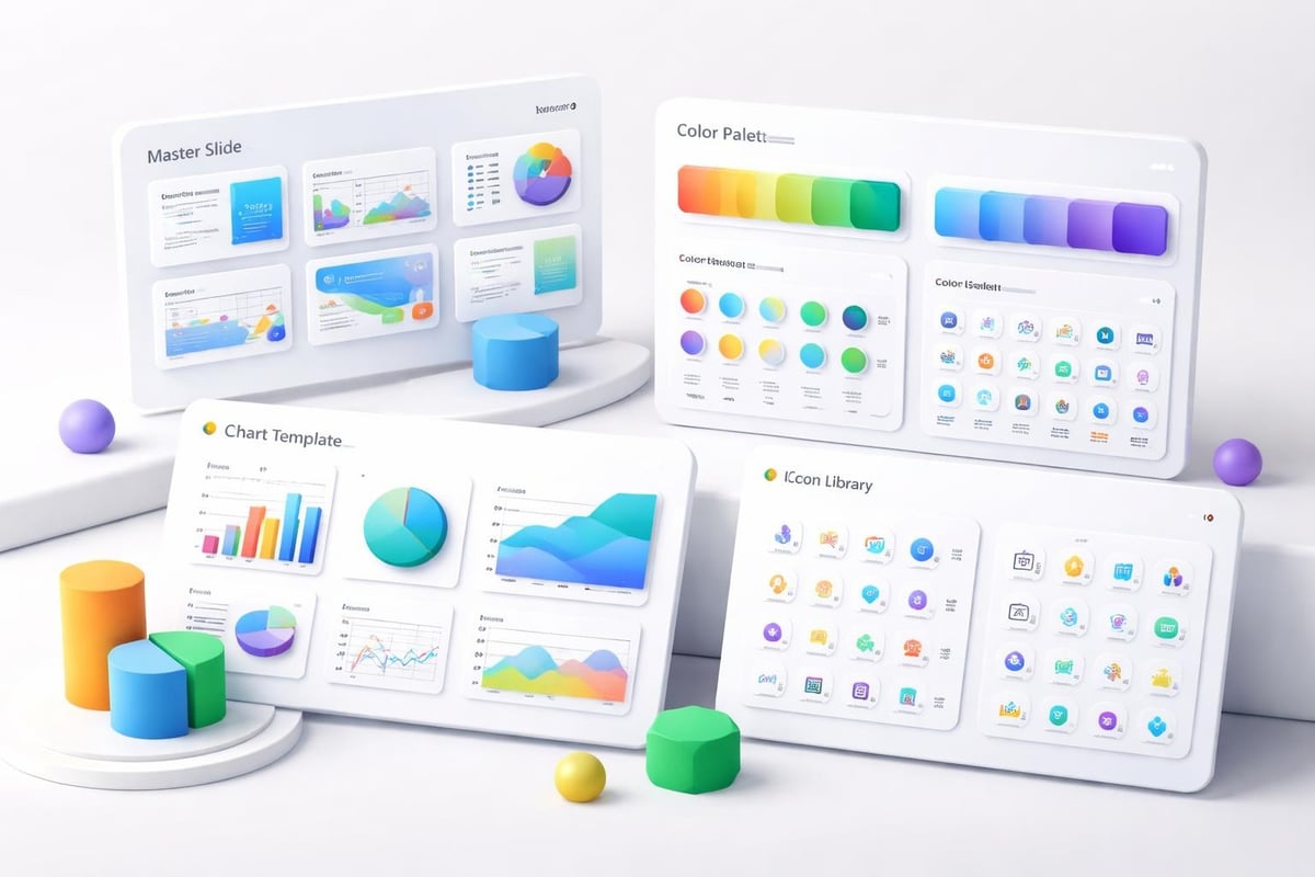
Template Selection and Customization for Brand Consistency
Starting with a basic PPT presentation template accelerates deck creation while ensuring design consistency. However, generic templates rarely reflect your brand identity or industry-specific needs adequately.
Professional template customization aligns presentation design with broader brand guidelines:
- Corporate color palettes applied consistently across all slide elements
- Logo placement and sizing that maintains brand standards
- Custom slide layouts for recurring content types (team slides, financial tables, case studies)
- Branded graphics and iconography that reinforce visual identity
Master slide configuration in PowerPoint enables efficient updates across entire decks. Changes made to master layouts automatically propagate to all slides using those layouts, ensuring consistency while simplifying maintenance. This approach proves especially valuable for organizations creating multiple presentations monthly.
Industry-specific requirements often necessitate specialized templates. Cybersecurity PPT templates incorporate threat visualization frameworks, security architecture diagrams, and compliance checklists that generic templates lack. Similarly, fintech pitch deck templates account for regulatory contexts, financial modeling standards, and investor expectations specific to that sector.
Common Pitfalls and How Professional Agencies Prevent Them
Even experienced presenters fall into predictable traps that undermine their business presentation ppt effectiveness. Avoiding common presentation mistakes requires awareness of these issues and systematic approaches to prevention.
Text overload remains the most frequent error in business presentations. Slides packed with paragraphs signal a fundamental misunderstanding of the medium. Presentations should complement verbal delivery, not duplicate it. Professional designers apply strict text limits: headlines of 10 words or fewer, body text of 20 words maximum per slide.
Animation and transition misuse creates distraction rather than emphasis. Every animation should serve a clear purpose: revealing information progressively, showing relationships, or controlling pacing. Gratuitous effects like spinning text or excessive fade-ins appear amateurish and undermine credibility.
Inconsistent formatting across slides creates visual chaos that frustrates audiences. Professional design agencies maintain detailed style guides specifying exact spacing measurements, color hex codes, and typography treatments to ensure perfect consistency across every element.
Quality Assurance and Pre-Presentation Review
Rigorous review processes catch errors before they reach audiences. Effective quality assurance for presentations includes multiple checkpoint stages:
- Content accuracy verification ensuring all data, statistics, and claims are current and correct
- Design consistency audit checking formatting, spacing, and brand compliance
- Technical testing confirming all embedded videos, links, and interactive elements function properly
- Accessibility review ensuring content remains perceivable to audiences with different abilities
- Device compatibility testing across the platforms where presentation will be delivered
Proofreading extends beyond spell-checking. Review for clarity, logical flow, and audience appropriateness. Read slides aloud to identify awkward phrasing or overly complex language. Have colleagues unfamiliar with the content review the deck to assess whether it communicates clearly without additional context.
Integrating Interactive Elements for Enhanced Engagement
Modern business presentation ppt increasingly incorporates interactive components that transform passive viewing into active participation. These elements prove especially effective for virtual presentations where maintaining engagement presents additional challenges.
Embedded polls and surveys gather real-time audience input that can be referenced throughout the presentation. This approach creates dialogue rather than monologue, making audiences feel invested in outcomes. Interactive data visualization tools allow presenters to manipulate variables and show impacts dynamically, responding to specific audience questions.
Hyperlinked navigation enables non-linear presentation paths. Rather than forcing every audience through identical sequences, skilled presenters jump to relevant sections based on expressed interests or time constraints. This flexibility demonstrates responsiveness and ensures audiences receive maximum value regardless of time limitations.
Click-through prototypes embedded within slides bring product concepts to life more effectively than static screenshots. Audiences can experience user flows, interface interactions, and feature functionality directly within the presentation context.
Measuring Presentation Impact and Iterating for Improvement
Creating effective presentations is an iterative process that benefits from systematic measurement and refinement. Track metrics that indicate whether your business presentation ppt achieves intended objectives.
Engagement indicators during live presentations include question quantity and quality, audience body language, and post-presentation follow-up requests. For distributed decks, track open rates, time spent per slide, and which sections receive most attention through analytics platforms.
Conversion metrics connect presentations to business outcomes:
| Presentation Type | Primary Metric | Secondary Metrics |
|---|---|---|
| Sales pitches | Deal close rate | Meeting requests, follow-up questions |
| Investor decks | Funding secured | Second meeting invitations, due diligence requests |
| Product launches | Adoption rate | Demo requests, trial signups |
| Internal updates | Decision velocity | Stakeholder alignment, action item completion |
Feedback collection should occur systematically after each presentation. Brief surveys asking what resonated, what confused, and what could improve provide actionable insights for deck refinement. Professional presentation services incorporate this feedback loop into their design processes, continuously evolving templates and approaches based on measured results.
Working with Professional Presentation Design Agencies
Organizations facing high-stakes presentations or lacking internal design resources increasingly partner with specialized agencies. These collaborations deliver professional-grade business presentation ppt that would require significant time and expertise to produce internally.
Engagement models vary based on needs and budgets. One-time project work suits organizations with occasional presentation needs, while retainer arrangements serve companies requiring ongoing support. Understanding how to access professional PPT services clarifies expectations and streamlines collaboration.
The best agency partnerships begin with comprehensive discovery:
- Target audience analysis and stakeholder mapping
- Competitive landscape assessment
- Brand guideline review and application
- Content audit and narrative development
- Timeline and milestone establishment
Professional agencies bring specialized expertise in transforming complex information into clear visual narratives. They understand industry-specific conventions, possess advanced design tool proficiency, and stay current with evolving presentation technologies. This specialized knowledge proves especially valuable for financial services presentations and technology sector decks where technical accuracy and visual appeal must coexist.
Mastering business presentation ppt design requires understanding your audience, applying proven design principles, and continuously refining based on results. Whether you're pitching to investors, presenting to executives, or demonstrating products to clients, professionally designed presentations significantly impact outcomes. If you're ready to transform your presentations from functional to exceptional, Prznt Perfect specializes in creating visually stunning decks that communicate complex financial and technical concepts with clarity and impact. Our team combines strategic thinking with design excellence to ensure your message resonates with exactly the audiences that matter most to your business success.


- This is some text inside of a div block.lay out the facts clearly and compellingly. Use data to establish the ground reality, but remember that facts alone are like the individual strands of a tapestry—necessary but not complete.lay out the facts clearly and compellingly. Use data to establish the ground reality, but remember that facts alone are like the individual strands of a tapestry—necessary but not complete.
- This is some text inside of a div block.lay out the facts clearly and compellingly. Use data to establish the ground reality, but remember that facts alone are like the individual strands of a tapestry—necessary but not complete.

