
7 Essential Simple PPT Design Tips for 2026 Presentations

Did you know that in 2026, professionals spend over 40% more time in virtual meetings than just two years ago? As the digital landscape evolves, the need for clear and engaging presentations has never been greater.
Yet, many still fall into common traps: cluttered slides, confusing visuals, and overwhelming text. The good news? Mastering simple ppt design can dramatically boost your message’s impact and audience engagement.
This article reveals 7 essential simple ppt design tips to help you stand out—whether you are leading meetings, pitching ideas, or speaking at conferences.
Ready to transform your presentations? Let’s unlock the secrets to clarity and connection with every slide.
Why Simple PPT Design Matters in 2026
The way we communicate visually is rapidly evolving. In 2026, the professional world thrives on speed, clarity, and digital-first connections. Remote and hybrid work are now standard, making it crucial for presenters to deliver messages that are instantly clear. This environment has sparked a widespread move toward simple ppt design as the foundation for impactful presentations.
Minimalism is not just a trend, but a necessity. Overloaded slides filled with dense text and noisy visuals can quickly overwhelm viewers. According to leading educational research, cognitive overload reduces audience attention and retention. When too much information is presented at once, viewers struggle to process key points. As outlined in Managing cognitive load through effective presentations, streamlining content and visuals helps audiences grasp core messages with ease. Simple ppt design combats information fatigue, making every slide more memorable.
Accessibility and inclusivity are also essential in today’s global workplace. Simple ppt design supports clear communication for diverse audiences, including those with visual or learning differences. Using high-contrast colors, readable fonts, and straightforward layouts ensures that everyone, regardless of background or ability, can engage with your content. This approach also bridges cultural gaps, as uncluttered visuals and concise messages are universally understood.
The data backs this up. A 2024 Prezi survey found that 82% of professionals prefer presentations with clean, uncluttered slides. Leading tech and finance companies have adopted simple ppt design to boost decision-making and drive results. For example, a fintech pitch deck that used minimal text and bold visuals secured investor interest within minutes, while a tech executive’s quarterly update saw improved retention rates thanks to streamlined charts and ample white space.
Despite these successes, some still believe that simple ppt design is boring or lacks creativity. In reality, simplicity opens the door for impactful storytelling, sharper branding, and more dynamic engagement. Clean slides allow your main ideas to shine, help audiences recall information, and encourage faster, better decisions.
In a competitive landscape, clear and focused presentations are a true differentiator. Executives, educators, and startups who master simple ppt design gain a powerful advantage. Their messages resonate, their ideas are remembered, and their results speak for themselves. As we move deeper into 2026, adopting simplicity in your presentations is not just smart—it is essential for standing out and making a lasting impression.

7 Essential Simple PPT Design Tips for 2026
Designing a simple ppt design that stands out in 2026 requires more than just clean slides. It demands consistency, clarity, and a keen awareness of audience needs. Below are seven actionable tips to help you create presentations that are both visually appealing and highly effective.
1. Use Consistent and Clean Typography
Typography is the foundation of any simple ppt design. Selecting one or two professional fonts and using them consistently across all slides is vital for clarity.
Font size, weight, and hierarchy help viewers instantly identify headings, subpoints, and body text. For example, using a bold sans-serif for titles and a lighter sans-serif for body text creates a clear structure.
According to Microsoft’s 2025 design guidelines, sans-serif fonts like Segoe UI and Calibri are preferred for digital screens. These fonts offer maximum readability and modern appeal. In academic or corporate settings, pairing Arial with Roboto or Helvetica can strike a balance between professionalism and warmth.
| Context | Heading Font | Body Font |
|---|---|---|
| Corporate | Segoe UI Bold | Calibri |
| Academic | Arial | Roboto |
| Tech Startup | Helvetica | Open Sans |
Accessibility is crucial in simple ppt design. Choose fonts that remain legible for viewers with dyslexia or visual impairments. Avoid decorative fonts except for rare emphasis. Tools like Google Fonts allow you to preview typography across devices, ensuring your design works everywhere.
Overusing decorative or script fonts can undermine your message and hinder comprehension. Stick to clean, readable choices for every audience.
2. Limit Color Palettes for Clarity
A simple ppt design thrives on color discipline. Limit your palette to 2-3 primary hues with 1-2 accent shades to maintain visual harmony and avoid overwhelming viewers.
Color psychology plays a powerful role. Blue builds trust, green signals growth, and orange sparks creativity. Leading SaaS and fintech brands often use muted blues and grays with a bright accent for calls to action.
For accessibility, ensure strong contrast between text and background. This is essential for ADA compliance and for people with visual impairments. Avoid clashing colors or overly vibrant schemes, as they distract from content.
Modern color palettes for 2026 favor soft neutrals with bold highlights. Tools like Coolors and Color palette tools for presentations help you test and refine your choices in real time.
| Palette Example | Primary | Accent | Usage |
|---|---|---|---|
| SaaS | Navy Blue | Teal | Headings, CTAs |
| Fintech | Charcoal | Lime Green | Charts, Emphasis |
| Academic | Slate | Coral | Highlights, Quotes |
A simple ppt design with a restrained palette ensures your audience focuses on the message, not the colors.
3. Maximize White Space for Focus
White space is the unsung hero of simple ppt design. It refers to the empty space between elements on a slide, helping reduce cognitive load and guide attention.
Slides crowded with text and graphics often overwhelm viewers. Increasing spacing between headings, bullets, and visuals creates breathing room, making content easier to scan and remember.
A Harvard Business Review study in 2025 found that slides with more white space improved message retention by up to 20 percent. Consider these two slides:
- Before: Dense with icons, text, and colored shapes.
- After: Only a headline, one image, and bullet points spaced out.
Simple ppt design is about balance. Remove unnecessary icons, redundant bullets, or background graphics. Prioritize what matters most.
Some fear that “empty” slides appear unfinished, but in reality, white space elevates professionalism. Aim for a ratio where content occupies no more than 60 percent of each slide.
Practical tips:
- Use margins and padding to separate elements.
- Group related items, leaving gaps between sections.
- Test slides on different screens to ensure clarity.
White space transforms a simple ppt design from cluttered to compelling.
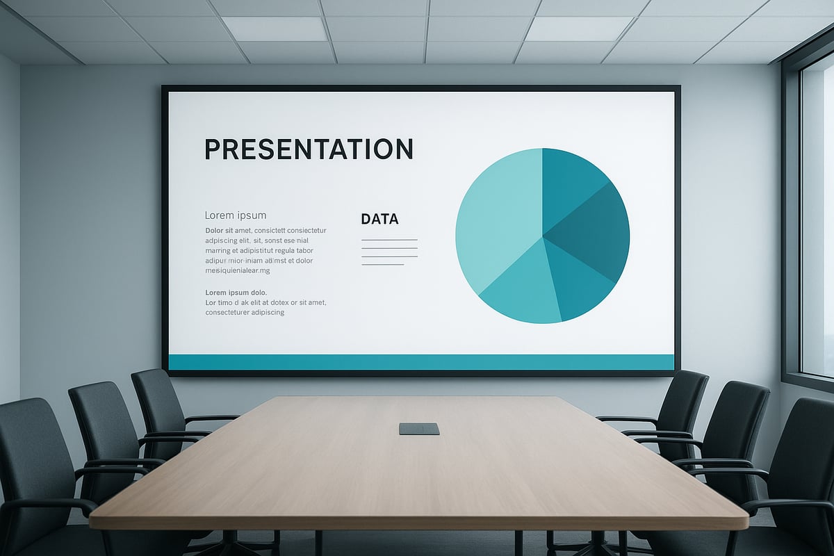
4. Use High-Impact Visuals, Not Clip Art
Modern audiences expect visuals that enhance, not distract. In simple ppt design, choose high-quality images or custom graphics over outdated clip art.
Professional photos, vector icons, and branded illustrations communicate credibility. For example, a real product photo or a custom infographic is far more persuasive than generic clip art.
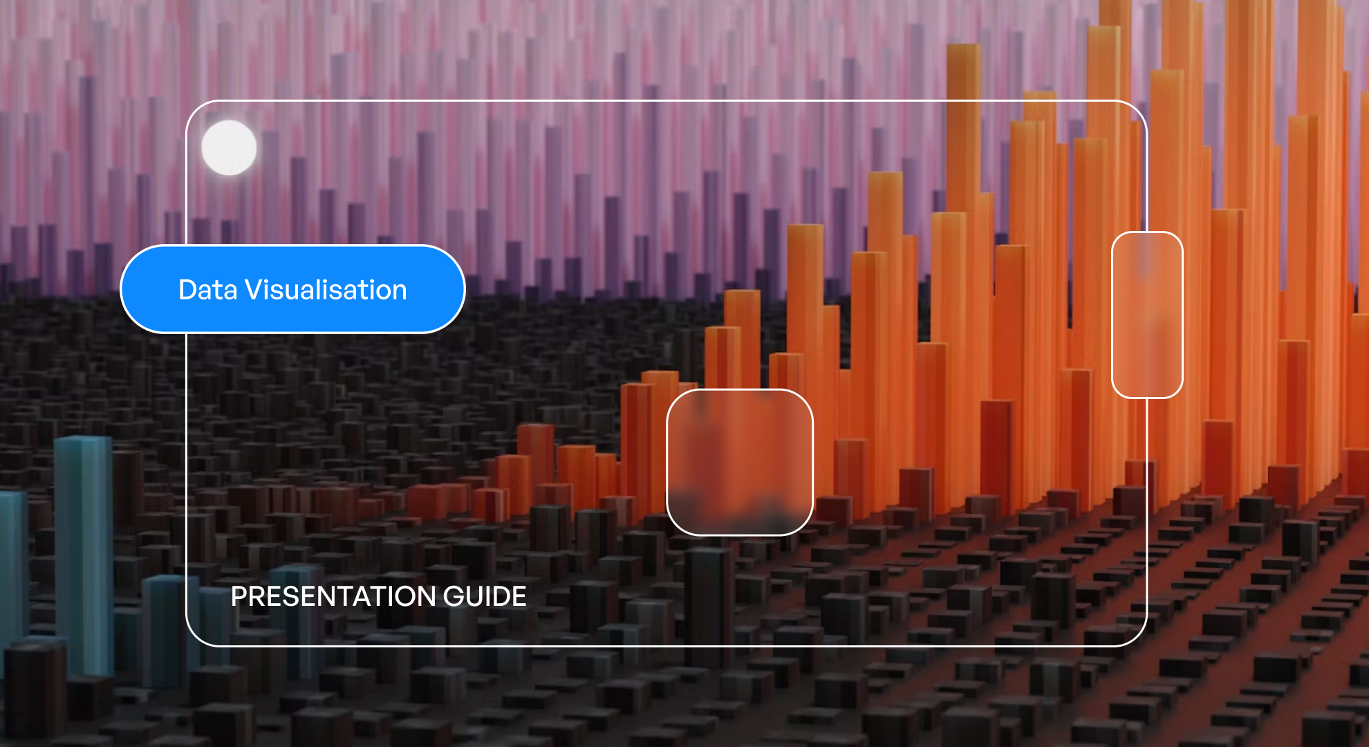
Data visualization is a rising trend in 2026. Infographics, charts, and diagrams turn complex information into memorable stories. Use resources like Unsplash for royalty-free images and Noun Project for modern icon sets.
Custom illustrations, tailored to your brand, boost recognition and trust in simple ppt design. However, always check for copyright permissions and ensure images are high resolution.
Before-and-after slides show the impact:
- Before: Cartoon clip art, pixelated images.
- After: Sharp, relevant visuals supporting the narrative.
Avoid cramming slides with images. One strong visual per slide is often enough to make your point stand out.
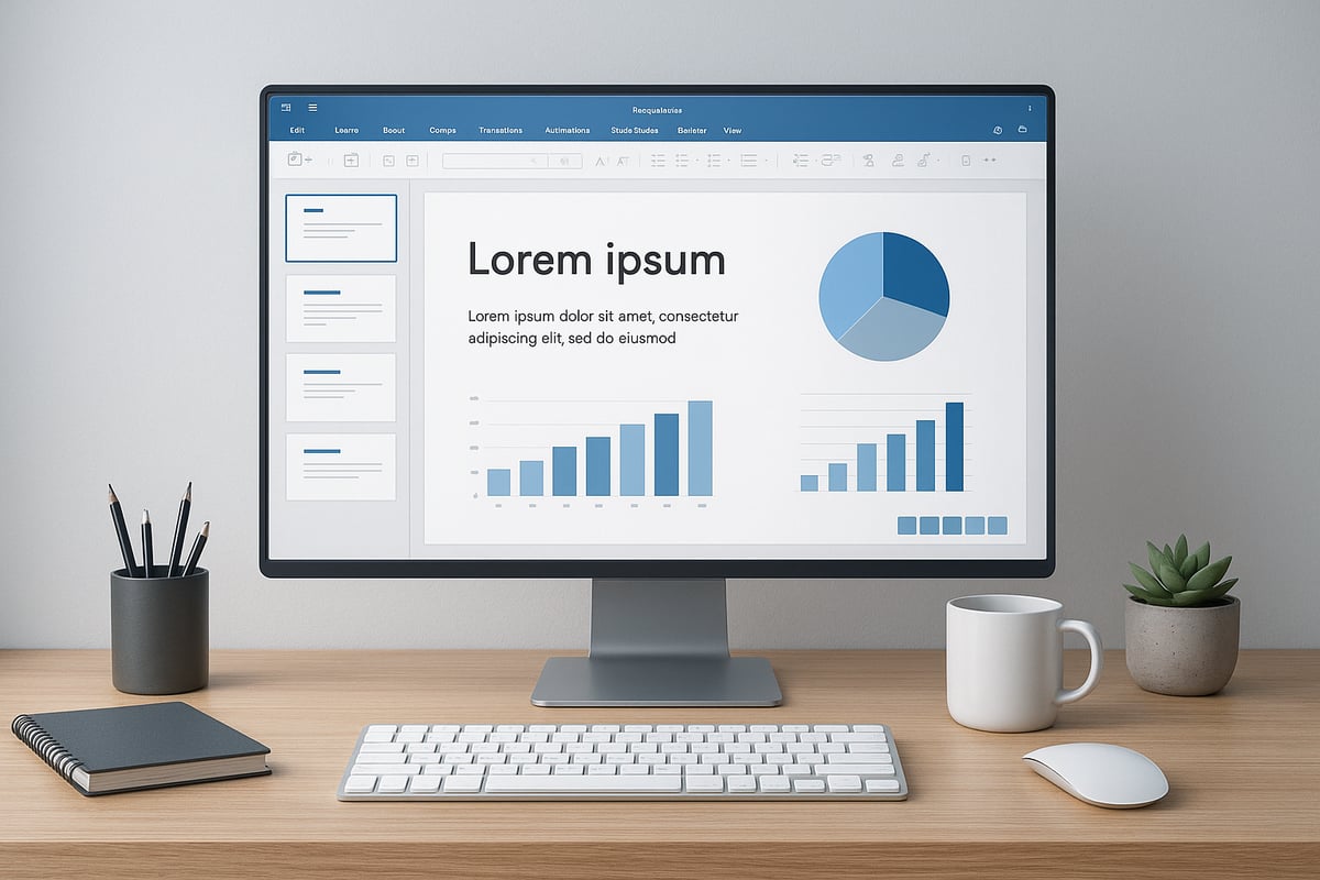
5. Simplify Data with Smart Charts
Data should clarify, not confuse. In simple ppt design, opt for clear charts over dense tables or busy graphs.
Best practices include limiting data points, using concise labels, and highlighting key insights. PowerPoint’s AI-driven chart suggestions, introduced in 2025, can help you pick the most effective visual representation.
Common chart types for business and academic use:
- Bar charts: Compare values across categories.
- Line charts: Show trends over time.
- Pie charts: Illustrate proportions.
Color coding and legends make information digestible. For accessibility, avoid relying solely on color. Use patterns or labels for clarity, especially for color-blind viewers.
Avoid 3D effects, gradients, or unnecessary embellishments. These features can make charts harder to read and detract from the message.
Tips for simple ppt design data visualization:
- Keep charts simple, focusing on one takeaway.
- Use a consistent style across all visuals.
- Test your charts with colleagues for clarity.
6. Keep Text Minimal and Action-Oriented
Too much text is the enemy of simple ppt design. Follow the “6x6 rule”: no more than 6 words per line and 6 lines per slide.
Headlines and concise key phrases are more effective than paragraphs. Consider this transformation:
- Before: “Our team has been working diligently to improve performance across all departments, resulting in significant operational efficiencies.”
- After: “Team efforts drive operational efficiency.”
Stanford neuroscience research in 2025 found that concise slides boost audience engagement by 40 percent. Use speaker notes for details, not the slide itself.
Avoid jargon, filler, or passive language. Write direct, compelling titles that guide your audience.
Tips for minimal text:
- Use bullets, not sentences.
- Highlight action verbs.
- Edit ruthlessly for brevity.
A simple ppt design with minimal text keeps attention where it belongs: on your message.
7. Maintain Visual Consistency Across Slides
Visual consistency is the backbone of a professional simple ppt design. This means uniform alignment, color, typography, and iconography from start to finish.
Master slides and templates are your allies. They enforce consistent layouts, colors, and fonts across every slide. Leading tech and financial companies use branded decks to reinforce identity and trust.
Risks of mixing styles include confusion and reduced credibility. PowerPoint’s 2026 template features make it easy to automate consistency.
Checklist for visual consistency:
- Align all text and visuals.
- Use the same fonts and color palette throughout.
- Standardize icon and image styles.
Before finalizing, review each slide for style and alignment. Consistency in simple ppt design signals attention to detail and enhances brand perception.
Advanced Tools and Resources for Simple PPT Design
In 2026, mastering simple ppt design is easier than ever thanks to advanced tools and resources. Whether you are a beginner or a seasoned professional, leveraging these features will help you create clear, memorable presentations with minimal effort.
Latest PowerPoint Features for 2026
PowerPoint 2026 introduces AI-powered design suggestions that streamline the creation of simple ppt design layouts. The software identifies clutter, recommends optimal font pairings, and automates color palette adjustments for clarity.
With real-time accessibility checks, you can ensure your slides are inclusive for all viewers. The new slide cleanup tool helps users effortlessly remove distractions, keeping slides focused and visually balanced.
These features empower users to implement simple ppt design principles quickly, reducing manual formatting and letting presenters focus on their core message.
Recommended Online Design Resources
Many online platforms now support simple ppt design by providing curated assets that align with minimalist trends. Top resources include:
- Unsplash: High-quality, royalty-free images.
- Noun Project: Comprehensive icon sets for varied topics.
- Google Fonts: Accessible, professional font libraries.
- Canva: Intuitive templates and drag-and-drop tools.
These sites help users maintain visual harmony and professionalism. Testing palettes and fonts across devices is simple, ensuring your simple ppt design remains consistent everywhere.
Tips for Customizing Templates Effectively
Personalizing templates is essential for strong branding, but it is important not to overcomplicate your slides. Start with a simple ppt design template and adjust only key elements like color or logo.
Maintain consistent alignment, font use, and icon style. Avoid mixing multiple themes within one deck. For more on template consistency, see How to use master slides for practical guidance.
By keeping customization focused, your simple ppt design will look polished, professional, and on-brand every time.
Simple PPT Design for Specialized Audiences
Adapting simple ppt design principles is essential when presenting to specialized audiences in 2026. Each field—finance, technology, or academia—has unique information needs and complexity levels.
In finance, clarity is crucial for presenting models and forecasts. Simple ppt design helps distill complex data into easy-to-understand visuals, supporting better decision-making and reducing confusion.
Technical presentations benefit from streamlined diagrams and process flows. Using clean layouts and minimal text makes it easier for diverse teams to grasp intricate systems quickly.
For academic or research presentations, a straightforward approach improves knowledge retention and accessibility. Strategies like those outlined in Reducing Cognitive Overload in the Anatomy Classroom show how simplifying slides can enhance clarity even in data-heavy topics.
By tailoring simple ppt design to your audience, you ensure that your message is clear, memorable, and impactful.


- This is some text inside of a div block.lay out the facts clearly and compellingly. Use data to establish the ground reality, but remember that facts alone are like the individual strands of a tapestry—necessary but not complete.lay out the facts clearly and compellingly. Use data to establish the ground reality, but remember that facts alone are like the individual strands of a tapestry—necessary but not complete.
- This is some text inside of a div block.lay out the facts clearly and compellingly. Use data to establish the ground reality, but remember that facts alone are like the individual strands of a tapestry—necessary but not complete.

