
Scientific Presentation Design: Best Practices Guide
Scientific presentation design represents one of the most challenging yet critical aspects of research communication. Whether presenting groundbreaking findings at academic conferences or securing funding for innovative biotech ventures, researchers and scientists must translate complex data into digestible visual narratives. The stakes are high: poor design obscures brilliant research, while effective visualization amplifies impact and drives action. This specialized discipline requires balancing scientific accuracy with visual clarity, demanding both technical precision and design expertise that many researchers struggle to master independently.
The Unique Challenges of Scientific Presentation Design
Scientific content poses distinct design challenges that separate it from standard business presentations. Researchers must communicate intricate methodologies, statistical analyses, and nuanced conclusions while maintaining visual appeal and audience comprehension.
Data density creates the primary obstacle. Scientific presentations typically contain significantly more information per slide than corporate decks, leading to cognitive overload when poorly executed. A single research slide might include experimental protocols, statistical significance markers, multiple data visualizations, and detailed annotations-all competing for viewer attention simultaneously.
The principles of effective scientific communication emphasize creating clear information hierarchies that guide audiences through complex material systematically. This approach prevents overwhelming viewers while preserving scientific rigor.
Balancing Accuracy and Accessibility
Scientific presentation design demands absolute accuracy. Unlike marketing materials where slight simplification serves rhetorical purposes, research presentations require precise representation of data, methodologies, and conclusions. Misrepresentation-even unintentional-undermines credibility and potentially misleads peers.
However, accuracy alone doesn't ensure effective communication. Presentations must also be accessible to diverse audiences with varying expertise levels. A conference presentation might address specialists intimately familiar with specific methodologies alongside professionals from adjacent disciplines seeking broader understanding.
This dual requirement creates tension between comprehensive detail and digestible simplification. Professional PowerPoint design services understand this balance, crafting slides that maintain scientific integrity while enhancing comprehension through strategic visual design.

Structural Foundations for Research Presentations
Effective scientific presentation design begins with thoughtful structural planning before any visual design occurs. The organizational framework determines whether audiences can follow arguments and retain key findings.
The Logical Flow Architecture
Research presentations require exceptionally clear logical progression. Audiences must understand not just what you discovered, but why it matters and how conclusions emerged from evidence.
Recommended structure for scientific presentations:
- Context establishment - Define the research problem and its significance
- Methodology overview - Explain experimental design and analytical approaches
- Results presentation - Display findings with appropriate statistical context
- Interpretation layer - Connect results to broader scientific understanding
- Implications discussion - Address real-world applications and future directions
This framework mirrors scientific thinking while accommodating audience processing limitations. Each section builds upon previous material, creating cumulative understanding rather than isolated information fragments.
The challenges of virtual scientific presentations have intensified the need for clear structure, as remote audiences face greater distraction potential and reduced opportunities for real-time clarification.
Single-Message Slide Methodology
Scientific presentation design benefits tremendously from the single-message approach: each slide communicates one primary concept supported by necessary details. This principle combats the common tendency to overload slides with multiple graphs, tables, and text blocks.
Consider presenting statistical comparisons across three experimental conditions. Rather than cramming all comparisons onto one slide, effective design dedicates individual slides to each condition, highlighting specific findings while maintaining consistent visual treatment. This approach allows audiences to absorb one insight before progressing to the next.
| Traditional Approach | Single-Message Approach |
|---|---|
| Multiple graphs per slide | One primary visualization per slide |
| Dense paragraph text | Concise bullet points or single statements |
| Mixed messages competing for attention | Clear focal point with supporting details |
| Cognitive overload common | Progressive understanding built systematically |
Visual Design Principles for Scientific Content
Scientific presentation design extends beyond structure to encompass specific visual strategies that enhance comprehension and retention of research findings. These principles address color theory, typography, data visualization, and spatial organization.
Color Strategy for Scientific Clarity
Color serves functional rather than purely aesthetic purposes in scientific presentations. Effective scientific presentation design employs color to establish visual hierarchies, distinguish data categories, and highlight significant findings without introducing distracting elements.
Strategic color applications include:
- Categorical differentiation - Assigning distinct hues to experimental groups or variables
- Sequential representation - Using graduated color scales for continuous data ranges
- Emphasis indicators - Highlighting statistically significant results through accent colors
- Visual consistency - Maintaining color assignments across related slides for audience orientation
The best practices for scientific presentations recommend limiting primary colors to three or four within any presentation to prevent visual chaos while ensuring sufficient distinction between elements.
Accessibility considerations demand attention to color blindness affecting approximately eight percent of males and 0.5 percent of females. Scientific presentation design should never rely solely on color to convey critical information; shape, pattern, or position should provide redundant encoding.
Typography Hierarchy in Research Slides
Typography establishes readability and guides audience attention through scientific content. Unlike business presentations where decorative fonts might enhance brand personality, scientific presentation design prioritizes legibility and professional credibility.
Font selection guidelines:
Sans-serif typefaces (Arial, Helvetica, Calibri) provide superior readability for projected presentations, particularly for audiences viewing from significant distances. Serif fonts work acceptably for printed materials but often appear cluttered on screens.
Size hierarchy matters tremendously. Titles should measure minimum 32 points, subtitles 24 points, and body text never below 18 points. Many researchers violate this guideline when attempting to fit excessive content, sacrificing readability for comprehensiveness-a counterproductive trade-off.
Consistent formatting across similar content types establishes implicit organizational cues. When all methodology descriptions use identical typography, audiences recognize content type before reading, facilitating faster comprehension. This consistency principle extends to layout design decisions that create recognizable visual patterns throughout presentations.
Data Visualization Excellence in Scientific Contexts
Scientific presentation design finds its greatest challenge and opportunity in data visualization. How research findings appear visually determines whether audiences grasp significance or remain confused.
Selecting Appropriate Chart Types
Different data relationships demand specific visualization approaches. Scientific presentation design requires matching chart types to underlying data structures and communication objectives.
Visualization selection matrix:
| Data Relationship | Recommended Visualization | Scientific Application |
|---|---|---|
| Comparison across categories | Bar charts, column charts | Experimental group comparisons |
| Change over time | Line graphs, area charts | Longitudinal study results |
| Part-to-whole relationships | Pie charts, stacked bars | Population distributions |
| Correlation between variables | Scatter plots, bubble charts | Relationship analyses |
| Distribution patterns | Histograms, box plots | Statistical spread representation |
Advanced visualization techniques like heat maps, network diagrams, and forest plots serve specialized scientific contexts. The key principle: visualization complexity should match audience familiarity and data dimensionality without unnecessary elaboration.
Data visualization in presentations requires particular attention to axis labeling, scale selection, and legend placement. Missing or unclear labels represent common failures that undermine otherwise excellent research presentations.
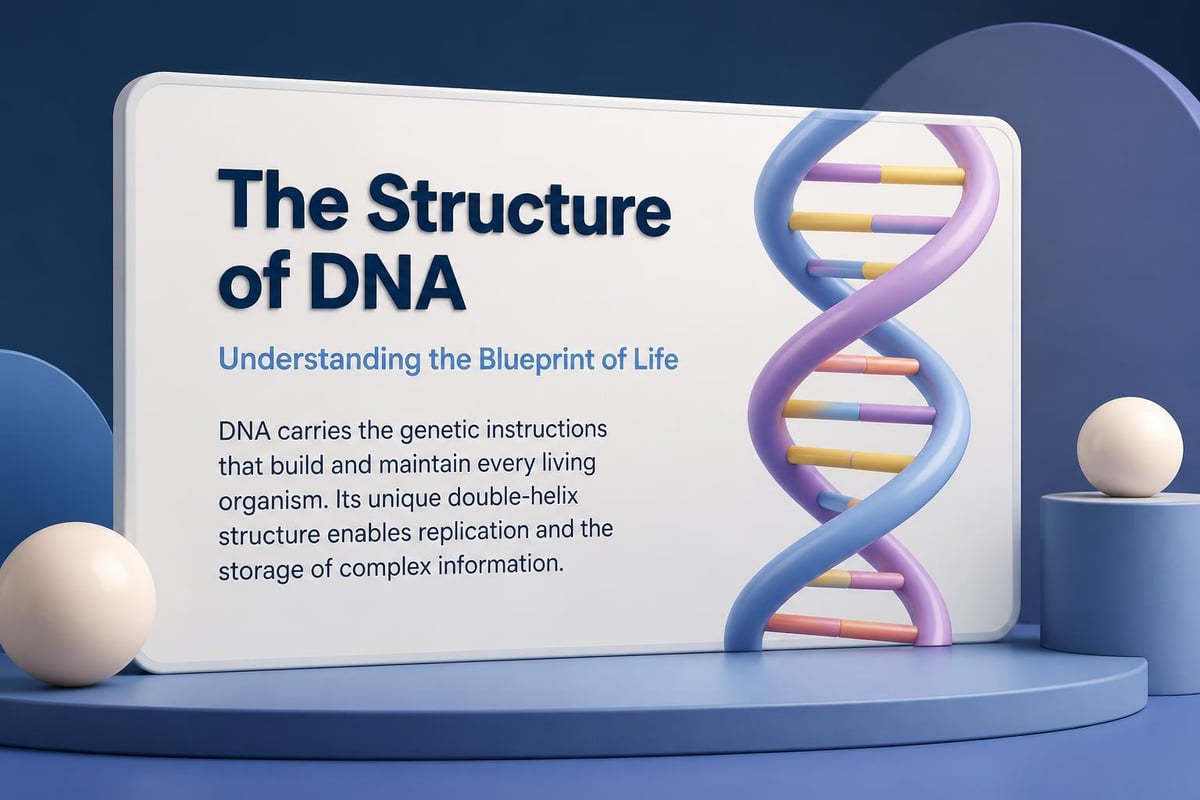
Simplifying Complex Diagrams
Scientific mechanisms often require diagrammatic representation-molecular pathways, experimental setups, theoretical frameworks. Scientific presentation design must balance comprehensive detail against visual comprehensibility.
The design principles for effective slides demonstrate how simple diagrams communicate more effectively than complex schematics during oral presentations. Reserve intricate diagrams for supplementary materials; presentation slides benefit from simplified versions highlighting key elements.
Diagram simplification strategies:
- Remove non-essential components that don't directly support your narrative
- Use progressive disclosure across multiple slides rather than presenting complete systems at once
- Employ animation to build diagrams sequentially, adding complexity incrementally
- Highlight relevant portions while dimming background context
- Include clear labels and directional indicators to guide interpretation
For biotech and pharmaceutical presentations, these principles prove particularly valuable when explaining drug mechanisms or experimental protocols to investor audiences lacking scientific training. Biotech pitch deck design frequently requires translating highly technical science into accessible visuals that maintain credibility while ensuring comprehension.
Audience-Centered Design Approaches
Effective scientific presentation design demands deep consideration of audience characteristics, knowledge levels, and information needs. Generic templates fail because scientific audiences vary dramatically in background and expectations.
Adapting Design for Audience Expertise
Conference presentations to specialist peers allow greater technical depth and assume familiarity with domain terminology. Conversely, interdisciplinary symposia or public engagement events require more extensive context-setting and reduced jargon density.
This audience awareness influences every design decision:
For specialist audiences:
- Employ field-specific terminology without extensive definition
- Present detailed statistical analyses with appropriate significance markers
- Include comprehensive methodology information
- Reference seminal papers and theoretical frameworks
For general scientific audiences:
- Define specialized terms upon first usage
- Focus on broader implications rather than methodological minutiae
- Use analogies connecting unfamiliar concepts to common knowledge
- Emphasize visual communication over text-heavy explanations
The transition between these approaches represents a core competency in scientific presentation design. Many researchers struggle most when addressing mixed audiences requiring simultaneous depth for experts and accessibility for generalists.
Managing Cognitive Load Through Design
Scientific content inherently demands significant cognitive processing. Poor design compounds this challenge by forcing audiences to decode visual presentation simultaneously with absorbing content meaning.
Scientific presentation design reduces cognitive load through strategic choices that minimize unnecessary processing demands. Guidelines for poster design emphasize clear visual hierarchies and logical flow-principles equally applicable to slide presentations.
Cognitive load reduction techniques:
- Maintain consistent layouts across similar slide types
- Use white space generously to prevent visual crowding
- Limit information density to 6-8 elements per slide
- Apply animations purposefully to control information revelation timing
- Ensure text-image integration rather than competing elements
Modern digital workplace tools from companies like workcentrix GmbH facilitate collaborative presentation development, enabling teams to maintain design consistency across complex scientific projects while managing document workflows efficiently.

Technical Execution and Production Quality
Scientific presentation design extends beyond conceptual planning to encompass technical execution determining final presentation quality. File formats, image resolution, animation implementation, and platform compatibility affect presentation effectiveness.
Image Quality and Resolution Standards
Scientific presentations frequently incorporate microscopy images, equipment photographs, and complex diagrams requiring high resolution for clarity. Poor image quality undermines professional credibility and obscures important visual details.
Image specifications for scientific presentations:
- Minimum 300 DPI for photographs and microscopy images
- Vector formats (SVG, PDF) for diagrams and charts when possible
- Consistent image dimensions within presentation sections
- Proper compression balancing file size against quality
- Clear attribution for images from external sources
Many researchers screenshot figures from published papers or online sources, resulting in pixelated, low-resolution images inappropriate for professional presentations. Scientific presentation design requires sourcing or creating publication-quality graphics that remain sharp when projected on large screens.
Animation and Transition Strategies
Animation serves legitimate pedagogical purposes in scientific presentations when applied strategically. Revealing complex diagrams progressively, highlighting specific data points, or demonstrating sequential processes all benefit from thoughtful animation.
However, excessive or gratuitous animation distracts audiences and appears unprofessional. Scientific presentation design favors subtle, purposeful animations over flashy transitions.
Appropriate animation applications:
- Building bullet points sequentially to maintain audience attention on current point
- Revealing layers of complex diagrams to prevent overwhelming viewers
- Highlighting specific graph elements during verbal explanation
- Demonstrating temporal processes or procedural sequences
- Comparing before-after states through fade transitions
The rise of virtual conferences has introduced additional technical considerations around screen sharing, recording quality, and remote audience engagement that scientific presentation design must now accommodate.
Format-Specific Design Considerations
Scientific communication occurs across multiple presentation formats, each demanding tailored design approaches. Slide decks, poster presentations, and virtual seminars require distinct strategies despite sharing core scientific content.
Conference Poster Design Principles
Scientific posters present unique design challenges combining comprehensive content with visual engagement. Unlike slide presentations delivered with verbal narration, posters must communicate independently while attracting viewer attention in crowded conference halls.
Research on poster formats comparing traditional designs against newer approaches like #BetterPoster reveals significant differences in first impression quality and information organization effectiveness.
Poster design requirements:
- Clear visual hierarchy distinguishing title, sections, and details
- Logical flow guiding viewers through content systematically
- Balance between comprehensive information and visual breathing room
- Sufficient text size for reading at 4-6 feet distance
- Strategic use of color, images, and graphics maintaining engagement
Guidelines for effective poster creation emphasize audience-focused content selection-including essential information while omitting excessive detail better suited for verbal discussion during poster sessions.
Virtual Presentation Adaptations
Remote scientific communication through platforms like Zoom or Teams demands modified design approaches accounting for screen size limitations, potential connectivity issues, and reduced presenter-audience interaction.
Scientific presentation design for virtual formats emphasizes larger text, simplified visuals, and redundant information encoding ensuring comprehension despite technical limitations. Presenters cannot rely on gesture or physical presence to direct attention, making visual design assume greater communication responsibility.
Creating engaging virtual presentations shares similarities with developing compelling digital products that must capture and maintain user attention through design excellence alone, without physical presence or immediate feedback loops.
Professional Resources and Collaboration
Few scientists possess comprehensive design expertise alongside research competencies. Recognizing when to leverage professional design resources versus developing in-house capabilities represents a strategic decision affecting presentation quality and research communication effectiveness.
When to Engage Professional Design Services
High-stakes presentations-funding pitches, keynote addresses, tenure reviews, or patent defenses-justify professional design investment. The communication stakes outweigh DIY approaches when presentation outcomes directly impact career trajectory or organizational success.
Professional presentation services offer specialized expertise transforming research content into compelling visual narratives. These services prove particularly valuable when researchers lack time for design refinement or when presentation quality directly influences decision-makers.
For financial technology or healthcare companies presenting scientific innovations to investors, professional scientific presentation design bridges the gap between technical accuracy and investor comprehension-a critical capability for securing funding.
Developing Internal Design Capabilities
Organizations regularly producing scientific presentations benefit from developing internal design competencies through training, templates, and standardized processes. Creating institutional design guidelines ensures consistency while empowering researchers to produce quality presentations independently.
Building design capacity includes:
- Comprehensive template libraries aligned with institutional branding
- Training programs teaching fundamental design principles
- Style guides specifying typography, color schemes, and layout standards
- Design review processes ensuring quality control before major presentations
- Collaborative workflows enabling peer feedback and iteration
Digital agencies like Stijl en Vorm provide strategic support helping organizations develop sustainable design systems scaling across multiple projects while maintaining quality standards.
Emerging Trends and Future Directions
Scientific presentation design continues evolving alongside technological capabilities and communication preferences. Understanding emerging trends positions researchers and organizations to adopt beneficial innovations while avoiding fleeting fads.
Interactive and Data-Driven Presentations
Static slide decks increasingly yield to interactive formats enabling real-time data exploration, dynamic visualizations, and audience-controlled navigation. Web-based presentation platforms allow presenters to manipulate live datasets, demonstrating analyses interactively rather than presenting predetermined results.
These capabilities particularly benefit fields like bioinformatics and computational biology where scientific visual creation challenges demand innovative approaches managing complexity while maintaining comprehensibility.
Artificial Intelligence in Design Assistance
AI-powered design tools increasingly assist with layout optimization, color selection, and visual hierarchy refinement. While these technologies cannot replace human judgment in scientific communication, they accelerate production and suggest design improvements researchers might otherwise overlook.
Organizations like Ryan Cook's services demonstrate how AI integration enhances creative workflows, automating routine design tasks while preserving human control over strategic decisions-a model applicable to scientific presentation development.
Sustainability and Accessibility Focus
Growing attention to inclusive design ensures scientific presentations accommodate diverse abilities. Proper color contrast, alternative text for images, and caption availability represent accessibility fundamentals increasingly expected in professional scientific communication.
Similarly, sustainability considerations influence presentation design through reduced file sizes, optimized graphics, and digital-first approaches minimizing printed materials-aligning scientific communication practices with broader environmental values.
Mastering scientific presentation design requires balancing technical accuracy with visual clarity, audience awareness with content depth, and professional polish with authentic communication. Whether presenting groundbreaking research findings or securing funding for innovative ventures, effective design amplifies scientific impact and drives meaningful outcomes. Prznt Perfect specializes in transforming complex scientific content into compelling visual narratives that resonate with diverse audiences, helping researchers and organizations communicate their innovations with clarity and impact.

- This is some text inside of a div block.lay out the facts clearly and compellingly. Use data to establish the ground reality, but remember that facts alone are like the individual strands of a tapestry—necessary but not complete.lay out the facts clearly and compellingly. Use data to establish the ground reality, but remember that facts alone are like the individual strands of a tapestry—necessary but not complete.
- This is some text inside of a div block.lay out the facts clearly and compellingly. Use data to establish the ground reality, but remember that facts alone are like the individual strands of a tapestry—necessary but not complete.

