
Professional Slide Deck: Design Principles & Best Practices

A professional slide deck can determine whether your business wins critical investments, closes major deals, or secures strategic partnerships. In today's competitive landscape, especially within financial and tech sectors, the quality of your visual presentation directly impacts how stakeholders perceive your expertise and credibility. Creating slides that communicate complex information with clarity while maintaining visual appeal requires more than just template selection. It demands strategic thinking about information architecture, design consistency, and audience psychology.
Understanding the Foundation of Effective Slide Design
Creating a professional slide deck starts with recognizing that every slide serves a specific purpose within your broader narrative. Unlike casual presentations, professional decks must balance aesthetic sophistication with functional clarity. The most successful presentations follow established design principles that have been refined through years of practice in high-stakes business environments.
The Core Elements That Define Professional Quality
When evaluating what makes a slide deck truly professional, several fundamental elements come into play:
- Visual consistency across all slides, including fonts, colors, and spacing
- Strategic use of whitespace to prevent cognitive overload
- High-quality imagery that enhances rather than distracts from your message
- Data visualization that transforms numbers into actionable insights
- Hierarchical information structure that guides viewer attention
These elements work together to create presentations that feel polished and authoritative. As outlined in best practices for creating a professional slide deck, consistency and quality visuals form the backbone of effective design.

Design Principles That Transform Good Slides Into Great Ones
Professional designers understand that creating a professional slide deck involves applying time-tested visual principles. The difference between amateur and expert presentations often comes down to how well these principles are executed.
Color Psychology and Palette Selection
Color choices significantly impact how audiences perceive your content. Financial presentations typically benefit from sophisticated palettes that convey trust and stability, while tech presentations might embrace bolder combinations that signal innovation. Limiting your palette to three primary colors prevents visual chaos while maintaining brand consistency. According to pitch deck design principles, this three-color approach helps investors focus on content rather than being distracted by excessive visual variety.
Strategic color application includes:
- Primary brand color for headlines and key elements
- Secondary color for supporting information and accents
- Neutral color for body text and backgrounds
- Consistent application across all slides
Typography That Commands Attention
Font selection and hierarchy play crucial roles in readability and professional appearance. Your professional slide deck should use no more than two font families: one for headlines and another for body text. Size variations create natural hierarchy, with headlines at 32-44 points and body text at 18-24 points minimum to ensure readability from distance.
| Element Type | Font Size | Weight | Purpose |
|---|---|---|---|
| Main Headline | 36-44pt | Bold | Primary message |
| Subheadline | 24-32pt | Medium | Supporting context |
| Body Text | 18-24pt | Regular | Detailed information |
| Caption | 14-16pt | Light | Supplementary notes |
The visual principles discussed in slide design best practices emphasize that typography should enhance comprehension, not hinder it.
Structuring Content for Maximum Impact
Beyond aesthetics, a professional slide deck must organize information logically. Financial and tech audiences expect clear progression through complex topics, making information architecture as important as visual design.
The One-Idea-Per-Slide Rule
Professional presentations resist the temptation to cram multiple concepts onto single slides. Each slide should communicate one core idea, supported by minimal text and relevant visuals. This approach aligns with cognitive load theory, which suggests that audiences process information more effectively when it's presented in digestible chunks.
When building your narrative flow, consider these structural approaches:
- Problem-Solution Framework: Establish challenges before introducing your offering
- Chronological Progression: Walk through timelines, roadmaps, or historical context
- Priority-Based Organization: Lead with most critical information
- Comparison Structure: Contrast options, competitors, or scenarios
Understanding slide deck organization guidelines helps ensure your content flows naturally from introduction through conclusion.
Balancing Text and Visual Elements
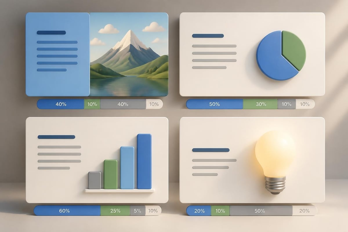
Professional designers know that slides should complement spoken presentations, not replace them. The 5-5-5 rule provides useful guidance: no more than five lines of text, five words per line, and five text-heavy slides in succession. While not absolute, this principle prevents text overload that characterizes amateur presentations.
Mastering Visual Storytelling Through Data
For financial and tech companies, effectively presenting data distinguishes exceptional professional slide decks from mediocre ones. Numbers tell stories, but only when visualized strategically.
Choosing the Right Chart Types
Different data requires different visualization approaches. Line charts excel at showing trends over time, bar charts compare discrete categories, and pie charts (used sparingly) show proportional relationships. The key is matching visualization type to your specific message.
Common data visualization mistakes to avoid:
- Using 3D effects that distort perception
- Including too many data series on single charts
- Failing to highlight key insights within visualizations
- Using default color schemes that lack contrast
- Omitting clear labels and legends
Transforming Complex Information Into Clarity
Tech and financial presentations often involve intricate concepts that require simplification without losing accuracy. Professional designers employ several techniques to achieve this balance. Process diagrams replace lengthy explanations of workflows. Icon-based infographics communicate statistics more memorably than text alone. Strategic animation reveals information progressively, preventing overwhelm.
When working with fintech presentation design, the challenge involves making sophisticated financial instruments and technologies accessible to diverse audiences, from technical experts to general investors.
Technical Specifications That Matter
Creating a professional slide deck involves attention to technical details that amateur presenters often overlook. These specifications ensure your presentation displays correctly across different environments and platforms.
Resolution, Aspect Ratio, and File Management
Modern presentations should use 16:9 aspect ratio, which has become the standard for most displays and projectors. Resolution should be sufficient for large screens without creating unwieldy file sizes. Aim for images at 1920x1080 pixels minimum, using PNG format for graphics with transparency and JPG for photographs.
File organization prevents last-minute disasters:
- Embed all fonts to ensure consistency across computers
- Compress images to balance quality with file size
- Save backup versions in multiple formats (PPT, PDF)
- Test presentations on actual presentation equipment when possible
The guidelines outlined in designing professional pitch decks emphasize these technical considerations alongside design principles.
Template Selection and Customization
While templates provide starting points, truly professional slide decks require customization that aligns with brand identity. The best PowerPoint presentation templates offer flexible layouts that accommodate various content types while maintaining visual consistency.
| Template Feature | Amateur Approach | Professional Approach |
|---|---|---|
| Master Slides | Uses default layouts | Customizes all masters |
| Brand Elements | Adds logos randomly | Integrates systematically |
| Color Palette | Uses template defaults | Applies brand colors |
| Placeholder Content | Leaves example text | Replaces with real content |
Advanced Techniques for High-Stakes Presentations
When presenting to investors, board members, or major clients, your professional slide deck must exceed basic competency and demonstrate exceptional craft.
Creating Memorable Opening Slides
First impressions establish tone and credibility. Your opening slide should immediately communicate professionalism through clean design and clear value proposition. Avoid clichéd stock imagery in favor of custom graphics or high-quality photography that relates directly to your business.
Elements of powerful opening slides:
- Company logo positioned consistently with brand guidelines
- Compelling headline that summarizes core message
- Minimal text that intrigues rather than explains everything
- Professional typography with appropriate hierarchy
- Sufficient whitespace to appear confident rather than cluttered
Designing for Different Presentation Contexts
Professional decks adapt to various scenarios. A pitch deck for investors emphasizes market opportunity and traction, while internal strategy presentations focus on execution details. Sales decks highlight customer benefits and ROI, whereas conference presentations prioritize thought leadership.

Consider context-specific adaptations:
- Investor presentations: Front-load traction metrics and market size
- Sales decks: Include customer testimonials and case studies
- Conference talks: Design for large screens and distant viewing
- Board meetings: Provide detailed appendices with supporting data
Resources like effective slide design principles demonstrate how context shapes design choices.
Leveraging Brand Identity Throughout Your Deck
A professional slide deck should feel like a natural extension of your brand identity. Every element, from color choices to image style, should reinforce brand perception.
Consistency Across All Touchpoints
Your presentation design should align with your website, marketing materials, and other brand assets. This consistency builds recognition and trust. If your brand emphasizes innovation, your slides might incorporate dynamic layouts and contemporary typography. Conservative financial brands might choose classical layouts with serif fonts and muted colors.
When examining slide deck templates, evaluate whether they can accommodate your specific brand requirements or if customization would be too extensive.
Custom Iconography and Visual Elements
Generic icons and stock imagery undermine professional credibility. Custom illustrations, branded icons, and original photography distinguish your professional slide deck from competitors using the same templates. Investment in unique visual assets pays dividends through increased memorability and perceived value.
Quality Control and Review Processes
Before presenting, professional slide decks undergo rigorous review. This process catches errors and ensures every element serves your strategic objectives.
The Multi-Layer Review Checklist
Implement a systematic review process:
- Content accuracy: Verify all data, statistics, and claims
- Design consistency: Check fonts, colors, alignment across all slides
- Technical functionality: Test all animations, links, and embedded media
- Grammar and spelling: Proofread all text multiple times
- Narrative flow: Ensure logical progression from slide to slide
- Brand compliance: Confirm adherence to brand guidelines
- Accessibility: Verify sufficient color contrast and readable text sizes
Professional agencies that specialize in presentation design employ dedicated quality control processes that individual designers often skip due to time constraints.
Testing Across Devices and Scenarios
Your professional slide deck should work flawlessly regardless of presentation environment. Test on different computers, projectors, and display sizes. Verify that animations trigger correctly, videos play smoothly, and fonts render as intended. Prepare for technical failures by having PDF backups and knowing which slides can be skipped if time runs short.
Emerging Trends in Professional Presentation Design
The presentation landscape continues evolving, with new tools and techniques reshaping what audiences expect from professional slide decks in 2026.
Interactive and Dynamic Elements
Static slides increasingly give way to interactive elements that engage audiences more deeply. Clickable prototypes, embedded calculators, and live data connections transform passive viewing into active participation. However, these elements must enhance rather than distract from core messages.
AI-Assisted Design and Automation
Artificial intelligence now assists with layout suggestions, image selection, and even content generation. While these tools accelerate production, they cannot replace strategic thinking about narrative structure and audience needs. The most effective approach combines AI efficiency with human creativity and business understanding.
Modern platforms like Figma for slide creation demonstrate how collaborative design tools are changing workflow and enabling real-time feedback.
Common Mistakes That Undermine Professional Quality
Even experienced presenters make errors that diminish their professional slide deck effectiveness. Awareness of these pitfalls helps avoid them.
Overdesign and Visual Complexity
Enthusiasm for design capabilities often leads to excessive effects. Too many transitions, animated elements, or decorative graphics distract from content. Professional design embraces restraint, using effects purposefully rather than demonstrating software capabilities.
Visual complexity red flags:
- More than three fonts on a single slide
- Inconsistent animation styles across slides
- Decorative elements without functional purpose
- Color combinations that reduce readability
- Competing visual focal points
The principles discussed in professional slide design tips emphasize simplicity and clarity over complexity.
Neglecting Mobile and Remote Viewing
With hybrid meetings becoming standard, your professional slide deck must work for remote participants viewing on laptops or tablets. This requires larger text, higher contrast, and avoiding details that disappear on small screens. Design for the worst viewing condition your audience might experience.
Industry-Specific Considerations
Financial and tech presentations face unique challenges that require specialized approaches.
Financial Sector Requirements
Financial presentations demand precision, credibility, and regulatory compliance. Series B pitch deck creation for later-stage funding rounds requires different emphasis than seed stage presentations, with more detailed financial projections and market validation.
Key considerations include:
- Compliance with securities regulations regarding forward-looking statements
- Detailed financial modeling presented clearly
- Risk disclosures integrated naturally
- Competitor analysis with defensible differentiation
Technology Sector Dynamics
Tech presentations must balance technical depth with accessibility for non-technical stakeholders. Explaining complex architectures, security protocols, or algorithmic advantages without losing executive audiences requires careful information layering. Resources focused on cybersecurity presentations demonstrate industry-specific approaches.
Measuring Presentation Effectiveness
A professional slide deck should be evaluated based on outcomes, not just aesthetics. Establishing metrics helps refine future presentations.
Quantitative and Qualitative Feedback
Track measurable results:
- Conversion rates from presentations to desired actions
- Audience engagement metrics during virtual presentations
- Follow-up questions that indicate comprehension gaps
- Time spent on specific slides (in recorded presentations)
- Stakeholder feedback through structured surveys
Qualitative assessment involves understanding emotional responses and perception shifts. Did your presentation change how audiences view your company? Did it clarify complex concepts? Did stakeholders feel confident in your expertise?
Iterative Improvement Process
Professional organizations treat presentation design as an ongoing refinement process. Each presentation provides data for improving the next. Maintain a library of successful slides and approaches that can be adapted for new contexts. Document what worked and what fell flat.
Creating professional slide decks that resonate with sophisticated audiences requires strategic thinking, design expertise, and meticulous attention to detail. Whether you're preparing investor pitches, sales presentations, or conference keynotes, the principles outlined here provide a foundation for exceptional visual communication. Prznt Perfect specializes in transforming complex financial and technical concepts into compelling visual narratives that drive results. Our team combines deep industry knowledge with award-winning design capabilities to help your message break through the noise and achieve your business objectives.



- This is some text inside of a div block.lay out the facts clearly and compellingly. Use data to establish the ground reality, but remember that facts alone are like the individual strands of a tapestry—necessary but not complete.lay out the facts clearly and compellingly. Use data to establish the ground reality, but remember that facts alone are like the individual strands of a tapestry—necessary but not complete.
- This is some text inside of a div block.lay out the facts clearly and compellingly. Use data to establish the ground reality, but remember that facts alone are like the individual strands of a tapestry—necessary but not complete.

.png)
