
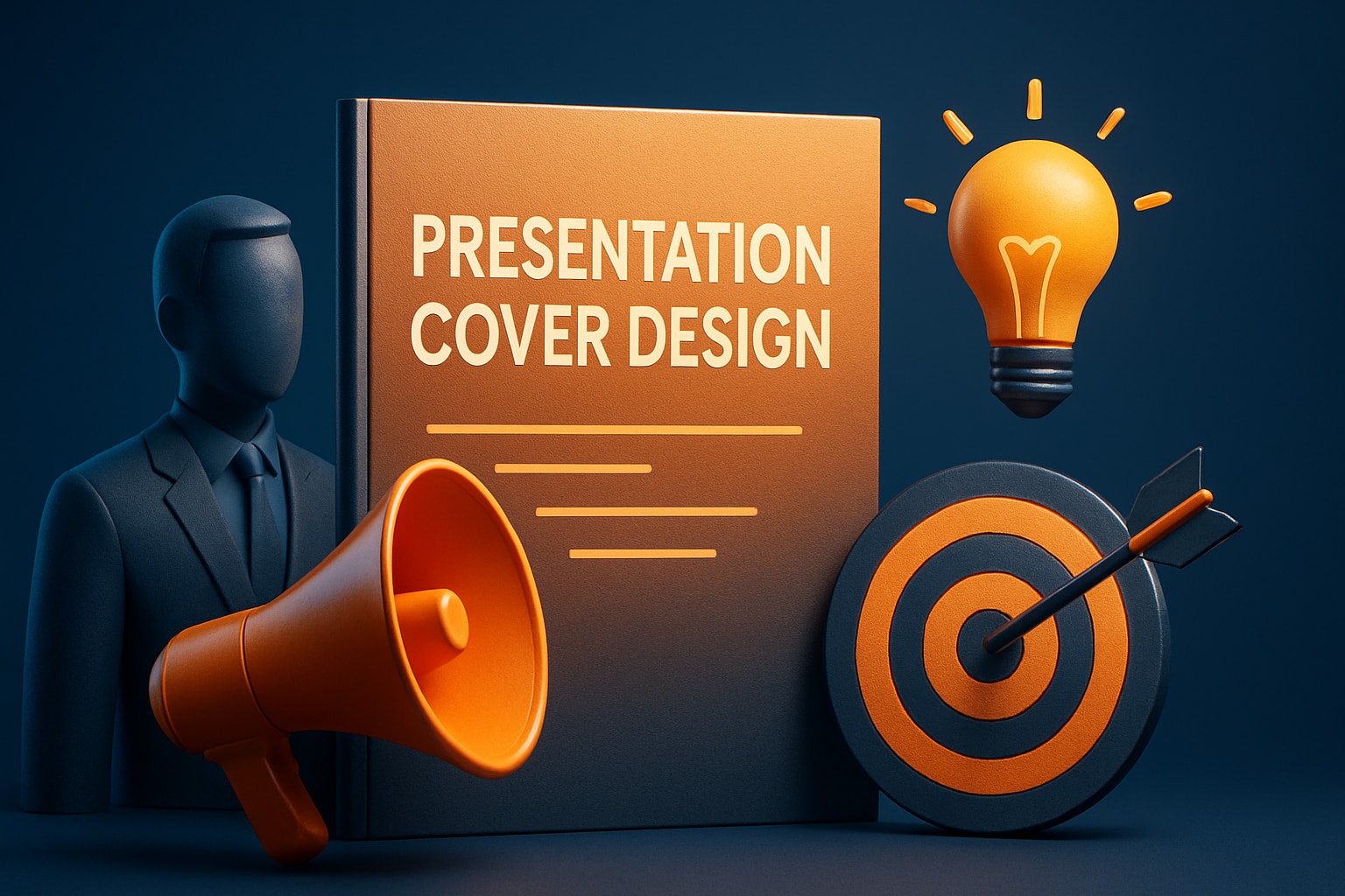
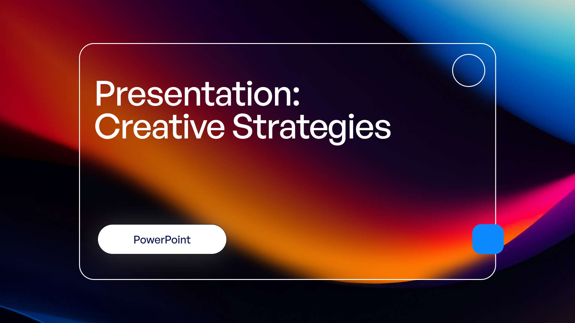
Expert Guide to Presentation Cover Design for 2026 Success
First impressions matter. In 2026, when attention spans are shorter and visuals drive decisions, your presentation cover design is your single best chance to stand out.
This guide unlocks proven strategies for presentation cover design that commands authority and sets the right tone from the very first glance.
You will discover the psychology behind first impressions, must-have design elements, 2026’s biggest trends, and step-by-step instructions for crafting covers that impress. We will also share advanced tips and real-world examples to help you achieve measurable results.
Get ready to elevate your presentation cover design and create an impact that lasts.
The Power of First Impressions in Presentation Design
First impressions are formed in a fraction of a second, especially when it comes to presentation cover design. Before a single word is read, your audience is already judging the professionalism, credibility, and relevance of your message. In today's visual-first landscape, the cover is your gateway to engagement and trust.
The Psychology Behind First Impressions
Our brains are wired to make snap judgments. According to the Stanford Web Credibility Project, 94% of first impressions are design-related. When someone sees your presentation cover design, cognitive biases kick in, shaping perceptions of trust, expertise, and relevance almost instantly.
Visual cues such as color, imagery, and layout trigger emotional responses like excitement or skepticism. For example, a cover with a bold, cohesive palette and a clear title fosters confidence, while a cluttered or bland design can create doubt. Research on First Impressions in Psychology confirms that these initial visual assessments strongly influence how your entire presentation is received.
Consider two covers: one with a crisp headline, well-placed logo, and inviting visuals, and another with mismatched fonts and crowded graphics. The former immediately commands respect, while the latter may lose your audience before you begin.
Why the Cover Page Sets the Tone for Success
A strong presentation cover design is more than decoration—it is a strategic branding opportunity. The cover signals your professionalism and sets expectations for the quality of your content. In business and academic settings, the cover can drive engagement and retention rates by making a memorable first impression.
The influence of a compelling cover extends throughout your presentation. SlidesCarnival emphasizes that the cover is the “first impression” for your entire message, impacting perceived value and audience attention. When the presentation cover design aligns with your brand and audience, it increases trust and motivates viewers to invest in your ideas.
Successful presenters use the cover as a credibility signal. Whether you are pitching investors or presenting research, a polished cover creates momentum and primes your audience for what follows.
Common Mistakes to Avoid
Even experienced professionals can undermine their message with poor presentation cover design choices. Overcrowding elements, neglecting visual hierarchy, and making poor color selections are frequent pitfalls. Failing to align the cover with audience expectations or brand identity can also erode trust.
Common mistakes include:
- Overloading the cover with text or images
- Using inconsistent or clashing colors
- Ignoring clear focal points or hierarchy
- Omitting essential details like date or presenter info
Covers that fail to engage often lack clarity or visual balance. For example, a busy layout with multiple logos and small, unreadable text can overwhelm viewers. In contrast, a streamlined, brand-aligned cover instantly communicates professionalism and authority.
Essential Elements of a Winning Presentation Cover
Creating a standout presentation cover design begins with understanding what elements are essential in 2026. A compelling cover is more than a formality—it is a strategic asset that sets expectations and establishes credibility from the first glance.

Must-Include Components for 2026
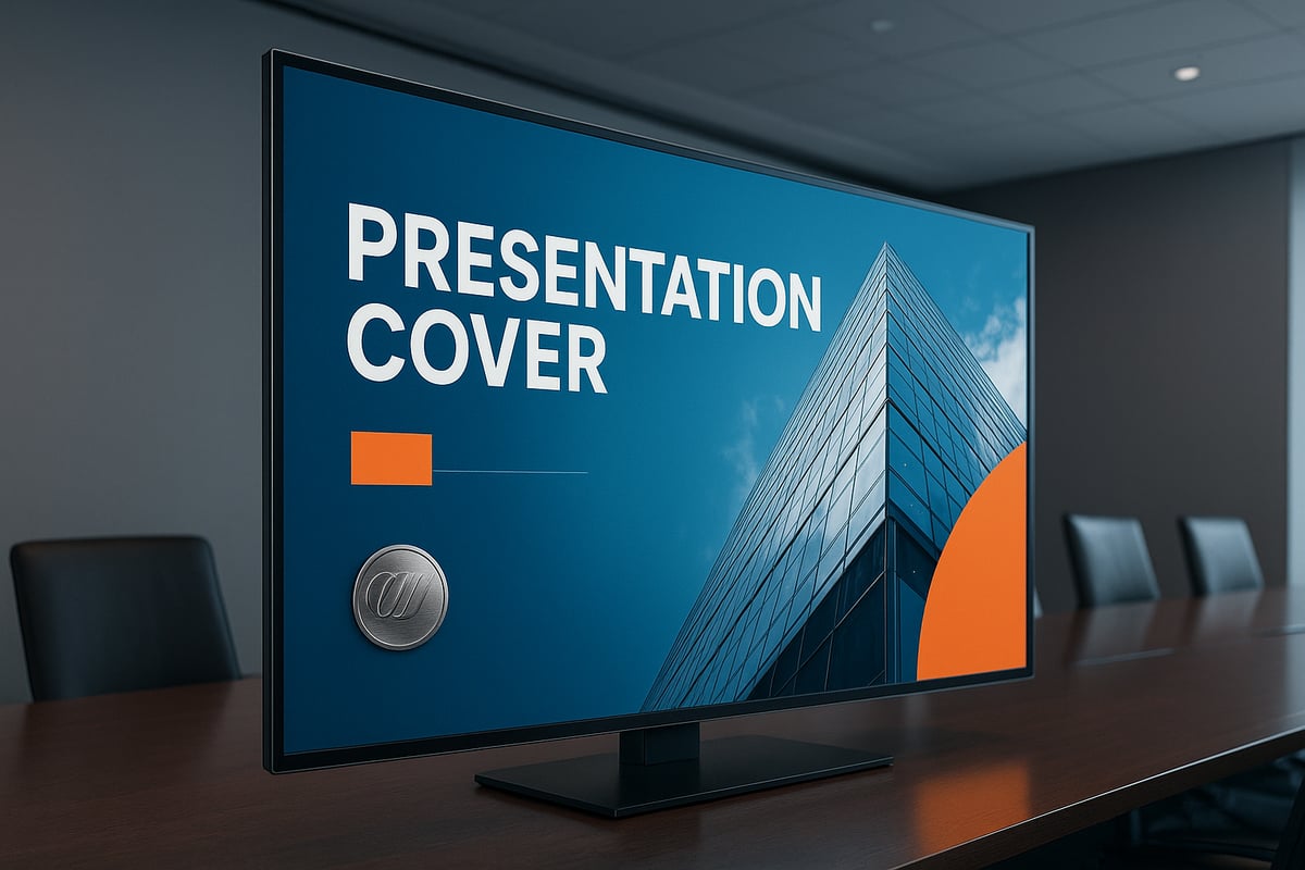
Every effective presentation cover design in 2026 incorporates vital elements that communicate professionalism and clarity. Begin with a clear, concise, and emotionally engaging title. This headline should immediately tell your audience what to expect and spark their interest.
A subtitle can add helpful context without overwhelming the layout. Presenter or contact information—such as email, LinkedIn, or social handles—offers a direct connection and enhances credibility. The company or organization logo, positioned strategically, reinforces brand presence.
Include the date and event details for context, especially for conferences or pitches. A visual anchor, like a hero image, icon, or custom graphic, draws attention and adds personality. For truly tailored impact, consider adding client or partner logos when relevant.
These components, thoughtfully combined, form the backbone of a memorable presentation cover design.
Best Practices for Layout and Hierarchy
An effective presentation cover design relies on skilled layout and hierarchy. Guide the viewer’s eye using clear focal points. Ample white space is essential—it gives each element room to breathe and creates a polished, uncluttered look.
Use hierarchical sizing to ensure that the title stands out, followed by logos and supporting details. Balance is key: avoid overcrowding, and align elements consistently for a professional finish.
Explore different layouts, such as centered titles with supporting graphics or left-aligned text blocks paired with a striking hero image. Top-performing 2025–2026 presentations often showcase covers that balance bold visuals with minimalist text, ensuring every detail has impact. For more in-depth guidelines, refer to good presentation design principles to master layout and hierarchy.
Examples of Effective Cover Pages
Examples from business, tech, and academic settings reveal what makes a presentation cover design effective. In business, covers often feature a confident title, company logo, and a hero image that reflects industry context. Tech presentations may use bold graphics, modern fonts, and subtle gradients to signal innovation.
Academic covers prioritize clarity, with straightforward titles, event dates, and clean layouts. What unites top examples is their ability to communicate purpose instantly while remaining visually appealing. Data from SlidesCarnival recommends using clear, concise, and engaging titles—these are proven to improve audience retention and perceived value.
By analyzing what works across sectors, you can adapt successful strategies to your own presentation cover design, ensuring your first impression resonates.
2026 Trends in Presentation Cover Design
Staying ahead in presentation cover design means embracing the latest trends that shape audience expectations. In 2026, covers are more than just a title page—they are immersive, interactive, and inclusive. Let us explore the six leading trends redefining how impactful covers are crafted for maximum engagement.
Visual Storytelling and Immersive Imagery
Visual storytelling is at the forefront of presentation cover design in 2026. Full-bleed, high-resolution hero images grab attention instantly and create a sense of context. Whether it is a photo capturing industry innovation or an abstract graphic that hints at the presentation's theme, imagery sets the emotional tone.
Effective covers use visuals to convey a narrative at a glance. For example, a tech pitch might feature a cityscape glowing with data streams, while a sustainability report could use lush, vivid landscapes. The right image anchors the audience’s focus, making your presentation cover design memorable and impactful.
Color, Gradient, and Shape Innovation
Color choices in presentation cover design are bolder and more strategic than ever. Designers are leveraging vibrant palettes, layered gradients, and organic shapes to direct attention and add depth. In 2026, expect to see accessible color schemes that align with brand identity and audience needs.
Gradients and overlays are used to highlight key information and create visual hierarchy. Engagement is further driven by dynamic shapes, which break away from rigid grids. For a comprehensive look at how these elements are shaping modern covers, see the 2026 Presentation Design Trends.
Typography: Modern, Readable, and Impactful
Typography trends in presentation cover design focus on clear, modern typefaces that balance style and readability. Bold sans-serifs paired with elegant serifs are popular for establishing hierarchy and visual interest. Font selection is not only about aesthetics but also accessibility and brand alignment.
The "type-only" cover trend is gaining traction, where impactful headlines stand alone without supporting imagery. This approach is ideal when clarity and authority are priorities. Always ensure your typography communicates the core message of your presentation cover design with confidence.
Minimalism vs. Maximalism: Finding the Right Balance
Minimalism and maximalism are both influential in 2026 presentation cover design. Minimalist covers use clean layouts, ample white space, and restrained color for a polished, sophisticated look. This style works well for corporate or academic presentations where clarity is key.
Conversely, maximalist designs embrace vibrant colors, layered elements, and energetic compositions. These covers are memorable and ideal for creative industries or pitches that demand attention. Choose your approach based on your audience, content, and the goal of your presentation cover design.
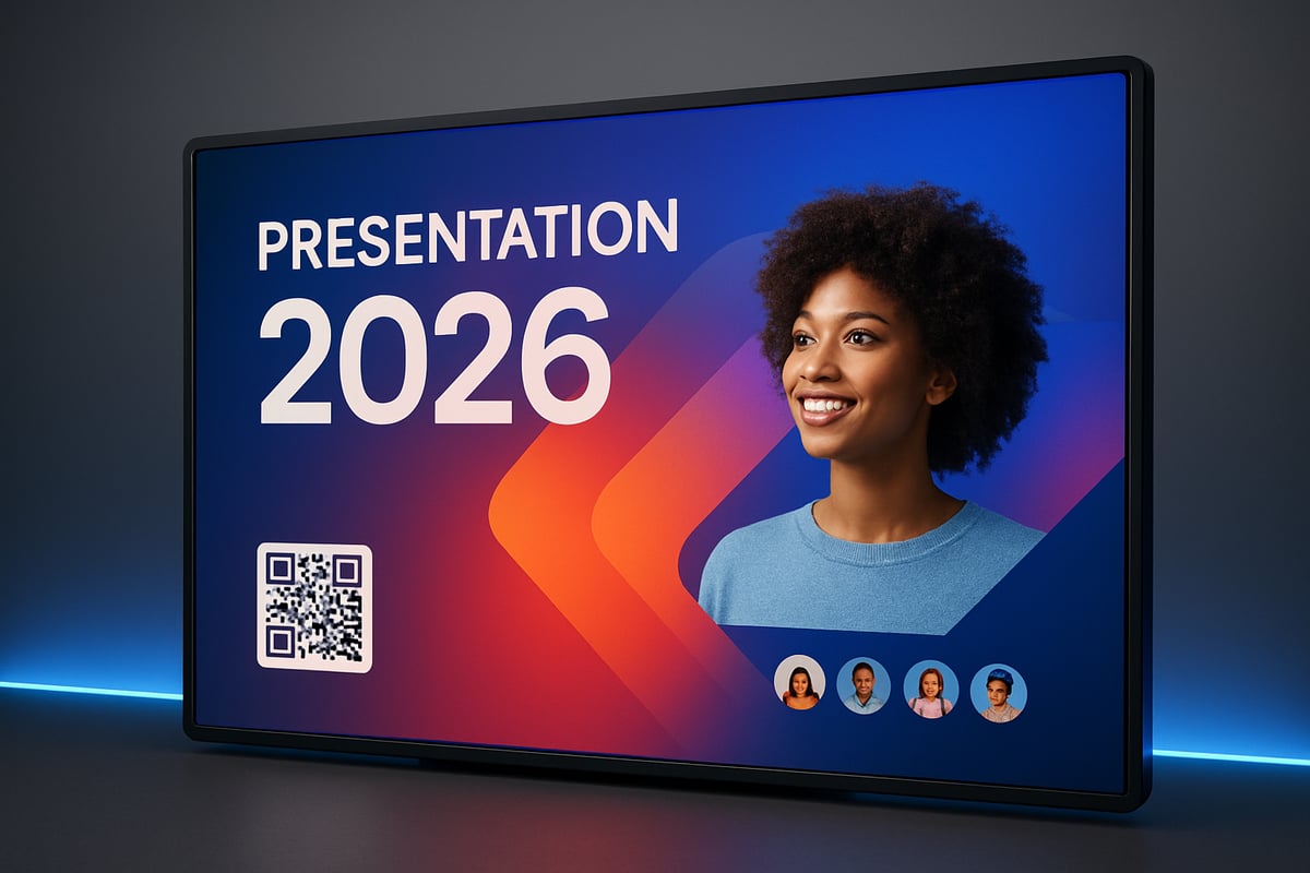
Personalization and Interactivity
Personalization in presentation cover design is essential for making a lasting impression. Including client or audience branding—such as partner logos or custom messaging—shows attention to detail. Digital covers now often feature interactive elements like QR codes or clickable links for enhanced engagement.
Interactivity turns a static cover into an entry point for further exploration. Whether you are presenting in person or virtually, these features help your presentation cover design stand out and invite participation.
Accessibility and Inclusivity in Design
Accessibility is a non-negotiable element of presentation cover design in 2026. High color contrast, large readable fonts, and clear visual hierarchy ensure that all viewers can engage with your content. Inclusive design also means considering diverse audiences, including those with visual impairments.
Check your cover for readability on different devices and backgrounds. Accessibility is not just a trend—it is a responsibility that elevates your presentation cover design to professional standards.
Step-by-Step Guide: Designing a Presentation Cover for 2026 Success
A successful presentation cover design starts with a clear, intentional process. By following these essential steps, you ensure every cover you create is visually striking, audience-focused, and on trend for 2026.
Step 1: Define Your Audience and Purpose
Begin your presentation cover design journey by understanding who will view your presentation and what you want to achieve. Is your audience comprised of industry experts, potential investors, or academic peers? Each group expects different visual cues and messaging.
Clarify your objective. Are you seeking to inform, persuade, or inspire? For example, a financial pitch might require a bold, data-driven cover, while an academic conference could benefit from a scholarly, understated approach.
Taking the time to define these factors ensures your presentation cover design aligns with both your goals and your audience’s expectations.
Step 2: Choose the Right Tools and Templates
The foundation of any modern presentation cover design is the tool and template you select. Popular platforms include PowerPoint, Google Slides, Canva, and Figma, each offering unique advantages for different skill levels and project needs.
When choosing a template, look for layouts that reflect 2026 visual trends: bold typography, immersive imagery, and innovative color palettes. Consider browsing resources that showcase 2024 presentation design trends to inspire your selection and ensure your cover feels fresh and relevant.
Customizing templates allows you to build a distinctive presentation cover design that stands out in any professional setting.
Step 3: Craft a Compelling Title and Subtitle
Your title is the anchor of your presentation cover design. Write a headline that is clear, concise, and emotionally engaging. Avoid jargon and make the value proposition obvious at a glance.
If needed, add a subtitle to provide context or expand on the main idea without overcrowding the cover. Use language that resonates with your audience and sets the appropriate tone.
Effective titles and subtitles work together to draw viewers in and set expectations for the rest of your presentation cover design.
Step 4: Select Imagery and Visual Anchors
Imagery is a powerful driver of attention in presentation cover design. Choose high-quality, copyright-safe images or graphics that reflect your topic, industry, or brand values. Consider hero images, icons, or abstract visuals to create a strong focal point.
Balance visual impact with relevance. Select imagery that evokes the right emotion and reinforces your message. For inspiration, review recent trends in full-bleed images, gradients, and layered effects that are shaping presentation cover design.
Proper image selection elevates your cover and makes a lasting impression.
Step 5: Apply Brand Elements and Personalization
Consistency is key in presentation cover design. Incorporate your company’s logo, brand colors, and fonts to reinforce identity and build trust. Make sure these elements are sized and positioned for maximum professionalism.
Personalize the cover by adding client or event logos when relevant. This small touch demonstrates attention to detail and can strengthen relationships with stakeholders.
Every element should feel intentional and aligned with the overall theme of your presentation cover design.
Step 6: Arrange Layout and Establish Hierarchy
A clear, organized layout is essential for effective presentation cover design. Prioritize visual hierarchy: the title should be most prominent, followed by supporting details and logos. Use white space to guide the viewer’s eye and prevent clutter.
Leverage alignment, spacing, and grid systems to maintain balance and professionalism. For expert guidance, review strategies in Effective layout for PowerPoint to ensure your arrangement supports your message.
Thoughtful layout choices help your presentation cover design communicate authority and clarity from the first glance.
Step 7: Finalize, Test, and Iterate
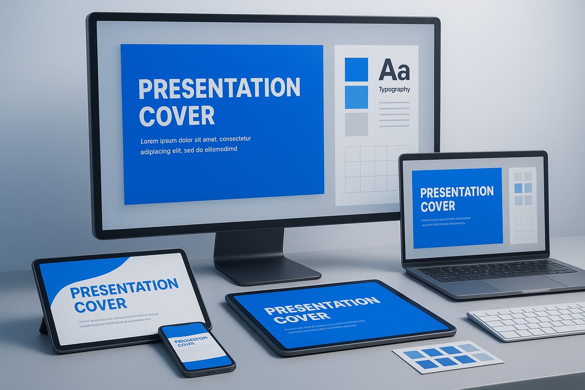
Before sharing your presentation cover design, review it for clarity, professionalism, and impact. Test its appearance on different devices and screen sizes to ensure consistency.
Gather feedback from colleagues or stakeholders, and make refinements as needed. Use a checklist to confirm all critical elements are present:
- Title and subtitle
- Presenter and contact info
- Logos and branding
- Date, event, or context
- High-quality imagery
- Balanced layout
Iterating on feedback guarantees your presentation cover design is polished and ready for success.
Expert Tips and Advanced Techniques for Standout Covers
A standout presentation cover design is more than just visually appealing. To capture attention and communicate authority, you need advanced strategies that blend creativity with intent. These expert techniques ensure your cover not only looks impressive but also drives results.
Leveraging Visual Storytelling for Impact
Visual storytelling transforms a presentation cover design from static to memorable. Use metaphors and symbols to convey your message instantly. For example, a tech pitch might use a rocket or circuitry pattern to evoke innovation.
Consider narrative cues, such as directional lines or focal imagery, to guide the viewer’s eye. These visual anchors help your audience grasp the purpose of your presentation cover design at a glance.
- Choose images that connect emotionally.
- Align visuals with your brand’s story.
- Use consistent iconography for clarity.
A compelling visual story can set your presentation apart and build immediate trust.
Animation and Microinteractions
Modern presentation cover design often includes subtle animations or microinteractions for digital decks. Animated logos, smooth transitions, and dynamic overlays can create a polished first impression.
Keep animations minimal to avoid distraction. Motion should enhance, not overpower, the cover. For instance, a gentle fade-in for your title or a looping animation on a key icon can add sophistication.
When designing, test animations across devices to ensure smooth performance. Thoughtful movement can make your presentation cover design feel truly cutting-edge.
Data Visualization on the Cover
Including data visualization on your presentation cover design is a powerful way to communicate value fast. A single, bold statistic or a small infographic can establish credibility before your audience reads a word.
- Highlight one key metric or result.
- Use simple charts, such as pie or bar graphs.
- Ensure visuals are clear and not cluttered.
Visual data should reinforce your message, not overwhelm the design. This approach works especially well for financial, tech, or research-focused presentations.
Consistency with Overall Presentation Design
A strong presentation cover design should set the tone for the entire deck. Consistency in fonts, colors, and graphic styles is essential for a cohesive experience.
| Element | Cover Example | Slide Example |
|---|---|---|
| Fonts | Bold headline font | Matching body font |
| Colors | Brand palette | Accent highlights |
| Visuals | Signature icon | Repeated motif |
By maintaining alignment, your presentation cover design ensures your message feels unified, professional, and intentional.
Common Pitfalls and How to Avoid Them
Many designers make avoidable mistakes in presentation cover design. Overcrowding, inconsistent branding, or poor contrast can weaken your message. Failing to meet accessibility standards or ignoring audience expectations also reduces engagement.
To steer clear of these issues, review common presentation design mistakes and always test your cover on multiple devices. Prioritize clarity, balance, and alignment with your brand.
Small adjustments can have a big impact on how your presentation cover design is perceived.
Real-World Examples and Case Studies
Award-winning presentation cover design often blends innovation with clarity. For example, a 2025 tech keynote used a minimalist layout paired with a bold data point, instantly capturing investor attention.
In another case, a financial pitch deck integrated client branding with a powerful hero image. This personalization helped secure funding and industry recognition.
Learning from real-world successes helps you refine your own presentation cover design and achieve measurable results.


- This is some text inside of a div block.lay out the facts clearly and compellingly. Use data to establish the ground reality, but remember that facts alone are like the individual strands of a tapestry—necessary but not complete.lay out the facts clearly and compellingly. Use data to establish the ground reality, but remember that facts alone are like the individual strands of a tapestry—necessary but not complete.
- This is some text inside of a div block.lay out the facts clearly and compellingly. Use data to establish the ground reality, but remember that facts alone are like the individual strands of a tapestry—necessary but not complete.

