
PPT Presentation Designer: Expert Guide for 2026

In today's competitive business landscape, the difference between closing a deal and losing an opportunity often comes down to presentation quality. A skilled ppt presentation designer doesn't just make slides look pretty-they transform complex information into compelling visual narratives that drive business outcomes. For financial and tech companies dealing with intricate data sets, market analyses, and technical specifications, working with presentation design experts has become essential. The stakes are higher than ever in 2026, with investors reviewing hundreds of pitch decks monthly and executives making split-second decisions based on visual clarity and professional polish.
The Strategic Role of a PPT Presentation Designer
A ppt presentation designer serves as both visual storyteller and strategic communications partner. Their expertise extends far beyond selecting fonts and colors-they architect information hierarchies that guide audiences through complex arguments with clarity and persuasive power.
Professional presentation designers bring multiple competencies to every project:
- Data visualization expertise to transform spreadsheets into actionable insights
- Brand alignment knowledge to maintain consistency across all touchpoints
- Audience psychology understanding to create emotionally resonant narratives
- Technical proficiency in design software and presentation platforms
- Strategic thinking to structure content for maximum impact
For financial services firms presenting quarterly reports or tech startups pitching to venture capitalists, the quality of company presentations directly impacts credibility. Research shows that audiences form judgments about presenter competence within the first 30 seconds-largely based on visual presentation quality. A ppt presentation designer ensures those critical first impressions work in your favor, not against you.
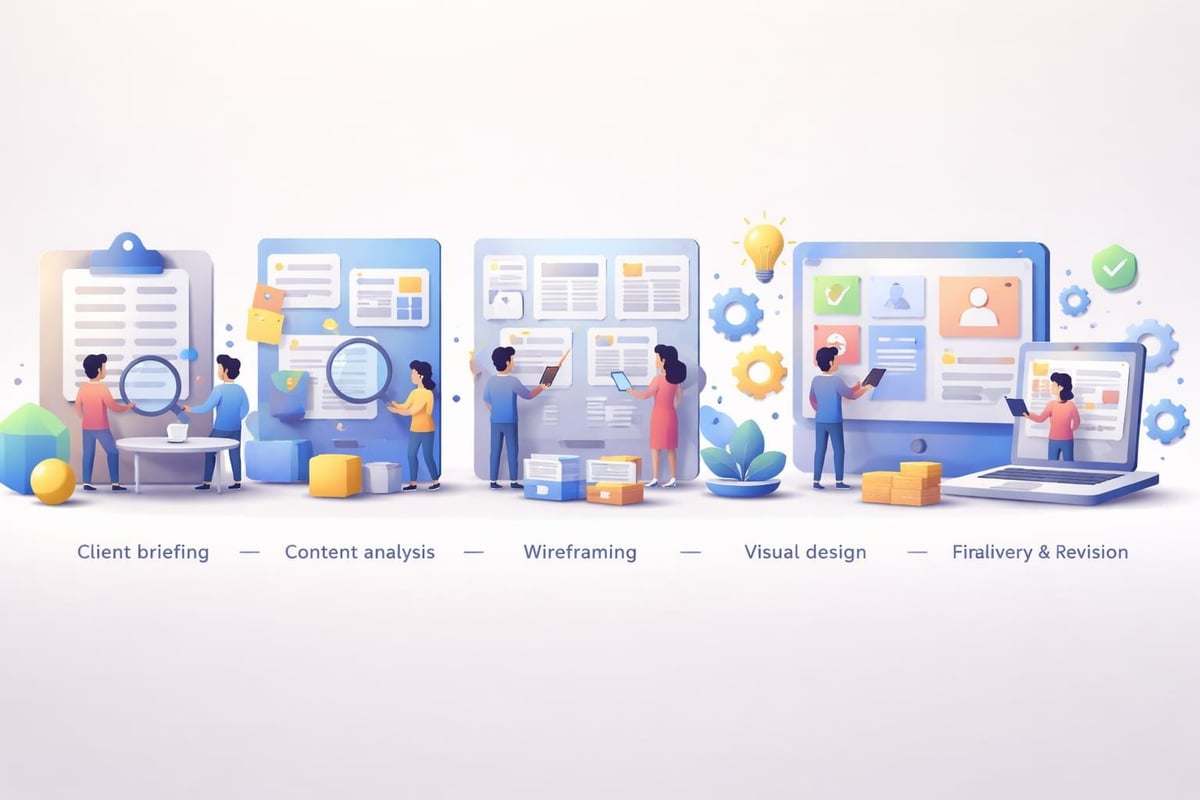
Understanding the Designer's Process
The methodology employed by professional presentation designers follows a structured approach that prioritizes strategic clarity before aesthetic refinement. This process begins with comprehensive discovery sessions where designers extract key messages, understand target audiences, and identify desired outcomes.
During content architecture phases, designers map information flow, establish narrative arcs, and determine which data points deserve emphasis. This strategic foundation prevents the common mistake of creating visually appealing slides that fail to communicate effectively. Following essential strategies and PowerPoint design tips for mastering presentations, professional designers balance aesthetic appeal with functional communication.
The typical design workflow includes:
- Discovery and content audit
- Strategic framework development
- Wireframing and information architecture
- Visual design exploration
- Refinement based on feedback
- Final production and delivery
This systematic approach ensures consistency across every slide while maintaining flexibility for creative innovation where appropriate.
Key Design Elements That Distinguish Professional Work
What separates amateur presentations from professionally designed decks? The answer lies in dozens of micro-decisions that collectively create either visual chaos or harmonious clarity. A skilled ppt presentation designer masters these elements instinctively, applying principles that enhance comprehension and retention.
Typography choices represent one of the most overlooked yet impactful design decisions. Professional designers understand that different typefaces convey distinct psychological associations-serif fonts suggest tradition and reliability, while sans-serif options communicate modernity and efficiency. They also know that readability trumps novelty, especially when presenting complex financial data or technical specifications to discerning audiences.
| Design Element | Amateur Approach | Professional Approach |
|---|---|---|
| Color Palette | Multiple competing colors | 2-3 primary colors with intentional accents |
| Data Visualization | Default chart templates | Custom-designed charts aligned with narrative |
| Content Density | Text-heavy slides | Strategic balance of text, visuals, and whitespace |
| Typography | Mixed fonts and sizes | Consistent hierarchy with 2-3 font families maximum |
Color theory application goes beyond brand compliance. Presentation designers use color strategically to create visual hierarchy, direct attention, and evoke specific emotional responses. For financial presentations requiring trust and stability, they might employ deep blues and greens. Tech startups seeking to communicate innovation benefit from bolder, more dynamic palettes.
Visual Hierarchy and Information Flow
Creating effective visual hierarchy represents perhaps the most critical skill a ppt presentation designer possesses. This principle determines the sequence in which audiences process information, ensuring key messages receive appropriate emphasis while supporting details remain accessible but subordinate.
Professional designers employ size, position, color, and contrast to establish clear reading paths through each slide. Primary headlines command attention through scale and placement. Supporting text appears in smaller, complementary sizes. PowerPoint design ideas often showcase how visual hierarchy transforms cluttered slides into comprehensible communications.
Whitespace-the unmarked areas surrounding design elements-serves as a powerful tool for creating breathing room and directing focus. Novice designers fear empty space, cramming every available pixel with content. Expert presentation designers embrace strategic emptiness, understanding that what you leave out often matters as much as what you include.
Industry-Specific Considerations for Financial and Tech Presentations
Financial services and technology sectors present unique challenges that demand specialized expertise from a ppt presentation designer. These industries deal with complex data, regulatory requirements, and sophisticated audiences who can immediately spot amateurish work or misleading visualizations.

Financial presentation requirements include:
- Accuracy in numerical representations (no misleading chart axes)
- Compliance with disclosure regulations
- Clear communication of risk factors
- Professional aesthetic that reinforces institutional credibility
- Data visualization that reveals trends without distortion
Technology companies face different challenges-explaining complex technical concepts to non-technical stakeholders, demonstrating product functionality visually, and communicating innovation in crowded markets. A ppt presentation designer working with tech clients must translate jargon into accessible language while maintaining technical accuracy that satisfies expert reviewers.
Data Visualization Best Practices
Transforming raw data into compelling visual narratives separates competent designers from exceptional ones. The best ppt presentation designer options know that every chart type serves specific communication purposes-bar charts for comparisons, line graphs for trends, pie charts for proportional relationships (used sparingly), and scatter plots for correlations.
For complex datasets common in financial and tech sectors, designers often create custom visualizations that traditional chart types cannot accommodate. These might include interactive dashboards, animated data progressions, or hybrid formats combining multiple data views. The goal remains constant: immediate comprehension leading to informed decision-making.
Following practical PowerPoint design tips, professional designers avoid common pitfalls like 3D effects that distort perception, excessive gridlines that create visual noise, and color choices that make data difficult to distinguish. They prioritize clarity, ensuring that audiences grasp key insights within seconds of viewing each visualization.
Selecting the Right Presentation Designer for Your Needs
Choosing a ppt presentation designer requires evaluating both technical capabilities and strategic understanding. The ideal designer comprehends your industry, understands your audience, and demonstrates proven ability to translate complex content into persuasive visual narratives.
Portfolio review represents the most critical evaluation step. Look for work samples addressing challenges similar to yours-financial pitch decks if you're raising capital, product presentations if you're launching new offerings, or professional PowerPoint examples if you need executive communications. Pay attention to visual consistency, data visualization approaches, and whether designs enhance or obscure core messages.
Key questions to ask potential designers:
- What is your process from initial brief to final delivery?
- How do you handle revisions and feedback integration?
- What industries do you specialize in?
- Can you provide client references or case studies?
- What file formats and design tools do you work with?
- How do you ensure brand consistency across slides?
Timeline and budget considerations matter significantly. Rush projects typically cost more and may compromise quality. Establish realistic schedules that allow for proper discovery, design exploration, and refinement. Understand pricing models-some designers charge per slide, others offer project-based rates, and agencies might provide retainer arrangements for ongoing presentation needs.
Advanced Techniques Used by Expert Designers
Expert-level ppt presentation designer professionals employ sophisticated techniques that elevate presentations beyond basic slide creation. These approaches require extensive experience, technical proficiency, and deep understanding of visual communication principles.
Animation and transition effects, when used judiciously, can significantly enhance storytelling. Professional designers avoid gratuitous motion that distracts from content, instead using subtle animations to reveal information progressively, guide attention, or demonstrate processes. Complex financial models might unfold step-by-step, allowing audiences to follow calculations without overwhelming cognitive load.
| Technique | Purpose | Best Application |
|---|---|---|
| Progressive Disclosure | Reveal information sequentially | Complex processes or multi-step arguments |
| Morphing Transitions | Show transformation between states | Product evolution or data comparisons |
| Parallax Effects | Create depth and visual interest | Section dividers or impactful openings |
| Interactive Elements | Enable audience exploration | Technical demonstrations or scenario modeling |
Custom illustration and iconography distinguish premium presentation design from template-based approaches. While stock graphics serve basic needs, custom visuals created specifically for your content create unique identity and perfect alignment with messaging. A skilled ppt presentation designer might commission or create bespoke illustrations that capture abstract concepts or technical processes impossible to photograph.
Template Development and Brand Systems
For organizations requiring consistent presentation quality across multiple teams and use cases, developing comprehensive template systems provides enormous value. These aren't simple PowerPoint templates-they're complete design systems with master slides, color palettes, typography rules, icon libraries, and usage guidelines.
Attractive PowerPoint templates balance flexibility with consistency, allowing non-designers to create professional presentations while preventing off-brand deviations. Smart template architecture includes pre-designed layouts for common slide types-title slides, section dividers, two-column comparisons, data visualizations, team introductions, and closing calls-to-action.
A comprehensive template system developed by a professional ppt presentation designer might include dozens of layout options, each optimized for specific content types. These systems save countless hours while ensuring every presentation maintains brand integrity and professional polish, regardless of who creates it.
Common Mistakes and How Professionals Avoid Them
Even experienced business professionals make presentation design mistakes that undermine their messages. Understanding these pitfalls helps you appreciate the value a skilled ppt presentation designer brings to critical communications.
The most prevalent presentation design errors include:
- Overcrowding slides with excessive text
- Using low-resolution images that appear pixelated
- Creating inconsistent formatting across slides
- Selecting illegible font sizes (especially for data labels)
- Applying distracting animations or transitions
- Choosing color combinations with poor contrast
- Neglecting to proofread for typos and inconsistencies
Professional designers combat these issues through systematic quality control processes. They maintain style guides, use grid systems for alignment precision, and conduct multiple review passes focusing on different aspects-content accuracy, visual consistency, technical execution, and narrative flow. Following PowerPoint layout design tips, they ensure design choices enhance rather than obstruct communication.

The six-by-six rule-no more than six bullet points per slide, with six words maximum per bullet-represents one guideline professionals reference while understanding when to break it. Rules provide frameworks, but context determines application. Sometimes a single powerful image with minimal text communicates more effectively than any bulleted list.
The ROI of Professional Presentation Design
Investing in professional ppt presentation designer services delivers measurable returns that extend far beyond aesthetic improvements. For financial firms pitching investment opportunities or tech companies presenting to potential clients, presentation quality directly correlates with conversion rates and deal closures.
Consider the mathematics: if improving presentation quality increases your pitch success rate by even 10%, and each successful deal generates $100,000 in revenue, the return on design investment becomes substantial. Professional presentations also save internal time-hours previously spent struggling with alignment and formatting can redirect toward higher-value strategic work.
Quantifiable benefits include:
- Higher pitch and proposal success rates
- Reduced time spent on presentation creation
- Improved audience engagement and message retention
- Enhanced brand perception and professional credibility
- Increased consistency across organizational communications
- Better internal collaboration through clear visual communications
Qualitative advantages matter equally. Professional presentations elevate your organization's perceived expertise and attention to detail. They demonstrate respect for your audience's time by communicating efficiently. They reduce cognitive load, making complex information accessible and actionable. These factors combine to create competitive advantages that compound over time.
Measuring Presentation Effectiveness
Forward-thinking organizations track presentation performance metrics to optimize their communications strategies. While some outcomes like closed deals are obvious, other indicators provide valuable insights for continuous improvement.
Audience engagement metrics during virtual presentations-attention duration, question quality, follow-up requests-reveal which slides resonate and which need refinement. A/B testing different design approaches for similar content helps identify effective visual strategies. Post-presentation surveys can assess message retention and clarity, informing future design decisions.
A strategic ppt presentation designer partners with clients beyond initial delivery, analyzing performance data and iterating designs based on real-world results. This ongoing optimization ensures presentations evolve with changing audience preferences, market conditions, and organizational objectives.
Emerging Trends Shaping Presentation Design
The presentation design landscape continually evolves as new technologies, platforms, and audience expectations emerge. Professional ppt presentation designer experts stay ahead of these trends, incorporating innovations that enhance communication effectiveness while avoiding fads that add complexity without value.
Artificial intelligence tools are beginning to influence presentation design workflows, with recent research on presentation generation frameworks exploring automated approaches to content creation and visual design. However, these technologies currently serve as assistants rather than replacements for skilled human designers who provide strategic thinking and nuanced judgment.
Significant trends for 2026 include:
- Interactive presentations enabling audience exploration
- Integration with data sources for real-time updates
- Accessibility-first design ensuring inclusivity
- Minimalist aesthetics prioritizing clarity over decoration
- Video integration for dynamic storytelling
- Mobile-optimized formats for on-the-go viewing
Sustainability considerations are influencing design choices, with some organizations requesting eco-conscious approaches that minimize file sizes and energy consumption during digital delivery. This aligns with broader corporate responsibility initiatives while presenting interesting technical challenges for designers.
Platform Diversification Beyond PowerPoint
While PowerPoint remains dominant in corporate environments, professional presentation designers increasingly work across multiple platforms-Google Slides for collaborative cloud-based workflows, Keynote for Apple-centric organizations, and specialized tools like Prezi for non-linear storytelling. Understanding platform-specific capabilities and limitations allows designers to maximize each tool's strengths.
Some designers now incorporate Figma for presentation design, leveraging its collaborative features and design precision for presentation creation. Each platform offers unique advantages, and choosing the right tool depends on delivery context, collaboration requirements, and technical considerations.
A versatile ppt presentation designer adapts their approach based on platform selection while maintaining consistent quality and strategic effectiveness regardless of the underlying technology. This platform agnostics ensures clients receive optimal solutions for their specific needs rather than forcing every project into a single tool.
Building Long-Term Partnerships with Design Teams
The most successful client-designer relationships extend beyond transactional project completion toward strategic partnerships where designers become trusted advisors on visual communications. These relationships develop when both parties invest in understanding each other's goals, constraints, and working styles.
Establishing clear communication protocols prevents misunderstandings and streamlines collaboration. Define preferred channels for feedback, revision processes, file sharing methods, and approval workflows at project outset. Document these procedures so teams can reference them across multiple engagements, reducing friction and accelerating timelines.
Regular strategy sessions beyond immediate project needs help designers understand your evolving business objectives, competitive landscape, and emerging challenges. This contextual knowledge enables more proactive, strategic design recommendations that align with broader organizational goals rather than merely executing tactical requests.
Characteristics of effective design partnerships:
- Mutual understanding of goals and constraints
- Transparent communication about timelines and expectations
- Collaborative rather than hierarchical working relationships
- Ongoing education about industry developments and best practices
- Flexibility to adapt processes as needs evolve
- Shared commitment to continuous improvement
When evaluating potential long-term ppt presentation designer partners, assess not just current capabilities but growth potential and strategic thinking. The best designers challenge assumptions constructively, propose innovative solutions, and educate clients about design principles that improve communication effectiveness. Understanding how to design presentations smarter, not harder becomes a collaborative journey rather than a service transaction.
Mastering presentation design requires balancing aesthetic sophistication with strategic communication, transforming complex information into narratives that drive business outcomes. Whether you're preparing a crucial investor pitch, quarterly board presentation, or client proposal, the quality of your visual communications directly impacts your success. Prznt Perfect specializes in creating presentation designs that combine visual excellence with strategic clarity, helping financial and tech businesses communicate their value with confidence and impact.


- This is some text inside of a div block.lay out the facts clearly and compellingly. Use data to establish the ground reality, but remember that facts alone are like the individual strands of a tapestry—necessary but not complete.lay out the facts clearly and compellingly. Use data to establish the ground reality, but remember that facts alone are like the individual strands of a tapestry—necessary but not complete.
- This is some text inside of a div block.lay out the facts clearly and compellingly. Use data to establish the ground reality, but remember that facts alone are like the individual strands of a tapestry—necessary but not complete.

