
PPT Conference Presentation Template: Expert Guide 2026

Creating a compelling conference presentation requires more than just good ideas. You need a professional framework that communicates your message clearly while maintaining visual consistency throughout your talk. A well-designed ppt conference presentation template serves as the foundation for delivering impactful presentations that resonate with your audience, whether you're speaking at an industry summit, academic conference, or corporate event. For professionals in tech and financial sectors, where complex data meets critical decision-makers, the right template makes the difference between confusion and clarity.
Understanding the Strategic Value of Conference Templates
The effectiveness of your conference presentation begins long before you step on stage. A ppt conference presentation template establishes the visual architecture that supports your narrative, ensuring that every slide reinforces your key messages without distracting from your content.
Professional templates offer several distinct advantages over starting from scratch. They provide pre-designed layouts that maintain consistency across all slides, saving valuable preparation time while ensuring brand alignment. Template-based approaches reduce cognitive load on your audience by creating predictable patterns for information delivery.
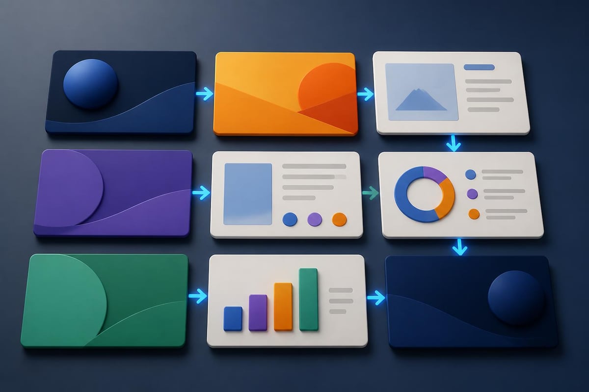
When selecting or designing a ppt conference presentation template, consider these critical factors:
- Audience context: Conference attendees have different expectations than boardroom executives
- Venue requirements: Large auditoriums demand different design choices than intimate meeting rooms
- Content complexity: Technical presentations need more space for diagrams and data
- Time constraints: 15-minute talks require different pacing than 45-minute keynotes
- Brand guidelines: Corporate presentations must align with established visual identity
Template Categories for Different Conference Formats
Different conference settings require specialized approaches. Academic conferences prioritize data clarity and methodological transparency, while business conferences emphasize actionable insights and compelling narratives.
| Conference Type | Primary Focus | Template Features | Typical Slide Count |
|---|---|---|---|
| Academic Research | Data and methodology | Chart-heavy layouts, citation space | 20-30 slides |
| Business Strategy | Insights and action | Visual metaphors, executive summaries | 15-25 slides |
| Technical Deep-Dive | Process and implementation | Diagram templates, code displays | 25-40 slides |
| Investor Pitch | Value and opportunity | Financial charts, roadmap layouts | 10-15 slides |
Understanding these distinctions helps you choose the right starting point for your specific presentation needs. The PowerPoint design services you select should align with your conference format and audience expectations.
Essential Design Elements for Conference Templates
Professional conference templates balance aesthetic appeal with functional clarity. Your template should enhance comprehension rather than compete for attention with your content.
Typography plays a crucial role in conference presentations. According to PowerPoint presentation guidelines, sans-serif fonts like Arial, Helvetica, or Calibri work best for projection, with minimum font sizes of 24 points for body text and 36 points for headings.
Color schemes demand careful consideration. High-contrast combinations ensure readability from the back of large conference halls. Professional templates typically use a primary brand color for emphasis, a neutral base for backgrounds, and carefully selected accent colors for data visualization.
Layout Principles That Drive Engagement
Effective ppt conference presentation template designs follow established visual hierarchy principles. The presentation design best practices emphasize white space, visual balance, and strategic placement of elements to guide audience attention.
Key layout components include:
- Title area: Consistent positioning across all slides with adequate contrast
- Content zone: Primary area for information with appropriate margins
- Footer elements: Slide numbers, conference details, or minimal branding
- Visual anchors: Recurring design elements that create template cohesion
The most effective templates establish these zones clearly, allowing presenters to focus on content rather than layout decisions for each slide. This consistency becomes particularly valuable when collaborating with teams or adapting presentations for multiple conferences throughout the year.
Grid systems underpin professional template design. A well-constructed grid ensures that text, images, and graphics align properly, creating visual harmony that enhances rather than distracts from your message. Most professional designers use 12-column or 16-column grids for maximum layout flexibility.
Building Content Structure Within Templates
A ppt conference presentation template should guide your content organization as much as your visual design. The structure you establish affects how audiences process and retain information during your talk.
Opening sequences set the tone for your entire presentation. Your template should include dedicated layouts for title slides, speaker introductions, and agenda overviews that immediately establish credibility and context. These opening moments create first impressions that influence audience engagement throughout your session.
The body of your presentation benefits from varied layouts that prevent visual monotony. Alternate between text-focused slides, image-dominant layouts, and data visualization frames to maintain interest. Research shows that audience attention wanes after 10 minutes, making visual variety essential for longer conference sessions.
Data Visualization Frameworks
Tech and financial presentations rely heavily on data communication. Your template should include purpose-built layouts for different data types:
- Trend charts: Layouts optimized for line graphs showing performance over time
- Comparison slides: Side-by-side formats for competitive analysis or option evaluation
- Process diagrams: Frameworks for illustrating workflows, systems, or methodologies
- Statistical displays: Clean backgrounds that let complex data speak clearly
Effective data visualization presentation templates provide adequate space for chart titles, axis labels, legends, and source citations without creating cluttered slides. The goal is immediate comprehension, even for attendees viewing from a distance.

Tables present special challenges in conference settings. Your ppt conference presentation template should include table layouts with appropriate row heights, column widths, and header formatting. Limit tables to essential data points, using bold text or color highlights to emphasize key findings.
Technical Specifications for Conference Delivery
Templates must meet technical requirements for various conference venues and presentation systems. Understanding these specifications prevents last-minute formatting crises and ensures your content displays correctly.
Aspect Ratio and Resolution Considerations
Modern conferences typically use 16:9 widescreen displays, though some venues maintain older 4:3 projectors. The presentation guidelines for conferences recommend creating templates in 16:9 format as standard, with 4:3 versions available if needed.
Resolution matters significantly for image quality. Design your template at 1920x1080 pixels minimum to ensure crisp display on high-resolution screens. Images and graphics within your template should maintain at least 150 DPI for professional appearance.
File size optimization becomes critical when submitting presentations to conference organizers in advance. Compress images appropriately, embed fonts to ensure consistent display, and avoid excessive animations that bloat file sizes without adding value.
| Technical Aspect | Recommended Specification | Why It Matters |
|---|---|---|
| Aspect Ratio | 16:9 (1920x1080) | Modern standard for conference venues |
| Font Size | 24pt minimum body, 36pt headers | Visibility from back rows |
| File Format | PPTX with embedded fonts | Cross-platform compatibility |
| Image Resolution | 150 DPI minimum | Clear display on large screens |
| Color Mode | RGB (not CMYK) | Optimized for screen display |
These specifications align with podium presentation standards used at professional conferences worldwide, ensuring your template performs reliably across different venues.
Customization Strategies for Brand Alignment
While using a ppt conference presentation template streamlines creation, customization ensures your presentation reflects your organization's unique identity. Generic templates undermine credibility with sophisticated audiences in tech and financial sectors.
Brand integration starts with color palette adaptation. Extract exact color values from your brand guidelines and apply them consistently throughout your template. Most professional templates include theme colors that automatically update across all design elements when modified.
Logo placement requires strategic consideration. Position your logo consistently on each slide, typically in the footer or corner position where it reinforces brand identity without competing with content. Avoid oversized logos that dominate slide real estate better used for valuable information.
Typography customization extends beyond simply changing fonts. Establish a clear type hierarchy that aligns with your brand's tone, whether that's authoritative and formal or approachable and contemporary. The professional PowerPoint presentation approach balances brand consistency with readability requirements.
Industry-Specific Adaptations
Tech companies and financial institutions face distinct presentation challenges that demand specialized template features. Technology presentations often require layouts for architecture diagrams, code snippets, and product screenshots, while financial presentations need robust frameworks for displaying complex data and regulatory information.
For organizations frequently presenting at major industry events, such as the TEAMZ Summit where Web3 and AI innovations take center stage, templates should accommodate cutting-edge visual trends while maintaining professional credibility. These high-profile venues demand presentation excellence that distinguishes speakers from competitors.
Advanced Template Features for Professional Impact
Sophisticated ppt conference presentation template designs incorporate features that elevate presentations beyond basic information delivery. These elements demonstrate polish and professionalism that impress discerning conference audiences.
Animation and transition schemes add visual interest when used judiciously. Your template should include subtle animations that reveal content progressively, helping audiences process information in digestible chunks. Avoid flashy effects that distract from your message or appear unprofessional.
Interactive elements transform static presentations into engaging experiences. Build clickable navigation into your template for non-linear presentations where you might jump between sections based on audience questions. This flexibility proves valuable during Q&A sessions or when adapting to time constraints.
Master Slide Architecture
The true power of templates lies in Master Slide functionality. According to presentation uniformity guidelines, proper Master Slide setup ensures changes cascade consistently across your entire presentation.
Well-constructed master slides include:
- Template layouts: Multiple pre-designed slide formats for different content types
- Placeholder positions: Consistent content areas across all layouts
- Theme fonts and colors: Centralized style controls for easy updates
- Background graphics: Recurring visual elements that establish brand identity
This architecture becomes particularly valuable for teams creating multiple presentations. When everyone works from the same master template, presentations maintain consistency across speakers and sessions, strengthening your organization's professional image.
Template Selection and Acquisition Methods
Choosing the right ppt conference presentation template involves evaluating multiple sources, each offering different trade-offs between convenience, quality, and customization potential.
Stock template marketplaces provide thousands of options at various price points. While convenient, these templates often lack the refinement needed for high-stakes conference presentations. Generic designs telegraph a lack of investment in presentation quality that undermines credibility with sophisticated audiences.
Custom template development delivers maximum impact but requires greater investment. Working with professional designers who understand presentation design trends for 2026 ensures your template incorporates current best practices while remaining distinctive. This approach makes sense for organizations that present frequently or at critical industry events.

Semi-custom solutions offer middle-ground options. Start with a premium template that aligns with your needs, then customize extensively to reflect your brand. This approach provides professional foundation while allowing meaningful personalization.
Evaluation Criteria for Template Selection
When assessing potential templates, consider these critical factors:
- Layout variety: Sufficient slide designs to accommodate diverse content types
- Edit flexibility: Easy modification without breaking design integrity
- File quality: Clean structure with properly organized layers and elements
- Support availability: Access to updates, documentation, or designer assistance
- Licensing terms: Clear usage rights for commercial conference presentations
The best PPT presentation templates balance aesthetic appeal with practical functionality, providing frameworks that support rather than constrain your content development process.
Workflow Integration and Template Management
Implementing a ppt conference presentation template successfully requires systematic workflow integration. Templates deliver maximum value when they become standard practice rather than occasional resources.
Template libraries centralize access for team members. Create a shared repository with current templates, supporting graphics, and usage guidelines. Version control prevents outdated templates from circulating, maintaining brand consistency across all conference appearances.
Documentation accelerates adoption. Provide clear instructions on template usage, including guidance on customization boundaries, recommended content volumes per slide, and best practices for specific slide types. This documentation reduces friction when team members create presentations under deadline pressure.
Training investments pay dividends in presentation quality. Conduct workshops teaching team members to leverage template features effectively, from basic layout selection to advanced Master Slide modifications. These sessions also gather feedback for template improvements, creating continuous refinement cycles.
Quality Assurance Processes
Establish review protocols before major conference presentations. Quality checks should verify:
- Brand compliance: Correct logos, colors, and fonts throughout
- Technical specifications: Appropriate aspect ratio, resolution, and file format
- Content clarity: Readable text, clear graphics, and logical flow
- Error elimination: No typos, broken links, or misaligned elements
This systematic approach mirrors the rigorous standards expected in fintech presentation design, where precision and professionalism directly impact business outcomes.
Accessibility and Inclusive Design Practices
Modern conference templates must accommodate diverse audience needs. Accessibility isn't just ethical, it's practical, ensuring your message reaches all attendees regardless of visual, cognitive, or physical abilities.
Color contrast ratios require particular attention. The visual guidelines for presentations specify minimum contrast levels that ensure text remains readable for people with color vision deficiencies. Test your template using accessibility checkers before finalizing designs.
Alternative text for images makes presentations accessible to attendees using screen readers or reviewing materials after the conference. Build alt text fields into your template workflow, ensuring every graphic includes descriptive text explaining its content and purpose.
Font choices impact readability beyond size considerations. Select typefaces with clear character differentiation, open letter forms, and adequate spacing. Avoid decorative fonts that sacrifice legibility for aesthetic appeal, particularly for body text and data labels.
Universal Design Principles
Templates built on universal design principles serve broader audiences more effectively:
- Simplified layouts: Clear hierarchy that doesn't rely solely on color coding
- Multiple information channels: Reinforcing key points through text, graphics, and verbal explanation
- Flexible navigation: Options for linear or non-linear presentation flow
- Readable formatting: Adequate white space, appropriate line lengths, and clear sectioning
These principles enhance comprehension for all audience members, not just those with specific accessibility needs, making your conference presentation more effective overall.
Maintenance and Evolution of Template Systems
A ppt conference presentation template isn't a one-time creation but an evolving asset that requires ongoing refinement. Regular updates ensure your templates remain current with design trends, technical standards, and organizational needs.
Annual reviews provide opportunities to assess template performance. Gather feedback from presenters about layout limitations, missing slide types, or customization challenges. Incorporate these insights into updated versions that better serve user needs.
Technology changes demand template evolution. New PowerPoint features, display technologies, or conference venue standards may require template modifications to maintain optimal performance. Stay informed about presentation design developments that could enhance your template effectiveness.
Brand refreshes necessitate template updates. When organizations update visual identities, templates must reflect these changes promptly and comprehensively. Maintain version control during transitions, allowing presentations in development to complete with current templates while new projects adopt updated versions.
Archive successful presentations to build knowledge bases. Document which template layouts worked particularly well for specific content types or audience segments. This institutional knowledge informs future template development and helps new team members leverage proven approaches.
Selecting and implementing the right ppt conference presentation template transforms how your organization communicates at industry events, turning complex information into compelling narratives that drive action. Whether you're presenting breakthrough research, unveiling new products, or pitching to investors, professional templates provide the foundation for presentations that command attention and respect. Prznt Perfect specializes in creating custom presentation templates and comprehensive visual communications for tech and financial organizations, combining strategic insight with design excellence to help you deliver conference presentations that truly stand out.


- This is some text inside of a div block.lay out the facts clearly and compellingly. Use data to establish the ground reality, but remember that facts alone are like the individual strands of a tapestry—necessary but not complete.lay out the facts clearly and compellingly. Use data to establish the ground reality, but remember that facts alone are like the individual strands of a tapestry—necessary but not complete.
- This is some text inside of a div block.lay out the facts clearly and compellingly. Use data to establish the ground reality, but remember that facts alone are like the individual strands of a tapestry—necessary but not complete.

.png)
