PowerPoint Style Presentation: Design Principles That Work

The powerpoint style presentation has become the universal language of business communication, shaping how organizations share ideas, secure funding, and drive decisions. For financial and tech companies, mastering presentation design principles isn't just about aesthetics-it's about transforming complex data into compelling narratives that move audiences to action. Understanding the fundamental elements that constitute effective presentation style enables businesses to craft decks that communicate with clarity, build credibility, and ultimately achieve their strategic objectives.

Understanding the Core Elements of Presentation Style

Visual consistency forms the backbone of any professional presentation. When we discuss powerpoint style presentation principles, we're referring to the systematic application of design choices that create coherence across every slide. This consistency extends beyond simple template selection to encompass typography, color application, spacing, and visual hierarchy.

Typography choices significantly impact readability and professional perception. The official Microsoft guide for creating effective presentations emphasizes selecting fonts with clear letterforms at various sizes. Sans-serif typefaces like Helvetica, Arial, or Calibri typically perform better in projection environments, while serif fonts may work for printed decks reviewed on tablets or paper.

Font hierarchy establishes information priority:

  • Headline text: 32-44 points for main slide titles
  • Subheadings: 24-28 points for section divisions
  • Body text: 18-24 points minimum for readability
  • Caption text: 14-16 points for footnotes and citations

Color theory extends beyond brand compliance to influence comprehension and emotional response. Financial presentations often leverage blue tones to convey trust and stability, while tech companies may incorporate vibrant accent colors to suggest innovation. The key principle involves maintaining sufficient contrast ratios-at least 4.5:1 between text and background-to ensure legibility across viewing conditions.

Typography hierarchy in presentations

Layout Principles That Drive Comprehension

Grid systems provide the invisible architecture supporting professional slide design. A powerpoint style presentation built on consistent grid structures feels intentional rather than arbitrary. Most effective presentations utilize a 12-column or 16-column grid that allows for flexible content placement while maintaining alignment across slides.

White space serves as a strategic design element rather than wasted real estate. Research on visual metrics for assessing slide quality demonstrates that presentations with adequate negative space receive higher quality ratings from viewers. This counterintuitive principle challenges the instinct to fill every pixel with information.

Layout Component Recommended Approach Common Mistake
Margins Minimum 0.5 inches on all sides Content extending to slide edges
Content blocks Maximum 3-4 distinct elements per slide Seven or more competing elements
Text density 6-8 lines maximum for body content Paragraph-length text blocks
Image placement Aligned to grid, purposeful sizing Random placement, inconsistent scaling

The rule of thirds, borrowed from photography, applies equally to presentation design. Positioning key elements along the intersections of imaginary lines dividing the slide into thirds creates natural focal points that guide viewer attention.

Typography Strategies for Financial and Tech Presentations

Specialized content demands specialized typographic treatment. When presenting financial data, numerical clarity becomes paramount. Tabular figures-numbers with consistent width-ensure columns of financial data align properly, preventing misinterpretation of values. Many corporate presentations benefit from exploring professional slide deck templates designed specifically for data-heavy content.

Font pairing establishes visual interest while maintaining professionalism. A common strategy pairs a geometric sans-serif headline font with a humanist sans-serif body font, creating subtle contrast without jarring transitions. For tech companies emphasizing innovation, contemporary typefaces like Montserrat or Proxima Nova communicate modernity while remaining highly legible.

Type size considerations extend beyond minimum readability thresholds:

  1. Determine your viewing environment (conference room, auditorium, virtual presentation)
  2. Calculate the appropriate minimum size based on furthest viewer distance
  3. Test readability on actual presentation equipment
  4. Adjust spacing between lines and letters for optimal comprehension
  5. Verify accessibility compliance for diverse audience needs

Letter spacing adjustments, while subtle, impact professional perception significantly. Tracking adjustments of +10 to +50 for uppercase headlines improve readability, while body text typically requires minimal tracking modifications. The multimedia design principles from cognitive research highlight how these seemingly minor adjustments affect information processing speed.

Advanced Typography Techniques

Text treatment goes beyond font selection to include strategic emphasis techniques. Bold weight draws attention to key terms without the harshness of underlining or italics. Color variation can highlight specific data points, though overuse dilutes impact. A powerpoint style presentation for investor meetings might use brand color to emphasize positive performance metrics while maintaining neutral tones for contextual information.

Kerning adjustments become necessary when large headline text creates awkward spacing between letter pairs. Manual kerning corrections for combinations like "VA," "To," or "We" polish presentation appearance at the detail level that separates amateur from professional work.

Color Psychology and Application in Business Presentations

Strategic color deployment influences audience perception before a single word is read. Color theory for presentations encompasses far more than aesthetic preference-it involves psychological impact, cultural associations, and functional requirements like accessibility compliance.

The 60-30-10 rule provides a proven framework for color distribution. Dominant colors occupy 60% of visual space (typically backgrounds and large design elements), secondary colors claim 30% (content backgrounds, supporting graphics), and accent colors punctuate 10% (call-to-action elements, key data highlights).

Industry-specific color conventions shape audience expectations. Financial services presentations often rely on navy blue, gray, and gold to convey stability and premium positioning. Technology companies frequently incorporate bright blues, greens, or purples to suggest innovation and forward-thinking culture. Understanding these associations allows designers to either align with expectations or deliberately contrast them for strategic purposes.

Accessibility requirements demand attention to color contrast and colorblind-safe palettes. Approximately 8% of males and 0.5% of females experience some form of color vision deficiency. Designing presentations that communicate effectively regardless of color perception ensures message delivery across diverse audiences.

Color theory for presentations

Data Visualization and Information Design

Transforming spreadsheets into compelling visual narratives represents one of the most critical skills in presentation design. A powerpoint style presentation for tech or financial audiences must balance data accuracy with visual clarity. Chart selection directly impacts comprehension speed and accuracy.

Each chart type serves specific communication purposes:

  • Bar charts: Comparing discrete categories or time periods
  • Line graphs: Showing trends and changes over continuous time
  • Pie charts: Illustrating part-to-whole relationships (limited to 5-6 segments maximum)
  • Scatter plots: Revealing correlations between variables
  • Heat maps: Displaying complex multi-dimensional data patterns

The evidence-based slide evaluation research emphasizes avoiding "busy" slides where excessive data points overwhelm viewers. Simplification doesn't mean dumbing down-it means removing non-essential elements that don't support the core message.

Visualization Best Practice Implementation Benefit
Direct labeling Place values on chart elements Eliminates legend-reading friction
Consistent scaling Use same axis ranges for comparison slides Enables accurate visual comparison
Selective highlighting Color only the data requiring attention Guides viewer focus immediately
Simplified legends Limit to essential categories Reduces cognitive load

Data-ink ratio, a concept from information design theory, suggests maximizing the proportion of ink (or pixels) dedicated to actual data rather than decorative elements. Removing unnecessary gridlines, borders, and embellishments allows the data itself to communicate more effectively.

Creating Narrative Flow Through Data

Sequential data slides should build upon each other, creating narrative momentum. A powerpoint style presentation for a tech startup pitch might begin with total addressable market, narrow to serviceable addressable market, then highlight the serviceable obtainable market-each slide adding specificity to the investment thesis. This progressive disclosure technique maintains engagement while building toward conclusions.

Annotation strategies help viewers interpret complex data. Callout boxes highlighting specific data points, brief explanatory text near unusual patterns, and clear axis labels prevent misinterpretation. For creative pitch deck design, these annotations become part of the visual storytelling apparatus.

Image Selection and Photographic Style

Photography and imagery establish emotional tone and reinforce messaging beyond what text alone can achieve. Stock photography selection separates amateur from professional presentations through authenticity criteria. Overused, obviously staged stock images undermine credibility, particularly in financial contexts where trust is paramount.

Authentic imagery characteristics include:

  • Real workspace environments rather than sterile studio setups
  • Genuine diversity reflecting actual organizational composition
  • Natural lighting and candid moments over posed arrangements
  • Relevance to specific slide content rather than generic business themes

Image treatment consistency maintains visual coherence across the deck. Applying uniform filters, maintaining consistent saturation levels, and standardizing overlay treatments create subliminal connections between slides. A powerpoint style presentation might use a subtle blue overlay at 20% opacity across all photographs, reinforcing brand color while ensuring text legibility.

Photography placement follows the same grid systems governing other content. Images bleeding to slide edges create bold, modern aesthetics suitable for tech presentations, while contained images with borders suggest traditional, conservative approaches often preferred in financial contexts.

Image treatment consistency

Animation and Transition Strategies

Motion design in presentations serves functional rather than decorative purposes. Thoughtful animation directs attention, reveals information progressively, and maintains engagement during longer presentations. A powerpoint style presentation benefits from subtle, purposeful motion that supports rather than distracts from content.

The comprehensive benchmark for evaluating presentation elements includes animation appropriateness among its 50+ design criteria. Excessive or inconsistent animation reduces perceived professionalism and can trigger accessibility concerns for viewers with vestibular disorders or attention challenges.

Strategic animation applications:

  1. Build animations reveal bullet points sequentially, controlling information flow
  2. Emphasis effects draw attention to specific data points during explanation
  3. Exit animations remove explanatory elements after they've served their purpose
  4. Morph transitions show data transformation between states

Transition selection between slides should maintain consistency throughout the presentation. "Push" or "Fade" transitions work universally, while flashy options like "Cube" or "Flip" rarely serve professional contexts. Duration matters equally-transitions between 0.3 and 0.5 seconds feel natural, while longer durations slow pacing unnecessarily.

Timing and Pacing Considerations

Animation timing coordinates with speaker pacing. Build animations timed at 0.75-second intervals between elements allow presenters to maintain natural speaking rhythm while visual elements appear. Auto-advancing slides work well for kiosk presentations or trade show displays but often constrain live presenters who need flexibility to respond to audience questions.

For organizations seeking templates that incorporate these principles effectively, resources like Canva pitch deck templates provide starting points, though customization remains essential for differentiation and brand alignment.

Master Slide Architecture and Template Design

Template architecture determines long-term presentation efficiency and consistency. Well-designed master slides enable team members to create on-brand content without specialized design skills. A powerpoint style presentation template for enterprise deployment requires thoughtful hierarchy planning across multiple master slide layouts.

Essential master slide variants include:

  • Title slide with comprehensive branding elements
  • Section divider for topic transitions
  • Content slide with single-column layout
  • Two-column layout for comparison content
  • Full-image slide for visual impact moments
  • Data visualization slide optimized for charts
  • Closing slide with contact information

Placeholder positioning on master slides should accommodate various content types without requiring layout adjustments. Fixed positions for logos, page numbers, and footer information ensure consistency even when content creators with limited design experience use the template.

Theme colors and fonts defined at the master level propagate throughout the presentation, enabling global updates when brand guidelines evolve. This systematic approach prevents the fragmentation that occurs when individual slides use locally applied formatting.

Industry-Specific Style Considerations

Financial sector presentations demand particular attention to credibility signals. Conservative color palettes, precise data visualization, and formal typography choices align with industry expectations. Compliance considerations may require specific disclosure language, standardized formatting for numerical data, and careful chart labeling to prevent misinterpretation.

Financial presentation style priorities:

  • Precise numerical formatting with appropriate decimal places
  • Clear source citations for data and projections
  • Conservative animation (if any) to maintain gravitas
  • High-contrast color schemes ensuring readability in various lighting
  • Professional photography avoiding overly casual or lifestyle imagery

Technology sector presentations permit greater creative latitude while still requiring clarity and professionalism. Bold color choices, contemporary typography, and dynamic layouts communicate innovation without sacrificing message delivery. However, the fundamental principles of hierarchy, consistency, and audience-focused design remain constant regardless of creative expression.

Cybersecurity presentations face unique challenges balancing technical complexity with executive accessibility. Resources like specialized cybersecurity presentation templates address these sector-specific requirements while maintaining professional standards.

Testing and Iteration for Presentation Excellence

Design validation extends beyond subjective preference to include objective testing protocols. Presenting drafts to representative audience members reveals comprehension gaps, pacing issues, and areas where visual communication fails. A powerpoint style presentation refined through multiple feedback cycles consistently outperforms first-draft alternatives.

Systematic testing approaches include:

  1. Readability testing at actual presentation distance and lighting
  2. Timing rehearsals to ensure content volume matches allocated time
  3. Accessibility audits verifying screen reader compatibility and color contrast
  4. Device testing across laptops, tablets, and projection systems
  5. Feedback collection from diverse stakeholders representing target audience

Iterative refinement focuses on eliminating friction points where viewers might disengage or misunderstand content. Each revision cycle should address specific feedback while maintaining overall design integrity. Version control becomes essential when multiple team members contribute to presentation development.

Professional design agencies systematically apply these testing protocols. Organizations working with presentation design services benefit from structured processes ensuring every element serves strategic communication objectives.

Brand Integration Without Brand Dominance

Brand elements establish identity without overwhelming content. Excessive logo placement, heavy-handed color application, or intrusive watermarks distract from message delivery. A powerpoint style presentation strikes balance between brand visibility and content primacy.

Strategic brand integration points:

  • Logo placement in consistent footer position (typically 0.3-0.5 inches, 60-80% opacity)
  • Brand color accents for emphasis elements rather than entire backgrounds
  • Typography selections from brand font families
  • Photographic style aligned with broader brand guidelines
  • Subtle pattern or texture elements referencing brand visual language

Title slides and closing slides accommodate more prominent branding since they bookend content-focused slides. This approach maintains professional identity without competing with substantive information on content slides.

Secondary brand elements like iconography styles, illustration approaches, or data visualization color schemes reinforce brand identity at subconscious levels. Consistency in these details creates cohesive brand experiences across customer touchpoints.


Mastering powerpoint style presentation principles requires balancing aesthetic sophistication with functional clarity-a challenge particularly acute for financial and tech organizations communicating complex information to diverse audiences. When strategic design choices align with content objectives, presentations become powerful tools for driving business outcomes. Prznt Perfect specializes in transforming complex financial and technical content into visually compelling presentations that resonate with investors, clients, and stakeholders, combining evidence-based design principles with industry-specific expertise to help your message achieve maximum impact.

We offer free 30-min consultation on the presentation design audit
and hiring the right visual 
comms professional, let’s talk!
Shedule a call
Shedule a call
"I understand" goes a step further into the cognitive dance of persuasion. It's where the audience begins to see the connections between the facts, to grasp the nuances of the problem and the elegance of the solution.
  • This is some text inside of a div block.
    lay out the facts clearly and compellingly. Use data to establish the ground reality, but remember that facts alone are like the individual strands of a tapestry—necessary but not complete.
    lay out the facts clearly and compellingly. Use data to establish the ground reality, but remember that facts alone are like the individual strands of a tapestry—necessary but not complete.
  • This is some text inside of a div block.
    lay out the facts clearly and compellingly. Use data to establish the ground reality, but remember that facts alone are like the individual strands of a tapestry—necessary but not complete.

We offer free 30-min consultation on the presentation design audit

and hiring the right visual 
comms professional, let’s talk!

Shedule a call

"I understand" goes a step further into the cognitive dance of persuasion. It's where the audience begins to see the connections between the facts, to grasp the nuances of the problem and the elegance of the solution.

  • - 1 -
    Consistency at Scale:

    Biotech Market Trends 2024: Tailoring Your Pitch Deck to Current Industry Dynamics.

  • - 2 -
    Efficiency and Speed:

    The traditional process of manually updating presentations is not only slow but also prone to bottlenecks, especially when dealing with large volumes of slides. Automation dramatically accelerates this process, enabling designers to apply changes across hundreds of slides in the time it would take to manually update a single one. This efficiency is a game-changer for agencies working under tight deadlines or managing multiple projects simultaneously.

  • - 3 -
    Enhanced Creativity:

    With the burden of manual updates lifted, designers can allocate more time and energy to the creative aspects of presentation design. This freedom allows for deeper exploration of innovative design concepts, experimentation with new visual storytelling techniques, and the development of more engaging and interactive presentations. Automation doesn't stifle creativity; it amplifies it, enabling designers to push the boundaries of what's possible in corporate presentation design.

  • - 4 -
    Error Reduction:

    Manual updates are inherently prone to inconsistencies and mistakes, from misaligned logos to incorrect font sizes. These errors can detract from the professionalism of a presentation and, by extension, the corporate image. Automation minimizes these risks by ensuring that updates are applied uniformly and accurately across all slides, enhancing the overall quality and integrity of the presentation.

  • - 5 -
    Cost-Effectiveness:

    The time savings afforded by automation directly translate to cost savings for both the design agency and its clients. By reducing the hours spent on manual updates, agencies can optimize their workflows and resources, allowing them to take on more projects without compromising on quality. This efficiency can also make high-quality presentation design services more affordable and accessible to a broader range of businesses.

PowerPoint Style Presentation: Design Principles That Work

Master PowerPoint style presentation design with proven principles. Learn layout, typography, color theory, and data visualization techniques.

The powerpoint style presentation has become the universal language of business communication, shaping how organizations share ideas, secure funding, and drive decisions. For financial and tech companies, mastering presentation design principles isn't just about aesthetics-it's about transforming complex data into compelling narratives that move audiences to action. Understanding the fundamental elements that constitute effective presentation style enables businesses to craft decks that communicate with clarity, build credibility, and ultimately achieve their strategic objectives.

Understanding the Core Elements of Presentation Style

Visual consistency forms the backbone of any professional presentation. When we discuss powerpoint style presentation principles, we're referring to the systematic application of design choices that create coherence across every slide. This consistency extends beyond simple template selection to encompass typography, color application, spacing, and visual hierarchy.

Typography choices significantly impact readability and professional perception. The official Microsoft guide for creating effective presentations emphasizes selecting fonts with clear letterforms at various sizes. Sans-serif typefaces like Helvetica, Arial, or Calibri typically perform better in projection environments, while serif fonts may work for printed decks reviewed on tablets or paper.

Font hierarchy establishes information priority:

  • Headline text: 32-44 points for main slide titles
  • Subheadings: 24-28 points for section divisions
  • Body text: 18-24 points minimum for readability
  • Caption text: 14-16 points for footnotes and citations

Color theory extends beyond brand compliance to influence comprehension and emotional response. Financial presentations often leverage blue tones to convey trust and stability, while tech companies may incorporate vibrant accent colors to suggest innovation. The key principle involves maintaining sufficient contrast ratios-at least 4.5:1 between text and background-to ensure legibility across viewing conditions.
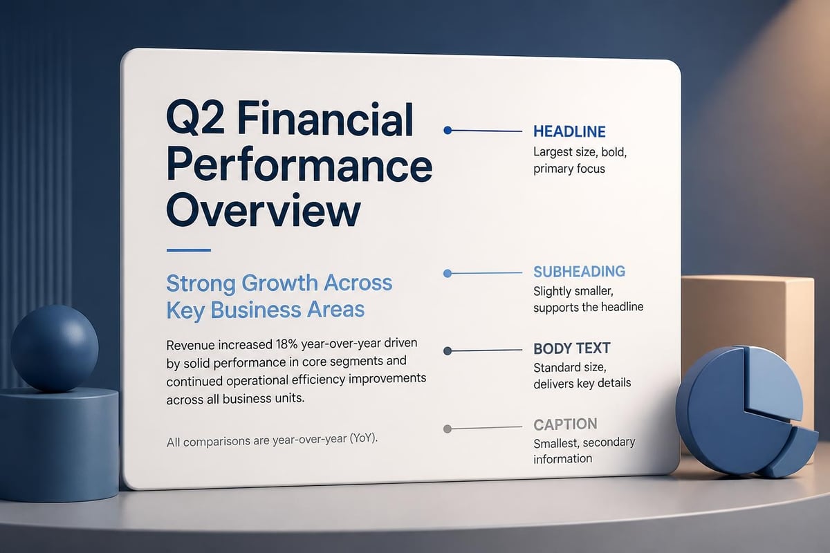
Typography hierarchy in presentations

Layout Principles That Drive Comprehension

Grid systems provide the invisible architecture supporting professional slide design. A powerpoint style presentation built on consistent grid structures feels intentional rather than arbitrary. Most effective presentations utilize a 12-column or 16-column grid that allows for flexible content placement while maintaining alignment across slides.

White space serves as a strategic design element rather than wasted real estate. Research on visual metrics for assessing slide quality demonstrates that presentations with adequate negative space receive higher quality ratings from viewers. This counterintuitive principle challenges the instinct to fill every pixel with information.

Layout Component Recommended Approach Common Mistake
Margins Minimum 0.5 inches on all sides Content extending to slide edges
Content blocks Maximum 3-4 distinct elements per slide Seven or more competing elements
Text density 6-8 lines maximum for body content Paragraph-length text blocks
Image placement Aligned to grid, purposeful sizing Random placement, inconsistent scaling

The rule of thirds, borrowed from photography, applies equally to presentation design. Positioning key elements along the intersections of imaginary lines dividing the slide into thirds creates natural focal points that guide viewer attention.

Typography Strategies for Financial and Tech Presentations

Specialized content demands specialized typographic treatment. When presenting financial data, numerical clarity becomes paramount. Tabular figures-numbers with consistent width-ensure columns of financial data align properly, preventing misinterpretation of values. Many corporate presentations benefit from exploring professional slide deck templates designed specifically for data-heavy content.

Font pairing establishes visual interest while maintaining professionalism. A common strategy pairs a geometric sans-serif headline font with a humanist sans-serif body font, creating subtle contrast without jarring transitions. For tech companies emphasizing innovation, contemporary typefaces like Montserrat or Proxima Nova communicate modernity while remaining highly legible.

Type size considerations extend beyond minimum readability thresholds:

  1. Determine your viewing environment (conference room, auditorium, virtual presentation)
  2. Calculate the appropriate minimum size based on furthest viewer distance
  3. Test readability on actual presentation equipment
  4. Adjust spacing between lines and letters for optimal comprehension
  5. Verify accessibility compliance for diverse audience needs

Letter spacing adjustments, while subtle, impact professional perception significantly. Tracking adjustments of +10 to +50 for uppercase headlines improve readability, while body text typically requires minimal tracking modifications. The multimedia design principles from cognitive research highlight how these seemingly minor adjustments affect information processing speed.

Advanced Typography Techniques

Text treatment goes beyond font selection to include strategic emphasis techniques. Bold weight draws attention to key terms without the harshness of underlining or italics. Color variation can highlight specific data points, though overuse dilutes impact. A powerpoint style presentation for investor meetings might use brand color to emphasize positive performance metrics while maintaining neutral tones for contextual information.

Kerning adjustments become necessary when large headline text creates awkward spacing between letter pairs. Manual kerning corrections for combinations like "VA," "To," or "We" polish presentation appearance at the detail level that separates amateur from professional work.

Color Psychology and Application in Business Presentations

Strategic color deployment influences audience perception before a single word is read. Color theory for presentations encompasses far more than aesthetic preference-it involves psychological impact, cultural associations, and functional requirements like accessibility compliance.

The 60-30-10 rule provides a proven framework for color distribution. Dominant colors occupy 60% of visual space (typically backgrounds and large design elements), secondary colors claim 30% (content backgrounds, supporting graphics), and accent colors punctuate 10% (call-to-action elements, key data highlights).

Industry-specific color conventions shape audience expectations. Financial services presentations often rely on navy blue, gray, and gold to convey stability and premium positioning. Technology companies frequently incorporate bright blues, greens, or purples to suggest innovation and forward-thinking culture. Understanding these associations allows designers to either align with expectations or deliberately contrast them for strategic purposes.

Accessibility requirements demand attention to color contrast and colorblind-safe palettes. Approximately 8% of males and 0.5% of females experience some form of color vision deficiency. Designing presentations that communicate effectively regardless of color perception ensures message delivery across diverse audiences.

Color theory for presentations

Data Visualization and Information Design

Transforming spreadsheets into compelling visual narratives represents one of the most critical skills in presentation design. A powerpoint style presentation for tech or financial audiences must balance data accuracy with visual clarity. Chart selection directly impacts comprehension speed and accuracy.

Each chart type serves specific communication purposes:

  • Bar charts: Comparing discrete categories or time periods
  • Line graphs: Showing trends and changes over continuous time
  • Pie charts: Illustrating part-to-whole relationships (limited to 5-6 segments maximum)
  • Scatter plots: Revealing correlations between variables
  • Heat maps: Displaying complex multi-dimensional data patterns

The evidence-based slide evaluation research emphasizes avoiding "busy" slides where excessive data points overwhelm viewers. Simplification doesn't mean dumbing down-it means removing non-essential elements that don't support the core message.

Visualization Best Practice Implementation Benefit
Direct labeling Place values on chart elements Eliminates legend-reading friction
Consistent scaling Use same axis ranges for comparison slides Enables accurate visual comparison
Selective highlighting Color only the data requiring attention Guides viewer focus immediately
Simplified legends Limit to essential categories Reduces cognitive load

Data-ink ratio, a concept from information design theory, suggests maximizing the proportion of ink (or pixels) dedicated to actual data rather than decorative elements. Removing unnecessary gridlines, borders, and embellishments allows the data itself to communicate more effectively.

Creating Narrative Flow Through Data

Sequential data slides should build upon each other, creating narrative momentum. A powerpoint style presentation for a tech startup pitch might begin with total addressable market, narrow to serviceable addressable market, then highlight the serviceable obtainable market-each slide adding specificity to the investment thesis. This progressive disclosure technique maintains engagement while building toward conclusions.

Annotation strategies help viewers interpret complex data. Callout boxes highlighting specific data points, brief explanatory text near unusual patterns, and clear axis labels prevent misinterpretation. For creative pitch deck design, these annotations become part of the visual storytelling apparatus.

Image Selection and Photographic Style

Photography and imagery establish emotional tone and reinforce messaging beyond what text alone can achieve. Stock photography selection separates amateur from professional presentations through authenticity criteria. Overused, obviously staged stock images undermine credibility, particularly in financial contexts where trust is paramount.

Authentic imagery characteristics include:

  • Real workspace environments rather than sterile studio setups
  • Genuine diversity reflecting actual organizational composition
  • Natural lighting and candid moments over posed arrangements
  • Relevance to specific slide content rather than generic business themes

Image treatment consistency maintains visual coherence across the deck. Applying uniform filters, maintaining consistent saturation levels, and standardizing overlay treatments create subliminal connections between slides. A powerpoint style presentation might use a subtle blue overlay at 20% opacity across all photographs, reinforcing brand color while ensuring text legibility.

Photography placement follows the same grid systems governing other content. Images bleeding to slide edges create bold, modern aesthetics suitable for tech presentations, while contained images with borders suggest traditional, conservative approaches often preferred in financial contexts.

Image treatment consistency

Animation and Transition Strategies

Motion design in presentations serves functional rather than decorative purposes. Thoughtful animation directs attention, reveals information progressively, and maintains engagement during longer presentations. A powerpoint style presentation benefits from subtle, purposeful motion that supports rather than distracts from content.

The comprehensive benchmark for evaluating presentation elements includes animation appropriateness among its 50+ design criteria. Excessive or inconsistent animation reduces perceived professionalism and can trigger accessibility concerns for viewers with vestibular disorders or attention challenges.

Strategic animation applications:

  1. Build animations reveal bullet points sequentially, controlling information flow
  2. Emphasis effects draw attention to specific data points during explanation
  3. Exit animations remove explanatory elements after they've served their purpose
  4. Morph transitions show data transformation between states

Transition selection between slides should maintain consistency throughout the presentation. "Push" or "Fade" transitions work universally, while flashy options like "Cube" or "Flip" rarely serve professional contexts. Duration matters equally-transitions between 0.3 and 0.5 seconds feel natural, while longer durations slow pacing unnecessarily.

Timing and Pacing Considerations

Animation timing coordinates with speaker pacing. Build animations timed at 0.75-second intervals between elements allow presenters to maintain natural speaking rhythm while visual elements appear. Auto-advancing slides work well for kiosk presentations or trade show displays but often constrain live presenters who need flexibility to respond to audience questions.

For organizations seeking templates that incorporate these principles effectively, resources like Canva pitch deck templates provide starting points, though customization remains essential for differentiation and brand alignment.

Master Slide Architecture and Template Design

Template architecture determines long-term presentation efficiency and consistency. Well-designed master slides enable team members to create on-brand content without specialized design skills. A powerpoint style presentation template for enterprise deployment requires thoughtful hierarchy planning across multiple master slide layouts.

Essential master slide variants include:

  • Title slide with comprehensive branding elements
  • Section divider for topic transitions
  • Content slide with single-column layout
  • Two-column layout for comparison content
  • Full-image slide for visual impact moments
  • Data visualization slide optimized for charts
  • Closing slide with contact information

Placeholder positioning on master slides should accommodate various content types without requiring layout adjustments. Fixed positions for logos, page numbers, and footer information ensure consistency even when content creators with limited design experience use the template.

Theme colors and fonts defined at the master level propagate throughout the presentation, enabling global updates when brand guidelines evolve. This systematic approach prevents the fragmentation that occurs when individual slides use locally applied formatting.

Industry-Specific Style Considerations

Financial sector presentations demand particular attention to credibility signals. Conservative color palettes, precise data visualization, and formal typography choices align with industry expectations. Compliance considerations may require specific disclosure language, standardized formatting for numerical data, and careful chart labeling to prevent misinterpretation.

Financial presentation style priorities:

  • Precise numerical formatting with appropriate decimal places
  • Clear source citations for data and projections
  • Conservative animation (if any) to maintain gravitas
  • High-contrast color schemes ensuring readability in various lighting
  • Professional photography avoiding overly casual or lifestyle imagery

Technology sector presentations permit greater creative latitude while still requiring clarity and professionalism. Bold color choices, contemporary typography, and dynamic layouts communicate innovation without sacrificing message delivery. However, the fundamental principles of hierarchy, consistency, and audience-focused design remain constant regardless of creative expression.

Cybersecurity presentations face unique challenges balancing technical complexity with executive accessibility. Resources like specialized cybersecurity presentation templates address these sector-specific requirements while maintaining professional standards.

Testing and Iteration for Presentation Excellence

Design validation extends beyond subjective preference to include objective testing protocols. Presenting drafts to representative audience members reveals comprehension gaps, pacing issues, and areas where visual communication fails. A powerpoint style presentation refined through multiple feedback cycles consistently outperforms first-draft alternatives.

Systematic testing approaches include:

  1. Readability testing at actual presentation distance and lighting
  2. Timing rehearsals to ensure content volume matches allocated time
  3. Accessibility audits verifying screen reader compatibility and color contrast
  4. Device testing across laptops, tablets, and projection systems
  5. Feedback collection from diverse stakeholders representing target audience

Iterative refinement focuses on eliminating friction points where viewers might disengage or misunderstand content. Each revision cycle should address specific feedback while maintaining overall design integrity. Version control becomes essential when multiple team members contribute to presentation development.

Professional design agencies systematically apply these testing protocols. Organizations working with presentation design services benefit from structured processes ensuring every element serves strategic communication objectives.

Brand Integration Without Brand Dominance

Brand elements establish identity without overwhelming content. Excessive logo placement, heavy-handed color application, or intrusive watermarks distract from message delivery. A powerpoint style presentation strikes balance between brand visibility and content primacy.

Strategic brand integration points:

  • Logo placement in consistent footer position (typically 0.3-0.5 inches, 60-80% opacity)
  • Brand color accents for emphasis elements rather than entire backgrounds
  • Typography selections from brand font families
  • Photographic style aligned with broader brand guidelines
  • Subtle pattern or texture elements referencing brand visual language

Title slides and closing slides accommodate more prominent branding since they bookend content-focused slides. This approach maintains professional identity without competing with substantive information on content slides.

Secondary brand elements like iconography styles, illustration approaches, or data visualization color schemes reinforce brand identity at subconscious levels. Consistency in these details creates cohesive brand experiences across customer touchpoints.


Mastering powerpoint style presentation principles requires balancing aesthetic sophistication with functional clarity-a challenge particularly acute for financial and tech organizations communicating complex information to diverse audiences. When strategic design choices align with content objectives, presentations become powerful tools for driving business outcomes. Prznt Perfect specializes in transforming complex financial and technical content into visually compelling presentations that resonate with investors, clients, and stakeholders, combining evidence-based design principles with industry-specific expertise to help your message achieve maximum impact.


News & Updates...

Discover how to choose and customize a simple PowerPoint template for professional presentations. Expert tips for financial and tech businesses.

Master the art of designing pitch decks with proven strategies for financial and tech businesses. Expert insights on visual storytelling and design.