
PowerPoint Graphic Design Guide: Creative Tips for 2026

PowerPoint has rapidly evolved from a simple presentation tool into a powerhouse for creative professionals. In 2026, the boundaries of powerpoint graphic design are being pushed further than ever, unlocking new creative possibilities for designers and business leaders alike.
This guide is designed to help you master advanced strategies and discover the latest trends shaping the field. You will find actionable tips, essential tools, and expert insights to elevate your skills.
Ready to transform your visuals? Explore step-by-step workflows, innovative techniques, and real-world examples that will empower you to create visually compelling, professional graphics with PowerPoint’s newest features. Start your journey now and unlock the full potential of powerpoint graphic design.
PowerPoint as a Modern Graphic Design Tool in 2026
Evolution of PowerPoint’s Design Capabilities
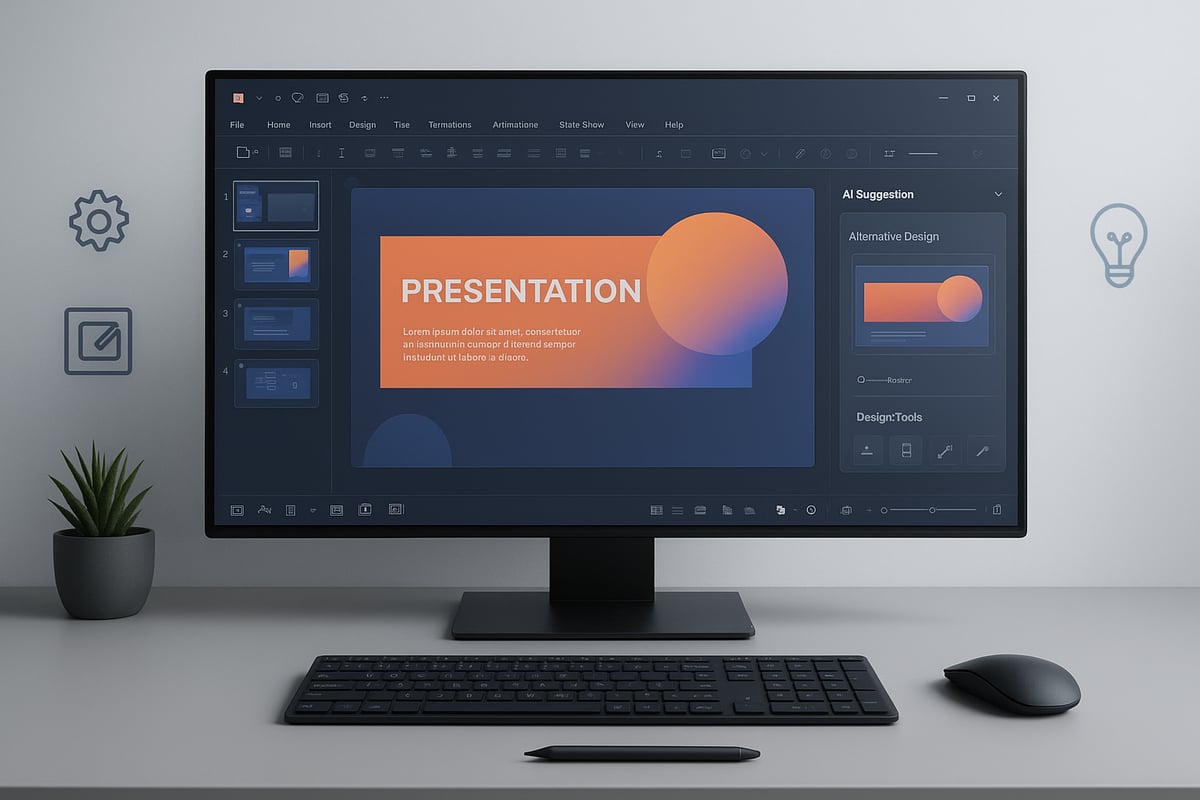
PowerPoint has rapidly evolved from basic presentation software into a powerful graphic design platform by 2026. The integration of AI-powered design suggestions, automation, and smart layout tools has made designing faster and more intuitive. Designers now benefit from enhanced vector editing tools and seamless SVG import and export, allowing greater flexibility.
Compared to traditional tools like Illustrator, Canva, or Figma, PowerPoint stands out for its rapid prototyping and accessibility. Many business professionals now prefer powerpoint graphic design for quick, high-impact tasks. For a deeper dive into these AI-driven features, explore the AI presentation designer and see how Copilot and DALL·E 3 are shaping modern workflows.
Key Features for Graphic Designers
Modern PowerPoint offers a suite of features tailored to graphic designers. Master slides and custom layouts make it simple to maintain consistent branding across projects. Advanced shape tools enable merging, fragmenting, and precise point editing, opening up new creative avenues.
Typography has also seen major improvements, with controls for kerning, line spacing, and full OpenType feature support. Exporting high-resolution PNG, SVG, or PDF files ensures visuals look sharp on any platform. Real-time collaboration and cloud integration further streamline powerpoint graphic design, letting teams work together efficiently from anywhere.
Limitations and Strategic Workarounds
Despite its strengths, PowerPoint still lacks professional CMYK workflows and advanced print color management. Its photo editing tools remain less robust than apps like Photoshop, which can be a limitation for some projects.
Strategic workarounds include combining powerpoint graphic design with external editors for complex images and using SVGs for scalable graphics. Choosing the right tool is crucial: PowerPoint excels for presentations, infographics, and quick content, while dedicated design software is better for print or advanced photo manipulation.
PowerPoint’s Place in the 2026 Design Ecosystem
In 2026, powerpoint graphic design is widely used for pitch decks, infographics, social media graphics, and internal communications. Its adoption has surged in remote and hybrid workplaces, supporting rapid collaboration and content iteration.
Industry-specific trends show finance, tech, and education sectors leveraging PowerPoint for non-traditional design tasks. Recent data indicates that over 70% of professionals now use PowerPoint for creative projects beyond standard presentations, proving its essential role in the modern design ecosystem.
Essential PowerPoint Graphic Design Principles
Creating standout visuals in PowerPoint graphic design starts with mastering a handful of core principles. Let’s break down the essentials every designer needs to know to craft professional, captivating slides.
Visual Hierarchy and Layout Fundamentals
Strong visual hierarchy is crucial in powerpoint graphic design for guiding the viewer’s eye and ensuring your message is clear. Use alignment, spacing, and grid systems to organize content logically. Leverage guides and snap-to-grid features to maintain precision.
For example, compare a cluttered slide with scattered elements to a refined version where titles, images, and data are aligned, creating a natural flow. Want to dig deeper? Explore Effective PowerPoint layouts and hierarchy for practical layout strategies you can apply today.
Color Theory and Palette Management
Color choices can make or break powerpoint graphic design. Use PowerPoint’s eyedropper tool, theme color palettes, and precise hex or RGB inputs to keep your slides on-brand. Accessible palettes are vital—ensure sufficient contrast for readability.
Consistent colors strengthen brand recognition. Studies show brands with unified color schemes are recognized 80% more often by audiences. Test your palette across slides to confirm harmony and accessibility for all viewers.
Typography Mastery in PowerPoint
Typography is a defining element in powerpoint graphic design. Select clean, professional fonts and pair them thoughtfully for visual interest. Adjust kerning and line spacing for optimal readability, and avoid overusing text effects.
Notice the difference between slides with inconsistent font styles versus those with harmonized headings and body text. Stick to two or three fonts per deck to maintain a polished, cohesive look.
Imagery, Icons, and Illustrations
High-quality visuals elevate powerpoint graphic design. Source royalty-free images and icons from reputable libraries, or use PowerPoint’s built-in SVG and icon sets for scalability. Take advantage of masking and cropping tools to shape visuals.
Experiment with background removal to highlight key elements. Always ensure images are crisp and relevant, never stretched or pixelated. Consistency in icon style ties your visuals together for a more unified appearance.
Consistency and Branding
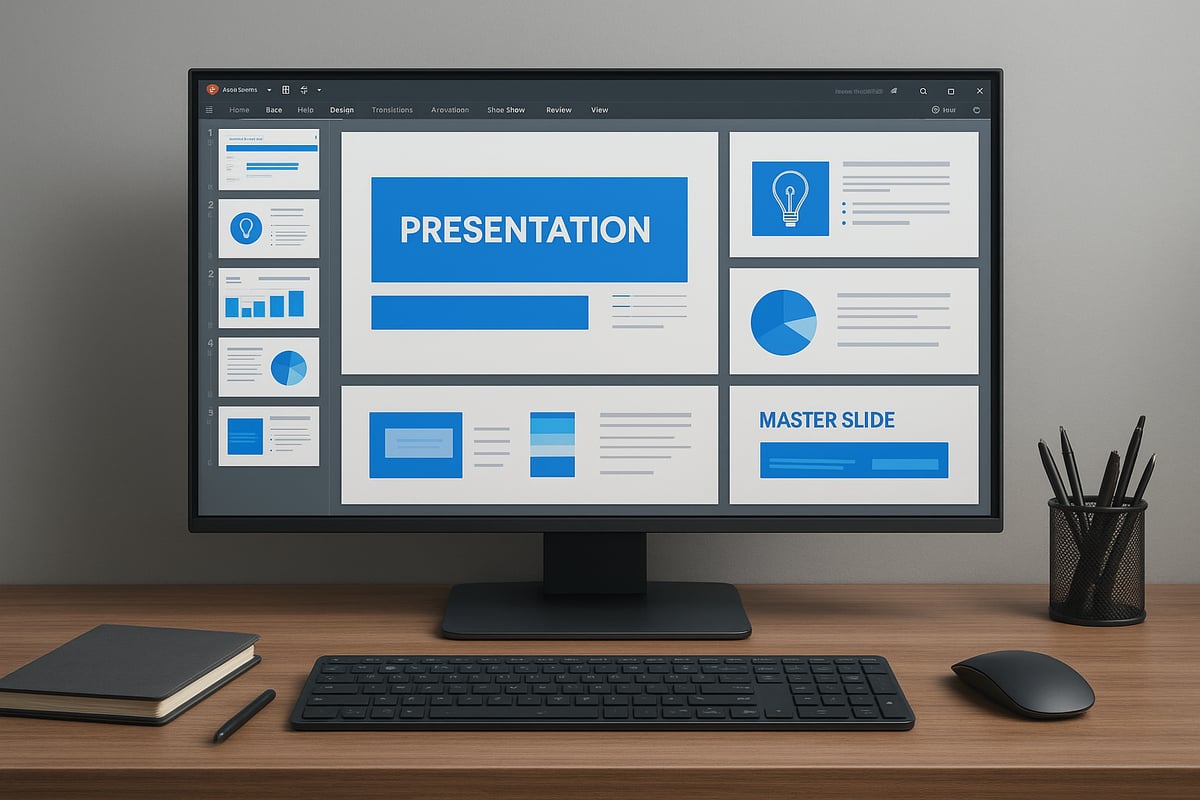
Brand consistency is the backbone of effective powerpoint graphic design. Utilize master slides and custom templates to set up fonts, colors, and logo placement. This ensures every presentation reflects your brand’s identity.
For example, a corporate pitch deck using master layouts maintains a professional, cohesive look across dozens of slides. Document your brand guidelines and apply them rigorously to avoid mixed messages or diluted branding.
Step-by-Step Creative Workflow: Designing Graphics in PowerPoint
Unlocking the full potential of powerpoint graphic design requires a structured, repeatable workflow. By following these six essential steps, you can transform your creative vision into high-impact visuals with precision and efficiency. Let’s break down each stage to help you achieve professional results.
Step 1: Planning and Storyboarding
Every successful powerpoint graphic design project begins with clear planning. Define your objectives and understand your audience. Are you creating a pitch deck, infographic, or social media graphic?
Start by outlining your message. Sketch rough layouts on paper or use PowerPoint’s slide sorter to map the flow. This visual roadmap ensures your ideas are logically organized before you dive into design.
For example, when preparing a tech product launch deck, storyboarding helps sequence product features, benefits, and call-to-action slides. This proactive approach keeps your powerpoint graphic design focused and cohesive.
Step 2: Setting Up Your Canvas
Set your canvas size based on the final output. For web graphics, use pixel dimensions; for print, select inches and adjust DPI. PowerPoint lets you customize slide size for specific platforms.
Establish guides and grids for precise alignment. Define your brand’s color palette and fonts using the theme settings. This groundwork is vital for consistent powerpoint graphic design across every slide.
Take advantage of master slides to lock in your visual identity. Setting up these details now streamlines your workflow as you build out the rest of your project.
Step 3: Creating and Customizing Visual Elements
Now, bring your ideas to life by drawing custom shapes and leveraging advanced tools. Merge, fragment, and edit points to craft unique graphics. Import SVGs for scalable, detailed illustrations.
PowerPoint’s enhanced features in 2026 offer gradients, shadows, and transparency for depth and polish. To spark new ideas, explore Creative PowerPoint design inspiration for expert techniques and trends.
Experiment with image masks, cropping, and background removal tools. These techniques elevate your powerpoint graphic design, making each element stand out.
Step 4: Incorporating Text and Data Visuals
Text is integral to effective powerpoint graphic design. Use text boxes, WordArt, or SmartArt for headlines and supporting content. Pair fonts thoughtfully and adjust line spacing for readability.
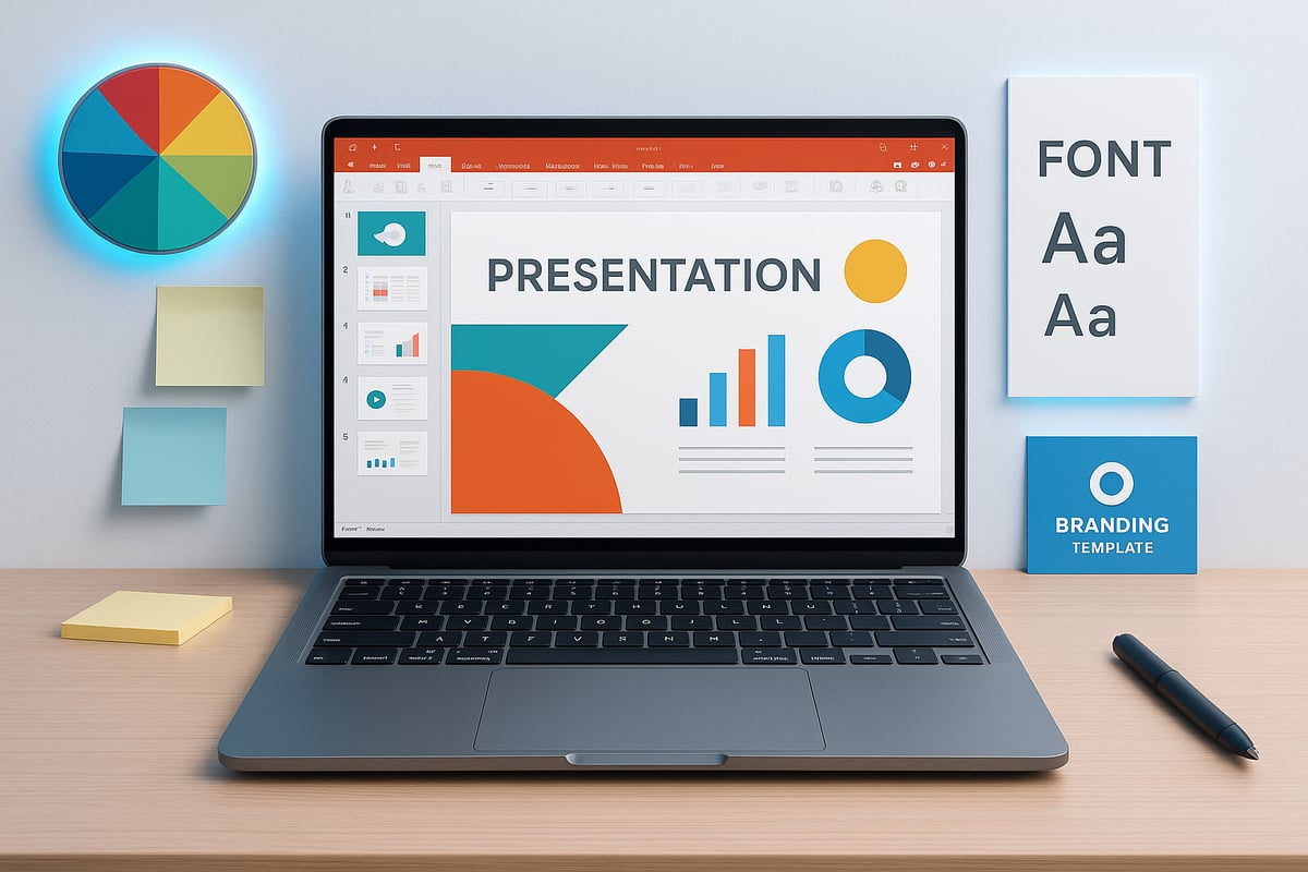
Transform raw data into engaging visuals. Build charts and infographics that simplify complex concepts. For example, turn a spreadsheet into a clean, color-coded bar graph that tells a story at a glance.
Prioritize clarity and hierarchy so your key messages shine. Always review your design to ensure information is accessible and visually balanced.
Step 5: Animation and Interactivity (2026 Features)
Modern powerpoint graphic design thrives with subtle movement. In 2026, new animation paths, triggers, and morph transitions make it easy to add dynamic effects. Use clickable buttons and navigation menus for interactive experiences.
Keep animations purposeful—enhance the narrative without distracting from content. Test transitions for smoothness and consistency.
These interactive features elevate your powerpoint graphic design, engaging viewers and guiding them through your story. Always review on multiple devices for optimal performance.
Step 6: Exporting and Sharing Graphics
Finalize your powerpoint graphic design by exporting in the right format. For web, choose high-res PNG or SVG. For print, use PDF with quality settings adjusted for sharpness.
Check export options to preserve transparency and color accuracy. Share editable PowerPoint files via cloud platforms for seamless collaboration.
Maintain file organization and version control. This ensures your powerpoint graphic design remains accessible, editable, and ready for future updates or feedback.
Creative Trends and Inspiration for PowerPoint Design in 2026
The landscape of powerpoint graphic design is rapidly evolving in 2026. Modern designers are blending clarity, automation, immersive visuals, and inclusivity to create presentations that engage, inform, and inspire. Let’s explore the creative trends shaping how professionals use PowerPoint today.
Minimalism and Data-Driven Storytelling
Minimalism is at the heart of powerpoint graphic design trends in 2026. Designers prioritize clarity by using whitespace, simple layouts, and restrained color schemes. This approach ensures key messages stand out.
Data-driven storytelling is also central. Presenters transform complex information into clean, visually impactful infographics and charts. For example, a minimalist financial report slide uses a single color accent and concise icons to highlight trends. This style not only improves comprehension but also strengthens brand perception.
- Keep layouts uncluttered
- Use one primary accent color
- Focus on essential data points
Minimalist powerpoint graphic design delivers both elegance and efficiency.
AI-Assisted Design and Automation
Artificial intelligence is revolutionizing powerpoint graphic design. AI-powered features like Designer and Copilot suggest layouts, pair fonts, and recommend color palettes, all in real time. These tools help users create professional visuals without extensive design training.
Efficiency gains are measurable. According to recent surveys, designers save up to 30 percent of their workflow time by leveraging automation. To see how AI integration streamlines presentation creation, explore Design Suggestions with Copilot in PowerPoint.
AI-driven powerpoint graphic design empowers teams to iterate faster while maintaining visual consistency.
Immersive Visuals: Gradients, 3D, and Motion
In 2026, immersive visuals are elevating powerpoint graphic design. Gradients and duotones add depth to backgrounds, while 3D objects and icons bring a tactile quality to slides. Subtle motion graphics, such as animated transitions or rotating product mockups, capture audience attention without distraction.
Example: A 3D product mockup embedded in a pitch deck slide helps viewers visualize innovation, making the message more memorable. Designers now experiment with layered effects and realistic lighting for dynamic results.
Adopting immersive elements in powerpoint graphic design can differentiate your brand and boost engagement.
Accessibility and Inclusivity in Design
Accessibility is essential in modern powerpoint graphic design. Designers use color palettes that are friendly to color blindness, ensure sufficient text contrast, and provide alternative text for images. PowerPoint’s built-in accessibility checker helps users identify and fix potential issues.
Data shows that presentations designed with accessibility in mind see increased audience engagement and wider reach. In 2026, inclusive design practices are not just recommended, they are expected.
By prioritizing accessibility, powerpoint graphic design becomes a tool for truly universal communication.
Real-World Examples and Case Studies
Industry leaders across tech, finance, and education are pushing the boundaries of powerpoint graphic design. For instance, a tech company’s investor deck might feature minimalist layouts, AI-curated visuals, and accessible charts, resulting in a compelling pitch.
Finance teams use branded templates to present quarterly data clearly, while educators create interactive slides that accommodate diverse learning needs. These real-world cases highlight the versatility and impact of modern powerpoint graphic design.
By studying successful presentations, designers can adapt proven strategies to their own projects.
Advanced Tips and Expert Insights for PowerPoint Graphic Design
Unlocking the full potential of PowerPoint graphic design in 2026 requires more than just mastering the basics. Advanced users apply sophisticated techniques and workflows that dramatically accelerate their creative output. Let’s explore expert strategies that set high-performing designers apart.
Power User Shortcuts and Time-Saving Techniques
Efficiency is crucial in powerpoint graphic design, especially when deadlines are tight. Power users rely on keyboard shortcuts and custom toolbars to streamline repetitive tasks.
Here’s a table of essential shortcuts:
| Task | Shortcut (Windows) | Shortcut (Mac) |
|---|---|---|
| Duplicate | Ctrl+D | Cmd+D |
| Align Left | Alt+H, AL | Cmd+Shift+L |
| Group/Ungroup | Ctrl+G/U | Cmd+G/U |
| Nudge | Arrow Keys | Arrow Keys |
| Export Slide | F12 | Cmd+Shift+S |
Customize the Quick Access Toolbar with frequently used commands for instant access. Batch editing—such as aligning multiple objects or formatting slides—saves hours over large projects. Embedding these habits into your powerpoint graphic design workflow ensures you create polished visuals faster.
Building and Using Asset Libraries
Consistency across projects is a hallmark of expert powerpoint graphic design. Creating reusable libraries of icons, shapes, and branded elements not only saves time but also ensures design cohesion.
- Store SVG icons and branded graphics in a dedicated slide deck.
- Use PowerPoint’s Slide Master to distribute templates team-wide.
- Organize graphics by theme, industry, or project for easy retrieval.
For teams, shared asset libraries in the cloud enable real-time updates and collaboration. If you want to deepen your approach to infographics and visual libraries, check the PowerPoint infographic design guide for detailed strategies.
Combining PowerPoint with Other Design Tools
Professional powerpoint graphic design often blends PowerPoint’s strengths with external tools. Import SVGs or high-res images from Illustrator or Figma to achieve intricate details. Export slides as PNG or SVG for further editing.
Tips for seamless integration:
- Use SVGs for scalable, editable graphics.
- Maintain consistent color profiles between apps.
- Choose PowerPoint for rapid prototyping, then refine in dedicated editors when needed.
Staying updated on graphic design trends for 2026 ensures your work remains current when moving assets between platforms.
Collaboration and Feedback in Modern Workflows
Modern powerpoint graphic design thrives on collaboration. PowerPoint’s real-time co-authoring enables multiple designers to work on the same file, leaving comments and suggestions instantly.
Leverage version history to track changes and revert if needed. For distributed teams, set up clear file naming conventions and feedback protocols. These steps foster a streamlined, constructive creative process, resulting in higher quality presentations and fewer errors.
Prznt Perfect: Elevating Executive-Level Presentations
For organizations aiming to elevate their powerpoint graphic design to the highest standard, partnering with a specialized agency can be transformative. Prznt Perfect is renowned for translating complex data into clear, impactful visuals.
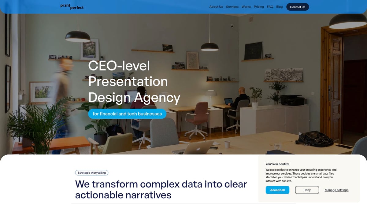
Their expertise spans creative consulting, visual storytelling, and marcom design—particularly for financial and tech clients. With over $2.3 billion raised through expertly crafted decks, and trusted by Fortune 500 leaders, Prznt Perfect demonstrates how professional support can unlock the full creative potential of PowerPoint.
Common Mistakes and How to Avoid Them
No matter your skill level, common mistakes can undermine even the best PowerPoint graphic design projects. Recognizing and addressing these pitfalls is essential for creating clear, professional visuals that engage your audience.
Overdesign and Visual Clutter
Overdesign is a frequent trap in PowerPoint graphic design, leading to slides that feel busy and overwhelming. Warning signs include too many fonts, excessive colors, crowded layouts, or unnecessary animations.
To avoid clutter:
- Limit your color palette and font choices.
- Use whitespace to create breathing room.
- Animate only key elements for emphasis.
Imagine a slide filled with icons, gradients, and animated text. Simplifying it by removing non-essential elements and focusing on hierarchy will make your message stand out. In PowerPoint graphic design, less truly is more for clarity and professionalism.
Inconsistent Branding and Formatting
Inconsistent branding can quickly erode trust and credibility in PowerPoint graphic design. Common risks include mismatched logos, off-brand colors, and varied font usage across slides.
To maintain consistency:
- Set up master slides with predefined layouts and brand colors.
- Use style guides to enforce logo and font rules.
- Regularly review presentations for alignment.
For a comprehensive approach, explore these PowerPoint branding best practices to establish strong guidelines and avoid costly errors. Consistency ensures your message remains clear and your brand identity is reinforced at every touchpoint.
Poor Data Visualization Practices
Poor data visualization in PowerPoint graphic design can confuse or mislead your audience. Common mistakes include using the wrong chart type, cluttered legends, or unclear labels.
To improve data visuals:
- Choose chart types that best tell your story.
- Remove unnecessary gridlines and effects.
- Highlight key data points for focus.
Consider a before-and-after example: a dense pie chart transformed into a clear bar graph with concise labels. Thoughtful data design ensures your insights are easily understood and actionable within PowerPoint graphic design.
Ignoring Accessibility and Readability
Neglecting accessibility excludes part of your audience from your PowerPoint graphic design. Consequences include low engagement, missed messages, and even compliance risks.
Key steps for accessibility:
- Use high-contrast colors for text and backgrounds.
- Ensure font sizes are readable from a distance.
- Add alternative text to all images and icons.
Accessible design boosts engagement and ensures everyone benefits from your content. By prioritizing accessibility in PowerPoint graphic design, you build presentations that reach and resonate with diverse audiences.


- This is some text inside of a div block.lay out the facts clearly and compellingly. Use data to establish the ground reality, but remember that facts alone are like the individual strands of a tapestry—necessary but not complete.lay out the facts clearly and compellingly. Use data to establish the ground reality, but remember that facts alone are like the individual strands of a tapestry—necessary but not complete.
- This is some text inside of a div block.lay out the facts clearly and compellingly. Use data to establish the ground reality, but remember that facts alone are like the individual strands of a tapestry—necessary but not complete.

