
Essential Guide to Power Point Design for Impactful Presentations

Did you know audiences remember 80% of what they see but only 20% of what they hear? This striking statistic highlights just how vital power point design is for anyone aiming to make a lasting impression.
A well-crafted presentation can transform complex information into clear, engaging messages. In this guide, you will discover every key aspect of power point design, from core principles and slide structure to data visualization and advanced features.
You will find proven techniques, real-world examples, and actionable tips to help you stand out. Ready to elevate your presentations? Let’s get started.
Understanding the Fundamentals of PowerPoint Design
Creating memorable presentations starts with mastering the fundamentals of power point design. These basics are essential for engaging your audience, delivering your message clearly, and building credibility. Let’s explore the core elements that set the foundation for impactful slides.
The Psychology of Visual Communication
Visuals are at the heart of effective power point design. Studies show that people process visuals 60,000 times faster than text, making images and graphics critical for audience engagement. Color, shape, and layout all influence how information is remembered.
For example, warm colors can evoke excitement, while cool tones promote calm. Strategic layouts guide the eye and highlight key points. Visual hierarchy helps the audience prioritize information, ensuring your message is clear. Aligning design choices with your audience’s expectations will boost retention and comprehension.
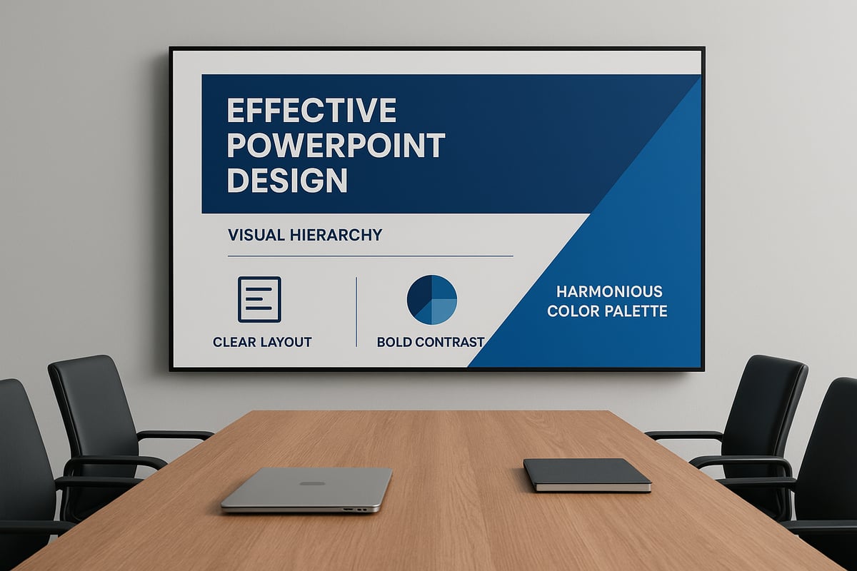
Core Design Principles for Presentations
Every great power point design relies on key principles: contrast, alignment, repetition, and proximity. Contrast ensures text stands out, while alignment creates order. Repetition unifies your slides, and proximity groups related items for clarity.
Whitespace is crucial for balance, preventing slides from feeling cluttered. Consistent fonts, colors, and imagery enhance professionalism. Explore Simple PPT design principles for real-world examples of effective versus ineffective slides, and see how these fundamentals can transform your presentations.
Choosing the Right PowerPoint Template
Selecting the right template is a vital part of power point design. Built-in templates offer convenience, but custom templates provide flexibility and brand alignment. Consider your message and audience when choosing a design.
Look for templates that offer variety in layouts and support your brand’s visual identity. Avoid templates with excessive graphics or distracting animations. Evaluate the template’s adaptability to different content types, and prioritize simplicity for maximum impact.
Color Theory and Branding in PowerPoint
Color is a powerful tool in power point design. Understanding color psychology helps you create a cohesive palette that supports your message and brand. For example, blue often signals trust, while red conveys urgency.
Integrate your company’s colors seamlessly for a unified look. Consistent use of color across slides strengthens brand presence and boosts professionalism. Successful presentations use color intentionally to highlight key information and reinforce branding.
Typography Best Practices
Typography is often overlooked in power point design, yet it shapes readability and tone. Choose clear, professional fonts that are easy to read on any screen. Pair fonts thoughtfully—one for headings, another for body text.
Maintain optimal font sizes and generous line spacing to prevent crowding. Avoid using too many fonts or colors, as this can distract the audience. Prioritize contrast between text and background for maximum clarity, and check for legibility in different lighting conditions.
Structuring Slides for Maximum Impact
The structure of your slides can define the overall effectiveness of your power point design. A well-organized presentation not only clarifies your message but also guides the audience through your story with confidence and clarity. Let us explore the essential elements that help you structure slides for maximum impact.

Crafting a Clear Narrative Flow
Great power point design begins with a compelling narrative. Storytelling helps your audience follow the progression of ideas, making your message memorable and persuasive. Start with a strong opening to set the context, then build the middle with your key points, and conclude with a decisive call to action.
Use signposting phrases like "First," "Next," and "Finally" to guide your audience. Transitions between slides should feel natural and logical. For deeper insight into narrative-driven slide creation, review these Effective PowerPoint design strategies.
- Begin with a clear introduction
- Structure content in logical sections
- End with a summary or recommendation
A narrative approach transforms your power point design into a story that resonates.
Designing Slide Layouts for Clarity
Clarity is the cornerstone of effective power point design. Each slide should focus on a single idea, using layouts that balance text, visuals, and whitespace. Use PowerPoint’s grid and alignment tools to position elements precisely.
Consider these layout principles:
- Place the most critical information at the top or center
- Limit slides to two or three visual elements
- Use consistent margins and spacing
Sample layouts might include a title with a supporting image, a chart with brief commentary, or a comparison table. Well-structured slides make your message immediately clear and easy to follow.
Reducing Cognitive Load: Less is More
Cognitive overload can derail even the best power point design. Audiences absorb information best when it is presented in small, manageable chunks. Avoid dense paragraphs or cluttered visuals.
Apply these techniques:
- Use bullet points to break up complex data
- Present only the most relevant facts per slide
- Replace text blocks with diagrams or icons when possible
Before-and-after examples often show how simplifying slides increases audience understanding. Remember, in power point design, less truly is more.
Visual Hierarchy and Emphasis Techniques
Visual hierarchy guides your audience’s eyes to the most important information. In power point design, use size, color, and placement to highlight key elements and create clear focal points.
Emphasis techniques include:
- Larger fonts for main messages
- Bold colors for action items or data highlights
- Strategic placement of visuals to direct attention
Layer information so that details are revealed progressively. Case studies show that strong hierarchy increases retention and engagement during presentations.
Integrating Consistent Visual Elements
Consistency across all slides builds trust and reinforces your brand. Use master slides and layouts to maintain uniformity in your power point design. Stick to a defined color palette, font set, and icon style.
Best practices:
- Apply the same logo and tagline on each slide
- Use matching iconography for related points
- Check alignment and spacing for each visual element
A cohesive visual theme ensures your power point design feels professional and polished from beginning to end.
Visual Storytelling and Data Visualization
In power point design, the ability to translate complex information into engaging visuals is invaluable. Visual storytelling not only grabs attention but also helps audiences retain key messages. Let us explore the core strategies for transforming data and ideas into compelling, memorable slides.

Transforming Data into Compelling Visuals
Data can be overwhelming if not presented clearly. In power point design, effective data visualization turns raw numbers into meaningful insights. Choose the right chart type for your message: use bar charts for comparing quantities, line charts for trends over time, and pie charts for proportions.
Simplify complex datasets by focusing on the story you want to tell. Limit the amount of data on each slide, highlight key figures, and use color to draw attention. For example, emphasizing a single data point in a contrasting color makes it stand out. Effective power point design ensures your audience grasps the main takeaway quickly.
Infographics and Custom Visuals
Infographics are powerful tools in power point design, offering a way to visualize processes, relationships, and statistics in a single glance. Custom diagrams, flowcharts, and timelines help break down intricate information into digestible segments.
When designing infographics, maintain a clean layout and use icons and colors consistently. Leverage tools like PowerPoint’s SmartArt or external resources to create visuals that support your narrative. For actionable tips and inspiration, check out Infographics and visual storytelling tips.
A well-crafted infographic can transform a dense data slide into a visually engaging story that resonates with your audience, reinforcing the principles of effective power point design.
Using Images and Icons for Storytelling
Images and icons are essential in power point design for illustrating ideas and evoking emotion. Select high-quality, relevant images that directly support your message. Avoid generic stock photos that may distract or confuse viewers.
Icons can clarify complex concepts quickly. Use them to represent steps in a process, highlight features, or categorize information. Maintain visual consistency by choosing icons from the same set and ensuring they match your color palette.
Strategic placement and appropriate sizing of images and icons help maintain balance and visual flow, making each slide in your power point design more impactful.
Animation and Transitions: Enhancing, Not Distracting
Animation, when used thoughtfully, can emphasize key points and guide attention in power point design. Introduce elements sequentially to reveal information gradually, helping audiences follow your story.
Use simple fade or wipe transitions to maintain professionalism. Avoid flashy effects that can distract from your content. Limit the number of animated elements per slide to keep the focus on your message.
Test your presentation to ensure animations run smoothly and enhance understanding. Purposeful use of animation in power point design adds polish without overwhelming your audience.
Accessibility and Inclusivity in Visuals
Inclusive power point design ensures your message reaches everyone. Use color combinations with strong contrast to aid visibility for people with color blindness. Select readable fonts and adequate text sizes for clarity.
Add alt text to images, charts, and graphics so screen readers can describe visual elements. Use descriptive labels and avoid relying solely on color to convey meaning.
Choose imagery that reflects diversity and represents your audience. By prioritizing accessibility, your power point design becomes more effective and ethical.
Case Study: Visual Storytelling in Financial/Tech Presentations
Consider a financial presentation that initially relied on dense tables and lengthy text. By applying power point design best practices, the slides were transformed: data was visualized using clean bar charts, infographics explained market trends, and icons highlighted growth areas.
The audience responded with increased engagement and questions, as post-event surveys noted higher clarity and retention. This case demonstrates how strategic visual storytelling in power point design can turn complex topics into persuasive, memorable presentations.
Advanced PowerPoint Features and Tools
Unlocking advanced features in power point design can dramatically elevate your presentations. These tools not only boost efficiency but also ensure your message is delivered with clarity and impact. Let us explore how to maximize these capabilities for polished, professional results.
Leveraging PowerPoint Design Ideas and AI Tools
The "Design Ideas" feature in PowerPoint harnesses artificial intelligence to suggest visually appealing slide layouts. This tool analyzes your content, offering options that align with effective power point design principles. With a single click, you can transform a basic slide into a professional visual.
AI-powered design assistants are also becoming more common. They help automate color selection, font pairing, and content arrangement. While these tools save time, it is important to review and customize suggested layouts to maintain brand consistency and relevance. By leveraging these features, your power point design process becomes both faster and more creative.
Master Slides and Custom Slide Layouts
Master slides are essential for ensuring consistency across your entire deck. In power point design, they allow you to define fonts, colors, logos, and layout elements once, which then propagate across all slides. This eliminates repetitive formatting and keeps branding uniform.
Custom slide layouts help address specific presentation needs, such as unique title slides, data visualizations, or section breaks. You can save these layouts as templates, making them easily shareable with your team. Streamlining your workflow with master slides and custom layouts will keep your power point design cohesive and professional.
Working with Multimedia: Images, Video, and Audio
Embedding multimedia elements can bring your power point design to life. High-quality images, videos, and audio clips help convey complex ideas quickly and keep audiences engaged. Always optimize media file sizes to ensure smooth playback and avoid technical glitches during live presentations.
Legal considerations matter—use only licensed or royalty-free content. Place videos and images thoughtfully so they support, not distract from, your core message. When executed well, multimedia integration is a hallmark of advanced power point design.
Interactive Elements and Hyperlinks
Interactive features transform static slides into dynamic experiences. Adding hyperlinks to text, images, or shapes enables seamless navigation within your presentation or to external resources. Creating interactive menus or branching slides is especially useful for training modules or sales pitches.
These techniques encourage audience participation and can be measured for engagement. Effective power point design leverages interactivity to make information accessible and memorable, setting your presentation apart from traditional decks.
Collaboration and Cloud Integration
Modern power point design workflows benefit from real-time collaboration. PowerPoint Online allows multiple team members to edit, comment, and review slides simultaneously. This reduces version control issues and streamlines feedback loops.
Cloud integration with Microsoft 365 ensures your files are always backed up and accessible from any device. Features like change tracking and shared folders make teamwork efficient and transparent. Collaborative power point design leads to higher quality results and faster turnaround for business-critical presentations.
Best Practices for Business and Executive Presentations
Creating impactful business presentations requires a strategic approach to power point design. Business audiences expect clarity, professionalism, and relevance in every slide. By mastering the following best practices, you can ensure your message resonates with executives, investors, and decision-makers.
Tailoring Design for Financial and Tech Audiences
Understanding your audience is fundamental to effective power point design in business. Financial and tech professionals value precision, data-driven insights, and clear visuals that reflect industry expertise. To meet these expectations, use a minimalist layout, emphasize key metrics, and avoid unnecessary embellishments.
- Highlight data with clear charts and concise labels.
- Integrate industry-specific terminology when relevant.
- Align visual style with your brand and sector.
For example, a financial presentation should focus on trends, forecasts, and ROI, while a tech deck might prioritize innovation, scalability, and product features. Consistency in power point design builds trust and credibility with these discerning audiences.
Storytelling for Persuasion and Influence
Power point design is more than aesthetics, it is a vehicle for storytelling. A compelling narrative transforms data and facts into actionable insights that drive decisions. Start with a strong opening, develop your case logically, and end with a memorable call to action.
- Use narrative arcs to guide the audience.
- Balance emotional and logical appeals.
- Incorporate real success stories for impact.
Executive audiences respond well to authentic examples and clear business outcomes. By weaving storytelling principles into your power point design, you can influence perspectives and inspire action.
Presenting Complex Data with Clarity
Presenting complex data is a core challenge in power point design for business. Cluttered charts and dense tables overwhelm audiences and obscure your message. Instead, aim for simplicity and focus.
- Use callouts to highlight critical metrics.
- Limit each slide to one main idea.
- Remove unnecessary “chart junk” for cleaner visuals.
For boardroom presentations, prioritize clarity over quantity. A well-designed slide should make your key takeaway instantly clear, helping executives absorb and act on the information presented.
Time Management and Slide Count Strategies
Efficient time management is essential in professional settings, where attention spans are limited. Effective power point design balances slide count with content depth, ensuring your message is delivered within the allotted time.
- Plan one slide per key point or minute.
- Use pacing cues and section dividers.
- Rehearse with built-in timers to refine delivery.
Condense or expand your content as needed for different formats, whether it is a brief pitch or a deep-dive session. Strategic timing and thoughtful slide sequencing enhance engagement and retention.
Prznt Perfect: Professional Presentation Design Services
For organizations seeking expert-level power point design, Prznt Perfect offers specialized services tailored to financial and tech businesses. Their team excels at transforming complex data into clear, actionable narratives that resonate with executive audiences.
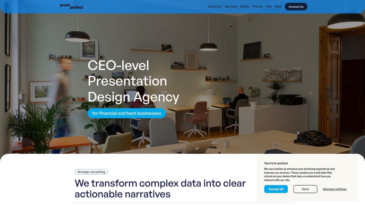
Prznt Perfect provides creative consulting, visual storytelling, and marcom design for high-stakes communications. With a proven track record of helping clients raise over $2.3 billion, and trusted by Fortune 500 companies and leading startups, their services deliver measurable results.
Flexible support, fast turnaround, and scalable resources make Prznt Perfect an ideal partner for pitch decks, keynotes, and recurring executive presentations. Discover how their expertise can elevate your next business presentation.
Common PowerPoint Design Mistakes and How to Avoid Them
Even the most experienced presenters can fall into common power point design traps. Recognizing and fixing these mistakes is crucial for creating slides that are clear, professional, and memorable.
Overloading Slides with Text and Data
Packing slides with dense text or excessive data leads to “death by PowerPoint.” This overwhelms audiences, reducing message retention and engagement. To avoid this, focus on one main idea per slide and use concise bullet points.
- Prioritize key points over exhaustive detail.
- Use visuals to illustrate concepts rather than paragraphs of text.
- Compare before-and-after slides to highlight the impact of simplification.
Clear power point design ensures your message stands out, not your word count.
Poor Color, Font, and Image Choices
Choosing clashing colors, hard-to-read fonts, or low-quality images can damage your credibility. Stick to professional color palettes and legible typography for a polished look. Select high-resolution visuals that support your content.
For a deeper dive into the fundamentals of effective design, review these Core PowerPoint design principles. These principles will help you choose elements that enhance, not distract from, your presentation.
Inconsistent Branding and Layouts
Inconsistent branding confuses audiences and diminishes trust. Always use master slides and templates to maintain uniformity in logos, colors, and layouts.
- Set up a brand-aligned template before you start.
- Apply the same fonts and color schemes throughout.
- Double-check for uniform placement of headers and footers.
Consistent power point design reinforces your professional identity on every slide.
Ignoring Accessibility Needs
Ignoring accessibility excludes part of your audience. Ensure strong color contrast and readable fonts for all viewers. Add alt text to images and use descriptive labels for charts.
- Test slides for readability in grayscale.
- Avoid color combinations problematic for color blindness.
- Choose inclusive images representing diverse groups.
Accessible power point design makes your message available to everyone.
Overusing Animations and Transitions
Animations and transitions can engage, but overuse is distracting. Limit movement to highlight key points. Stick with subtle, purposeful effects and avoid excessive motion.
- Use simple fades or wipes for transitions.
- Reserve animation for essential emphasis.
- Preview the flow to ensure smooth delivery.
Professional power point design uses animation to support, not overshadow, your story.


- This is some text inside of a div block.lay out the facts clearly and compellingly. Use data to establish the ground reality, but remember that facts alone are like the individual strands of a tapestry—necessary but not complete.lay out the facts clearly and compellingly. Use data to establish the ground reality, but remember that facts alone are like the individual strands of a tapestry—necessary but not complete.
- This is some text inside of a div block.lay out the facts clearly and compellingly. Use data to establish the ground reality, but remember that facts alone are like the individual strands of a tapestry—necessary but not complete.

