
How to Make PowerPoint Presentation: A Complete Guide
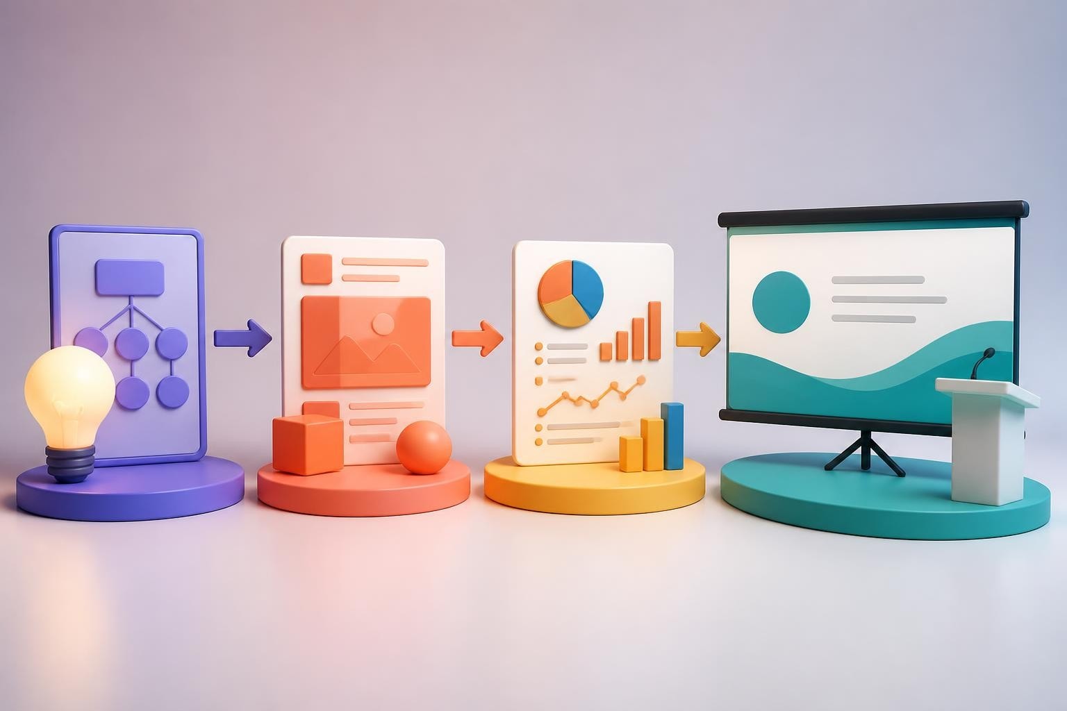
Creating presentations that capture attention and drive business results requires more than dropping text onto slides. When you make powerpoint presentation materials for financial or tech audiences, every element must work together to communicate complex ideas with clarity and impact. Whether you're pitching to investors, presenting quarterly results, or unveiling a new product strategy, your presentation design directly influences how your message is received and remembered.
Understanding Your Presentation Foundation
Before you open PowerPoint, invest time in defining your presentation's core purpose. Strategic planning separates forgettable slide decks from presentations that drive decisions and action.
Defining Objectives and Audience Needs
Start by identifying what you want your audience to do, think, or feel after your presentation. Financial executives need data-driven insights with clear ROI implications. Tech stakeholders require product specifications balanced with market opportunity. Your objective shapes every subsequent design decision.
Consider these audience-specific questions:
- What prior knowledge does your audience possess about the topic?
- What objections or concerns might they raise?
- Which data points will resonate most strongly with their priorities?
- What action do you need them to take immediately afterward?
The University of Waterloo's Centre for Teaching Excellence emphasizes that effective presentations begin with clear learning objectives, a principle that applies equally to business communications.
Structuring Your Narrative Flow
Every compelling presentation follows a logical narrative arc. Start with context that establishes why your topic matters now. Build tension by identifying the problem or opportunity. Present your solution with supporting evidence. Close with clear next steps.
Recommended presentation structures:
- Problem-Solution-Benefit: Ideal for product launches and sales pitches
- Situation-Complication-Resolution: Perfect for strategic recommendations
- What-So What-Now What: Effective for data-heavy financial presentations
- Past-Present-Future: Compelling for company updates and vision presentations

Creating Your PowerPoint Presentation
Once your strategy is clear, you can begin to make powerpoint presentation files with confidence. Microsoft PowerPoint remains the industry standard for business presentations, offering robust features for both beginners and advanced users.
Starting with the Right Template
Your template establishes visual consistency and accelerates the design process. While PowerPoint includes built-in themes, professional slide deck templates designed specifically for your industry create stronger first impressions.
When selecting or creating templates, prioritize these elements:
- Brand alignment: Colors, fonts, and visual style should reflect your corporate identity
- Flexibility: Templates need to accommodate various content types (text, data, images)
- Readability: Typography must remain legible from the back of the room
- Professional polish: Subtle design details signal credibility and attention to quality
Microsoft provides basic tasks for creating a PowerPoint presentation that cover theme selection and fundamental operations.
Building Slide-by-Slide Content
Each slide should communicate one primary idea. Overloading slides with multiple concepts dilutes impact and confuses audiences. When you make powerpoint presentation content, apply the "one slide, one message" principle rigorously.
Effective slide components include:
- Descriptive headlines that communicate the main takeaway
- Supporting visuals that reinforce rather than decorate
- Minimal text that audiences can absorb in 3-5 seconds
- Strategic white space that guides attention to key elements
| Slide Type | Primary Purpose | Best Practices |
|---|---|---|
| Title Slide | Establish topic and speaker credibility | Include presentation title, presenter name, date, company logo |
| Agenda Slide | Set expectations for presentation flow | List 3-5 main sections with brief descriptors |
| Content Slide | Deliver core information | One concept per slide, visual hierarchy, actionable headlines |
| Data Slide | Present quantitative evidence | Clear chart titles, simplified visualizations, highlighted insights |
| Transition Slide | Signal section changes | Minimal text, visual break, preview upcoming content |
| Closing Slide | Reinforce key messages and next steps | Summary of main points, clear call-to-action, contact information |
Designing for Visual Impact
Visual design directly affects comprehension and retention. When financial and tech professionals make powerpoint presentation materials, they often default to dense text and complex charts. This approach creates cognitive overload rather than clarity.
Apply these design principles:
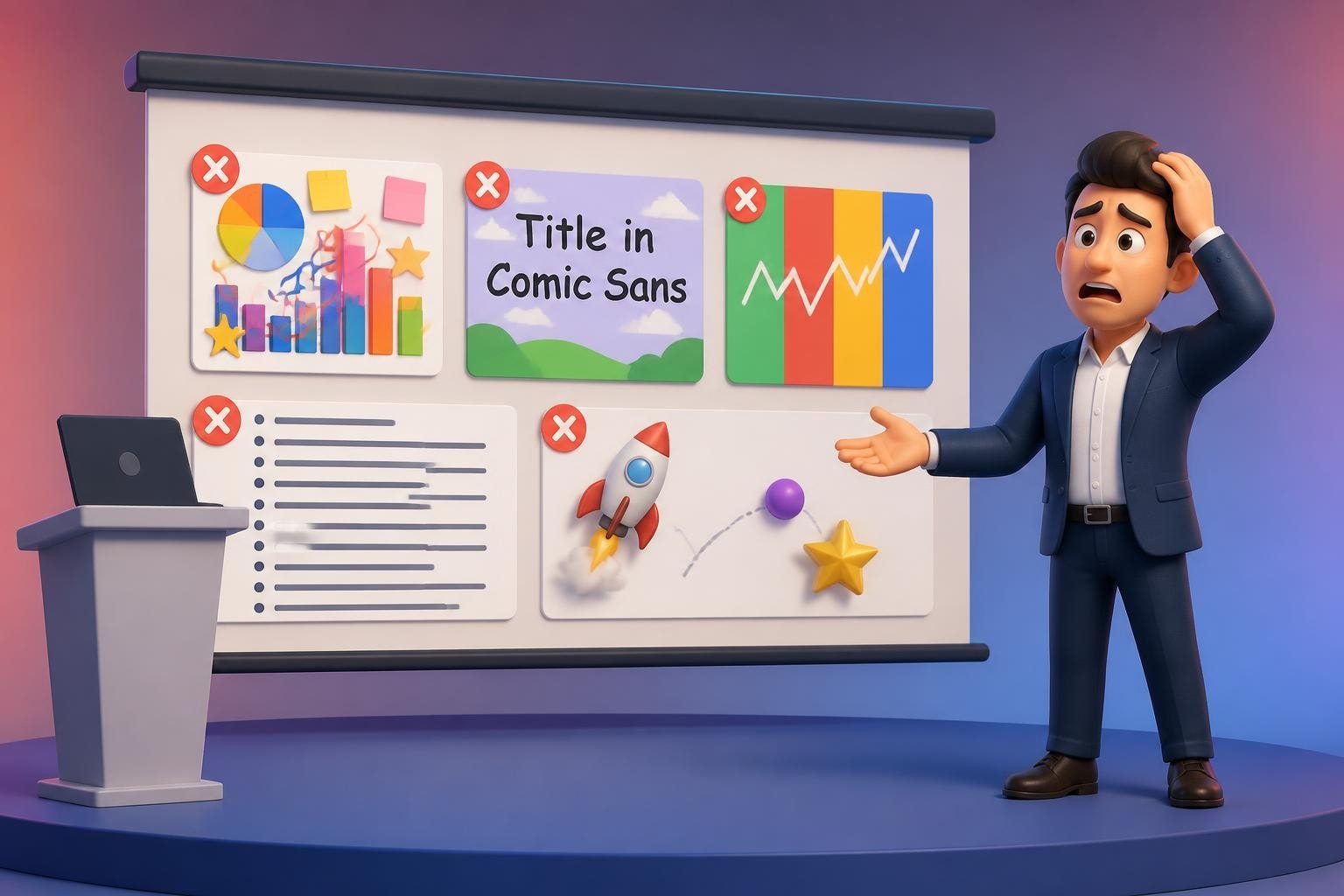
Typography: Limit yourself to two font families maximum. Use sans-serif fonts like Calibri, Arial, or Helvetica for body text. Reserve serif fonts for emphasis only. Maintain minimum font sizes of 24pt for body text and 36pt for headlines.
Color psychology: Choose colors that align with your message. Blue conveys trust and professionalism. Green suggests growth and sustainability. Red signals urgency or caution. Limit your palette to 3-4 colors plus neutral tones.
Contrast and hierarchy: High contrast between text and background ensures readability. Visual hierarchy guides audiences through information in order of importance. Size, color, position, and weight all communicate relative significance.
For specialized presentations, creative pitch deck design approaches can differentiate your content in competitive environments.

Transforming Data into Visual Stories
Financial and tech presentations invariably include complex data. The challenge isn't presenting numbers but transforming them into narratives that drive understanding and action.
Selecting Appropriate Chart Types
Different data relationships require different visualization approaches. When you make powerpoint presentation charts, match the visualization to your analytical goal.
- Line charts: Show trends over time, ideal for revenue growth, user acquisition, market evolution
- Bar charts: Compare discrete categories, perfect for competitive analysis, departmental performance
- Pie charts: Display composition of a whole (use sparingly, only for 3-5 segments maximum)
- Scatter plots: Reveal correlations between variables, useful for risk-return analysis, pricing strategy
- Waterfall charts: Illustrate sequential positive and negative contributions, excellent for financial reconciliation
Simplifying Complex Information
Data clarity trumps data volume. Remove chart junk-unnecessary gridlines, 3D effects, excessive labels, and decorative elements that distract from insights. Focus audience attention on the specific data point that supports your argument.
Data simplification techniques:
- Round numbers to significant figures (use "$2.3M" instead of "$2,347,892")
- Highlight key data points with contrasting colors
- Add annotations that explain what the data means
- Remove or gray out less relevant data series
- Use consistent scales across related charts for easy comparison
Crafting Data Narratives
Every chart needs context. What changed? Why does it matter? What should we do about it? When presenting quarterly results, don't just show the numbers-explain the story behind them. Market conditions, strategic initiatives, and competitive dynamics provide the narrative framework that makes data meaningful.
Incorporating Multimedia and Interactive Elements
Static slides represent only the baseline. Multimedia elements can elevate engagement when used strategically, though restraint prevents distraction from your core message.
Using Images Effectively
High-quality images add emotional resonance and aid memory retention. Avoid generic stock photos that audiences have seen countless times. Instead, use authentic images that connect specifically to your content.
When you make powerpoint presentation visuals, consider these image applications:
- Metaphorical images: Reinforce abstract concepts (growth, collaboration, innovation)
- Product screenshots: Demonstrate software functionality or user interfaces
- Team photos: Build personal connection and credibility
- Process diagrams: Clarify workflows and operational sequences
- Custom illustrations: Explain proprietary concepts or frameworks
Adding Video and Animation
Video clips can demonstrate products, share customer testimonials, or break up long presentations. Keep videos under 60 seconds and ensure they play reliably on presentation systems. Test thoroughly before high-stakes presentations.
Animation guidelines:
- Use entrance animations to control information reveal
- Apply emphasis animations to highlight critical points
- Limit yourself to simple, professional transitions (fade, wipe)
- Avoid bouncing, spinning, or other distracting effects
- Ensure animations support rather than overshadow content
Microsoft offers comprehensive training on creating presentations in PowerPoint that covers multimedia integration and advanced features.
Ensuring Accessibility and Compatibility
Professional presentations must work for all audiences and across different presentation environments. Accessibility isn't optional-it's essential for inclusive communication and regulatory compliance.
Building Accessible Presentations
Accessibility ensures everyone can engage with your content, regardless of abilities or limitations. When you make powerpoint presentation files with accessibility in mind, you expand your reach and demonstrate professional standards.
Key accessibility considerations include:
- Adding alt text to all images, charts, and graphics
- Using sufficient color contrast (minimum 4.5:1 ratio for text)
- Providing text equivalents for audio and video content
- Structuring content with proper heading hierarchies
- Testing presentations with screen readers
The best practices for creating accessible PowerPoint presentations provide detailed guidance on inclusive design.
Optimizing for Different Platforms
Your presentation might be delivered on various screens, projectors, or shared digitally. Different contexts require different optimizations.
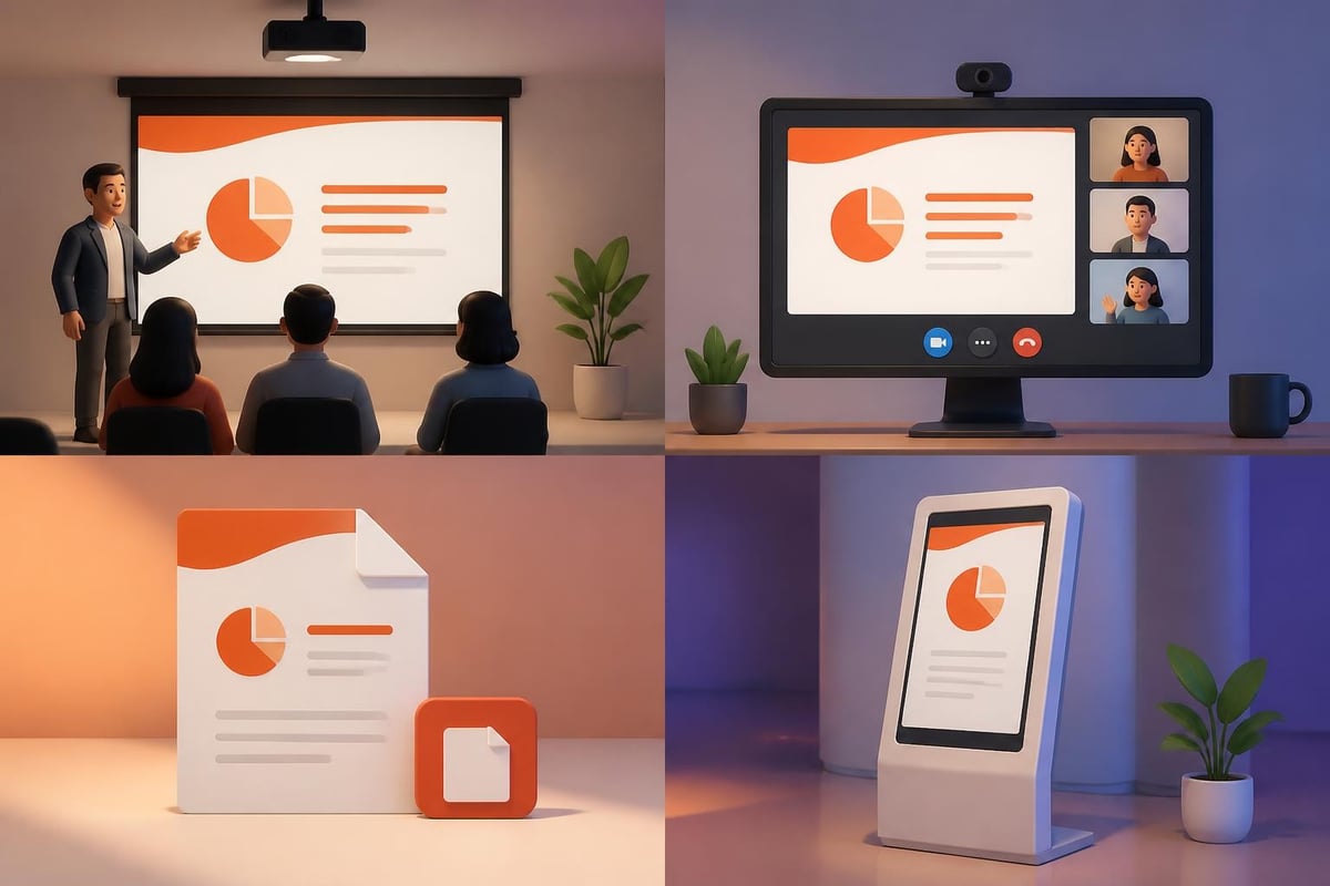
| Delivery Method | Optimization Strategy |
|---|---|
| In-person presentation | Design for large screens, test on actual projector, include speaker notes |
| Video conference | Increase font sizes, simplify visuals, ensure high contrast, test screen sharing |
| PDF distribution | Embed fonts, compress images, add hyperlinks, ensure print quality |
| Self-running kiosk | Add auto-advance timing, include narration, loop presentation |
File compatibility issues can derail presentations. Save files in multiple formats (.pptx, .pdf, .odp) and bring backup copies on different media. For maximum compatibility, embed fonts and convert videos to standard formats.
Refining and Rehearsing Your Presentation
Creating slides represents only half the work. Refinement and practice transform good presentations into exceptional ones.
Getting Feedback and Iterating
Fresh perspectives reveal blind spots in your logic, design, or messaging. Share drafts with colleagues who represent your target audience. Specifically ask them:
- Does the narrative flow logically from slide to slide?
- Which concepts remain unclear or confusing?
- Where does the presentation lose momentum or interest?
- Which data visualizations require additional explanation?
- What questions or objections does the content raise?
Incorporate feedback systematically. Not every suggestion merits implementation, but patterns across multiple reviewers signal genuine issues.
Practicing Delivery
Even the most beautifully designed slides fail without confident delivery. Rehearse your presentation multiple times, ideally in the actual presentation space. Time yourself to ensure you fit within allocated slots. Practice transitions between sections and slides.
Microsoft provides valuable tips for creating and delivering an effective presentation that cover both design and delivery techniques.
Rehearsal best practices:
- Record yourself presenting to identify verbal tics and pacing issues
- Practice with the remote control or advance mechanism you'll use
- Prepare answers to likely questions from your audience
- Develop backup explanations for complex concepts
- Plan what you'll say if technology fails
Finalizing Technical Details
Before your presentation, verify every technical element. Check that links work, videos play, animations trigger correctly, and fonts display properly. Create a pre-presentation checklist covering equipment, files, backup plans, and logistics.
Professional presenters arrive early to test equipment, adjust lighting, and familiarize themselves with the space. This preparation reduces anxiety and allows you to focus on delivering value rather than managing crises.
Leveraging Modern Presentation Trends
Presentation design evolves continuously. Staying current with emerging trends helps your content feel fresh and relevant in 2026, though timeless design principles remain foundational.
Data Storytelling and Visualization Innovation
Advanced data visualization techniques help financial and tech presenters communicate complex information more effectively. Interactive dashboards, animated data transitions, and progressive disclosure reveal insights gradually rather than overwhelming audiences.
When working with sophisticated datasets, consider whether PowerPoint remains the optimal platform or whether alternatives like Tableau, Power BI, or custom web applications better serve your needs. Free presentation software alternatives offer different strengths for specific use cases.
AI-Assisted Presentation Development
Artificial intelligence tools increasingly support presentation creation, from generating initial outlines to suggesting design improvements. While these tools accelerate workflows, human judgment remains essential for strategic messaging and audience-specific customization.
Research on AI-powered presentation editing systems demonstrates emerging capabilities for automated slide modifications, though professional expertise ensures business-critical presentations meet quality standards.
Design Minimalism and Focus
Contemporary presentation design favors simplicity over complexity. Minimalist approaches reduce cognitive load, accelerate comprehension, and project confidence. When you make powerpoint presentation materials for executive audiences, less truly becomes more.
Current design trends include:
- Generous white space that emphasizes key content
- Bold typography with limited font variations
- Monochromatic or analogous color schemes
- Full-bleed images that create emotional impact
- Geometric shapes and clean lines over decorative elements
For organizations requiring specialized presentations, working with experts like Prznt Perfect ensures alignment with current best practices while maintaining brand consistency.
Managing Presentation Projects at Scale
Organizations frequently need to make powerpoint presentation files across multiple teams, regions, and business units. Consistency and efficiency at scale require systematic approaches.
Establishing Brand Guidelines
Comprehensive brand guidelines ensure visual consistency across all presentations. Document approved color palettes, typography systems, logo usage, image styles, and layout templates. Distribute master templates that incorporate these standards.
Essential brand guideline components:
- Color values (RGB, CMYK, hex codes) for primary and secondary palettes
- Font specifications including weights, sizes, and usage rules
- Logo placement rules with minimum size and clearance space requirements
- Image style guidance covering photography, illustration, and iconography
- Layout grids and spacing systems for consistent slide composition
Creating Content Libraries
Reusable content libraries accelerate presentation development while maintaining quality. Build repositories of approved charts, diagrams, case studies, product images, and messaging frameworks. Tag content for easy discovery and ensure regular updates as information changes.
Cloud-based collaboration platforms enable teams to access current templates, share best practices, and avoid redundant work. Version control prevents outdated information from circulating in new presentations.
Training Teams on Presentation Standards
Investment in team training pays dividends through consistently professional presentations. When multiple stakeholders make powerpoint presentation materials, training ensures everyone applies the same quality standards and design principles.
Training programs should cover design fundamentals, storytelling techniques, data visualization best practices, and accessibility requirements. Advanced sessions might address industry-specific considerations like fintech pitch decks or cybersecurity presentations.
Measuring Presentation Effectiveness
Professional communicators measure results to improve future presentations. Tracking effectiveness helps identify what resonates with audiences and what requires refinement.
Quantitative Success Metrics
Different presentation goals require different success metrics. Sales presentations track conversion rates and deal progression. Internal communications measure employee understanding and behavior change. Investor pitches monitor funding secured and meeting requests generated.
Common presentation metrics:
- Audience engagement scores (attention, questions, participation)
- Conversion rates (deals closed, approvals granted, actions taken)
- Information retention (comprehension tests, follow-up surveys)
- Net Promoter Score (likelihood to recommend your solution)
- Secondary distribution (how often audiences share your content)
Qualitative Feedback Collection
Numbers tell part of the story, but qualitative feedback reveals why presentations succeed or fail. Post-presentation surveys, stakeholder interviews, and informal conversations uncover insights that metrics miss.
Ask specific questions about content clarity, design effectiveness, pacing, and relevance. Understand which examples resonated most strongly and which concepts required additional explanation. Use these insights to refine templates, messaging frameworks, and delivery techniques.
Continuous Improvement Processes
Excellence in presentation design requires ongoing learning and adaptation. Review presentations quarterly to identify patterns in feedback, measure performance against objectives, and update standards based on emerging best practices.
Benchmark your work against industry leaders. Analyze competitor presentations, study award-winning decks, and observe how top speakers structure their content. Adapt successful techniques to your specific context and audience needs.
Mastering how to make powerpoint presentation materials that drive business results combines strategic thinking, design excellence, and audience empathy. By focusing on clear narratives, simplified data visualization, and professional polish, financial and tech professionals can transform presentations from routine updates into compelling communications that influence decisions and accelerate growth. When you need presentations that truly stand out and deliver measurable impact, Prznt Perfect specializes in transforming complex financial and technical concepts into visually stunning, strategically crafted presentations that resonate with your most important audiences.


- This is some text inside of a div block.lay out the facts clearly and compellingly. Use data to establish the ground reality, but remember that facts alone are like the individual strands of a tapestry—necessary but not complete.lay out the facts clearly and compellingly. Use data to establish the ground reality, but remember that facts alone are like the individual strands of a tapestry—necessary but not complete.
- This is some text inside of a div block.lay out the facts clearly and compellingly. Use data to establish the ground reality, but remember that facts alone are like the individual strands of a tapestry—necessary but not complete.

.png)
