
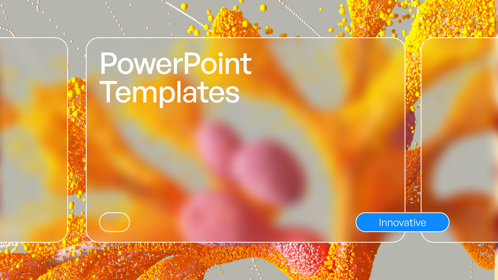
9 Innovative Layout for PPT Ideas to Elevate Your Slides 2026
Standard PowerPoint slides just do not cut it anymore in 2026’s fast-paced business environment. Audiences expect more than the same old templates, and grabbing attention has never been tougher.
If you are tired of presentations that fall flat, this article is for you. Here, you will discover nine innovative layout for ppt ideas that will make your slides stand out, engage your audience, and deliver your message with real impact.
Explore what makes a layout truly innovative, see how cutting-edge trends are shaping presentations, and get practical tips you can use right away. Ready to transform your next slide deck? Let’s dive in.
The Importance of Innovative Layouts in 2026
In today’s business world, the expectations for a standout layout for ppt have never been higher. Over the past decade, presentation design has undergone a remarkable evolution. No longer are simple bullet points and static slides enough to captivate an audience. Instead, the focus has shifted toward compelling visual storytelling and data-driven communication.
This transformation is fueled by the rapid digitization of workflows and the widespread adoption of remote and hybrid work environments. As a result, professionals must rethink their approach to layout for ppt to ensure it remains effective and engaging, regardless of where or how it is viewed.
The Evolution of Presentation Design
Over the last ten years, the way professionals use layout for ppt has changed dramatically. Traditional, text-heavy slides have given way to visually rich designs that tell stories and simplify complex information. The demand for clarity and engagement is higher, especially as attention spans shorten in digital spaces.
Remote and hybrid work have accelerated this shift. Presenters now compete with countless distractions, making it essential for a layout for ppt to be visually compelling. The integration of multimedia, infographics, and interactive elements has become the new standard for effective communication.
Why Layout Matters More Than Ever
The layout for ppt plays a central role in capturing and sustaining audience attention. Research shows that 65 percent of people are visual learners (Forbes, 2023), meaning they absorb information best through images and design. A well-structured layout for ppt can boost retention, making messages more memorable and actionable.
On the other hand, outdated or cluttered slides can obscure your message and reduce your credibility. Imagine delivering critical insights only for them to be lost in a sea of text. The right layout for ppt ensures your key points stand out and resonate with every viewer.
Trends Shaping PPT Layouts in 2026
In 2026, the most effective layout for ppt is defined by innovation and adaptability. Immersive backgrounds, interactive elements, and AI-generated visuals are at the forefront. Minimalism, bold typography, and dynamic color schemes create a fresh, modern look that supports both clarity and engagement.
Staying ahead of these trends is crucial for professionals who want their presentations to impress. To dive deeper into emerging design strategies, explore the Trends in presentation design 2024, which highlights how new tools and creative approaches are reshaping the landscape.
| Trend | Description |
|---|---|
| Immersive Elements | Engages viewers with full-bleed visuals |
| AI Visuals | Smart templates and automated graphics |
| Bold Typography | Large, clear fonts for key messages |
| Dynamic Colors | Vibrant palettes to guide attention |
Common Mistakes to Avoid
Even the most creative layout for ppt can fall short if common pitfalls are not addressed. Overcrowding slides with too much text or imagery is a frequent error, making it hard for audiences to focus. Ignoring accessibility—for instance, not considering color contrast or screen reader compatibility—can exclude key viewers.
Generic templates also undermine the uniqueness of your message. To maximize the impact of your layout for ppt, always tailor design choices to your content, audience, and brand identity. Regularly review and update your slides to avoid stagnation and ensure consistent quality.
9 Innovative Layout for PPT Ideas to Elevate Your Slides 2026
Are you ready to break away from conventional layouts and create slides that command attention? In 2026, the right layout for ppt can transform your message, boost engagement, and make your ideas unforgettable. Below, discover nine innovative layout for ppt ideas that blend trendsetting design, storytelling, and interactivity to elevate every presentation.
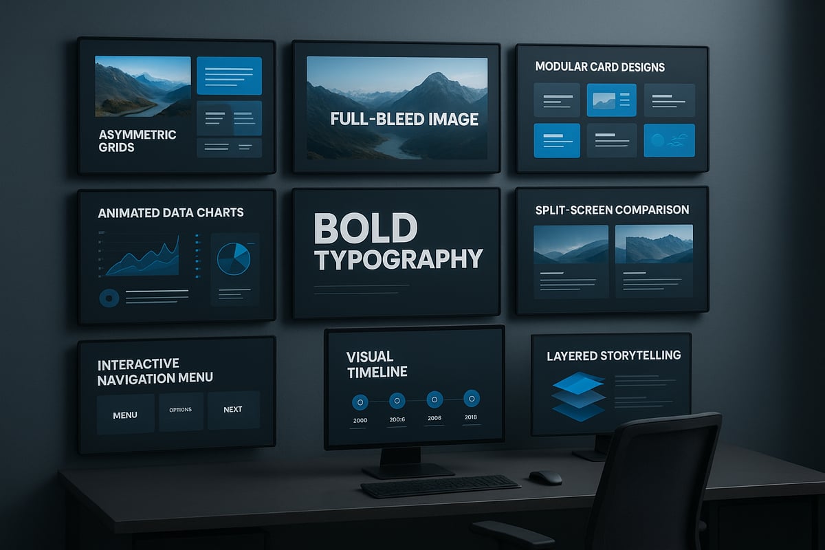
1. Asymmetrical Grid Layout
The asymmetrical grid layout for ppt disrupts the predictable balance of traditional slides, creating visual intrigue and guiding viewers' attention with intention. By offsetting elements like text blocks, images, and icons, you can emphasize key points and encourage the audience to explore the slide naturally.
Tech companies often use this approach in pitch decks, placing product visuals off-center to highlight innovation or contrast. The layout for ppt with an asymmetrical grid is ideal for storytelling, spotlighting differences, or showcasing before-and-after scenarios.
Tips for balance:
- Use whitespace strategically to avoid clutter.
- Anchor heavier visuals with lighter text or icons.
- Ensure visual flow directs the audience’s gaze toward your main message.
For more inspiration and actionable advice, check out PPT layout design best practices. This resource offers further strategies for mastering the art of slide arrangement.
Experiment with different grid structures to find the right layout for ppt that fits your narrative and captures your brand’s unique energy.
2. Immersive Full-Bleed Backgrounds
A full-bleed background layout for ppt turns every slide into an immersive experience. By using high-resolution images or subtle video loops that extend to the edges, you instantly evoke emotion and strengthen brand storytelling.
This approach is especially impactful for title slides, section dividers, or transitions. Slides with compelling visuals are shown to be 43% more persuasive, making this layout for ppt a powerful tool for influence.
Accessibility matters:
- Use overlays or semi-transparent shapes to maintain text readability.
- Choose images with strong contrast for clarity.
- Test on both large screens and mobile devices.
For a dramatic effect, select visuals that reflect your presentation’s mood or core message. Remember, an effective layout for ppt should enhance—not overpower—your content.
3. Modular Card-Based Design
The modular card-based layout for ppt brings order and flexibility to complex information. By dividing content into distinct “cards,” you make it easier for viewers to scan, compare, and digest ideas.
This style, inspired by modern web and app interfaces, is perfect for financial overviews, feature comparisons, or team introductions. Imagine a slide with KPI cards, each featuring a bold icon and key metric—this modular layout for ppt keeps information organized and visually engaging.
Customization tips:
- Use color coding for different categories.
- Add subtle shadows or borders for depth.
- Rearrange cards as needed for different audiences.
A well-structured card-based layout for ppt ensures clarity and adaptability, letting your audience focus on what matters most.
4. Dynamic Data Visualization Layouts
Presenting data doesn’t have to be dull. A dynamic data visualization layout for ppt leverages animated charts, interactive infographics, or even live data feeds to bring numbers to life.
This interactive approach is ideal for quarterly reports, academic findings, or startup growth metrics. Imagine a bar chart that animates as you speak, or a live dashboard updating in real time—this layout for ppt turns complex statistics into compelling stories.
Recommended tools:
- PowerPoint’s built-in animation features.
- Add-ins like DataPoint or LiveWeb for real-time data.
- Online chart creators for infographics.
Prioritize clarity by avoiding excessive animation or clutter. The right layout for ppt makes your data not just visible, but memorable.
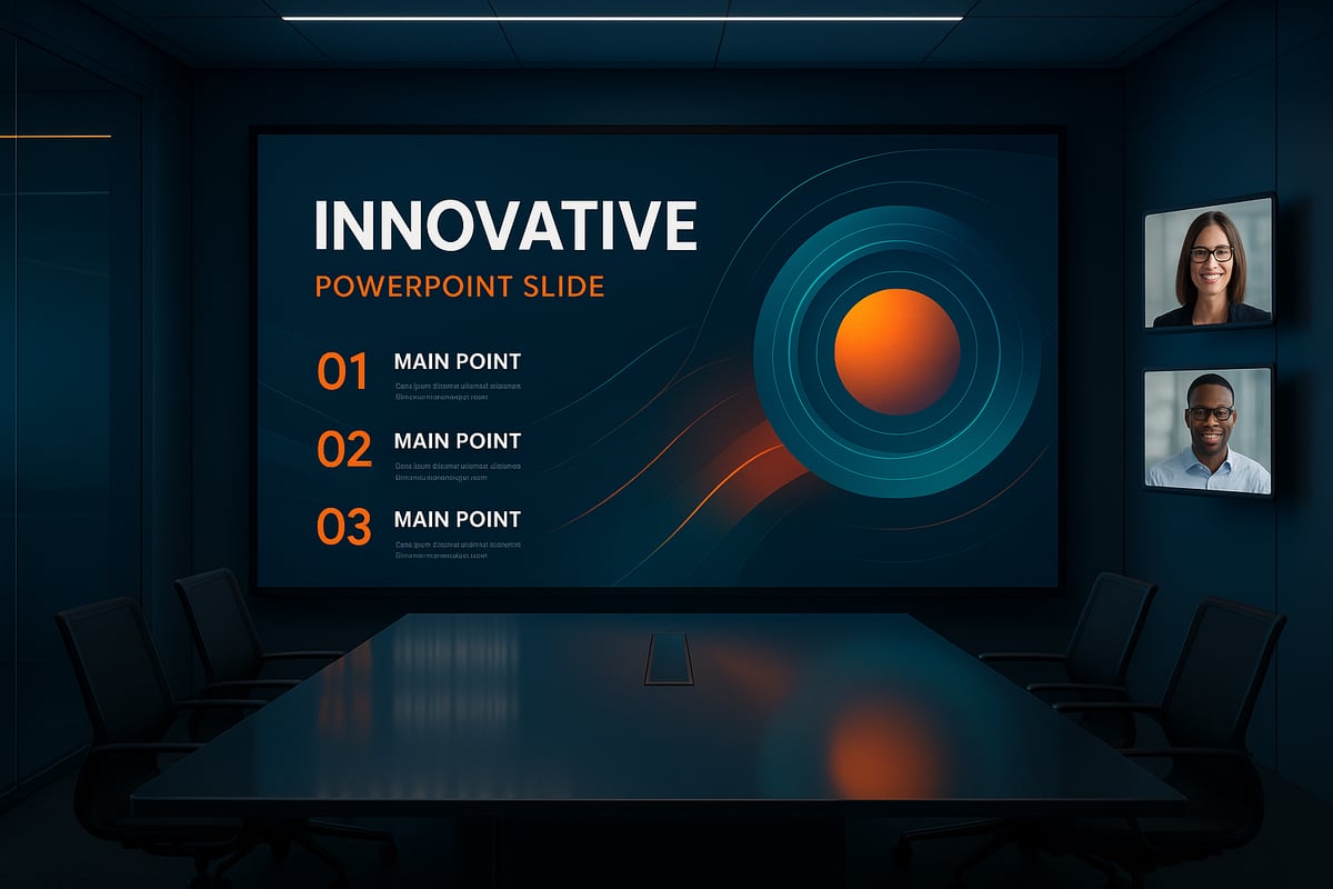
5. Minimalist Typography-Forward Slides
Sometimes, less truly is more. The minimalist, typography-forward layout for ppt focuses on bold, large-scale text, allowing your core message to take center stage.
This style works brilliantly for vision statements, impactful quotes, or single-idea slides. Using variable fonts and kinetic typography can add energy without relying on imagery. Research shows that bold typography enhances clarity and draws immediate attention.
Tips for success:
- Limit each slide to one core idea.
- Use brand colors for accent words.
- Pair bold headlines with subtle subtext.
A minimalist layout for ppt is both timeless and modern, making your message impossible to ignore.
6. Split-Screen Comparisons
A split-screen layout for ppt divides your slide into two or more sections, making it easy to compare ideas side by side. Whether you’re presenting before-and-after results, pros and cons, or competitor analysis, this format brings clarity to contrasts.
Visual cues such as color blocks, arrows, or icons help guide the audience’s eye. For example, SaaS sales decks often use split-screen layouts for ppt to highlight product features against competitors.
Design tips:
- Maintain symmetry and balance between sections.
- Use consistent typography and color palettes.
- Add subtle dividers or icons to emphasize differences.
With a split-screen layout for ppt, your comparisons become instantly clear and actionable.
7. Interactive Navigation Layouts
Take your audience on a journey with an interactive navigation layout for ppt. By embedding clickable menus, links, or buttons, you empower viewers to explore content in a non-linear fashion.
This approach is popular in training modules, onboarding presentations, and product demos. For example, an interactive org chart lets users jump directly to team members or departments. A well-designed interactive layout for ppt creates a sense of agency and engagement.
Best practices:
- Keep navigation elements intuitive and visible.
- Use consistent icons or menu styles.
- Test all links for smooth user experience.
An interactive layout for ppt transforms static slides into a dynamic, personalized experience.
8. Timeline and Process Flows with Visual Anchors
Timelines and process flows, when anchored by visuals, make complex sequences easy to follow. This layout for ppt uses horizontal or vertical lines with icons, images, or milestones to map out steps, phases, or events.
Executives and project teams prefer this method for roadmaps, case studies, or process overviews. Data shows that 78% of leaders favor visual process explanations, underscoring the power of this layout for ppt.
Customization ideas:
- Use industry-specific icons for relevance.
- Highlight completed vs. upcoming milestones with color.
- Keep steps evenly spaced for clean flow.
A timeline layout for ppt not only organizes information, it also tells a visual story your audience can remember.
9. Storytelling with Layered Visual Hierarchies
The storytelling layout for ppt leverages layered visual hierarchies—backgrounds, midgrounds, and foregrounds—to create depth and narrative flow. By stacking images, shapes, and text, you guide the audience through a journey, revealing information step by step.
This technique shines in keynote addresses and investor pitches, where building suspense or context is key. For example, layered graphics can illustrate market opportunity by gradually unveiling components. Tools like PowerPoint’s morph transition or parallax effects add extra dimension.
Implementation tips:
- Start with a subtle background, then build up with midground visuals.
- Use transparency and layering for smooth transitions.
- Limit the number of layers to avoid distraction.
A layered layout for ppt transforms your slides into cinematic stories, making every message resonate.
How to Choose the Right Layout for Your Presentation
Selecting the ideal layout for ppt can make the difference between a forgettable presentation and one that truly resonates. With so many innovative options available, making the right choice requires a strategic approach. Consider your audience, your goals, and the type of content you want to convey. Let’s break down the key steps to help you confidently choose the best layout for ppt.

Assessing Your Audience and Goals
Understanding your audience is the first step in selecting a layout for ppt. Are you presenting to executives, investors, or technical teams? Each group has unique expectations and preferences.
- Executives often prefer concise, high-level overviews.
- Investors look for clear, data-driven visuals.
- Technical teams appreciate detailed process flows.
Define your primary objective: do you want to inform, persuade, or inspire? Align your layout for ppt with both your audience’s needs and your presentation goals. For more advice on effective slide selection, see this guide on crafting impactful slides.
Matching Layouts to Content Types
Not every layout for ppt fits every type of content. For data-heavy presentations, modular card-based or dynamic data visualization layouts work best. These layouts organize complex information into digestible segments.
For narrative-driven presentations, consider storytelling with layered visual hierarchies or immersive backgrounds. These formats help guide the audience through your story.
Use the table below to match layouts to common content types:
| Content Type | Recommended Layout for PPT |
|---|---|
| Financial Reports | Modular Card, Data Visualization |
| Vision Statements | Minimalist Typography |
| Product Comparisons | Split-Screen |
| Project Roadmaps | Timeline/Process Flow |
Choose based on what supports your message most effectively.
Balancing Creativity with Brand Consistency
While it’s tempting to experiment, your layout for ppt should always reflect your brand’s identity. Adapt layout innovations to fit your organization’s color palette, typography, and logo usage.
- Use creative elements like bold fonts or dynamic visuals within brand guidelines.
- Maintain consistent slide backgrounds and iconography.
- Ensure every slide feels like part of a cohesive story.
A well-chosen layout for ppt balances visual creativity and professional consistency, ensuring your message stands out without sacrificing credibility.
Testing and Iterating for Maximum Impact
Before finalizing your layout for ppt, gather feedback from stakeholders or a test audience. Present a draft version and invite constructive criticism.
- Ask if the key messages are clear and memorable.
- Check for visual overload or distracting elements.
- Review accessibility on different devices.
Use analytics or engagement metrics, like time spent per slide, to refine your layout for ppt. Regular testing and iteration will help you achieve a presentation that not only looks impressive but also communicates with maximum impact.
Expert Tips for Implementing Innovative PPT Layouts
Creating a standout layout for ppt in 2026 demands more than just creativity. You need smart tools, compelling visuals, and accessible design to ensure your slides engage every audience. Let’s explore practical tips to elevate your next presentation.

Leveraging AI and Smart Design Tools
Today’s layout for ppt is powered by intelligent design assistants. AI-driven platforms like PowerPoint Designer, Canva, and Beautiful.ai can suggest layouts, color palettes, and even content arrangements tailored to your topic.
AI tools not only speed up slide creation but also ensure consistency and visual harmony. For example, these platforms can recommend the best way to highlight data or propose layouts that boost audience retention. If you want to stay ahead, consider how AI revolutionizes design possibilities by automating routine choices and freeing you to focus on storytelling.
Test a few AI-powered tools to see which matches your workflow. Always review their suggestions to ensure your brand identity and message remain clear.
Sourcing High-Impact Visuals Legally
Choosing the right visuals is essential for a compelling layout for ppt. Powerful images, icons, and videos can make your message more memorable. However, you must use visuals legally to avoid copyright issues.
Seek royalty-free libraries such as Unsplash, Pexels, and The Noun Project. Always check licensing requirements and provide attribution if needed. Remember, slides with strong visuals can be up to 43% more persuasive than those relying on text alone.
Curate images that reflect your topic and audience. High-resolution visuals and consistent icon styles will elevate your slides and reinforce professionalism.
Ensuring Accessibility and Mobile Compatibility
An inclusive layout for ppt ensures everyone can engage with your content. Design for color contrast so text is readable for people with colorblindness. Use alt text for important images, and make sure fonts are legible when viewed on mobile devices.
Follow the latest WCAG guidelines to guarantee accessibility. Test your presentation with screen readers and resize your slides to see how they appear on smaller screens. Accessible design is not just best practice, it’s a necessity for reaching diverse audiences.
By prioritizing accessibility, you future-proof your layout for ppt and demonstrate respect for every participant.
Future-Proofing Your PPT Layouts: Trends Beyond 2026
Staying ahead in presentation design means thinking beyond current trends. As organizations strive for engagement and memorability, a future-ready layout for ppt is no longer optional, but essential. Let's explore what tomorrow's slide design could look like, and how your team can adapt for lasting impact.
Anticipating Next-Gen Design Innovations
The next wave of layout for ppt will harness immersive technologies. Expect to see AR and VR integration, where presenters manipulate 3D slide elements in real-time. These innovations can make data storytelling more tangible and engaging for any audience.
Personalization will also play a key role. Slides may adapt to audience preferences, showing data and visuals based on real-time feedback or user interaction. Imagine a layout for ppt that tailors its visuals for each viewer, increasing relevance and retention.
To prepare, start exploring tools that support 3D graphics, VR-ready content, and dynamic data feeds. These features will become standard as expectations for interactive and adaptive presentations rise.
Preparing for Evolving Audience Expectations
As attention spans shrink and digital fatigue grows, audiences demand interactivity and collaboration. Future layout for ppt designs will focus on real-time content updates, embedded polls, and seamless audience participation.
Modern presenters are already leveraging interactive Q&A sessions and clickable navigation. In the coming years, expect even more tools that foster engagement, such as integrated feedback loops and gamified learning. According to research, storytelling increases memorability 22-fold, making narrative-driven layouts essential for impact.
Stay ahead by experimenting with audience engagement features now. Test new formats and gather feedback to refine your approach as these innovations become mainstream.
Building a Culture of Continuous Presentation Improvement
Adapting to future trends in layout for ppt is not just about technology, but also about mindset. Teams should prioritize ongoing training in design best practices, as well as upskilling in emerging tools and platforms.
Encourage regular knowledge sharing and peer reviews. Consider creating a resource library with the latest guidelines and case studies. Staying updated with industry standards and experimenting with new features will ensure your slides remain effective and compelling.
A proactive learning culture empowers your organization to evolve with the times, ensuring your presentations always stand out and achieve their goals.

- This is some text inside of a div block.lay out the facts clearly and compellingly. Use data to establish the ground reality, but remember that facts alone are like the individual strands of a tapestry—necessary but not complete.lay out the facts clearly and compellingly. Use data to establish the ground reality, but remember that facts alone are like the individual strands of a tapestry—necessary but not complete.
- This is some text inside of a div block.lay out the facts clearly and compellingly. Use data to establish the ground reality, but remember that facts alone are like the individual strands of a tapestry—necessary but not complete.

