
Good Presentation Design Guide for 2025: Essentials for Success
In 2025, a good presentation is not just about slides, it is about creating an immersive, memorable experience that truly resonates. Businesses, educators, and digital communicators alike are recognizing the immense value of impactful presentation design.
When you master good presentation design, you unlock new levels of influence, engagement, and measurable results across all settings. This article is your comprehensive guide for 2025, packed with actionable strategies and proven techniques.
We will explore the latest trends shaping design, essential principles for clarity and impact, a step-by-step creation process, visual storytelling methods, technology integration, and accessibility best practices. Get ready to elevate your next presentation.
The Evolving Landscape of Presentation Design in 2025
In 2025, the world of good presentation design is experiencing a significant transformation. Audiences expect more than static slides; they want interactive, personalized, and visually compelling experiences. To succeed, presenters must understand the forces shaping this landscape and adapt accordingly.

Key Trends Shaping Presentation Design
Good presentation design is now defined by its ability to engage audiences through innovation and relevance. Major trends include immersive experiences with AR and VR, the integration of AI-powered design tools, and a focus on personalized, audience-centric content. Hybrid and remote formats are driving the need for adaptable layouts and real-time interactive features. Data-driven storytelling is becoming a core expectation, with presenters using live polling and dynamic charts to make information come alive. For a deeper look at these changes, see Emerging Presentation Design Trends for 2025, which highlights bold minimalism, high-contrast color schemes, and AI integration as key directions.
Why Good Presentation Design Matters More Than Ever
The importance of good presentation design has never been clearer. Studies show that 80 percent of professionals believe strong visuals increase message retention. In fact, presentations influence decision-making in 65 percent of business meetings. Poor design often leads to disengaged audiences and missed opportunities. One Fortune 500 company, for example, revamped its sales decks and saw a measurable boost in client engagement and deal closure rates. In 2025, effective presentations can be the difference between success and failure in both business and education.
Common Mistakes and Pitfalls to Avoid
Even with advanced tools, common errors can undermine good presentation design. Overloading slides with text or complex data remains a frequent issue. Inconsistent branding, mismatched visuals, and neglecting the needs of remote or mobile audiences can erode professionalism. Accessibility is often overlooked, resulting in presentations that are not inclusive. Using outdated templates and relying on design clichés can make content appear stale. By avoiding these pitfalls, presenters ensure their message is clear, engaging, and effective.
The Role of Design in Building Credibility and Trust
Good presentation design is fundamental to establishing credibility. A well-structured, visually consistent deck signals professionalism and attention to detail. Consistency in colors, fonts, and layouts reinforces brand reliability. Tech startups, for example, often secure funding by delivering compelling, visually cohesive pitch decks that build trust with investors. Visual storytelling transforms abstract concepts into relatable narratives, further strengthening trust between presenter and audience. In 2025, these design choices are key assets for anyone seeking influence.
Future-Proofing Your Presentation Skills
To stay ahead, presenters must make ongoing learning a priority. Good presentation design now requires familiarity with new tools, trends, and audience expectations. Building a portfolio that showcases diverse styles and formats helps professionals remain adaptable. Leveraging AI design assistants and keeping up with evolving best practices are essential steps. Continuous skill development ensures presentations remain impactful, relevant, and ready for any environment—whether live, virtual, or hybrid.
Core Principles of Good Presentation Design
Mastering the core principles of good presentation design is essential for influencing your audience in 2025. These principles guide every slide, ensuring your message is clear, visually engaging, and accessible to all. Let us explore the foundational elements that make a presentation stand out.
Clarity and Simplicity
The heart of good presentation design lies in clarity. Aim for one idea per slide, often called the "Rule of One." This focus helps your message stick and keeps your audience engaged. Use whitespace intentionally to give content room to breathe, making slides easier to scan.
Avoid jargon and dense blocks of text. Instead, choose simple language and concise statements. When you streamline your message, your audience can quickly grasp the main point. For deeper insight on this principle, explore the one core message of a presentation.
Think of your slides as billboards: quick, clear, and memorable. This approach is the foundation of good presentation design and sets the stage for the rest of your content.
Visual Hierarchy and Consistency
Every effective presentation uses visual hierarchy to guide the viewer's eye. Establish clear focal points by making important elements larger, bolder, or more colorful. Consistent color schemes, fonts, and layouts create a professional and cohesive look.
Use grids and alignment tools to organize content. This structure supports readability and ensures each slide feels balanced. Good presentation design relies on visual order, helping audiences connect ideas from slide to slide.
To reinforce your message, repeat key design elements throughout your deck. Consistency builds trust and makes your presentation feel intentional and polished.
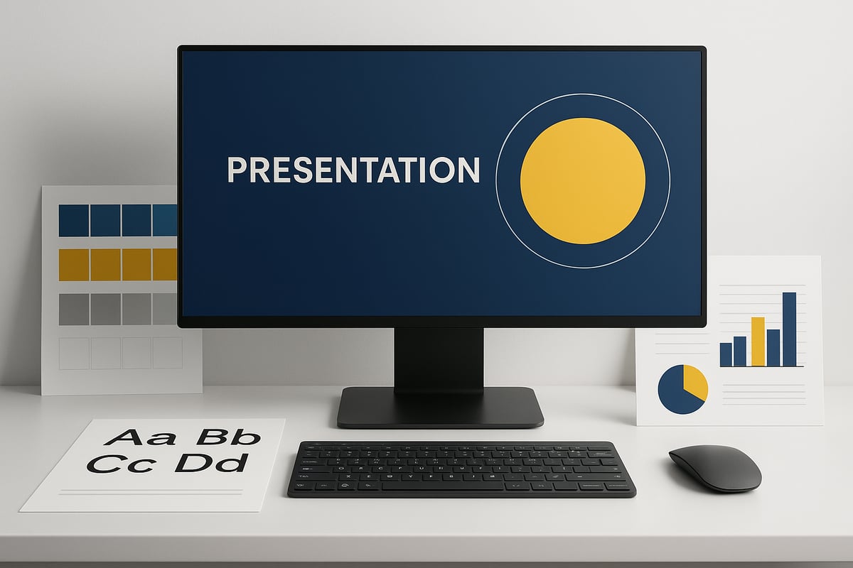
Effective Use of Color and Typography
Color and typography set the tone for your entire presentation. Choose color palettes that reflect your brand and support your message. Consider color psychology—blues can feel calming, while reds add energy.
Accessibility is crucial. Ensure enough contrast between text and background for readability. Use font pairings that complement each other and maintain legibility, even on smaller screens.
Limit the number of fonts to two or three, and avoid decorative styles that hinder clarity. Good presentation design leverages color and typography to engage viewers and make your content stand out.
Data Visualization Done Right
Presenting data effectively is a hallmark of good presentation design. Select the right chart or graph for your information—pie charts for proportions, line graphs for trends, and bar charts for comparisons.
Simplify complex data. Only include essential numbers and avoid clutter. For example, a financial dashboard slide can use color-coded bars and icons to highlight key metrics.
Label charts clearly and use legends when necessary. Well-designed data visuals help your audience understand insights quickly, making your presentation more persuasive and actionable.
Storytelling and Narrative Flow
A strong narrative transforms facts into a memorable journey. Structure your presentation with a clear beginning, middle, and end. Use transitions and signposting to help your audience follow along.
Incorporate emotional hooks and narrative arcs to boost engagement. For example, share a customer story or a before-and-after scenario to illustrate your point.
Good presentation design weaves storytelling throughout the slides, making each idea connect logically to the next. This flow keeps your audience invested and improves retention.
Accessibility and Inclusivity in Design
Designing for everyone is a non-negotiable aspect of good presentation design. Use color palettes that accommodate color blindness and provide sufficient contrast. Include alt text for images to support screen readers.
Choose readable fonts at appropriate sizes and avoid small text. Add captions to videos and ensure all interactive elements are accessible by keyboard.
Inclusive language and diverse visuals show respect for all audience members. By prioritizing accessibility, your presentation reaches a wider audience and leaves a positive impression.
Step-by-Step Guide to Creating a Winning Presentation
Creating a winning presentation in 2025 requires a blend of strategic planning, audience awareness, and mastery of good presentation design. By following a structured approach, you can ensure your message resonates and stands out in any setting.
Step 1: Define Your Purpose and Audience
Begin with clarity. Ask yourself, what is the main goal of your presentation? Is it to inform, persuade, or inspire? Defining your purpose gives direction to your content and design choices.
Next, analyze your audience. Consider their demographics, professional background, expectations, and pain points. Are they industry experts, students, or executives? Tailoring your message and tone to their needs is a cornerstone of good presentation design.
Use surveys, interviews, or simple research to gather insights. This targeted approach helps you craft content that is both relevant and engaging.
Step 2: Structure Your Narrative
A logical structure is essential for good presentation design. Start by outlining your key messages and supporting points. Choose a framework that fits your objective, such as Problem-Solution, Story-Arc, or Cause-Effect.
Organize your content into a clear sequence. Begin with an introduction that sets the stage, follow with a body that develops your ideas, and close with a strong conclusion. Use signposting language to guide your audience through each section.
Consider using a table like the one below to plan your structure:
| Section | Key Point | Supporting Data |
|---|---|---|
| Introduction | Main goal | Statistic |
| Body | Insight 1, 2, 3 | Examples |
| Conclusion | Call to action | Summary |
This systematic approach ensures your presentation flows smoothly and keeps your audience engaged.
Step 3: Design Visually Engaging Slides
Visual impact is at the heart of good presentation design. Select templates and layouts that reflect your brand identity and enhance readability. Incorporate branded elements, such as logos and color schemes, for consistency.
Balance is key. Use concise text, high-quality imagery, and ample whitespace to prevent clutter. Visual hierarchy, achieved through font size, color, and placement, guides the viewer’s attention to what matters most.
Stay current by exploring 7 trends in presentation design to inspire your slide layouts and visual choices. Integrating modern design elements can elevate the professionalism and appeal of your presentation.
Step 4: Integrate Data and Visuals Effectively
Data is powerful when presented well. Source accurate, up-to-date information from reliable references. Use charts, graphs, and infographics to simplify complex data, making it digestible at a glance.
Icons, illustrations, and photos can reinforce your message and add visual interest. Ensure every visual element has a clear purpose and supports your narrative. Maintain consistency in style and tone across all visuals for cohesive good presentation design.
Test your data visuals for clarity and avoid overloading slides with too much information. Simplicity enhances understanding and audience retention.
Step 5: Refine for Accessibility and Inclusivity
Accessibility should be integral to good presentation design. Add descriptive alt text to all images, so screen readers can interpret visuals for visually impaired users. Use readable fonts and adequate color contrast for legibility.
Include captions for audio and video elements. Test your slides on various devices and platforms to ensure they are accessible to remote and mobile viewers. Choose inclusive language and visuals that reflect diverse audiences.
Proactively addressing accessibility ensures your message reaches everyone, regardless of ability or environment.
Step 6: Practice and Gather Feedback
Even the best-designed slides need effective delivery. Rehearse your presentation multiple times, focusing on timing, tone, and clarity. Record yourself or present to peers to identify areas for improvement.
Seek feedback from colleagues or a test audience. Use their insights to refine both content and delivery. Constructive criticism is invaluable for perfecting good presentation design.
Iterate as needed, making minor adjustments to enhance flow and impact. Practice builds confidence and ensures you are prepared for any scenario.
Step 7: Prepare for Different Presentation Environments
Adaptability is crucial in 2025’s diverse presentation landscape. Prepare for live, virtual, and hybrid settings by testing your slides and technology in advance. Check hardware, software, and internet connectivity to avoid technical issues.
Have backup plans ready, such as offline copies of your slides or alternative sharing methods. Familiarize yourself with the platform’s features, including screen sharing, chat, and interactive tools.
By being prepared, you can deliver your good presentation design seamlessly, regardless of the environment or audience.
Visual Storytelling: Turning Data and Ideas into Impact
Visual storytelling is the secret weapon behind good presentation design. In 2025, audiences expect more than static slides—they crave engaging narratives that turn data and ideas into memorable experiences. Mastering visual storytelling not only clarifies your message but also creates lasting impact for any good presentation design.

The Science Behind Visual Storytelling
Why does visual storytelling matter for good presentation design? Research like Dual Coding Theory shows that combining visuals with spoken words helps people process and remember information more effectively. When data is presented visually, the brain creates stronger associations, improving retention.
Images also evoke emotions, which makes your message stick. Consider a TED Talk where a powerful image supports a key point—audiences remember the story, not just the statistics. In good presentation design, visuals act as anchors, guiding viewers through complex topics with clarity and confidence.
Techniques for Compelling Visual Narratives
To achieve good presentation design, use proven storytelling strategies. Start with a strong metaphor or analogy that simplifies your concept. Build a story arc: introduce the challenge, show the journey, and end with a resolution.
Sequence your visuals so each slide leads naturally to the next, creating momentum. Use dramatic transitions or highlight key data points for effect. For practical inspiration, explore visual storytelling for presentations to see how experts craft engaging visual narratives that resonate with diverse audiences.
Balancing Data and Emotion
A hallmark of good presentation design is blending hard data with emotional stories. Statistics alone can feel cold, but pairing them with real-world examples humanizes your message. For instance, an infographic that connects financial results to personal success stories encourages empathy and action.
Consider this quick comparison:
| Approach | Impact |
|---|---|
| Pure Data | Informative, but less memorable |
| Data + Story | Engaging, persuasive, emotionally resonant |
By striking this balance, your presentations drive both understanding and motivation, making your insights truly actionable.
Common Mistakes in Visual Storytelling
Even with good presentation design, some pitfalls are common. Overcomplicating charts or using generic imagery can confuse or bore your audience. Avoid slides with visuals that lack a clear narrative connection.
Key mistakes to watch for:
- Crowded, unreadable data visualizations
- Irrelevant stock photos or icons
- Slides that do not support the overall story
By sidestepping these errors, you ensure your visual storytelling remains focused, impactful, and aligned with your message.
Harnessing Technology and Tools for Modern Presentations
The landscape of good presentation design is rapidly changing as new technologies emerge. In 2025, leveraging innovative tools is essential for creating presentations that captivate modern audiences. Let us explore how AI, collaboration platforms, immersive technologies, and security protocols are shaping the future of good presentation design.
AI and Automation in Presentation Design
Artificial intelligence is transforming good presentation design by automating repetitive tasks and enhancing creativity. AI-powered tools, such as Microsoft Designer and Beautiful.ai, can generate slide layouts, suggest visuals, and improve content flow with just a few clicks. This not only saves valuable time but also raises the quality of presentations by minimizing common design errors.
Modern AI systems analyze your content and recommend design adjustments that align with the latest trends. For example, Top Presentation Design Trends to Watch in 2025 highlights how AI integration, minimalistic design, and bold typography are now central to good presentation design. By embracing these advances, professionals can focus on delivering compelling messages rather than struggling with manual formatting.
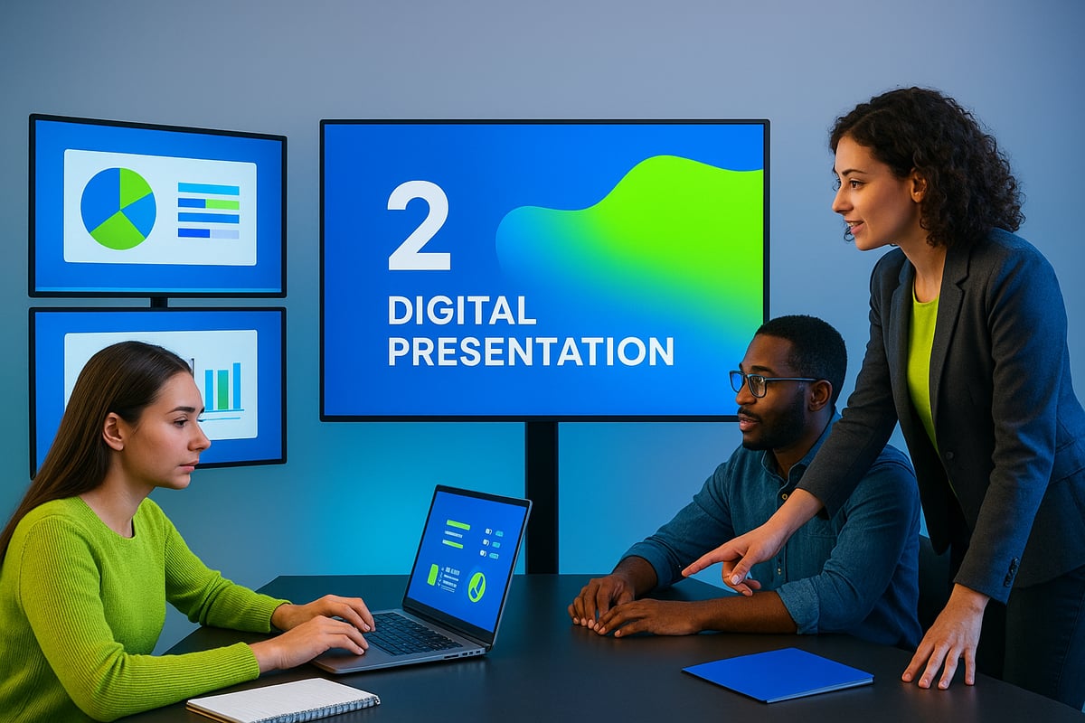
Collaborative and Cloud-Based Tools
Collaboration is at the heart of good presentation design in 2025. Teams are no longer limited by location or time zones thanks to cloud-based platforms like Google Slides, Canva, and Pitch. These tools enable multiple contributors to work on a single presentation in real time, ensuring consistency and efficiency throughout the design process.
Version control features help track changes and maintain a clear history of edits, reducing confusion and mistakes. Asset management systems store logos, templates, and images in a centralized library, making it easy to uphold branding guidelines. Good presentation design benefits from these seamless workflows, allowing teams to produce polished slides faster and with fewer errors.
Interactive and Immersive Technologies
Immersive experiences have become a hallmark of good presentation design. The integration of AR and VR technologies allows presenters to create interactive training modules, virtual product demos, and engaging sales pitches. Live audience engagement tools, such as polls and Q&A sessions, foster participation and keep viewers attentive.
Emerging trends, including bold text, AI-generated images, and dark mode, are shaping how presenters connect with audiences. For a deeper look at these trends, 4 Presentation Trends for 2025 – Microsoft 365 offers valuable insights. Leveraging these technologies ensures your good presentation design stands out, making complex ideas accessible and memorable.
Ensuring Security and Privacy
With the rise of cloud-based sharing and remote collaboration, protecting sensitive information is a critical part of good presentation design. Secure sharing options and granular access controls prevent unauthorized viewing and editing. Many platforms now offer encrypted storage and compliance features to align with privacy regulations.
Presenters should be diligent about reviewing security settings before sharing materials, especially when confidential data is involved. Regular updates and staff training on digital safety best practices help safeguard both the content and the audience. By making security a priority, you reinforce trust in your good presentation design and maintain your professional reputation.
Measuring Success: Analytics and Continuous Improvement
Tracking the impact of good presentation design is essential for ongoing growth. Metrics provide clear, actionable insights into how your slides resonate with audiences. By measuring results and acting on data, presenters can ensure their message connects, persuades, and drives outcomes.
Key Presentation Metrics to Track
To measure the effectiveness of good presentation design, focus on the right metrics. Engagement rates, such as slide views and time spent per slide, reveal which parts capture attention.
Track audience feedback scores and satisfaction ratings after each presentation. Measure conversion or action rates to see if viewers take desired steps, like signing up or making a purchase.
Summarize your findings in a simple table:
| Metric | What It Shows |
|---|---|
| Slide Views | Interest in content |
| Time Spent | Depth of engagement |
| Feedback Scores | Audience satisfaction |
| Conversion Rate | Action taken post-presentation |
Regularly reviewing these numbers helps you refine your approach and achieve better results with good presentation design.
Gathering and Analyzing Feedback
Collecting feedback is crucial for improving good presentation design. Use post-presentation surveys, quick polls, or digital feedback forms to gather honest opinions.
Analyze Q and A sessions and chat interactions for recurring questions or confusion points. This data highlights areas where your message may need clarification.
For deeper insights, review audience engagement tools or analytics dashboards. Addressing issues and learning from feedback helps avoid repeating common presentation design mistakes, ensuring your presentations evolve with every iteration.
Case Studies: Iterative Presentation Design
Real-world examples showcase the value of analytics in good presentation design. A financial firm, for instance, tracked engagement and noticed certain slides lost attention quickly.
By redesigning those slides and simplifying data visuals, they increased deal closure rates by 15 percent. Another company used feedback to streamline their narrative, leading to higher satisfaction scores.
Key lessons learned:
- Act on feedback, not just numbers
- A/B test different slide formats
- Regularly update visuals to maintain relevance
Iterative improvement transforms presentations from static to dynamic assets.
Building a Culture of Continuous Improvement
Embedding continuous improvement is the hallmark of good presentation design. Encourage your team to share feedback openly and experiment with new approaches.
Offer regular training in design thinking and analytics tools. Stay updated with industry benchmarks and trends to inspire fresh ideas.
Celebrate small wins and incremental progress. Over time, this culture ensures presentations remain effective, relevant, and engaging for every audience.


- This is some text inside of a div block.lay out the facts clearly and compellingly. Use data to establish the ground reality, but remember that facts alone are like the individual strands of a tapestry—necessary but not complete.lay out the facts clearly and compellingly. Use data to establish the ground reality, but remember that facts alone are like the individual strands of a tapestry—necessary but not complete.
- This is some text inside of a div block.lay out the facts clearly and compellingly. Use data to establish the ground reality, but remember that facts alone are like the individual strands of a tapestry—necessary but not complete.

