
Designing What You Can’t See
There’s a certain kind of project that begins with silence.
No product photos, no colors to reference, no visuals at all — just equations, timing diagrams, and talk of nanoseconds.
That’s what it’s like to design for the semiconductor industry.
Our latest project began there, in that invisible space — with a company building some of the world’s most advanced clock and timing systems, keeping critical technologies perfectly in sync.
They work at the edge of physics, eliminating jitter and phase noise to make communication faster and more stable.
Our challenge was to take something you can’t see or touch and give it form, story, and emotion.
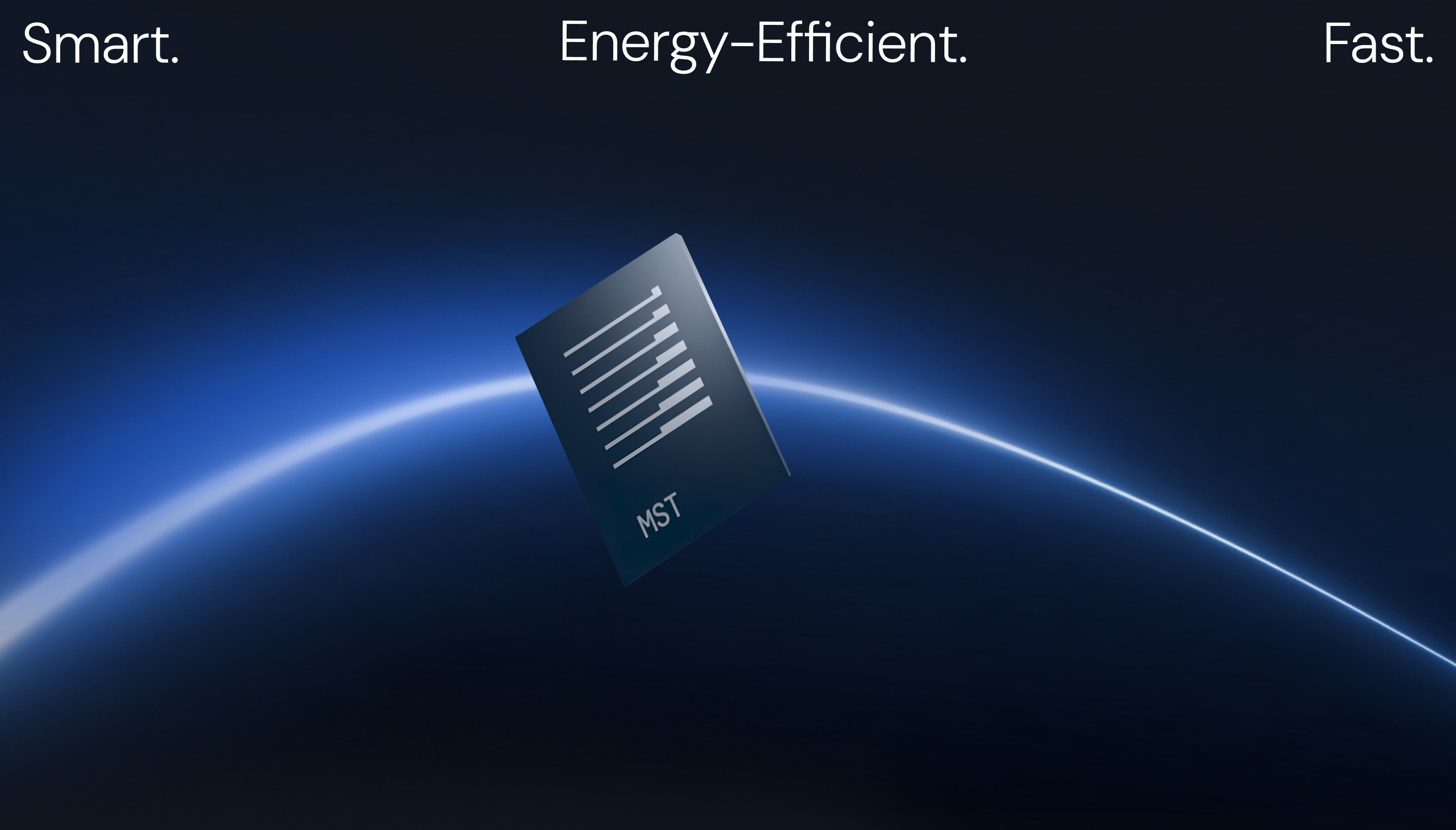
When your product lives at atomic scale
In semiconductors, beauty hides in performance. The product is a component smaller than a fingernail, yet it powers drones, autonomous vehicles, and marine systems that rely on flawless timing.
Our client wanted a visual identity that could express that sophistication — a system that communicates precision, speed, and stability without losing clarity or warmth.
The central question became:
How do you design for something you can’t see?
Finding the signal in the noise
We started by learning the language of engineers — studying how signals behave, how data flows, how small distortions change everything.
Through that exploration, one idea kept resurfacing: clarity.
Everything this company does is about amplifying what matters and eliminating interference.
We built the brand around that principle, translating technical precision into a clear, scalable design language.
Our solution included:
- A strategic brand platform rooted in clarity, precision, and confidence.
- A scalable visual framework, built from modular “signal blocks” that adapt across formats and audiences.
- An AI-powered image system inspired by signal dynamics, helping teams create expressive visuals with consistency and ease.

Building a brand that feels engineered
The result is a visual identity that bridges science and storytelling.
Every line, color, and motion is grounded in signal behavior — technical, yet unmistakably human.
The new system positions the company for growth across Drones, Automotive, and Marine sectors, helping it communicate innovation not just through data, but through design.
What this project taught us
Some of the most exciting design challenges start with the unseen.
When nothing visual exists, you have to create the language from scratch — one that engineers respect, and others can instantly understand.
Design, at its best, doesn’t decorate complexity. It reveals it.
And that’s what this project is about: visualizing the invisible.
See the full case study on Behance:
Semiconductor Company Brand Identity →
For teams building the future
If you’re leading a technical or engineering-driven company and want to make your story as clear and compelling as your technology, we’d love to talk.
You can book a short call with our strategy team to explore how design can amplify your message and help you scale with clarity.
or reach out directly at hello@przntperfect.com
Keep reading
→ Presenting With Confidence in Compliance-Heavy Sectors
→ Why Quick Turnarounds Still Deserve Great Thinking


- This is some text inside of a div block.lay out the facts clearly and compellingly. Use data to establish the ground reality, but remember that facts alone are like the individual strands of a tapestry—necessary but not complete.lay out the facts clearly and compellingly. Use data to establish the ground reality, but remember that facts alone are like the individual strands of a tapestry—necessary but not complete.
- This is some text inside of a div block.lay out the facts clearly and compellingly. Use data to establish the ground reality, but remember that facts alone are like the individual strands of a tapestry—necessary but not complete.

