Designing Pitch Decks: Expert Guide for 2026

Designing pitch decks that secure funding and capture investor attention requires a strategic blend of visual storytelling, data clarity, and brand consistency. For financial and tech businesses navigating competitive markets in 2026, the presentation deck has evolved from a simple slide collection into a sophisticated visual narrative that must communicate complex value propositions within minutes. Whether you're a fintech startup seeking Series A funding or an established tech company presenting to enterprise clients, understanding the fundamental principles of effective deck design can mean the difference between securing investment and losing opportunities to better-prepared competitors.

Understanding the Strategic Foundation of Pitch Deck Design

Designing pitch decks starts with recognizing that investors and decision-makers receive dozens of presentations weekly. Your deck must immediately establish credibility while maintaining visual interest throughout the entire presentation. This balance requires careful attention to both content hierarchy and design execution.

The most successful pitch decks follow a clear narrative structure that guides viewers through problem identification, solution presentation, market opportunity, business model, competitive advantages, and financial projections. Each section serves a specific purpose in building confidence and demonstrating viability.

Building Your Core Narrative Structure

Before diving into visual design elements, establish the fundamental story your pitch deck will tell. Financial services and technology companies face unique challenges when designing pitch decks for financial and tech audiences because technical complexity must be balanced with accessibility.

Start by identifying your three core messages:

  • The problem you solve and why it matters now
  • Your unique solution and competitive differentiation
  • The market opportunity with supporting financial data

Each slide should advance one of these messages while maintaining visual consistency. According to research on pitch deck design principles, investors make preliminary decisions within the first three slides, making your opening sequence critical.

Pitch deck narrative flow

Visual Hierarchy and Information Architecture

Effective visual hierarchy guides viewer attention to the most important information on each slide. When designing pitch decks for sophisticated audiences, understanding how to structure information becomes as important as the data itself.

Typography plays a foundational role in establishing hierarchy. Use size, weight, and placement strategically to create clear information layers. Your headline should communicate the slide's main point independently, while supporting text provides necessary context and detail.

Implementing the One Concept Per Slide Rule

Professional presentation designers consistently emphasize that each slide should communicate a single, focused idea. This principle becomes especially important when working with complex financial models or technical architectures. Breaking down sophisticated concepts into digestible components demonstrates both clarity of thought and respect for your audience's time.

Consider these hierarchy best practices:

  1. Headlines that function as standalone statements
  2. Supporting visuals that reinforce rather than duplicate text
  3. Data points highlighted through color, size, or position
  4. White space used strategically to create breathing room

When exploring creative pitch deck design approaches, remember that creativity should enhance clarity rather than obscure your message. The most effective presentations make complex information feel accessible rather than overwhelming.

Color Theory and Brand Consistency in Financial Presentations

Color selection significantly impacts how your pitch deck is perceived and remembered. For financial and technology businesses, color choices must balance professionalism with memorability while maintaining brand alignment.

Color Purpose Best Practices Common Mistakes
Primary Brand Use for headlines, key data, CTAs Overusing throughout entire deck
Accent Colors Highlight critical metrics, differentiate categories Choosing too many accent colors
Neutrals Background, body text, supporting elements Using pure black or stark white
Data Visualization Distinct but harmonious palette Low contrast combinations

Your color palette should remain consistent throughout the presentation while allowing flexibility for emphasis. Financial data visualizations particularly benefit from thoughtful color application that makes trends and comparisons immediately obvious.

Creating Accessible Color Combinations

Accessibility considerations extend beyond basic visibility. When designing pitch decks that may be viewed on various devices or printed in grayscale, ensure your color choices work across contexts. Use contrast checkers to verify readability and consider how color-blind viewers will interpret your visualizations.

The comprehensive guide to pitch deck structure emphasizes that professional presentations maintain at least a 4.5:1 contrast ratio between text and backgrounds for optimal legibility across viewing conditions.

Data Visualization Strategies for Complex Information

Financial and technical presentations often require communicating dense datasets and complex relationships. The way you visualize this information can either clarify or confuse your narrative. When designing pitch decks with substantial data components, choosing the right visualization method becomes critical.

Chart selection guidelines:

  • Line graphs for trends over time
  • Bar charts for comparisons across categories
  • Pie charts only for simple part-to-whole relationships
  • Scatter plots for correlation demonstrations
  • Custom infographics for unique data stories

Each visualization should include clear labels, appropriate scale, and contextual information that helps viewers understand significance. Avoid chart junk and decorative elements that don't contribute to comprehension. For complex datasets, consider breaking information across multiple slides rather than cramming everything into a single, overwhelming visual.

Financial data transformation

Transforming Tables into Visual Stories

Raw data tables rarely engage audiences effectively. When you must present detailed financial projections or technical specifications, look for opportunities to visualize relationships and highlight key figures. Use color coding, progressive disclosure, or animated builds to guide attention through complex information systematically.

Many successful pitch decks featured in real-world startup examples demonstrate how strategic data visualization transforms potentially dry financial information into compelling evidence of market opportunity and business viability.

Typography and Readability Optimization

Font selection and text formatting significantly impact how professional and credible your pitch deck appears. When designing pitch decks for high-stakes presentations, typography deserves careful consideration beyond simple aesthetic preferences.

Choose font families that reflect your brand personality while maintaining excellent readability across presentation contexts. Sans-serif fonts typically work best for digital presentations, offering clean lines that remain crisp at various sizes and resolutions.

Establishing Typographic Hierarchy

Create clear distinction between different text levels using a consistent system:

  1. Slide headlines: 32-44 points, bold or semibold weight
  2. Subheadings: 24-28 points, medium weight
  3. Body text: 18-24 points, regular weight
  4. Captions and labels: 14-16 points, light or regular weight

Never use font sizes below 14 points in presentation slides. Information that seems readable on your laptop may become illegible when projected or viewed on smaller devices. The guidance on designing professional pitch decks reinforces that readability should never be sacrificed for design aesthetics.

Image Selection and Visual Authenticity

Photography and imagery contribute significantly to the emotional resonance and professional polish of your pitch deck. When designing pitch decks for financial services or technology sectors, image choices must balance professionalism with human connection.

Avoid obvious stock photography that undermines authenticity. Investors can immediately recognize generic business imagery that adds no genuine value to your story. Instead, prioritize:

  • Product screenshots showing actual interface and functionality
  • Team photographs that humanize your organization
  • Custom graphics created specifically for your narrative
  • Data visualizations that present unique insights
  • Industry-specific imagery that demonstrates domain expertise

If using stock images becomes necessary, choose photographs that feel authentic rather than staged. Modern platforms like RankPill help businesses optimize their digital content strategy, including presentation assets, through automated SEO services that can improve discoverability of visual resources.

Layout Principles and Grid Systems

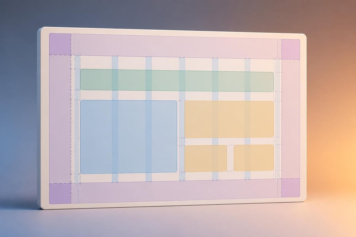
Professional layout design provides invisible structure that makes information feel organized and intentional. When designing pitch decks, establishing a consistent grid system ensures visual harmony across all slides while providing flexibility for different content types.

Most effective pitch decks use a simple grid structure with clear margins and alignment points. This framework allows designers to maintain consistency while varying content presentation to prevent monotony.

Creating Visual Rhythm Through Layout Variation

While consistency remains important, varying your layout approach across sections helps maintain audience engagement. Consider these layout patterns:

Layout Type Best Used For Design Considerations
Full-bleed image Section dividers, emotional impact Ensure text remains readable
Split screen Before/after, comparison slides Maintain balance between sides
Centered focus Key statistics, crucial messages Use generous white space
Asymmetric Dynamic product showcases Maintain clear hierarchy

The best practices for pitch deck design in 2026 emphasize that layout variation should serve strategic purposes rather than existing purely for aesthetic variety.

Grid layout system

Animation and Transition Strategy

Movement and transitions can enhance understanding when used strategically, but they can also distract from your message when overused. When designing pitch decks for professional audiences, animation should clarify rather than entertain.

Effective animation applications:

  • Revealing data points sequentially to build narrative
  • Demonstrating product workflow or user journey
  • Transitioning between related concepts
  • Highlighting specific metrics or findings

Avoid slide transitions that draw attention to the transition itself. Subtle fades or simple cuts maintain professionalism while keeping focus on content. Save motion for moments where it genuinely aids comprehension, such as showing progression through a process or revealing components of a complex system.

Brand Integration Without Overwhelming

Your pitch deck should reflect brand identity while remaining focused on investor needs. When designing pitch decks that balance brand expression with information delivery, subtlety often proves more effective than heavy-handed branding.

Incorporate brand elements through:

  • Consistent color palette aligned with brand guidelines
  • Typography choices that reflect brand personality
  • Strategic logo placement without repetition
  • Icon style and graphic treatments
  • Photography tone and composition approach

Your brand should feel present throughout the deck without competing for attention with crucial business information. For companies working with professional agencies, exploring professional slide deck services can provide guidance on achieving this balance effectively.

Technical Considerations and File Optimization

The technical execution of your pitch deck impacts both presentation quality and ease of sharing. When designing pitch decks in 2026, consider how your file will be distributed, presented, and potentially modified.

Format and Compatibility Planning

Create your deck in formats that ensure compatibility across platforms. While specialized design tools offer advanced capabilities, ensure your final deliverable works reliably in standard presentation software. Many investors prefer receiving PDF versions for review, while live presentations may require PowerPoint or Keynote files.

File size matters particularly when decks will be emailed or uploaded to investor portals. Optimize images before embedding them, using appropriate resolution for screen display without unnecessarily large file sizes. A well-optimized deck typically ranges from 10-30MB depending on image count and complexity.

Consider creating multiple versions:

  1. Presentation version with animations and transitions
  2. PDF reading version for independent review
  3. Shortened version for initial outreach
  4. Detailed appendix with supporting documentation

Mobile and Multi-Device Considerations

Investors increasingly review pitch decks on tablets and smartphones before formal presentations. When designing pitch decks for modern viewing contexts, ensure your design remains effective across device types and screen sizes.

Test your deck on various devices to verify readability and layout integrity. Text that seems appropriately sized on desktop monitors may become uncomfortably small on mobile devices. Similarly, layouts relying on precise positioning may break when viewed in different aspect ratios.

The insights shared in 10 pitch deck design tips emphasize responsive thinking even within presentation design, ensuring critical information remains accessible regardless of viewing context.

Template Customization and Unique Expression

While templates provide helpful starting frameworks, truly effective pitch decks require customization that reflects your specific business and value proposition. When designing pitch decks from templates, use them as structural guides rather than rigid constraints.

Template customization priorities:

  • Adapt color schemes to your brand palette
  • Replace placeholder content with genuine data and insights
  • Modify layouts to accommodate your specific content needs
  • Add custom graphics that illustrate unique concepts
  • Refine typography to match brand personality

Resources exploring Canva pitch deck templates demonstrate how accessible design tools have democratized pitch deck creation, though professional customization remains essential for high-stakes presentations.

Common Design Mistakes and How to Avoid Them

Even experienced presenters fall into predictable design traps when creating pitch decks. Understanding these common mistakes helps you avoid them from the outset. The article on common mistakes to avoid in pitch deck design identifies patterns that undermine otherwise strong presentations.

Frequent design errors:

  • Overcrowding slides with excessive text and graphics
  • Inconsistent formatting across slide sections
  • Poor color contrast reducing readability
  • Generic stock photos that undermine authenticity
  • Complex charts without clear takeaways
  • Mixing too many font families
  • Ignoring white space as a design element

Each mistake shares a common root: prioritizing quantity over quality and decoration over communication. When designing pitch decks, constantly ask whether each element serves your strategic narrative or merely fills space.

Testing and Iteration Process

Professional presentation design involves systematic testing and refinement. When designing pitch decks for critical funding rounds or major client presentations, build time into your process for multiple review cycles and adjustments.

Share your deck with colleagues who represent different perspectives: technical team members can verify accuracy, sales professionals can assess persuasiveness, and individuals unfamiliar with your business can identify confusing elements.

Gathering Actionable Feedback

Structure feedback sessions to generate specific, actionable insights rather than subjective preferences. Ask reviewers:

  1. What was the main message of each section?
  2. Which slides felt confusing or overwhelming?
  3. Where did your attention naturally focus on each slide?
  4. What questions remained unanswered?
  5. How credible did the presentation feel overall?

This targeted approach reveals where your design succeeds and where adjustments might strengthen impact. The comprehensive startup pitch deck guide emphasizes iterative refinement as essential to creating truly effective presentations.

Industry-Specific Design Considerations

Financial services and technology companies face distinct challenges when designing pitch decks due to the complexity of their offerings and the sophistication of their audiences. Technical products require clear explanation without oversimplification, while financial services demand credibility and regulatory awareness.

For cybersecurity companies, presentations must balance technical depth with accessibility. Exploring cybersecurity pitch deck specialization reveals how industry-specific design approaches address unique stakeholder concerns and regulatory contexts.

Industry Design Priorities Content Emphasis
Fintech Regulatory compliance, security, user experience Market size, unit economics, compliance framework
SaaS Product demonstration, scalability, integration Customer acquisition cost, lifetime value, churn rates
Cybersecurity Threat landscape, technical capability, certification Problem severity, solution effectiveness, team expertise
Enterprise Tech Implementation process, ROI, case studies Total addressable market, competitive analysis, roadmap

Understanding your industry's specific requirements helps you prioritize design elements that resonate with sector-specific investors and decision-makers.

Working With Professional Design Partners

Many successful companies recognize when internal resources should be supplemented with professional design expertise. When designing pitch decks that will determine funding outcomes or major partnership decisions, partnering with specialists often proves worthwhile.

Professional presentation designers bring expertise in visual communication, stakeholder psychology, and technical execution that accelerates the creation process while improving outcomes. They understand how to translate complex business concepts into clear visual narratives that resonate with specific audiences.

When evaluating potential design partners, examine their portfolio for work in your industry, assess their process for understanding business context, and verify their ability to work within your timeline and budget constraints. The right partnership transforms pitch deck development from a stressful obligation into a strategic advantage that differentiates your presentation from competitors.


Designing pitch decks that effectively communicate value propositions while maintaining visual excellence requires balancing strategic thinking with design execution across multiple dimensions. By focusing on clear narrative structure, thoughtful visual hierarchy, appropriate data visualization, and consistent brand integration, financial and tech businesses can create presentations that capture attention and drive desired outcomes. Whether you're preparing for your first funding round or refining presentations for enterprise sales, Prznt Perfect specializes in transforming complex financial and technical concepts into visually compelling narratives that resonate with investors and decision-makers, helping you present your vision with the clarity and professionalism it deserves.

We offer free 30-min consultation on the presentation design audit
and hiring the right visual 
comms professional, let’s talk!
Shedule a call
Shedule a call
"I understand" goes a step further into the cognitive dance of persuasion. It's where the audience begins to see the connections between the facts, to grasp the nuances of the problem and the elegance of the solution.
  • This is some text inside of a div block.
    lay out the facts clearly and compellingly. Use data to establish the ground reality, but remember that facts alone are like the individual strands of a tapestry—necessary but not complete.
    lay out the facts clearly and compellingly. Use data to establish the ground reality, but remember that facts alone are like the individual strands of a tapestry—necessary but not complete.
  • This is some text inside of a div block.
    lay out the facts clearly and compellingly. Use data to establish the ground reality, but remember that facts alone are like the individual strands of a tapestry—necessary but not complete.

We offer free 30-min consultation on the presentation design audit

and hiring the right visual 
comms professional, let’s talk!

Shedule a call

"I understand" goes a step further into the cognitive dance of persuasion. It's where the audience begins to see the connections between the facts, to grasp the nuances of the problem and the elegance of the solution.

  • - 1 -
    Consistency at Scale:

    Biotech Market Trends 2024: Tailoring Your Pitch Deck to Current Industry Dynamics.

  • - 2 -
    Efficiency and Speed:

    The traditional process of manually updating presentations is not only slow but also prone to bottlenecks, especially when dealing with large volumes of slides. Automation dramatically accelerates this process, enabling designers to apply changes across hundreds of slides in the time it would take to manually update a single one. This efficiency is a game-changer for agencies working under tight deadlines or managing multiple projects simultaneously.

  • - 3 -
    Enhanced Creativity:

    With the burden of manual updates lifted, designers can allocate more time and energy to the creative aspects of presentation design. This freedom allows for deeper exploration of innovative design concepts, experimentation with new visual storytelling techniques, and the development of more engaging and interactive presentations. Automation doesn't stifle creativity; it amplifies it, enabling designers to push the boundaries of what's possible in corporate presentation design.

  • - 4 -
    Error Reduction:

    Manual updates are inherently prone to inconsistencies and mistakes, from misaligned logos to incorrect font sizes. These errors can detract from the professionalism of a presentation and, by extension, the corporate image. Automation minimizes these risks by ensuring that updates are applied uniformly and accurately across all slides, enhancing the overall quality and integrity of the presentation.

  • - 5 -
    Cost-Effectiveness:

    The time savings afforded by automation directly translate to cost savings for both the design agency and its clients. By reducing the hours spent on manual updates, agencies can optimize their workflows and resources, allowing them to take on more projects without compromising on quality. This efficiency can also make high-quality presentation design services more affordable and accessible to a broader range of businesses.

Designing Pitch Decks: Expert Guide for 2026

Master the art of designing pitch decks with proven strategies for financial and tech businesses. Expert insights on visual storytelling and design.

Designing pitch decks that secure funding and capture investor attention requires a strategic blend of visual storytelling, data clarity, and brand consistency. For financial and tech businesses navigating competitive markets in 2026, the presentation deck has evolved from a simple slide collection into a sophisticated visual narrative that must communicate complex value propositions within minutes. Whether you're a fintech startup seeking Series A funding or an established tech company presenting to enterprise clients, understanding the fundamental principles of effective deck design can mean the difference between securing investment and losing opportunities to better-prepared competitors.

Understanding the Strategic Foundation of Pitch Deck Design

Designing pitch decks starts with recognizing that investors and decision-makers receive dozens of presentations weekly. Your deck must immediately establish credibility while maintaining visual interest throughout the entire presentation. This balance requires careful attention to both content hierarchy and design execution.

The most successful pitch decks follow a clear narrative structure that guides viewers through problem identification, solution presentation, market opportunity, business model, competitive advantages, and financial projections. Each section serves a specific purpose in building confidence and demonstrating viability.

Building Your Core Narrative Structure

Before diving into visual design elements, establish the fundamental story your pitch deck will tell. Financial services and technology companies face unique challenges when designing pitch decks for financial and tech audiences because technical complexity must be balanced with accessibility.

Start by identifying your three core messages:

  • The problem you solve and why it matters now
  • Your unique solution and competitive differentiation
  • The market opportunity with supporting financial data

Each slide should advance one of these messages while maintaining visual consistency. According to research on pitch deck design principles, investors make preliminary decisions within the first three slides, making your opening sequence critical.

Pitch deck narrative flow

Visual Hierarchy and Information Architecture

Effective visual hierarchy guides viewer attention to the most important information on each slide. When designing pitch decks for sophisticated audiences, understanding how to structure information becomes as important as the data itself.

Typography plays a foundational role in establishing hierarchy. Use size, weight, and placement strategically to create clear information layers. Your headline should communicate the slide's main point independently, while supporting text provides necessary context and detail.

Implementing the One Concept Per Slide Rule

Professional presentation designers consistently emphasize that each slide should communicate a single, focused idea. This principle becomes especially important when working with complex financial models or technical architectures. Breaking down sophisticated concepts into digestible components demonstrates both clarity of thought and respect for your audience's time.

Consider these hierarchy best practices:

  1. Headlines that function as standalone statements
  2. Supporting visuals that reinforce rather than duplicate text
  3. Data points highlighted through color, size, or position
  4. White space used strategically to create breathing room

When exploring creative pitch deck design approaches, remember that creativity should enhance clarity rather than obscure your message. The most effective presentations make complex information feel accessible rather than overwhelming.

Color Theory and Brand Consistency in Financial Presentations

Color selection significantly impacts how your pitch deck is perceived and remembered. For financial and technology businesses, color choices must balance professionalism with memorability while maintaining brand alignment.

Color Purpose Best Practices Common Mistakes
Primary Brand Use for headlines, key data, CTAs Overusing throughout entire deck
Accent Colors Highlight critical metrics, differentiate categories Choosing too many accent colors
Neutrals Background, body text, supporting elements Using pure black or stark white
Data Visualization Distinct but harmonious palette Low contrast combinations

Your color palette should remain consistent throughout the presentation while allowing flexibility for emphasis. Financial data visualizations particularly benefit from thoughtful color application that makes trends and comparisons immediately obvious.

Creating Accessible Color Combinations

Accessibility considerations extend beyond basic visibility. When designing pitch decks that may be viewed on various devices or printed in grayscale, ensure your color choices work across contexts. Use contrast checkers to verify readability and consider how color-blind viewers will interpret your visualizations.

The comprehensive guide to pitch deck structure emphasizes that professional presentations maintain at least a 4.5:1 contrast ratio between text and backgrounds for optimal legibility across viewing conditions.

Data Visualization Strategies for Complex Information

Financial and technical presentations often require communicating dense datasets and complex relationships. The way you visualize this information can either clarify or confuse your narrative. When designing pitch decks with substantial data components, choosing the right visualization method becomes critical.

Chart selection guidelines:

  • Line graphs for trends over time
  • Bar charts for comparisons across categories
  • Pie charts only for simple part-to-whole relationships
  • Scatter plots for correlation demonstrations
  • Custom infographics for unique data stories

Each visualization should include clear labels, appropriate scale, and contextual information that helps viewers understand significance. Avoid chart junk and decorative elements that don't contribute to comprehension. For complex datasets, consider breaking information across multiple slides rather than cramming everything into a single, overwhelming visual.

Financial data transformation

Transforming Tables into Visual Stories

Raw data tables rarely engage audiences effectively. When you must present detailed financial projections or technical specifications, look for opportunities to visualize relationships and highlight key figures. Use color coding, progressive disclosure, or animated builds to guide attention through complex information systematically.

Many successful pitch decks featured in real-world startup examples demonstrate how strategic data visualization transforms potentially dry financial information into compelling evidence of market opportunity and business viability.

Typography and Readability Optimization

Font selection and text formatting significantly impact how professional and credible your pitch deck appears. When designing pitch decks for high-stakes presentations, typography deserves careful consideration beyond simple aesthetic preferences.

Choose font families that reflect your brand personality while maintaining excellent readability across presentation contexts. Sans-serif fonts typically work best for digital presentations, offering clean lines that remain crisp at various sizes and resolutions.

Establishing Typographic Hierarchy

Create clear distinction between different text levels using a consistent system:

  1. Slide headlines: 32-44 points, bold or semibold weight
  2. Subheadings: 24-28 points, medium weight
  3. Body text: 18-24 points, regular weight
  4. Captions and labels: 14-16 points, light or regular weight

Never use font sizes below 14 points in presentation slides. Information that seems readable on your laptop may become illegible when projected or viewed on smaller devices. The guidance on designing professional pitch decks reinforces that readability should never be sacrificed for design aesthetics.

Image Selection and Visual Authenticity

Photography and imagery contribute significantly to the emotional resonance and professional polish of your pitch deck. When designing pitch decks for financial services or technology sectors, image choices must balance professionalism with human connection.

Avoid obvious stock photography that undermines authenticity. Investors can immediately recognize generic business imagery that adds no genuine value to your story. Instead, prioritize:

  • Product screenshots showing actual interface and functionality
  • Team photographs that humanize your organization
  • Custom graphics created specifically for your narrative
  • Data visualizations that present unique insights
  • Industry-specific imagery that demonstrates domain expertise

If using stock images becomes necessary, choose photographs that feel authentic rather than staged. Modern platforms like RankPill help businesses optimize their digital content strategy, including presentation assets, through automated SEO services that can improve discoverability of visual resources.

Layout Principles and Grid Systems

Professional layout design provides invisible structure that makes information feel organized and intentional. When designing pitch decks, establishing a consistent grid system ensures visual harmony across all slides while providing flexibility for different content types.

Most effective pitch decks use a simple grid structure with clear margins and alignment points. This framework allows designers to maintain consistency while varying content presentation to prevent monotony.

Creating Visual Rhythm Through Layout Variation

While consistency remains important, varying your layout approach across sections helps maintain audience engagement. Consider these layout patterns:

Layout Type Best Used For Design Considerations
Full-bleed image Section dividers, emotional impact Ensure text remains readable
Split screen Before/after, comparison slides Maintain balance between sides
Centered focus Key statistics, crucial messages Use generous white space
Asymmetric Dynamic product showcases Maintain clear hierarchy

The best practices for pitch deck design in 2026 emphasize that layout variation should serve strategic purposes rather than existing purely for aesthetic variety.
Grid layout system

Animation and Transition Strategy

Movement and transitions can enhance understanding when used strategically, but they can also distract from your message when overused. When designing pitch decks for professional audiences, animation should clarify rather than entertain.

Effective animation applications:

  • Revealing data points sequentially to build narrative
  • Demonstrating product workflow or user journey
  • Transitioning between related concepts
  • Highlighting specific metrics or findings

Avoid slide transitions that draw attention to the transition itself. Subtle fades or simple cuts maintain professionalism while keeping focus on content. Save motion for moments where it genuinely aids comprehension, such as showing progression through a process or revealing components of a complex system.

Brand Integration Without Overwhelming

Your pitch deck should reflect brand identity while remaining focused on investor needs. When designing pitch decks that balance brand expression with information delivery, subtlety often proves more effective than heavy-handed branding.

Incorporate brand elements through:

  • Consistent color palette aligned with brand guidelines
  • Typography choices that reflect brand personality
  • Strategic logo placement without repetition
  • Icon style and graphic treatments
  • Photography tone and composition approach

Your brand should feel present throughout the deck without competing for attention with crucial business information. For companies working with professional agencies, exploring professional slide deck services can provide guidance on achieving this balance effectively.

Technical Considerations and File Optimization

The technical execution of your pitch deck impacts both presentation quality and ease of sharing. When designing pitch decks in 2026, consider how your file will be distributed, presented, and potentially modified.

Format and Compatibility Planning

Create your deck in formats that ensure compatibility across platforms. While specialized design tools offer advanced capabilities, ensure your final deliverable works reliably in standard presentation software. Many investors prefer receiving PDF versions for review, while live presentations may require PowerPoint or Keynote files.

File size matters particularly when decks will be emailed or uploaded to investor portals. Optimize images before embedding them, using appropriate resolution for screen display without unnecessarily large file sizes. A well-optimized deck typically ranges from 10-30MB depending on image count and complexity.

Consider creating multiple versions:

  1. Presentation version with animations and transitions
  2. PDF reading version for independent review
  3. Shortened version for initial outreach
  4. Detailed appendix with supporting documentation

Mobile and Multi-Device Considerations

Investors increasingly review pitch decks on tablets and smartphones before formal presentations. When designing pitch decks for modern viewing contexts, ensure your design remains effective across device types and screen sizes.

Test your deck on various devices to verify readability and layout integrity. Text that seems appropriately sized on desktop monitors may become uncomfortably small on mobile devices. Similarly, layouts relying on precise positioning may break when viewed in different aspect ratios.

The insights shared in 10 pitch deck design tips emphasize responsive thinking even within presentation design, ensuring critical information remains accessible regardless of viewing context.

Template Customization and Unique Expression

While templates provide helpful starting frameworks, truly effective pitch decks require customization that reflects your specific business and value proposition. When designing pitch decks from templates, use them as structural guides rather than rigid constraints.

Template customization priorities:

  • Adapt color schemes to your brand palette
  • Replace placeholder content with genuine data and insights
  • Modify layouts to accommodate your specific content needs
  • Add custom graphics that illustrate unique concepts
  • Refine typography to match brand personality

Resources exploring Canva pitch deck templates demonstrate how accessible design tools have democratized pitch deck creation, though professional customization remains essential for high-stakes presentations.

Common Design Mistakes and How to Avoid Them

Even experienced presenters fall into predictable design traps when creating pitch decks. Understanding these common mistakes helps you avoid them from the outset. The article on common mistakes to avoid in pitch deck design identifies patterns that undermine otherwise strong presentations.

Frequent design errors:

  • Overcrowding slides with excessive text and graphics
  • Inconsistent formatting across slide sections
  • Poor color contrast reducing readability
  • Generic stock photos that undermine authenticity
  • Complex charts without clear takeaways
  • Mixing too many font families
  • Ignoring white space as a design element

Each mistake shares a common root: prioritizing quantity over quality and decoration over communication. When designing pitch decks, constantly ask whether each element serves your strategic narrative or merely fills space.

Testing and Iteration Process

Professional presentation design involves systematic testing and refinement. When designing pitch decks for critical funding rounds or major client presentations, build time into your process for multiple review cycles and adjustments.

Share your deck with colleagues who represent different perspectives: technical team members can verify accuracy, sales professionals can assess persuasiveness, and individuals unfamiliar with your business can identify confusing elements.

Gathering Actionable Feedback

Structure feedback sessions to generate specific, actionable insights rather than subjective preferences. Ask reviewers:

  1. What was the main message of each section?
  2. Which slides felt confusing or overwhelming?
  3. Where did your attention naturally focus on each slide?
  4. What questions remained unanswered?
  5. How credible did the presentation feel overall?

This targeted approach reveals where your design succeeds and where adjustments might strengthen impact. The comprehensive startup pitch deck guide emphasizes iterative refinement as essential to creating truly effective presentations.

Industry-Specific Design Considerations

Financial services and technology companies face distinct challenges when designing pitch decks due to the complexity of their offerings and the sophistication of their audiences. Technical products require clear explanation without oversimplification, while financial services demand credibility and regulatory awareness.

For cybersecurity companies, presentations must balance technical depth with accessibility. Exploring cybersecurity pitch deck specialization reveals how industry-specific design approaches address unique stakeholder concerns and regulatory contexts.

Industry Design Priorities Content Emphasis
Fintech Regulatory compliance, security, user experience Market size, unit economics, compliance framework
SaaS Product demonstration, scalability, integration Customer acquisition cost, lifetime value, churn rates
Cybersecurity Threat landscape, technical capability, certification Problem severity, solution effectiveness, team expertise
Enterprise Tech Implementation process, ROI, case studies Total addressable market, competitive analysis, roadmap

Understanding your industry's specific requirements helps you prioritize design elements that resonate with sector-specific investors and decision-makers.

Working With Professional Design Partners

Many successful companies recognize when internal resources should be supplemented with professional design expertise. When designing pitch decks that will determine funding outcomes or major partnership decisions, partnering with specialists often proves worthwhile.

Professional presentation designers bring expertise in visual communication, stakeholder psychology, and technical execution that accelerates the creation process while improving outcomes. They understand how to translate complex business concepts into clear visual narratives that resonate with specific audiences.

When evaluating potential design partners, examine their portfolio for work in your industry, assess their process for understanding business context, and verify their ability to work within your timeline and budget constraints. The right partnership transforms pitch deck development from a stressful obligation into a strategic advantage that differentiates your presentation from competitors.


Designing pitch decks that effectively communicate value propositions while maintaining visual excellence requires balancing strategic thinking with design execution across multiple dimensions. By focusing on clear narrative structure, thoughtful visual hierarchy, appropriate data visualization, and consistent brand integration, financial and tech businesses can create presentations that capture attention and drive desired outcomes. Whether you're preparing for your first funding round or refining presentations for enterprise sales, Prznt Perfect specializes in transforming complex financial and technical concepts into visually compelling narratives that resonate with investors and decision-makers, helping you present your vision with the clarity and professionalism it deserves.
News & Updates...

Learn how to make powerpoint presentation that captivates audiences. Expert strategies for design, storytelling, and data visualization in 2026.

Master design on PowerPoint presentation with proven strategies for layout, typography, visuals, and data storytelling for impactful slides.