
Design on PowerPoint Presentation: Expert Guide

Creating effective presentations requires more than simply adding text to slides. The design on powerpoint presentation directly impacts how audiences receive, process, and retain your message. Whether you're pitching to investors, presenting quarterly results, or sharing complex technical information, thoughtful design transforms raw data into compelling visual narratives. For financial and tech professionals, where precision and credibility are paramount, mastering presentation design principles isn't optional-it's essential for business success.
Understanding the Foundation of Effective PowerPoint Design
The design on powerpoint presentation starts with understanding your presentation's core purpose and audience needs. Before selecting colors or fonts, you must define what action you want your audience to take and what information they need to make that decision.
Strategic design planning involves several critical components:
- Clear messaging hierarchy that guides viewers through your argument
- Audience-specific content calibration based on technical knowledge and decision-making authority
- Visual consistency that reinforces brand identity and professionalism
- Data presentation methods that clarify rather than confuse
Research demonstrates that presentation design significantly impacts comprehension and retention. According to insights on slide layout and design understanding, effective visual structure helps audiences process complex information more efficiently. This becomes especially important when presenting financial models, technical architectures, or data-heavy reports where clarity directly influences stakeholder decisions.
Establishing Visual Hierarchy
Visual hierarchy determines how viewers navigate your slides. The human eye naturally follows patterns, and skilled designers leverage this behavior to direct attention strategically.
Primary elements-such as slide titles and key statistics-should dominate visual space through size, color contrast, or positioning. Secondary information supports these focal points without competing for attention. This layered approach ensures audiences grasp essential concepts before processing supporting details.
When working on design on powerpoint presentation for executive audiences, consider that decision-makers typically scan presentations quickly. Your visual hierarchy must communicate core messages within seconds, allowing deeper exploration for those who need additional context.

Layout Principles That Drive Engagement
Slide layout forms the structural foundation of your presentation. Poor layouts create cognitive friction, forcing audiences to work harder to extract meaning. Professional layouts guide viewers effortlessly through your narrative.
| Layout Principle | Purpose | Application |
|---|---|---|
| Grid System | Creates alignment and consistency | Use PowerPoint's guides to establish columns and margins |
| White Space | Reduces cognitive load and emphasizes content | Leave 30-40% of each slide empty |
| Rule of Thirds | Creates visual interest and balance | Position key elements at intersection points |
| Focal Points | Directs viewer attention strategically | Use size, color, or isolation to emphasize critical data |
The Microsoft 365 formatting guide emphasizes that consistent layout patterns help audiences develop visual literacy with your presentation. When viewers learn your design language on early slides, they process subsequent information more efficiently.
Content Density and Information Architecture
One common mistake in design on powerpoint presentation involves overcrowding slides with excessive information. Financial professionals often struggle with this challenge when presenting comprehensive analyses or detailed forecasts.
The solution involves strategic content curation. Each slide should communicate one primary idea supported by two to three secondary points. Complex topics require multiple slides rather than cramming everything into a single, overwhelming layout.
Best practices for managing content density:
- Limit bullet points to five per slide, preferably three
- Use sentence fragments rather than complete paragraphs
- Separate complex concepts across sequential slides
- Employ build animations to reveal information progressively
- Create appendix slides for detailed supporting data
For tech companies presenting technical specifications or system architectures, this discipline proves especially valuable. Professional slide deck design demonstrates how strategic simplification enhances rather than diminishes credibility.
Typography: The Often-Overlooked Design Element
Font selection and text formatting significantly impact readability and professional perception. The design on powerpoint presentation must prioritize legibility across different viewing conditions-from laptop screens in small meetings to projection systems in large conference rooms.
Selecting Appropriate Typefaces
Professional presentations typically employ two fonts maximum: one for headlines and another for body text. This limitation creates visual cohesion while maintaining clear distinction between content types.
Sans-serif fonts such as Calibri, Arial, Helvetica, or Segoe UI work well for body text because they remain legible at smaller sizes. Serif fonts like Georgia or Times New Roman can work for headlines in certain contexts, though many contemporary presentations use sans-serif throughout for a clean, modern aesthetic.
Specialized presentations may incorporate brand-specific typography. Financial institutions often have strict brand guidelines governing font usage, and adhering to these standards reinforces organizational identity while maintaining professionalism.
The University of South Carolina's presentation guidelines recommend minimum font sizes of 24 points for body text and 36 points for headlines. However, actual requirements depend on presentation context and room size.
Text Formatting for Maximum Impact
Beyond font selection, text formatting choices dramatically affect communication effectiveness. Proper formatting creates scannable content that audiences can absorb quickly.
Avoid full justification, which creates uneven word spacing that hinders readability. Left-aligned text provides consistent starting points for each line, facilitating faster reading. Center alignment works for headlines or slides with minimal text but becomes problematic for longer content blocks.
Emphasis techniques should be used sparingly:
- Bold text highlights key terms or critical data points
- Italics indicate nuance or introduce new concepts
- Color variation draws attention to specific information
- SIZE changes create immediate visual hierarchy
When multiple emphasis techniques appear on the same slide, they compete rather than clarify. Choose one primary emphasis method per slide to maintain visual order.
Color Strategy for Business Presentations
Color choices in design on powerpoint presentation serve multiple functions: reinforcing brand identity, creating visual interest, establishing hierarchy, and evoking emotional responses. For financial and tech businesses, color strategy must balance creativity with professional credibility.
Building a Professional Color Palette
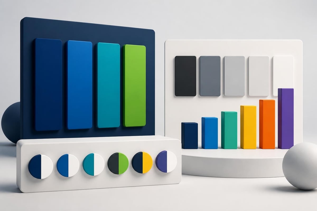
Effective presentations employ limited color palettes-typically three to five colors total. This constraint prevents visual chaos while providing sufficient variation for different content types.
A strategic color palette includes:
- Primary brand color for headlines, key graphics, and brand elements
- Secondary brand color for supporting graphics and accents
- Neutral colors (grays, off-whites) for backgrounds and body text
- Data visualization colors that provide sufficient contrast for charts and graphs
- Accent color for calls-to-action or critical information highlights
The University of New South Wales design tips emphasize considering color accessibility. Approximately 8% of men and 0.5% of women have some form of color vision deficiency, making certain color combinations indistinguishable. Avoid relying solely on red-green distinctions to convey critical information.
Background and Contrast Considerations
Background color selections fundamentally shape presentation aesthetics and readability. While creative presentations might employ dark backgrounds or gradients, business contexts typically favor light backgrounds for several practical reasons.
Light backgrounds reduce eye strain during extended presentations and provide better visibility in various lighting conditions. They also accommodate printed handouts more economically, as printing dark backgrounds consumes excessive toner.
Contrast ratios between text and backgrounds must meet accessibility standards-ideally 7:1 for body text and 4.5:1 minimum for larger elements. Old Dominion University's presentation guidelines provide contrast checkers and tools for validating color combinations.
Data Visualization and Chart Design
For financial and tech presentations, data visualization often determines whether complex information resonates or confuses. The design on powerpoint presentation must transform spreadsheets and databases into clear visual narratives.
Selecting Appropriate Chart Types
| Data Relationship | Recommended Chart Type | Use Case |
|---|---|---|
| Comparison across categories | Bar chart | Revenue by product line, market share analysis |
| Trends over time | Line chart | Stock performance, user growth, quarterly metrics |
| Part-to-whole relationships | Pie chart (limited use) | Budget allocation, market composition |
| Correlation between variables | Scatter plot | Risk-return analysis, feature adoption patterns |
| Distribution analysis | Histogram | Customer segments, response time distributions |
Each chart type communicates specific relationships. Using inappropriate visualizations obscures rather than clarifies patterns. Creative pitch deck design often involves transforming standard Excel charts into custom visualizations that align with brand aesthetics while improving clarity.
Chart Design Best Practices
Standard PowerPoint chart defaults rarely produce publication-quality visualizations. Professional design on powerpoint presentation requires customization to enhance readability and visual appeal.
Essential chart refinements include:
- Removing unnecessary gridlines that create visual clutter
- Simplifying axis labels to show only relevant increments
- Using direct labeling instead of legends when possible
- Applying brand colors strategically to highlight key data points
- Increasing font sizes for comfortable viewing from distance
Data-to-ink ratio-the proportion of chart elements dedicated to actual data versus decorative features-should be maximized. Every visual element should serve a functional purpose or be eliminated.
The 2026 PowerPoint design trends highlight increasing sophistication in data storytelling, with presenters moving beyond basic charts toward interactive dashboards and animated data reveals that build narratives progressively.
Visual Elements: Photography, Icons, and Graphics
Strategic imagery elevates design on powerpoint presentation from functional to memorable. However, visual elements must serve specific communication purposes rather than simply decorating slides.
Photography Selection and Usage
Professional photography creates emotional connections and contextualizes abstract concepts. For business presentations, image selection criteria include:
- Relevance: Images must directly support slide content
- Quality: High-resolution, professionally composed photographs only
- Authenticity: Avoid clichéd stock photos that undermine credibility
- Diversity: Ensure visual representation reflects actual stakeholder demographics
- Brand alignment: Imagery should match overall aesthetic and values
Financial presentations benefit from abstract photography-architectural details, textures, patterns-that suggests concepts like stability, growth, or innovation without literal interpretation. Tech presentations might incorporate product screenshots, interface designs, or technology-focused imagery.
When incorporating photographs, consider composition interaction with text overlays. Ensure sufficient contrast between image elements and text, potentially using gradient overlays or darkening filters to maintain readability.
Icons and Graphic Elements
Icons provide visual shorthand for concepts, making complex ideas immediately recognizable. However, icon usage requires consistency and restraint.
Icon implementation guidelines:
- Use single style system (outlined, filled, or flat) throughout presentation
- Maintain consistent sizing relative to text and other elements
- Apply icons meaningfully, not decoratively
- Ensure cultural appropriateness and universal recognition
- Limit to 3-5 icons per slide maximum
Custom icon sets aligned with brand guidelines create distinctive visual identities. For companies working extensively with presentations, developing proprietary icon libraries ensures consistency across all materials while reinforcing brand recognition.
Mastering Slide Templates and Master Slides
Efficient design on powerpoint presentation requires leveraging PowerPoint's template and master slide functionality. These tools ensure consistency while dramatically reducing design time.
Building Custom Templates
PowerPoint templates define default layouts, fonts, colors, and placeholders for new presentations. Custom templates embedding brand guidelines ensure every presentation maintains organizational standards automatically.
Template components include:
- Master slide defining overall design framework
- Layout variants for different content types (title slides, content slides, data slides)
- Pre-formatted chart templates with brand colors
- Custom placeholder text with appropriate formatting
- Footer information with branding elements
Slide deck templates designed for specific industries or use cases provide starting points that reduce design time while ensuring professional results. Financial templates might include specialized layouts for financial statements, while tech templates could feature layouts optimized for product demonstrations or technical architectures.
Working with Master Slides
Master slides control inherited formatting across presentation layouts. Changes made at the master level cascade automatically throughout the presentation, enabling instant global updates.
This functionality proves invaluable when clients request brand updates mid-project. Modifying colors, fonts, or logos at the master level updates every slide simultaneously, eliminating tedious manual corrections.
Understanding master slide hierarchy-master slide, layout masters, and individual slides-allows sophisticated design control. Elements placed on the master appear on all slides, while layout-specific elements appear only on slides using that layout.

Animation and Transition Strategy
While animation capabilities have improved significantly, design on powerpoint presentation must employ motion purposefully rather than gratuitously. Excessive animation distracts from content and undermines professional credibility.
Purposeful Animation Applications
Strategic animation serves three primary functions in business presentations:
Progressive disclosure reveals complex information incrementally, preventing cognitive overload. Rather than displaying a complete process diagram immediately, animation builds the workflow step-by-step, allowing audiences to process each component before adding the next.
Emphasis draws attention to critical data points or key conclusions. A subtle grow animation on quarterly revenue figures or a brief color pulse on positive trend indicators guides viewer focus without overwhelming.
Transitions between major sections signal narrative shifts and maintain engagement. However, transitions should remain subtle-simple fades or cuts rather than elaborate wipes or spins that distract from content.
Animation Timing and Pacing
Animation speed significantly impacts effectiveness. PowerPoint's default timings often prove too fast for business contexts where audiences need time to process information.
Recommended timing parameters:
- Object entrances: 0.5-1.0 seconds
- Emphasis effects: 0.3-0.5 seconds
- Exit animations: 0.3-0.7 seconds
- Slide transitions: 0.4-0.6 seconds
Automated timing presents risks in live presentations where speaker pacing varies. Manual advancement provides control, allowing presenters to synchronize animations with verbal explanations naturally.
Accessibility Considerations in Presentation Design
Professional design on powerpoint presentation must accommodate diverse audience needs, including individuals with visual, auditory, or cognitive disabilities. Accessible design isn't just ethical-it often improves usability for all viewers.
Visual Accessibility
Beyond color contrast ratios mentioned earlier, visual accessibility involves multiple design considerations:
- Alternative text for images enables screen readers to describe visual content
- Font choices that avoid easily confused characters (like "l" and "1")
- Sufficient sizing ensuring readability without magnification
- Logical reading order that screen readers can follow coherently
- Clear language avoiding unnecessary jargon or complex terminology
PowerPoint's built-in accessibility checker identifies common issues, though it doesn't catch every potential problem. Manual review from an accessibility perspective reveals additional opportunities for improvement.
Cognitive Accessibility
Information architecture affects how easily audiences process and retain content. Cognitive accessibility principles align closely with general design best practices:
- One concept per slide prevents information overload
- Consistent layouts reduce cognitive load by establishing predictable patterns
- Clear headings and subheadings create navigable information structures
- Logical sequencing moves from simple to complex or general to specific
- Sufficient processing time between transitions allows comprehension
These principles prove especially important for technical presentations where complex concepts already challenge comprehension. Reducing extraneous cognitive demands through thoughtful design allows audiences to focus mental resources on understanding content rather than decoding presentation structure.
Advanced Techniques for Professional Polish
Sophisticated design on powerpoint presentation employs advanced techniques that separate exceptional work from merely adequate presentations.
Custom Graphics and Data Visualizations
While PowerPoint provides robust charting capabilities, custom graphics created in specialized tools often communicate more effectively. Financial presentations might benefit from custom infographics created in Adobe Illustrator, while tech presentations could incorporate product mockups from Figma or Sketch.
These external graphics, when imported as high-resolution images or vector files, maintain quality at any size while providing design flexibility beyond PowerPoint's native tools. Infographic design for executives demonstrates how custom visualizations transform complex data into immediately comprehensible narratives.
Consistency Across Presentation Suites
Organizations typically require multiple presentation types-pitch decks, sales presentations, board reports, conference talks-each serving different purposes but sharing brand identity. Creating design systems that maintain consistency while allowing appropriate variation requires strategic planning.
Design system components include:
| Element | Standard Specification | Variation Allowance |
|---|---|---|
| Color palette | Strict brand colors only | Accent colors for specific contexts |
| Typography | Primary and secondary fonts | Weight variations for emphasis |
| Layout grid | Consistent margin and column system | Content-specific arrangements within grid |
| Photography style | Defined aesthetic guidelines | Subject matter varies by topic |
| Icon style | Single consistent system | Custom icons for specialized concepts |
This systematic approach ensures cybersecurity pitch decks and fintech presentations maintain family resemblance while addressing their distinct audiences appropriately.
Quality Control and Review Processes
Professional design on powerpoint presentation requires rigorous quality control before delivery. Even minor errors undermine credibility and distract from messaging.
Comprehensive review checklist:
- Spell-check and grammar review for all text content
- Data accuracy verification against source materials
- Consistent formatting across all slides
- Image resolution appropriate for intended display method
- Animation functionality across different systems
- File compatibility with client equipment
- Brand guideline compliance throughout
- Accessibility standards met comprehensively
Testing presentations on actual presentation equipment-not just development computers-reveals potential issues with font substitution, color rendering, or animation performance that could disrupt live delivery.
Platform Considerations and Future Trends
While this article focuses on PowerPoint specifically, understanding the broader presentation ecosystem helps inform design decisions. The design on powerpoint presentation must sometimes accommodate cross-platform compatibility or integration with other tools.
PowerPoint Alternatives and Complementary Tools
Some organizations use Google Slides for collaborative features, Apple Keynote for Mac-centric workflows, or specialized tools like Prezi for non-linear presentations. When clients may view or edit presentations in different applications, design choices should prioritize compatibility.
Basic formatting-fonts, colors, layouts-generally transfers between platforms, though complex animations or custom fonts may require adjustment. Providing presentations in multiple formats (PPTX, PDF, video) ensures accessibility regardless of recipient's preferred platform.
The emergence of AI-powered design assistants and automated layout tools represents significant industry evolution. Research on presentation authoring frameworks explores how technology might streamline design processes while maintaining quality standards.
Mobile and Remote Presentation Considerations
Increasingly, presentations are viewed on mobile devices or shared asynchronously rather than presented live. This shift affects design priorities:
Mobile-optimized design principles:
- Larger text sizes ensuring readability on smaller screens
- Simplified layouts that translate to vertical orientations
- Reduced animation reliance as mobile playback may not support all effects
- Self-contained slides that communicate effectively without narration
- Shorter overall length accommodating shorter attention spans
Remote presentations via video conferencing platforms introduce additional constraints. Screen sharing reduces visual quality, making clarity and contrast even more critical. Presenters can't rely on room lighting control or projection quality, necessitating designs that perform well in various conditions.
Mastering design on powerpoint presentation requires understanding visual communication principles, technical proficiency with PowerPoint's capabilities, and strategic thinking about audience needs and business objectives. The difference between average and exceptional presentations often determines whether critical initiatives receive funding, whether prospects become customers, and whether ideas gain organizational traction. Prznt Perfect specializes in transforming complex financial and technical concepts into visually compelling narratives that drive business results, combining creative expertise with deep understanding of what resonates with sophisticated stakeholders.


- This is some text inside of a div block.lay out the facts clearly and compellingly. Use data to establish the ground reality, but remember that facts alone are like the individual strands of a tapestry—necessary but not complete.lay out the facts clearly and compellingly. Use data to establish the ground reality, but remember that facts alone are like the individual strands of a tapestry—necessary but not complete.
- This is some text inside of a div block.lay out the facts clearly and compellingly. Use data to establish the ground reality, but remember that facts alone are like the individual strands of a tapestry—necessary but not complete.

.png)
