
Design for Power Point: Professional Guide for 2026

Creating exceptional presentations demands more than simply placing text on slides. Design for power point has evolved into a strategic discipline that combines visual communication principles, brand identity, and audience psychology. For financial and tech businesses competing in high-stakes environments, presentation design directly impacts funding decisions, client acquisitions, and market positioning. Understanding the fundamental principles and advanced techniques of presentation design separates forgettable slide decks from compelling visual narratives that drive business outcomes.
Strategic Foundation of Presentation Design
Effective design for power point begins with understanding your audience and objectives before opening the software. Financial executives require different visual approaches than technology innovators, while investor pitch decks demand distinct structures from client proposals. This strategic foundation shapes every design decision that follows.
Audience analysis should address:
- Decision-making authority and information needs
- Technical expertise and industry familiarity
- Time constraints and attention patterns
- Cultural preferences and visual expectations
The University of Texas System emphasizes the importance of slide format and content organization as foundational elements that support message clarity. Without proper planning, even beautifully designed slides fail to achieve their communication objectives.
Defining Clear Objectives
Every presentation must serve specific business goals. Whether securing investment, winning client contracts, or communicating quarterly results, these objectives dictate design choices. A professional powerpoint approach aligns visual elements with strategic outcomes rather than aesthetic preferences alone.
| Presentation Type | Primary Objective | Design Priority |
|---|---|---|
| Investor Pitch | Secure Funding | Credibility & Clarity |
| Sales Deck | Win Contract | Value Proposition |
| Quarterly Review | Inform Stakeholders | Data Visualization |
| Product Launch | Generate Excitement | Visual Impact |

Visual Hierarchy and Layout Principles
Design for power point relies heavily on establishing clear visual hierarchy that guides audience attention. The human eye processes visual information in predictable patterns, and effective designers leverage these patterns to control information flow. Size, color, contrast, and positioning work together to create slides that communicate instantaneously.
McGill University provides comprehensive guidelines for designing PowerPoint slides that emphasize clarity and strategic visual use. Their research demonstrates that audiences retain information better when presentations follow consistent visual patterns.
Grid Systems and Alignment
Professional presentations employ invisible grid systems that create visual order. Rather than placing elements arbitrarily, designers align content to consistent horizontal and vertical guides. This systematic approach produces slides that feel balanced and professional, even when containing diverse content types.
The most effective grid systems for business presentations include:
- Three-column layouts for feature comparisons or process flows
- Two-column asymmetric grids balancing text with supporting visuals
- Centered single-column formats for high-impact statements
- Modular grids accommodating complex data visualizations
Consistency across slides reinforces brand identity while reducing cognitive load. When audiences encounter familiar layout patterns, they process information faster and retain key messages longer. This principle becomes particularly important in contemporary powerpoint templates designed for repeated use across multiple presentations.
Typography for Readability and Impact
Font selection significantly impacts presentation effectiveness. Design for power point requires balancing readability with brand personality, choosing typefaces that remain clear at various viewing distances while reinforcing company identity. Sans-serif fonts typically perform better in presentation contexts than serif alternatives.
Essential typography guidelines:
- Minimum 24-point font size for body text
- Maximum two font families per presentation
- Adequate line spacing (1.2-1.5 line height)
- High contrast between text and background
- Bold weights for emphasis rather than underlining
Old Dominion University highlights consistency in font choices as critical for maintaining professional appearance throughout presentations. Inconsistent typography signals lack of attention to detail, undermining presenter credibility.
Color Psychology and Brand Integration
Color choices in presentation design communicate beyond aesthetic appeal. Different colors trigger specific emotional and psychological responses, influencing how audiences perceive information and presenters. Financial presentations benefit from blues and grays suggesting stability and trustworthiness, while technology companies often leverage vibrant palettes conveying innovation.
Strategic Color Application
Effective design for power point employs color purposefully rather than decoratively. Every color should serve a specific function: directing attention, categorizing information, or reinforcing brand identity. Excessive color variety creates visual chaos, while strategic limitation produces clarity.
| Color Function | Application | Example Use |
|---|---|---|
| Primary Brand | Headings, key elements | Company logo color |
| Secondary Accent | Highlights, CTAs | Complementary shade |
| Neutral Base | Backgrounds, body text | Whites, grays |
| Data Visualization | Charts, graphs | Distinct palette |
The University of New South Wales provides design tips emphasizing simplicity and appropriate visual use, noting that restrained color palettes typically outperform elaborate schemes in professional contexts. This principle aligns with modern minimalist design trends dominating corporate communications.
Accessibility Considerations
Professional presentations must accommodate diverse audience needs, including color vision deficiencies. Design for power point requires ensuring sufficient contrast ratios between text and backgrounds, avoiding color as the sole information carrier, and testing presentations for accessibility compliance.
The City of Tampa's guidelines address text readability and color contrast specifically for video presentations, principles equally applicable to live presentations. These standards ensure presentations communicate effectively regardless of viewing conditions or audience capabilities.

Data Visualization Excellence
Financial and technology businesses frequently present complex quantitative information requiring sophisticated visualization approaches. Design for power point transforms raw data into clear, actionable insights through charts, graphs, and infographics that reveal patterns and trends. Poor data visualization obscures meaning, while excellent visualization illuminates truth.
Choosing Appropriate Chart Types
Different data relationships demand specific visualization formats. Comparing values requires different charts than showing trends over time or illustrating proportions. Understanding these relationships ensures audiences grasp insights immediately rather than struggling to decode inappropriate visualizations.
Chart selection guide:
- Bar charts: Comparing discrete categories or values
- Line graphs: Showing trends and changes over time
- Pie charts: Illustrating proportions (limited to 5-6 segments)
- Scatter plots: Revealing correlations between variables
- Heat maps: Displaying complex multi-variable data
A case study slide design approach demonstrates how professional designers select and customize visualizations to support specific narrative goals. The same data can tell different stories depending on visualization choices and design execution.
Simplifying Complex Information
Design for power point often involves distilling intricate financial models or technical specifications into digestible visual formats. This simplification process requires understanding the core message rather than presenting every available data point. Strategic omission proves as important as thoughtful inclusion.
Best practices for data simplification include removing unnecessary gridlines, limiting color variety within charts, labeling data points directly rather than relying on legends, and using annotations to highlight key insights. The University of Nebraska emphasizes simplicity and effective white space use as critical factors in presentation clarity.
Template Development and Customization
Professional organizations benefit enormously from developing custom presentation templates that codify brand standards while accelerating creation workflows. Design for power point templates establishes consistent visual language across all company communications, from investor relations to sales enablement materials.
Building Master Slide Systems
Microsoft PowerPoint's master slide functionality enables designers to create comprehensive template systems controlling every aspect of presentation appearance. These systems include title slides, content layouts, section dividers, and specialized formats for data visualization. Understanding layout for ppt master slide architecture empowers organizations to maintain brand consistency effortlessly.
Effective master slide systems incorporate:
- Multiple layout variations accommodating diverse content types
- Placeholder formatting ensuring consistent text styling
- Brand color palettes accessible through theme colors
- Custom fonts embedded for cross-platform compatibility
- Reusable graphic elements like dividers and icons
Microsoft Support offers guidance on creating custom templates optimized for PowerPoint Designer, enabling organizations to leverage artificial intelligence features while maintaining brand integrity. This integration of automation with customization represents the future of presentation design.
Template Flexibility and Constraints
The most successful design for power point templates balance consistency with flexibility. Overly restrictive templates frustrate users and encourage workarounds that undermine brand standards. Conversely, excessive flexibility produces inconsistent presentations that dilute brand impact.
Professional template systems provide multiple approved layout options rather than forcing all content into identical formats. This variety accommodates different communication needs while maintaining visual coherence through shared design elements, color palettes, and typographic systems.
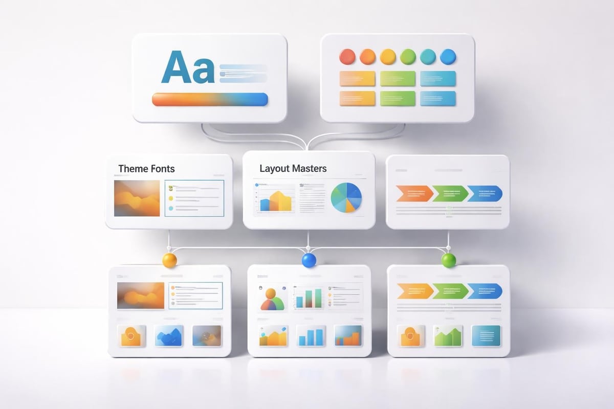
Image Selection and Integration
Visual imagery powerfully reinforces messages, evokes emotions, and maintains audience engagement throughout presentations. Design for power point requires strategic image selection aligned with brand positioning and message goals. Generic stock photography undermines credibility, while authentic, relevant imagery strengthens presenter authority.
Professional Photography Standards
Financial and technology presentations benefit from high-quality photography that reflects industry professionalism. Images should feature appropriate resolution (minimum 1920x1080 pixels), proper exposure and color balance, and subjects relevant to presentation content. Blurry, pixelated, or poorly composed images damage presenter credibility more effectively than no images at all.
Image quality checklist:
- Resolution sufficient for projection without pixelation
- Consistent color grading across all presentation images
- Professional composition following rule of thirds
- Appropriate subject matter supporting key messages
- Licensing cleared for commercial presentation use
Hillsborough Community College provides best practices for PowerPoint design including template and background selection guidelines that emphasize maintaining consistent visual themes. These principles extend to photographic selections throughout presentations.
Illustration and Icon Systems
Abstract concepts often communicate more effectively through illustrations or icons than photography. Financial metrics, technology processes, and strategic frameworks particularly benefit from custom illustration systems that simplify complexity while maintaining visual interest. A power point designer approach incorporates cohesive icon libraries that establish visual language across presentation series.
Effective icon systems share consistent line weights, corner radiuses, and stylistic approaches. Mixing illustration styles within single presentations creates visual discord that distracts from content. Professional designers develop or license comprehensive icon sets ensuring every concept receives appropriate visual representation.
Animation and Transition Strategy
Motion in presentations serves functional purposes: revealing information progressively, emphasizing key points, and maintaining audience attention. However, design for power point animation requires restraint and purpose. Excessive or inappropriate animation distracts from messages rather than supporting them.
Purposeful Animation Applications
Strategic animation builds narrative momentum by controlling information revelation timing. Complex diagrams benefit from sequential builds that introduce elements progressively rather than overwhelming audiences with complete graphics. Data visualizations gain impact through animated builds revealing insights step-by-step.
Appropriate animation uses include:
- Fade transitions between major presentation sections
- Wipe effects revealing chart data progressively
- Emphasis animations drawing attention to critical information
- Path animations illustrating processes or workflows
- Morph transitions showing transformations or comparisons
Inappropriate animations include spinning text, bouncing bullets, or decorative effects lacking functional purpose. These distract rather than enhance, undermining presenter professionalism. The principle of purposeful restraint separates amateur from professional presentation design.
Timing and Pacing Considerations
Animation timing significantly impacts presentation flow and audience comprehension. Transitions occurring too quickly prevent information processing, while excessively slow animations waste precious presentation time. Design for power point requires calibrating animation duration to content complexity and audience sophistication.
Standard animation durations range from 0.3 seconds for simple fades to 1.5 seconds for complex morphs or path animations. Coordinating animation timing with verbal delivery ensures visual and auditory information reinforce rather than compete with each other.
Responsive Design for Multiple Contexts
Modern presentations appear across diverse contexts: projected in conference rooms, viewed on tablets during meetings, or distributed as standalone documents. Design for power point must accommodate these varying consumption patterns while maintaining effectiveness across contexts.
Screen Size Optimization
Different viewing contexts demand different design considerations. Projected presentations prioritize large text and bold graphics visible from distance, while screen-based viewing permits finer details and smaller text. Professional designers develop presentation versions optimized for specific delivery contexts rather than assuming one-size-fits-all approaches.
| Viewing Context | Minimum Font Size | Design Priority |
|---|---|---|
| Large Projection | 28-32pt | High Contrast |
| Conference Room | 24-28pt | Balanced Detail |
| Laptop Screen | 18-24pt | Information Density |
| Tablet Viewing | 20-24pt | Touch Navigation |
Organizations frequently create presentation variants: detailed versions for document distribution and simplified versions for live delivery. This dual-track approach ensures optimal effectiveness across consumption patterns without compromise.
Print and Digital Distribution
Some presentations transition from slides to printed handouts or PDF documents, requiring design considerations beyond screen display. Text sizing, color choices, and layout arrangements that work brilliantly on screens may fail in print formats. Design for power point addressing multiple output formats considers these requirements from project inception.
Printed presentations benefit from higher contrast ratios, larger margins for binding, and footnote systems for URL references. Digital distributions require embedded fonts, optimized file sizes, and navigation systems supporting non-linear access patterns.
Brand Consistency and Visual Identity
Presentations function as brand ambassadors, extending organizational identity into stakeholder interactions. Design for power point must reflect and reinforce brand values, visual standards, and market positioning established across other communication channels. Inconsistent presentation design undermines brand equity built through marketing investments.
Implementing Brand Guidelines
Comprehensive brand guidelines specify approved colors, typography, imagery styles, and graphic treatments applicable to presentations. Professional presentation design translates these broader guidelines into PowerPoint-specific applications, ensuring every slide reflects brand identity accurately.
Effective brand implementation includes creating approved color palettes within PowerPoint theme colors, installing and embedding brand fonts, developing icon libraries matching brand illustration styles, and establishing photography standards aligned with marketing materials. This systematic approach maintains consistency without requiring extensive design expertise from every presenter.
Balancing Creativity and Compliance
While brand consistency remains critical, rigid adherence to templates can produce monotonous presentations lacking impact. Design for power point requires finding the balance between recognizable brand identity and fresh creative execution that maintains audience engagement. Exploring ppt new design approaches within brand parameters keeps presentations contemporary and compelling.
Professional designers achieve this balance by establishing flexible systems rather than rigid templates, defining brand essence rather than prescriptive rules, and encouraging creative interpretation within defined parameters. This approach produces presentations that feel fresh while remaining unmistakably branded.
Industry-Specific Considerations
Financial and technology sectors present unique presentation design challenges requiring specialized approaches. These industries deal with complex information, sophisticated audiences, and high-stakes outcomes where presentation quality directly impacts business results.
Financial Presentation Requirements
Financial presentations demand absolute accuracy, clear data visualization, and credibility-building design choices. Audiences include investors, regulators, and financial professionals who scrutinize every detail. Design for power point in financial contexts prioritizes clarity over creativity, ensuring numbers tell accurate stories without distortion.
Financial presentation best practices include using consistent formatting for numerical data, clearly labeling axes and data sources, avoiding decorative chart elements that obscure information, and maintaining conservative design aesthetics that reinforce trustworthiness. A marketing presentation ppt for financial services differs significantly from technology sector approaches.
Technology and Innovation Presentations
Technology presentations showcase cutting-edge solutions, complex technical concepts, and future-oriented visions requiring different design approaches. These presentations benefit from modern aesthetics, sophisticated visualization techniques, and creative elements that reinforce innovation positioning.
Technology presentation design often incorporates dark backgrounds with vibrant accents, abstract geometric patterns suggesting digital environments, animated demonstrations of product functionality, and technical diagrams illustrating architecture or processes. Understanding how to adapt design for power point to sector expectations determines presentation effectiveness.
Mastering design for power point transforms presentations from information delivery vehicles into powerful business tools that influence decisions and drive outcomes. By applying strategic design principles, maintaining brand consistency, and tailoring approaches to specific audiences and industries, organizations create presentations that command attention and inspire action. Prznt Perfect specializes in elevating financial and tech business presentations through expert design, visual storytelling, and strategic communication approaches that turn complex information into compelling narratives that resonate with stakeholders and achieve measurable business results.


- This is some text inside of a div block.lay out the facts clearly and compellingly. Use data to establish the ground reality, but remember that facts alone are like the individual strands of a tapestry—necessary but not complete.lay out the facts clearly and compellingly. Use data to establish the ground reality, but remember that facts alone are like the individual strands of a tapestry—necessary but not complete.
- This is some text inside of a div block.lay out the facts clearly and compellingly. Use data to establish the ground reality, but remember that facts alone are like the individual strands of a tapestry—necessary but not complete.

