
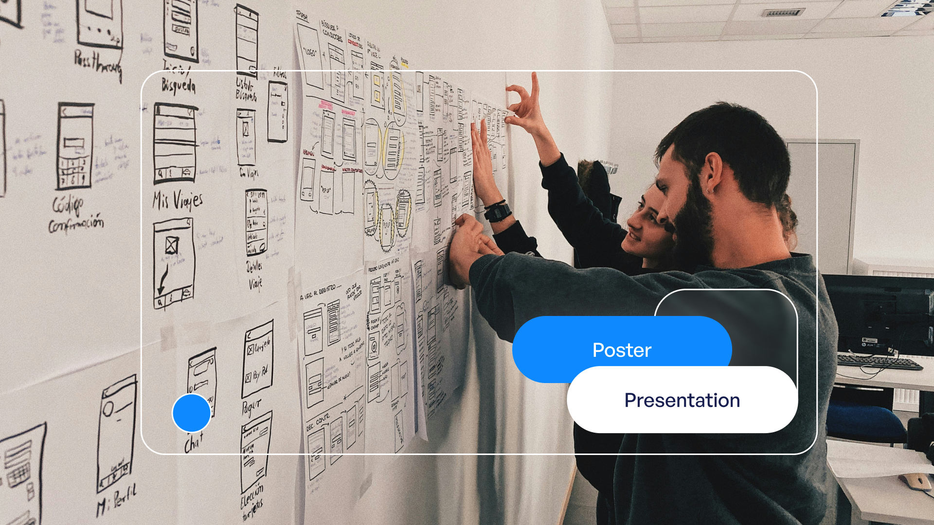
Design for Poster Presentation: Creating Impactful Visuals
Creating an effective design for poster presentation requires a strategic approach that balances visual appeal with clear communication. Whether you're presenting groundbreaking research at an academic conference or showcasing innovative solutions at a tech symposium, your poster serves as a visual gateway to complex ideas. The difference between a poster that attracts engaged viewers and one that gets overlooked often comes down to thoughtful design decisions that prioritize clarity, hierarchy, and visual storytelling. In financial and tech sectors, where data complexity meets the need for immediate comprehension, mastering poster presentation design becomes essential for professionals who want their research and insights to make an impact.
Understanding the Fundamentals of Poster Presentation Design
The foundation of exceptional design for poster presentation starts with understanding your medium's unique constraints and opportunities. Unlike slide decks or digital presentations, posters must communicate effectively from distances ranging from three feet to fifteen feet away. This physical reality shapes every design decision you make.
Key considerations include:
Your poster competes for attention in crowded conference halls where dozens or hundreds of other presentations vie for viewer interest. The American Evaluation Association emphasizes that successful posters combine visual appeal with substantive content, creating an invitation for deeper conversation rather than simply displaying information.
Establishing Visual Hierarchy
Visual hierarchy guides viewers through your content in a logical sequence. Without clear hierarchy, viewers struggle to identify entry points and navigate your research or business insights effectively.
Primary elements include your title, which should occupy the top 10-15% of your poster space. Secondary elements encompass section headings, key findings, and data visualizations. Tertiary elements include supporting text, methodology details, and references.

Hierarchy LevelFont Size RangePurposeVisual WeightTitle72-96ptAttract from distanceHighestSection Headings36-48ptGuide navigationHighBody Text24-32ptConvey detailsMediumCaptions18-24ptExplain visualsLow
The spacing between elements matters as much as the elements themselves. White space provides visual breathing room and prevents cognitive overload, particularly important when presenting dense financial models or technical architectures.
Strategic Layout Planning for Maximum Impact
Layout selection dramatically influences how viewers engage with your poster content. The design for poster presentation must account for natural reading patterns while highlighting your most compelling findings or value propositions.
Traditional academic posters often follow a column-based structure with 3-4 vertical sections. However, modern approaches increasingly favor asymmetric layouts that create visual interest while maintaining clear information flow. For tech and financial presentations, consider layouts that mirror the logical progression of your argument or data story.
Grid Systems and Alignment
Professional designers use grid systems to maintain consistency and visual order. A well-constructed grid provides invisible structure that viewers subconsciously recognize as professional and trustworthy. Effective poster design tips emphasize that alignment along consistent gridlines creates cohesion even when incorporating diverse content types.
Grid best practices:
The same principles that guide PPT layout design apply to poster creation with adjustments for the static, large-format medium. Balance is crucial, ensuring that no single quadrant overwhelms others unless strategically justified.
Typography: The Foundation of Readability
Font choices directly impact whether viewers can comfortably read your poster from appropriate distances. The design for poster presentation demands larger type sizes than typical print materials, with readability taking absolute priority over aesthetic preferences.
Sans-serif fonts like Arial, Helvetica, or Calibri work best for poster body text because their clean letterforms maintain clarity at distance. Reserve serif fonts for titles where their traditional authority can enhance credibility without compromising legibility.
Font Pairing and Hierarchy
Limit your poster to two typeface families maximum. One font family for headings and another for body text creates sufficient visual variety without introducing chaos. Consistency in font usage signals professionalism and helps viewers quickly categorize information types.
Content TypeRecommended FontSize RangeStyle VariationsMain TitleBold Sans-serif72-96ptBold, All Caps OptionalSection HeadsSans-serif36-48ptBoldBody TextSans-serif24-32ptRegularData LabelsSans-serif20-28ptRegular or Semi-bold
Weight and style variations within a single font family provide hierarchy without multiplying typefaces. Bold weights draw attention to headings, while regular weights facilitate comfortable reading of longer text passages. The comprehensive poster presentation guidelines stress that readability should never be sacrificed for decorative font choices.

Color Strategy for Visual Communication
Color serves multiple purposes in design for poster presentation: attracting attention, organizing information, reinforcing brand identity, and supporting data visualization. Strategic color use distinguishes professional posters from amateur attempts.
Begin with a limited palette of 3-5 colors maximum. This constraint forces intentional choices and prevents the visual chaos that results from excessive color variation. Your palette should include one dominant color (60% of usage), one secondary color (30%), and accent colors (10%) for highlighting critical information.
Color psychology considerations:
Ensure sufficient contrast between text and backgrounds. Dark text on light backgrounds offers optimal readability, while reverse contrast (light text on dark backgrounds) works for limited areas but causes eye strain in extended reading. The NCDOT Research and Innovation Symposium guidelines recommend testing color combinations under various lighting conditions to ensure consistent legibility.
Color Coding for Information Architecture
Use color consistently to categorize information types. For example, all methodology sections might use blue headers, while results sections use green. This color coding helps viewers navigate your poster and locate specific information quickly, similar to how presentation cover design uses color to signal content themes.
Data Visualization Excellence
For tech and financial professionals, data visualization often constitutes the core of poster presentations. Transforming complex datasets into clear, compelling visuals requires both technical skill and design sensitivity.
Charts and graphs must be large enough that data labels remain readable from viewing distance. This typically means increasing standard chart sizes by 150-200% compared to report graphics. Simplify visualizations by removing unnecessary gridlines, reducing data series to essential comparisons, and using clear axis labels.
Choosing Appropriate Chart Types
Data RelationshipBest Chart TypeUsage GuidelinesTrends over timeLine chartLimit to 3-4 data seriesPart-to-wholePie or donut chartUse only for 5-6 categories maximumComparisonsBar chartHorizontal bars for long labelsCorrelationsScatter plotInclude trend line when relevantHierarchiesTreemap or sunburstEnsure labels remain readable
Annotations enhance data visualizations by directing attention to significant findings. Arrows, callout boxes, and highlighted data points help viewers extract key insights without extensive study. This approach mirrors the visual storytelling techniques used in professional company presentations adapted for the poster format.
Content Organization and Information Density
The design for poster presentation must balance comprehensive coverage with digestibility. Attempting to include every detail results in dense, uninviting posters that viewers avoid. Instead, think of your poster as a visual abstract that sparks conversation rather than a complete research paper.
Content prioritization framework:
Each section should answer a specific question viewers might have. Introduction sections address "Why does this matter?" Methods answer "How did you approach this?" Results show "What did you discover?" Conclusions explain "What should we do with this information?"

Text blocks should rarely exceed 75 words. Bullet points break information into scannable chunks that viewers can absorb quickly. The Texas A&M poster presentation guidelines recommend using active voice and present tense to create immediacy and engagement.
Graphics, Images, and Visual Elements
High-quality imagery elevates poster presentations from information displays to visual experiences. However, graphics must serve clear purposes rather than functioning as mere decoration.
Photography works best when it illustrates concepts, shows research subjects, or provides context that text cannot efficiently convey. All images should be high resolution (minimum 300 DPI at printed size) to prevent pixelation that undermines professional credibility.
Icons and Infographics
Icons condense complex concepts into recognizable visual shorthand. A cloud icon instantly communicates cloud computing, while a shield represents security. Use icon sets from a single family to maintain visual consistency, and ensure adequate sizing (minimum 0.5 inch square) for distance visibility.
Infographics combine text, data, and graphics to tell cohesive visual stories. They work particularly well for explaining processes, comparing alternatives, or showing relationships between system components. The key is maintaining simplicity while conveying accurate information.
Technical Specifications and Production Considerations
Understanding technical requirements prevents costly mistakes and ensures your design for poster presentation translates effectively to physical format. Standard academic poster sizes include 36" x 48" and 42" x 56", though poster preparation guidelines note that requirements vary by conference and venue.
Production checklist:
Resolution requirements differ dramatically from digital presentations. While screen graphics at 72 DPI appear crisp, printed posters require much higher resolution to prevent visible pixelation. Images and graphics should be at least 150-300 DPI at final printed size.
File Organization and Version Control
Maintain organized source files with clearly labeled layers and elements. This organization enables efficient revisions and adaptations for different venues or audiences. Similar to how professionals approach layout for PPT, systematic file management prevents errors and saves time during deadline pressures.
Branding and Professional Identity
For business posters at conferences, trade shows, or investor events, consistent branding reinforces organizational identity and professionalism. Your poster should align with broader corporate visual standards while adapting those standards for the poster medium.
Incorporate logos prominently but not obtrusively, typically in the header area alongside the title or in the footer with contact information. Use brand colors as foundation for your color palette, ensuring poster-specific selections maintain sufficient contrast and readability.
Typography should reflect brand guidelines while prioritizing the legibility requirements specific to poster presentations. If brand fonts lack the clarity needed at distance, select similar alternatives that maintain visual consistency while improving readability.
Testing and Refinement
Before finalizing your design for poster presentation, conduct thorough testing to identify improvements. Print your poster at 25-50% scale and view it from various distances. This scaled review reveals hierarchy problems, readability issues, and visual balance concerns that may not be apparent on screen.
Gather feedback from colleagues unfamiliar with your content. Can they identify your main finding in 30 seconds? Do they understand the logical flow without guidance? Fresh perspectives reveal assumptions you've made as the content expert but that general viewers won't share.
Testing protocol:
Make iterative refinements based on testing results. Small adjustments to spacing, sizing, or color can significantly improve overall effectiveness without requiring complete redesign.
Digital Adaptations and Multi-Channel Usage
In 2026, many conferences offer hybrid formats combining physical posters with digital displays or online viewing. Design for poster presentation now requires considering both printed and screen-based viewing contexts.
For digital displays, ensure your design works in both portrait and landscape orientations. Interactive elements like clickable sections or embedded video may enhance digital versions while remaining compatible with static printing requirements. Consider creating supplementary digital assets that extend your poster's reach beyond the physical venue.
QR codes bridge physical and digital experiences by linking poster viewers to detailed resources, video explanations, or contact forms. Position QR codes prominently with clear calls to action, typically in the conclusion or contact section. Test all QR codes before printing to ensure they direct to correct, active URLs.
Mastering design for poster presentation requires balancing aesthetic appeal with functional communication, ensuring your research or business insights make maximum impact in competitive conference environments. When you need poster presentations that combine rigorous visual strategy with stunning execution, Prznt Perfect transforms complex data and innovative concepts into compelling visual narratives that engage audiences and drive meaningful conversations. Our expertise in financial and tech presentations ensures your posters communicate with clarity and authority.


- This is some text inside of a div block.lay out the facts clearly and compellingly. Use data to establish the ground reality, but remember that facts alone are like the individual strands of a tapestry—necessary but not complete.lay out the facts clearly and compellingly. Use data to establish the ground reality, but remember that facts alone are like the individual strands of a tapestry—necessary but not complete.
- This is some text inside of a div block.lay out the facts clearly and compellingly. Use data to establish the ground reality, but remember that facts alone are like the individual strands of a tapestry—necessary but not complete.

