
Deck PPT: Mastering Professional Presentations in 2026
Creating a compelling deck ppt has become an essential skill for professionals in financial services and technology sectors. Whether you're pitching to investors, presenting quarterly results, or showcasing a new product, your presentation deck serves as the visual backbone of your message. The difference between a mediocre presentation and one that drives action often comes down to how effectively you structure information, apply design principles, and maintain audience engagement throughout your delivery.
Understanding the Modern Deck PPT Landscape
The term "deck ppt" refers to presentation slide decks created in PowerPoint or similar software platforms. These visual communication tools have evolved significantly beyond simple bullet points and clip art.
Today's professional presentations demand sophisticated design thinking, strategic content organization, and brand consistency. Financial institutions use presentation decks to communicate complex market analyses, while tech companies leverage them to explain intricate product architectures and growth strategies.
What Sets Professional Decks Apart
Key differentiators of effective presentation decks include:
- Strategic visual hierarchy that guides viewer attention
- Data visualization that transforms numbers into narratives
- Brand alignment that reinforces corporate identity
- Content clarity that eliminates confusion
- Design consistency across all slides
The gap between amateur and professional presentation design continues to widen. Organizations that invest in quality deck ppt development see measurable improvements in stakeholder engagement, investment outcomes, and internal alignment. When crafting pitch decks, the visual execution can be just as important as the underlying business model.
Design Principles That Drive Results
Effective deck ppt design requires understanding foundational principles that enhance comprehension and retention. Research consistently demonstrates that well-designed presentations improve information processing by up to 43% compared to text-heavy alternatives.
Visual Hierarchy and Layout Structure
Every slide in your deck should have a clear focal point. The human eye naturally follows certain patterns when scanning visual content, making strategic placement of elements critical for message delivery.
Layout considerations include:
- F-pattern scanning: Position critical information where viewers look first
- White space utilization: Allow breathing room around key concepts
- Alignment consistency: Maintain grid-based positioning throughout
- Size relationships: Use scale to indicate importance
The principles of slide deck design emphasize that every element should serve a purpose. Decorative components that don't enhance understanding create visual noise and dilute your message.
| Design Element | Purpose | Common Mistakes |
|---|---|---|
| Typography | Readability and hierarchy | Too many fonts, small sizes |
| Color Palette | Brand identity and emphasis | Clashing colors, poor contrast |
| Images | Emotional connection and context | Low resolution, generic stock photos |
| Data Charts | Simplify complex information | Overcomplicated graphs, missing labels |
Typography and Text Management
Font selection and text formatting significantly impact how audiences process your deck ppt content. Typography choices convey professionalism, establish brand personality, and affect readability across different viewing environments.
Selecting Appropriate Typefaces
Professional presentations typically employ two font families maximum. One serves display purposes for headlines and emphasis, while another handles body text and supporting information. Sans-serif typefaces like Helvetica, Arial, or custom corporate fonts work well for tech and financial presentations due to their clean, modern appearance.
Text hierarchy best practices:
- Headlines: 32-44 points for main titles
- Subheadings: 24-28 points for section breaks
- Body text: 18-24 points for readability
- Captions: 14-16 points for annotations
Avoid the temptation to fill slides with extensive text blocks. Each slide should communicate one primary idea with supporting details limited to essential points. When developing professional PowerPoint presentations, the goal is clarity over comprehensiveness.
Color Strategy for Business Presentations
Color choices in your deck ppt influence emotional responses, brand recognition, and information hierarchy. Financial and technology sectors often favor specific color palettes that convey trust, innovation, and stability.
Building Effective Color Schemes
Start with your corporate brand guidelines, then expand to include complementary colors for data visualization and emphasis. A well-structured color system includes primary brand colors, secondary accent colors, neutral backgrounds, and semantic colors for specific purposes like highlighting positive or negative trends.
The 60-30-10 rule provides a reliable framework: use your dominant color for 60% of the design, a secondary color for 30%, and an accent color for the remaining 10%. This creates visual balance while preventing color overload.
Professional services providers like Prznt Perfect specialize in developing custom color systems that align with brand identity while optimizing for various presentation contexts, from boardroom projectors to video conference platforms.

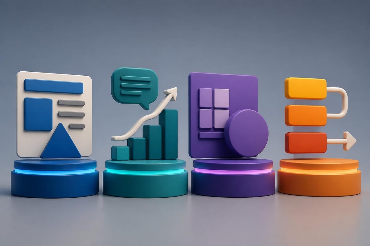
Data Visualization in Financial and Tech Decks
Transforming complex datasets into clear visual narratives represents one of the most challenging aspects of creating an effective deck ppt. Financial metrics, technology architectures, and market analyses require thoughtful visualization approaches that preserve accuracy while enhancing understanding.
Choosing the Right Chart Types
Different data relationships demand specific visualization formats. Time-series data works best with line charts, while comparative values suit bar charts. Proportional relationships shine in pie charts or treemaps, and correlations require scatter plots.
Chart selection guide:
| Data Type | Best Visualization | When to Use |
|---|---|---|
| Trends over time | Line chart | Showing growth, decline, or patterns |
| Comparisons | Bar or column chart | Comparing discrete categories |
| Composition | Pie, stacked bar, or area chart | Showing parts of a whole |
| Distribution | Histogram or box plot | Displaying data spread |
| Relationship | Scatter plot or bubble chart | Revealing correlations |
Simplify charts by removing unnecessary gridlines, limiting data series, and using color strategically to highlight key insights. The PowerPoint design strategies outlined by industry experts emphasize that every chart should answer a specific question without requiring extensive explanation.
Content Structure and Narrative Flow
A successful deck ppt tells a story rather than simply presenting disconnected facts. Strategic content organization guides audiences through your logic, builds credibility, and culminates in clear calls to action.
Building a Compelling Narrative Arc
Every presentation needs a beginning that establishes context, a middle that develops your argument, and an end that drives action. This structure applies whether you're pitching investors, reporting results, or proposing initiatives.
Standard deck structure:
- Opening: Problem statement or opportunity identification
- Context: Market landscape and competitive positioning
- Solution: Your approach or methodology
- Evidence: Supporting data and case studies
- Implementation: Timeline and resource requirements
- Conclusion: Next steps and decision points
For fintech presentation design, this narrative framework helps communicate regulatory compliance, market opportunity, and technical innovation in a coherent sequence that builds investor confidence.
Technical Considerations for Deck PPT Files
Beyond visual design, technical aspects of your presentation files affect reliability, collaboration, and delivery quality. File management, formatting consistency, and platform compatibility require attention to prevent last-minute complications.
File Organization and Master Slides
Proper use of PowerPoint master slides ensures consistency across your entire deck ppt. Master slides control default fonts, colors, logo placement, and layout templates. When team members create new slides, they automatically inherit these formatting rules, preventing visual inconsistencies.
File management best practices include:
- Embedding fonts to prevent substitution issues
- Compressing images to balance quality and file size
- Naming slides descriptively for easy navigation
- Maintaining a backup copy in cloud storage
- Testing playback on target presentation equipment
Version control becomes critical when multiple stakeholders contribute content. Establish clear naming conventions that include version numbers and dates. Cloud-based collaboration tools now enable real-time co-editing, though final presentations often benefit from a single designer ensuring visual consistency.
Advanced Design Techniques
Sophisticated deck ppt presentations incorporate techniques that elevate them beyond standard templates. Animation, transitions, and multimedia elements can enhance storytelling when applied judiciously.
Strategic Use of Animation
Animation should serve communication goals rather than showcasing software capabilities. Use motion to reveal information sequentially, demonstrate processes, or emphasize relationships between concepts.
Effective animation applications:
- Build complex diagrams step-by-step to prevent overwhelm
- Highlight specific data points within charts
- Show before-and-after transformations
- Create visual continuity between related slides
Avoid arbitrary effects like spinning text or bouncing bullets. The research-backed PowerPoint design tips consistently show that subtle, purposeful animations enhance retention while excessive motion creates distraction and cognitive load.

Template Selection and Customization
Starting with quality templates accelerates deck ppt development while maintaining professional standards. However, templates require customization to reflect your brand identity and specific content needs.
Evaluating Template Quality
Professional templates provide structured layouts, consistent styling, and placeholder content that demonstrates best practices. When selecting templates, assess typography quality, color flexibility, layout variety, and compatibility with your content types.
Organizations often maintain branded template libraries that ensure consistency across departments. These templates include approved color palettes, font selections, logo usage guidelines, and pre-formatted chart styles. Accessing professional PowerPoint design services can help establish these foundational assets.
| Template Feature | What to Look For | Red Flags |
|---|---|---|
| Layout Options | 15+ unique slide designs | Only title and content slides |
| Typography | Professional font pairings | Comic Sans or outdated fonts |
| Color Schemes | Editable color palettes | Hard-coded colors |
| Image Placeholders | High-quality example photos | Pixelated or stretched images |
Accessibility and Inclusive Design
Modern deck ppt development must consider diverse audiences, including those with visual impairments, color blindness, or other accessibility needs. Inclusive design principles benefit all viewers while ensuring compliance with corporate policies and legal requirements.
Implementing Accessible Design Features
Color alone should never convey critical information. Combine color coding with patterns, labels, or icons. Ensure sufficient contrast ratios between text and backgrounds, with a minimum ratio of 4.5:1 for normal text and 3:1 for large text.
Accessibility checklist:
- Add alt text descriptions to all images and charts
- Use descriptive link text instead of "click here"
- Structure content with proper heading hierarchy
- Ensure reading order follows logical sequence
- Test color schemes with colorblindness simulators
- Provide text alternatives for audio or video content
The comprehensive PowerPoint design guide emphasizes that accessible presentations demonstrate professionalism and consideration for all stakeholders.
Industry-Specific Considerations
Financial services and technology companies face unique presentation challenges that require specialized approaches to deck ppt development.
Financial Sector Requirements
Financial presentations demand precision, regulatory compliance, and credibility. Every data point must be accurate and properly sourced. Legal and compliance teams often review materials before external distribution.
Financial deck priorities:
- Clear disclosure of assumptions and limitations
- Consistent treatment of financial metrics
- Professional data visualization without manipulation
- Source attribution for market data
- Version control for regulatory documentation
Technology company presentations face different challenges, including explaining complex architectures to non-technical audiences, demonstrating product capabilities, and differentiating in crowded markets. Visual metaphors and simplified diagrams help bridge technical and business perspectives.
Collaboration and Review Processes
Creating effective deck ppt materials typically involves multiple stakeholders across different functions. Efficient collaboration processes prevent delays while maintaining quality standards.
Establishing Clear Workflows
Define roles for content creation, design execution, and review approval. Subject matter experts provide raw content and data, designers translate this into visual formats, and stakeholders review for accuracy and messaging alignment.
Collaboration best practices include:
- Kick-off meetings to align on objectives and audience
- Content outlines before design begins
- Staged reviews at 25%, 50%, and 90% completion
- Consolidated feedback to prevent conflicting revisions
- Final sign-off from designated decision-maker
Tools like shared cloud storage, version control systems, and project management platforms streamline these workflows. However, the human element remains critical, particularly for high-stakes presentations where messaging nuances matter significantly.
Platforms like FreelanceDEV can connect businesses with specialized developers and designers when internal resources lack specific technical expertise for interactive presentations or custom data visualization solutions.
Presentation Delivery Optimization
Even the most beautifully designed deck ppt falls flat without effective delivery. Optimizing files for various presentation contexts ensures consistent performance across different scenarios.
Adapting for Different Contexts
Boardroom presentations on large displays require different optimization than video conference screen shares or self-running kiosks. File resolution, transition timing, and content density should match the viewing environment.
For virtual presentations, test screen-sharing quality beforehand. Some compression algorithms reduce text clarity, particularly for small fonts or detailed charts. Increasing font sizes and simplifying visuals often improves virtual readability.
Context-specific considerations:
| Presentation Type | Optimization Focus | Key Adjustments |
|---|---|---|
| In-person boardroom | High-resolution graphics | Detailed data, subtle colors |
| Video conference | Screen-share clarity | Larger text, high contrast |
| Self-running display | Auto-advance timing | Minimal text, strong visuals |
| Printed handouts | Print-safe colors | Remove animations, check pagination |
Just as Pixilated Photo Booth optimizes photo experiences for different event types, professional presentations require context-appropriate customization to maximize impact and engagement.
Measuring Presentation Effectiveness
Evaluating deck ppt performance helps refine future presentations and justify design investments. While measuring presentation impact presents challenges, several metrics provide useful feedback.
Quantitative and Qualitative Metrics
Track outcomes directly attributable to presentations, such as investment secured, deals closed, or projects approved. These hard metrics demonstrate ROI but don't capture all value dimensions.
Qualitative feedback from audience surveys, stakeholder debriefs, and engagement observations provides context for improvement. Did audiences ask questions indicating confusion? Which slides generated the most discussion? Where did attention wane?
Measurement approaches:
- Post-presentation surveys measuring comprehension and persuasion
- Conversion rates for presentations with clear calls to action
- Time spent on each slide in recorded or virtual presentations
- Follow-up actions taken by audience members
- Stakeholder feedback on clarity and professionalism
For businesses evaluating strategic partnerships or acquisitions, platforms like Aligned IQ facilitate connections where compelling presentation materials can differentiate opportunities and demonstrate organizational sophistication.
Future Trends in Presentation Design
The deck ppt landscape continues evolving with technological advances, changing audience expectations, and new communication platforms emerging. Staying current with these trends maintains competitive advantage.
Emerging Technologies and Approaches
Artificial intelligence tools now assist with content generation, design suggestions, and automated formatting. While these technologies accelerate certain tasks, human judgment remains essential for strategic messaging and brand alignment.
Trends shaping presentation design:
- Interactive elements enabling audience participation
- Data connections allowing real-time metric updates
- Virtual and augmented reality presentation experiences
- Vertical formats optimized for mobile viewing
- Sustainability considerations reducing print materials
Recent research on pedagogical question generation from slide decks and multi-agent frameworks for academic presentations demonstrates how AI continues advancing presentation capabilities. However, the PPTArena benchmark research reveals that automated editing still requires human oversight for nuanced business contexts.
Professional career development, much like perfecting presentation skills, benefits from expert guidance. Services like John Logan's professional CV writing help individuals present their qualifications compellingly, applying similar principles of clarity and strategic communication.
Resources and Continuous Improvement
Developing deck ppt expertise requires ongoing learning and exposure to design excellence. Multiple resources support skill development for both designers and business professionals.
Building Your Design Knowledge
Study presentations from successful companies in your sector. Analyze what makes them effective rather than simply admiring aesthetics. Consider typography choices, information hierarchy, data visualization approaches, and narrative structures.
Learning resources include:
- Design principle guides and pitch deck design best practices
- Industry-specific presentation examples and case studies
- Design software tutorials and certification programs
- Professional conferences focusing on visual communication
- Peer feedback from colleagues and design communities
Maintain a collection of exemplary slides that inspire your work. Note what makes them effective and consider how similar approaches might apply to your content challenges. This ongoing observation develops your design intuition over time.
Mastering deck ppt creation requires balancing design excellence with strategic communication, technical proficiency with creative thinking. Whether you're developing investor pitches, quarterly reports, or product demonstrations, these principles elevate your presentations from adequate to exceptional. If you're looking to transform your business presentations into compelling visual narratives that drive results, Prznt Perfect specializes in creating impactful presentation designs for financial and tech companies, combining strategic thinking with visual excellence to help you achieve your communication objectives.


- This is some text inside of a div block.lay out the facts clearly and compellingly. Use data to establish the ground reality, but remember that facts alone are like the individual strands of a tapestry—necessary but not complete.lay out the facts clearly and compellingly. Use data to establish the ground reality, but remember that facts alone are like the individual strands of a tapestry—necessary but not complete.
- This is some text inside of a div block.lay out the facts clearly and compellingly. Use data to establish the ground reality, but remember that facts alone are like the individual strands of a tapestry—necessary but not complete.

