
Data Visualization for Presentations: Expert Guide 2026

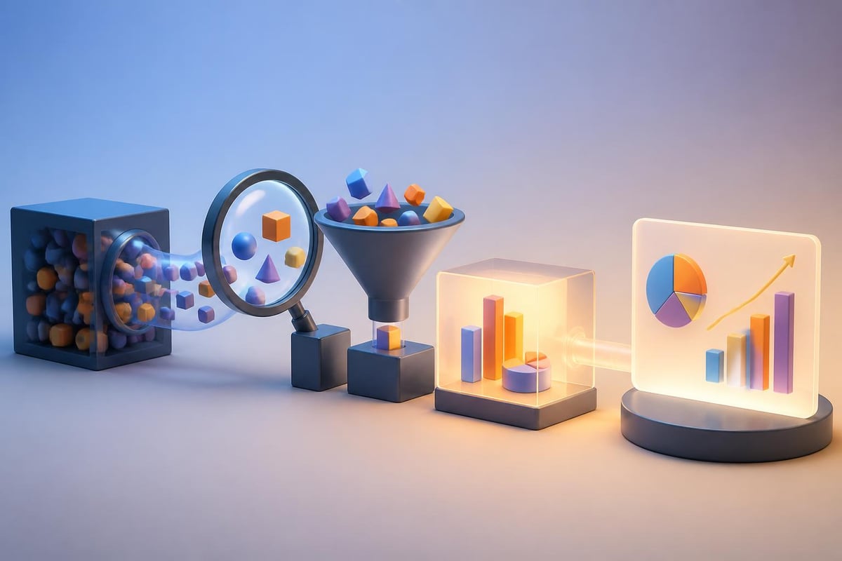
Business presentations live or die by how well they communicate complex information. When your audience includes investors, executives, or technical stakeholders, the ability to transform raw data into compelling visual narratives becomes mission-critical. Data visualization for presentations is not merely about creating attractive charts; it represents a strategic communication tool that bridges the gap between analytical complexity and audience comprehension. Financial services firms and technology companies especially require presentation designs that turn intricate datasets into actionable insights that drive decision-making and secure competitive advantages.
Understanding the Strategic Role of Visual Data Communication
Effective data visualization for presentations serves multiple strategic purposes within business communications. Beyond aesthetic appeal, well-designed visuals reduce cognitive load, accelerate comprehension, and increase information retention among diverse audiences.
Research from Michigan State University's Digital Experience Studio emphasizes the importance of establishing clear purpose and audience engagement before selecting visualization types. This principle proves particularly relevant for financial pitch decks and technical presentations where stakeholders bring varying levels of domain expertise.
Key Benefits for Business Presentations
Enhanced Comprehension: Visual representations process 60,000 times faster than text-based information. Complex financial models, growth projections, and market analyses become immediately accessible when presented through appropriate visual formats.
Increased Persuasiveness: Data-driven arguments gain credibility when supported by clear, professional visualizations. Investors and executives respond more favorably to presentations that demonstrate analytical rigor through compelling charts and graphs.
Improved Retention: Audiences remember approximately 80% of what they see compared to just 20% of what they read. Strategic visualization ensures key metrics and insights remain top-of-mind long after presentations conclude.
Selecting Appropriate Visualization Types for Different Data Stories
Choosing the right chart type represents perhaps the most critical decision in data visualization for presentations. Each visualization format communicates specific relationships, patterns, and insights more effectively than others.
| Visualization Type | Best Used For | Common Mistakes |
|---|---|---|
| Bar Charts | Comparing discrete categories, showing rankings | Using 3D effects, too many categories |
| Line Graphs | Displaying trends over time, continuous data | Inconsistent time intervals, multiple overlapping lines |
| Pie Charts | Showing parts of a whole (limited categories) | More than 5-6 segments, starting at positions other than 12 o'clock |
| Scatter Plots | Revealing correlations and distributions | Overcrowding with data points, missing trend lines |
| Heat Maps | Displaying intensity across multiple dimensions | Poor color choices, missing legends |
Matching Visualization to Communication Goals
Different business objectives require distinct visualization approaches. When presenting quarterly revenue growth to investors, line graphs clearly demonstrate trajectory and momentum. However, when illustrating market share distribution across competitors, horizontal bar charts provide immediate comparative context.
Purdue University's comprehensive guide outlines how design principles and ethical considerations intersect in creating effective visual communications. For financial presentations, this means ensuring visualizations never distort data through manipulated axes, truncated scales, or misleading proportions.
The technology sector frequently requires presentations that showcase multiple related metrics simultaneously. Dashboard-style layouts incorporating several complementary visualizations help stakeholders understand complex ecosystems at a glance while maintaining focus on primary insights.
Design Principles That Elevate Professional Presentations
Professional data visualization for presentations adheres to specific design principles that separate amateur attempts from executive-ready deliverables. These principles ensure clarity, accessibility, and visual impact across various presentation contexts.
The Data-Ink Ratio Principle
Pioneered by Edward Tufte, the data-ink ratio concept advocates maximizing the proportion of ink dedicated to actual data representation while eliminating decorative elements. Statspresso's best practices guide emphasizes maintaining high data-ink ratios to create impactful, easily interpretable visuals.
Practical applications include:
- Removing unnecessary gridlines that don't aid interpretation
- Eliminating redundant labels and legends
- Simplifying color schemes to essential distinctions
- Focusing attention on data points rather than chart containers
Color Strategy and Visual Hierarchy
Strategic color application guides audience attention toward critical insights while maintaining professional aesthetics. Financial presentations particularly benefit from consistent color coding that reinforces brand identity while highlighting performance indicators.
When working with professional PowerPoint presentations, color choices should align with established brand guidelines while ensuring accessibility. Colorblind-friendly palettes prevent excluding significant portions of audiences from fully comprehending presented data.
Typography and Readability Considerations
- Font Selection: Use sans-serif fonts for digital presentations ensuring legibility across screen sizes
- Size Hierarchy: Maintain consistent sizing with titles at 24-28pt, labels at 14-18pt, and annotations at 10-12pt
- Contrast Requirements: Ensure minimum 4.5:1 contrast ratios between text and backgrounds
- Number Formatting: Apply consistent decimal places, thousand separators, and currency symbols throughout
Accessibility and Inclusive Design Standards
Creating accessible data visualization for presentations ensures all stakeholders can engage with presented information regardless of visual, cognitive, or situational limitations. The University of Maryland, Baltimore County provides comprehensive guidelines on inclusive visualization design.
Essential Accessibility Features
Alternative Text Descriptions: Every chart requires descriptive alt text summarizing key trends and insights for screen reader users. Rather than generic descriptions, provide specific data points and relationships.
Pattern and Texture Supplementation: Never rely solely on color to convey information. Supplement color coding with patterns, textures, or direct labels ensuring colorblind audiences access complete information.
Sufficient Contrast Ratios: Beyond text contrast, ensure visual elements maintain distinguishability. Adjacent colors in charts should meet WCAG AA standards for graphical objects.
Modern presentation tools increasingly incorporate accessibility checkers, yet manual review remains essential. When developing company presentations, testing visualizations with various accessibility tools reveals potential barriers before stakeholder meetings.
Advanced Techniques for Financial and Technical Data
Financial services and technology companies face unique challenges presenting specialized data types. From complex financial models to technical performance metrics, advanced visualization techniques transform potentially overwhelming information into digestible narratives.
Financial Performance Visualization
| Metric Type | Recommended Visualization | Key Considerations |
|---|---|---|
| Revenue Growth | Combination line and bar charts | Show absolute values and percentage changes |
| Profit Margins | Waterfall charts | Illustrate contributing factors to final margins |
| Portfolio Performance | Small multiples or faceted charts | Enable comparison across multiple instruments |
| Cash Flow Analysis | Sankey diagrams | Visualize flow between categories over time |
Technical Metrics and System Performance
Technology presentations often require showcasing system performance, user engagement, or technical capabilities. Interactive elements, when appropriate for the presentation context, allow stakeholders to explore data dimensions relevant to their specific interests.
Software development firms like Brytend, which creates custom solutions, benefit from visualizations that demonstrate system architecture, performance benchmarks, and scalability metrics. These technical visualizations require balancing specificity with comprehensibility for mixed-technical audiences.
Storytelling Through Data Sequences
The most compelling data visualization for presentations doesn't present isolated charts but constructs coherent narratives through sequential visualization. This storytelling approach guides audiences through logical progressions from problem identification through proposed solutions.
Building Narrative Arc with Data
Establish Context: Begin with market overview or industry benchmarks establishing baseline understanding. Opening visualizations should orient audiences to the competitive landscape or operational environment.
Identify Challenges: Present data highlighting specific problems, gaps, or opportunities. Comparative visualizations excel at demonstrating performance gaps or market opportunities requiring attention.
Demonstrate Solutions: Show how proposed strategies address identified challenges through projected outcomes, pilot results, or case study data. Before-and-after comparisons or scenario modeling visualizations prove particularly effective.
Quantify Impact: Conclude data sequences with clear metrics demonstrating expected returns, improvements, or competitive advantages. Financial projections, ROI calculations, and timeline visualizations solidify business cases.
When crafting biotech pitch deck insights, this narrative structure helps investors understand scientific concepts, market opportunities, regulatory pathways, and financial projections through coordinated visual sequences.

Tools and Technology Selection
Selecting appropriate tools for creating data visualization for presentations depends on data complexity, update frequency, design flexibility requirements, and team technical capabilities. The presentation design landscape in 2026 offers robust options ranging from simplified templates to sophisticated custom development.
Native Presentation Software Capabilities
Microsoft PowerPoint: Offers built-in charting engines suitable for standard business visualizations with recent updates providing improved customization options and real-time data connections.
Google Slides: Provides cloud-based collaboration with integration to Google Sheets enabling dynamic data updates ideal for teams requiring simultaneous editing capabilities.
Apple Keynote: Delivers superior animation capabilities and refined aesthetic controls preferred for high-stakes executive presentations requiring polish and visual sophistication.
Specialized Visualization Platforms
- Tableau: Enterprise-grade analytics platform enabling complex interactive dashboards and advanced statistical visualizations
- Power BI: Microsoft's business intelligence solution integrating seamlessly with existing Microsoft ecosystems
- Flourish: Web-based platform offering animated and interactive visualizations with minimal technical requirements
- D3.js: JavaScript library providing complete customization control for organizations with development resources
Organizations increasingly explore how AI solutions for small businesses can automate visualization creation, update presentations with real-time data, and generate insights from complex datasets. Practical AI implementation in presentation workflows saves significant time while ensuring data accuracy and consistency.
Common Pitfalls and How to Avoid Them
Even experienced professionals encounter recurring challenges in data visualization for presentations. Recognizing and avoiding these pitfalls separates adequate presentations from exceptional stakeholder communications.
Chart Junk and Visual Clutter
Research published in academic journals examining chartjunk perspectives reveals how visual embellishments impact data interpretation. While some decorative elements can enhance memorability, excessive ornamentation obscures insights and reduces professional credibility.
Eliminate unnecessary elements:
- 3D effects that distort proportions and complicate interpretation
- Decorative backgrounds competing with data for attention
- Redundant gridlines creating visual noise without aiding comprehension
- Excessive animation distracting from content substance
Misleading Scale and Axis Manipulation
Ethical data presentation requires honest axis scaling and proportional representations. Truncated y-axes, inconsistent intervals, or dual-axis charts with mismatched scales can inadvertently (or intentionally) misrepresent trends and comparisons.
Johns Hopkins University's design guide emphasizes audience understanding and message clarity through appropriate visual encoding techniques. When presenting financial performance or market analysis, maintaining consistent scales across comparable charts ensures fair interpretation.
Information Overload
Attempting to communicate too many insights through single visualizations overwhelms audiences and dilutes key messages. Complex datasets require thoughtful decomposition into focused, sequential visualizations each communicating specific insights.
Simplification strategies include:
- Breaking complex analyses into multiple related charts
- Using progressive disclosure revealing detail as needed
- Highlighting primary insights while providing supporting context
- Employing small multiples for pattern comparison across categories
Integration with Overall Presentation Design
Data visualization for presentations exists within broader visual communication frameworks requiring cohesive design integration. Charts and graphs should complement rather than clash with overall presentation aesthetics, messaging hierarchy, and brand identity.
Visual Consistency Across Slide Decks
Professional presentations maintain consistent visual language throughout all slides. This extends beyond brand colors to encompass typography, spacing, alignment, and visual rhythm creating polished, executive-ready deliverables.
Organizations leveraging presentation outsourcing services benefit from design teams ensuring visual consistency while adapting visualizations to specific slide contexts and audience expectations.
Balancing Data with Narrative Content
Effective presentations integrate data visualizations with supporting narrative, strategic context, and audience-focused messaging. The ratio of data-heavy slides to explanatory content varies based on audience technical sophistication and presentation objectives.
Technical audiences appreciate detailed visualizations with comprehensive data points, while executive summaries require simplified, insight-focused charts emphasizing strategic implications over analytical minutiae. Understanding stakeholder preferences informs appropriate visualization complexity and density.
Testing and Refinement Processes
Creating exceptional data visualization for presentations requires iterative refinement based on stakeholder feedback, comprehension testing, and presentation context optimization. Few visualizations achieve optimal effectiveness in initial drafts.
Stakeholder Review Cycles
Internal Review: Share draft visualizations with colleagues representing diverse perspectives. Technical team members verify data accuracy while non-specialist reviewers confirm comprehensibility.
Client Collaboration: For agency-developed presentations, collaborative refinement ensures visualizations align with client preferences, brand guidelines, and strategic messaging priorities.
Audience Testing: When possible, preview visualizations with representative audience members gathering feedback on clarity, persuasiveness, and information retention.
Presentation Context Optimization
Visualizations performing well on desktop monitors may fail when projected in large conference rooms or viewed on mobile devices during virtual presentations. Testing across delivery contexts prevents last-minute surprises.
Environmental considerations include:
- Projection brightness affecting color visibility and contrast
- Screen resolution impacting text legibility and detail perception
- Virtual meeting compression affecting visual quality
- Print reproduction for handout materials requiring different specifications
Organizations can reference resources like Zoho's detailed guide which provides step-by-step approaches to incorporating visuals effectively and simplifying complex information for various presentation contexts.
Future Trends Shaping Presentation Data Visualization
The presentation design landscape continues evolving with emerging technologies, changing audience expectations, and advancing best practices. Staying current with trends ensures presentations remain competitive and engaging throughout 2026 and beyond.
Real-Time Data Integration
Modern stakeholders increasingly expect presentations incorporating live data feeds rather than static snapshots. API connections, database queries, and automated updates ensure presentations reflect current business conditions without manual revision.
Financial dashboards, operational metrics, and market intelligence presentations particularly benefit from real-time integration maintaining relevance throughout extended stakeholder engagements or recurring business reviews.
Interactive and Immersive Experiences
While traditional linear presentations remain standard, interactive elements allow audiences to explore data dimensions relevant to their specific interests. Clickable dashboards, filterable datasets, and drill-down capabilities transform passive viewing into active exploration.
Virtual and hybrid presentation formats accelerate adoption of interactive features. Tools enabling audience polling, collaborative annotation, and personalized data views enhance engagement across distributed teams.
AI-Assisted Visualization Creation
Artificial intelligence increasingly supports visualization creation through automated chart type selection, design optimization, and insight generation. These capabilities democratize professional-quality data presentation while accelerating development timelines.
However, human oversight remains essential. AI tools excel at pattern recognition and technical execution but lack strategic context, audience understanding, and creative judgment separating adequate visualizations from compelling narratives.
Educational Resources and Continued Learning
Professional development in data visualization for presentations requires ongoing education as tools evolve, audience expectations shift, and design best practices advance. Multiple high-quality resources support continuous skill development.
Academic research on visualization education identifies challenges and opportunities supporting diverse learner communities. Professional presenters benefit from engaging with both theoretical frameworks and practical application resources.
Recommended learning paths include:
- University-sponsored workshops and certification programs
- Industry conference sessions focusing on visual communication
- Online courses covering specific tools and techniques
- Professional communities sharing templates and best practices
Organizations serious about presentation excellence often invest in professional presentation templates providing design frameworks that incorporate data visualization best practices while maintaining brand consistency and professional polish.
Mastering data visualization for presentations transforms how financial and technology businesses communicate complex information, making the difference between presentations that inform and those that inspire action. Whether you're preparing investor pitch decks, executive briefings, or technical demonstrations, strategic visualization design ensures your data tells compelling stories that resonate with stakeholders and drive business results. Prznt Perfect specializes in transforming complex datasets into clear, visually stunning presentations that capture attention and communicate strategic insights effectively-reach out to elevate your next high-stakes presentation.


- This is some text inside of a div block.lay out the facts clearly and compellingly. Use data to establish the ground reality, but remember that facts alone are like the individual strands of a tapestry—necessary but not complete.lay out the facts clearly and compellingly. Use data to establish the ground reality, but remember that facts alone are like the individual strands of a tapestry—necessary but not complete.
- This is some text inside of a div block.lay out the facts clearly and compellingly. Use data to establish the ground reality, but remember that facts alone are like the individual strands of a tapestry—necessary but not complete.

