Data Visualisation Presentation: Best Practices Guide

The ability to transform complex data into compelling visual narratives has become a critical business skill. Financial institutions and technology companies generate massive volumes of information daily, yet raw numbers rarely inspire action or drive decision-making. A well-executed data visualisation presentation bridges this gap, converting spreadsheets and databases into meaningful stories that stakeholders can understand and act upon. Whether presenting quarterly results to investors, demonstrating product metrics to executives, or communicating market research findings to teams, the quality of your visual data communication directly impacts business outcomes.

Understanding the Foundation of Effective Data Presentations

Data visualisation presentation requires more than aesthetic appeal. The fundamental purpose centers on clarity, comprehension, and actionable insights. Financial services firms and tech startups face unique challenges when communicating metrics because their audiences range from technically sophisticated analysts to C-suite executives who need high-level overviews.

Audience Analysis and Message Alignment

Before selecting charts or designing slides, successful presenters identify their audience's technical literacy, decision-making authority, and information needs. A professional PowerPoint presentation for venture capitalists demands different visual approaches than internal team dashboards.

Key audience considerations include:

  • Technical expertise and data literacy levels
  • Time constraints and attention spans
  • Decision-making responsibilities
  • Prior knowledge of the subject matter
  • Cultural and industry-specific expectations

The Johns Hopkins University Library emphasizes knowing your audience and message as foundational to effective data visualization design. This alignment ensures your visualizations answer the specific questions stakeholders bring to the presentation.

Audience analysis framework

Selecting the Right Visualization Types

Chart selection represents one of the most consequential decisions in data visualisation presentation design. Each visualization type communicates specific relationships, and mismatches between data structure and chart type create confusion rather than clarity.

Data Relationship Recommended Chart Type Best Use Case
Comparison across categories Bar chart, column chart Quarterly revenue by product line
Trends over time Line chart, area chart Stock performance, user growth
Part-to-whole relationships Pie chart, treemap Market share, budget allocation
Distribution Histogram, box plot Customer age ranges, response times
Correlation Scatter plot, bubble chart Marketing spend vs. revenue
Geographic patterns Choropleth map, heat map Regional sales, user locations

Advanced Visualization Techniques for Complex Data

Financial and technology sectors frequently deal with multidimensional datasets requiring sophisticated visualization approaches. Combination charts overlay multiple data series, such as revenue bars with profit margin lines. Small multiples display the same chart type across different categories, enabling pattern recognition across segments.

Dashboard layouts integrate multiple visualizations into cohesive analytical narratives. When developing a fintech presentation design, interactive elements can reveal deeper insights while maintaining slide clarity.

Critical considerations for complex visualizations:

  1. Limit the number of data series per chart to maintain readability
  2. Use consistent color coding across related visualizations
  3. Provide clear legends and axis labels
  4. Consider animation to reveal data progressively
  5. Balance detail with cognitive load management

Design Principles That Enhance Data Communication

Visual design choices profoundly impact how audiences interpret and retain information from your data visualisation presentation. Carnegie Mellon University's data visualization guidelines stress accessibility, usability, and consistent styling as essential design principles.

Color Strategy and Visual Hierarchy

Color serves functional and aesthetic purposes in data presentations. Strategic color application directs attention to key findings, differentiates data categories, and maintains brand consistency. However, excessive or poorly chosen colors create visual noise that obscures insights.

Professional presentations limit color palettes to 4-6 complementary colors plus neutrals. Sequential color schemes represent ordered data like temperature ranges or time progressions. Diverging palettes highlight positive and negative deviations from a baseline. Categorical colors distinguish unrelated data groups.

Color accessibility requirements:

  • Ensure sufficient contrast ratios for colorblind viewers
  • Avoid red-green combinations as primary differentiators
  • Use patterns or textures alongside colors for critical distinctions
  • Test visualizations in grayscale to verify clarity
  • Consider cultural color associations for international audiences

Typography hierarchy establishes information importance through size, weight, and positioning. Chart titles use larger, bolder fonts than axis labels. Data callouts employ distinct styling to highlight specific values requiring audience attention.

Storytelling Frameworks for Data Narratives

Numbers alone rarely persuade. Effective data visualisation presentation weaves metrics into narratives that resonate emotionally while maintaining analytical rigor. The DaSy Center provides presentation design principles emphasizing how slides should communicate clearly even without verbal narration.

The Three-Act Structure for Data Stories

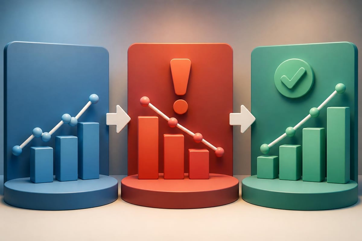
Borrowing from traditional storytelling, data presentations benefit from setup, conflict, and resolution frameworks. The setup establishes context and baseline conditions. Conflict introduces the problem, challenge, or opportunity revealed by data analysis. Resolution presents recommendations, predictions, or solutions supported by evidence.

A pitch deck for a technology startup might show market size (setup), current inefficiencies in the sector (conflict), and projected growth enabled by the proposed solution (resolution). Each section relies on carefully selected visualizations that advance the narrative.

Data storytelling structure

Technical Execution and Platform Considerations

Platform selection influences both design possibilities and audience accessibility. PowerPoint remains dominant in corporate environments, while Google Slides facilitates collaboration. Specialized tools like Tableau or Power BI enable sophisticated interactive dashboards but may require viewer accounts.

Building Presentations for Multiple Delivery Contexts

Modern data visualisation presentation must function across live presentations, asynchronous sharing, and mobile viewing. Design choices that work for projection may fail on laptop screens or smartphones.

  1. Use generous font sizes (minimum 24pt for body text, 36pt+ for titles)
  2. Design for 16:9 aspect ratio to match contemporary displays
  3. Export backup PDF versions to ensure formatting consistency
  4. Test on multiple devices before high-stakes presentations
  5. Include slide notes with talking points and data sources

Michigan State University's Digital Experience Studio highlights best practices for presenting data that emphasize making complex information more understandable through thoughtful visualization choices.

Platform Strengths Limitations Best For
PowerPoint Universal compatibility, animation control Limited interactivity Board presentations, investor decks
Google Slides Real-time collaboration, cloud access Fewer design features Team reviews, remote presentations
Tableau Advanced analytics, interactivity Steep learning curve Data exploration, dashboards
Keynote Superior visual quality Mac/iOS ecosystem only High-stakes product launches

Avoiding Common Data Visualization Pitfalls

Even experienced presenters fall into traps that undermine data communication effectiveness. Recognizing and avoiding these errors separates mediocre presentations from exceptional ones.

Chartjunk and Visual Clutter

The term "chartjunk" refers to decorative elements that distract from data interpretation. 3D effects, unnecessary gridlines, ornate backgrounds, and excessive labels all qualify as chartjunk. Research from Purdue University's Online Writing Lab covers data visualization presentation ethics and design best practices.

Elements to eliminate or minimize:

  • Drop shadows and gradient fills on chart elements
  • Redundant data labels when values appear in legends
  • Decorative icons unrelated to data meaning
  • Multiple font families within single visualizations
  • Animated transitions without narrative purpose

Misleading Scales and Proportions

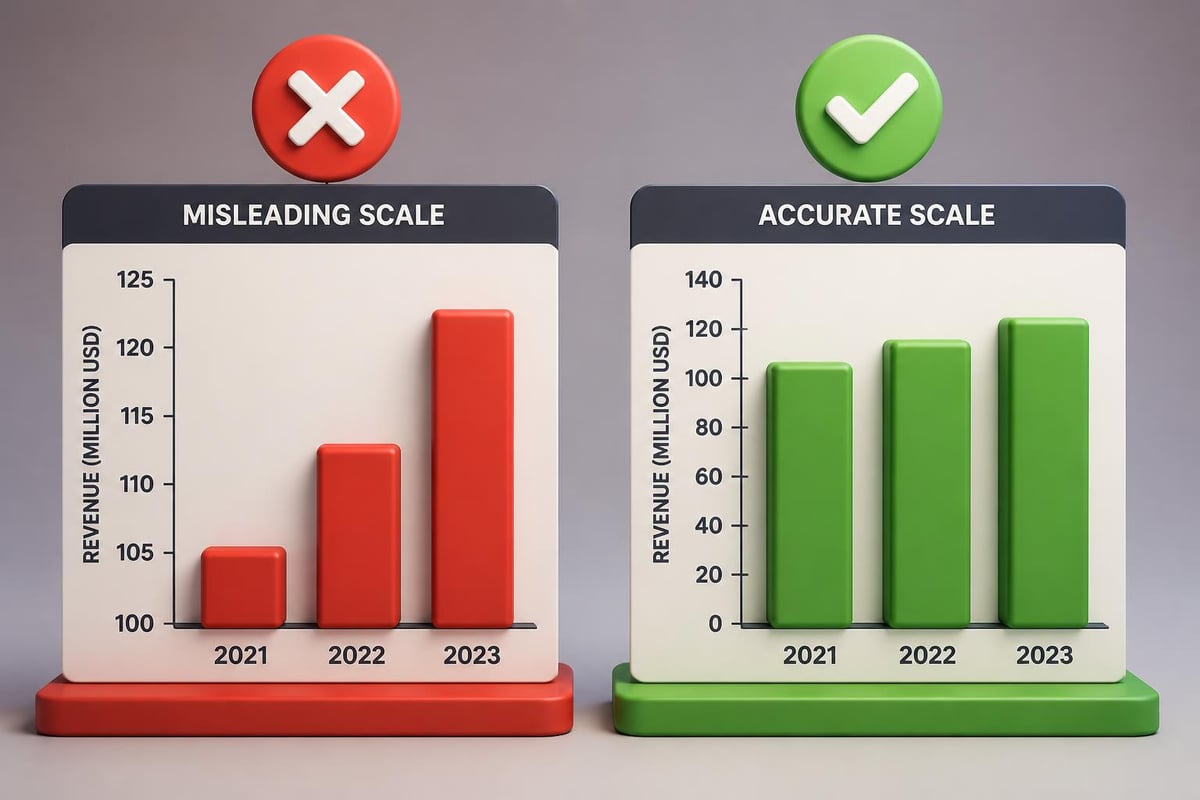
Manipulated axes represent a serious ethical concern in data visualisation presentation. Truncated y-axes exaggerate modest changes, logarithmic scales obscure true proportional differences, and inconsistent intervals distort temporal patterns. Maintaining integrity requires transparent, proportional representations that allow audiences to form accurate conclusions.

Data integrity principles

Industry-Specific Applications and Examples

Financial services and technology sectors have distinct data presentation requirements shaped by regulatory environments, stakeholder expectations, and subject matter complexity.

Financial Sector Data Presentations

Investment firms, banks, and insurance companies handle sensitive financial data requiring precision and compliance awareness. A biotech pitch deck presenting clinical trial results and market projections must balance scientific accuracy with investor accessibility.

Financial presentation priorities:

  • Waterfall charts for variance analysis
  • Candlestick charts for securities trading data
  • Risk-adjusted return visualizations
  • Scenario modeling with sensitivity analysis
  • Regulatory compliance footnotes and disclosures

Technology Company Metrics

Tech businesses track user engagement, system performance, growth funnels, and development velocity. These metrics require visualizations that reveal patterns across massive datasets while remaining interpretable to non-technical stakeholders.

Product managers presenting feature adoption rates benefit from cohort analysis visualizations. Engineering leaders demonstrating system reliability use uptime dashboards and error rate trends. Marketing teams showcase funnel conversion optimization through sequential charts highlighting drop-off points.

Enhancing Presentations Through Professional Design Services

While many professionals possess analytical skills to interpret data, translating insights into visually compelling presentations requires specialized design expertise. PowerPoint design services help businesses transform raw analysis into polished deliverables that reflect brand quality and strategic messaging.

When to Engage Presentation Design Professionals

High-stakes presentations justify professional design investment. Board meetings, investor pitches, major client proposals, and conference keynotes create opportunities where presentation quality directly influences outcomes. Design agencies bring typography expertise, color theory knowledge, animation capabilities, and strategic communication experience that elevate content beyond template-based approaches.

Benefits of professional data visualisation presentation design:

  1. Custom chart designs aligned with brand guidelines
  2. Strategic information architecture that guides audience focus
  3. Accessible designs meeting WCAG standards
  4. Animation sequences that reveal insights progressively
  5. Quality assurance across platforms and viewing contexts

Testing and Iteration for Maximum Impact

Effective presenters treat data visualisation presentation development as an iterative process rather than a one-time creation. User testing reveals comprehension gaps, confusing elements, and opportunities for refinement.

Feedback Collection Methods

Sharing draft presentations with representative audience members provides invaluable insights. Ask reviewers to summarize key takeaways without verbal explanation to test whether visualizations communicate independently. Track which slides generate questions or confusion, indicating redesign opportunities.

A/B testing different chart types for the same data reveals which approaches resonate most effectively. Time tracking identifies slides requiring excessive explanation, suggesting simplification needs. Recording practice presentations exposes pacing issues and highlights where visual support falls short.

Iterative improvement checklist:

  • Can viewers identify the main message within five seconds?
  • Do chart titles clearly state the insight rather than describing the data?
  • Are axis labels and legends immediately understandable?
  • Does color coding remain consistent throughout the presentation?
  • Have you eliminated all non-essential visual elements?

Emerging Trends and Future Considerations

Data visualisation presentation continues evolving alongside technological capabilities and audience expectations. Artificial intelligence enables automated insight generation from datasets, suggesting optimal visualization types. Virtual and augmented reality create immersive data exploration experiences. Real-time data integration allows presentations to display current metrics rather than static snapshots.

Preparing for Next-Generation Presentations

Forward-thinking organizations invest in dynamic presentation capabilities that adapt to viewer interactions. Branching narratives allow presenters to explore different analytical paths based on audience questions. Embedded calculators let stakeholders model scenarios during presentations. Cloud-based platforms enable collaborative annotation and discussion around visualizations.

Accessibility requirements continue expanding beyond color contrast to include screen reader compatibility, keyboard navigation, and alternative text descriptions for every visual element. Organizations prioritizing inclusive design ensure all stakeholders can engage with data regardless of physical capabilities.


Mastering data visualisation presentation transforms how organizations communicate insights, drive decisions, and inspire action. By combining analytical rigor with design excellence, financial and technology businesses can ensure their most valuable data receives the visual treatment it deserves. Prznt Perfect specializes in creating compelling data visualizations and presentations that turn complex information into clear narratives for financial and tech clients. Whether you need a high-stakes investor pitch or ongoing presentation design support, professional design services ensure your data stories resonate with audiences and achieve business objectives.

We offer free 30-min consultation on the presentation design audit
and hiring the right visual 
comms professional, let’s talk!
Shedule a call
Shedule a call
"I understand" goes a step further into the cognitive dance of persuasion. It's where the audience begins to see the connections between the facts, to grasp the nuances of the problem and the elegance of the solution.
  • This is some text inside of a div block.
    lay out the facts clearly and compellingly. Use data to establish the ground reality, but remember that facts alone are like the individual strands of a tapestry—necessary but not complete.
    lay out the facts clearly and compellingly. Use data to establish the ground reality, but remember that facts alone are like the individual strands of a tapestry—necessary but not complete.
  • This is some text inside of a div block.
    lay out the facts clearly and compellingly. Use data to establish the ground reality, but remember that facts alone are like the individual strands of a tapestry—necessary but not complete.

We offer free 30-min consultation on the presentation design audit

and hiring the right visual 
comms professional, let’s talk!

Shedule a call

"I understand" goes a step further into the cognitive dance of persuasion. It's where the audience begins to see the connections between the facts, to grasp the nuances of the problem and the elegance of the solution.

  • - 1 -
    Consistency at Scale:

    Biotech Market Trends 2024: Tailoring Your Pitch Deck to Current Industry Dynamics.

  • - 2 -
    Efficiency and Speed:

    The traditional process of manually updating presentations is not only slow but also prone to bottlenecks, especially when dealing with large volumes of slides. Automation dramatically accelerates this process, enabling designers to apply changes across hundreds of slides in the time it would take to manually update a single one. This efficiency is a game-changer for agencies working under tight deadlines or managing multiple projects simultaneously.

  • - 3 -
    Enhanced Creativity:

    With the burden of manual updates lifted, designers can allocate more time and energy to the creative aspects of presentation design. This freedom allows for deeper exploration of innovative design concepts, experimentation with new visual storytelling techniques, and the development of more engaging and interactive presentations. Automation doesn't stifle creativity; it amplifies it, enabling designers to push the boundaries of what's possible in corporate presentation design.

  • - 4 -
    Error Reduction:

    Manual updates are inherently prone to inconsistencies and mistakes, from misaligned logos to incorrect font sizes. These errors can detract from the professionalism of a presentation and, by extension, the corporate image. Automation minimizes these risks by ensuring that updates are applied uniformly and accurately across all slides, enhancing the overall quality and integrity of the presentation.

  • - 5 -
    Cost-Effectiveness:

    The time savings afforded by automation directly translate to cost savings for both the design agency and its clients. By reducing the hours spent on manual updates, agencies can optimize their workflows and resources, allowing them to take on more projects without compromising on quality. This efficiency can also make high-quality presentation design services more affordable and accessible to a broader range of businesses.

Data Visualisation Presentation: Best Practices Guide
Master data visualisation presentation design for financial and tech businesses. Learn best practices, chart selection, and storytelling techniques.

The ability to transform complex data into compelling visual narratives has become a critical business skill. Financial institutions and technology companies generate massive volumes of information daily, yet raw numbers rarely inspire action or drive decision-making. A well-executed data visualisation presentation bridges this gap, converting spreadsheets and databases into meaningful stories that stakeholders can understand and act upon. Whether presenting quarterly results to investors, demonstrating product metrics to executives, or communicating market research findings to teams, the quality of your visual data communication directly impacts business outcomes.

Understanding the Foundation of Effective Data Presentations

Data visualisation presentation requires more than aesthetic appeal. The fundamental purpose centers on clarity, comprehension, and actionable insights. Financial services firms and tech startups face unique challenges when communicating metrics because their audiences range from technically sophisticated analysts to C-suite executives who need high-level overviews.

Audience Analysis and Message Alignment

Before selecting charts or designing slides, successful presenters identify their audience's technical literacy, decision-making authority, and information needs. A professional PowerPoint presentation for venture capitalists demands different visual approaches than internal team dashboards.

Key audience considerations include:

  • Technical expertise and data literacy levels
  • Time constraints and attention spans
  • Decision-making responsibilities
  • Prior knowledge of the subject matter
  • Cultural and industry-specific expectations

The Johns Hopkins University Library emphasizes knowing your audience and message as foundational to effective data visualization design. This alignment ensures your visualizations answer the specific questions stakeholders bring to the presentation.

Audience analysis framework

Selecting the Right Visualization Types

Chart selection represents one of the most consequential decisions in data visualisation presentation design. Each visualization type communicates specific relationships, and mismatches between data structure and chart type create confusion rather than clarity.

Data Relationship Recommended Chart Type Best Use Case
Comparison across categories Bar chart, column chart Quarterly revenue by product line
Trends over time Line chart, area chart Stock performance, user growth
Part-to-whole relationships Pie chart, treemap Market share, budget allocation
Distribution Histogram, box plot Customer age ranges, response times
Correlation Scatter plot, bubble chart Marketing spend vs. revenue
Geographic patterns Choropleth map, heat map Regional sales, user locations

Advanced Visualization Techniques for Complex Data

Financial and technology sectors frequently deal with multidimensional datasets requiring sophisticated visualization approaches. Combination charts overlay multiple data series, such as revenue bars with profit margin lines. Small multiples display the same chart type across different categories, enabling pattern recognition across segments.

Dashboard layouts integrate multiple visualizations into cohesive analytical narratives. When developing a fintech presentation design, interactive elements can reveal deeper insights while maintaining slide clarity.

Critical considerations for complex visualizations:

  1. Limit the number of data series per chart to maintain readability
  2. Use consistent color coding across related visualizations
  3. Provide clear legends and axis labels
  4. Consider animation to reveal data progressively
  5. Balance detail with cognitive load management

Design Principles That Enhance Data Communication

Visual design choices profoundly impact how audiences interpret and retain information from your data visualisation presentation. Carnegie Mellon University's data visualization guidelines stress accessibility, usability, and consistent styling as essential design principles.

Color Strategy and Visual Hierarchy

Color serves functional and aesthetic purposes in data presentations. Strategic color application directs attention to key findings, differentiates data categories, and maintains brand consistency. However, excessive or poorly chosen colors create visual noise that obscures insights.

Professional presentations limit color palettes to 4-6 complementary colors plus neutrals. Sequential color schemes represent ordered data like temperature ranges or time progressions. Diverging palettes highlight positive and negative deviations from a baseline. Categorical colors distinguish unrelated data groups.

Color accessibility requirements:

  • Ensure sufficient contrast ratios for colorblind viewers
  • Avoid red-green combinations as primary differentiators
  • Use patterns or textures alongside colors for critical distinctions
  • Test visualizations in grayscale to verify clarity
  • Consider cultural color associations for international audiences

Typography hierarchy establishes information importance through size, weight, and positioning. Chart titles use larger, bolder fonts than axis labels. Data callouts employ distinct styling to highlight specific values requiring audience attention.

Storytelling Frameworks for Data Narratives

Numbers alone rarely persuade. Effective data visualisation presentation weaves metrics into narratives that resonate emotionally while maintaining analytical rigor. The DaSy Center provides presentation design principles emphasizing how slides should communicate clearly even without verbal narration.

The Three-Act Structure for Data Stories

Borrowing from traditional storytelling, data presentations benefit from setup, conflict, and resolution frameworks. The setup establishes context and baseline conditions. Conflict introduces the problem, challenge, or opportunity revealed by data analysis. Resolution presents recommendations, predictions, or solutions supported by evidence.

A pitch deck for a technology startup might show market size (setup), current inefficiencies in the sector (conflict), and projected growth enabled by the proposed solution (resolution). Each section relies on carefully selected visualizations that advance the narrative.
Data storytelling structure

Technical Execution and Platform Considerations

Platform selection influences both design possibilities and audience accessibility. PowerPoint remains dominant in corporate environments, while Google Slides facilitates collaboration. Specialized tools like Tableau or Power BI enable sophisticated interactive dashboards but may require viewer accounts.

Building Presentations for Multiple Delivery Contexts

Modern data visualisation presentation must function across live presentations, asynchronous sharing, and mobile viewing. Design choices that work for projection may fail on laptop screens or smartphones.

  1. Use generous font sizes (minimum 24pt for body text, 36pt+ for titles)
  2. Design for 16:9 aspect ratio to match contemporary displays
  3. Export backup PDF versions to ensure formatting consistency
  4. Test on multiple devices before high-stakes presentations
  5. Include slide notes with talking points and data sources

Michigan State University's Digital Experience Studio highlights best practices for presenting data that emphasize making complex information more understandable through thoughtful visualization choices.

Platform Strengths Limitations Best For
PowerPoint Universal compatibility, animation control Limited interactivity Board presentations, investor decks
Google Slides Real-time collaboration, cloud access Fewer design features Team reviews, remote presentations
Tableau Advanced analytics, interactivity Steep learning curve Data exploration, dashboards
Keynote Superior visual quality Mac/iOS ecosystem only High-stakes product launches

Avoiding Common Data Visualization Pitfalls

Even experienced presenters fall into traps that undermine data communication effectiveness. Recognizing and avoiding these errors separates mediocre presentations from exceptional ones.

Chartjunk and Visual Clutter

The term "chartjunk" refers to decorative elements that distract from data interpretation. 3D effects, unnecessary gridlines, ornate backgrounds, and excessive labels all qualify as chartjunk. Research from Purdue University's Online Writing Lab covers data visualization presentation ethics and design best practices.

Elements to eliminate or minimize:

  • Drop shadows and gradient fills on chart elements
  • Redundant data labels when values appear in legends
  • Decorative icons unrelated to data meaning
  • Multiple font families within single visualizations
  • Animated transitions without narrative purpose

Misleading Scales and Proportions

Manipulated axes represent a serious ethical concern in data visualisation presentation. Truncated y-axes exaggerate modest changes, logarithmic scales obscure true proportional differences, and inconsistent intervals distort temporal patterns. Maintaining integrity requires transparent, proportional representations that allow audiences to form accurate conclusions.
Data integrity principles

Industry-Specific Applications and Examples

Financial services and technology sectors have distinct data presentation requirements shaped by regulatory environments, stakeholder expectations, and subject matter complexity.

Financial Sector Data Presentations

Investment firms, banks, and insurance companies handle sensitive financial data requiring precision and compliance awareness. A biotech pitch deck presenting clinical trial results and market projections must balance scientific accuracy with investor accessibility.

Financial presentation priorities:

  • Waterfall charts for variance analysis
  • Candlestick charts for securities trading data
  • Risk-adjusted return visualizations
  • Scenario modeling with sensitivity analysis
  • Regulatory compliance footnotes and disclosures

Technology Company Metrics

Tech businesses track user engagement, system performance, growth funnels, and development velocity. These metrics require visualizations that reveal patterns across massive datasets while remaining interpretable to non-technical stakeholders.

Product managers presenting feature adoption rates benefit from cohort analysis visualizations. Engineering leaders demonstrating system reliability use uptime dashboards and error rate trends. Marketing teams showcase funnel conversion optimization through sequential charts highlighting drop-off points.

Enhancing Presentations Through Professional Design Services

While many professionals possess analytical skills to interpret data, translating insights into visually compelling presentations requires specialized design expertise. PowerPoint design services help businesses transform raw analysis into polished deliverables that reflect brand quality and strategic messaging.

When to Engage Presentation Design Professionals

High-stakes presentations justify professional design investment. Board meetings, investor pitches, major client proposals, and conference keynotes create opportunities where presentation quality directly influences outcomes. Design agencies bring typography expertise, color theory knowledge, animation capabilities, and strategic communication experience that elevate content beyond template-based approaches.

Benefits of professional data visualisation presentation design:

  1. Custom chart designs aligned with brand guidelines
  2. Strategic information architecture that guides audience focus
  3. Accessible designs meeting WCAG standards
  4. Animation sequences that reveal insights progressively
  5. Quality assurance across platforms and viewing contexts

Testing and Iteration for Maximum Impact

Effective presenters treat data visualisation presentation development as an iterative process rather than a one-time creation. User testing reveals comprehension gaps, confusing elements, and opportunities for refinement.

Feedback Collection Methods

Sharing draft presentations with representative audience members provides invaluable insights. Ask reviewers to summarize key takeaways without verbal explanation to test whether visualizations communicate independently. Track which slides generate questions or confusion, indicating redesign opportunities.

A/B testing different chart types for the same data reveals which approaches resonate most effectively. Time tracking identifies slides requiring excessive explanation, suggesting simplification needs. Recording practice presentations exposes pacing issues and highlights where visual support falls short.

Iterative improvement checklist:

  • Can viewers identify the main message within five seconds?
  • Do chart titles clearly state the insight rather than describing the data?
  • Are axis labels and legends immediately understandable?
  • Does color coding remain consistent throughout the presentation?
  • Have you eliminated all non-essential visual elements?

Emerging Trends and Future Considerations

Data visualisation presentation continues evolving alongside technological capabilities and audience expectations. Artificial intelligence enables automated insight generation from datasets, suggesting optimal visualization types. Virtual and augmented reality create immersive data exploration experiences. Real-time data integration allows presentations to display current metrics rather than static snapshots.

Preparing for Next-Generation Presentations

Forward-thinking organizations invest in dynamic presentation capabilities that adapt to viewer interactions. Branching narratives allow presenters to explore different analytical paths based on audience questions. Embedded calculators let stakeholders model scenarios during presentations. Cloud-based platforms enable collaborative annotation and discussion around visualizations.

Accessibility requirements continue expanding beyond color contrast to include screen reader compatibility, keyboard navigation, and alternative text descriptions for every visual element. Organizations prioritizing inclusive design ensure all stakeholders can engage with data regardless of physical capabilities.


Mastering data visualisation presentation transforms how organizations communicate insights, drive decisions, and inspire action. By combining analytical rigor with design excellence, financial and technology businesses can ensure their most valuable data receives the visual treatment it deserves. Prznt Perfect specializes in creating compelling data visualizations and presentations that turn complex information into clear narratives for financial and tech clients. Whether you need a high-stakes investor pitch or ongoing presentation design support, professional design services ensure your data stories resonate with audiences and achieve business objectives.


News & Updates...

Master ppt conference presentation templates with expert tips on design, structure, and delivery for tech and financial professionals in 2026.

Master PowerPoint presentations for project management with expert strategies, templates, and design tips that transform complex data into clear narratives.