
Creative PPT Presentation: Expert Design Strategies
The difference between a forgettable slideshow and a memorable business presentation often comes down to creative execution. In today's competitive landscape, where financial and tech professionals present complex ideas to demanding stakeholders, a creative ppt presentation serves as the bridge between raw data and actionable insights. Whether you're pitching to investors, presenting quarterly results, or explaining a technical solution, your slides must capture attention while maintaining professional credibility. This comprehensive guide explores the strategic approaches, design principles, and practical techniques that transform ordinary presentations into powerful communication tools.
Understanding the Foundation of Creative Presentation Design
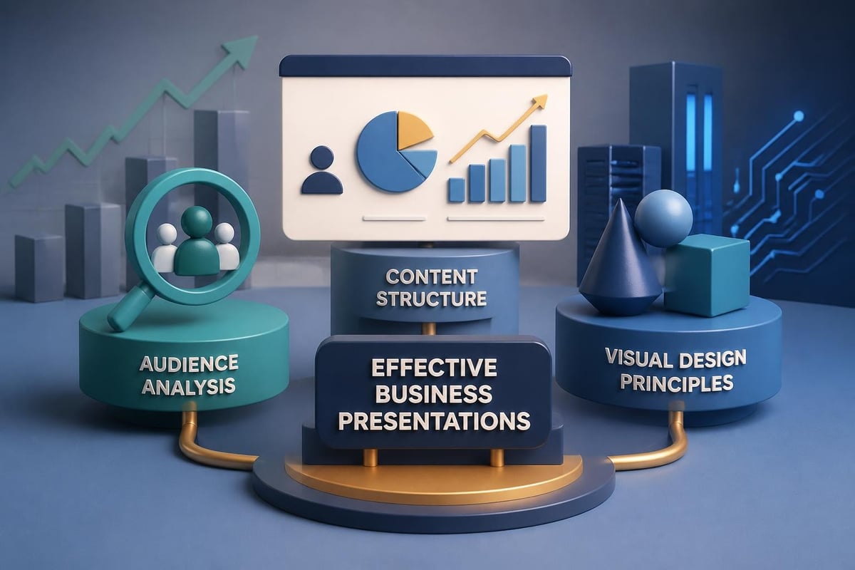
A creative ppt presentation begins with understanding your audience's needs and expectations. Financial executives and tech decision-makers process information differently than general audiences, requiring a balance between visual appeal and data-driven content. The foundation of effective presentation design rests on three pillars: clarity of message, visual hierarchy, and strategic storytelling.
When developing presentations for sophisticated audiences, every design choice must serve a purpose. Color selections should reinforce brand identity while ensuring readability across projection environments. Typography choices need to communicate professionalism while maintaining accessibility. Layout decisions must guide the viewer's eye through complex information without overwhelming them.
Defining Your Creative Approach
Before opening your presentation software, define what "creative" means for your specific context. For a fintech presentation, creativity might involve innovative data visualization techniques that make financial metrics instantly comprehensible. For technology companies, it could mean interactive elements that demonstrate product functionality.
The most effective presentations avoid creativity for its own sake. Instead, they deploy creative solutions to solve specific communication challenges. This might include:
- Custom infographics that replace dense tables
- Animated sequences that explain complex processes step-by-step
- Visual metaphors that make abstract concepts tangible
- Strategic use of whitespace to emphasize key points
- Cohesive color systems that categorize information types
Strategic Content Architecture for Maximum Impact
The structure of your creative ppt presentation determines how effectively your audience absorbs and retains information. Content architecture involves organizing your message into logical segments that build upon each other, creating a narrative flow that feels both natural and persuasive.
Start by mapping your key messages against your audience's priorities. Financial stakeholders need to see ROI and risk mitigation. Technical audiences require depth and specificity. Executives want high-level insights with the option to dive deeper. Your content architecture should accommodate these varying needs through strategic layering.
Building a Compelling Narrative Arc
Every successful pitch deck follows a narrative structure that creates tension and resolution. Begin by establishing context: what problem exists in the current landscape? Progress to complication: why haven't existing solutions adequately addressed this problem? Then introduce your solution as the turning point, followed by evidence of validation and a clear path forward.
This narrative approach transforms data presentations from mere information delivery into persuasive storytelling. When presenting quarterly financial results, the narrative might move from market challenges to strategic responses to measurable outcomes. For product launches, the story flows from customer pain points through solution architecture to market opportunity.
| Presentation Section | Primary Purpose | Creative Opportunity |
|---|---|---|
| Opening | Establish relevance | Visual hook that resonates with audience priorities |
| Problem Statement | Build urgency | Data visualization showing market gap or challenge |
| Solution Overview | Introduce core value | Simplified diagrams or interactive demonstrations |
| Evidence & Validation | Build credibility | Case studies with visual before/after comparisons |
| Implementation Path | Remove objections | Timeline graphics with clear milestones |
| Call to Action | Drive next steps | Memorable closing visual that reinforces key message |
Visual Design Principles That Elevate Presentations
Visual design transforms information into insight. The most creative presentations leverage design principles that professional designers have refined over decades. Understanding these principles allows you to make intentional choices that enhance rather than distract from your message.
Contrast creates visual interest and guides attention. Use size, color, and positioning to establish hierarchy. Your most important information should dominate the visual space. Supporting details should recede appropriately. This doesn't mean making everything large and bold; it means thoughtful calibration of visual weight.
Color Psychology and Strategic Palettes
Color choices communicate before words do. Financial presentations benefit from palettes that convey stability and trustworthiness: deep blues, sophisticated grays, strategic accent colors. Technology presentations can embrace broader palettes that demonstrate innovation while maintaining readability.
According to comprehensive design guidance from Figma, effective color systems use:
- A primary brand color for main elements (20-30% of slides)
- A secondary color for emphasis and calls to action (10-15% of slides)
- Neutral backgrounds that don't compete with content (60-70% of slides)
- Accent colors used sparingly for highlighting critical data points
Avoid the temptation to use every color available. Restraint demonstrates sophistication. A well-executed three-color palette outperforms a chaotic rainbow every time.
Typography as a Design Element
Typography serves dual purposes in creative presentations: it must be readable while reinforcing your brand personality. Financial institutions often favor serif fonts that convey tradition and stability. Tech companies frequently choose clean sans-serif options that feel modern and approachable.
The best creative ppt presentation designs use typography hierarchy to guide reading. Headlines should be 2-3 times larger than body text. Key statistics might deserve even larger treatment. Subheadings create visual breaks that make content scannable. Consider exploring professional PowerPoint templates that demonstrate effective typography systems.
Font pairing guidelines for business presentations:
- Pair a distinctive headline font with a neutral body font
- Limit presentations to two font families maximum
- Ensure minimum 24pt size for body text (30pt preferred)
- Use bold weights for emphasis, not underlines or italics
- Maintain consistent spacing between text elements
Data Visualization Techniques for Complex Information
Financial and technical presentations inevitably involve data. The challenge lies in presenting numbers, statistics, and metrics in ways that audiences can quickly comprehend and remember. Creative data visualization transforms spreadsheets into stories.
Charts and graphs serve as the workhorses of data presentation, but not all visualizations are created equal. Pie charts work only for simple part-to-whole relationships with few categories. Bar charts excel at comparisons. Line graphs show trends over time. Scatter plots reveal correlations. Choose the right tool for your specific data story.
Beyond Standard Charts
Innovation in data presentation comes from thinking beyond default chart options. Custom infographics can show relationships that standard charts miss. Pictorial representations make abstract numbers concrete. For example, rather than showing "40% market share" as a pie chart, consider using a visual where 40 out of 100 icons are highlighted.
Creative presentation approaches from Visme demonstrate how custom visualizations can transform standard business metrics:
- Timeline graphics that show company evolution or product roadmaps
- Process diagrams that illustrate workflows or customer journeys
- Comparison matrices that evaluate options against multiple criteria
- Icon-based statistics that make numbers more memorable
- Layered diagrams that reveal complexity progressively

When presenting complex datasets, consider using animation to reveal information progressively. Start with the overall trend, then highlight specific data points that support your narrative. This controlled revelation keeps audiences engaged while preventing information overload.
Interactive Elements and Modern Presentation Techniques
The evolution of presentation technology has expanded what's possible beyond static slides. Interactive elements can transform passive viewing into active engagement, particularly effective for technical demonstrations or complex financial models.
Modern creative ppt presentation design incorporates clickable navigation that allows presenters to adapt on the fly. Create a non-linear structure where you can jump to detailed backup slides based on audience questions. This demonstrates preparation while maintaining narrative flow during the main presentation.
Video Integration for Enhanced Storytelling
Video content adds dimension that static slides cannot match. A 30-second customer testimonial video carries more weight than a text quote. A screen recording demonstrating software functionality communicates more clearly than a dozen screenshots. Product demos through video can showcase real-world applications.
When incorporating video, partner with professionals who understand how video integrates with presentation design. Viva Media specializes in creating high-performance video content that delivers measurable business results, ensuring your video elements maintain the same professional quality as your slide design.
Video integration best practices:
- Keep videos under 90 seconds for optimal engagement
- Ensure audio quality matches visual quality
- Add captions for accessibility and sound-off viewing
- Use video strategically at key transition points
- Have a backup plan if technical issues arise
Animations That Enhance Rather Than Distract
Animation should serve your message, not overwhelm it. Subtle transitions between slides create professional polish. Entrance animations can reveal bullet points sequentially, helping audiences focus on one concept at a time. Exit animations can clear space for new information.
According to PowerPoint design tips from GeeksforGeeks, effective animations follow these principles:
- Consistency in animation style throughout the presentation
- Timing set to feel natural, not rushed or sluggish
- Animation used to support content hierarchy
- Restraint in effects, avoiding bounces, spins, or other distracting movements
- Testing animations on actual presentation equipment before delivery
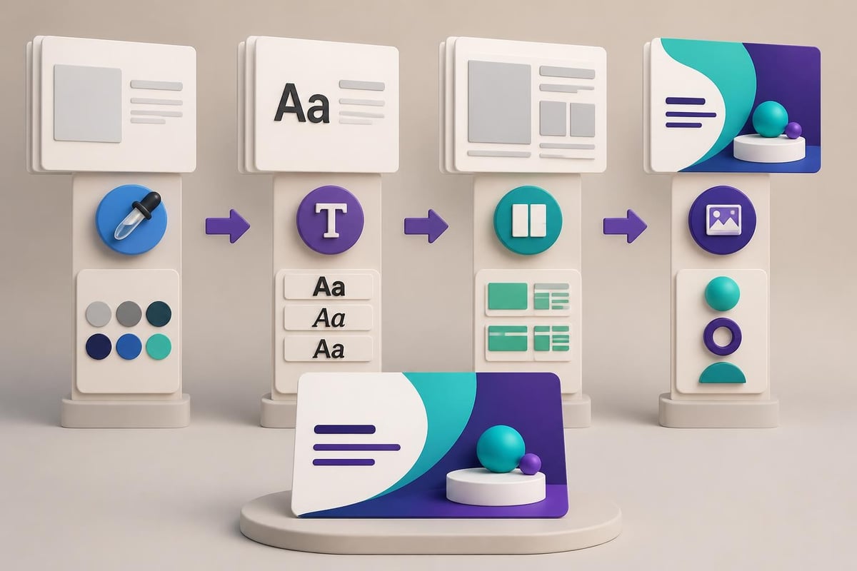
Template Customization and Brand Consistency
While templates provide valuable starting points, truly creative presentations require customization that reflects your unique brand identity. The goal is not to look like every other presentation in your industry, but to establish a distinctive visual signature that makes your content immediately recognizable.
Start with understanding your brand guidelines. What colors represent your company? Which fonts appear in your other marketing materials? How should your logo be displayed? These elements form the foundation of your presentation design system.
Moving Beyond Default Templates
Default templates signal lack of investment in your message. Even free minimal PowerPoint templates require customization to align with your specific needs. Replace stock photos with relevant imagery. Adjust color palettes to match your brand. Modify layouts to accommodate your content appropriately.
The customization process involves:
- Creating master slides that encode your brand standards
- Developing a library of custom shapes and icons
- Building reusable chart and graph templates in brand colors
- Establishing spacing and alignment rules for consistency
- Creating slide variations for different content types
| Customization Element | Standard Approach | Creative Approach |
|---|---|---|
| Title Slides | Centered text with logo | Custom illustration or brand pattern with integrated typography |
| Content Slides | Bullet points on white background | Mixed layouts with visual elements supporting each point |
| Data Slides | Default chart styles | Custom-colored charts with annotations and visual context |
| Section Dividers | Text on solid color | Full-bleed imagery or abstract graphics with minimal text |
| Closing Slides | Contact information list | Visual summary of key points with memorable graphic |
Audience Engagement Strategies Through Design
The most creative ppt presentation delivers value not just through what it shows, but through how it engages. Design choices can actively facilitate audience participation and comprehension. This becomes particularly important in hybrid or virtual presentation contexts where maintaining attention requires extra effort.
Strategic use of visual cues helps audiences know where to focus. Arrows, circles, and highlighting draw attention to specific data points. Callout boxes emphasize key takeaways. Progress indicators show how far through the presentation the audience has traveled. These elements transform passive viewing into active processing.
Designing for Different Presentation Contexts
A boardroom presentation on a large monitor requires different design considerations than a webinar viewed on laptop screens. Room lighting, screen size, viewing distance, and audience size all impact design decisions. As outlined in presentation tactics from DesignPal, context-aware design considers:
- Font sizes appropriate for viewing distance
- Color contrast that works under various lighting conditions
- Image resolution suitable for screen size
- Animation complexity matched to delivery platform
- File size optimized for sharing method
For investor presentations, audiences expect detailed financial projections they can study. For sales presentations, simpler visuals that support verbal explanation work better. For training sessions, step-by-step progression with clear visual markers aids comprehension.
Creating Memorable Moments
Strategic design creates moments that stick with audiences long after the presentation ends. A powerful statistic deserves a dedicated slide with minimal text and maximum visual impact. A key insight might be presented as a quotation-style slide with distinctive typography. Transitions between major sections can use visual metaphors that make the structure memorable.
Consider how powerpoint design services approach these memorable moments: by identifying the three to five most important messages and designing showcase slides that give these ideas the visual weight they deserve.
Technical Excellence in Presentation Production
Creative design must be matched with technical execution. Poor image resolution, misaligned elements, or inconsistent spacing undermines even the most innovative visual concepts. Professional presentation production requires attention to technical details that less experienced creators might overlook.
Image quality stands as a common failure point. Web images often lack the resolution needed for projection. Always use high-resolution images (at least 1920x1080 for full-slide images). Compress file sizes without sacrificing visual quality. Test presentations on actual projection equipment to ensure colors appear as intended.
File Management and Compatibility
A creative ppt presentation loses impact if technical issues disrupt delivery. Embed fonts to ensure typography appears correctly on different systems. Convert videos to standard formats. Test all animations and transitions. Create PDF backups for situations where PowerPoint isn't available.
Pre-presentation technical checklist:
- All fonts embedded or converted to standard system fonts
- All videos and audio files embedded, not linked
- File size optimized for sharing (under 100MB when possible)
- Tested on presentation computer and projection system
- Backup copy saved in multiple locations
- PDF version created for distribution
- All hyperlinks verified as functional
Consider consulting Microsoft's guidance on creative presentation design for technical best practices that ensure your creative vision translates to successful delivery.
Measuring Presentation Effectiveness
The true measure of a creative ppt presentation lies in its impact. Did it change minds? Drive decisions? Generate the desired action? While creativity attracts attention, effectiveness drives results. Establishing metrics for presentation success helps refine your approach over time.
For sales presentations, track conversion rates and deal velocity. For investor pitches, measure funding secured and follow-up meetings generated. For internal communications, assess comprehension through follow-up surveys or questions asked. These metrics inform future design decisions.
Iterative Improvement Through Feedback
The best presentation designers continuously refine their craft based on real-world results. After each high-stakes presentation, conduct a retrospective. What slides generated the most questions? Where did audiences seem confused? Which visuals proved most memorable? This feedback loop drives continuous improvement.
Presentation effectiveness metrics to track:
| Metric Category | Specific Measures | Design Implications |
|---|---|---|
| Engagement | Questions asked, discussion length, audience attention | Slides generating questions may need clarity improvements |
| Comprehension | Post-presentation quiz results, recall of key points | Complex information may need better visualization |
| Persuasion | Decision outcomes, follow-up actions, conversion rates | Narrative flow and evidence presentation effectiveness |
| Efficiency | Presentation length, pace, time management | Slide count and content density optimization |
| Memorability | Unprompted recall after one week, shared key points | Memorable visual moments and message clarity |
Advanced presenters A/B test different approaches. Try two versions of a critical slide and note which generates better response. Experiment with different opening strategies. Test various closing techniques. Data-driven creativity outperforms guesswork.
Industry-Specific Creative Approaches
Financial services and technology sectors each have distinct presentation needs. Understanding these nuances allows you to craft creative solutions that resonate with specific audiences while respecting industry norms.
Financial presentations balance innovation with conservatism. Stakeholders expect rigorous data presentation but appreciate clarity and visual accessibility. Creative approaches in finance focus on making complex metrics comprehensible, showing trends clearly, and presenting scenarios effectively. Explore specialized fintech pitch deck approaches that balance innovation with industry expectations.
Technology Sector Presentation Dynamics
Technology presentations allow for broader creative expression. Audiences expect innovation in both content and delivery. Interactive demonstrations, animated product walkthroughs, and dynamic data visualizations align with tech industry culture. However, clarity remains paramount; technical audiences quickly dismiss flashy design that obscures substance.
For cybersecurity companies, presentations must convey both threat sophistication and solution elegance. For software companies, demonstrations should feel seamless and intuitive. For hardware companies, product visuals need technical accuracy paired with aspirational appeal. Each subsector within technology has its own visual language that creative presentations should speak fluently.
Mastering creative ppt presentation design requires balancing visual innovation with strategic communication, technical excellence with audience awareness. The most effective presentations don't just look impressive; they drive understanding, facilitate decisions, and inspire action. Whether you're preparing a critical investor pitch or an important client presentation, Prznt Perfect specializes in transforming complex financial and technical concepts into visually stunning narratives that resonate with sophisticated audiences and deliver measurable results.


- This is some text inside of a div block.lay out the facts clearly and compellingly. Use data to establish the ground reality, but remember that facts alone are like the individual strands of a tapestry—necessary but not complete.lay out the facts clearly and compellingly. Use data to establish the ground reality, but remember that facts alone are like the individual strands of a tapestry—necessary but not complete.
- This is some text inside of a div block.lay out the facts clearly and compellingly. Use data to establish the ground reality, but remember that facts alone are like the individual strands of a tapestry—necessary but not complete.

