Corporate PowerPoint: Design Standards for 2026

Corporate PowerPoint presentations remain the backbone of business communication in 2026, serving as critical tools for investor pitches, quarterly reviews, strategic planning sessions, and client proposals. Despite the emergence of alternative presentation platforms, PowerPoint continues to dominate boardrooms and conference halls across financial services and technology sectors. The difference between an effective corporate presentation and a forgettable one often lies not in the content itself, but in how that content is designed, structured, and delivered to stakeholders.

The Evolution of Corporate PowerPoint Standards

Corporate PowerPoint design has undergone significant transformation over the past decade. What once consisted of text-heavy slides with basic transitions has evolved into sophisticated visual communication that balances data complexity with aesthetic appeal.

Modern Expectations for Business Presentations

Today's executives expect presentations that communicate complex information quickly and clearly. Financial data, market analysis, and strategic initiatives must be presented in formats that facilitate rapid decision-making. This shift has elevated the importance of visual design in corporate settings.

Key characteristics of modern corporate PowerPoint include:

  • Data visualization that transforms spreadsheets into actionable insights
  • Consistent brand application across all slides and sections
  • Minimal text paired with compelling visual elements
  • Professional typography that enhances readability
  • Strategic use of white space to reduce cognitive load

The professional PowerPoint approach emphasizes clarity over decoration, ensuring every visual element serves a specific communication purpose.

Modern corporate PowerPoint design principles

Brand Consistency in Corporate Presentations

Maintaining corporate identity throughout PowerPoint presentations goes beyond simply adding a logo to each slide. Brand compliance in presentations directly impacts how audiences perceive organizational professionalism and credibility.

Building a Visual System

A comprehensive visual system ensures every presentation reinforces brand recognition. This system should include defined parameters for typography, color palettes, layout grids, and imagery styles.

Brand Element Application Standard Impact on Perception
Typography Maximum two font families, consistent sizing hierarchy Professionalism and readability
Color Palette Primary, secondary, and accent colors with specific use cases Brand recognition and visual coherence
Layout Grids Standardized margins and element positioning Visual harmony and polish
Imagery Style Photography vs. illustration guidelines, color treatment Emotional tone and authenticity

Corporate PowerPoint templates should codify these standards, making it impossible for presenters to deviate from established guidelines. This systematization ensures that whether a presentation is created by the marketing team, finance department, or executive leadership, it maintains consistent brand expression.

Typography and Hierarchy Fundamentals

Font selection significantly influences how audiences process information. Corporate presentations typically perform best with sans-serif typefaces that remain legible across projection systems and screen sizes. Professional design principles recommend establishing a clear hierarchy using size, weight, and color rather than relying on multiple font families.

Effective hierarchy guidelines:

  1. Slide titles: 32-40pt, bold weight
  2. Body text: 18-24pt, regular weight
  3. Supporting details: 14-16pt, light weight
  4. Annotations: 12-14pt, italic or light weight

This structured approach ensures that viewers immediately understand the relative importance of information elements, even when reviewing slides independently.

Data Visualization Excellence

Financial and technology companies face unique challenges when presenting data-dense information. Effective corporate PowerPoint design transforms raw numbers into visual narratives that support strategic decision-making.

Chart Selection Strategy

Choosing the appropriate chart type directly impacts comprehension speed and accuracy. Each visualization method serves specific communication objectives.

  • Bar charts: Comparing discrete values across categories
  • Line graphs: Showing trends and changes over time
  • Pie charts: Illustrating proportional relationships (limited to 5-6 segments)
  • Scatter plots: Revealing correlations between variables
  • Heat maps: Displaying complex multi-dimensional data patterns

The key to successful data visualization in corporate PowerPoint lies in simplification. Remove gridlines, reduce color complexity, and emphasize the specific data points that support your narrative. Fintech presentation design particularly benefits from clean, focused visualizations that highlight market opportunities and financial projections.

Tables vs. Visual Alternatives

While tables efficiently present precise numerical values, they rarely engage audiences effectively. Consider when tables genuinely serve the communication objective versus when visual alternatives would improve comprehension.

When to Use Tables When to Use Visuals
Exact values are critical Trends matter more than precision
Comparing multiple variables simultaneously Highlighting a single insight
Reference material for detailed review Supporting verbal narrative
Appendix or supporting documentation Main presentation slides
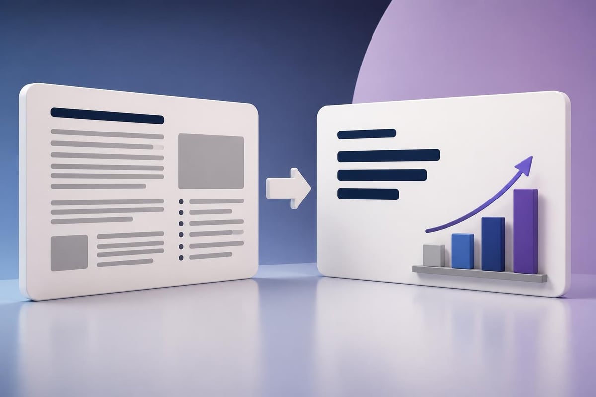
Data transformation in corporate presentations

Slide Structure and Information Architecture

How information is organized across slides dramatically affects audience retention and engagement. Corporate PowerPoint presentations benefit from intentional structure that guides viewers through complex topics systematically.

The Pyramid Principle in Practice

Starting with conclusions and supporting them with evidence creates more impactful business presentations. This approach, particularly valuable in financial contexts, allows decision-makers to grasp recommendations immediately before diving into supporting analysis.

Recommended slide sequence:

  1. Executive summary with key recommendations
  2. Strategic context and market landscape
  3. Detailed analysis and supporting data
  4. Implementation roadmap and resource requirements
  5. Risk assessment and mitigation strategies

Following investor presentation best practices ensures corporate PowerPoint decks communicate strategic thinking alongside operational details.

Section Breaks and Transitions

Visual section dividers help audiences navigate longer presentations, providing mental breaks between major topics. These divider slides should maintain brand consistency while clearly signaling topic transitions.

Effective section breaks include:

  • Topic title with supporting visual element
  • Progress indicators showing presentation structure
  • Brief preview of upcoming content
  • Consistent placement and styling across all sections

Design System Implementation

Creating a sustainable corporate PowerPoint design system requires balancing flexibility with control. Templates should enable creativity within defined parameters rather than restricting all design decisions.

Master Slide Architecture

PowerPoint's master slide functionality allows organizations to enforce brand standards while providing layout options for different content types. A comprehensive master slide set includes:

Layout Type Primary Use Case Key Elements
Title slide Opening and section dividers Large title area, minimal branding
Content slide Standard information delivery Title, content area, footer
Data slide Charts and visualizations Title, expanded chart area, source citation
Comparison Side-by-side analysis Split layout with balanced columns
Timeline Process or chronological information Horizontal or vertical timeline structure

This systematic approach ensures presenters select appropriate layouts rather than creating inconsistent custom designs. The sample PowerPoint design demonstrates how master slides create cohesive visual systems.

Color Application Strategy

Strategic color use in corporate PowerPoint extends beyond brand palette application. Colors should create visual hierarchy, guide attention, and support comprehension without overwhelming viewers.

Functional color applications:

  • Primary brand color: Titles, key metrics, call-to-action elements
  • Secondary colors: Section differentiation, data series
  • Neutral grays: Body text, supporting information, backgrounds
  • Accent colors: Highlighting critical data points, emphasis

Maintaining accessible presentation design requires sufficient contrast ratios between text and backgrounds, ensuring readability for all audience members regardless of viewing conditions or visual abilities.

Content Density and White Space Management

One of the most common failures in corporate PowerPoint design involves overcrowding slides with excessive information. The temptation to include comprehensive details often undermines communication effectiveness.

The 6x6 Rule and Beyond

While the traditional 6x6 rule (maximum six bullets per slide, six words per bullet) provides basic guidance, modern corporate presentations benefit from even more aggressive content reduction. Each slide should communicate a single core idea supported by minimal text and strong visuals.

Consider this progression:

  1. Traditional approach: Paragraph-length bullets explaining multiple concepts
  2. 6x6 approach: Six brief bullets with supporting points
  3. Modern approach: One headline, one supporting visual, spoken narrative provides detail

This evolution reflects growing understanding that slides should complement verbal presentation rather than duplicate it. When creating slides deck organization, prioritize visual communication over comprehensive written documentation.

White space in corporate slide design

Image Selection and Integration

Photography and illustration in corporate PowerPoint must balance aesthetic appeal with professional credibility. Generic stock imagery often undermines presentation quality, while poorly chosen visuals distract from core messages.

Authentic Visual Content

Financial and technology audiences respond better to authentic imagery that reflects real business contexts. This includes:

  • Actual product screenshots and interface designs
  • Genuine workspace photography rather than staged stock images
  • Custom data visualizations specific to the presentation context
  • Industry-relevant imagery that demonstrates sector understanding

When stock photography is necessary, select images that avoid clichéd business tropes (handshakes, people pointing at screens, diverse teams standing in hallways) in favor of more subtle, sophisticated visuals.

Image Treatment Consistency

Applying consistent treatment to all images creates visual cohesion. This might include:

  1. Standardized corner radius on all photograph frames
  2. Consistent overlay opacity when placing text over images
  3. Unified color grading or filter application
  4. Matching aspect ratios and sizing conventions

These details separate professional corporate PowerPoint presentations from amateur efforts, signaling attention to quality that reflects organizational standards.

Animation and Transition Discipline

While PowerPoint offers extensive animation capabilities, corporate presentations benefit from restrained, purposeful motion. Excessive animation undermines professionalism and distracts from content.

Strategic Animation Applications

Animation serves legitimate purposes when it:

  • Reveals information progressively: Building complex diagrams step-by-step
  • Directs attention: Highlighting specific data points during discussion
  • Shows relationships: Demonstrating process flows or system connections
  • Controls pacing: Preventing audiences from reading ahead

Recommended transition approach:

  • Consistent transition type throughout (typically "None" or subtle fade)
  • Animation duration of 0.3-0.5 seconds maximum
  • Entrance effects limited to "Fade" or "Wipe"
  • Exit effects rarely necessary

The corporate presentation design guide emphasizes that less is consistently more when it comes to motion in professional contexts.

Quality Assurance and Review Processes

Even well-designed corporate PowerPoint presentations suffer when basic quality issues slip through. Implementing systematic review processes prevents common errors that damage credibility.

Pre-Presentation Checklist

Before finalizing any corporate presentation, verify:

  • Consistency: Fonts, colors, and layouts match standards across all slides
  • Accuracy: Data sources are current, calculations are verified
  • Clarity: Each slide communicates one clear message
  • Readability: Text is legible from expected viewing distance
  • Completeness: No placeholder text or broken image links remain
  • Attribution: All external data includes proper source citations

Technical Preparation

Technical issues during presentations undermine even exceptional content. Prevent problems by:

  1. Testing presentations on the actual delivery equipment
  2. Embedding all fonts to ensure consistent rendering
  3. Compressing images to optimize file size without quality loss
  4. Creating backup versions in multiple formats (PDF, cloud-based)
  5. Rehearsing with presenter notes and timing

Organizations that implement rigorous quality standards for corporate PowerPoint consistently deliver more effective business communications.

Adapting Presentations for Different Contexts

A single corporate PowerPoint deck rarely serves all audiences equally well. Strategic adaptation ensures presentations resonate with specific stakeholder groups while maintaining core messaging.

Audience-Specific Modifications

Audience Type Emphasis Areas Presentation Adjustments
Executive leadership Strategic implications, financial impact Higher-level summary, outcome focus
Board of directors Governance, risk management, long-term value Comprehensive data, regulatory context
Investors Growth potential, competitive advantage Market opportunity, financial projections
Technical teams Implementation details, specifications Detailed process flows, technical architecture
Sales prospects Value proposition, differentiation Customer benefits, use cases

Understanding these distinctions allows presenters to maintain brand consistency while optimizing content relevance. The approach used in pitch deck design demonstrates how core content can be reframed for different decision-making contexts.

Format Variations

Beyond content adaptation, consider format requirements for different distribution methods:

  • Live presentation: Minimal text, strong visuals, presenter-dependent
  • Email distribution: More comprehensive text, self-explanatory content
  • Print handouts: Additional context, detailed appendices
  • Video recording: Timed animations, embedded explanations

Each format demands specific design considerations within the broader corporate PowerPoint framework.

Measuring Presentation Effectiveness

Sophisticated organizations don't simply create corporate PowerPoint presentations; they measure and optimize their impact systematically.

Quantifiable Success Metrics

Depending on presentation objectives, relevant metrics include:

  • Decision velocity: Time from presentation to stakeholder approval
  • Follow-up questions: Volume and type of clarification requests
  • Meeting outcomes: Percentage achieving intended objectives
  • Stakeholder feedback: Satisfaction scores and improvement suggestions
  • Resource efficiency: Preparation time relative to presentation reuse

Iterative Improvement Process

Establishing feedback loops ensures continuous enhancement of corporate presentation quality:

  1. Document stakeholder reactions and questions after each presentation
  2. Analyze which slides generated confusion or required additional explanation
  3. Track which visual approaches drove fastest comprehension
  4. Update templates and guidelines based on performance data
  5. Share learnings across presentation creators organization-wide

This systematic approach transforms corporate PowerPoint from a one-time creation task into a continuous improvement discipline that compounds value over time.

Emerging Technologies and Future Considerations

While corporate PowerPoint has maintained market dominance, emerging technologies are reshaping what effective business presentations look like in 2026 and beyond.

AI-Assisted Design

Artificial intelligence tools now assist with layout optimization, color selection, and content organization. However, these technologies work best when guided by established design systems and brand standards rather than operating independently. The human judgment required to craft compelling narratives remains irreplaceable.

Interactive Elements

Modern corporate PowerPoint supports embedded interactive elements including clickable prototypes, embedded calculators, and dynamic data connections. These features transform static presentations into exploratory experiences, particularly valuable for complex financial models and scenario planning.

Hybrid Presentation Formats

The evolution of work patterns demands presentations that function equally well for in-person audiences, remote participants, and asynchronous viewers. This requirement influences everything from text density to animation timing to supplementary documentation.


Mastering corporate PowerPoint design requires balancing aesthetic sophistication with communication clarity, brand consistency with content flexibility, and visual impact with professional credibility. These principles apply whether you're creating quarterly business reviews, investor presentations, or strategic planning decks. When your organization needs presentation design that transforms complex financial and technical concepts into compelling visual narratives, Prznt Perfect brings specialized expertise in crafting executive-ready presentations that drive decision-making and deliver measurable business impact.

We offer free 30-min consultation on the presentation design audit
and hiring the right visual 
comms professional, let’s talk!
Shedule a call
Shedule a call
"I understand" goes a step further into the cognitive dance of persuasion. It's where the audience begins to see the connections between the facts, to grasp the nuances of the problem and the elegance of the solution.
  • This is some text inside of a div block.
    lay out the facts clearly and compellingly. Use data to establish the ground reality, but remember that facts alone are like the individual strands of a tapestry—necessary but not complete.
    lay out the facts clearly and compellingly. Use data to establish the ground reality, but remember that facts alone are like the individual strands of a tapestry—necessary but not complete.
  • This is some text inside of a div block.
    lay out the facts clearly and compellingly. Use data to establish the ground reality, but remember that facts alone are like the individual strands of a tapestry—necessary but not complete.

We offer free 30-min consultation on the presentation design audit

and hiring the right visual 
comms professional, let’s talk!

Shedule a call

"I understand" goes a step further into the cognitive dance of persuasion. It's where the audience begins to see the connections between the facts, to grasp the nuances of the problem and the elegance of the solution.

  • - 1 -
    Consistency at Scale:

    Biotech Market Trends 2024: Tailoring Your Pitch Deck to Current Industry Dynamics.

  • - 2 -
    Efficiency and Speed:

    The traditional process of manually updating presentations is not only slow but also prone to bottlenecks, especially when dealing with large volumes of slides. Automation dramatically accelerates this process, enabling designers to apply changes across hundreds of slides in the time it would take to manually update a single one. This efficiency is a game-changer for agencies working under tight deadlines or managing multiple projects simultaneously.

  • - 3 -
    Enhanced Creativity:

    With the burden of manual updates lifted, designers can allocate more time and energy to the creative aspects of presentation design. This freedom allows for deeper exploration of innovative design concepts, experimentation with new visual storytelling techniques, and the development of more engaging and interactive presentations. Automation doesn't stifle creativity; it amplifies it, enabling designers to push the boundaries of what's possible in corporate presentation design.

  • - 4 -
    Error Reduction:

    Manual updates are inherently prone to inconsistencies and mistakes, from misaligned logos to incorrect font sizes. These errors can detract from the professionalism of a presentation and, by extension, the corporate image. Automation minimizes these risks by ensuring that updates are applied uniformly and accurately across all slides, enhancing the overall quality and integrity of the presentation.

  • - 5 -
    Cost-Effectiveness:

    The time savings afforded by automation directly translate to cost savings for both the design agency and its clients. By reducing the hours spent on manual updates, agencies can optimize their workflows and resources, allowing them to take on more projects without compromising on quality. This efficiency can also make high-quality presentation design services more affordable and accessible to a broader range of businesses.

Corporate PowerPoint: Design Standards for 2026

Master corporate PowerPoint design with proven strategies for financial and tech presentations. Learn brand consistency, visual hierarchy, and data storytelling techniques.

Corporate PowerPoint presentations remain the backbone of business communication in 2026, serving as critical tools for investor pitches, quarterly reviews, strategic planning sessions, and client proposals. Despite the emergence of alternative presentation platforms, PowerPoint continues to dominate boardrooms and conference halls across financial services and technology sectors. The difference between an effective corporate presentation and a forgettable one often lies not in the content itself, but in how that content is designed, structured, and delivered to stakeholders.

The Evolution of Corporate PowerPoint Standards

Corporate PowerPoint design has undergone significant transformation over the past decade. What once consisted of text-heavy slides with basic transitions has evolved into sophisticated visual communication that balances data complexity with aesthetic appeal.

Modern Expectations for Business Presentations

Today's executives expect presentations that communicate complex information quickly and clearly. Financial data, market analysis, and strategic initiatives must be presented in formats that facilitate rapid decision-making. This shift has elevated the importance of visual design in corporate settings.

Key characteristics of modern corporate PowerPoint include:

  • Data visualization that transforms spreadsheets into actionable insights
  • Consistent brand application across all slides and sections
  • Minimal text paired with compelling visual elements
  • Professional typography that enhances readability
  • Strategic use of white space to reduce cognitive load

The professional PowerPoint approach emphasizes clarity over decoration, ensuring every visual element serves a specific communication purpose.

Modern corporate PowerPoint design principles

Brand Consistency in Corporate Presentations

Maintaining corporate identity throughout PowerPoint presentations goes beyond simply adding a logo to each slide. Brand compliance in presentations directly impacts how audiences perceive organizational professionalism and credibility.

Building a Visual System

A comprehensive visual system ensures every presentation reinforces brand recognition. This system should include defined parameters for typography, color palettes, layout grids, and imagery styles.

Brand Element Application Standard Impact on Perception
Typography Maximum two font families, consistent sizing hierarchy Professionalism and readability
Color Palette Primary, secondary, and accent colors with specific use cases Brand recognition and visual coherence
Layout Grids Standardized margins and element positioning Visual harmony and polish
Imagery Style Photography vs. illustration guidelines, color treatment Emotional tone and authenticity

Corporate PowerPoint templates should codify these standards, making it impossible for presenters to deviate from established guidelines. This systematization ensures that whether a presentation is created by the marketing team, finance department, or executive leadership, it maintains consistent brand expression.

Typography and Hierarchy Fundamentals

Font selection significantly influences how audiences process information. Corporate presentations typically perform best with sans-serif typefaces that remain legible across projection systems and screen sizes. Professional design principles recommend establishing a clear hierarchy using size, weight, and color rather than relying on multiple font families.

Effective hierarchy guidelines:

  1. Slide titles: 32-40pt, bold weight
  2. Body text: 18-24pt, regular weight
  3. Supporting details: 14-16pt, light weight
  4. Annotations: 12-14pt, italic or light weight

This structured approach ensures that viewers immediately understand the relative importance of information elements, even when reviewing slides independently.

Data Visualization Excellence

Financial and technology companies face unique challenges when presenting data-dense information. Effective corporate PowerPoint design transforms raw numbers into visual narratives that support strategic decision-making.

Chart Selection Strategy

Choosing the appropriate chart type directly impacts comprehension speed and accuracy. Each visualization method serves specific communication objectives.

  • Bar charts: Comparing discrete values across categories
  • Line graphs: Showing trends and changes over time
  • Pie charts: Illustrating proportional relationships (limited to 5-6 segments)
  • Scatter plots: Revealing correlations between variables
  • Heat maps: Displaying complex multi-dimensional data patterns

The key to successful data visualization in corporate PowerPoint lies in simplification. Remove gridlines, reduce color complexity, and emphasize the specific data points that support your narrative. Fintech presentation design particularly benefits from clean, focused visualizations that highlight market opportunities and financial projections.

Tables vs. Visual Alternatives

While tables efficiently present precise numerical values, they rarely engage audiences effectively. Consider when tables genuinely serve the communication objective versus when visual alternatives would improve comprehension.

When to Use Tables When to Use Visuals
Exact values are critical Trends matter more than precision
Comparing multiple variables simultaneously Highlighting a single insight
Reference material for detailed review Supporting verbal narrative
Appendix or supporting documentation Main presentation slides
Data transformation in corporate presentations

Slide Structure and Information Architecture

How information is organized across slides dramatically affects audience retention and engagement. Corporate PowerPoint presentations benefit from intentional structure that guides viewers through complex topics systematically.

The Pyramid Principle in Practice

Starting with conclusions and supporting them with evidence creates more impactful business presentations. This approach, particularly valuable in financial contexts, allows decision-makers to grasp recommendations immediately before diving into supporting analysis.

Recommended slide sequence:

  1. Executive summary with key recommendations
  2. Strategic context and market landscape
  3. Detailed analysis and supporting data
  4. Implementation roadmap and resource requirements
  5. Risk assessment and mitigation strategies

Following investor presentation best practices ensures corporate PowerPoint decks communicate strategic thinking alongside operational details.

Section Breaks and Transitions

Visual section dividers help audiences navigate longer presentations, providing mental breaks between major topics. These divider slides should maintain brand consistency while clearly signaling topic transitions.

Effective section breaks include:

  • Topic title with supporting visual element
  • Progress indicators showing presentation structure
  • Brief preview of upcoming content
  • Consistent placement and styling across all sections

Design System Implementation

Creating a sustainable corporate PowerPoint design system requires balancing flexibility with control. Templates should enable creativity within defined parameters rather than restricting all design decisions.

Master Slide Architecture

PowerPoint's master slide functionality allows organizations to enforce brand standards while providing layout options for different content types. A comprehensive master slide set includes:

Layout Type Primary Use Case Key Elements
Title slide Opening and section dividers Large title area, minimal branding
Content slide Standard information delivery Title, content area, footer
Data slide Charts and visualizations Title, expanded chart area, source citation
Comparison Side-by-side analysis Split layout with balanced columns
Timeline Process or chronological information Horizontal or vertical timeline structure

This systematic approach ensures presenters select appropriate layouts rather than creating inconsistent custom designs. The sample PowerPoint design demonstrates how master slides create cohesive visual systems.

Color Application Strategy

Strategic color use in corporate PowerPoint extends beyond brand palette application. Colors should create visual hierarchy, guide attention, and support comprehension without overwhelming viewers.

Functional color applications:

  • Primary brand color: Titles, key metrics, call-to-action elements
  • Secondary colors: Section differentiation, data series
  • Neutral grays: Body text, supporting information, backgrounds
  • Accent colors: Highlighting critical data points, emphasis

Maintaining accessible presentation design requires sufficient contrast ratios between text and backgrounds, ensuring readability for all audience members regardless of viewing conditions or visual abilities.

Content Density and White Space Management

One of the most common failures in corporate PowerPoint design involves overcrowding slides with excessive information. The temptation to include comprehensive details often undermines communication effectiveness.

The 6x6 Rule and Beyond

While the traditional 6x6 rule (maximum six bullets per slide, six words per bullet) provides basic guidance, modern corporate presentations benefit from even more aggressive content reduction. Each slide should communicate a single core idea supported by minimal text and strong visuals.

Consider this progression:

  1. Traditional approach: Paragraph-length bullets explaining multiple concepts
  2. 6x6 approach: Six brief bullets with supporting points
  3. Modern approach: One headline, one supporting visual, spoken narrative provides detail

This evolution reflects growing understanding that slides should complement verbal presentation rather than duplicate it. When creating slides deck organization, prioritize visual communication over comprehensive written documentation.
White space in corporate slide design

Image Selection and Integration

Photography and illustration in corporate PowerPoint must balance aesthetic appeal with professional credibility. Generic stock imagery often undermines presentation quality, while poorly chosen visuals distract from core messages.

Authentic Visual Content

Financial and technology audiences respond better to authentic imagery that reflects real business contexts. This includes:

  • Actual product screenshots and interface designs
  • Genuine workspace photography rather than staged stock images
  • Custom data visualizations specific to the presentation context
  • Industry-relevant imagery that demonstrates sector understanding

When stock photography is necessary, select images that avoid clichéd business tropes (handshakes, people pointing at screens, diverse teams standing in hallways) in favor of more subtle, sophisticated visuals.

Image Treatment Consistency

Applying consistent treatment to all images creates visual cohesion. This might include:

  1. Standardized corner radius on all photograph frames
  2. Consistent overlay opacity when placing text over images
  3. Unified color grading or filter application
  4. Matching aspect ratios and sizing conventions

These details separate professional corporate PowerPoint presentations from amateur efforts, signaling attention to quality that reflects organizational standards.

Animation and Transition Discipline

While PowerPoint offers extensive animation capabilities, corporate presentations benefit from restrained, purposeful motion. Excessive animation undermines professionalism and distracts from content.

Strategic Animation Applications

Animation serves legitimate purposes when it:

  • Reveals information progressively: Building complex diagrams step-by-step
  • Directs attention: Highlighting specific data points during discussion
  • Shows relationships: Demonstrating process flows or system connections
  • Controls pacing: Preventing audiences from reading ahead

Recommended transition approach:

  • Consistent transition type throughout (typically "None" or subtle fade)
  • Animation duration of 0.3-0.5 seconds maximum
  • Entrance effects limited to "Fade" or "Wipe"
  • Exit effects rarely necessary

The corporate presentation design guide emphasizes that less is consistently more when it comes to motion in professional contexts.

Quality Assurance and Review Processes

Even well-designed corporate PowerPoint presentations suffer when basic quality issues slip through. Implementing systematic review processes prevents common errors that damage credibility.

Pre-Presentation Checklist

Before finalizing any corporate presentation, verify:

  • Consistency: Fonts, colors, and layouts match standards across all slides
  • Accuracy: Data sources are current, calculations are verified
  • Clarity: Each slide communicates one clear message
  • Readability: Text is legible from expected viewing distance
  • Completeness: No placeholder text or broken image links remain
  • Attribution: All external data includes proper source citations

Technical Preparation

Technical issues during presentations undermine even exceptional content. Prevent problems by:

  1. Testing presentations on the actual delivery equipment
  2. Embedding all fonts to ensure consistent rendering
  3. Compressing images to optimize file size without quality loss
  4. Creating backup versions in multiple formats (PDF, cloud-based)
  5. Rehearsing with presenter notes and timing

Organizations that implement rigorous quality standards for corporate PowerPoint consistently deliver more effective business communications.

Adapting Presentations for Different Contexts

A single corporate PowerPoint deck rarely serves all audiences equally well. Strategic adaptation ensures presentations resonate with specific stakeholder groups while maintaining core messaging.

Audience-Specific Modifications

Audience Type Emphasis Areas Presentation Adjustments
Executive leadership Strategic implications, financial impact Higher-level summary, outcome focus
Board of directors Governance, risk management, long-term value Comprehensive data, regulatory context
Investors Growth potential, competitive advantage Market opportunity, financial projections
Technical teams Implementation details, specifications Detailed process flows, technical architecture
Sales prospects Value proposition, differentiation Customer benefits, use cases

Understanding these distinctions allows presenters to maintain brand consistency while optimizing content relevance. The approach used in pitch deck design demonstrates how core content can be reframed for different decision-making contexts.

Format Variations

Beyond content adaptation, consider format requirements for different distribution methods:

  • Live presentation: Minimal text, strong visuals, presenter-dependent
  • Email distribution: More comprehensive text, self-explanatory content
  • Print handouts: Additional context, detailed appendices
  • Video recording: Timed animations, embedded explanations

Each format demands specific design considerations within the broader corporate PowerPoint framework.

Measuring Presentation Effectiveness

Sophisticated organizations don't simply create corporate PowerPoint presentations; they measure and optimize their impact systematically.

Quantifiable Success Metrics

Depending on presentation objectives, relevant metrics include:

  • Decision velocity: Time from presentation to stakeholder approval
  • Follow-up questions: Volume and type of clarification requests
  • Meeting outcomes: Percentage achieving intended objectives
  • Stakeholder feedback: Satisfaction scores and improvement suggestions
  • Resource efficiency: Preparation time relative to presentation reuse

Iterative Improvement Process

Establishing feedback loops ensures continuous enhancement of corporate presentation quality:

  1. Document stakeholder reactions and questions after each presentation
  2. Analyze which slides generated confusion or required additional explanation
  3. Track which visual approaches drove fastest comprehension
  4. Update templates and guidelines based on performance data
  5. Share learnings across presentation creators organization-wide

This systematic approach transforms corporate PowerPoint from a one-time creation task into a continuous improvement discipline that compounds value over time.

Emerging Technologies and Future Considerations

While corporate PowerPoint has maintained market dominance, emerging technologies are reshaping what effective business presentations look like in 2026 and beyond.

AI-Assisted Design

Artificial intelligence tools now assist with layout optimization, color selection, and content organization. However, these technologies work best when guided by established design systems and brand standards rather than operating independently. The human judgment required to craft compelling narratives remains irreplaceable.

Interactive Elements

Modern corporate PowerPoint supports embedded interactive elements including clickable prototypes, embedded calculators, and dynamic data connections. These features transform static presentations into exploratory experiences, particularly valuable for complex financial models and scenario planning.

Hybrid Presentation Formats

The evolution of work patterns demands presentations that function equally well for in-person audiences, remote participants, and asynchronous viewers. This requirement influences everything from text density to animation timing to supplementary documentation.


Mastering corporate PowerPoint design requires balancing aesthetic sophistication with communication clarity, brand consistency with content flexibility, and visual impact with professional credibility. These principles apply whether you're creating quarterly business reviews, investor presentations, or strategic planning decks. When your organization needs presentation design that transforms complex financial and technical concepts into compelling visual narratives, Prznt Perfect brings specialized expertise in crafting executive-ready presentations that drive decision-making and deliver measurable business impact.


News & Updates...

Discover how to select and customize strategy PowerPoint templates for impactful business presentations. Expert tips for financial and tech firms.

Master creative slide presentation design with proven strategies for financial and tech businesses. Transform complex data into visual stories.