Consulting PowerPoint Template Design Guide 2026

Professional consultants face a unique challenge: transforming complex strategic insights into clear, actionable presentations that drive executive decision-making. A well-designed consulting powerpoint template serves as the foundation for this transformation, enabling firms to maintain brand consistency while delivering insights with precision and impact. Whether you're preparing client deliverables, internal strategy reviews, or board-level presentations, understanding the nuances of consulting template design can elevate your communication effectiveness and establish credibility before you even speak.

Essential Elements of Consulting Template Architecture

The foundation of any effective consulting powerpoint template lies in its structural integrity and visual hierarchy. Unlike generic presentation templates, consulting formats prioritize clarity, logical flow, and data-driven storytelling. These templates must accommodate diverse content types while maintaining a consistent professional appearance across hundreds of slides.

Key structural components include:

  • Executive summary layouts with clear action titles
  • Data visualization frames for charts, graphs, and tables
  • Framework slides for 2x2 matrices and process diagrams
  • Issue tree and logic flow templates
  • Appendix and reference slide formats

The most successful templates incorporate flexible grid systems that allow presenters to maintain alignment and proportion regardless of content complexity. This systematic approach ensures that whether you're presenting market analysis or organizational recommendations, every slide adheres to the same exacting standards that define consulting-quality slides.

Typography Standards and Hierarchy

Typography choices communicate professionalism before content is even absorbed. Leading consulting firms maintain strict font hierarchies that guide the viewer's eye through information layers efficiently. The standard approach uses sans-serif typefaces such as Helvetica, Arial, or Calibri for maximum readability across projection environments.

Font sizing follows a predictable pattern: slide titles typically range from 24 to 28 points, body text sits at 16 to 20 points, and supporting annotations or footnotes appear at 10 to 12 points. This hierarchy creates natural visual breaks and ensures presentations remain legible from the back of conference rooms.

Color application in text follows equally rigorous standards. Primary headers use dark grays or blacks, while supporting text may employ lighter grays to create depth without introducing unnecessary color variation. This restraint allows data visualizations and key insights to command attention where it matters most.

Consulting slide typography standards

Layout Principles for Maximum Impact

Effective consulting presentations rely on consistent spatial organization that reduces cognitive load and accelerates comprehension. The consulting powerpoint template establishes invisible grids that govern where elements appear, ensuring every slide feels cohesive within a larger narrative structure.

White space management separates amateur presentations from professional deliverables. Top-tier templates allocate generous margins-typically one inch on all sides-creating breathing room that prevents slides from feeling cluttered. This approach aligns with recommendations found in consulting slide standards followed by leading strategy firms.

Layout Element Standard Specification Purpose
Page Margins 1 inch all sides Creates visual breathing room
Title Position Top left or centered Establishes clear hierarchy
Content Grid 3-4 columns Enables flexible layouts
Chart Placement Centered with balanced white space Maximizes data readability
Footer Height 0.5 inches Accommodates source citations

The three-zone principle divides slides into distinct areas: the message zone (title), the support zone (body content), and the reference zone (footer with sources and page numbers). This segmentation allows audiences to quickly locate information types and understand slide purpose at a glance.

Color Schemes and Brand Alignment

Color psychology plays a critical role in consulting presentations, where credibility and objectivity must be preserved while still creating visual interest. A professional consulting powerpoint template typically employs a restrained color palette of three to five colors maximum: one or two primary brand colors, neutral grays for text and backgrounds, and accent colors for data visualization.

Strategic Color Application

The most effective templates reserve saturated colors exclusively for data highlights and calls to action. Background colors should never compete with content-light grays or whites provide optimal contrast for dark text while maintaining professionalism. When incorporating client branding, templates must balance brand colors with consulting firm standards to create cohesive deliverables.

Color coding serves functional purposes beyond aesthetics. Consistent color application across chart elements, categories, or business units helps audiences track themes throughout lengthy presentations. For financial and tech businesses specifically, blue tones often dominate for their association with trust and stability, while accent colors like orange or green highlight key performance indicators or growth metrics.

Accessibility considerations demand attention to contrast ratios. Text must maintain at least a 4.5:1 contrast ratio against backgrounds to ensure readability for all audience members. This technical requirement influences color selection from the template design phase forward, preventing last-minute accessibility corrections that can compromise visual consistency.

Data Visualization Framework Integration

Consulting presentations live or die on their ability to transform raw data into compelling visual narratives. A robust consulting powerpoint template includes pre-designed chart layouts that accommodate common visualization types while maintaining formatting consistency. These frameworks ensure that data presentations meet professional standards without requiring custom design for each analysis.

Standard visualization templates include:

  1. Waterfall charts for showing sequential contributions
  2. Segmented bar charts for category comparisons
  3. Line graphs with clear trend indicators
  4. Scatter plots for correlation analysis
  5. Heat maps for multi-dimensional data
  6. Gantt charts for project timelines

Each visualization type requires specific formatting considerations. Axis labels must be clearly readable, legends should appear in consistent positions, and data labels need appropriate precision levels. The template establishes these parameters upfront, allowing consultants to focus on insight development rather than formatting decisions.

When working with complex datasets, the template should support layered information revelation. Initial slides might present high-level trends while subsequent slides drill into supporting details. This progressive disclosure approach, combined with proper slides deck organization guidelines, prevents information overload while building comprehensive understanding.

Data visualization framework

Industry-Specific Template Customization

While core consulting principles remain consistent, different industries demand specific adaptations to standard templates. Financial services presentations require particular attention to regulatory compliance, precise numerical formatting, and secure handling of sensitive data. Technology sector presentations might emphasize product roadmaps, user experience flows, and technical architecture diagrams.

For organizations working in fintech presentation design, templates must accommodate both financial metrics and technology innovation narratives. This dual focus requires flexible layouts that can present traditional financial data alongside product screenshots, user journey maps, and competitive positioning frameworks.

Cybersecurity presentations face unique challenges in balancing technical depth with executive accessibility. A cyber security ppt template might include threat landscape visualizations, risk assessment matrices, and compliance framework mappings that wouldn't appear in other sectors. These specialized elements must integrate seamlessly with standard consulting structures.

Adapting Templates Across Client Contexts

The most versatile consulting powerpoint template systems support rapid customization without sacrificing core design principles. Master templates include color swap functionality, allowing quick brand alignment when working with multiple clients. This flexibility proves essential for agencies serving diverse portfolios, much like how pitch deck design agencies adapt their approaches across different funding contexts.

Client-facing presentations often require co-branded templates that merge consulting firm identity with client brand guidelines. This collaboration demands careful attention to hierarchy-typically the client brand receives primary placement while the consulting firm maintains a supporting presence in footers or cover slides.

Building Narrative Flow Through Template Design

Strategic consultants don't just present information; they construct arguments that lead audiences to specific conclusions. The consulting powerpoint template must support this narrative architecture through intentional sequencing and visual progression. Leading firms organize presentations using the situation-complication-resolution framework, and templates should facilitate this storytelling structure.

The pyramid principle guides content organization, placing conclusions upfront followed by supporting arguments. Templates accommodate this approach through executive summary layouts that present key takeaways before detailed analysis. This inverted structure respects executive time constraints while ensuring critical insights receive immediate attention.

Transition slides serve as chapter markers in longer presentations, signaling shifts between major topics and allowing audiences to mentally prepare for new information streams. These divider slides typically feature minimal content-often just a section title-but their consistent design reinforces presentation flow and prevents cognitive fatigue during extended sessions.

Quality Control and Template Maintenance

Even the most carefully designed consulting powerpoint template degrades without consistent maintenance and quality control processes. Organizations must establish clear ownership for template updates, ensuring that version control prevents teams from using outdated formats or conflicting style guidelines.

Template governance includes:

  • Quarterly reviews for design relevance
  • Accessibility compliance audits
  • Software compatibility testing
  • User feedback integration
  • Brand guideline synchronization

Version control becomes critical when multiple team members access shared templates. Cloud-based template libraries with check-out systems prevent conflicting edits and ensure everyone works from current versions. This infrastructure supports collaboration while maintaining design integrity across distributed teams.

Quality assurance checklists help presenters verify template compliance before client delivery. These checklists might cover alignment precision, font consistency, color accuracy, and source citation completeness. Systematic reviews catch formatting inconsistencies that could undermine professional credibility, particularly important when deliverables flow to executive audiences or board members.

Template quality control process

Advanced Features for Complex Presentations

Modern consulting presentations increasingly incorporate interactive elements and advanced functionality that static templates alone cannot support. Smart templates might include embedded calculation engines that update visualizations when underlying data changes, reducing manual reformatting and minimizing error risks.

For financial advisors and wealth management professionals, platforms like WebPrez demonstrate how structured presentation frameworks can standardize complex client communications. While this approach extends beyond traditional PowerPoint templates, it illustrates the evolution toward more dynamic presentation systems that maintain consistency while enabling personalization at scale.

Animation and transition effects, when used judiciously, can enhance understanding of complex processes or sequential developments. Templates should include animation presets that align with professional standards-subtle fades and wipes rather than distracting spins or bounces. These effects serve functional purposes, revealing information progressively rather than overwhelming audiences with dense slides.

Collaboration Tools and Template Distribution

Organizations serving multiple stakeholders need robust systems for template distribution and collaborative editing. Cloud platforms enable real-time co-authoring while maintaining format consistency, though this requires careful configuration to prevent inadvertent design compromises during collaborative sessions.

Template libraries organized by presentation type streamline project initiation. Categories might include client pitch decks, progress reviews, final deliverables, and internal strategy sessions. This organization helps teams quickly locate appropriate starting points rather than building from scratch or adapting ill-fitting formats.

When agencies like OxD PR coordinate comprehensive marketing campaigns, presentation consistency across multiple touchpoints reinforces brand coherence. Similarly, consulting firms benefit from template ecosystems that extend beyond PowerPoint to include Word reports, Excel dashboards, and web-based deliverables, all sharing common design language.

Training programs ensure team members understand template features and application contexts. New consultants particularly benefit from structured onboarding that covers not just what templates look like, but why specific design choices support effective client communication. This knowledge transfer preserves institutional design standards even as team composition evolves.

Template Selection and Customization Strategies

Choosing between building custom templates and adapting existing frameworks requires careful consideration of organizational needs, budget constraints, and timeline pressures. Resources like free consulting PowerPoint templates provide starting points for firms testing new formats or working within tight budgets, though customization typically proves necessary for distinctive brand expression.

Approach Benefits Considerations Best For
Custom Build Perfect brand alignment, unique design Higher cost, longer timeline Established firms with clear identity
Template Adaptation Faster deployment, proven layouts Generic appearance, limited differentiation Startups, rapid projects
Hybrid Model Balance of speed and customization Requires design expertise Growing firms, varied client base

The hybrid approach combines pre-built structural elements with custom branding and specialized slide types. This method delivers professional results faster than pure custom development while avoiding the generic appearance of unmodified commercial templates. For firms serving best PPT presentation templates needs across multiple industries, this flexibility proves essential.

Investment in template development pays dividends through reduced per-project design time and improved cross-team consistency. When consultants spend less time formatting slides, they allocate more energy to strategic thinking and client relationship development. This efficiency gain particularly matters for firms operating on billable hours models where non-billable administrative tasks directly impact profitability.

Emerging Trends in Consulting Presentation Design

The consulting presentation landscape continues evolving as audience expectations shift and new technologies enable different communication approaches. Current trends emphasize minimalism over complexity, with PowerPoint trends in consulting for 2025 highlighting the one-slide-one-idea principle that reduces cognitive load and improves message retention.

Interactive dashboards increasingly supplement traditional linear presentations, allowing executives to explore data dimensions that interest them most. While these dynamic tools extend beyond standard PowerPoint capabilities, they reflect broader movement toward personalized, audience-driven content delivery rather than one-size-fits-all presentations.

Sustainability considerations now influence design choices, with digital-first approaches reducing printed materials and encouraging more streamlined content that respects audience attention as a precious resource. This philosophical shift aligns with broader consulting trends toward agile methodologies and iterative client engagement rather than comprehensive one-time deliverables.

The rise of remote presentation contexts demands templates optimized for screen sharing rather than conference room projection. This shift affects everything from font sizing to color contrast, as presenters adapt to smaller viewing windows and varied display technologies. Templates must perform equally well on executive desktop monitors and analyst laptop screens.


Mastering consulting powerpoint template design requires balancing rigid standards with flexible application, ensuring every presentation maintains professional credibility while effectively communicating unique strategic insights. Whether you're developing internal capabilities or seeking expert support, the right template foundation accelerates your team's ability to transform complex analysis into compelling visual narratives. Prznt Perfect specializes in creating custom presentation templates and design systems for financial and tech businesses, helping organizations establish distinctive visual identities that enhance their consulting deliverables and strengthen client relationships.

We offer free 30-min consultation on the presentation design audit
and hiring the right visual 
comms professional, let’s talk!
Shedule a call
Shedule a call
"I understand" goes a step further into the cognitive dance of persuasion. It's where the audience begins to see the connections between the facts, to grasp the nuances of the problem and the elegance of the solution.
  • This is some text inside of a div block.
    lay out the facts clearly and compellingly. Use data to establish the ground reality, but remember that facts alone are like the individual strands of a tapestry—necessary but not complete.
    lay out the facts clearly and compellingly. Use data to establish the ground reality, but remember that facts alone are like the individual strands of a tapestry—necessary but not complete.
  • This is some text inside of a div block.
    lay out the facts clearly and compellingly. Use data to establish the ground reality, but remember that facts alone are like the individual strands of a tapestry—necessary but not complete.

We offer free 30-min consultation on the presentation design audit

and hiring the right visual 
comms professional, let’s talk!

Shedule a call

"I understand" goes a step further into the cognitive dance of persuasion. It's where the audience begins to see the connections between the facts, to grasp the nuances of the problem and the elegance of the solution.

  • - 1 -
    Consistency at Scale:

    Biotech Market Trends 2024: Tailoring Your Pitch Deck to Current Industry Dynamics.

  • - 2 -
    Efficiency and Speed:

    The traditional process of manually updating presentations is not only slow but also prone to bottlenecks, especially when dealing with large volumes of slides. Automation dramatically accelerates this process, enabling designers to apply changes across hundreds of slides in the time it would take to manually update a single one. This efficiency is a game-changer for agencies working under tight deadlines or managing multiple projects simultaneously.

  • - 3 -
    Enhanced Creativity:

    With the burden of manual updates lifted, designers can allocate more time and energy to the creative aspects of presentation design. This freedom allows for deeper exploration of innovative design concepts, experimentation with new visual storytelling techniques, and the development of more engaging and interactive presentations. Automation doesn't stifle creativity; it amplifies it, enabling designers to push the boundaries of what's possible in corporate presentation design.

  • - 4 -
    Error Reduction:

    Manual updates are inherently prone to inconsistencies and mistakes, from misaligned logos to incorrect font sizes. These errors can detract from the professionalism of a presentation and, by extension, the corporate image. Automation minimizes these risks by ensuring that updates are applied uniformly and accurately across all slides, enhancing the overall quality and integrity of the presentation.

  • - 5 -
    Cost-Effectiveness:

    The time savings afforded by automation directly translate to cost savings for both the design agency and its clients. By reducing the hours spent on manual updates, agencies can optimize their workflows and resources, allowing them to take on more projects without compromising on quality. This efficiency can also make high-quality presentation design services more affordable and accessible to a broader range of businesses.

Consulting PowerPoint Template Design Guide 2026

Master consulting PowerPoint template design with expert tips on layouts, standards, and best practices for creating impactful presentations.

Professional consultants face a unique challenge: transforming complex strategic insights into clear, actionable presentations that drive executive decision-making. A well-designed consulting powerpoint template serves as the foundation for this transformation, enabling firms to maintain brand consistency while delivering insights with precision and impact. Whether you're preparing client deliverables, internal strategy reviews, or board-level presentations, understanding the nuances of consulting template design can elevate your communication effectiveness and establish credibility before you even speak.

Essential Elements of Consulting Template Architecture

The foundation of any effective consulting powerpoint template lies in its structural integrity and visual hierarchy. Unlike generic presentation templates, consulting formats prioritize clarity, logical flow, and data-driven storytelling. These templates must accommodate diverse content types while maintaining a consistent professional appearance across hundreds of slides.

Key structural components include:

  • Executive summary layouts with clear action titles
  • Data visualization frames for charts, graphs, and tables
  • Framework slides for 2x2 matrices and process diagrams
  • Issue tree and logic flow templates
  • Appendix and reference slide formats

The most successful templates incorporate flexible grid systems that allow presenters to maintain alignment and proportion regardless of content complexity. This systematic approach ensures that whether you're presenting market analysis or organizational recommendations, every slide adheres to the same exacting standards that define consulting-quality slides.

Typography Standards and Hierarchy

Typography choices communicate professionalism before content is even absorbed. Leading consulting firms maintain strict font hierarchies that guide the viewer's eye through information layers efficiently. The standard approach uses sans-serif typefaces such as Helvetica, Arial, or Calibri for maximum readability across projection environments.

Font sizing follows a predictable pattern: slide titles typically range from 24 to 28 points, body text sits at 16 to 20 points, and supporting annotations or footnotes appear at 10 to 12 points. This hierarchy creates natural visual breaks and ensures presentations remain legible from the back of conference rooms.

Color application in text follows equally rigorous standards. Primary headers use dark grays or blacks, while supporting text may employ lighter grays to create depth without introducing unnecessary color variation. This restraint allows data visualizations and key insights to command attention where it matters most.
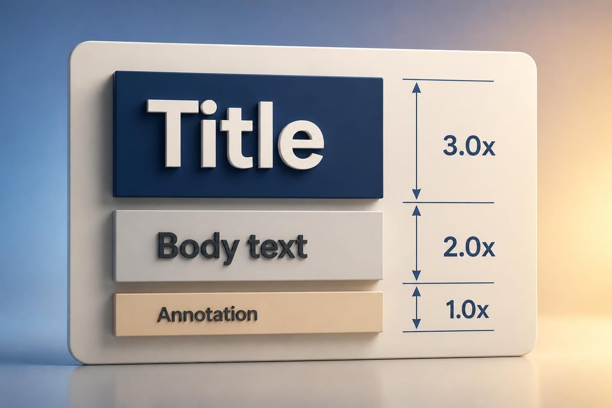
Consulting slide typography standards

Layout Principles for Maximum Impact

Effective consulting presentations rely on consistent spatial organization that reduces cognitive load and accelerates comprehension. The consulting powerpoint template establishes invisible grids that govern where elements appear, ensuring every slide feels cohesive within a larger narrative structure.

White space management separates amateur presentations from professional deliverables. Top-tier templates allocate generous margins-typically one inch on all sides-creating breathing room that prevents slides from feeling cluttered. This approach aligns with recommendations found in consulting slide standards followed by leading strategy firms.

Layout Element Standard Specification Purpose
Page Margins 1 inch all sides Creates visual breathing room
Title Position Top left or centered Establishes clear hierarchy
Content Grid 3-4 columns Enables flexible layouts
Chart Placement Centered with balanced white space Maximizes data readability
Footer Height 0.5 inches Accommodates source citations

The three-zone principle divides slides into distinct areas: the message zone (title), the support zone (body content), and the reference zone (footer with sources and page numbers). This segmentation allows audiences to quickly locate information types and understand slide purpose at a glance.

Color Schemes and Brand Alignment

Color psychology plays a critical role in consulting presentations, where credibility and objectivity must be preserved while still creating visual interest. A professional consulting powerpoint template typically employs a restrained color palette of three to five colors maximum: one or two primary brand colors, neutral grays for text and backgrounds, and accent colors for data visualization.

Strategic Color Application

The most effective templates reserve saturated colors exclusively for data highlights and calls to action. Background colors should never compete with content-light grays or whites provide optimal contrast for dark text while maintaining professionalism. When incorporating client branding, templates must balance brand colors with consulting firm standards to create cohesive deliverables.

Color coding serves functional purposes beyond aesthetics. Consistent color application across chart elements, categories, or business units helps audiences track themes throughout lengthy presentations. For financial and tech businesses specifically, blue tones often dominate for their association with trust and stability, while accent colors like orange or green highlight key performance indicators or growth metrics.

Accessibility considerations demand attention to contrast ratios. Text must maintain at least a 4.5:1 contrast ratio against backgrounds to ensure readability for all audience members. This technical requirement influences color selection from the template design phase forward, preventing last-minute accessibility corrections that can compromise visual consistency.

Data Visualization Framework Integration

Consulting presentations live or die on their ability to transform raw data into compelling visual narratives. A robust consulting powerpoint template includes pre-designed chart layouts that accommodate common visualization types while maintaining formatting consistency. These frameworks ensure that data presentations meet professional standards without requiring custom design for each analysis.

Standard visualization templates include:

  1. Waterfall charts for showing sequential contributions
  2. Segmented bar charts for category comparisons
  3. Line graphs with clear trend indicators
  4. Scatter plots for correlation analysis
  5. Heat maps for multi-dimensional data
  6. Gantt charts for project timelines

Each visualization type requires specific formatting considerations. Axis labels must be clearly readable, legends should appear in consistent positions, and data labels need appropriate precision levels. The template establishes these parameters upfront, allowing consultants to focus on insight development rather than formatting decisions.

When working with complex datasets, the template should support layered information revelation. Initial slides might present high-level trends while subsequent slides drill into supporting details. This progressive disclosure approach, combined with proper slides deck organization guidelines, prevents information overload while building comprehensive understanding.

Data visualization framework

Industry-Specific Template Customization

While core consulting principles remain consistent, different industries demand specific adaptations to standard templates. Financial services presentations require particular attention to regulatory compliance, precise numerical formatting, and secure handling of sensitive data. Technology sector presentations might emphasize product roadmaps, user experience flows, and technical architecture diagrams.

For organizations working in fintech presentation design, templates must accommodate both financial metrics and technology innovation narratives. This dual focus requires flexible layouts that can present traditional financial data alongside product screenshots, user journey maps, and competitive positioning frameworks.

Cybersecurity presentations face unique challenges in balancing technical depth with executive accessibility. A cyber security ppt template might include threat landscape visualizations, risk assessment matrices, and compliance framework mappings that wouldn't appear in other sectors. These specialized elements must integrate seamlessly with standard consulting structures.

Adapting Templates Across Client Contexts

The most versatile consulting powerpoint template systems support rapid customization without sacrificing core design principles. Master templates include color swap functionality, allowing quick brand alignment when working with multiple clients. This flexibility proves essential for agencies serving diverse portfolios, much like how pitch deck design agencies adapt their approaches across different funding contexts.

Client-facing presentations often require co-branded templates that merge consulting firm identity with client brand guidelines. This collaboration demands careful attention to hierarchy-typically the client brand receives primary placement while the consulting firm maintains a supporting presence in footers or cover slides.

Building Narrative Flow Through Template Design

Strategic consultants don't just present information; they construct arguments that lead audiences to specific conclusions. The consulting powerpoint template must support this narrative architecture through intentional sequencing and visual progression. Leading firms organize presentations using the situation-complication-resolution framework, and templates should facilitate this storytelling structure.

The pyramid principle guides content organization, placing conclusions upfront followed by supporting arguments. Templates accommodate this approach through executive summary layouts that present key takeaways before detailed analysis. This inverted structure respects executive time constraints while ensuring critical insights receive immediate attention.

Transition slides serve as chapter markers in longer presentations, signaling shifts between major topics and allowing audiences to mentally prepare for new information streams. These divider slides typically feature minimal content-often just a section title-but their consistent design reinforces presentation flow and prevents cognitive fatigue during extended sessions.

Quality Control and Template Maintenance

Even the most carefully designed consulting powerpoint template degrades without consistent maintenance and quality control processes. Organizations must establish clear ownership for template updates, ensuring that version control prevents teams from using outdated formats or conflicting style guidelines.

Template governance includes:

  • Quarterly reviews for design relevance
  • Accessibility compliance audits
  • Software compatibility testing
  • User feedback integration
  • Brand guideline synchronization

Version control becomes critical when multiple team members access shared templates. Cloud-based template libraries with check-out systems prevent conflicting edits and ensure everyone works from current versions. This infrastructure supports collaboration while maintaining design integrity across distributed teams.

Quality assurance checklists help presenters verify template compliance before client delivery. These checklists might cover alignment precision, font consistency, color accuracy, and source citation completeness. Systematic reviews catch formatting inconsistencies that could undermine professional credibility, particularly important when deliverables flow to executive audiences or board members.

Template quality control process

Advanced Features for Complex Presentations

Modern consulting presentations increasingly incorporate interactive elements and advanced functionality that static templates alone cannot support. Smart templates might include embedded calculation engines that update visualizations when underlying data changes, reducing manual reformatting and minimizing error risks.

For financial advisors and wealth management professionals, platforms like WebPrez demonstrate how structured presentation frameworks can standardize complex client communications. While this approach extends beyond traditional PowerPoint templates, it illustrates the evolution toward more dynamic presentation systems that maintain consistency while enabling personalization at scale.

Animation and transition effects, when used judiciously, can enhance understanding of complex processes or sequential developments. Templates should include animation presets that align with professional standards-subtle fades and wipes rather than distracting spins or bounces. These effects serve functional purposes, revealing information progressively rather than overwhelming audiences with dense slides.

Collaboration Tools and Template Distribution

Organizations serving multiple stakeholders need robust systems for template distribution and collaborative editing. Cloud platforms enable real-time co-authoring while maintaining format consistency, though this requires careful configuration to prevent inadvertent design compromises during collaborative sessions.

Template libraries organized by presentation type streamline project initiation. Categories might include client pitch decks, progress reviews, final deliverables, and internal strategy sessions. This organization helps teams quickly locate appropriate starting points rather than building from scratch or adapting ill-fitting formats.

When agencies like OxD PR coordinate comprehensive marketing campaigns, presentation consistency across multiple touchpoints reinforces brand coherence. Similarly, consulting firms benefit from template ecosystems that extend beyond PowerPoint to include Word reports, Excel dashboards, and web-based deliverables, all sharing common design language.

Training programs ensure team members understand template features and application contexts. New consultants particularly benefit from structured onboarding that covers not just what templates look like, but why specific design choices support effective client communication. This knowledge transfer preserves institutional design standards even as team composition evolves.

Template Selection and Customization Strategies

Choosing between building custom templates and adapting existing frameworks requires careful consideration of organizational needs, budget constraints, and timeline pressures. Resources like free consulting PowerPoint templates provide starting points for firms testing new formats or working within tight budgets, though customization typically proves necessary for distinctive brand expression.

Approach Benefits Considerations Best For
Custom Build Perfect brand alignment, unique design Higher cost, longer timeline Established firms with clear identity
Template Adaptation Faster deployment, proven layouts Generic appearance, limited differentiation Startups, rapid projects
Hybrid Model Balance of speed and customization Requires design expertise Growing firms, varied client base

The hybrid approach combines pre-built structural elements with custom branding and specialized slide types. This method delivers professional results faster than pure custom development while avoiding the generic appearance of unmodified commercial templates. For firms serving best PPT presentation templates needs across multiple industries, this flexibility proves essential.

Investment in template development pays dividends through reduced per-project design time and improved cross-team consistency. When consultants spend less time formatting slides, they allocate more energy to strategic thinking and client relationship development. This efficiency gain particularly matters for firms operating on billable hours models where non-billable administrative tasks directly impact profitability.

Emerging Trends in Consulting Presentation Design

The consulting presentation landscape continues evolving as audience expectations shift and new technologies enable different communication approaches. Current trends emphasize minimalism over complexity, with PowerPoint trends in consulting for 2025 highlighting the one-slide-one-idea principle that reduces cognitive load and improves message retention.

Interactive dashboards increasingly supplement traditional linear presentations, allowing executives to explore data dimensions that interest them most. While these dynamic tools extend beyond standard PowerPoint capabilities, they reflect broader movement toward personalized, audience-driven content delivery rather than one-size-fits-all presentations.

Sustainability considerations now influence design choices, with digital-first approaches reducing printed materials and encouraging more streamlined content that respects audience attention as a precious resource. This philosophical shift aligns with broader consulting trends toward agile methodologies and iterative client engagement rather than comprehensive one-time deliverables.

The rise of remote presentation contexts demands templates optimized for screen sharing rather than conference room projection. This shift affects everything from font sizing to color contrast, as presenters adapt to smaller viewing windows and varied display technologies. Templates must perform equally well on executive desktop monitors and analyst laptop screens.


Mastering consulting powerpoint template design requires balancing rigid standards with flexible application, ensuring every presentation maintains professional credibility while effectively communicating unique strategic insights. Whether you're developing internal capabilities or seeking expert support, the right template foundation accelerates your team's ability to transform complex analysis into compelling visual narratives. Prznt Perfect specializes in creating custom presentation templates and design systems for financial and tech businesses, helping organizations establish distinctive visual identities that enhance their consulting deliverables and strengthen client relationships.


News & Updates...

Master conference PPT design with expert strategies for financial and tech presentations. Learn visual storytelling, data clarity, and engagement.

Master visual data presentation techniques to transform complex information into clear, compelling narratives for financial and tech audiences.