Conference PPT: Design Strategies for Maximum Impact

Creating a compelling conference ppt requires more than simply transferring information onto slides. Whether you're presenting quarterly financial results, unveiling a new technology platform, or pitching to investors, your presentation serves as the visual backbone of your message. In today's competitive business landscape, where attention spans are measured in seconds and audiences expect professional polish, the quality of your conference ppt can determine whether your message resonates or gets forgotten. This comprehensive guide explores the strategic design approaches that transform ordinary presentations into powerful communication tools, with particular focus on the unique challenges faced by financial and tech professionals.

Understanding Conference PPT Requirements

Conference presentations demand a different approach than internal team meetings or casual updates. Your audience likely includes industry experts, potential clients, investors, or competitors who will evaluate both your content and how you present it. The stakes are significantly higher when you're on stage rather than in a boardroom.

Key considerations for conference environments include:

  • Audience size and seating arrangement affecting readability
  • Presentation duration and time constraints
  • Technical setup and screen dimensions
  • Recording or live-streaming requirements
  • Lighting conditions that impact color choices

The physical environment shapes every design decision. A conference ppt viewed on a massive screen from 50 feet away requires dramatically different typography and layout choices compared to a deck shared during a video call. Understanding these constraints before you begin design work prevents costly last-minute revisions.

Technical Specifications That Matter

Most conference organizers provide specific technical guidelines, but many presenters overlook these critical details until it's too late. Screen aspect ratios vary between venues, with 16:9 being standard for modern conferences while older venues may still use 4:3 projectors.

Specification Standard Conference Large Venue Virtual Conference
Aspect Ratio 16:9 16:9 16:9
Resolution 1920x1080 1920x1080 or higher 1920x1080
File Format PPTX, PDF PPTX, PDF PPTX, PDF, Video
Font Embedding Required Required Required
Video Codec H.264 H.264 H.264

File size also matters when you're uploading to conference systems or sharing with organizers. Compressed images and embedded fonts keep files manageable while maintaining quality. Always test your conference ppt on the actual presentation system when possible, or at minimum, bring backup copies in multiple formats.

Conference presentation technical requirements

Visual Hierarchy and Data Presentation

Financial and tech presentations frequently involve complex data sets, detailed charts, and technical specifications that can overwhelm audiences if not properly structured. The challenge lies in maintaining accuracy while ensuring clarity. Your conference ppt must balance comprehensiveness with digestibility.

Establishing clear visual hierarchy guides audience attention exactly where you want it. Primary information should dominate through size, color, or position, while supporting details receive proportionally less emphasis. This approach proves especially critical when presenting financial data visualizations that require both precision and quick comprehension.

Structuring Complex Information

Breaking down complex topics into digestible segments prevents cognitive overload. Rather than cramming extensive data onto single slides, strategic distribution across multiple slides with clear transitions maintains audience engagement while preserving detail.

Effective data presentation strategies:

  • Use progressive disclosure to build understanding step by step
  • Highlight key metrics with contrasting colors or callout boxes
  • Employ consistent chart styles throughout the presentation
  • Include data sources and timestamps for credibility
  • Remove unnecessary gridlines, labels, and chart elements

The most effective conference ppt designs make complex information feel simple. When presenting technical specifications or financial projections, consider how each element serves your core message. Every chart, graph, or data point should answer a specific question your audience has, not simply display information because it's available.

Typography and Readability Standards

Typography choices dramatically impact how audiences perceive and retain your message. Selecting appropriate fonts for a conference ppt goes beyond aesthetic preference; readability from distance determines whether your audience can actually read your slides. Many presenters make the critical error of using font sizes appropriate for computer screens rather than projection.

Minimum font sizes for conference presentations start at 24 points for body text and 36 points for headings, though 30 and 44 points respectively provide better readability. These guidelines from effective slide design research account for typical conference room dimensions and audience positioning.

Font Selection Best Practices

Sans-serif fonts generally provide superior readability on screens compared to serif alternatives. However, the specific font family matters less than consistency and appropriate sizing. Limiting your conference ppt to two font families maximum creates visual coherence without monotony.

Font Purpose Recommended Size Font Weight Example Applications
Main Headings 44-54pt Bold Slide titles, section dividers
Subheadings 32-40pt Semibold Topic introductions, categories
Body Text 28-32pt Regular Bullet points, descriptions
Captions 24-28pt Regular Chart labels, footnotes

Color contrast between text and background proves equally important as size. The WCAG 2.1 standard recommends a contrast ratio of at least 4.5:1 for normal text and 3:1 for large text. These standards ensure readability under various lighting conditions common in conference venues. Testing your conference ppt under different brightness settings reveals potential visibility issues before presentation day.

Typography hierarchy in presentations

Color Strategy for Professional Impact

Color psychology influences how audiences perceive your message and your brand. Financial institutions typically employ blues and greens to convey stability and growth, while tech companies often choose bolder palettes suggesting innovation and energy. Your conference ppt color scheme should align with both your brand identity and your message intent.

Beyond brand alignment, color serves functional purposes in guiding attention and organizing information. Consistent color coding throughout your presentation helps audiences quickly understand data categories, process stages, or comparative elements. However, restraint prevents visual chaos; limiting your palette to 3-4 primary colors plus neutral tones creates sophisticated, professional presentations.

Strategic color applications include:

  • Highlighting key performance metrics or critical data points
  • Differentiating between data series in charts and graphs
  • Creating visual separation between sections or topics
  • Emphasizing calls to action or important conclusions
  • Establishing consistent themes across related content

Accessibility considerations require attention to color blindness, which affects approximately 8% of men and 0.5% of women. Never rely solely on color to convey information; combine color coding with patterns, labels, or icons to ensure universal comprehension. Professional presentation design approaches incorporate these accessibility standards from the outset.

Image Selection and Visual Storytelling

Powerful imagery transforms abstract concepts into memorable moments. However, generic stock photos often undermine credibility rather than enhance it. Your conference ppt benefits most from specific, relevant visuals that directly support your narrative rather than simply filling space.

When presenting technical concepts, custom diagrams and infographics communicate more effectively than photographs. Financial data comes alive through thoughtful visualization that highlights trends and relationships rather than simply displaying numbers. The investment in quality imagery pays dividends in audience retention and message impact.

Balancing Text and Visuals

Following best practices from conference slide design experts, the most effective presentations use visuals as the primary communication vehicle with text serving as support rather than the reverse. Slides dominated by bullet points fail to leverage the visual medium's full potential.

Consider the "billboard test" for each slide: if someone glanced at your conference ppt for three seconds, would they grasp the main point? This standard forces clarity and visual impact while eliminating unnecessary clutter. Complex ideas benefit from visual metaphors that create instant understanding where text explanations would require paragraphs.

Narrative Structure and Flow

Even the most beautifully designed conference ppt fails without coherent narrative structure. Your presentation should follow a logical progression that builds understanding, maintains interest, and drives toward clear conclusions. This storytelling approach proves particularly important in financial and tech contexts where complexity can quickly overwhelm audiences.

Opening slides establish context and credibility while preview what's coming. The body delivers core content through structured segments, each building on previous information. Closing slides synthesize key points and provide clear next steps or calls to action. This three-act structure, adapted from conference presentation best practices, creates satisfying narrative arcs that audiences follow naturally.

Transition Strategies

Smooth transitions between topics prevent jarring jumps that confuse audiences. Section divider slides signal major topic shifts, while consistent layouts within sections create cohesion. Your conference ppt should feel like a single, flowing story rather than disconnected information segments.

Effective transition techniques:

  1. Use consistent section headers with progress indicators
  2. Include brief recap slides before major topic changes
  3. Employ visual motifs that carry through the presentation
  4. Reference previous points when introducing related concepts
  5. Maintain consistent positioning for recurring elements

Understanding slides deck organization principles ensures your conference ppt maintains logical flow even as content complexity increases. Each slide should serve a specific purpose in advancing your overall narrative.

Animation and Multimedia Integration

Strategic animation directs attention and reveals information progressively, preventing audiences from reading ahead while you're still explaining earlier points. However, excessive or flashy animations distract rather than enhance. Your conference ppt should use animation purposefully, not decoratively.

Entrance animations work well for bullet points, allowing you to control pacing and keep focus on current discussion topics. Build sequences help explain complex processes step by step. Transitions between slides should remain subtle; simple fades or cuts maintain professionalism while flashy wipes and spins appear amateurish.

Video and Embedded Content

Video clips add powerful impact when used judiciously. Product demonstrations, customer testimonials, or process visualizations communicate more effectively through video than static slides. However, technical considerations matter; always embed videos directly in your conference ppt rather than linking to external files that might not work on presentation systems.

Media Type Best Use Cases Technical Considerations Duration Guidelines
Product Demo Feature showcase, UI walkthrough 1920x1080, H.264 codec 30-60 seconds
Customer Testimonial Social proof, case studies Audio quality critical 20-40 seconds
Process Animation Complex workflows, data flows Vector format preferred 15-30 seconds
Background Video Ambient mood, brand reinforcement Muted, loop seamlessly Continuous

Testing all multimedia elements on the actual presentation system prevents last-minute technical failures. Always prepare static backup slides showing key frames from videos in case playback issues occur.

Conference presentation workflow

Template Strategy and Brand Consistency

Professional templates provide structure and consistency while accelerating creation timelines. However, generic templates undermine uniqueness and often fail to address industry-specific needs. Custom conference ppt templates tailored to your organization ensure brand consistency while accommodating the specific content types you regularly present.

Effective templates include master slides for common scenarios: title slides, content slides with various layouts, data visualization slides, section dividers, and closing slides. This variety prevents monotony while maintaining cohesive design language. When exploring sample PowerPoint design options, prioritize flexibility alongside visual appeal.

Building Reusable Components

Creating libraries of reusable chart templates, icon sets, and diagram frameworks accelerates future presentations while ensuring quality consistency. Financial teams benefit from standardized templates for common metrics and KPIs, while tech teams need consistent diagram styles for architecture and workflow illustrations.

Template component library essentials:

  • Chart templates for all standard data visualization types
  • Icon sets aligned with brand visual language
  • Diagram frameworks for common process flows
  • Color palette swatches with exact values documented
  • Typography style guides with specific size and weight specifications

Maintaining these resources centrally ensures team-wide consistency and significantly reduces design time for routine presentations. Updates to brand standards propagate efficiently when templates serve as the single source of truth.

Audience Engagement Techniques

Even perfectly designed conference ppt slides cannot compensate for disengaged delivery. Your presentation design should facilitate interaction rather than create barriers between you and your audience. Slides serve as visual support for your message, not teleprompters to read verbatim.

Incorporating audience interaction points maintains attention and creates memorable moments. Strategic pauses after key revelations allow information to sink in. Questions posed to the audience, even rhetorical ones, activate mental engagement. These techniques, recommended in conference presentation guidelines, transform passive viewing into active participation.

Designing for Speaker Notes

Comprehensive speaker notes ensure smooth delivery while keeping slides clean and visual. Your conference ppt should contain minimal text on slides with detailed notes providing context, statistics, examples, and transition cues. This separation allows you to maintain eye contact with audiences rather than reading from slides.

Speaker notes should include timing cues, emphasis reminders, and potential audience questions with prepared responses. For particularly complex topics, notes might include alternative explanations for different audience knowledge levels. This preparation prevents the common scenario where presenters improvise explanations that contradict or confuse their visual materials.

Testing and Refinement Process

No conference ppt should debut at the actual event. Rigorous testing reveals issues while there's still time for corrections. Practice runs with colleagues provide feedback on clarity, pacing, and impact. Recording these rehearsals allows self-evaluation that identifies verbal tics, unclear explanations, or timing issues.

Technical testing on presentation equipment catches compatibility problems before they become public failures. Many presenters discover too late that custom fonts don't display correctly, videos won't play, or colors appear drastically different on projection systems versus computer monitors. Following presentation delivery best practices includes thorough technical validation.

Iterative Improvement Strategies

Great conference ppt designs emerge through iteration rather than single drafts. Initial versions focus on content structure and message hierarchy. Subsequent revisions refine visual design, improve data visualization, and polish transitions. Final passes eliminate every unnecessary element until only essential components remain.

Revision checklist for conference presentations:

  1. Verify all data accuracy and source citations
  2. Confirm consistent font usage and sizing throughout
  3. Check color contrast ratios for accessibility
  4. Test all animations and multimedia elements
  5. Validate file compatibility on presentation systems
  6. Remove any outdated information or references
  7. Ensure backup plans for technical failures exist

Peer review from both subject matter experts and design professionals provides balanced feedback. Technical reviewers ensure accuracy while design reviewers optimize visual impact. This dual perspective catches issues that single-discipline review might miss.

Industry-Specific Considerations

Financial presentations carry unique requirements around data accuracy, regulatory compliance, and stakeholder expectations. Your conference ppt might require specific disclaimers, standardized calculation methodologies, or audited data sources. These constraints demand extra attention to detail and documentation.

Tech presentations face different challenges, particularly when demonstrating products or explaining complex architectures. Live demonstrations carry risk but create powerful impact when executed well. Screen recordings provide safer alternatives while maintaining demonstration value. Architecture diagrams require careful abstraction to convey concepts without overwhelming detail.

Regulatory and Compliance Factors

Financial services presentations often require legal review, particularly when discussing performance projections or investment opportunities. Building approval time into your schedule prevents last-minute scrambles. Standard disclaimer slides should exist as template components, ensuring consistent compliance language across all presentations.

Tech companies presenting at industry conferences must navigate intellectual property concerns and competitive intelligence. Your conference ppt should showcase capabilities without revealing proprietary methodologies or sensitive technical details. This balance requires careful content planning and often legal consultation for high-stakes presentations.

Resource Optimization and Efficiency

Creating exceptional conference ppt presentations demands significant time and expertise. Organizations face the classic build-versus-buy decision: develop in-house capabilities or engage specialized agencies. For occasional presentations, internal development may suffice. However, companies regularly presenting at major conferences often find that professional design services deliver superior results while freeing internal resources for core business activities.

Professional presentation design agencies bring specialized expertise in visual communication, data visualization, and storytelling that typical employees lack. They also maintain current knowledge of design trends, technical capabilities, and industry best practices. When evaluating whether to work with experts in presentation design services, consider both direct costs and opportunity costs of internal development.

Building Internal Capabilities

Organizations choosing to develop internal expertise should invest in training, tools, and templates. Establishing design standards and component libraries prevents inconsistency while accelerating production. Regular skill development ensures teams stay current with evolving best practices and technical capabilities.

Creating feedback loops where presentation performance informs future design decisions drives continuous improvement. Audience surveys, engagement metrics, and outcome tracking reveal which design approaches resonate most effectively. This data-driven refinement process elevates presentation quality over time.


Mastering conference ppt design requires balancing aesthetic appeal with functional clarity, brand consistency with audience needs, and creative innovation with proven best practices. The strategies outlined here provide a comprehensive framework for creating presentations that inform, persuade, and inspire action.

When your conference presentations need to make maximum impact, Prznt Perfect transforms complex financial and technical concepts into visually compelling narratives that resonate with audiences. Our specialized expertise in presentation design for financial and tech businesses ensures your message receives the professional polish it deserves, allowing you to focus on delivery while we handle the visual storytelling.

We offer free 30-min consultation on the presentation design audit
and hiring the right visual 
comms professional, let’s talk!
Shedule a call
Shedule a call
"I understand" goes a step further into the cognitive dance of persuasion. It's where the audience begins to see the connections between the facts, to grasp the nuances of the problem and the elegance of the solution.
  • This is some text inside of a div block.
    lay out the facts clearly and compellingly. Use data to establish the ground reality, but remember that facts alone are like the individual strands of a tapestry—necessary but not complete.
    lay out the facts clearly and compellingly. Use data to establish the ground reality, but remember that facts alone are like the individual strands of a tapestry—necessary but not complete.
  • This is some text inside of a div block.
    lay out the facts clearly and compellingly. Use data to establish the ground reality, but remember that facts alone are like the individual strands of a tapestry—necessary but not complete.

We offer free 30-min consultation on the presentation design audit

and hiring the right visual 
comms professional, let’s talk!

Shedule a call

"I understand" goes a step further into the cognitive dance of persuasion. It's where the audience begins to see the connections between the facts, to grasp the nuances of the problem and the elegance of the solution.

  • - 1 -
    Consistency at Scale:

    Biotech Market Trends 2024: Tailoring Your Pitch Deck to Current Industry Dynamics.

  • - 2 -
    Efficiency and Speed:

    The traditional process of manually updating presentations is not only slow but also prone to bottlenecks, especially when dealing with large volumes of slides. Automation dramatically accelerates this process, enabling designers to apply changes across hundreds of slides in the time it would take to manually update a single one. This efficiency is a game-changer for agencies working under tight deadlines or managing multiple projects simultaneously.

  • - 3 -
    Enhanced Creativity:

    With the burden of manual updates lifted, designers can allocate more time and energy to the creative aspects of presentation design. This freedom allows for deeper exploration of innovative design concepts, experimentation with new visual storytelling techniques, and the development of more engaging and interactive presentations. Automation doesn't stifle creativity; it amplifies it, enabling designers to push the boundaries of what's possible in corporate presentation design.

  • - 4 -
    Error Reduction:

    Manual updates are inherently prone to inconsistencies and mistakes, from misaligned logos to incorrect font sizes. These errors can detract from the professionalism of a presentation and, by extension, the corporate image. Automation minimizes these risks by ensuring that updates are applied uniformly and accurately across all slides, enhancing the overall quality and integrity of the presentation.

  • - 5 -
    Cost-Effectiveness:

    The time savings afforded by automation directly translate to cost savings for both the design agency and its clients. By reducing the hours spent on manual updates, agencies can optimize their workflows and resources, allowing them to take on more projects without compromising on quality. This efficiency can also make high-quality presentation design services more affordable and accessible to a broader range of businesses.

Conference PPT: Design Strategies for Maximum Impact

Master conference PPT design with expert strategies for financial and tech presentations. Learn visual storytelling, data clarity, and engagement.

Creating a compelling conference ppt requires more than simply transferring information onto slides. Whether you're presenting quarterly financial results, unveiling a new technology platform, or pitching to investors, your presentation serves as the visual backbone of your message. In today's competitive business landscape, where attention spans are measured in seconds and audiences expect professional polish, the quality of your conference ppt can determine whether your message resonates or gets forgotten. This comprehensive guide explores the strategic design approaches that transform ordinary presentations into powerful communication tools, with particular focus on the unique challenges faced by financial and tech professionals.

Understanding Conference PPT Requirements

Conference presentations demand a different approach than internal team meetings or casual updates. Your audience likely includes industry experts, potential clients, investors, or competitors who will evaluate both your content and how you present it. The stakes are significantly higher when you're on stage rather than in a boardroom.

Key considerations for conference environments include:

  • Audience size and seating arrangement affecting readability
  • Presentation duration and time constraints
  • Technical setup and screen dimensions
  • Recording or live-streaming requirements
  • Lighting conditions that impact color choices

The physical environment shapes every design decision. A conference ppt viewed on a massive screen from 50 feet away requires dramatically different typography and layout choices compared to a deck shared during a video call. Understanding these constraints before you begin design work prevents costly last-minute revisions.

Technical Specifications That Matter

Most conference organizers provide specific technical guidelines, but many presenters overlook these critical details until it's too late. Screen aspect ratios vary between venues, with 16:9 being standard for modern conferences while older venues may still use 4:3 projectors.

Specification Standard Conference Large Venue Virtual Conference
Aspect Ratio 16:9 16:9 16:9
Resolution 1920x1080 1920x1080 or higher 1920x1080
File Format PPTX, PDF PPTX, PDF PPTX, PDF, Video
Font Embedding Required Required Required
Video Codec H.264 H.264 H.264

File size also matters when you're uploading to conference systems or sharing with organizers. Compressed images and embedded fonts keep files manageable while maintaining quality. Always test your conference ppt on the actual presentation system when possible, or at minimum, bring backup copies in multiple formats.
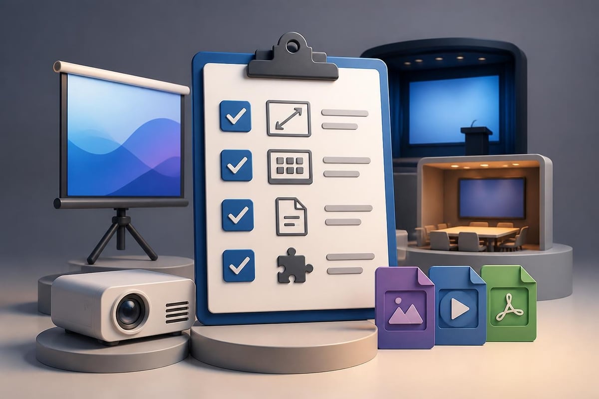
Conference presentation technical requirements

Visual Hierarchy and Data Presentation

Financial and tech presentations frequently involve complex data sets, detailed charts, and technical specifications that can overwhelm audiences if not properly structured. The challenge lies in maintaining accuracy while ensuring clarity. Your conference ppt must balance comprehensiveness with digestibility.

Establishing clear visual hierarchy guides audience attention exactly where you want it. Primary information should dominate through size, color, or position, while supporting details receive proportionally less emphasis. This approach proves especially critical when presenting financial data visualizations that require both precision and quick comprehension.

Structuring Complex Information

Breaking down complex topics into digestible segments prevents cognitive overload. Rather than cramming extensive data onto single slides, strategic distribution across multiple slides with clear transitions maintains audience engagement while preserving detail.

Effective data presentation strategies:

  • Use progressive disclosure to build understanding step by step
  • Highlight key metrics with contrasting colors or callout boxes
  • Employ consistent chart styles throughout the presentation
  • Include data sources and timestamps for credibility
  • Remove unnecessary gridlines, labels, and chart elements

The most effective conference ppt designs make complex information feel simple. When presenting technical specifications or financial projections, consider how each element serves your core message. Every chart, graph, or data point should answer a specific question your audience has, not simply display information because it's available.

Typography and Readability Standards

Typography choices dramatically impact how audiences perceive and retain your message. Selecting appropriate fonts for a conference ppt goes beyond aesthetic preference; readability from distance determines whether your audience can actually read your slides. Many presenters make the critical error of using font sizes appropriate for computer screens rather than projection.

Minimum font sizes for conference presentations start at 24 points for body text and 36 points for headings, though 30 and 44 points respectively provide better readability. These guidelines from effective slide design research account for typical conference room dimensions and audience positioning.

Font Selection Best Practices

Sans-serif fonts generally provide superior readability on screens compared to serif alternatives. However, the specific font family matters less than consistency and appropriate sizing. Limiting your conference ppt to two font families maximum creates visual coherence without monotony.

Font Purpose Recommended Size Font Weight Example Applications
Main Headings 44-54pt Bold Slide titles, section dividers
Subheadings 32-40pt Semibold Topic introductions, categories
Body Text 28-32pt Regular Bullet points, descriptions
Captions 24-28pt Regular Chart labels, footnotes

Color contrast between text and background proves equally important as size. The WCAG 2.1 standard recommends a contrast ratio of at least 4.5:1 for normal text and 3:1 for large text. These standards ensure readability under various lighting conditions common in conference venues. Testing your conference ppt under different brightness settings reveals potential visibility issues before presentation day.
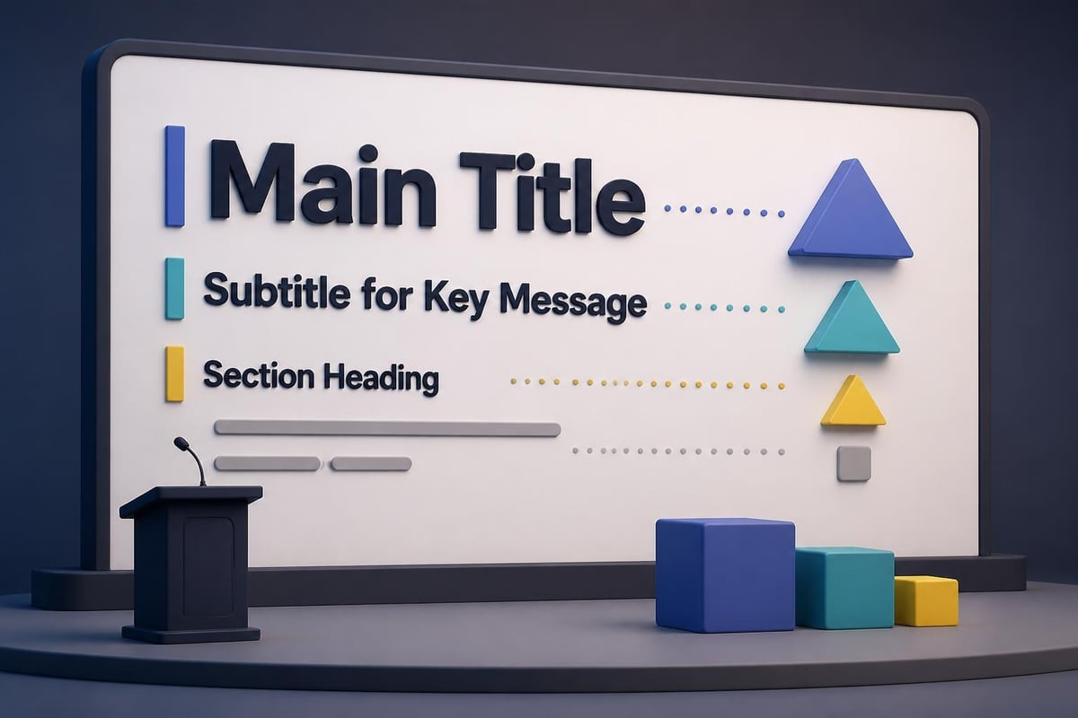
Typography hierarchy in presentations

Color Strategy for Professional Impact

Color psychology influences how audiences perceive your message and your brand. Financial institutions typically employ blues and greens to convey stability and growth, while tech companies often choose bolder palettes suggesting innovation and energy. Your conference ppt color scheme should align with both your brand identity and your message intent.

Beyond brand alignment, color serves functional purposes in guiding attention and organizing information. Consistent color coding throughout your presentation helps audiences quickly understand data categories, process stages, or comparative elements. However, restraint prevents visual chaos; limiting your palette to 3-4 primary colors plus neutral tones creates sophisticated, professional presentations.

Strategic color applications include:

  • Highlighting key performance metrics or critical data points
  • Differentiating between data series in charts and graphs
  • Creating visual separation between sections or topics
  • Emphasizing calls to action or important conclusions
  • Establishing consistent themes across related content

Accessibility considerations require attention to color blindness, which affects approximately 8% of men and 0.5% of women. Never rely solely on color to convey information; combine color coding with patterns, labels, or icons to ensure universal comprehension. Professional presentation design approaches incorporate these accessibility standards from the outset.

Image Selection and Visual Storytelling

Powerful imagery transforms abstract concepts into memorable moments. However, generic stock photos often undermine credibility rather than enhance it. Your conference ppt benefits most from specific, relevant visuals that directly support your narrative rather than simply filling space.

When presenting technical concepts, custom diagrams and infographics communicate more effectively than photographs. Financial data comes alive through thoughtful visualization that highlights trends and relationships rather than simply displaying numbers. The investment in quality imagery pays dividends in audience retention and message impact.

Balancing Text and Visuals

Following best practices from conference slide design experts, the most effective presentations use visuals as the primary communication vehicle with text serving as support rather than the reverse. Slides dominated by bullet points fail to leverage the visual medium's full potential.

Consider the "billboard test" for each slide: if someone glanced at your conference ppt for three seconds, would they grasp the main point? This standard forces clarity and visual impact while eliminating unnecessary clutter. Complex ideas benefit from visual metaphors that create instant understanding where text explanations would require paragraphs.

Narrative Structure and Flow

Even the most beautifully designed conference ppt fails without coherent narrative structure. Your presentation should follow a logical progression that builds understanding, maintains interest, and drives toward clear conclusions. This storytelling approach proves particularly important in financial and tech contexts where complexity can quickly overwhelm audiences.

Opening slides establish context and credibility while preview what's coming. The body delivers core content through structured segments, each building on previous information. Closing slides synthesize key points and provide clear next steps or calls to action. This three-act structure, adapted from conference presentation best practices, creates satisfying narrative arcs that audiences follow naturally.

Transition Strategies

Smooth transitions between topics prevent jarring jumps that confuse audiences. Section divider slides signal major topic shifts, while consistent layouts within sections create cohesion. Your conference ppt should feel like a single, flowing story rather than disconnected information segments.

Effective transition techniques:

  1. Use consistent section headers with progress indicators
  2. Include brief recap slides before major topic changes
  3. Employ visual motifs that carry through the presentation
  4. Reference previous points when introducing related concepts
  5. Maintain consistent positioning for recurring elements

Understanding slides deck organization principles ensures your conference ppt maintains logical flow even as content complexity increases. Each slide should serve a specific purpose in advancing your overall narrative.

Animation and Multimedia Integration

Strategic animation directs attention and reveals information progressively, preventing audiences from reading ahead while you're still explaining earlier points. However, excessive or flashy animations distract rather than enhance. Your conference ppt should use animation purposefully, not decoratively.

Entrance animations work well for bullet points, allowing you to control pacing and keep focus on current discussion topics. Build sequences help explain complex processes step by step. Transitions between slides should remain subtle; simple fades or cuts maintain professionalism while flashy wipes and spins appear amateurish.

Video and Embedded Content

Video clips add powerful impact when used judiciously. Product demonstrations, customer testimonials, or process visualizations communicate more effectively through video than static slides. However, technical considerations matter; always embed videos directly in your conference ppt rather than linking to external files that might not work on presentation systems.

Media Type Best Use Cases Technical Considerations Duration Guidelines
Product Demo Feature showcase, UI walkthrough 1920x1080, H.264 codec 30-60 seconds
Customer Testimonial Social proof, case studies Audio quality critical 20-40 seconds
Process Animation Complex workflows, data flows Vector format preferred 15-30 seconds
Background Video Ambient mood, brand reinforcement Muted, loop seamlessly Continuous

Testing all multimedia elements on the actual presentation system prevents last-minute technical failures. Always prepare static backup slides showing key frames from videos in case playback issues occur.

Conference presentation workflow

Template Strategy and Brand Consistency

Professional templates provide structure and consistency while accelerating creation timelines. However, generic templates undermine uniqueness and often fail to address industry-specific needs. Custom conference ppt templates tailored to your organization ensure brand consistency while accommodating the specific content types you regularly present.

Effective templates include master slides for common scenarios: title slides, content slides with various layouts, data visualization slides, section dividers, and closing slides. This variety prevents monotony while maintaining cohesive design language. When exploring sample PowerPoint design options, prioritize flexibility alongside visual appeal.

Building Reusable Components

Creating libraries of reusable chart templates, icon sets, and diagram frameworks accelerates future presentations while ensuring quality consistency. Financial teams benefit from standardized templates for common metrics and KPIs, while tech teams need consistent diagram styles for architecture and workflow illustrations.

Template component library essentials:

  • Chart templates for all standard data visualization types
  • Icon sets aligned with brand visual language
  • Diagram frameworks for common process flows
  • Color palette swatches with exact values documented
  • Typography style guides with specific size and weight specifications

Maintaining these resources centrally ensures team-wide consistency and significantly reduces design time for routine presentations. Updates to brand standards propagate efficiently when templates serve as the single source of truth.

Audience Engagement Techniques

Even perfectly designed conference ppt slides cannot compensate for disengaged delivery. Your presentation design should facilitate interaction rather than create barriers between you and your audience. Slides serve as visual support for your message, not teleprompters to read verbatim.

Incorporating audience interaction points maintains attention and creates memorable moments. Strategic pauses after key revelations allow information to sink in. Questions posed to the audience, even rhetorical ones, activate mental engagement. These techniques, recommended in conference presentation guidelines, transform passive viewing into active participation.

Designing for Speaker Notes

Comprehensive speaker notes ensure smooth delivery while keeping slides clean and visual. Your conference ppt should contain minimal text on slides with detailed notes providing context, statistics, examples, and transition cues. This separation allows you to maintain eye contact with audiences rather than reading from slides.

Speaker notes should include timing cues, emphasis reminders, and potential audience questions with prepared responses. For particularly complex topics, notes might include alternative explanations for different audience knowledge levels. This preparation prevents the common scenario where presenters improvise explanations that contradict or confuse their visual materials.

Testing and Refinement Process

No conference ppt should debut at the actual event. Rigorous testing reveals issues while there's still time for corrections. Practice runs with colleagues provide feedback on clarity, pacing, and impact. Recording these rehearsals allows self-evaluation that identifies verbal tics, unclear explanations, or timing issues.

Technical testing on presentation equipment catches compatibility problems before they become public failures. Many presenters discover too late that custom fonts don't display correctly, videos won't play, or colors appear drastically different on projection systems versus computer monitors. Following presentation delivery best practices includes thorough technical validation.

Iterative Improvement Strategies

Great conference ppt designs emerge through iteration rather than single drafts. Initial versions focus on content structure and message hierarchy. Subsequent revisions refine visual design, improve data visualization, and polish transitions. Final passes eliminate every unnecessary element until only essential components remain.

Revision checklist for conference presentations:

  1. Verify all data accuracy and source citations
  2. Confirm consistent font usage and sizing throughout
  3. Check color contrast ratios for accessibility
  4. Test all animations and multimedia elements
  5. Validate file compatibility on presentation systems
  6. Remove any outdated information or references
  7. Ensure backup plans for technical failures exist

Peer review from both subject matter experts and design professionals provides balanced feedback. Technical reviewers ensure accuracy while design reviewers optimize visual impact. This dual perspective catches issues that single-discipline review might miss.

Industry-Specific Considerations

Financial presentations carry unique requirements around data accuracy, regulatory compliance, and stakeholder expectations. Your conference ppt might require specific disclaimers, standardized calculation methodologies, or audited data sources. These constraints demand extra attention to detail and documentation.

Tech presentations face different challenges, particularly when demonstrating products or explaining complex architectures. Live demonstrations carry risk but create powerful impact when executed well. Screen recordings provide safer alternatives while maintaining demonstration value. Architecture diagrams require careful abstraction to convey concepts without overwhelming detail.

Regulatory and Compliance Factors

Financial services presentations often require legal review, particularly when discussing performance projections or investment opportunities. Building approval time into your schedule prevents last-minute scrambles. Standard disclaimer slides should exist as template components, ensuring consistent compliance language across all presentations.

Tech companies presenting at industry conferences must navigate intellectual property concerns and competitive intelligence. Your conference ppt should showcase capabilities without revealing proprietary methodologies or sensitive technical details. This balance requires careful content planning and often legal consultation for high-stakes presentations.

Resource Optimization and Efficiency

Creating exceptional conference ppt presentations demands significant time and expertise. Organizations face the classic build-versus-buy decision: develop in-house capabilities or engage specialized agencies. For occasional presentations, internal development may suffice. However, companies regularly presenting at major conferences often find that professional design services deliver superior results while freeing internal resources for core business activities.

Professional presentation design agencies bring specialized expertise in visual communication, data visualization, and storytelling that typical employees lack. They also maintain current knowledge of design trends, technical capabilities, and industry best practices. When evaluating whether to work with experts in presentation design services, consider both direct costs and opportunity costs of internal development.

Building Internal Capabilities

Organizations choosing to develop internal expertise should invest in training, tools, and templates. Establishing design standards and component libraries prevents inconsistency while accelerating production. Regular skill development ensures teams stay current with evolving best practices and technical capabilities.

Creating feedback loops where presentation performance informs future design decisions drives continuous improvement. Audience surveys, engagement metrics, and outcome tracking reveal which design approaches resonate most effectively. This data-driven refinement process elevates presentation quality over time.


Mastering conference ppt design requires balancing aesthetic appeal with functional clarity, brand consistency with audience needs, and creative innovation with proven best practices. The strategies outlined here provide a comprehensive framework for creating presentations that inform, persuade, and inspire action.

When your conference presentations need to make maximum impact, Prznt Perfect transforms complex financial and technical concepts into visually compelling narratives that resonate with audiences. Our specialized expertise in presentation design for financial and tech businesses ensures your message receives the professional polish it deserves, allowing you to focus on delivery while we handle the visual storytelling.


News & Updates...

Master visual data presentation techniques to transform complex information into clear, compelling narratives for financial and tech audiences.

Master corporate PowerPoint design with proven strategies for financial and tech presentations. Learn brand consistency, visual hierarchy, and data storytelling techniques.