
Complex Systems Visualization for Business Presentations
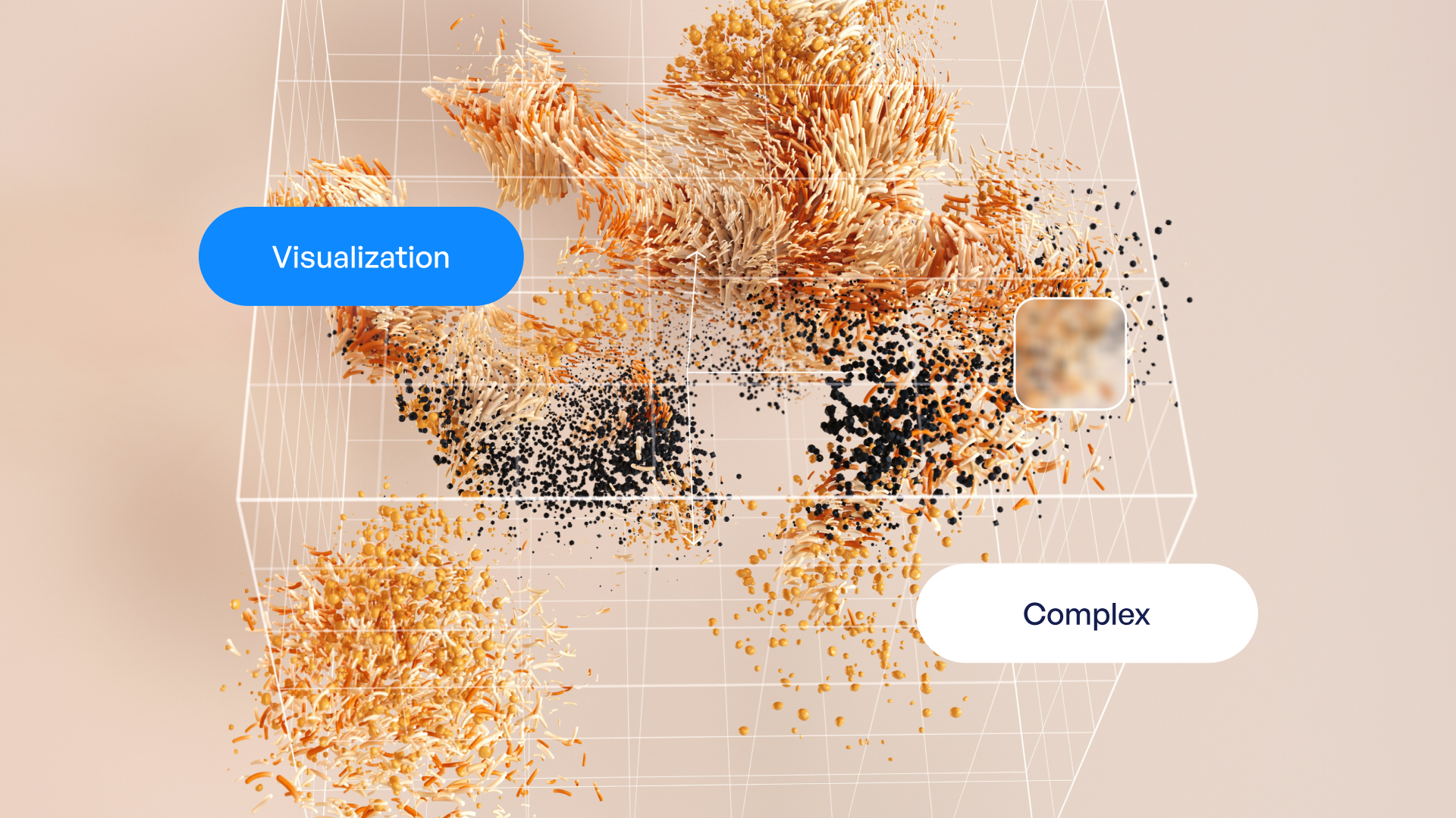
Modern business environments operate as intricate networks of interconnected processes, dependencies, and feedback loops. For financial and tech organizations, communicating these complexities to stakeholders, investors, and clients demands more than traditional charts and graphs. Complex systems visualization has emerged as an essential discipline that transforms multifaceted data relationships into digestible visual narratives, enabling audiences to grasp sophisticated concepts quickly and make informed decisions confidently.
Understanding Complex Systems in Business Contexts
Complex systems exist wherever multiple components interact dynamically to produce emergent behaviors. In business settings, these systems manifest in countless ways: supply chain networks, customer journey mapping, algorithmic trading platforms, cybersecurity threat landscapes, and organizational hierarchies.
The challenge lies not merely in collecting data from these systems but in presenting it meaningfully. Financial institutions grapple with risk assessment models involving hundreds of variables, while technology companies must explain cloud architectures, data pipelines, and machine learning workflows to non-technical stakeholders.
Traditional visualization methods often fall short when addressing these challenges. A simple bar chart cannot capture the recursive feedback loops in a pricing algorithm. A basic flowchart struggles to represent the temporal dynamics of network security events. This is where complex systems visualization techniques become indispensable.
The Science Behind Effective Visualization
Research institutions like the New England Complex Systems Institute have demonstrated that visual representations significantly enhance our understanding of system behaviors. Their work shows that intuitive graphics reduce cognitive load, allowing viewers to identify patterns, anomalies, and relationships that would remain hidden in spreadsheets or text descriptions.

Key principles governing effective complex systems visualization include:
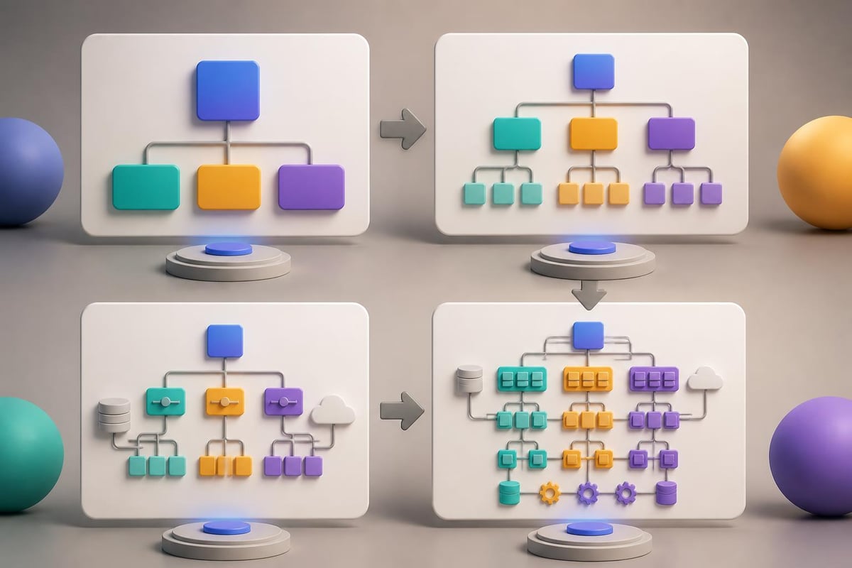
- Hierarchical layering to separate different levels of system abstraction
- Color coding to distinguish system states, categories, or risk levels
- Dynamic representations showing changes over time or under different conditions
- Interactive elements enabling audiences to explore specific pathways or scenarios
- Spatial organization reflecting actual relationships between components
For data visualization presentations, these principles create the foundation for transforming complexity into clarity.
Strategic Approaches to Visualizing Business Complexity
Different business scenarios demand tailored visualization strategies. Financial analysts presenting portfolio risk need different tools than software architects explaining microservices architecture, yet both face the fundamental challenge of making complexity comprehensible.
Network Visualizations for Interconnected Systems
Network graphs excel at representing relationships between entities. In financial contexts, this might show counterparty exposure across trading desks. For technology companies, network visualizations map service dependencies, data flows, or user interaction patterns.
| Visualization Type | Best Use Case | Key Advantage | Common Pitfall |
|---|---|---|---|
| Force-directed graphs | Showing natural clustering | Reveals hidden groupings | Can become cluttered with too many nodes |
| Hierarchical trees | Organizational structures | Clear parent-child relationships | Doesn't show cross-hierarchy connections |
| Sankey diagrams | Flow and allocation | Quantifies volume through pathways | Limited to sequential processes |
| Chord diagrams | Circular relationships | Compact representation of many-to-many | Difficult to read with asymmetric data |
When creating network visualizations for executive presentations, focus on information hierarchy. Not every connection deserves equal visual weight. Emphasize critical paths, high-value relationships, or risk concentrations while maintaining context through lighter visual treatment of secondary elements.
Temporal Dynamics and System Evolution
Complex systems rarely exist in static states. Market conditions shift, user behaviors evolve, and system performance fluctuates. Visualizing these temporal dimensions requires approaches that balance comprehensiveness with clarity.
Animation and sequential reveals work effectively in live presentations, allowing presenters to build understanding progressively. However, for pitch decks and investor materials that audiences review independently, consider small multiples showing key snapshots or sparklines indicating trends within larger visualizations.
The NIST visualization project demonstrates sophisticated techniques for representing behavior in complex information systems over time, offering valuable models for business applications.
Technical Implementation for Business Presentations
Creating compelling complex systems visualization requires both conceptual understanding and technical execution. The gap between concept and delivery often determines whether a presentation succeeds in driving decision-making or leaves audiences confused.
Tool Selection and Workflow Integration
Modern presentation designers leverage a combination of specialized visualization software and traditional presentation platforms. While tools like Tableau, D3.js, and specialized network analysis software generate sophisticated visualizations, the challenge lies in integrating these outputs into cohesive professional PowerPoint presentations.
Consider this workflow for incorporating complex visualizations:
- Analyze system architecture and identify key relationships, flows, or hierarchies
- Determine visualization type based on the specific insights you need to communicate
- Generate initial visualizations using specialized software or custom development
- Refine for presentation context by simplifying, annotating, and emphasizing critical elements
- Test comprehension with representative audience members before finalizing
- Integrate with narrative flow ensuring visualizations support rather than overshadow key messages
The importance of this systematic approach cannot be overstated. Complex systems visualization should illuminate, not overwhelm.

Design Principles for Maximum Impact
Even technically accurate visualizations fail if they don't communicate effectively. Apply these design principles when developing complex systems visualization for business contexts:
Reduce visual noise. Every element should serve a purpose. Remove gridlines, legends, and labels that don't directly support comprehension. Use whitespace strategically to create visual breathing room.
Establish clear visual hierarchy. Guide viewers' eyes through a logical progression. Primary insights should dominate visually through size, color, or position. Supporting details should recede without disappearing entirely.
Maintain brand consistency. Complex visualizations should align with corporate design standards while prioritizing clarity over strict adherence to brand guidelines when conflicts arise.
Provide contextual anchors. Include reference points, benchmarks, or comparative elements that help audiences interpret scale and significance. A network graph showing 500 connections means little without context about whether this represents growth, risk, or opportunity.
Industry-Specific Applications and Case Studies
The application of complex systems visualization varies significantly across industries. Understanding these nuances enables more effective communication tailored to specific audience expectations and knowledge levels.
Financial Services Visualizations
Financial institutions face unique challenges in visualizing complex systems. Risk assessment frameworks, trading algorithms, portfolio optimization models, and regulatory compliance structures all demand sophisticated visual treatment.
For fintech pitch decks, investors expect to see clear representations of how platforms handle transaction flows, manage risk exposure, or generate network effects. Traditional financial charts inadequately capture these dynamics.
Effective approaches include:
- Risk heat maps showing exposure concentrations across multiple dimensions simultaneously
- Waterfall charts illustrating capital allocation through complex fund structures
- Multi-axis visualizations comparing performance metrics across diverse asset classes
- Scenario trees depicting potential outcomes under different market conditions
The Stanford Rivet visualization environment offers insights into handling large financial datasets through flexible visualization frameworks that adapt to different analytical needs.
Technology Sector Applications
Technology companies present distinct visualization challenges. Software architectures, data pipelines, user journeys, and system performance metrics involve layers of abstraction that non-technical stakeholders struggle to comprehend.
| Technical Concept | Effective Visualization | Communication Goal |
|---|---|---|
| Microservices architecture | Layered network diagram | Show service independence and communication patterns |
| Data pipeline flow | Annotated Sankey diagram | Illustrate transformation stages and volume handling |
| System scalability | Multi-chart dashboard | Demonstrate performance across load conditions |
| Security architecture | Defense-in-depth visualization | Explain protection layers and threat mitigation |
For cybersecurity pitch decks, complex systems visualization must convey both technical sophistication and accessibility. Investors need to understand the threat landscape, defensive capabilities, and competitive advantages without requiring deep technical expertise.
Understanding multiscale methods becomes particularly relevant for technology presentations where system behaviors differ significantly at various scales, from individual user interactions to platform-wide performance metrics.
Advanced Techniques for Executive Communication
Executive audiences demand visualizations that deliver insights rapidly without requiring extensive interpretation. This presents a particular challenge when dealing with genuinely complex systems that resist oversimplification.
Progressive Disclosure Strategies
Rather than presenting complete system complexity upfront, employ progressive disclosure. Begin with high-level overviews highlighting key insights, then provide mechanisms for audiences to explore deeper details as needed.
In live presentations, this manifests through strategic slide sequencing. Start with simplified representations showing essential relationships or trends. Subsequent slides add layers of detail, building comprehensive understanding incrementally.
For materials reviewed asynchronously, consider annotation strategies that guide viewers through complexity. Numbered callouts, highlighted paths, or visual emphasis on critical components create reading order that prevents overwhelm.
Balancing Accuracy and Accessibility
The tension between technical accuracy and audience accessibility defines the central challenge of complex systems visualization. Oversimplification risks misrepresenting system behaviors, while excessive detail obscures actionable insights.
Successful approaches acknowledge this tension explicitly. Include brief annotations noting simplifications made for clarity. Provide supplementary materials with complete technical details for audiences requiring deeper understanding. Frame visualizations around specific decisions or questions rather than attempting comprehensive system documentation.
The research on complex systems science principles emphasizes that effective interaction with complex systems requires conceptual frameworks that balance completeness with usability, a principle equally applicable to business visualization.
Creating Actionable Visualizations for Decision-Making
Ultimately, complex systems visualization in business contexts must drive decisions. Whether securing investment, gaining stakeholder approval, or coordinating organizational action, visualizations succeed when they enable confident decision-making despite underlying complexity.
Linking Visualization to Business Outcomes
Every complex systems visualization should connect clearly to specific business outcomes or decisions. When presenting network effects in a platform business model, show how network density correlates with user retention or revenue growth. When visualizing supply chain complexity, highlight vulnerability points that inform risk mitigation strategies.
This outcome orientation transforms complex systems visualization from academic exercise into strategic tool. Consider these connections:
- Investment decisions: Show risk-adjusted return projections across scenario variations
- Resource allocation: Visualize constraint interactions and optimization opportunities
- Strategic planning: Illustrate competitive dynamics and market evolution pathways
- Operational improvement: Highlight bottlenecks, inefficiencies, or failure points
Presentation layout design plays a crucial role in reinforcing these connections, ensuring visualizations integrate seamlessly with supporting narrative and calls to action.
Testing and Validation Approaches
Before deploying complex visualizations in high-stakes presentations, validate their effectiveness through structured testing. Present visualizations to representative audience members and assess comprehension through specific questions about key insights.
Common validation questions include:
- What is the primary insight this visualization communicates?
- Which elements of the system appear most critical or risky?
- How does this system change over time or under different conditions?
- What decision does this visualization support?
Responses reveal whether visualizations achieve their communication objectives or require refinement. Iterative testing and adjustment separate effective complex systems visualization from merely attractive graphics.
Emerging Trends and Future Directions
The field of complex systems visualization continues evolving rapidly, driven by advances in data processing, interactive technologies, and behavioral research into how audiences process visual information.
Interactive and Immersive Experiences
While static presentations remain standard for many business contexts, interactive visualizations offer compelling advantages for exploring complex systems. Web-based tools allow stakeholders to adjust parameters, filter data, or focus on specific subsystems, creating personalized understanding.
Interactive complexity explorables demonstrate sophisticated approaches to making complex dynamical processes accessible through engagement rather than passive consumption. These techniques increasingly influence business presentation design.
However, interactivity introduces implementation challenges. Not all presentation contexts support interactive elements, and poorly designed interactivity can confuse rather than clarify. Consider audience technical sophistication, presentation format, and available development resources when deciding whether to pursue interactive approaches.
Artificial Intelligence and Automated Visualization
Machine learning algorithms increasingly assist in generating complex systems visualization, automatically identifying patterns, clustering related elements, or suggesting optimal visual representations based on data characteristics and communication objectives.
These capabilities promise significant efficiency gains but require careful human oversight. Automated visualizations may miss domain-specific nuances or optimize for generic patterns rather than business-relevant insights. The most effective implementations combine algorithmic assistance with expert human judgment about what matters for specific audiences and decisions.
Real-Time System Monitoring
For operational contexts, real-time complex systems visualization enables dynamic monitoring and rapid response to changing conditions. Trading floors, network operations centers, and manufacturing facilities increasingly deploy sophisticated dashboards that update continuously, alerting personnel to anomalies or opportunities.
Translating these operational visualizations into strategic presentations requires thoughtful adaptation. Capture key moments, trends, or scenarios that illustrate system behaviors without overwhelming decision-makers with operational minutiae.
Building Organizational Capability
Developing expertise in complex systems visualization extends beyond individual presentation designers. Organizations benefit from cultivating this capability across teams responsible for communicating with technical and non-technical stakeholders.
Training and Skill Development
Effective complex systems visualization requires skills spanning data analysis, design principles, storytelling, and domain expertise. Few individuals possess all these capabilities naturally, making structured training essential.
Focus training programs on:
- Analytical thinking to identify meaningful patterns and relationships in complex data
- Visual design fundamentals including color theory, typography, and composition
- Storytelling techniques that transform data insights into compelling narratives
- Technical tools for creating sophisticated visualizations efficiently
- Audience psychology understanding how different stakeholders process visual information
Organizations serious about improving their presentation capabilities often benefit from presentation outsourcing services that combine expert design with strategic communication consulting.
Establishing Visualization Standards
Creating organization-wide standards for complex systems visualization ensures consistency, quality, and efficiency. Standards might address color schemes for different data types, approved visualization formats for common scenarios, or guidelines for simplification and annotation.
These standards should balance consistency with flexibility, providing frameworks rather than rigid templates. Different presentation contexts demand different approaches, but common principles and quality benchmarks maintain professionalism across all materials.
Collaboration Between Technical and Creative Teams
The most effective complex systems visualization emerges from collaboration between technical experts who understand system intricacies and creative professionals who excel at visual communication. Neither group alone typically produces optimal results.
Structure collaboration workflows that leverage each group's strengths:
- Technical teams provide accurate system models, identify key relationships, and validate visualization accuracy
- Creative teams translate technical models into visually compelling formats, simplify without distorting, and integrate visualizations into broader narrative structures
- Joint review ensures both technical accuracy and communication effectiveness
This collaborative approach mirrors the methodology employed by specialized agencies working at the intersection of complex data and compelling presentation design.
Mastering complex systems visualization transforms how financial and tech organizations communicate with stakeholders, turning intricate data relationships into clear, actionable narratives that drive confident decision-making. Whether you're preparing investor pitches, executive briefings, or client presentations, the ability to visualize complexity effectively separates memorable, persuasive communications from forgettable data dumps. Prznt Perfect specializes in exactly this transformation, combining deep expertise in visual storytelling with sophisticated understanding of financial and technical subject matter to create presentations that resonate powerfully with your most important audiences.


- This is some text inside of a div block.lay out the facts clearly and compellingly. Use data to establish the ground reality, but remember that facts alone are like the individual strands of a tapestry—necessary but not complete.lay out the facts clearly and compellingly. Use data to establish the ground reality, but remember that facts alone are like the individual strands of a tapestry—necessary but not complete.
- This is some text inside of a div block.lay out the facts clearly and compellingly. Use data to establish the ground reality, but remember that facts alone are like the individual strands of a tapestry—necessary but not complete.

