
Bad Presentation Examples Funny: Learn From Epic Fails
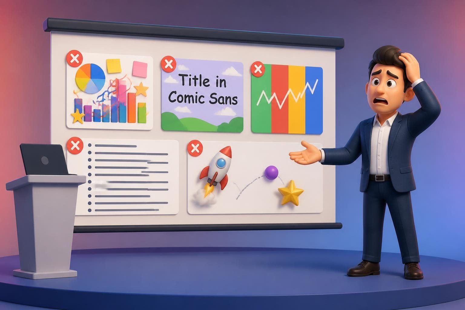
We've all sat through presentations that made us cringe, laugh, or quietly question the presenter's design choices. While presentation disasters can be painful to watch, they offer valuable lessons in what not to do. The internet is filled with bad presentation examples funny enough to go viral, from slides crammed with illegible text to animations that would make a 1990s website jealous. For financial and tech professionals who need to communicate complex data effectively, understanding these common pitfalls is essential to avoiding similar embarrassment and ensuring your message lands with impact.
The Comic Sans Catastrophe and Font Failures
Typography choices can make or break a presentation's credibility. Nothing screams unprofessional quite like Comic Sans in a quarterly earnings report or investor pitch deck.
Why Font Choices Matter More Than You Think
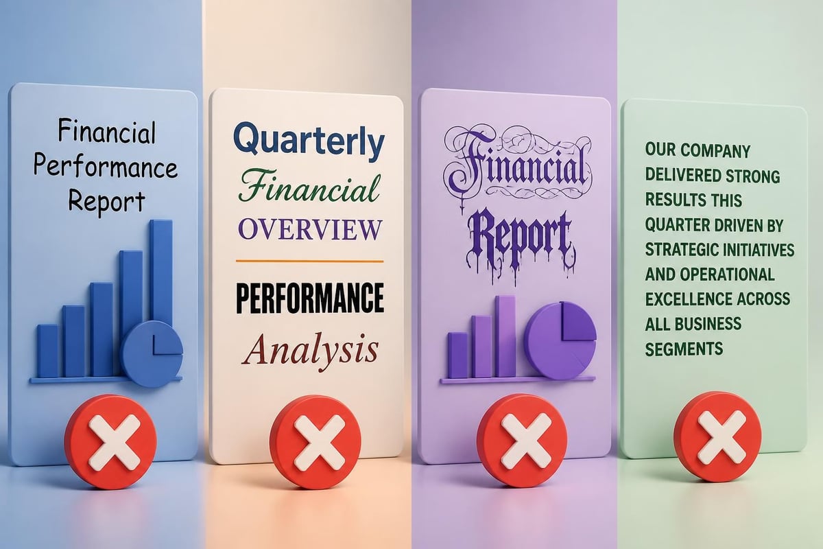
Bad presentation examples funny often feature font disasters that undermine the speaker's authority before they even begin. Comic Sans, Papyrus, and Curlz MT have become the poster children for poor typography decisions, particularly in business contexts. When analyzing what makes a bad presentation, font selection consistently ranks among the top visual offenders.
The comedy gold comes when serious topics get paired with whimsical fonts. Imagine presenting cybersecurity threat analysis in Curlz MT or financial projections in Jokerman. These mismatches create cognitive dissonance that distracts from your message and damages credibility.
Common font failures include:
- Using more than three different font families on a single slide
- Selecting decorative fonts for body text that becomes illegible at distance
- Mixing serif and sans-serif fonts without strategic purpose
- Choosing fonts smaller than 24pt for presentation viewing
- Using all caps for extended paragraphs (IT LOOKS LIKE YOU'RE SHOUTING)
Professional presentation designers understand that typography communicates as much as the words themselves. When creating a professional slide deck, font selection should reflect your brand identity while maintaining readability and professionalism.
The Bullet Point Avalanche
Death by bullet points is a presentation cliché for good reason. It's everywhere, it's boring, and it's completely ineffective at communicating meaningful information.
When Bullets Become Weapons Against Engagement
One of the most common bad presentation examples funny scenarios involves slides that look more like grocery lists than visual communications. Presenters often mistake PowerPoint for a Word document, creating slides with 8-10 bullet points, each containing complete sentences that they proceed to read verbatim.
This catalog of presentation catastrophes demonstrates how excessive bullet points transform audiences into zombies scrolling through their phones. The humor comes from watching presenters turn their backs to the audience, reading every word while their listeners silently suffer.
| Bullet Point Error | Impact | Better Alternative |
|---|---|---|
| 8+ bullets per slide | Cognitive overload | Maximum 3-5 bullets |
| Complete sentences | Presenter reads verbatim | Short phrases only |
| Sub-bullets 3 levels deep | Confusion and complexity | Flat hierarchy |
| Every slide has bullets | Visual monotony | Mix formats: charts, images, quotes |
Financial and tech presentations often fall into this trap when dealing with complex information. The instinct is to include everything, resulting in slides that overwhelm rather than illuminate. Creating effective pitch decks requires discipline to present only essential points while saving details for appendices or verbal elaboration.
The funniest bullet point fails occur when presenters create bullets for single words or obvious statements like "Introduction" or "Thank you for listening." If a bullet point doesn't add value, it shouldn't exist.
Animation Nightmares and Transition Chaos
PowerPoint's animation features are powerful tools in skilled hands. In unskilled hands, they become comedy gold that distracts, annoys, and confuses audiences.
Excessive animations represent some of the most entertaining bad presentation examples funny collections online. Examples of terrible PowerPoint presentations showcase spinning text, bouncing logos, and slide transitions that make audiences seasick.
The Animation Hall of Shame
Notorious animation mistakes:
- Every element flies in from different directions with different timings
- Sound effects accompany each animation (whoosh, ding, applause)
- Text spirals in letter-by-letter, wasting valuable presentation time
- Images bounce three times before settling into position
- Slide transitions cycle through every available option
The comedy peaks when animations malfunction or take longer than anticipated. Watching a presenter stand awkwardly while text crawls onto the screen at glacial speed provides unintentional entertainment that undermines their credibility.
Tech startups presenting to investors are particularly susceptible to animation overuse, perhaps believing that flashy effects demonstrate innovation. However, experienced investors want clarity and substance, not digital fireworks. When designing creative pitch deck designs, restraint with animations demonstrates sophistication and respect for your audience's time.
Strategic animation serves specific purposes: revealing data progressively, emphasizing key points, or guiding attention. Everything else is noise.

Color Catastrophes and Visual Chaos
Color theory isn't just for artists. Poor color choices can render text illegible, trigger headaches, and signal amateur design skills.
The most hilarious color failures create physical discomfort. Bright red text on bright blue backgrounds. Neon yellow backgrounds with white text. Gradients that make reading impossible. These worst presentation examples demonstrate how color choices alone can doom an otherwise solid presentation.
Understanding Color Psychology and Readability
Different colors evoke different emotions and associations, particularly important for financial and tech presentations where trust and credibility matter. However, the funniest color mistakes ignore both psychology and basic readability principles.
Classic color errors include:
- Using your company's full rainbow logo colors across every slide
- Black text on dark blue backgrounds (basically invisible)
- Clashing color combinations that create visual vibration
- Different color schemes on every slide with no consistency
- Overusing gradients, especially those rainbow-spectrum transitions
| Color Mistake | Why It's Problematic | Professional Solution |
|---|---|---|
| Rainbow themes | Looks childish, hard to read | Limit to 2-3 brand colors |
| Low contrast | Text becomes illegible | Ensure sufficient contrast ratios |
| Inconsistent schemes | Appears disorganized | Maintain color consistency |
| Excessive highlighting | Everything emphasized means nothing emphasized | Use color sparingly for impact |
When comparing best and worst PowerPoint examples, color usage consistently differentiates professional from amateur work. Financial services presentations benefit from conservative color palettes that communicate stability and trust, while tech presentations can embrace bolder choices that signal innovation while maintaining readability.
The Data Visualization Disasters
Charts and graphs should clarify information. In bad presentation examples funny compilations, they accomplish the opposite with spectacular failure.
When Charts Attack
3D pie charts with 12 segments. Bar graphs with three different y-axes. Line charts where lines cross so many times they resemble abstract art. These visualization catastrophes confuse rather than clarify, turning data into decorative nonsense.
The humor intensifies when presenters include complex Excel tables copied directly onto slides, with text so small it requires binoculars to read. Watching someone say "I know you can't read this, but..." while displaying an incomprehensible spreadsheet has become a cliché precisely because it happens so frequently.
Data visualization mistakes that inspire laughter:
- 3D effects that distort data proportions
- Pie charts with more than 5 segments
- Multiple data series with similar colors
- Missing axis labels or legends
- Charts that don't match the point being made
Financial professionals face particular challenges visualizing complex data. The temptation to include every data point can result in charts that obscure trends rather than reveal them. Effective visual storytelling requires selecting the right visualization type and simplifying to highlight key insights.
Tech presentations similarly struggle with technical diagrams that make sense to engineers but confuse everyone else. Network topology charts with 50 nodes and crossing connection lines create comedy when presenters zoom in and out repeatedly trying to explain relationships.
Image Fails and Stock Photo Sins
Images should enhance your message, not distract from it. Poor image choices have launched a thousand internet memes.
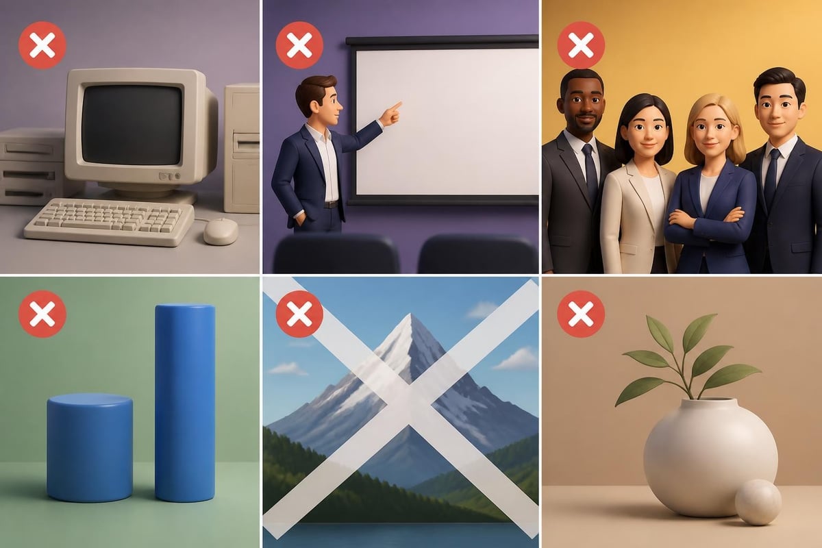
Low-resolution logos that pixelate when enlarged. Awkward stock photos of people pointing at blank screens. Clipart from 1995. Watermarked images downloaded from Google. These visual offenses feature prominently in bad presentation examples funny enough to go viral.
The Stock Photo Phenomenon
Nothing dates a presentation faster than outdated stock photography. Images of business people in 1980s suits giving exaggerated thumbs-up. Uncomfortably diverse teams gathered around a single laptop, all pointing and smiling. These clichéd images communicate inauthenticity and lazy design.
The funniest image failures involve complete mismatches between content and visuals. Discussing cybersecurity threats while showing a picture of a kitten. Presenting financial projections with a background image of a tropical beach. These disconnects create unintentional comedy that undermines serious messages.
Common image mistakes:
- Stretching images and distorting proportions
- Using blurry, low-resolution photos
- Leaving watermarks on downloaded images
- Background images that make text illegible
- Irrelevant decorative images that add no value
When selecting imagery for slide deck templates, relevance and quality matter more than quantity. One powerful, high-resolution image beats ten mediocre stock photos every time.
Text Overload and the Wall of Words
If your slide looks like a page from a textbook, you've created a wall of words that audiences will ignore while they check email.
Paragraph after paragraph crammed onto slides represents perhaps the most common and most boring failure mode. These text-heavy disasters force audiences to choose between reading slides or listening to the presenter, effectively splitting attention and reducing comprehension of both.
The Paragraph Problem
Bad presentation examples funny often feature slides containing 200+ words in 12-point font. Presenters then compound this error by reading every word while standing in front of the projection, blocking portions of text. The absurdity reaches peak levels when presenters apologize for the text volume: "I know there's a lot here, but..."
The fundamental misunderstanding is treating presentation software as a document delivery system. Slides should support spoken words, not replace them. When every detail appears on screen, the presenter becomes redundant.
| Text Overload Sign | Why It Fails | Solution |
|---|---|---|
| Paragraphs of body text | Audience reads instead of listening | Use brief phrases only |
| Tiny font sizes | Content becomes illegible | Minimum 24pt, preferably 32pt+ |
| Full sentences everywhere | Information overload | Fragments and keywords only |
| No white space | Visual claustrophobia | Embrace empty space for breathing room |
Financial presentations often struggle with text overload when trying to include regulatory disclosures, methodology details, and comprehensive data. However, effective communication requires editing ruthlessly and moving supporting information to appendix slides or handout documents.
Template Tragedies and Design Inconsistency
Using PowerPoint's default templates signals either laziness or inexperience. Mixing multiple templates in one presentation signals chaos.
The comedy emerges when presenters cycle through different built-in templates throughout a presentation, each slide sporting a different color scheme, font, and layout. This visual whiplash suggests the deck was assembled by multiple people who never communicated, creating an inconsistent mess.
Default Template Dangers
PowerPoint's default templates have appeared in millions of presentations, making them instantly recognizable and thoroughly boring. Using them signals that you couldn't invest time in custom design, undermining perceptions of professionalism and attention to detail.
Template mistakes that amuse and confuse:
- Switching templates between sections
- Using different layouts on every slide with no consistency
- Keeping default placeholder text ("Click to add title")
- Leaving template graphics that don't relate to content
- Mixing multiple brand guidelines in investor presentations
When creating presentations for tech and finance audiences, template selection communicates brand identity and organizational sophistication. Professional presentation design ensures consistency across all slides while reflecting company branding and maintaining visual interest.
The funniest template failures occur when placeholder text remains intact: "Your Company Name Here" or "Insert Logo." These oversights suggest the presenter never reviewed their own slides before presenting.
Technical Failures and Live Demo Disasters
Technical difficulties provide some of the most memorable presentation disasters, though they're painful rather than intentionally funny.
Live demonstrations that crash spectacularly. Videos that won't play. Slides that display incorrectly on venue projectors. Internet connections that fail during cloud-based presentations. These technical catastrophes create sympathy for presenters while highlighting the importance of backup plans.
The Demo That Shall Not Be Named
"Let me just pull up this live demo..." are words that often precede disaster. Software crashes. Features malfunction. Loading screens freeze. The audience watches in uncomfortable silence as the presenter frantically clicks, types, and mutters technical explanations.
Preventing technical comedy:
- Always have offline backup versions of everything
- Test all technology in the actual presentation venue
- Prepare screenshots as fallback for live demos
- Have video recordings of demos that might fail
- Practice with the exact equipment you'll use
Tech companies presenting products to investors face particular risks with live demonstrations. While demos can powerfully showcase functionality, failures can destroy credibility instantly. Many experienced presenters now use recorded demos with live narration, eliminating technical risk while maintaining engagement.
The Overstuffed Slide Syndrome
When presenters try to cram every possible element onto a single slide, they create visual cacophony that communicates nothing effectively.
Charts, bullet points, images, logos, diagrams, and text all competing for attention on one slide creates bad presentation examples funny enough to feature in design courses as cautionary tales. These kitchen-sink slides demonstrate a fundamental misunderstanding: more is not better.
Recognizing Information Overload
The overstuffed slide syndrome typically results from presenters trying to "save time" by combining multiple topics. Instead of creating logical flow across several focused slides, they create one incomprehensible mess that requires several minutes to explain.
Audiences confronted with overstuffed slides experience cognitive overload, unable to process all elements simultaneously. Eyes dart around randomly, attention fragments, and key messages disappear in the clutter.
Elements contributing to slide chaos:
- Multiple charts with different scales and axes
- Background images that compete with foreground content
- Logo repeated in multiple locations and sizes
- Sidebar text boxes containing tangential information
- Decorative elements that serve no communication purpose
- Footer text in 8-point font listing sources, dates, and disclaimers
Breaking complex information into sequential slides allows presenters to guide attention deliberately, building understanding progressively. This approach respects cognitive limitations and creates clearer communication pathways.
Timing Disasters and Pacing Problems
Having 87 slides for a 15-minute presentation guarantees either rushed delivery or incomplete coverage.
The comedy emerges when presenters realize 10 minutes in that they're only on slide 12 of 75. Watching someone accelerate frantically through slides, skipping content and mumbling "I'll send you this later," provides unintentional entertainment while destroying message effectiveness.
Slide Count Mathematics
Presentation timing guidelines:
- Standard pace: approximately 1-2 minutes per slide
- Complex data slides: 2-3 minutes per slide
- Simple transition slides: 30 seconds
- Title/section divider slides: 10-15 seconds
Calculating backwards from your allocated time helps determine appropriate slide count. A 20-minute investor pitch should contain roughly 10-20 substantive slides, not 50.
The inverse problem also creates comedy: presenters with 8 slides for 45 minutes, resulting in awkward pauses, repeated explanations, and desperate filler content. Finding the right balance between too much and too little requires practice and realistic time estimation.
Learning From Laughter
While bad presentation examples funny enough to go viral provide entertainment, they offer valuable lessons in what to avoid. Each disaster demonstrates principles worth understanding:
Key takeaways from presentation failures:
- Simplicity beats complexity in visual communication
- Consistency creates professionalism and credibility
- Respect for audience time and attention is paramount
- Technical preparation prevents embarrassing failures
- Design choices communicate as powerfully as content
For financial and tech professionals, presentations often determine funding outcomes, partnership opportunities, and career advancement. Understanding common pitfalls helps avoid them. Studying failures helps identify excellence.
The difference between amateur and professional presentations isn't budget, it's knowledge, attention to detail, and respect for communication principles. While laughing at presentation disasters provides cathartic relief for anyone who's endured bad slides, the real value lies in applying these lessons to your own work.
Learning from hilarious presentation failures helps you avoid similar disasters in your critical business communications. Understanding what makes audiences cringe, laugh, or tune out completely arms you with knowledge to create presentations that engage, persuade, and deliver results. When your next investor pitch, client presentation, or executive briefing demands visual excellence, Prznt Perfect brings professional design expertise to transform your complex data into compelling visual narratives that resonate with financial and tech audiences.



- This is some text inside of a div block.lay out the facts clearly and compellingly. Use data to establish the ground reality, but remember that facts alone are like the individual strands of a tapestry—necessary but not complete.lay out the facts clearly and compellingly. Use data to establish the ground reality, but remember that facts alone are like the individual strands of a tapestry—necessary but not complete.
- This is some text inside of a div block.lay out the facts clearly and compellingly. Use data to establish the ground reality, but remember that facts alone are like the individual strands of a tapestry—necessary but not complete.

.png)
